ℹ️ Affiliate Disclosure: This article may contain affiliate links. If you book or purchase through these links, we may earn a commission at no additional cost to you.
Choosing the Best Canva Fonts for Banners and Signs for Maximum Impact
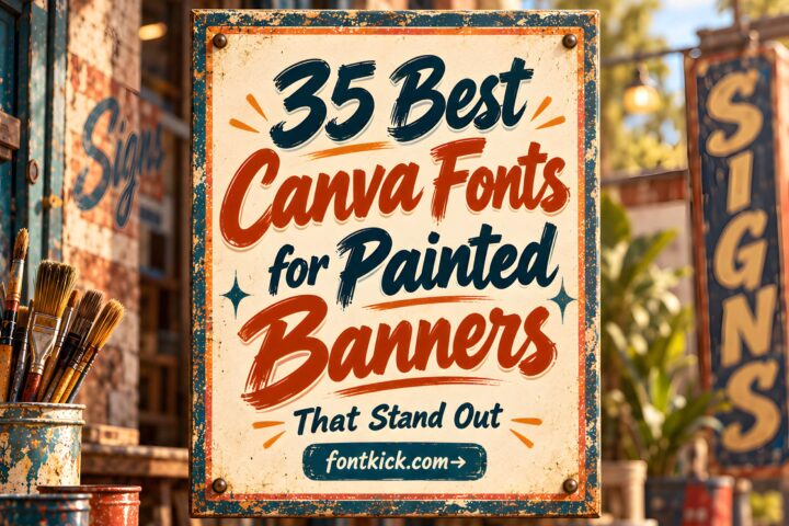
A banner or sign has only a few seconds to communicate its message, so the font has to do more than look interesting. The strongest Canva fonts for banners and signs need enough visual weight for distance, clear letter shapes, and a personality that matches the project without making the wording harder to read. A chunky display face can work for a sale banner, while a vintage script or blackletter style makes more sense for themed signage where character matters as much as speed of reading.
This roundup focuses on downloadable fonts that can be brought into Canva as custom fonts, rather than pretending every choice is already built into Canva’s standard font library. The selections cover clean display lettering, retro sign styles, bold geometric faces, scripts, blackletter, playful fonts, and a few more decorative options for projects where the type itself is part of the visual idea.

Many more display and signage fonts are available, while this selection concentrates on styles with distinct project uses, readable letterforms, and clearly different personalities.
The best choices for banners and signs are usually bold display or sans serif fonts for fast readability, retro and script fonts for themed signage, and decorative display faces for short event or promotional phrases. Use heavier, simpler letterforms when viewers will read from farther away, and reserve intricate scripts or blackletter styles for larger text with plenty of surrounding space.
Canva Fonts for Banners, Signs, and Large Display Text
1. Designer
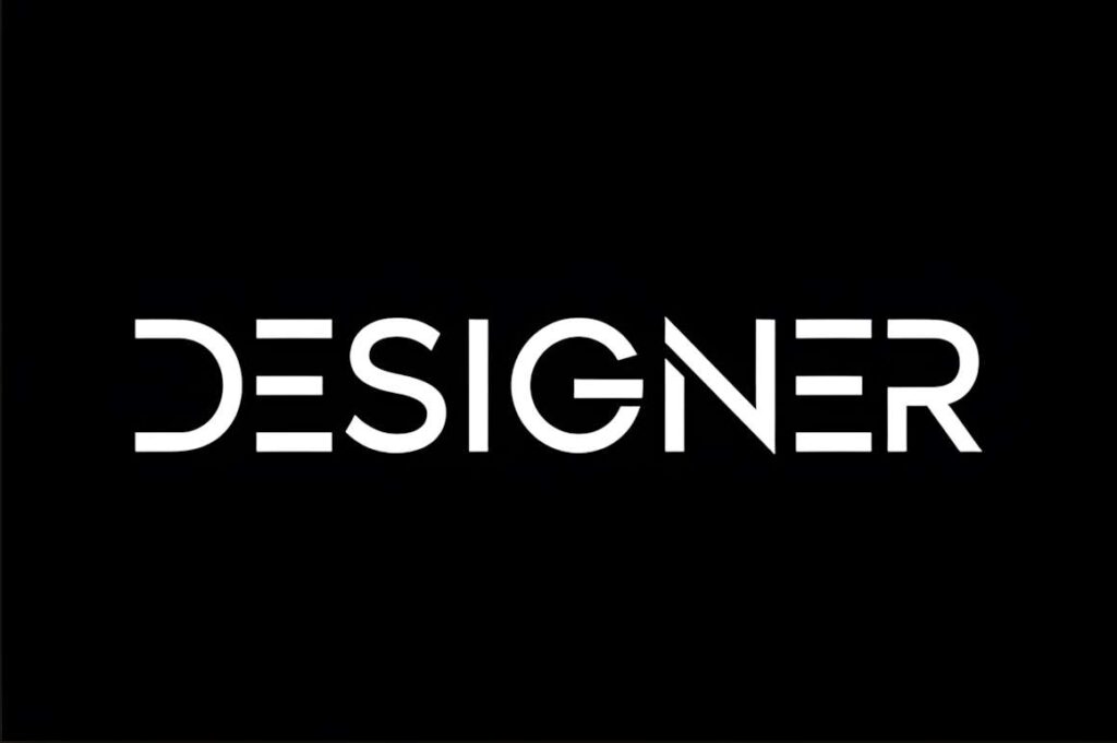
Designer is a clean, casual display font that suits banners and signs where the message needs to stay uncomplicated. Its letterforms are restrained compared with the more decorative fonts in this list, which makes it useful for promotions, event headings, simple business signage, and layouts that already contain photography or graphic elements.
Choose Designer when you want the font to support the composition instead of becoming the entire visual theme. For a sign that needs a stronger retro, neon, or handmade identity, one of the more specialized display fonts below will create a clearer stylistic direction.
2. Neon Party
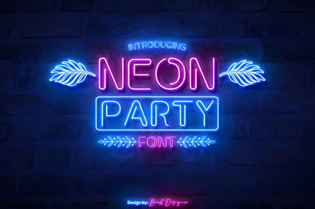
Neon Party is a neon-sign display font for nightlife graphics, party banners, bar-style signs, event posters, and other designs that benefit from an illuminated-lettering look. The style is immediately thematic, so a short phrase can establish the mood without relying on extra decorative type.
This makes the most sense for large words, names, and compact headings. On information-heavy banners, neon-style letterforms can become visually busy, so pair the main message with a quieter supporting font rather than setting every line in the same decorative face.
3. Prestige Signage
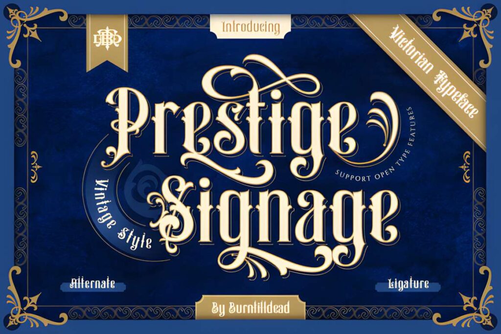
Prestige Signage is a Victorian-inspired blackletter font aimed at classic signage, labels, covers, and heritage-style branding. The angular construction gives short words an ornate, historical appearance that is very different from the rounded modern display fonts in this roundup.
Use it when the sign itself is meant to feel vintage, formal, tattoo-influenced, or old-world. Blackletter rewards generous scale and spacing; for directional signage, long event details, or small-print information, a simpler face such as Designer or Bigbold will usually be easier to scan.
4. Crafty Signs
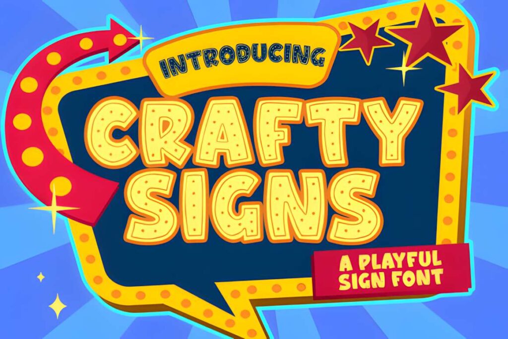
Crafty Signs is a bold, playful display font suited to casual banners, craft-fair signs, classroom graphics, kids’ events, and friendly promotional designs. Its personality is more informal than a geometric sans serif, so it can carry a cheerful headline without needing script swashes or ornamental details.
The font works best where a relaxed tone is intentional. For upscale retail signage or minimalist branding, Quinn is more restrained; for a louder retro look, Huge or Colakind brings a stronger period-inspired shape.
5. Signs Painted
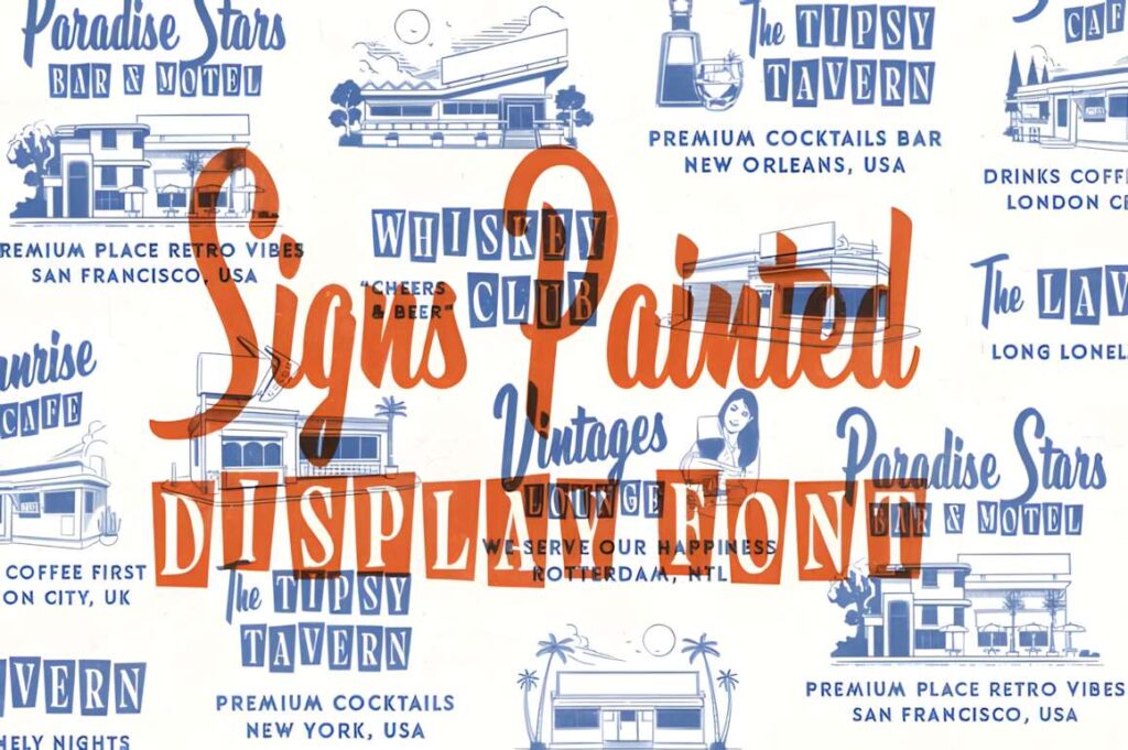
Signs Painted combines script and serif styling around a vintage sign-painting theme. It is well suited to restaurant signage, hotel-inspired graphics, retro menu boards, packaging displays, and posters that need more handcrafted character than a standard bold sans serif can provide.
The mixed style gives you more room to build hierarchy inside one visual direction: script can handle the expressive name or headline while the serif side carries supporting words. It is less suitable when the banner needs an ultra-modern or purely minimal look.
6. Display
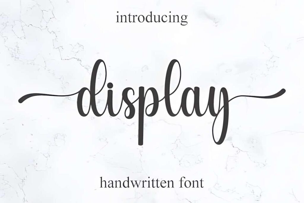
Display is an elegant handwritten font for signs and banners where a softer, more personal tone matters. It fits boutique graphics, wedding signage, beauty promotions, name-based banners, and short decorative headlines better than utilitarian directional or sale messaging.
Handwritten forms are most effective when the wording stays short and the text is given room to breathe. If your design will be viewed from farther away or contains several lines, switch supporting information to a simpler companion font so the headline remains decorative without reducing overall clarity.
7. Dinofiles
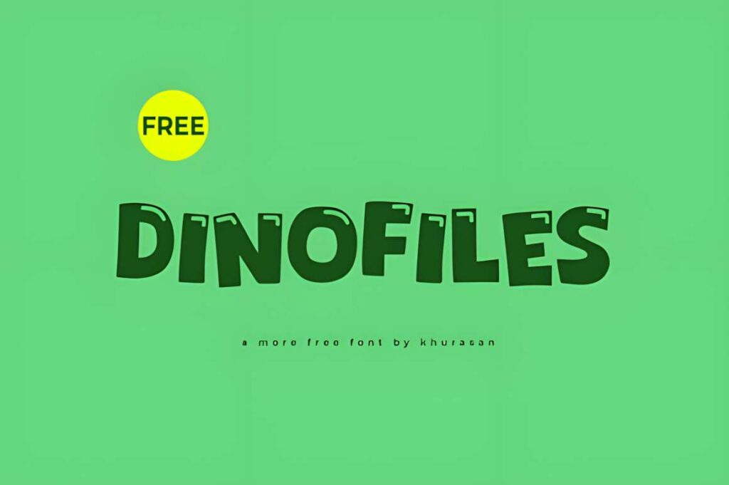
Dinofiles is a cute modern display font made for prominent titles on posters, covers, logos, and banners. Its playful character makes it a natural fit for birthday banners, school projects, children’s events, casual shop signs, and colorful social graphics.
Choose Dinofiles when the sign should feel friendly rather than corporate. The decorative personality is useful for the main message, but a neutral sans serif will usually make dates, addresses, prices, or instructions easier to read beneath it.
8. Above the Stars
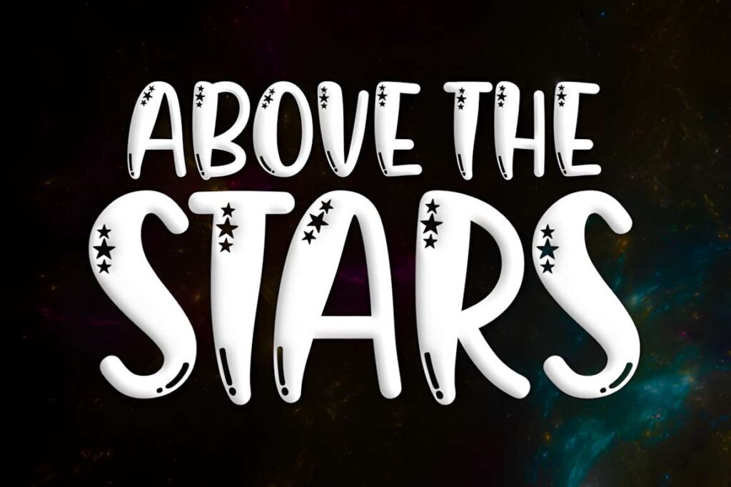
Above the Stars is a tall, chubby display font with star details built into the character style. That makes it useful for kids’ banners, school celebrations, space-themed signs, party graphics, bookish displays, and other projects where the lettering is expected to contribute a visible decorative motif.
The embedded detail gives short words more personality, but it also makes the face less neutral. Use it as a headline rather than a general-purpose text font, especially when the banner includes practical information that needs quick reading.
9. Colakind
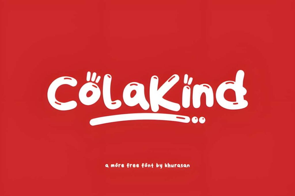
Colakind is a modern, fancy display font intended for prominent visual uses such as posters, logos, covers, and banners. It works well when a design needs a cheerful headline that feels more stylized than a standard sans serif but still reads as contemporary rather than historical.
It fits promotional banners, creator graphics, casual retail signs, and event headlines. If your project needs strict geometry or a more serious business tone, Bigbold or Quinn provides a calmer structure with less decorative character.
10. Yourmate
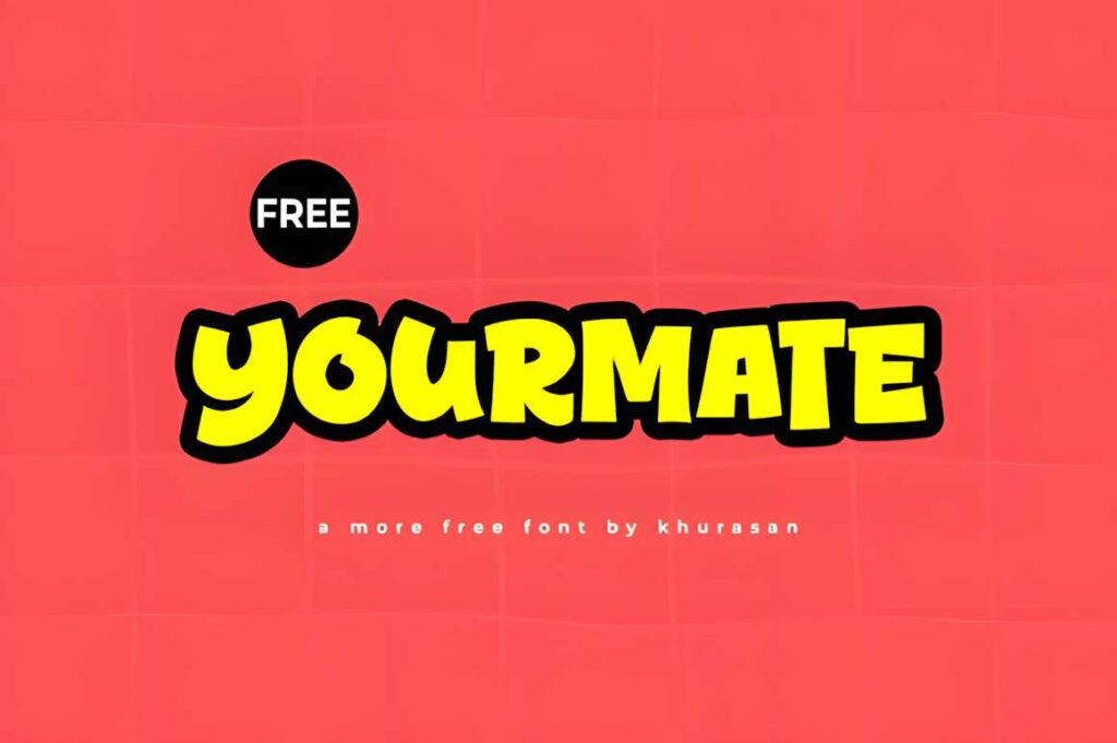
Yourmate is a modern, cute display font suited to banners, posters, logos, magazines, and cover-style graphics. The tone is friendly and accessible, making it a practical choice for small-business promotions, community events, classroom visuals, and social banners that should feel approachable.
Use Yourmate for short, visible phrases where personality matters but an ornate script would be too delicate. For a vintage sign-painting feel, Maltone offers more movement; for a heavy modern block, Bold Style pushes the message with more visual weight.
11. Vegas
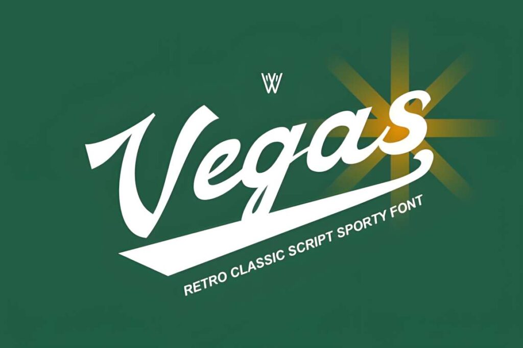
Vegas is a retro script font with a sporty, vintage-signage influence. Its flowing strokes fit team banners, classic Americana graphics, apparel-style signs, retro events, diner-inspired promotions, and brand names that need motion rather than rigid block lettering.
Because the letters connect visually, Vegas is most persuasive in large words and short phrases. Avoid using a script like this for dense schedules, safety information, or small secondary copy. Pairing it with a simple sans serif preserves the retro headline without sacrificing readability elsewhere.
12. Showtoon
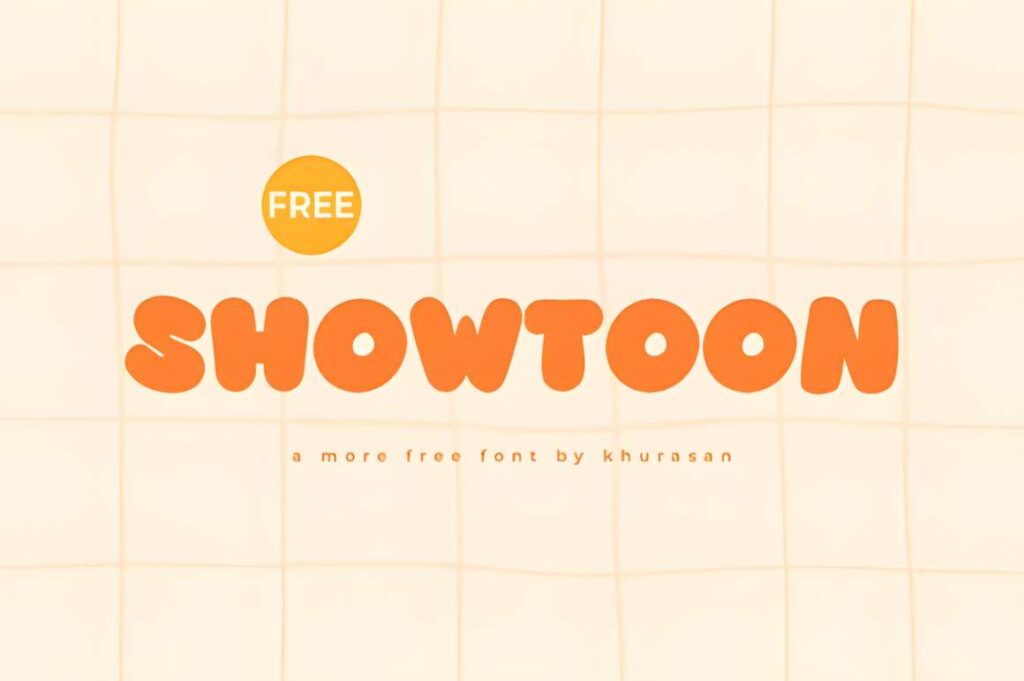
Showtoon is a cute modern display font designed for visually prominent uses such as posters, logos, covers, and banners. It suits party signage, playful promotions, creator graphics, and kid-oriented displays where the headline should feel lighthearted without moving into script lettering.
This is a better fit for casual messages than luxury or heritage projects. When a sign needs to feel more polished and restrained, Quinn creates a quieter visual tone; when the design should look deliberately retro, Huge or Signs Painted gives you a more specific period reference.
13. Creation Fabreca
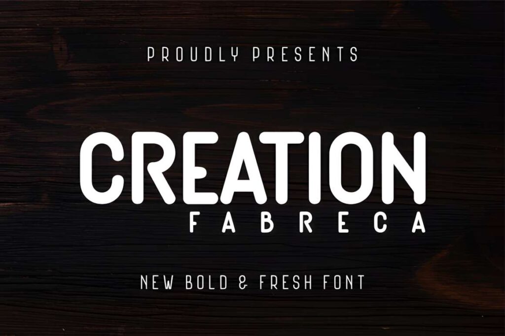
Creation Fabreca is a bold display font with rounded, smooth terminals and a shape intended for signs, banners, billboards, packaging, and posters. The broad, rounded construction makes it useful when you want a visible headline without the sharper industrial feel of many heavy display faces.
It works particularly well for promotional graphics and casual commercial signage that needs strong size and softer edges. If the project calls for stricter geometry, Bigbold is the cleaner alternative; if it needs a hand-painted retro mood, Maltone or Signs Painted will feel more thematic.
14. Huge
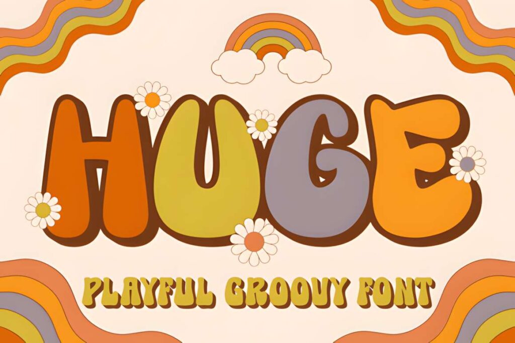
Huge is a thick, playful display font with a groovy retro direction. It is well suited to event banners, apparel graphics, poster headlines, kids’ designs, and signs that need a 1970s-inspired or cheerful visual voice rather than a formal business look.
The heavy shapes are useful for large text, but the retro personality is strong enough that it should be a deliberate choice. A modern sale banner or corporate event sign may look cleaner in Bold Style or Designer, while Huge makes sense when the theme benefits from obvious nostalgia.
15. Maltone
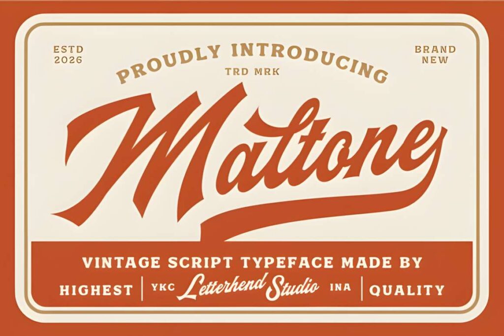
Maltone is a vintage script typeface with bold strokes and sweeping curves inspired by classic sign painting and retro labels. That combination makes it particularly suitable for café signs, restaurant banners, packaging displays, retro logos, menu headers, and storefront graphics that should feel handmade rather than digitally neutral.
The script carries more visual movement than a block font, so keep the wording concise and give the letters room around the edges of the layout. For quick-read directional text or long promotional copy, Bigbold or Designer is the more practical choice.
16. Bold Style
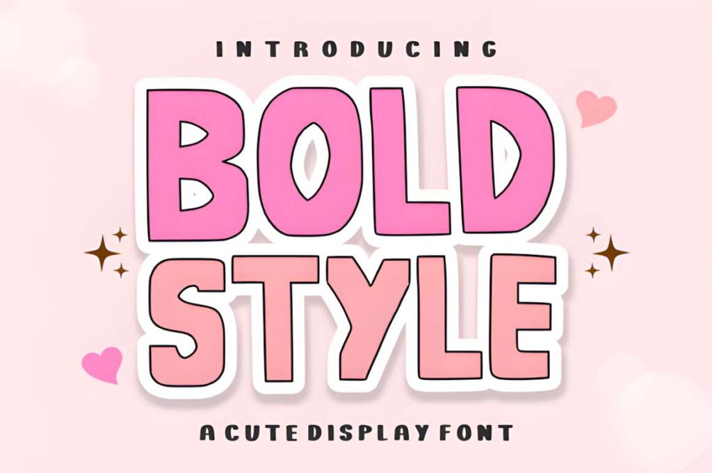
Bold Style is a chunky modern display font built from thick, clean blocks with minimal curves. It makes sense for sale banners, sports graphics, event signage, school spirit displays, and promotional headlines where visibility matters more than ornament.
This is one of the more functional high-impact choices in the roundup because the visual idea comes from weight rather than intricate decoration. It can dominate a layout quickly, though, so give long words enough width and avoid crowding the headline with too many competing elements.
17. Quinn
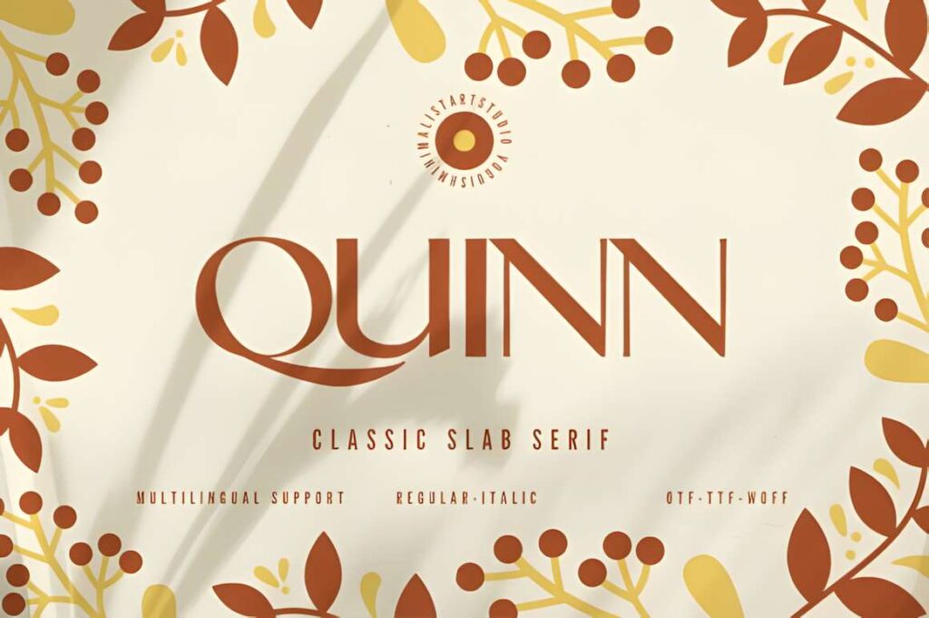
Quinn is a minimalist, chic sans serif aimed at elegant posters, magazine covers, fashion graphics, banners, and premium-looking layouts. Compared with the chunky or novelty display faces here, Quinn gives a sign more breathing room and relies on clean proportion rather than obvious decoration.
Choose Quinn for boutique banners, beauty signage, gallery-style graphics, and modern retail displays. It is less suited to loud sports or children’s designs, where a heavier or more playful face can communicate the tone more immediately.
18. Bigbold
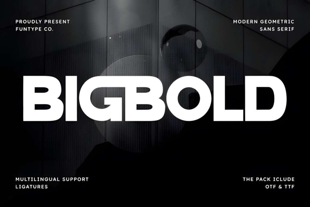
Bigbold is a heavy geometric sans serif with solid, rounded forms built for headlines, branding, sports graphics, and display use. Its structure makes it a practical candidate for banners and signs that need a modern message to remain visually strong against photos, color blocks, or busy event graphics.
Use Bigbold for sales, announcements, team graphics, directional displays, and short promotional statements. The heavy weight can feel too forceful for delicate wedding or boutique signage; Quinn or Display is better when the visual tone should be lighter.
19. Strong Display
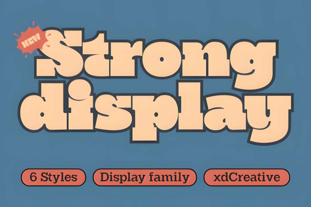
Strong Display is a slab-serif display font designed around a sturdy, headline-focused appearance. The heavier serif structure works well for bold banners, workshop signs, masculine branding, event headers, vintage-industrial graphics, and layouts that need more texture than a plain sans serif.
It offers a useful middle ground between geometric block lettering and highly decorative vintage fonts. For very small text, the serif detail can become less efficient than a simple sans serif, so reserve Strong Display for the parts of the sign that deserve emphasis.
| Product | Best for | Font Style / Personality | Best Project Fit |
|---|---|---|---|
| Designer | Flexible clean headlines | Casual display | Promotional banners and simple signs |
| Neon Party | Nightlife themes | Neon display | Party signs and event graphics |
| Prestige Signage | Heritage styling | Victorian blackletter | Vintage signs and labels |
| Crafty Signs | Friendly displays | Bold playful display | Craft fairs and kids’ events |
| Signs Painted | Hand-painted character | Vintage script and serif | Restaurant and retro signage |
| Display | Soft decorative headings | Elegant handwritten | Boutique and wedding signs |
| Dinofiles | Playful banners | Cute modern display | Birthdays and school events |
| Above the Stars | Themed headlines | Tall playful display | Space and celebration banners |
| Colakind | Stylized promotions | Modern fancy display | Events and creator graphics |
| Yourmate | Approachable headings | Modern cute display | Community and small-business banners |
| Vegas | Retro movement | Sporty vintage script | Team and Americana signage |
| Showtoon | Casual fun | Cute display | Party and promotional banners |
| Creation Fabreca | Rounded impact | Bold rounded display | Billboards and promotions |
| Huge | Groovy retro headlines | Thick playful display | 70s-inspired banners and posters |
| Maltone | Classic sign-painting style | Bold vintage script | Café and storefront signs |
| Bold Style | Maximum visual weight | Chunky modern display | Sales, sports, and event signage |
| Quinn | Minimal elegance | Chic sans serif | Boutique and fashion banners |
| Bigbold | Modern visibility | Heavy geometric sans serif | Announcements and directional signs |
| Strong Display | Sturdy headline texture | Slab serif display | Workshop and industrial-style signs |
How to Make Banner and Sign Fonts Read Better in Canva
Start by designing for the real viewing distance, not just the Canva editor. A headline that fills the screen on your laptop may still be too thin once it is printed on a banner and seen across a room. Zoom out until the design is much smaller than normal. If the important words stop reading clearly before the rest of the layout does, the font is probably too delicate, too condensed, or too decorative for that job.
Keep the main message short. Signs work best when the viewer can understand the primary idea almost instantly. Put the event name, sale message, direction, or business name in the display font, then move dates, addresses, prices, and explanatory copy into a simpler companion face. This is especially useful with scripts such as Maltone or Vegas and highly themed faces such as Prestige Signage or Neon Party.
Watch the space inside and around the letters. Heavy fonts need enough tracking and line spacing to keep words from turning into a solid block. Scripts need enough room for connected strokes and flourishes. Blackletter and detailed display styles need open margins so the silhouette remains recognizable. Canva makes it easy to enlarge text, but scaling alone does not fix cramped spacing.
Contrast should come from the whole composition. A bold headline placed over a detailed photograph may still disappear if the colors are too similar. Use a quieter section of the image, a solid text panel, or a controlled shadow or outline when the design calls for it. Decorative effects should clarify the word shape rather than bury it under extra styling.
If you are bringing one of these downloadable fonts into Canva, custom font uploads are available on eligible Canva plans. Canva currently accepts OTF, TTF, and WOFF files for custom font upload. Check the current font license before uploading, especially when you plan to use the design for client work, commercial branding, print-on-demand, templates, or other distribution.
Choosing the Right Style for Your Banner or Sign
If readability and flexibility are the priority, start with Designer, Bold Style, or Bigbold. They rely on clear display weight rather than complicated decoration, so they are easier to adapt to promotional banners and general signage.
For a sign that needs a strong theme, choose the font that carries the idea most directly. Neon Party fits nightlife and illuminated-sign visuals, Prestige Signage suits Victorian or heritage graphics, and Maltone works when a classic painted-script mood is more important than minimalism.
For playful projects, Crafty Signs, Dinofiles, and Above the Stars give the headline more built-in personality. For boutique or fashion-oriented signage, Quinn keeps the layout quieter and more refined.
Frequently Asked Questions
What type of font works best for a large banner?
A bold display or sans serif font usually works best for a large banner because thick strokes and clear letter shapes remain easier to recognize at a distance. Decorative scripts and themed display fonts can work well for a short headline, but supporting information should usually use a simpler font so dates, prices, directions, or event details remain easy to scan.
Can I upload downloaded fonts to Canva?
Yes, eligible Canva plans allow custom font uploads. Canva currently supports OTF, TTF, and WOFF font files for custom uploads. The font also needs to be covered by a license that permits the way you plan to use it, so check the current license terms before using an uploaded font for commercial, client, or distributed designs.
Are script fonts good for signs?
Script fonts can work well for signs when the wording is short, large, and decorative. Bold scripts such as vintage sign-painting styles can give storefront names, café graphics, and event banners a clear personality. For directions, safety information, prices, schedules, or long phrases, a simpler display or sans serif font usually provides faster reading.
How many fonts should I use on one banner?
One or two fonts are usually enough for a banner. Use one display font for the main message and, when needed, one simpler companion font for supporting details. Adding several decorative fonts can weaken hierarchy and make the sign harder to scan, especially when the layout already includes photos, illustrations, logos, or strong color blocks.