ℹ️ Affiliate Disclosure: This article may contain affiliate links. If you book or purchase through these links, we may earn a commission at no additional cost to you.
Explore the Best Cute Canva Fonts for Banners with High Impact and Readability
A cute banner font has to do more than look playful in the font menu. Large letters need enough weight to stay visible over photos and colored backgrounds, distinctive shapes need to survive quick scrolling, and decorative details cannot make a short headline harder to read. These cute Canva fonts for banners cover rounded bubble lettering, chunky display styles, handwritten options, and retro shapes suited to birthday graphics, shop announcements, classroom banners, social headers, and other cheerful designs.
The fonts below are downloadable font products rather than a list limited to Canva’s built-in library. Canva accounts that support custom font uploads can add compatible font files to a Brand Kit, so you can use an outside typeface in your Canva layouts after checking the current font license and upload requirements.

Many more playful fonts are available, while this selection concentrates on styles with distinct banner uses, readable display shapes, and clearly different personalities.
The strongest cute banner fonts usually fall into a few useful groups: chunky rounded lettering for maximum visibility, bubbly display fonts for children’s and party graphics, groovy retro faces for nostalgic banners, and casual handwritten fonts for a softer handmade look. Choose primarily by headline length, background contrast, and how decorative the finished banner needs to feel.
Quick Picks
- Best for bold retro banners: Groovy Cute — thick, curving display forms give short headlines a strong 1970s-inspired personality.
- Best for bubbly party graphics: Bubble — rounded, puffy letters stay playful without relying on a script structure.
- Best for chunky kid-friendly headlines: Playful Sans — broad rounded shapes work well when readability matters as much as cuteness.
- Best for a softer handwritten look: Kawaii — casual hand-drawn forms make short banner text feel friendly rather than rigid.
- Best for a cleaner cute style: Rounded — simple sans-serif construction gives you more room for supporting text and longer phrases.
Cute Canva Fonts for Banners, Signs, and Header Graphics
1. Groovy
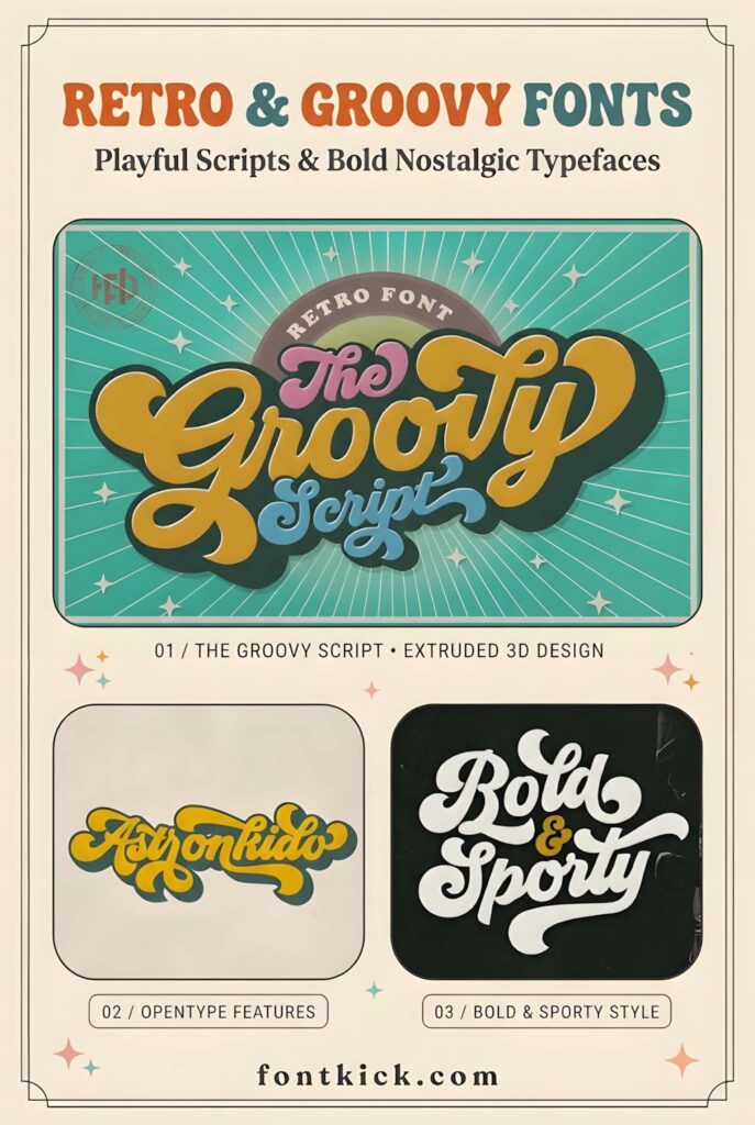
Groovy is a retro script and display font suited to banners that need an unmistakable late-1960s or 1970s mood. Its flowing, inflated curves create a large decorative word shape, so it works especially well for a short event title, retro sale banner, or themed social header.
The lettering already carries substantial personality, which means the rest of the banner can stay relatively simple. Long informational copy is a weaker fit; use Groovy as the focal headline and pair it with a quieter sans serif when you need dates, prices, or supporting details.
2. Groovy Cute
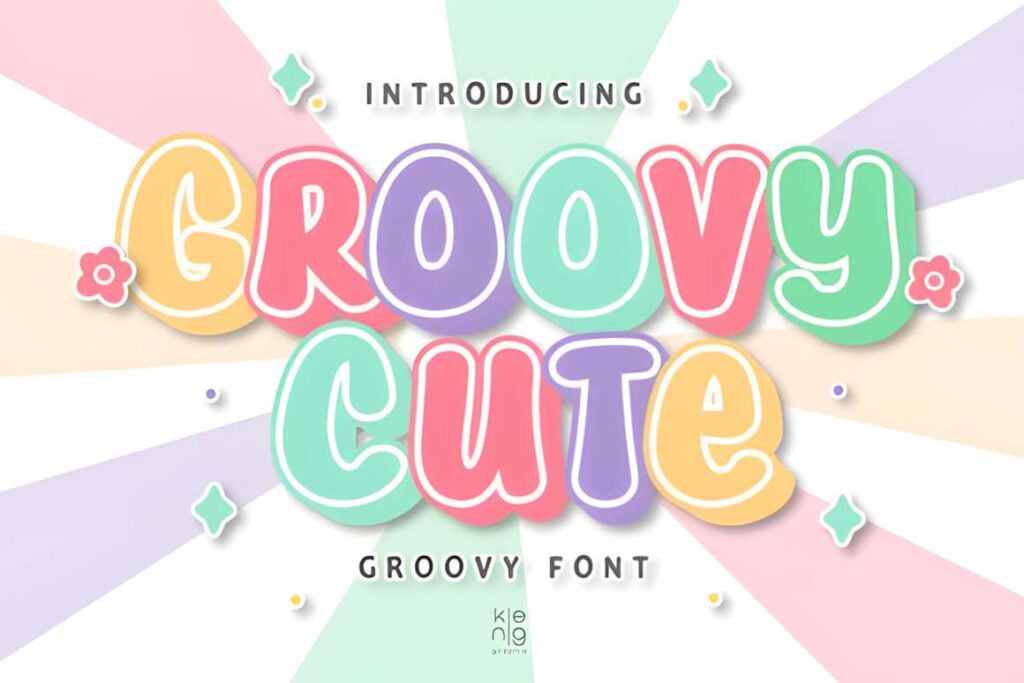
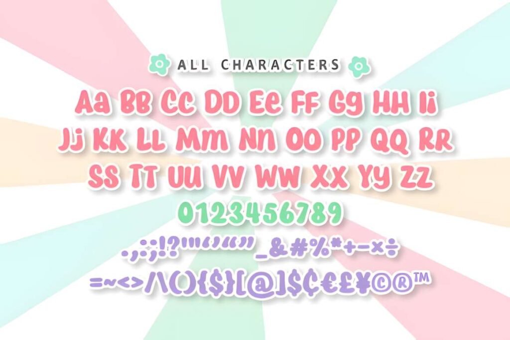
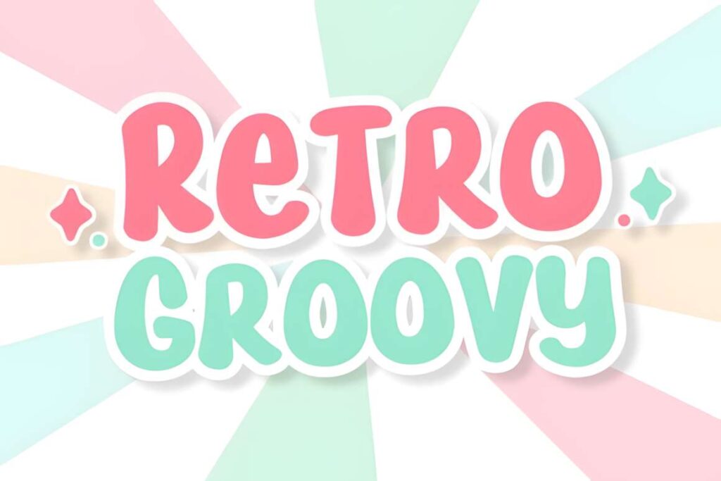
Groovy Cute is a punchy display font for playful banners where the headline should dominate the layout. The heavy curved shapes give short words plenty of surface area, which works nicely with outlines, shadows, or contrasting text colors in Canva.
I would favor it for retro birthday graphics, cheerful shop headers, and colorful announcement banners. The wide decorative construction can consume horizontal space quickly, so a narrow banner with a long sentence may be easier to manage with Playful Sans or Rounded.
3. Kawaii
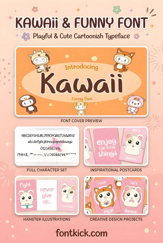
This Kawaii font has a casual handwritten structure that suits banners intended to feel friendly, personal, and lightly playful. The less rigid letterforms can soften classroom signs, children’s graphics, informal announcements, and social-media headers without the bulk of a full bubble font.
Use it when a hand-drawn mood matters more than perfect geometric consistency. For very large sale percentages or short words that need immediate visual weight, Bubble or Cute Bold provides a heavier silhouette and stronger block-like presence.
4. Bubble
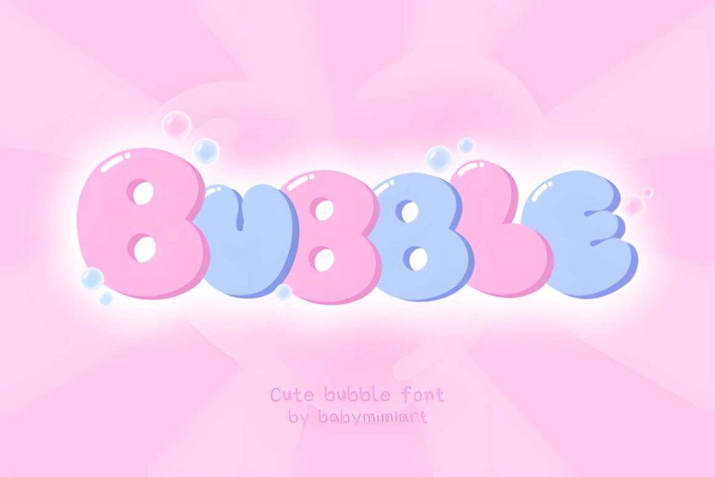
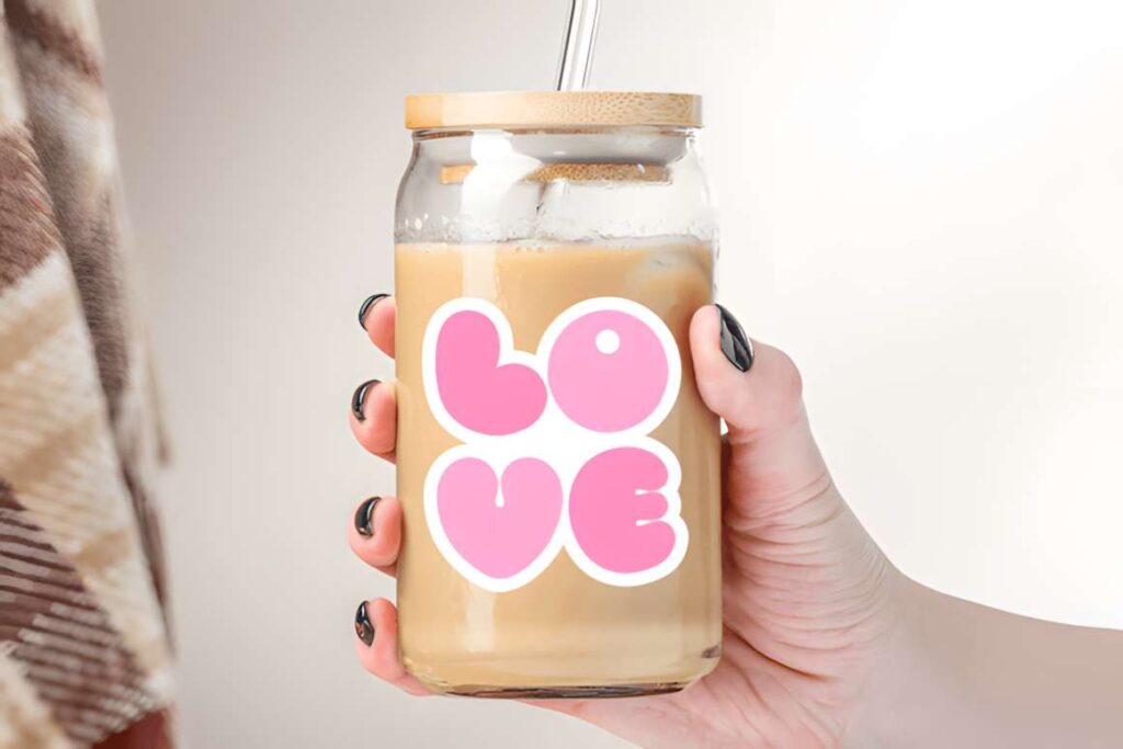
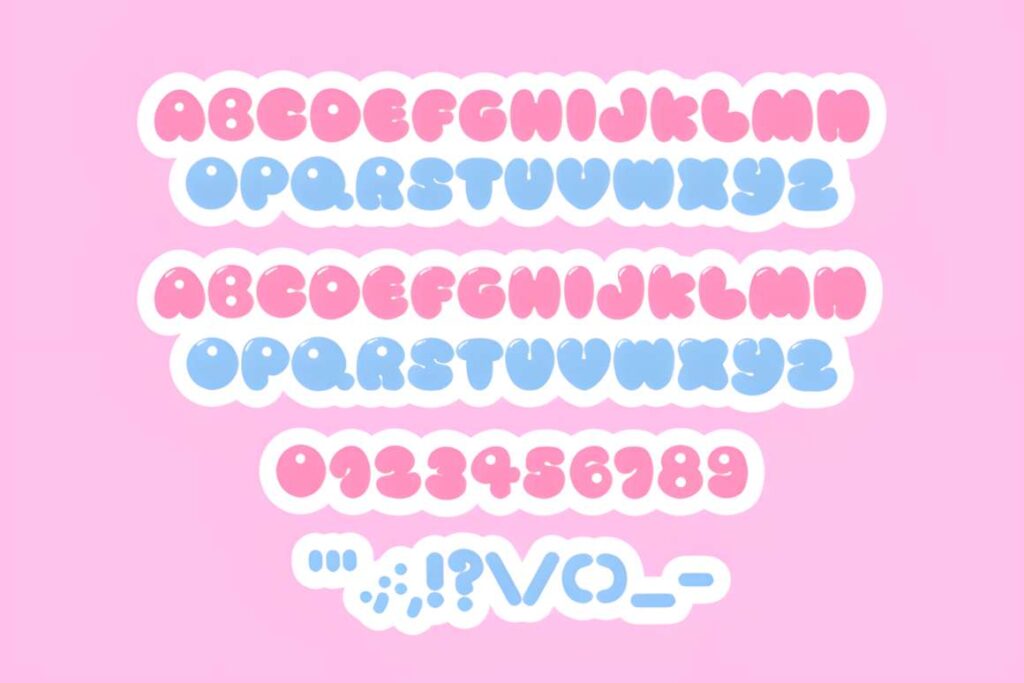
Bubble uses rounded, inflated display letters that immediately read as playful. It makes sense for party banners, children’s graphics, cute product announcements, greeting-style headers, and other designs where soft curves are part of the theme rather than just decoration.
The thick construction is useful when you want to add a contrasting outline or place the headline over a busy background. Because the letters occupy plenty of space, keep the wording concise. A longer promotional message will usually fit more comfortably in a cleaner rounded font.
5. Cute Bubble
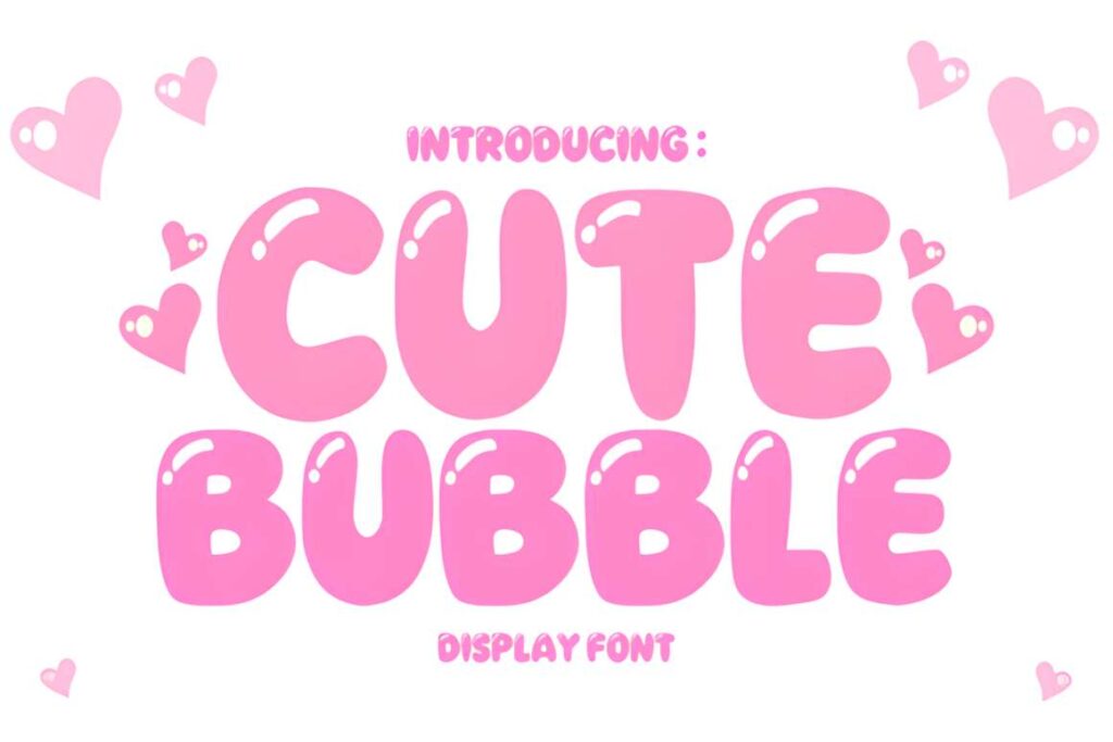
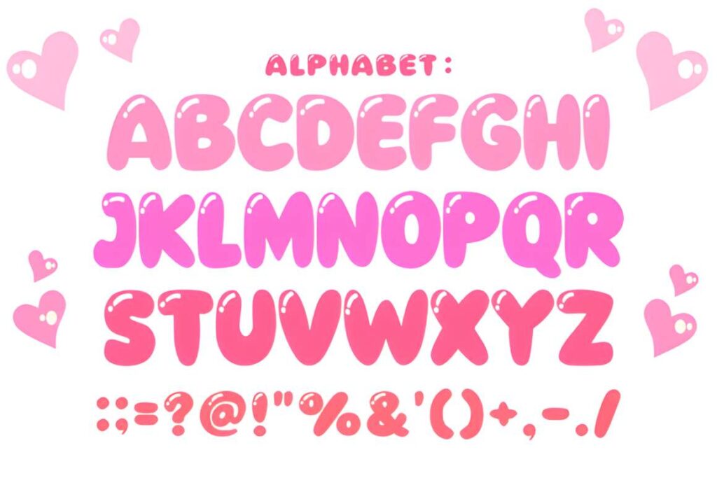
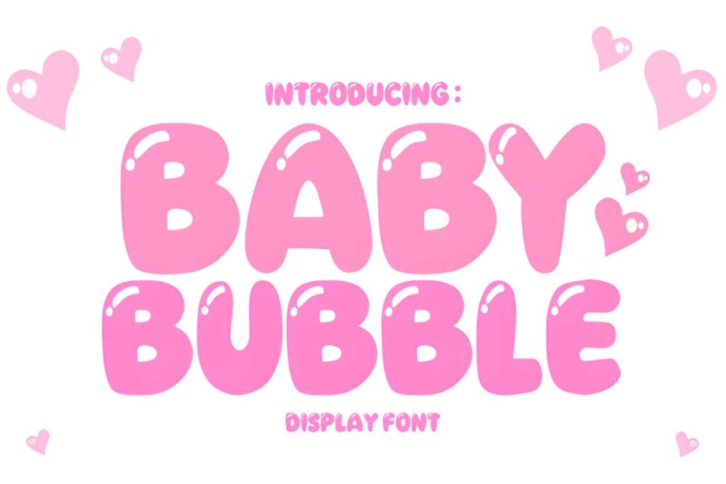
Cute Bubble is another rounded display choice, but its cheerful cartoon-like construction makes it especially suitable for youthful banner designs, invitations, social graphics, comics, and digital headers. Large counters and rounded corners help keep the overall word shape soft.
Choose it when you want the typography itself to supply most of the cute visual theme. On banners aimed at a more restrained brand audience, the playful character may become too dominant; Rounded gives a friendlier but less themed result.
6. Kawaii by Honiiemoon
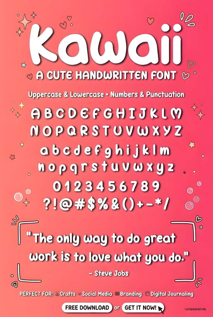
Kawaii by Honiiemoon has a bold, friendly personality that suits cute banner headings without needing a formal or polished mood. Its playful construction makes sense for children’s promotions, cheerful event graphics, craft-related banners, and casual social designs.
This is better used as display lettering than as a font for dense supporting information. If your banner needs a prominent headline plus several lines of details, keep Kawaii for the main phrase and move the smaller copy into a simpler companion font.
7. Chunky
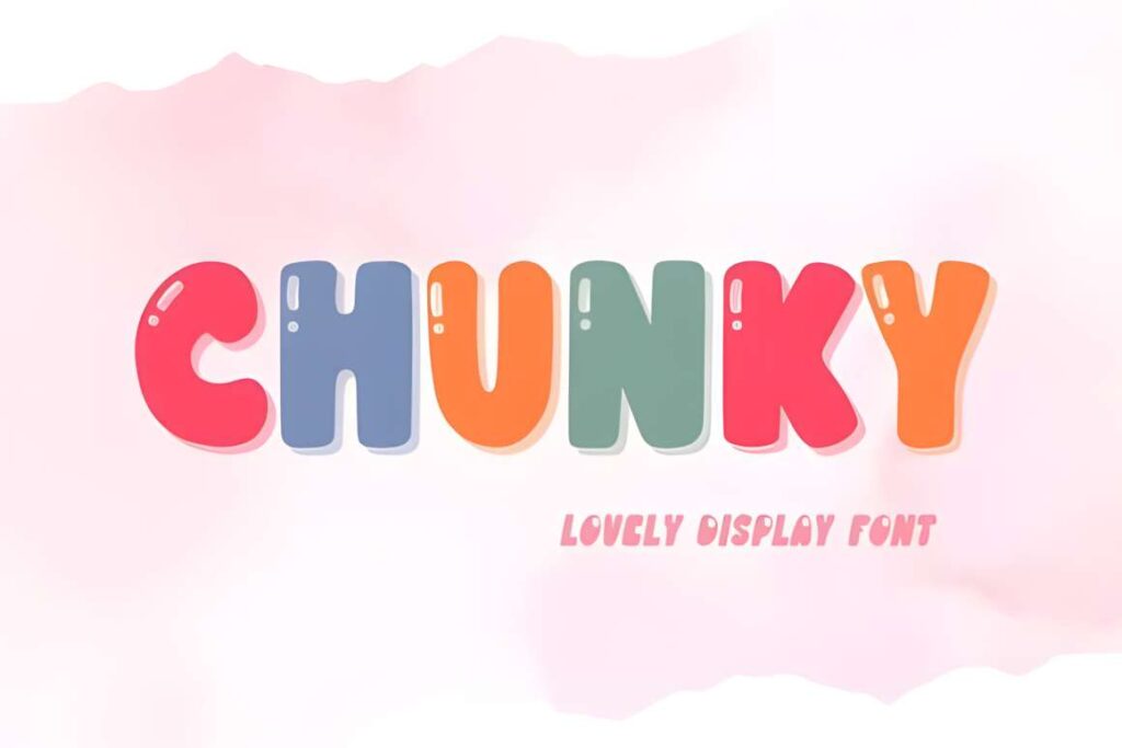
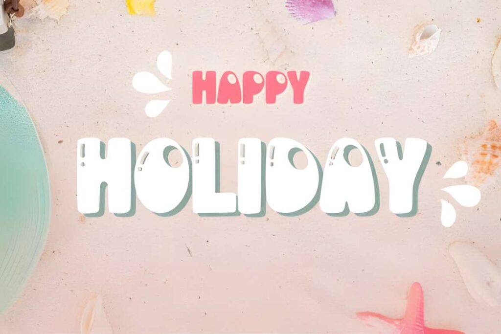
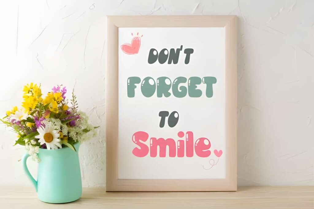
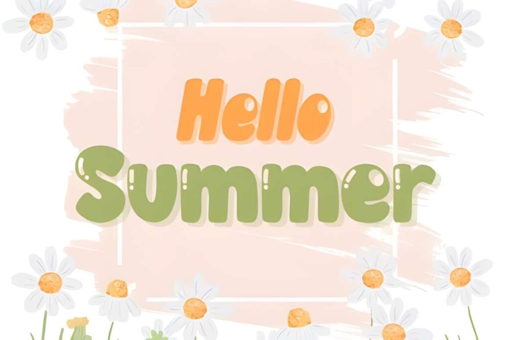
Chunky is a happy display font built for noticeable lettering, and banners are one of the uses explicitly associated with its product presentation. Broad forms give the headline enough visual mass for colorful backgrounds, social headers, classroom graphics, and informal product promotions.
Its strongest role is a short statement where the letters can remain large. The heavier silhouette can make a long phrase feel cramped, particularly in landscape headers. Reduce the number of words before shrinking the type too aggressively.
8. Cute Retro
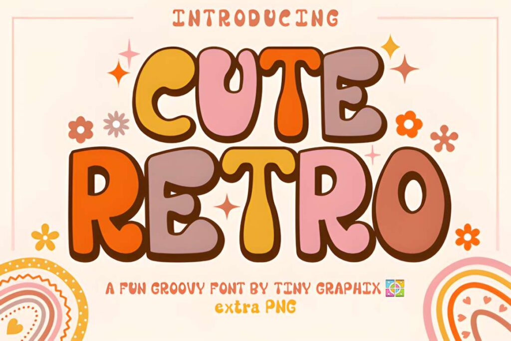
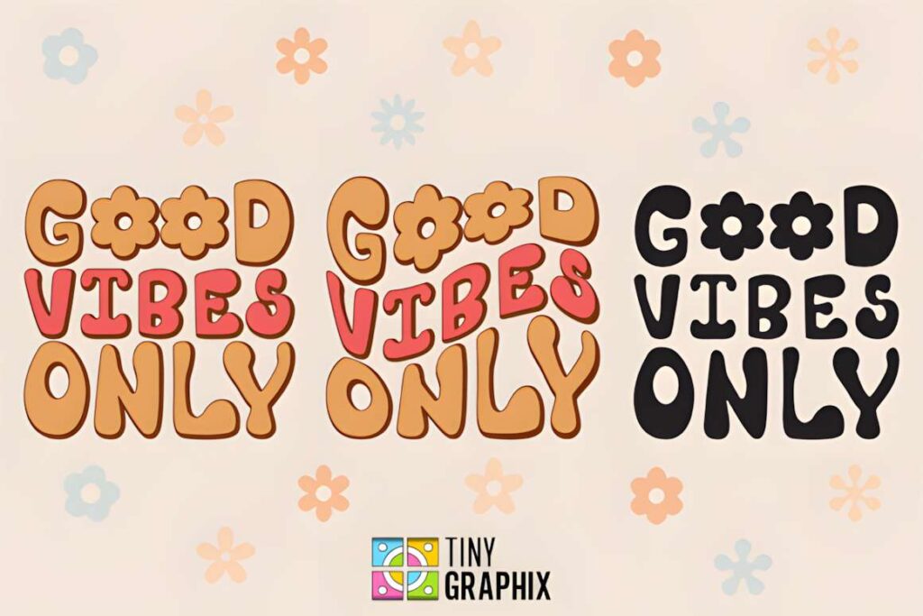
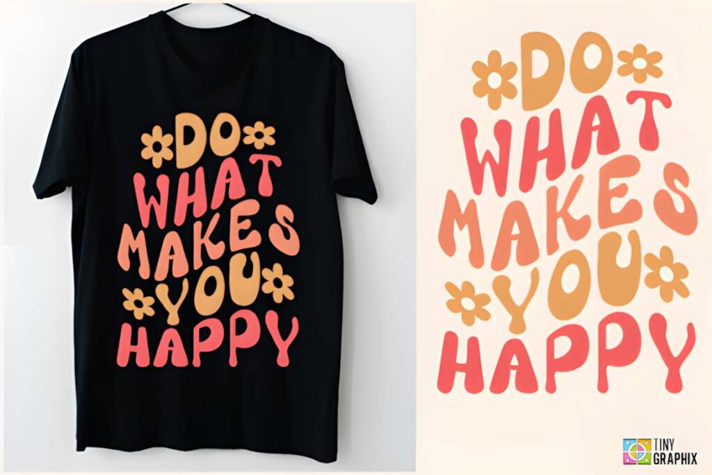
Cute Retro mixes playful display lettering with a clear nostalgic direction. It suits banners for retro-themed collections, craft fairs, colorful promotions, vintage-inspired parties, and social posts where ordinary rounded text would feel too neutral.
The style works best when the banner has enough empty space to let the letter shapes remain recognizable. If you are already using several decorative illustrations, patterns, or stickers, a simpler typeface such as Rounded may prevent the composition from becoming visually crowded.
9. Cute Bold
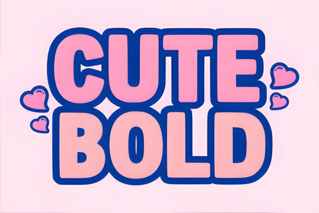
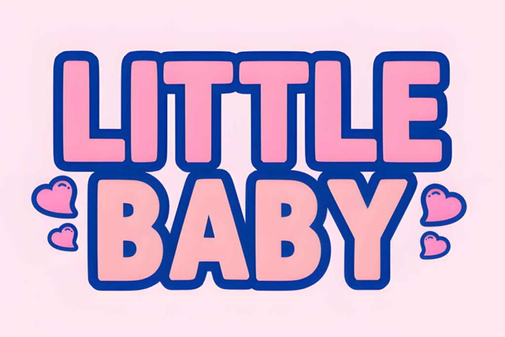
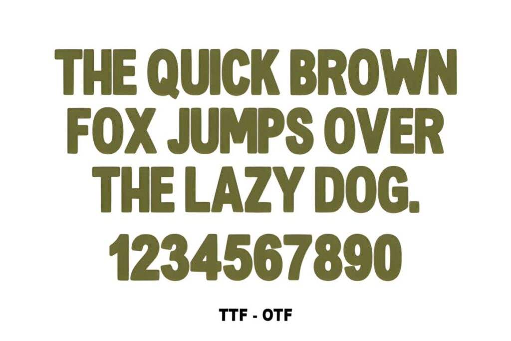
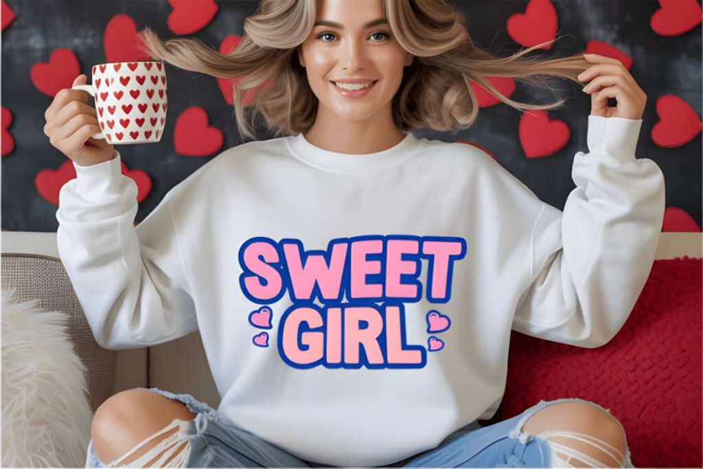
Cute Bold is a heavy display font with thick, irregular letterforms that suit banners where the main phrase needs substantial visual weight. The chunky construction is useful for bright promotional graphics, youth-focused designs, stickers, and high-contrast social headers.
The thick shapes also provide room for Canva effects such as outlines and shadows without immediately swallowing the interior space of each letter. Use another font for small disclaimers or secondary information; Cute Bold is much more convincing as the headline than as dense text.
10. Barbie Kawaii
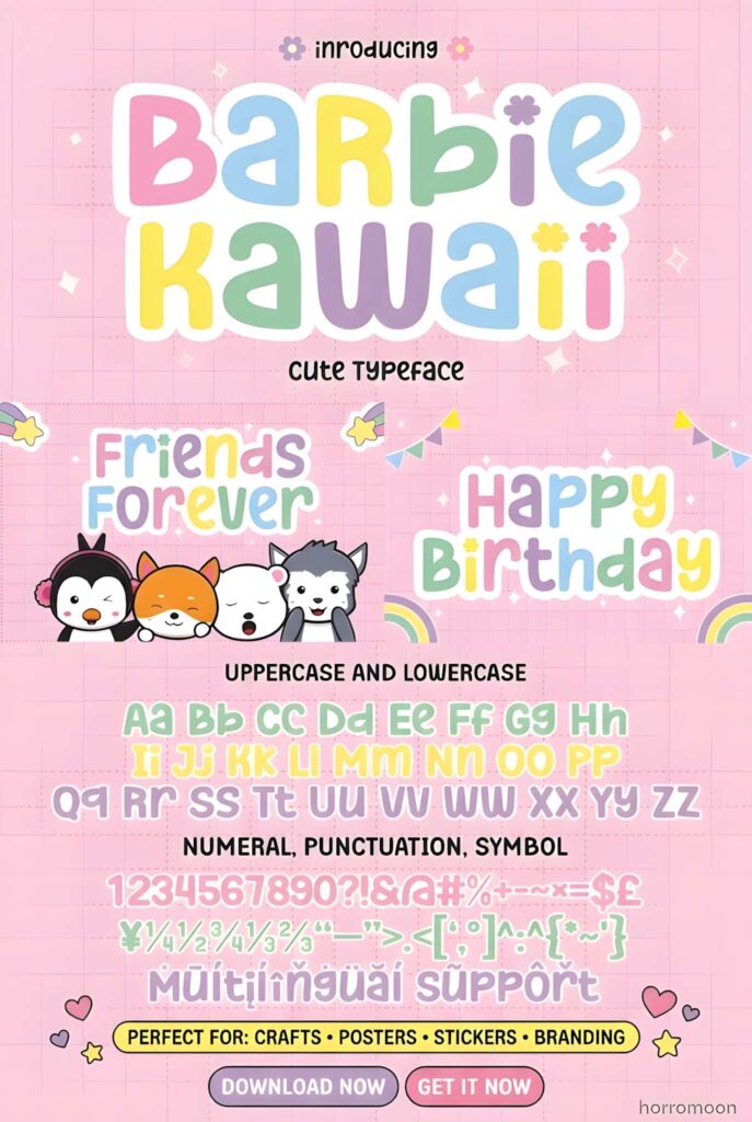
Barbie Kawaii is a cute display font with an openly playful, youthful tone. It is suited to children’s banners, illustration-led layouts, invitations, packaging-style graphics, quotes, and cheerful headline treatments where a conventional sans serif would feel too restrained.
Its personality is specific enough that the audience matters. For an adult retail announcement or a banner that needs to shift between playful and professional contexts, Playful Sans or Rounded offers more flexibility without losing the soft-edged appearance.
11. Playful Sans
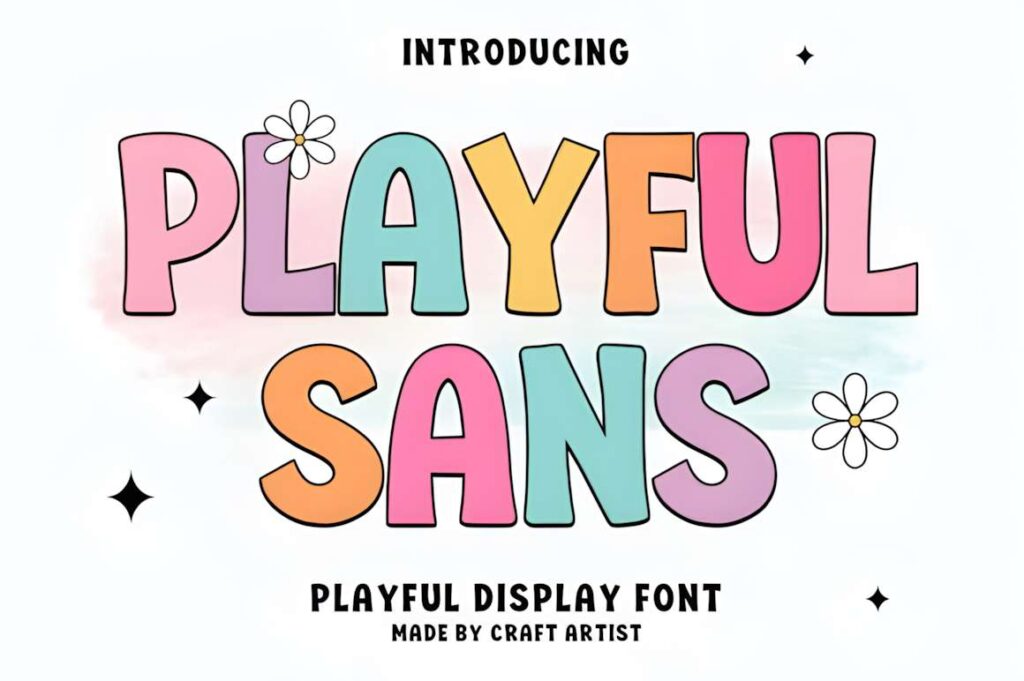
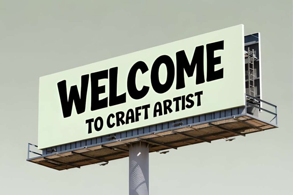
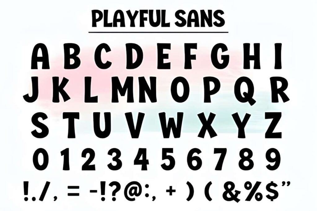
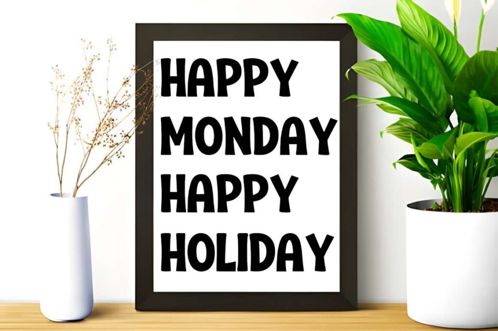
Playful Sans uses chunky rounded letters that make a strong fit for birthday banners, children’s branding, posters, packaging, nursery graphics, and social headers. The broad shapes give the type a clear display role while keeping the underlying letter construction relatively straightforward.
This is one of the easier options to use when you want cute typography without committing to a script or heavily nostalgic style. It still occupies more room than a conventional sans serif, so very long headlines may need tighter wording rather than a much smaller font size.
12. Groovy by NPNaay
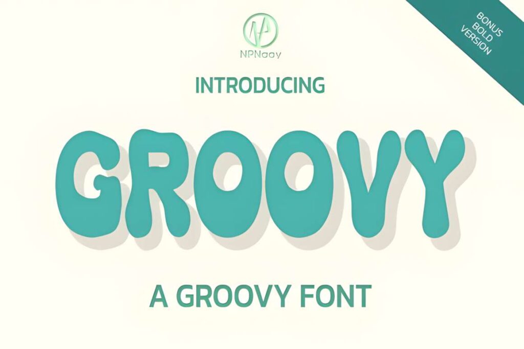
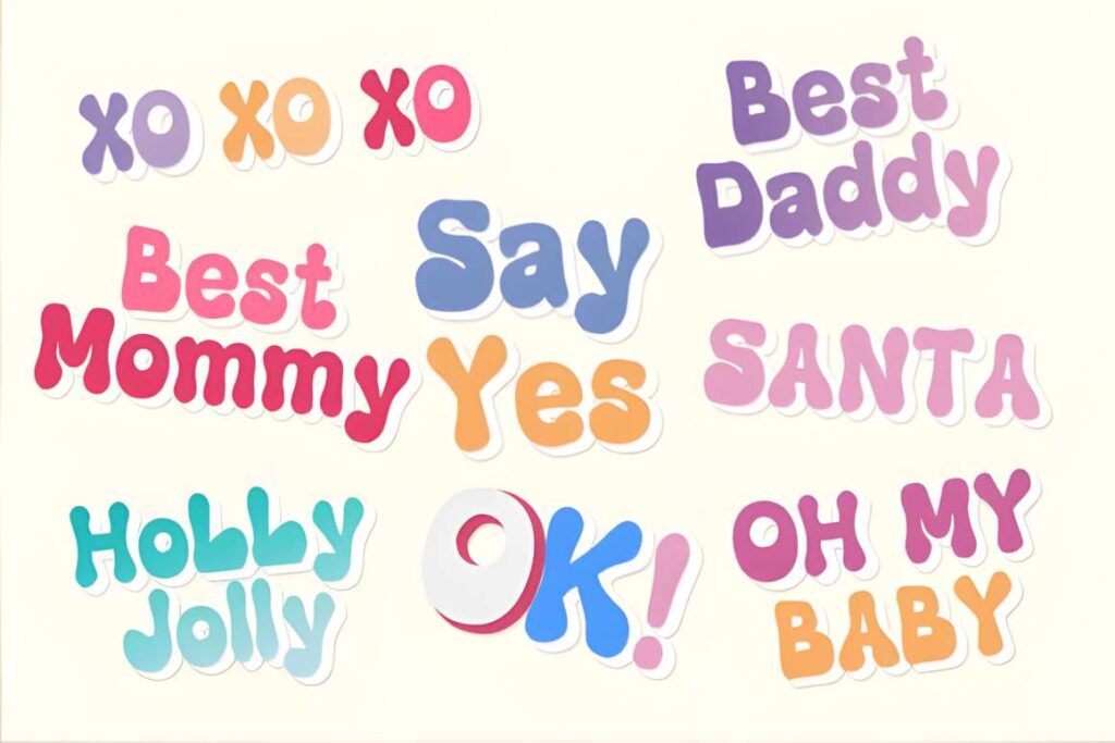
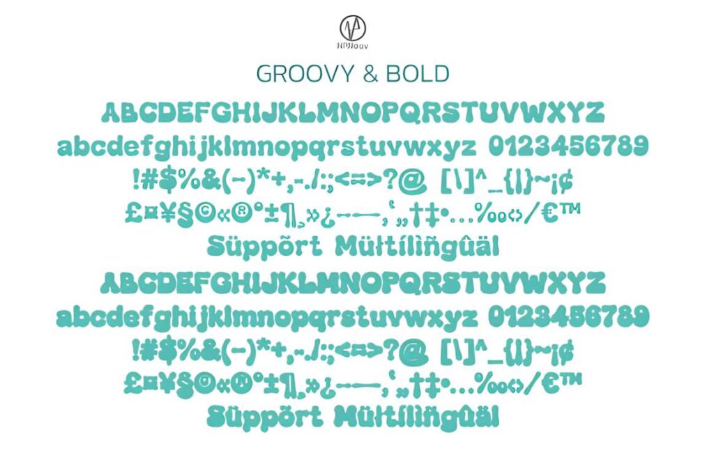
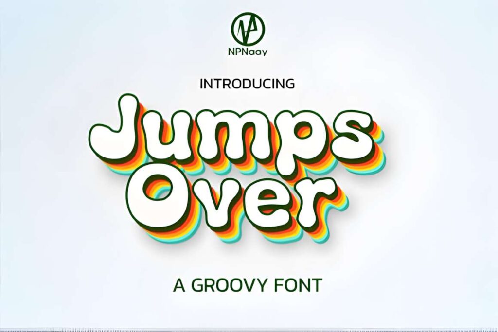
This Groovy font is a cute retro display face suited to headlines, stickers, cards, and banners that need recognizable vintage energy. Curved character shapes give it more movement than a basic bold sans serif, making the font useful when the typography is the main decorative element.
Keep surrounding graphics restrained enough for the lettering to breathe. For designs that already contain several retro illustrations or complex patterns, using this font only for one short phrase will produce a cleaner hierarchy.
13. Kawaii by Inermedia STUDIO
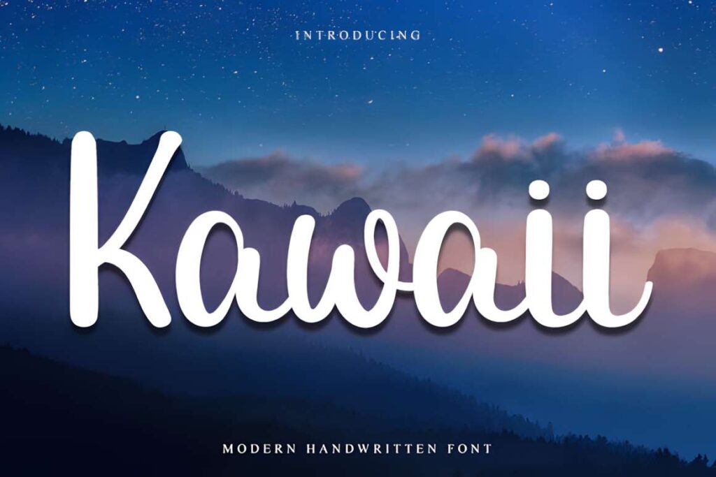
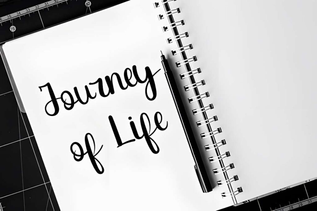
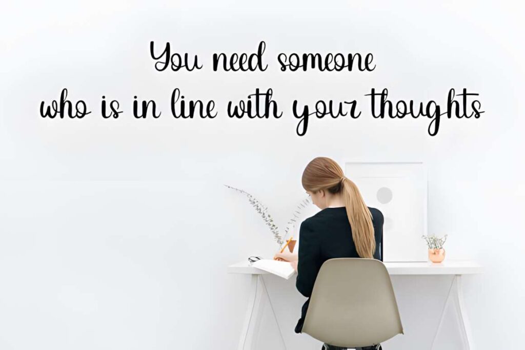
Kawaii by Inermedia STUDIO is a playful handwritten font for casual banners, logo-style headers, quotes, and branding graphics that benefit from irregular hand-drawn character. It feels lighter and more personal than the rounder bubble options in this list.
The handwritten rhythm is the reason to choose it, but it also means text should remain relatively short and large. If every word in a multi-line banner needs immediate clarity at thumbnail size, a chunky display face such as Playful Sans is the safer direction.
14. Groovy by Cutie Kate Studio
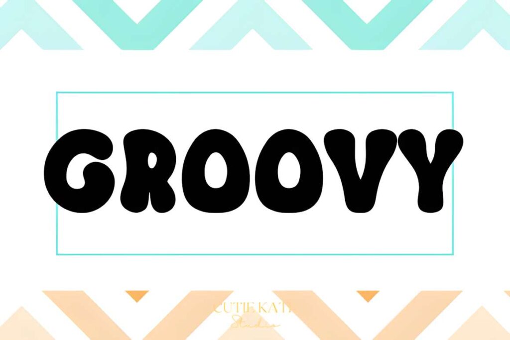
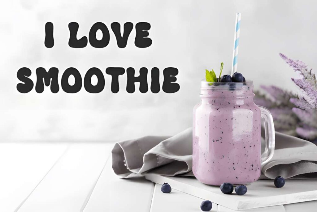
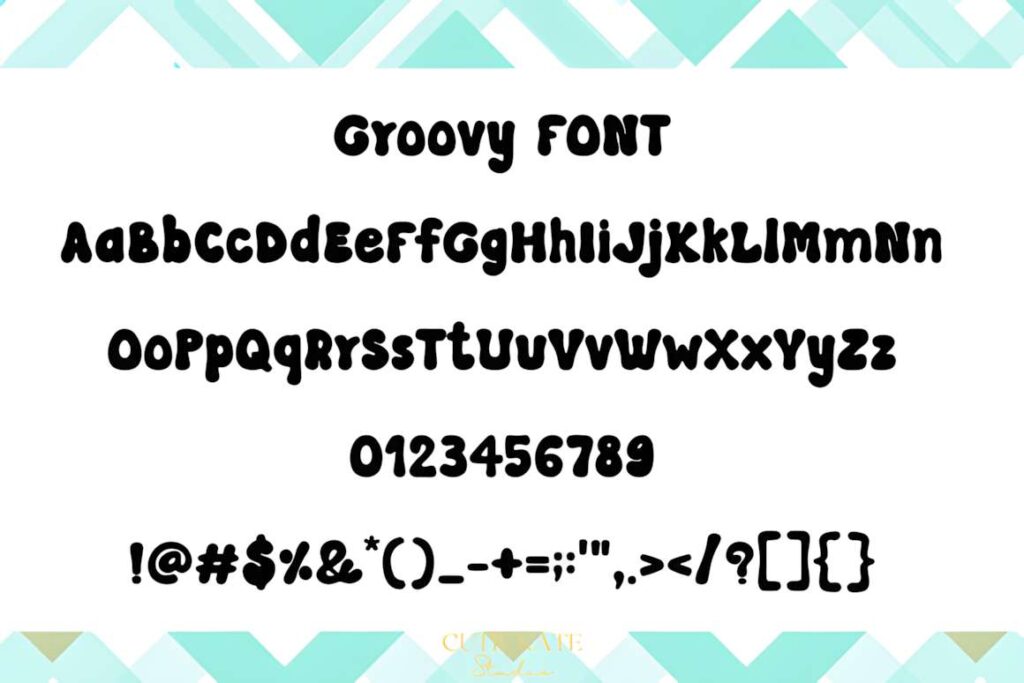
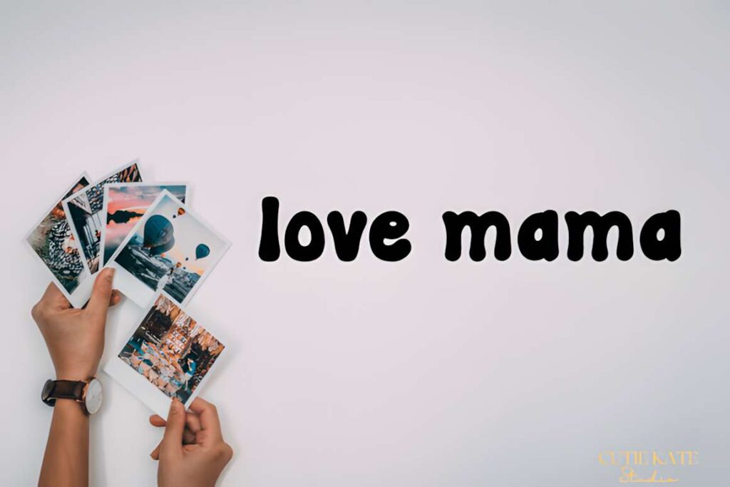
Groovy by Cutie Kate Studio is a cute display font with a retro character that fits short banner headlines, quotes, stickers, cards, and themed promotional graphics. Its curving shapes can supply the nostalgic tone before you add any extra decorative elements.
This font makes more sense for an intentionally retro banner than for a neutral everyday announcement. If you expect to reuse the same typography across many unrelated campaigns, Rounded or Playful Sans offers a broader visual range.
15. Canva
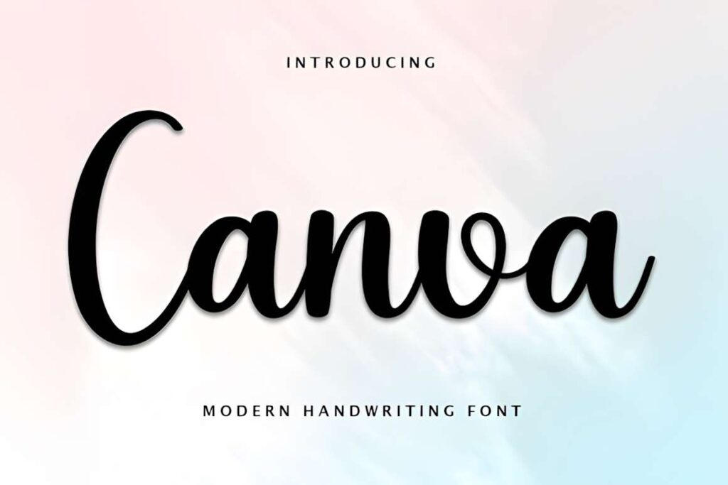
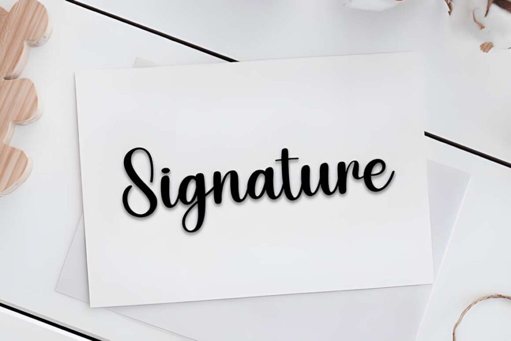
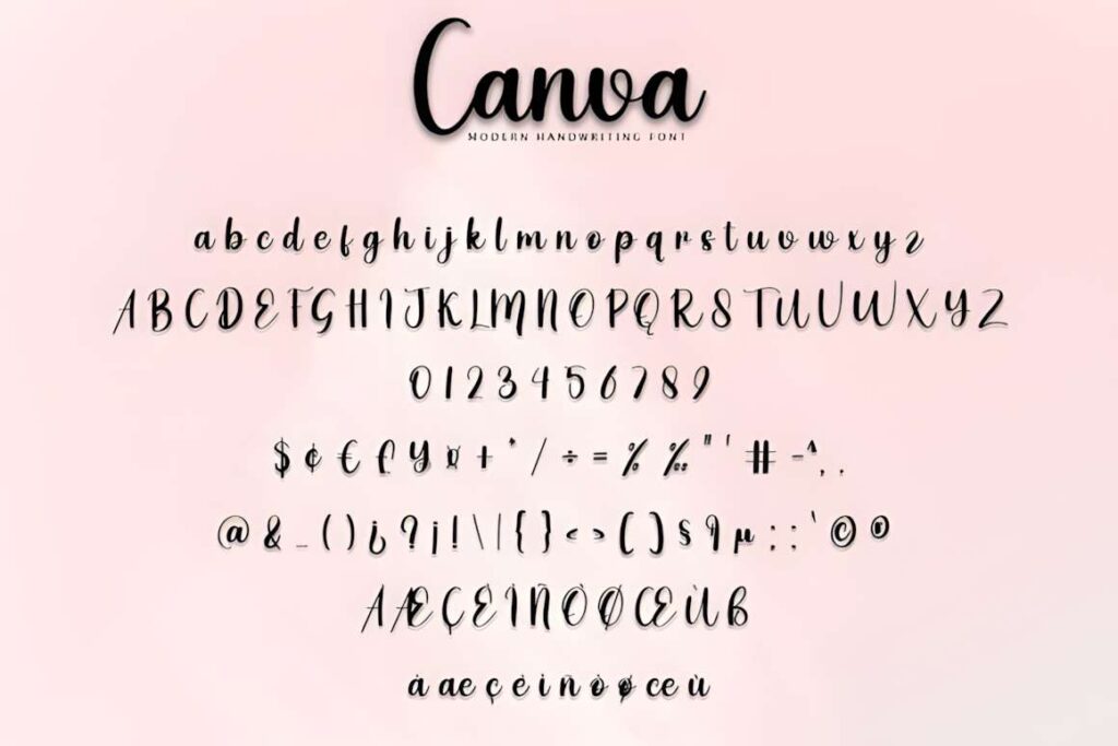
Canva is the actual product name of this round-lettered handwritten font. Its compact, informal strokes suit banner designs that need a friendly handwritten finish without the oversized volume of a bubble face.
I would use it for short craft-shop headings, personal announcements, casual labels, or supportive banner text. Do not choose it merely because its name matches the Canva platform; choose it when the rounded handwritten appearance fits the project. Chunky display fonts remain stronger for maximum-distance readability.
16. Cute Groovy by Densu Creative
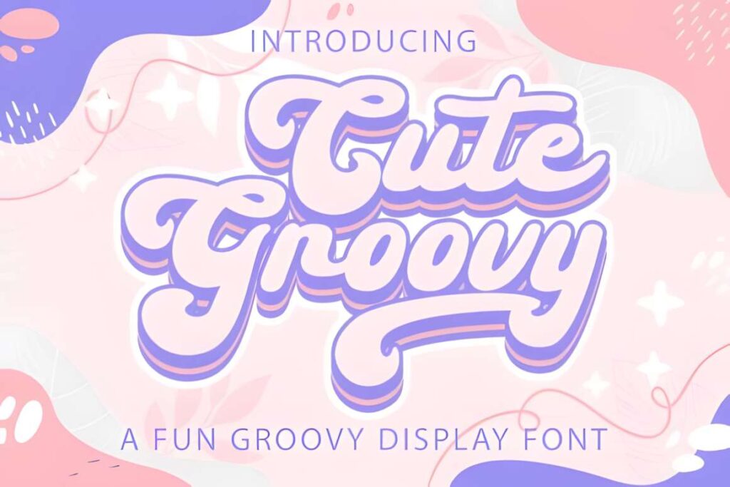
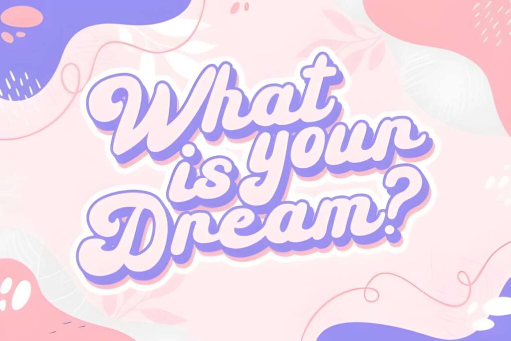
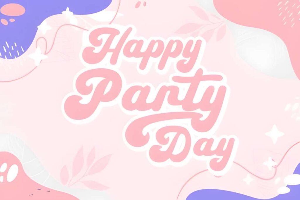
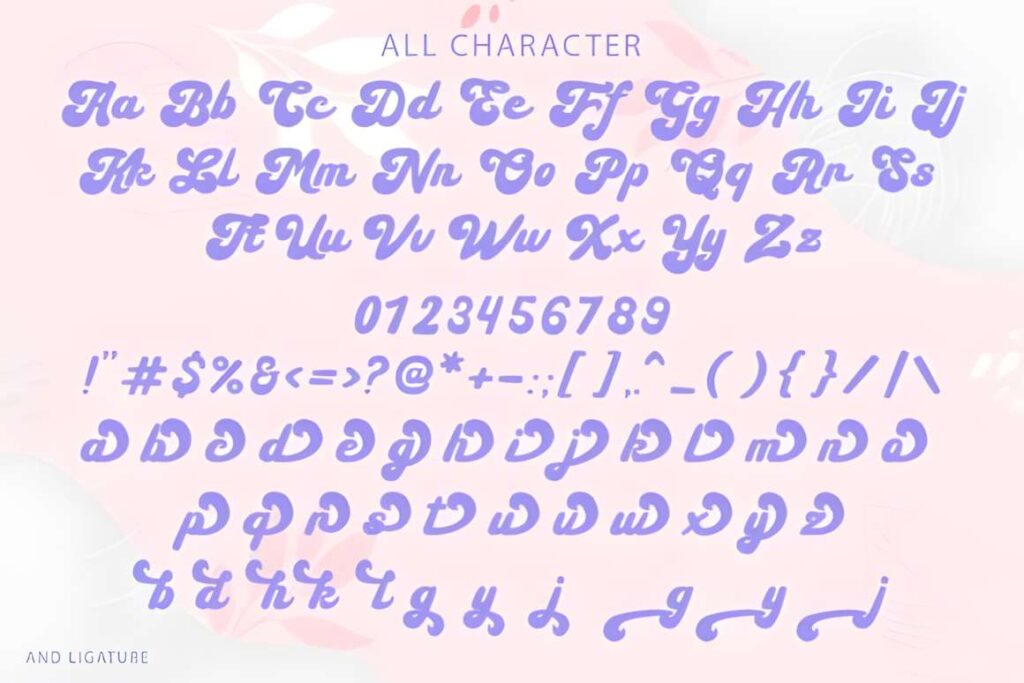
Cute Groovy by Densu Creative combines a playful retro direction with softer handwritten character. It suits banners where you want nostalgia without the heavier block forms found in many 1970s-style display fonts.
The font works nicely for party graphics, handmade shop promotions, cute quotes, and themed social headers. Because the style itself is expressive, keep secondary text plain. Using several equally decorative fonts on the same banner will weaken the headline rather than make it more playful.
17. Simply Playful
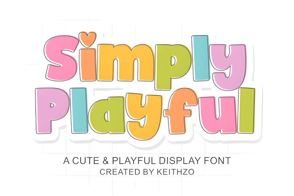
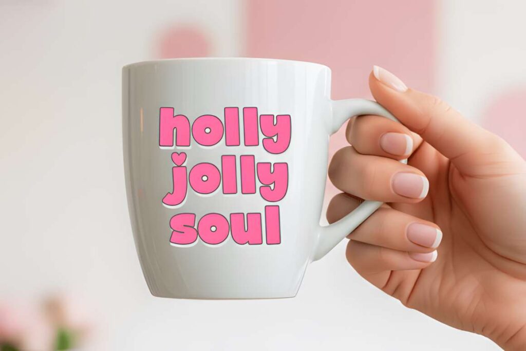
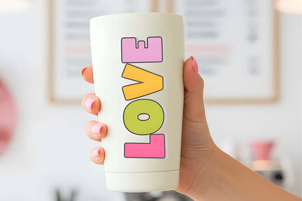
Simply Playful is a robust rounded display font with a handcrafted, lightly retro mood. Its thick boundaries make short words easy to turn into the focal point of a banner, especially when combined with bright backgrounds or a simple border treatment.
It bridges the gap between bubble lettering and retro display type, which makes it useful when you want both softness and noticeable weight. For more delicate invitations or handwritten-style announcements, one of the Kawaii options will feel less blocky.
18. Playful by Pasha Larin
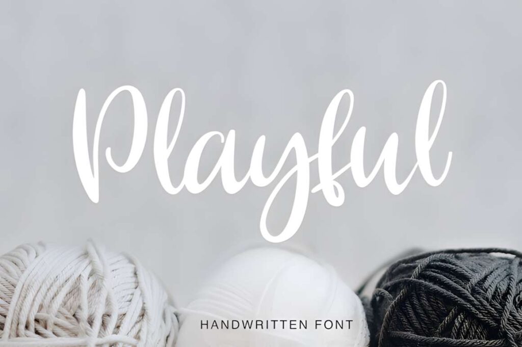
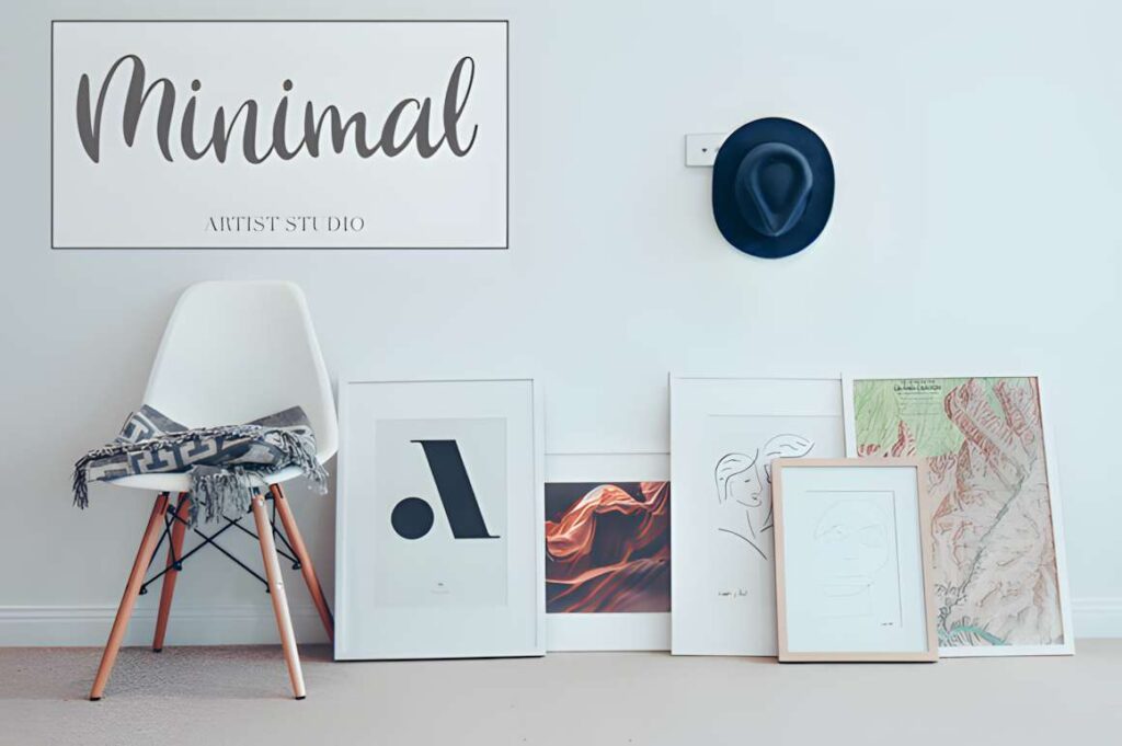
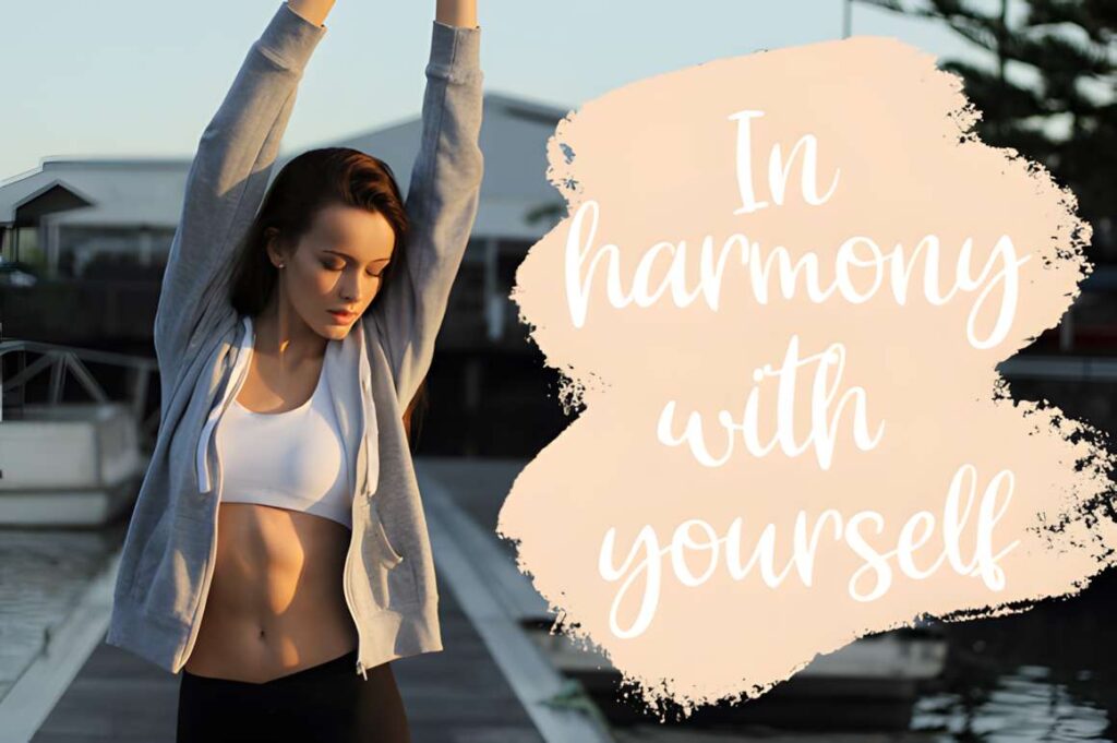
Playful by Pasha Larin is a handmade script-style font suited to banners that need an informal decorative accent rather than a heavy block headline. It can work for craft branding, celebratory headings, boutique-style announcements, and short names.
The connected or script-like character makes scale important. Give it enough size and breathing room so the word shape stays clear. For a busy photo background or a banner viewed mainly on phones, Bubble or Cute Bold will provide a simpler silhouette.
19. Cute
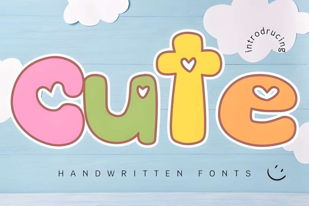
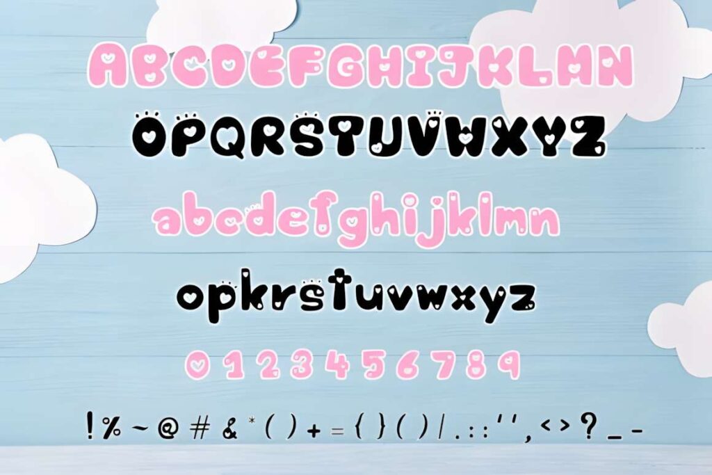
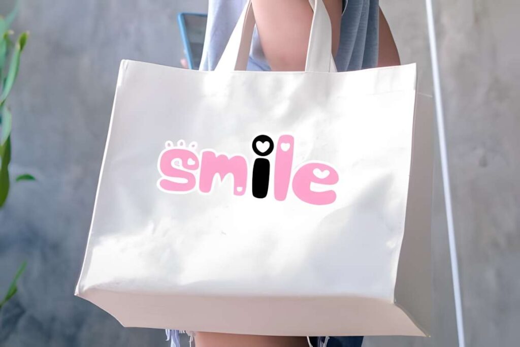
Cute by Jan Jao studio leans toward a smoother, more graceful script personality. It fits banners that need a softer decorative mood, such as boutique announcements, invitation-style graphics, feminine headers, or elegant celebratory phrases.
This is not the font I would choose for a dense sale banner packed with numbers and supporting details. Its appeal is strongest when one short phrase has room to breathe. For a louder children’s or party design, Cute Bubble produces much more visual weight.
20. Kawaii by Wanida Toffy
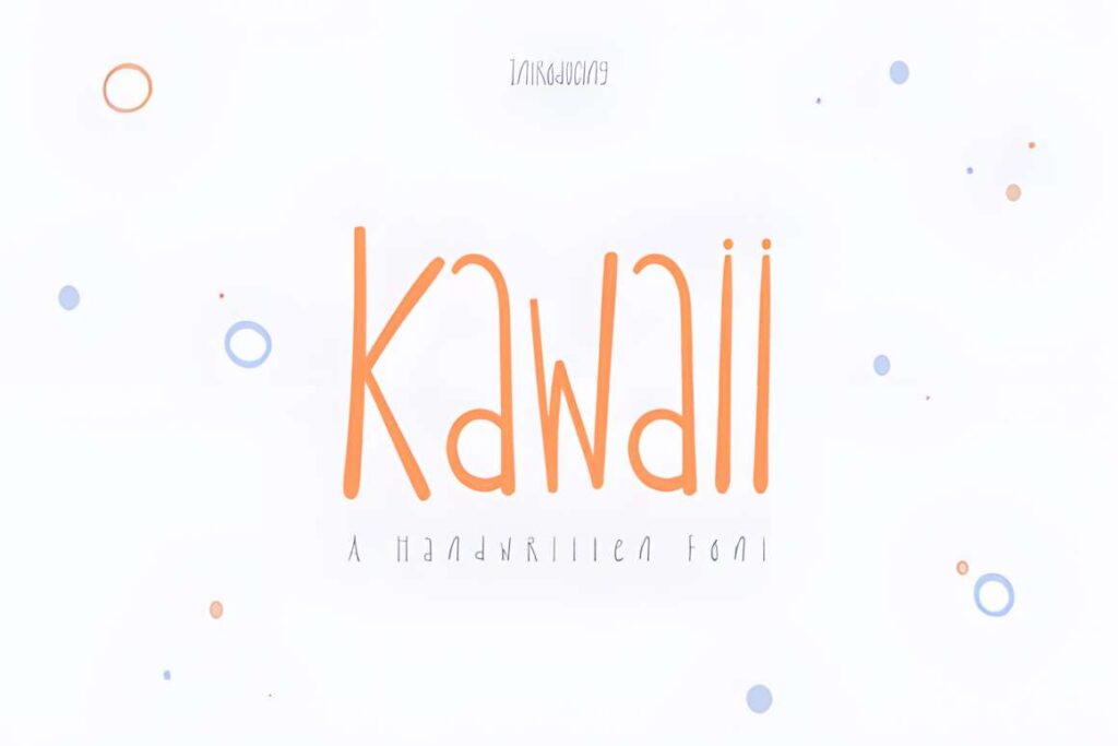
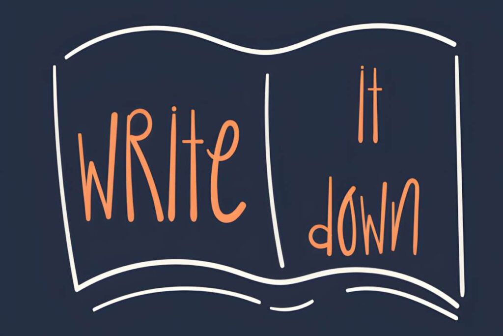
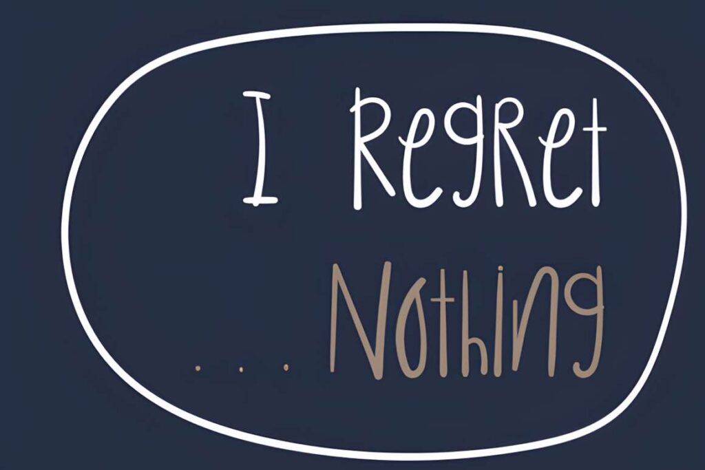
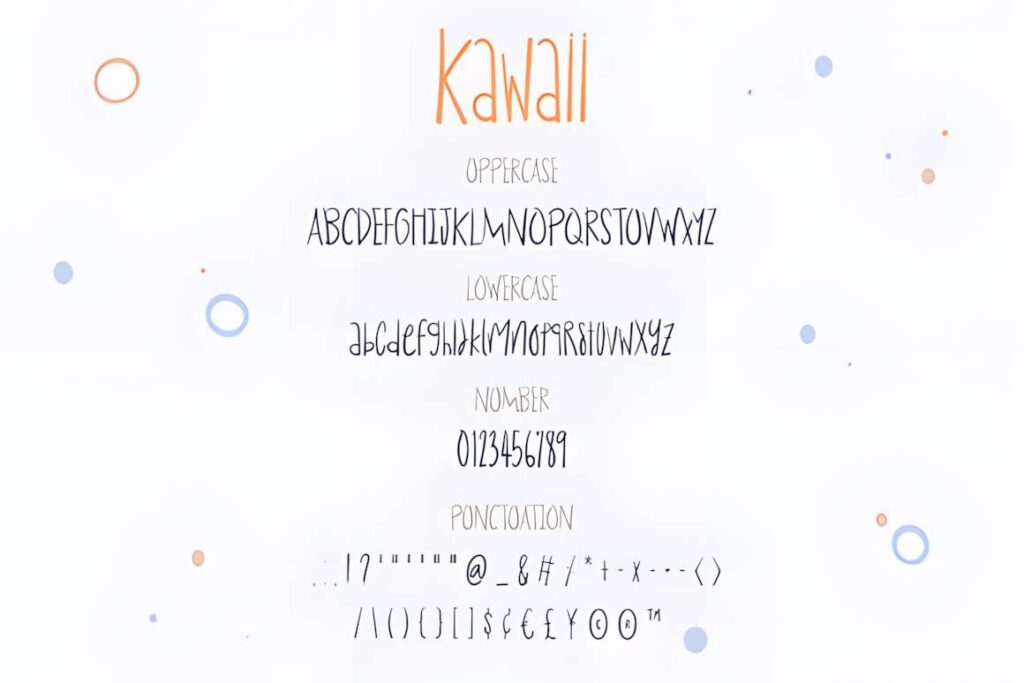
Kawaii by Wanida Toffy is an irregular handwritten font with obvious quirky character. It makes sense for cute handmade banners, kid-oriented graphics, playful labels, informal event headers, and short messages where rigid typography would feel out of place.
The irregular rhythm is also its limitation. Avoid squeezing a long sentence into one line, because reducing the font too far removes the advantage of those distinctive letterforms. Let the headline remain large and move explanatory text into a simpler font.
21. Playful by Pila Studio
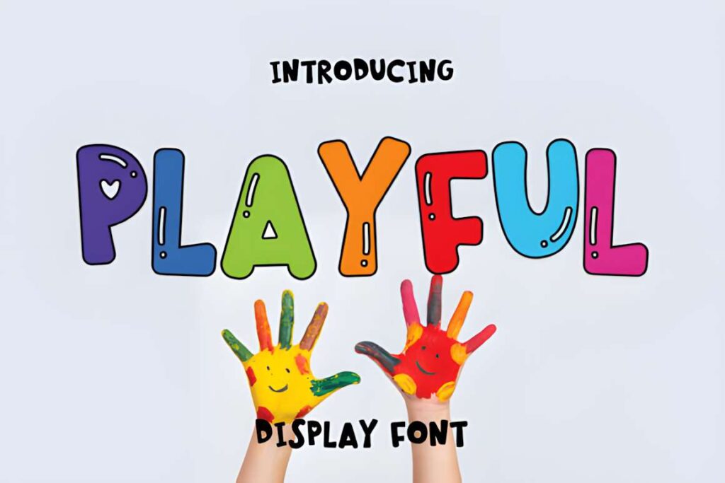
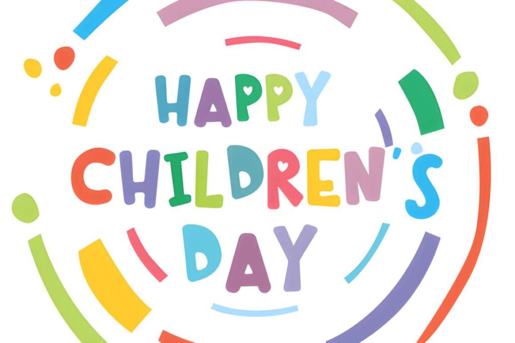
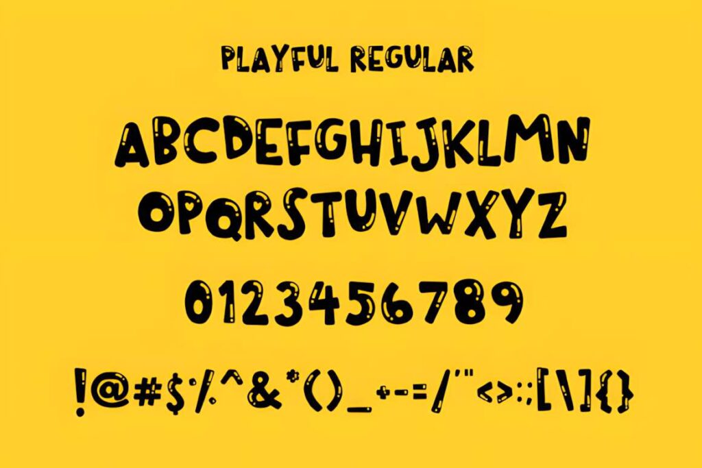
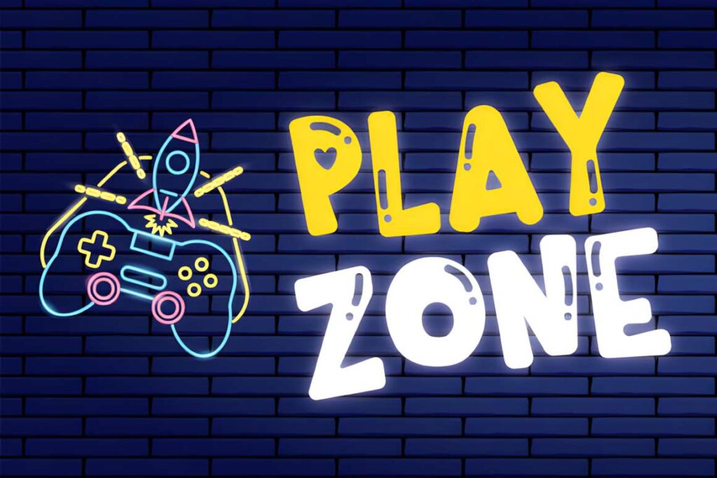
Playful by Pila Studio is a chunky display font aimed at children’s and school-oriented projects. Rounded, substantial letters give it enough presence for classroom banners, birthday headings, kid-focused signs, and cheerful digital announcements.
Choose it when friendly visibility matters more than subtlety. The style is deliberately youthful, so it may feel too informal for boutique, wedding, or adult lifestyle graphics. Cute or one of the softer handwritten Kawaii fonts better suits those situations.
22. Bubble by Vladimir Carrer
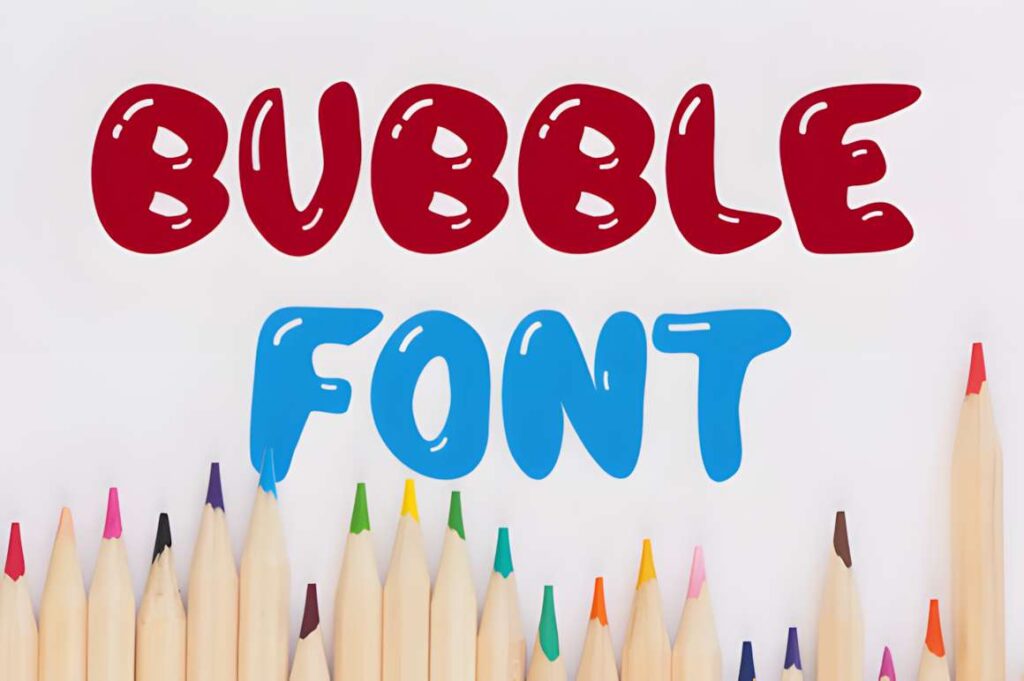
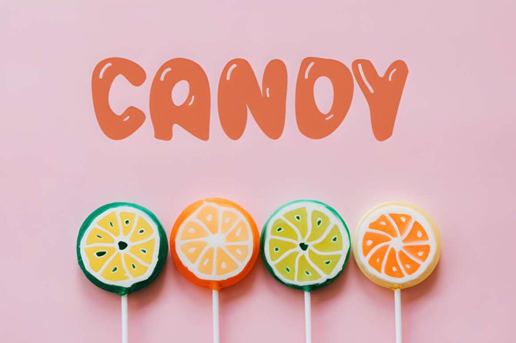
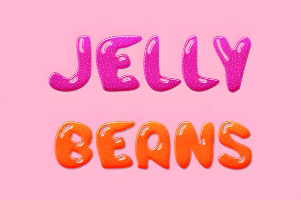
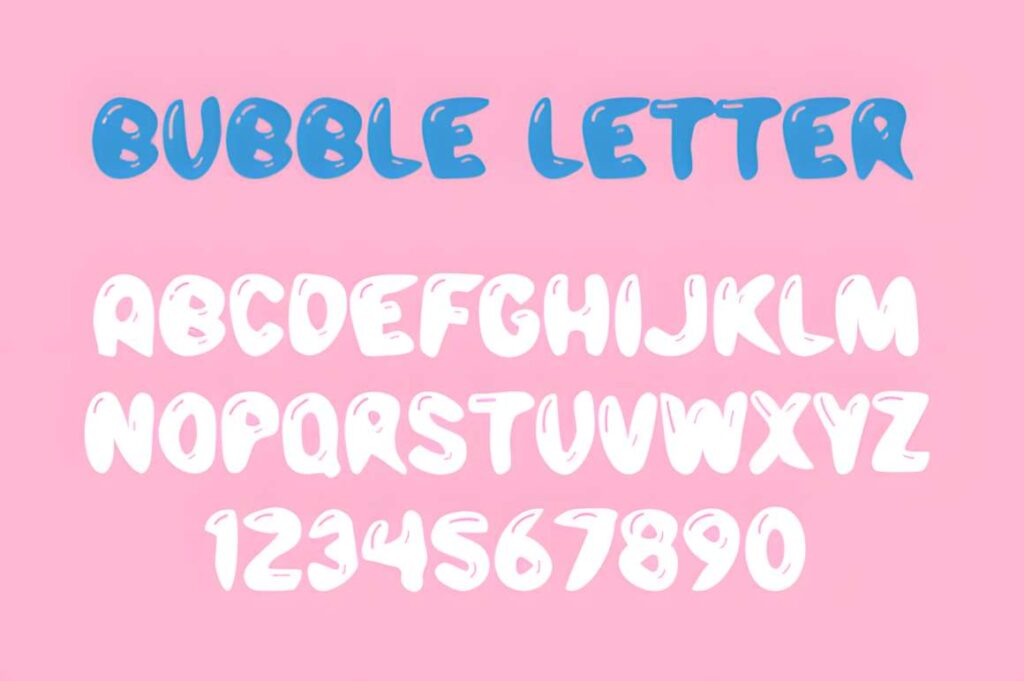
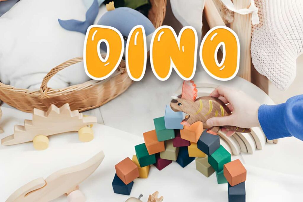
This Bubble font uses thick display lettering with a sweet, school-friendly character. It is a straightforward choice for children’s banners, school graphics, classroom signs, party headers, and other layouts where large friendly shapes are more useful than delicate decoration.
The heavy weight makes short phrases easy to emphasize with high-contrast color. Avoid using the same font for every piece of information in a multi-level banner. A simple secondary sans serif will create cleaner separation between the headline and practical details.
23. Cute Groovy by The Magic Bee Studio
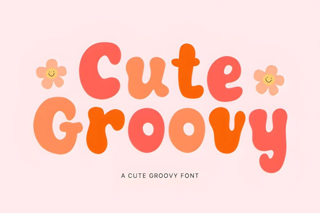
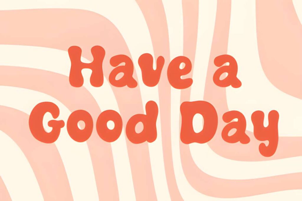
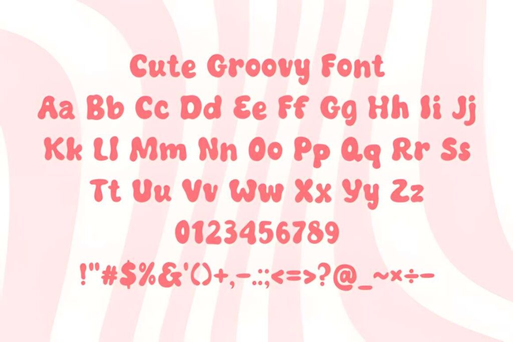
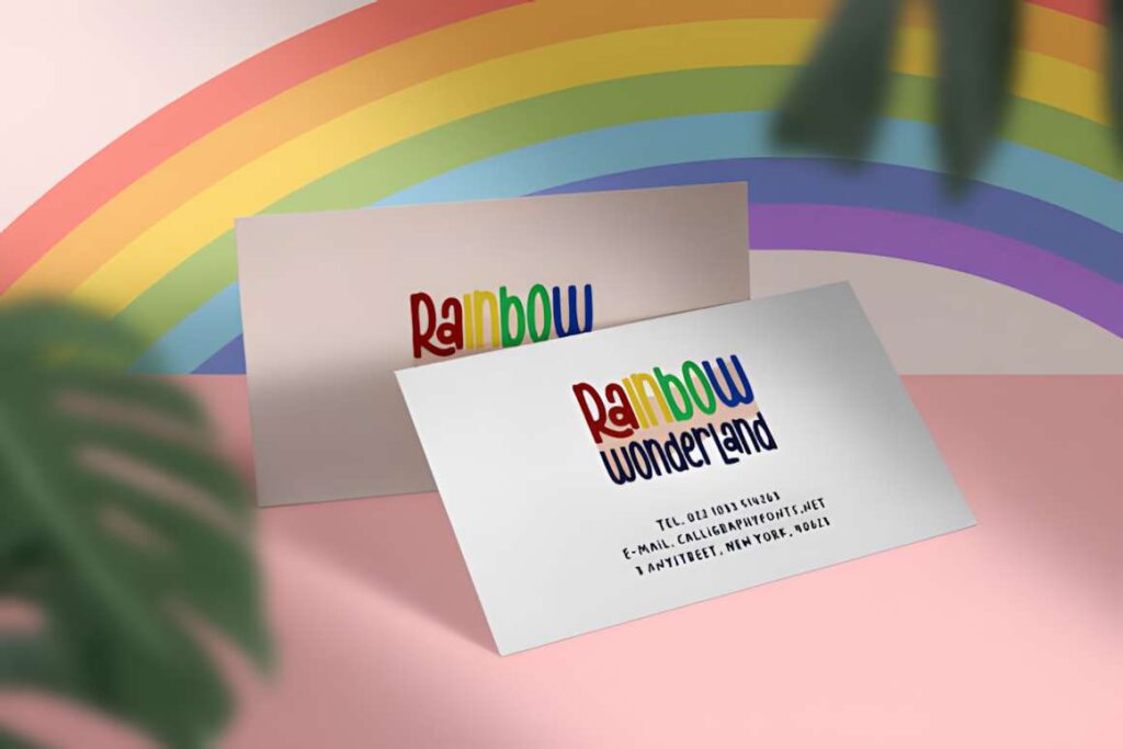
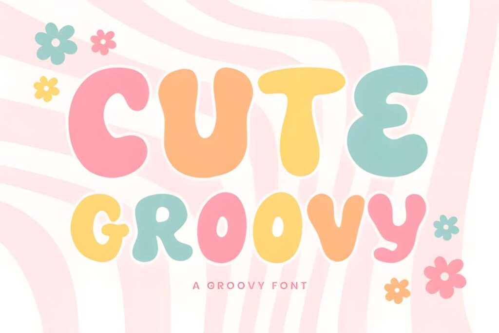
Cute Groovy by The Magic Bee Studio combines rounded playfulness with a clear retro direction. It is suited to banners for themed parties, creative shops, nostalgic promotions, cheerful apparel graphics, or any layout where the title should immediately establish a 1970s-inspired mood.
The decorative style can compete with illustrations if every element is equally bold. Give the font one dominant headline role and keep surrounding text quieter. For a more neutral cute banner, Playful Sans gives you fewer stylistic constraints.
24. Rounded
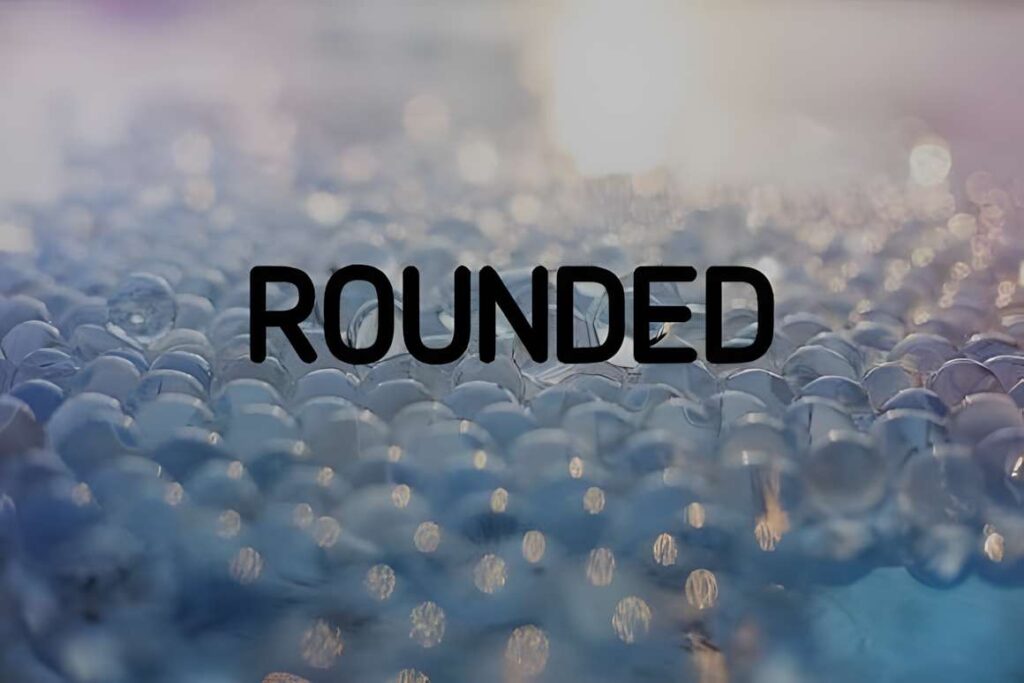
Rounded is the cleanest option in this roundup. It uses a medium-weight sans-serif structure with softened forms, making it useful for cute banners that still need clear supporting information, longer headlines, or a less juvenile visual tone.
This is a practical choice when illustrations and colors already provide most of the personality. It will not create the same dramatic retro or bubbly effect as Groovy Cute or Bubble, but that restraint makes it easier to reuse across sales banners, craft graphics, classroom materials, and social headers.
25. Cute Playful
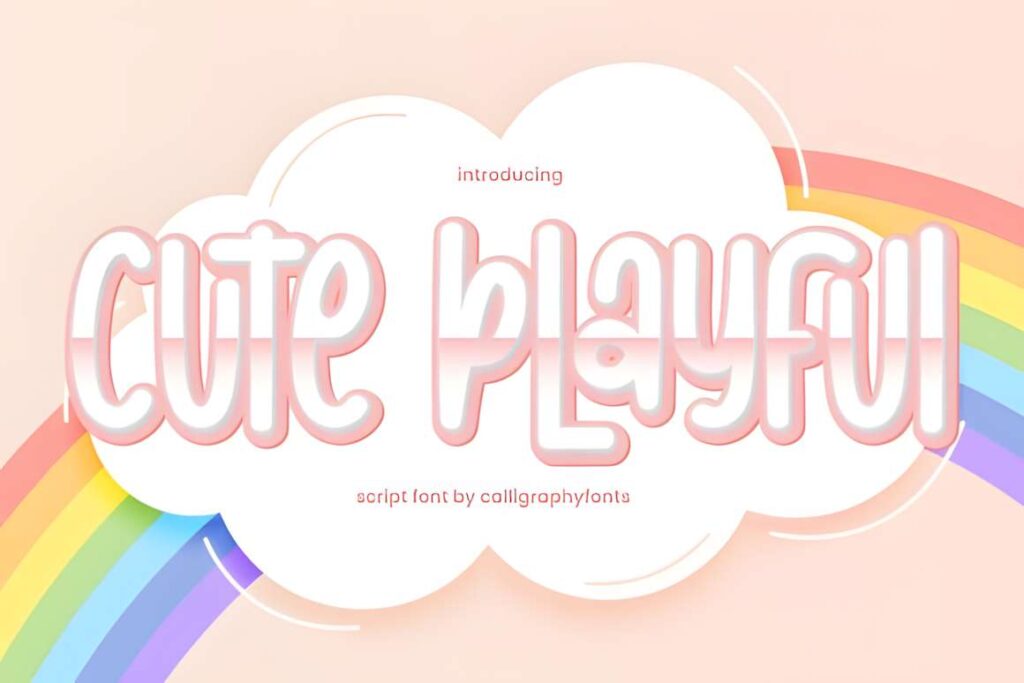
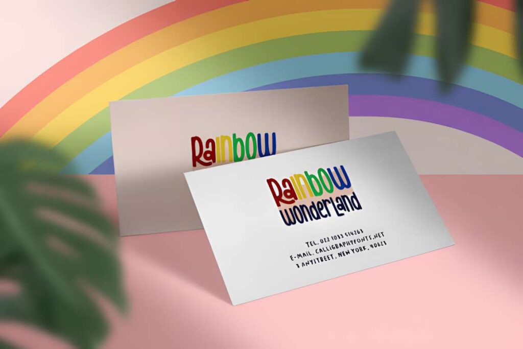
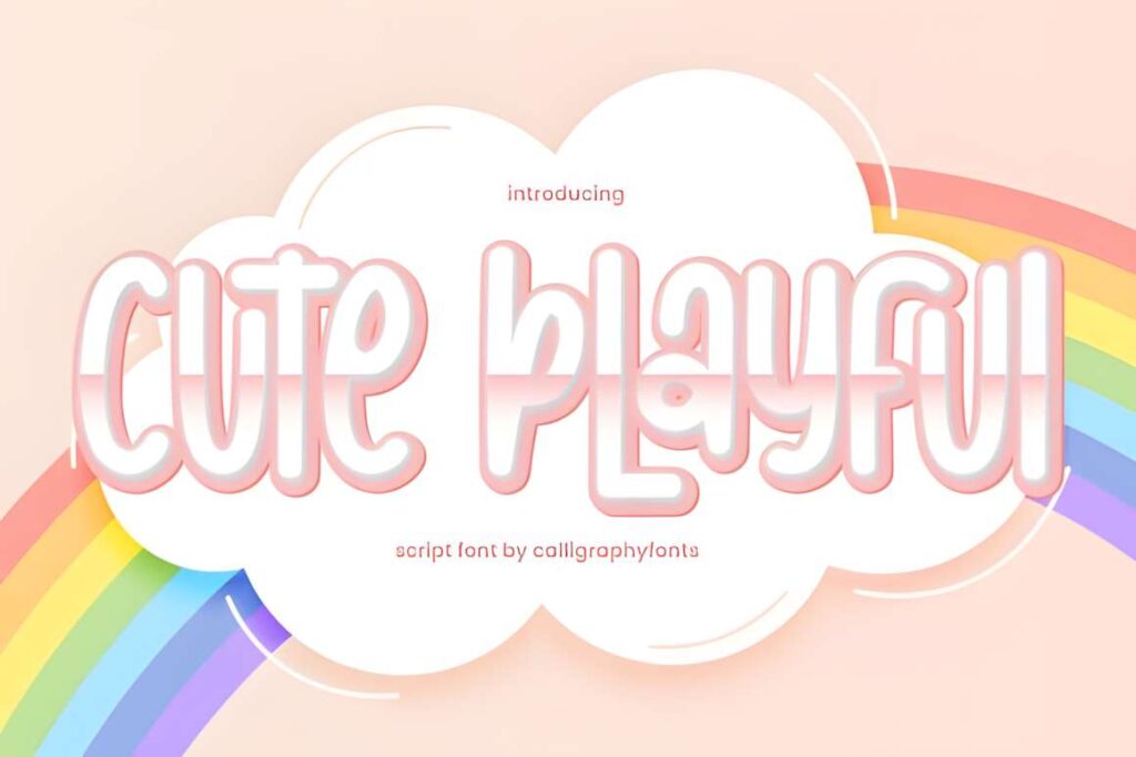
Cute Playful is a friendly display font designed for projects that need uncomplicated fun. Its playful shapes suit birthday banners, kids’ graphics, craft signs, classroom headings, and short social-media announcements where a standard bold font feels too plain.
It works best as a clear decorative headline rather than small informational copy. If your banner needs a more specific visual theme, Groovy Cute pushes further into retro territory, while Bubble gives the design a softer inflated-letter appearance.
| Product | Best for | Font Style / Personality | Best Project Fit |
|---|---|---|---|
| Groovy | Retro statement text | Flowing 60s–70s script | Retro event banners |
| Groovy Cute | Bold nostalgic headlines | Chunky, curved, playful | Party and promo banners |
| Kawaii | Friendly handmade text | Casual handwritten | Classroom and social graphics |
| Bubble | Soft bold headlines | Rounded bubble display | Birthday and kids’ banners |
| Cute Bubble | Cartoon-style titles | Cheerful rounded display | Invitations and youth graphics |
| Kawaii by Honiiemoon | Playful focal text | Friendly bold display | Craft and children’s banners |
| Chunky | Large cheerful wording | Heavy playful display | Social and classroom banners |
| Cute Retro | Nostalgic playful layouts | Retro display | Vintage-inspired promotions |
| Cute Bold | Maximum headline weight | Thick irregular display | Sale and youth banners |
| Barbie Kawaii | Youthful graphic titles | Cute display | Kids’ and invitation graphics |
| Playful Sans | Readable cute headlines | Chunky rounded sans | Birthday and product banners |
| Groovy by NPNaay | Retro headline character | Curved vintage display | Stickers and themed banners |
| Kawaii by Inermedia | Casual handwritten titles | Irregular handwritten | Quotes and social banners |
| Groovy by Cutie Kate | Simple retro graphics | Cute groovy display | Cards and themed headers |
| Canva | Friendly handmade wording | Round handwritten | Craft and shop banners |
| Cute Groovy by Densu | Softer retro lettering | Playful handwritten retro | Party and handmade graphics |
| Simply Playful | Rounded retro headlines | Thick handcrafted display | Bright announcement banners |
| Playful by Pasha Larin | Decorative short phrases | Handmade script | Boutique and event headers |
| Cute | Softer decorative titles | Graceful script | Invitations and boutique banners |
| Kawaii by Wanida Toffy | Quirky handwritten text | Irregular playful script | Handmade and kids’ graphics |
| Playful by Pila Studio | School-friendly headlines | Chunky display | Classroom and kids’ banners |
| Bubble by Vladimir Carrer | Heavy friendly titles | Thick bubble display | School and party banners |
| Cute Groovy by Magic Bee | Retro themed titles | Rounded groovy display | Party and shop promotions |
| Rounded | Cleaner cute layouts | Medium rounded sans | Longer headlines and supporting text |
| Cute Playful | Simple cheerful headings | Friendly display | Birthdays and classroom graphics |
How to Make Cute Fonts Work Better in Canva Banners
A font can look clear at 100% zoom and still disappear when the finished banner is shown as a small social preview. Before finalizing the layout, shrink the design on screen. If the headline stops being readable immediately, simplify the wording, increase contrast, or choose a heavier font instead of adding more effects.
For most cute banners, one decorative font is enough. Use Bubble, Groovy Cute, Kawaii, or another expressive option for the main message, then place dates, prices, URLs, or explanatory copy in a simpler sans serif. Two fonts with equally strong personalities compete for attention and make hierarchy harder to understand.
Background choice changes readability as much as the typeface. A pale rounded font can disappear against a pastel photograph even when the letters are thick. Use strong light-dark contrast first. An outline or shadow can help separate text from imagery, but effects should support the letters rather than compensate for poor contrast.
Watch the width of bubble and chunky fonts. A five-word headline may become too wide for a landscape banner long before it becomes too tall. Splitting a phrase into two intentional lines is usually better than compressing the font or reducing it until the playful letter shapes lose their impact.
Canva supports custom font uploads for eligible plans, including Canva Pro, Teams, Business, Education, and Canva for Nonprofits. Supported custom font formats include OTF, TTF, and WOFF. Before uploading a purchased or downloaded font, check the current license to make sure your intended use and font embedding are allowed.
Once a font is available in your Brand Kit, test the actual banner phrase rather than relying on the specimen image. Look closely at repeated letters, numbers, apostrophes, and capitals. A decorative uppercase letter that looks charming by itself may alter spacing dramatically inside a short promotional phrase.
Common Banner Font Mistakes
- Using too much text in a chunky font: shorten the headline before shrinking it into a narrow space.
- Pairing two decorative fonts: let one font provide the personality and keep secondary information quieter.
- Relying on pastel color alone: confirm that the text still has strong contrast against the background.
- Ignoring mobile size: preview the banner small enough to resemble how it will appear in a feed or search result.
- Adding heavy effects to intricate letters: thick outlines can close small counters and make decorative forms harder to distinguish.
- Choosing by font name instead of shape: judge the actual letters used in your headline, not the product title or category label.
Which Cute Font Fits Your Banner Best?
If your banner needs bold retro energy, Groovy Cute gives short headlines thick curving forms with an obvious nostalgic direction. For a softer party or children’s design, Bubble makes the lettering feel rounder and more buoyant.
If readability is the priority but you still want a playful look, Playful Sans is easier to build a clear headline around. Choose Kawaii when a handwritten feel suits the project better than geometric shapes.
For banners that already contain colorful illustrations, patterns, or stickers, Rounded is the more restrained choice. Its simpler letter construction lets the surrounding graphics provide the decoration instead of forcing the headline to compete with them.
Frequently Asked Questions
Can I upload these cute fonts to Canva?
Canva allows custom font uploads on eligible plans, including Canva Pro, Teams, Business, Education, and Canva for Nonprofits. A downloadable font still needs to use a supported file format and have licensing that permits your intended use and font embedding. After adding a compatible font to the appropriate Brand Kit, you can select it inside eligible Canva designs.
What type of cute font works best for a banner?
A thick display font usually works best when a banner needs a short headline that remains visible at smaller viewing sizes. Bubble, chunky, rounded, and bold retro styles provide more visual mass than delicate scripts. A handwritten or script font can still work well when the banner has a short phrase, clean background, and enough space around the lettering.
How many fonts should I use on one Canva banner?
One decorative font plus one simple supporting font is enough for most Canva banners. Use the expressive font for the main phrase, then place dates, prices, URLs, or smaller details in a quieter sans serif. Using several bubble, script, or retro fonts together can make the hierarchy harder to scan and reduce the impact of the headline.
What font file formats can Canva upload?
Canva supports OTF, TTF, and WOFF files for custom font uploads. Custom font uploading is limited to eligible Canva plans, and the font license must allow the intended use and embedding. If several file formats are included with a font, use a supported version and confirm the current licensing terms before adding it to your Brand Kit.