ℹ️ Affiliate Disclosure: This article may contain affiliate links. If you book or purchase through these links, we may earn a commission at no additional cost to you.
Choosing the Best Modern Sans Serif Fonts for Canva Social Media Designs
Modern sans serif fonts in Canva need to do more than look clean on a large artboard. Social media typography often has only a second or two to communicate a headline, so letter width, weight, spacing, and contrast become especially important once a design is reduced to feed or mobile size. A thin minimalist font can work beautifully for an editorial post, while a condensed or bold sans serif usually makes more sense for promotions, covers, and short attention-grabbing statements.
This selection focuses on downloadable modern sans serif fonts with noticeably different personalities, from neutral geometric families to tall condensed faces and heavier headline styles. The goal is to make it easier to choose typography for Instagram posts, Pinterest graphics, quote cards, launch announcements, carousels, and other Canva-based social content.
Many more modern sans serif fonts are available, while this shortlist concentrates on styles that solve clearly different social-media design needs rather than repeating the same minimalist look.

For Canva social media designs, the most useful modern sans serif choices usually fall into four groups: versatile families for repeatable brand systems, bold fonts for short headlines, condensed styles for limited space, and lighter minimalist faces for editorial graphics. The right option depends less on decoration and more on how clearly the message survives at thumbnail size.
Quick Picks
For clean reusable templates: Minimalist — restrained enough for quote cards, announcements, and branded content.
For bold promotional posts: Finder — heavier letterforms suit short headlines that need immediate visual presence.
For a complete brand system: Modern Sans — multiple weights make it easier to create hierarchy inside one family.
For fashion and editorial graphics: Maurico — geometric forms with an Art Deco influence add more personality.
For tall compact headlines: Longline — condensed proportions help fit larger typography into narrow layouts.
Modern Sans Serif Fonts for Canva Social Media Designs
1. Minimalist
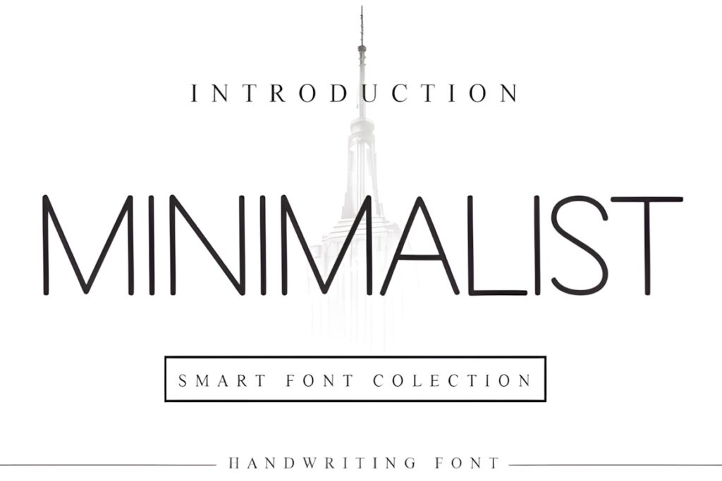
Minimalist is a clean sans serif suited to social graphics where the typography should feel modern without competing with photography, illustrations, or product imagery. Its straightforward shapes make it a practical starting point for quote posts, educational carousels, launch announcements, simple covers, and reusable branded templates. Creative Fabrica currently shows it as a strongly established font with thousands of favorites.
Choose Minimalist when you want the same visual language to work across several types of content. Its restrained personality is easier to repeat consistently than a highly stylized display face. The tradeoff is that it provides less built-in drama, so a promotional post may need stronger size contrast, color, photography, or layout to create emphasis.
2. Mograph
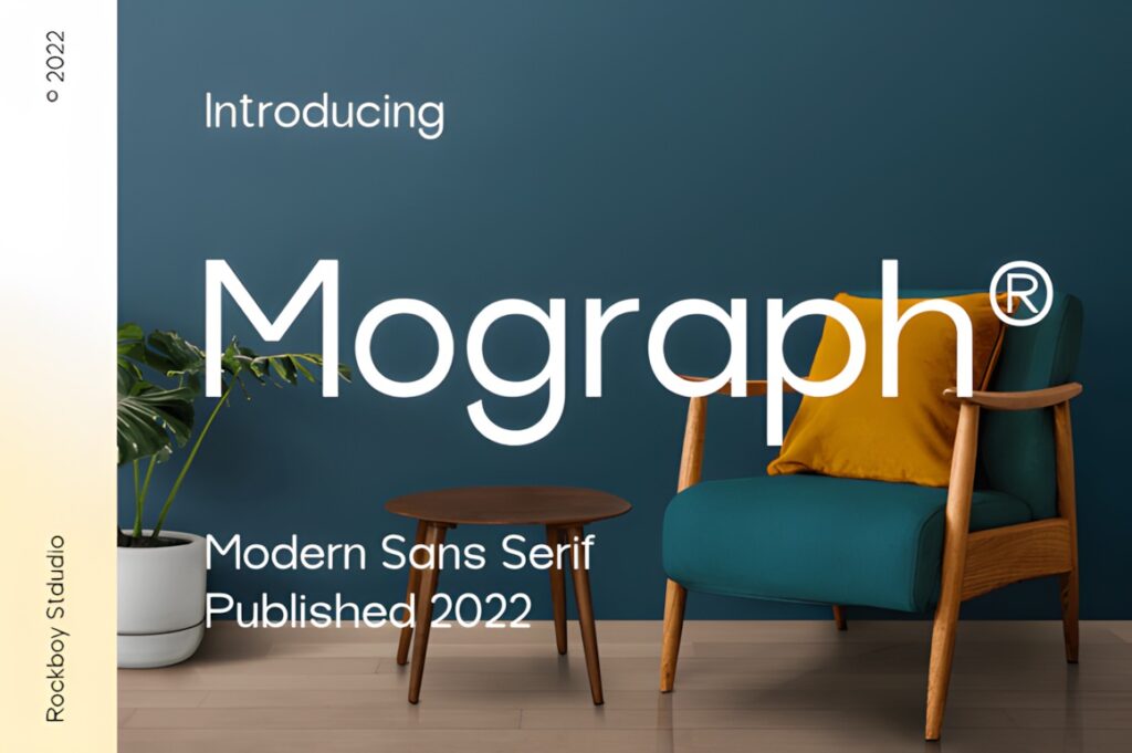
Mograph is a minimal modern sans serif that makes sense for clean digital layouts, especially when you want a contemporary look without unusual letterforms dominating the design. It has also accumulated substantial visible marketplace engagement compared with many similar modern sans serif options.
For Canva, I would use Mograph for branded quote graphics, short educational headlines, minimalist promotional tiles, and simple cover designs. It provides more neutrality than a fashion-oriented face such as Maurico. If the post depends on oversized expressive typography as the main visual element, however, Finder or Longline creates a stronger silhouette.
3. Finder
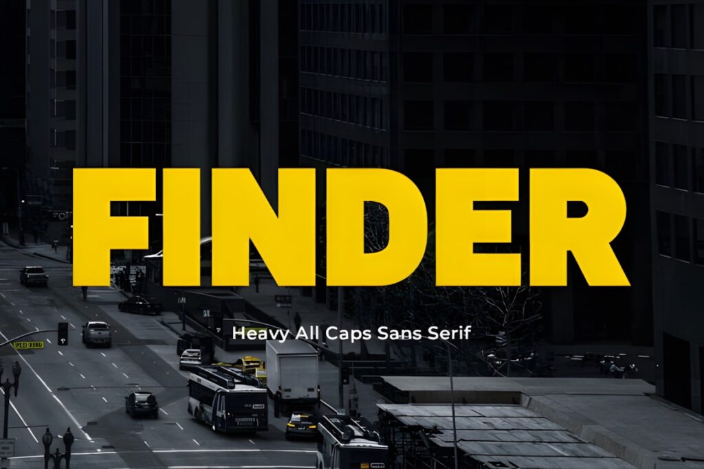
Finder is a bolder modern sans serif designed for layouts that need more visual force. Its product page specifically positions it for headlines, posters, product packaging, and similarly prominent typography, which translates naturally to promotional social graphics and short campaign messages.
This makes more sense than Minimalist when the words themselves need to become one of the largest elements in the composition. Try it for sale announcements, event graphics, launches, cover slides, and short statements. Because the style is visually heavier, I would keep supporting copy restrained rather than setting every line at the same scale and weight.
4. Modern Sans
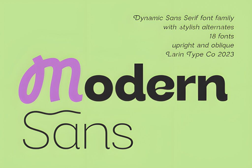
Modern Sans is a larger sans serif family with nine weights from Thin through Black plus basic and oblique styles. The product also includes alternate uppercase and lowercase forms, giving it more flexibility than a single-style display font. Creative Fabrica lists uses including branding, advertising, banners, posters, labels, titles, and social media.
For a Canva content system, that weight range is the main advantage. A heavier style can handle a feed-post headline while a lighter version can support a subtitle or secondary message without changing families. Choose Modern Sans when consistency across many templates matters. For a more immediately distinctive editorial personality, Maurico or Longline may provide more character with less layout work.
5. Minimalist Aesthetic
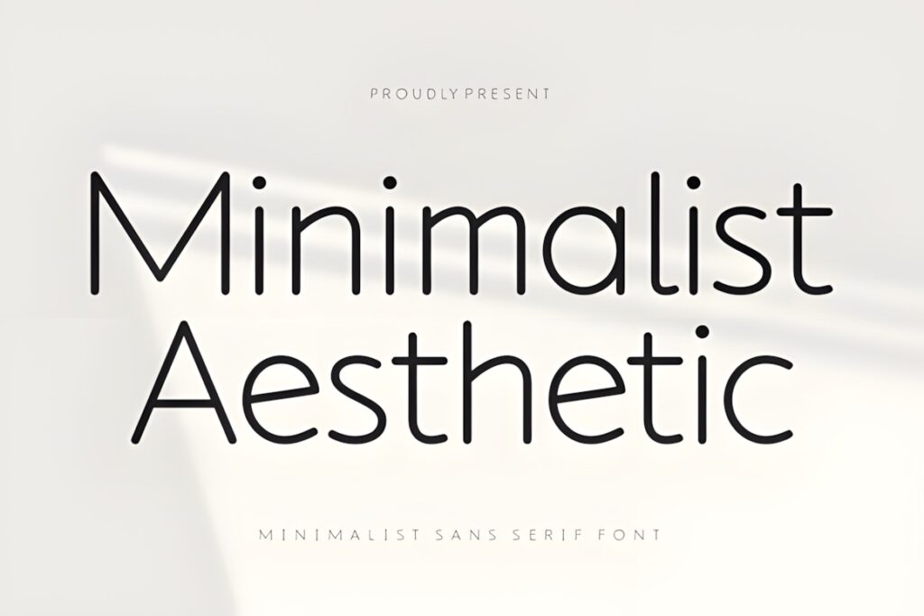
Minimalist Aesthetic uses light, clean geometric forms and airy spacing, making it better suited to sophisticated social graphics than dense promotional layouts. Its product description specifically highlights branding and social media as intended uses.
Consider it for beauty content, neutral mood boards, wellness graphics, fashion posts, editorial covers, and posts with only a few carefully positioned words. The lighter construction benefits from generous sizing and strong contrast against the background. If a headline must remain unmistakable inside a small thumbnail or busy photograph, Finder or a heavier Modern Sans weight is the safer visual direction.
6. Maurico
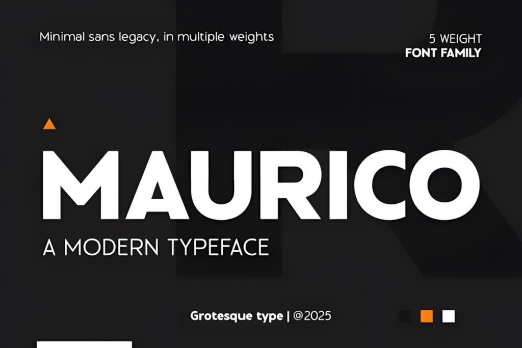
Maurico combines modern sans serif construction with geometric Art Deco influence. The family includes six weights from Regular through ExtraBold, and its sharper shapes give it a more fashion-forward and editorial character than the neutral options above. Its listed applications include posters, flyers, logos, branding, websites, editorial layouts, magazines, and motion graphics.
That makes Maurico useful for fashion announcements, creative-agency posts, editorial carousel covers, premium product launches, and graphics where typography needs recognizable personality. The stronger styling can be a benefit for short phrases, but it may be unnecessarily expressive for information-heavy templates that need to disappear into the background.
7. Verollina
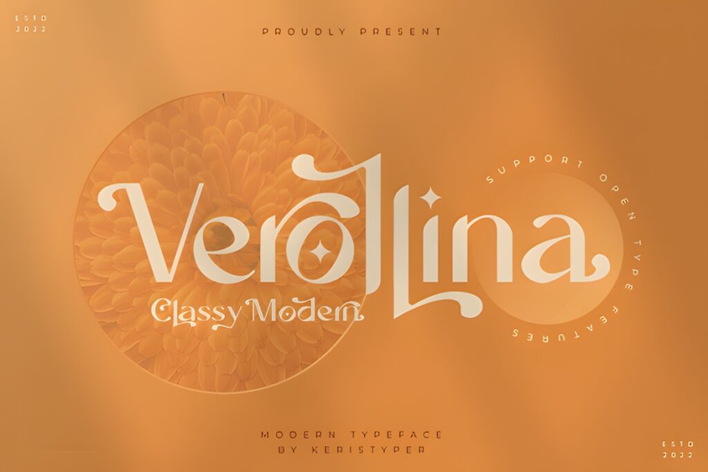
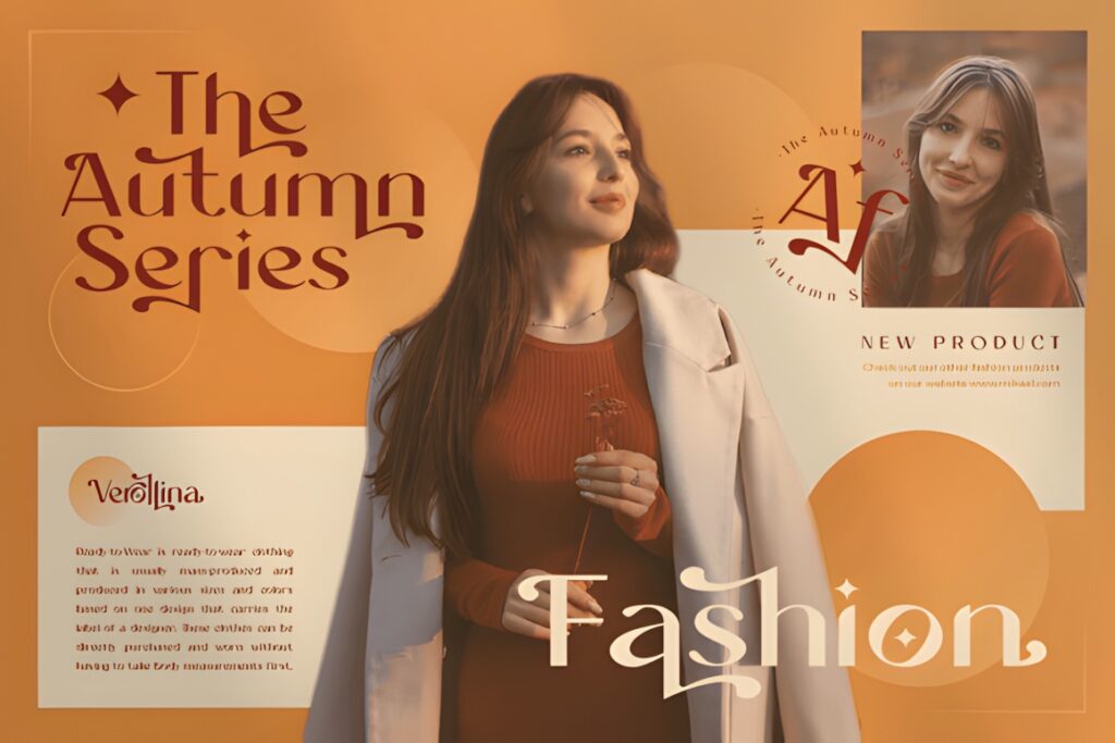
Verollina is described as a minimalist, elegant sans serif with both modern and vintage character, and its listed uses include social media, logos, movie titles, book titles, short text, and longer text. That broader range makes it interesting when a social feed needs a little more personality without moving into decorative script or display typography.
I would consider Verollina for lifestyle accounts, editorial graphics, creative quotes, image-led posts, and brands that want something softer than a strictly geometric corporate sans. For very systematic business templates, Modern Sans or Vactory Sans gives you a more obvious hierarchy-focused approach.
8. Vactory Sans
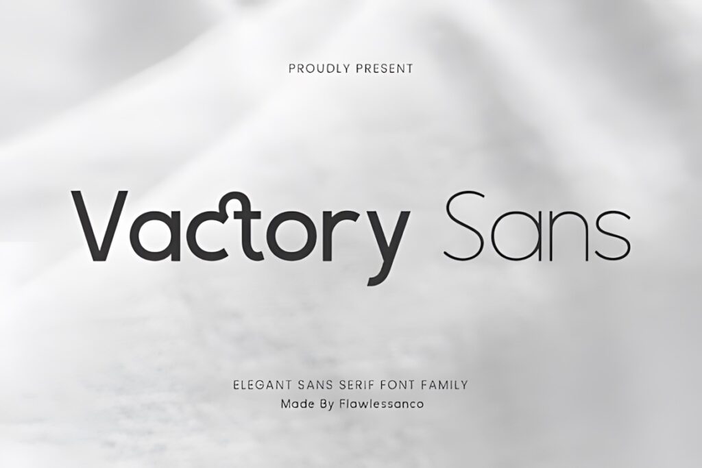
Vactory Sans is a geometric sans serif family with weights ranging from Thin to Bold, including Extra Light, Light, Regular, Medium, and Semi-Bold. Its clean shapes and subtle stroke variation are intended for branding, web, and editorial work, giving it the structure needed for a repeatable social-media identity rather than a single isolated post.
The weight range is useful when creating a Canva template set: use a stronger weight for headlines, Medium or Regular for smaller supporting text, and the lighter styles only when the type will remain large enough. Choose a more expressive option such as Maurico when typography needs to carry the personality by itself.
9. Moda
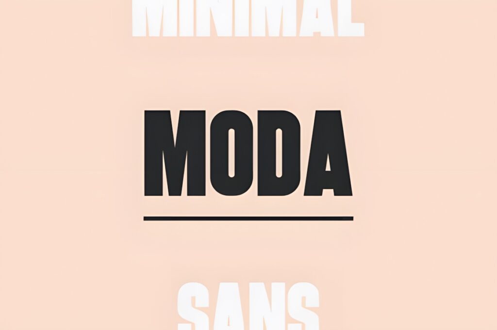
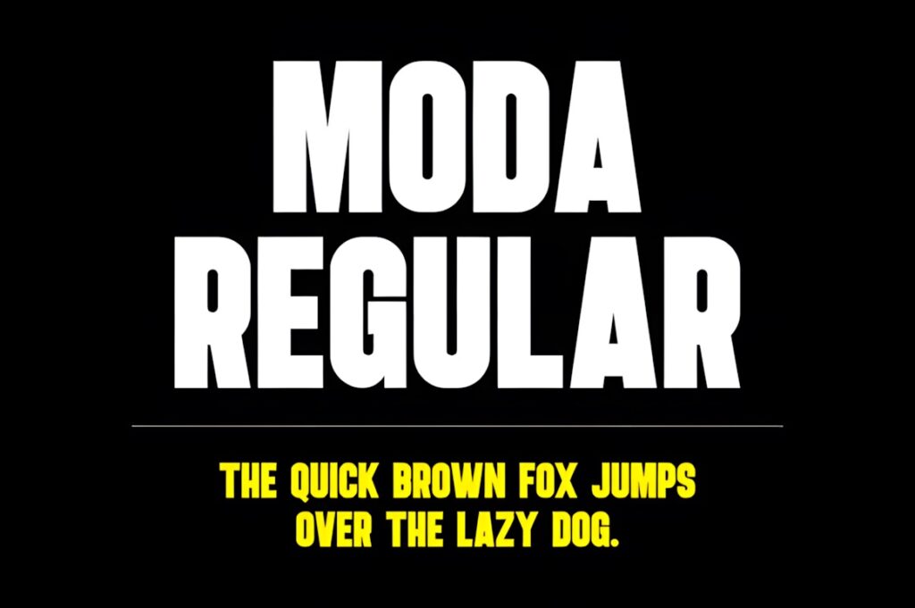
Moda is a heavier clean modern sans serif designed around impactful titles and headlines. Its product page highlights website headers, posters, logos, advertising, and promotions, which makes the font a natural fit for social graphics where one short message needs to dominate the composition.
Use Moda for promotion cards, launch announcements, punchy quote covers, sale graphics, and carousel title slides. Its heavier appearance gives a layout instant weight, but that same characteristic can make paragraphs or multiple competing text blocks feel crowded. Keep secondary information noticeably smaller or pair the display line with a quieter supporting sans serif.
10. Longline
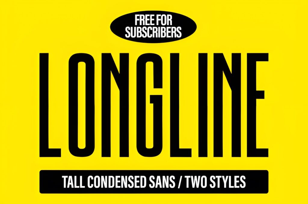
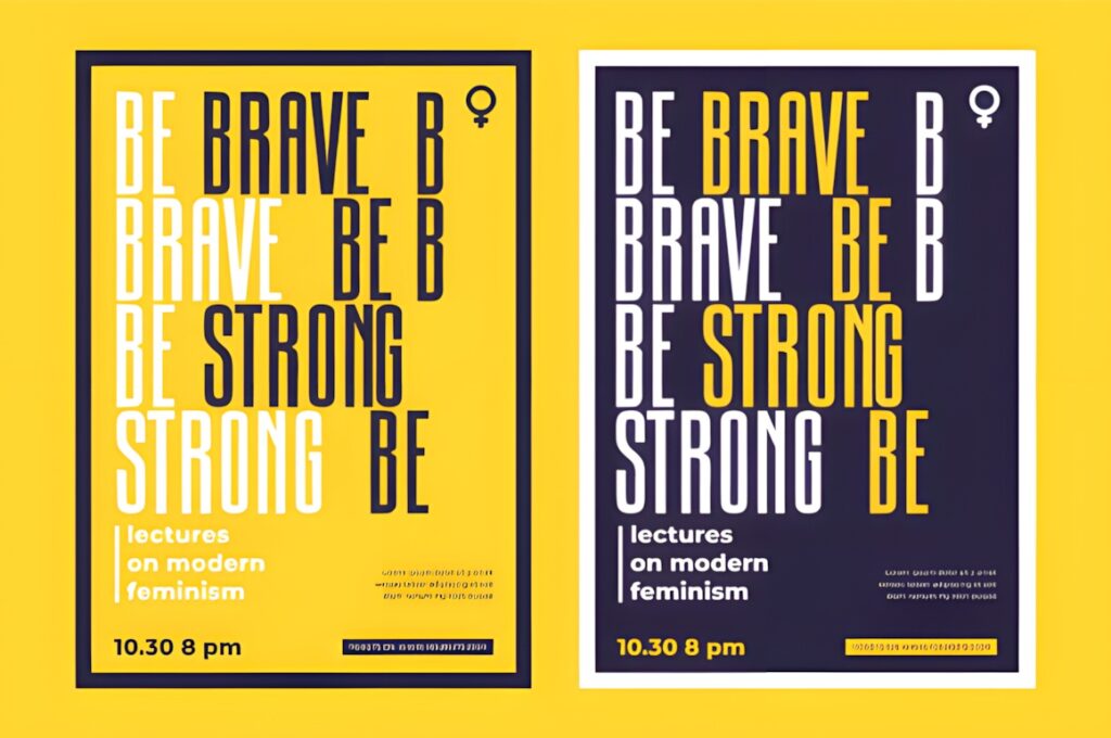
Longline is a tall condensed modern sans serif with narrow proportions and a strong vertical rhythm. It is specifically presented for posters, branding, editorial work, social media titles, logos, magazine headers, packaging, and website hero headlines.
The condensed structure is particularly useful when a Canva design has limited horizontal room. Longline can make a multi-word heading feel larger without forcing as many line breaks, which suits vertical social posts, Pinterest graphics, story covers, and editorial title cards. For smaller explanatory copy, switch to a wider, calmer sans serif instead of forcing condensed lettering into every text role.
Quick Comparison
| Font | Best for | Style | Key visual trait | Project fit |
|---|---|---|---|---|
| Minimalist | Reusable templates | Minimal sans serif | Clean and restrained | Quotes, educational posts, branding |
| Mograph | Clean branded content | Modern minimalist | Neutral contemporary shape | Carousels, covers, quote graphics |
| Finder | Promotional headlines | Bold sans serif | Strong visual weight | Sales, launches, announcements |
| Modern Sans | Complete content systems | Grotesque family | Wide weight range | Brand templates, ads, social campaigns |
| Minimalist Aesthetic | Editorial layouts | Light geometric | Airy spacing | Beauty, fashion, wellness |
| Maurico | Fashion-forward graphics | Geometric Art Deco | Sharp distinctive forms | Editorial covers, launches |
| Verollina | Lifestyle content | Elegant minimalist | Modern-vintage character | Quotes, imagery, brand posts |
| Vactory Sans | Structured hierarchy | Geometric family | Multiple weights | Consistent campaign templates |
| Moda | Short bold messages | Heavy modern sans | Chunky headline presence | Promotions, covers, announcements |
| Longline | Narrow layouts | Tall condensed sans | Vertical proportions | Stories, Pins, title cards |
Social Media and Canva Considerations
A font that works in a logo does not automatically work in every social post. Canva templates are often resized between square posts, vertical stories, Pinterest graphics, presentations, and other formats, so typography needs enough flexibility to survive changes in available space.
For short headlines, prioritize recognizable shapes and enough stroke weight to remain visible on a phone. Finder and Moda suit this role because the typography can become a major visual element. Longline solves a different problem: it lets you increase apparent headline size without consuming as much horizontal room.
Minimalist Aesthetic is better treated as an editorial tool. Give it space, strong contrast, and a limited word count instead of asking delicate lettering to compete with a busy photograph. For template systems containing headlines, subheads, labels, and supporting information, a multi-weight family such as Modern Sans or Vactory Sans provides more control.
Canva’s Brand Kit can store brand fonts so approved typography is easier to reuse consistently across designs. Custom-font availability and permissions vary by Canva plan, so confirm the current account features before making an uploaded font essential to a shared workflow.
Font Pairing Tips for Social Graphics
The simplest pairing strategy is to give each typeface a clear job. If your main sans serif already has strong personality, use it only for the headline and let the supporting font stay visually quiet. Maurico, Finder, Moda, and Longline benefit from this approach because their distinctive shapes or proportions can dominate a composition quickly.
With more neutral choices such as Minimalist, Mograph, Modern Sans, or Vactory Sans, hierarchy can come from weight and scale rather than from introducing a second unrelated font. A bold headline, regular supporting line, and smaller medium-weight label can create enough contrast while keeping the post visually consistent.
Avoid pairing two fonts that compete for the same role. Two oversized geometric sans serifs with similar weight usually create less hierarchy, not more. Contrast the function of the typography first: headline versus information, expressive versus neutral, or condensed versus comfortably readable.
Readability and Size
Social-media typography should be judged at approximately the size a follower will actually see it, not only while the Canva canvas fills a desktop monitor. Zoom out regularly or preview the design on a phone. If the headline loses its shape immediately, increasing font size may help more than adding extra effects.
Light styles need especially careful treatment. Minimalist Aesthetic and the thinner weights inside larger font families can look sophisticated in spacious compositions, but a small pale headline over detailed photography can disappear. Heavier choices such as Finder or Moda tolerate smaller previews more easily, although oversized heavy lettering can crowd compact layouts.
Also watch line length. Condensed lettering gives you more characters per line, while wider geometric typography may require shorter wording or another line break. Instead of shrinking an entire headline to fit, simplify the copy or select a font whose proportions match the available space.
Before Uploading a Custom Font to Canva
- Confirm that the downloaded package contains a font format Canva currently supports.
- Check that your Canva plan includes custom font uploading.
- Review the current font license and confirm that your intended use and font upload are permitted.
- Upload only the weights you actually need so the font menu remains manageable.
- Create a test post with uppercase, lowercase, numbers, and common punctuation before building an entire template collection.
- Preview the typography at mobile size before finalizing recurring social-media templates.
Canva currently lists OTF, TTF, and WOFF among the supported custom-font formats and advises users to make sure the font license permits embedding.
Which Sans Serif Font Fits Your Social Content?
If you want a clean font that can disappear comfortably behind the content, Minimalist or Mograph makes sense. For a repeatable Canva brand system with stronger typographic hierarchy, Modern Sans or Vactory Sans provides more weight flexibility.
For promotion-led graphics where the headline should command attention, choose Finder or Moda. Maurico works better when the goal is a distinctive editorial or fashion direction, while Longline is especially useful when a tall headline needs to fit into a narrow vertical composition.
The most reliable choice is the one that remains legible at the final social-media size and gives each text element a clear role. Test one headline, one supporting line, and one small label before committing an entire Canva template set to a font.
Frequently Asked Questions
Can I upload custom sans serif fonts to Canva?
Yes, Canva supports custom font uploads for eligible accounts. Canva currently accepts OTF, TTF, and WOFF font files and advises users to confirm that the font license permits embedding. Check your current Canva plan and the specific font package before building templates around a downloaded typeface.
Which sans serif fonts work well for social media headlines?
Bold or clearly structured sans serif fonts usually work well for short social media headlines because they remain noticeable at smaller viewing sizes. Finder and Moda suit high-impact messages, while Longline can help when horizontal space is limited. The final choice should still be tested at actual mobile viewing size.
Should I use the same font for every part of a Canva post?
Using one font family can work well when it includes enough weight variation to create hierarchy. A bold weight can handle the headline while regular or medium styles support smaller information. When using a more distinctive display font, limiting it to the headline and using restrained supporting typography usually produces a clearer composition.
Do I need to check the font license before using it in Canva?
Yes, check the current license before uploading or using a downloaded font in Canva, particularly for client work, products for sale, advertising, or other commercial projects. Canva also advises users to make sure a font license permits embedding. License terms can vary, so rely on the current terms associated with the specific font.