ℹ️ Affiliate Disclosure: This article may contain affiliate links. If you book or purchase through these links, we may earn a commission at no additional cost to you.
Choosing Effective Font Pairing Ideas for Branding
A brand name might look convincing in a large logo preview, then become hard to read on a small product label. That is the central challenge with font pairing ideas for branding: two attractive fonts are not automatically a useful pair. They need different jobs, compatible personalities, and enough contrast to create a clear reading order.
For a compact identity, one font might carry the wordmark while the second handles a signature-style accent. Larger brand systems may benefit from a serif, sans, and script trio with defined roles. The options below concentrate on installable font pairings rather than premade logo graphics.
There are more font combinations available than any shortlist can cover, so these selections focus on different branding moods, layout constraints, and practical uses.

Professional-looking brand font pairings usually combine a clear anchor font with a contrasting accent: serif plus script for boutiques, condensed sans plus handwriting for lifestyle labels, or a coordinated serif–sans–script trio for an identity system. Keep decorative lettering brief, test small-format legibility, and assign each font a consistent role.
Font Pairing Ideas for Logos, Packaging, and Brand Identities
1. Indigo Font Duo
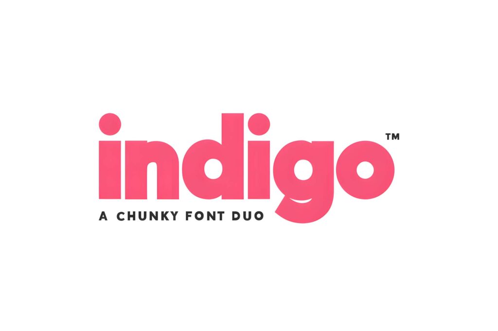
The solid sans and matching outline give one brand name two levels of emphasis without introducing an unrelated typeface. Use the filled version for the main wordmark and the outline for a large campaign headline or secondary graphic.
Outline letters lose clarity when scaled down, so use the solid version for small packaging labels.
2. Troemys Font Trio
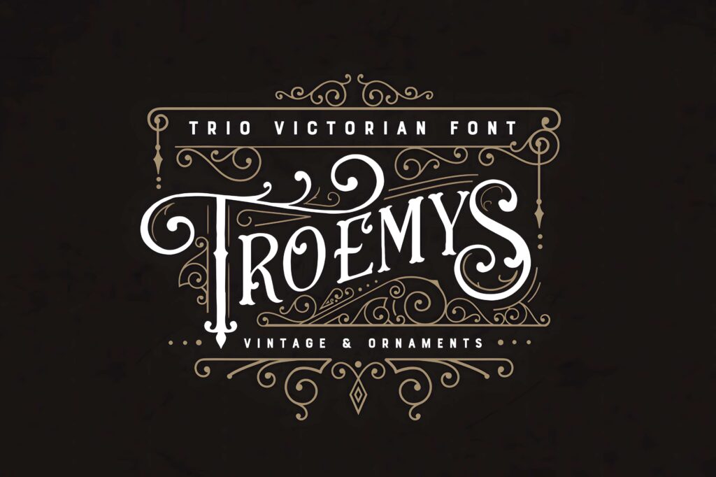
Its Victorian-inspired lettering and ornamented details create a deliberate historical mood for specialty goods, labels, and event identities. A restrained supporting line helps the decorative lettering carry the visual weight.
For minimalist brands or tiny icons, the ornate forms will feel crowded.
3. Cornelia Font Duo
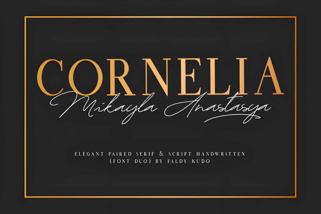
Cornelia pairs a formal serif with a graceful script, giving a boutique name a structured foundation and a softer handwritten accent. It suits invitation-led brands, boutique stationery, and expressive packaging.
Keep the script to a short name or phrase rather than putting specifications in cursive.
4. Selina Daniel Duo Font
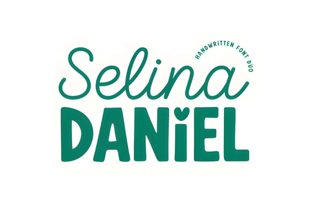
A light handwritten script contrasts with a thick, rounded sans, making it possible to separate an expressive name from more direct supporting words. The heart-shaped i dot adds a specifically cute character.
That detail can feel too informal for legal, financial, or restrained luxury branding.
5. Pablo Duo
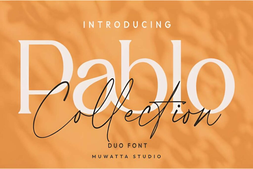
Pablo brings together an elegant serif and flowing script for a refined two-voice identity. Lead with the serif for legibility, then place the script in a signature, collection name, or limited-edition message.
The script is an accent, not the safest choice for long product instructions.
6. Fujinstall Font Duo
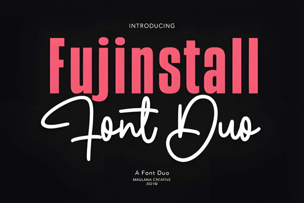
The sans-and-script construction is useful when an identity needs readable service information alongside an expressive business name. It can work across appointment cards, stationery, and social announcements.
Test the script at avatar size; delicate movement often disappears before the sans does.
7. Signature Trio
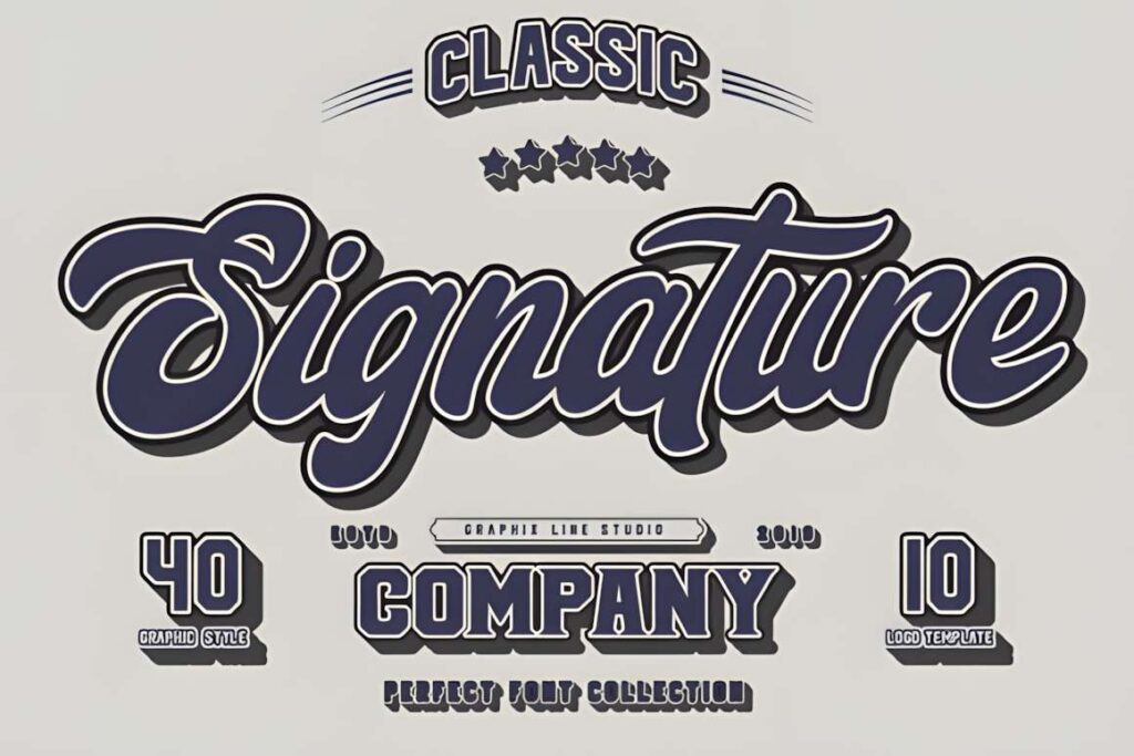
Signature Trio combines a handmade atmosphere with a stronger vintage tone. It makes sense for a business that wants a personal signature without using plain brush lettering as its only identity.
The expressive forms are better used selectively than across every label and paragraph.
8. Bronx Simpul Duo
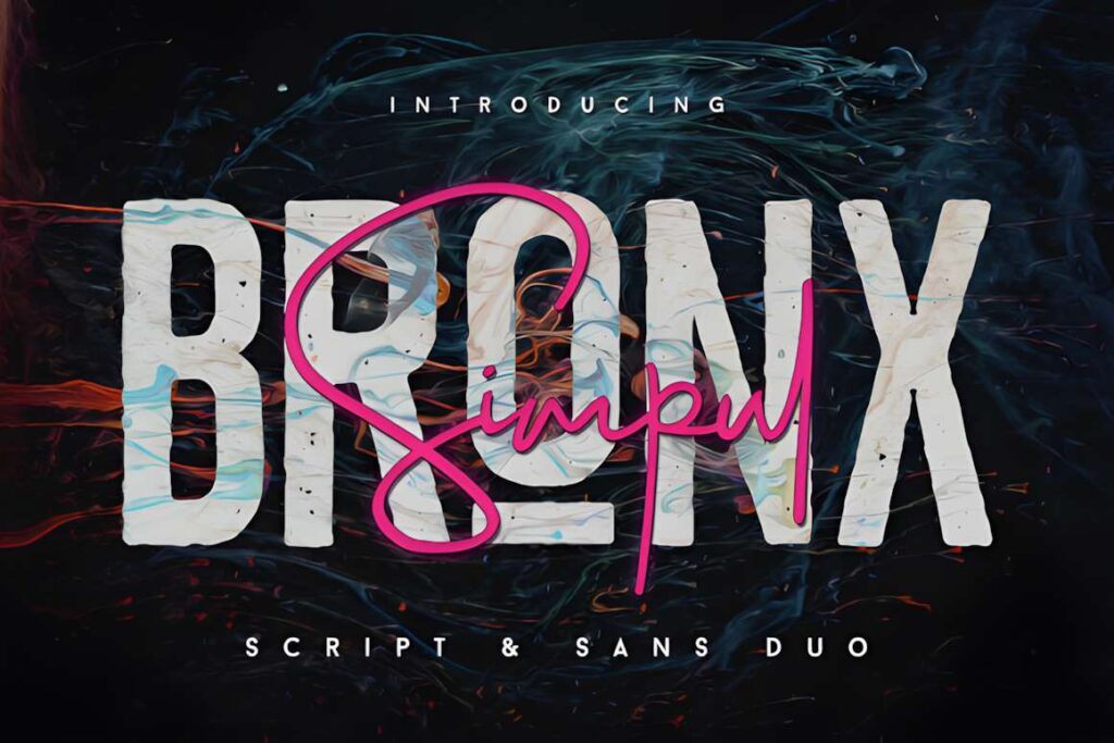
Bronx Simpul supplies a clean serif framework, an outline treatment, and a free-flowing script. This is useful for photographic signatures and identity layouts that alternate between a wordmark and editorial headings.
The outline treatment needs generous size and contrast; it should not carry small details.
9. Fine Art Duo
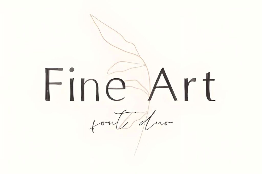
Fine Art Duo uses an expressive painted feel beside more controlled lettering. It suits art studios and individual maker brands that want the mark to feel authored rather than industrial.
Save the expressive component for large statements and use clear supporting typography for prices or contact information.
10. Orleans Script Font Duo
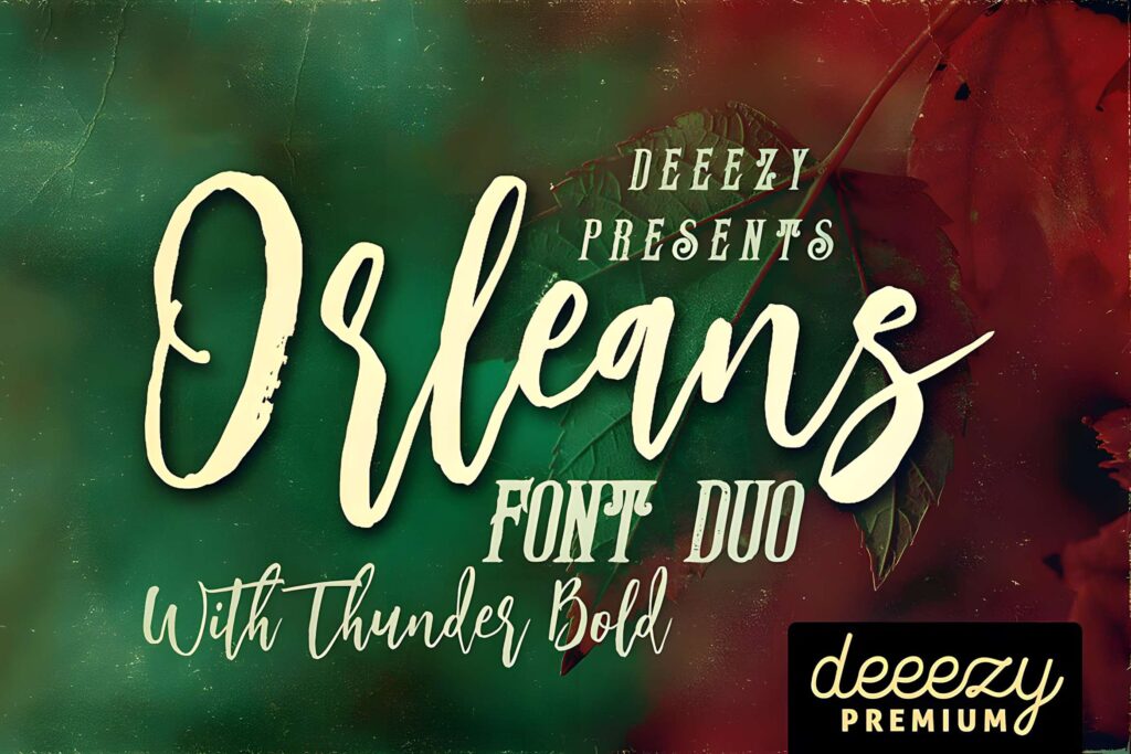
A modern hand-drawn brush script and complementary lettering offer a casual identity vocabulary. The more energetic letterforms suit short brand names, a cafe special, or display packaging.
Long all-script menu text risks becoming hard to scan, especially at a distance.
11. Shalimar Font Duo
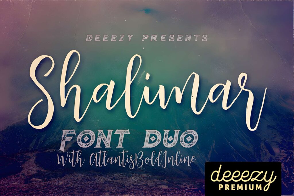
The rough brush character gives the pairing an intentionally aged, energetic appearance. It makes sense for apparel labels, music-adjacent merchandise, and short promotional graphics.
Texture and flourishes can break up letter recognition at very small sizes.
12. Hajime Font Duo
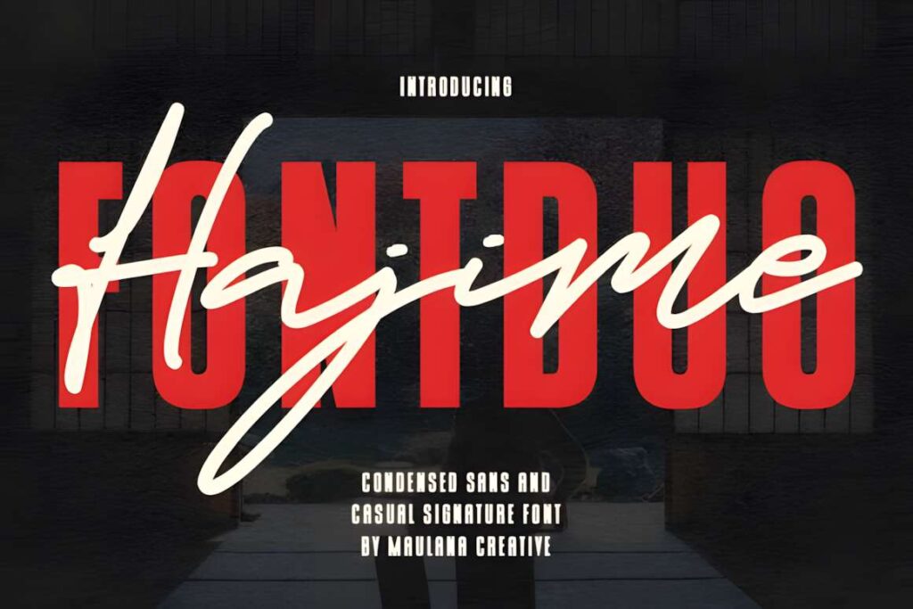
Hajime combines a narrow sans for high-impact headlines with a looser handwritten script. The width contrast helps longer business names fit a compact wordmark while leaving room for a casual accent.
The script should not compete with the condensed headline for equal prominence.
13. Clemore Duo
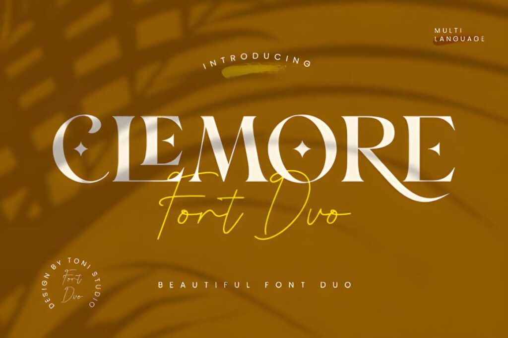
Clemore pairs clean serif lines with smooth script curves. That contrast suits event professionals or intimate retail brands that need a measured primary logo and a more personal secondary voice.
Decorative swashes belong in spacious applications; they can collide in tight label layouts.
14. Tropica Marisol Duo
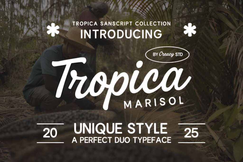
The retro script brings the personality of vintage signage; the contemporary sans keeps menus, location names, and packaging information straightforward. This contrast is particularly suitable for relaxed hospitality identities.
Avoid using the script for dense menus or accessibility-critical small print.
15. Seriffity Duo
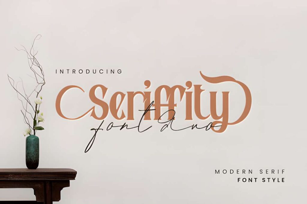
Seriffity offers a modern serif foundation paired with an elegant script. It works for brands that want a magazine-like heading with a more individual signature accent.
The script should be subordinate to the serif when clarity matters more than flourish.
16. Brampton Trio
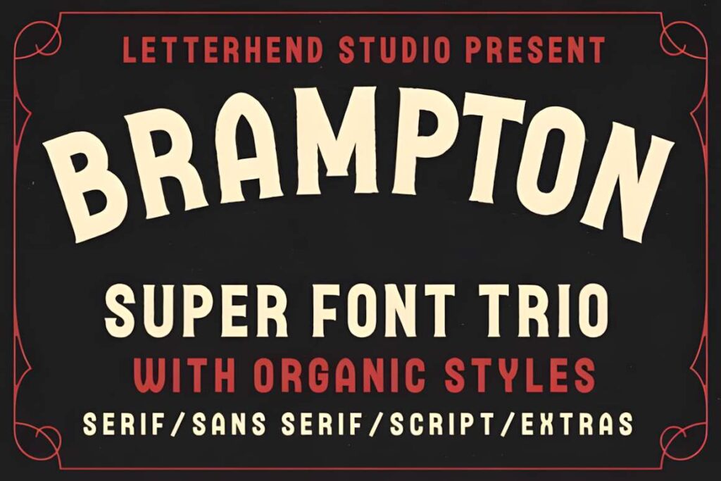
Brampton combines three distinct voices: a monoline script, serif, and sans. A brand can keep the serif or sans constant across applications and reserve the script for launches and short highlights.
Three styles give flexibility, but using all three at once can produce a busy logo.
17. Corlita Trio
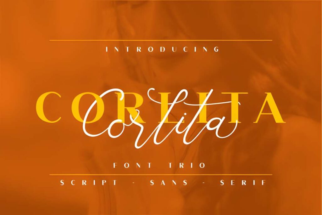
Corlita provides serif, sans, and script options in one coordinated set. This is useful for small businesses needing a logo, packaging headers, and occasional expressive callouts without sourcing three unrelated families.
Set a role for each style; otherwise consistency suffers across channels.
18. Second Mark Duo
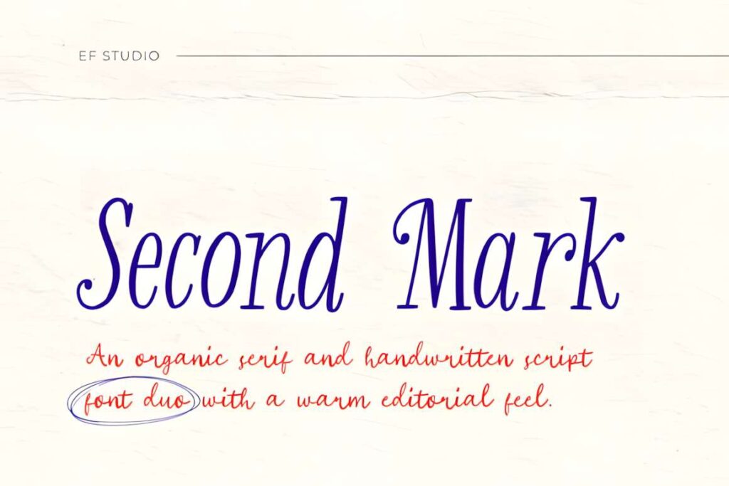
Second Mark pairs a warm, organic serif with handwritten accents, an approachable combination for wellness packaging and personal-service brands. Use the serif for the central logo and handwritten lettering for brief emphasis.
The informal script may be less appropriate for brands seeking a strict corporate voice.
19. Friday Edition Duo
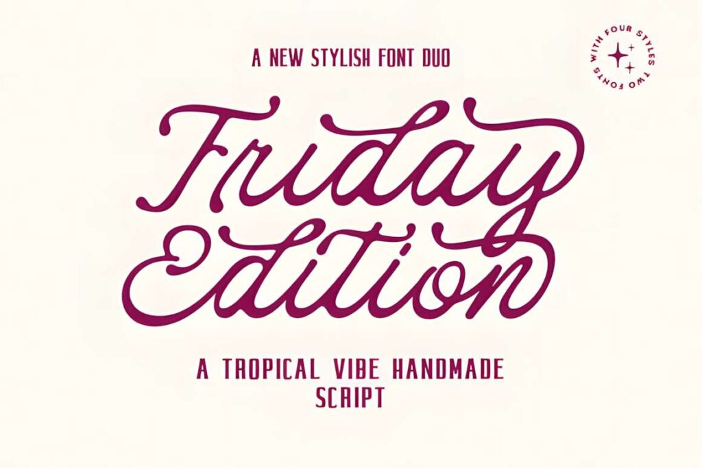
A weighty rounded serif anchors the design while the flowing handwritten partner softens it. For cheerful small-business packaging, that gives the product name and short supporting slogan visibly different jobs.
A playful pairing can look out of place on austere or technical labels.
20. Claudia Sansbert Duo
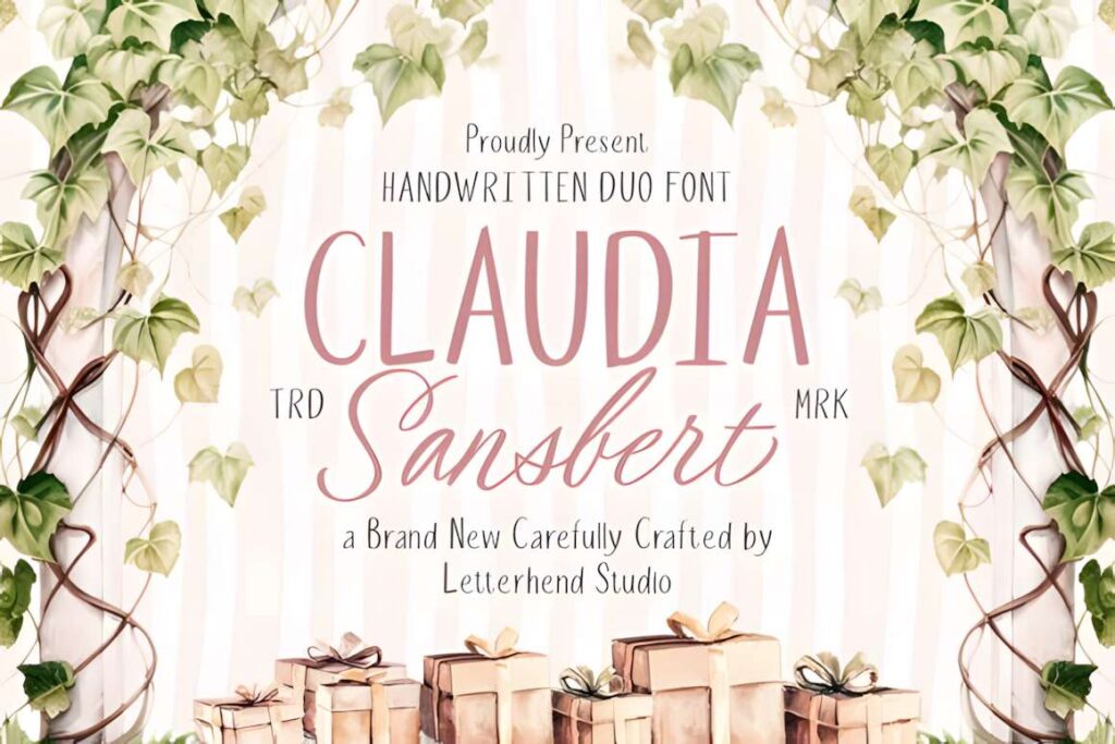
Tall, clean capitals sit beside a delicate handwritten script, helping a boutique name stay orderly without becoming impersonal. It is a logical match for floral, garden, and handmade-gift brands.
Give the tall capitals breathing room and do not compress the script into tiny tags.
21. Premium Look Duo
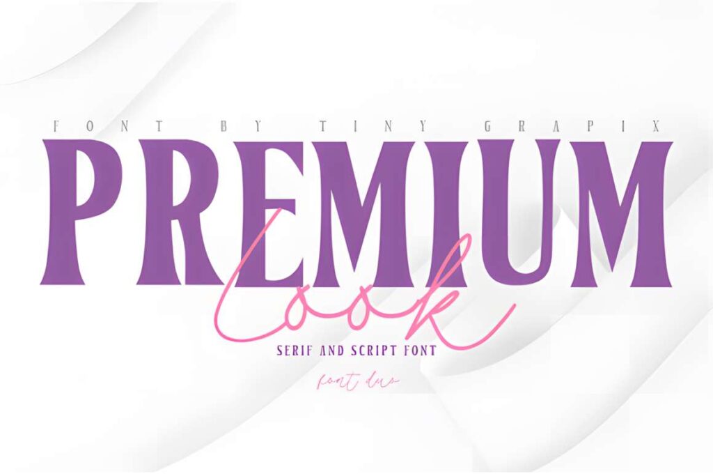
The pronounced serif contrast gives a fashion-led headline a deliberate editorial finish. The fluid script is useful as a limited accent on beauty labels or campaign material.
Fine serif strokes and delicate script need proofing against low-contrast packaging backgrounds.
22. Fontega Duo
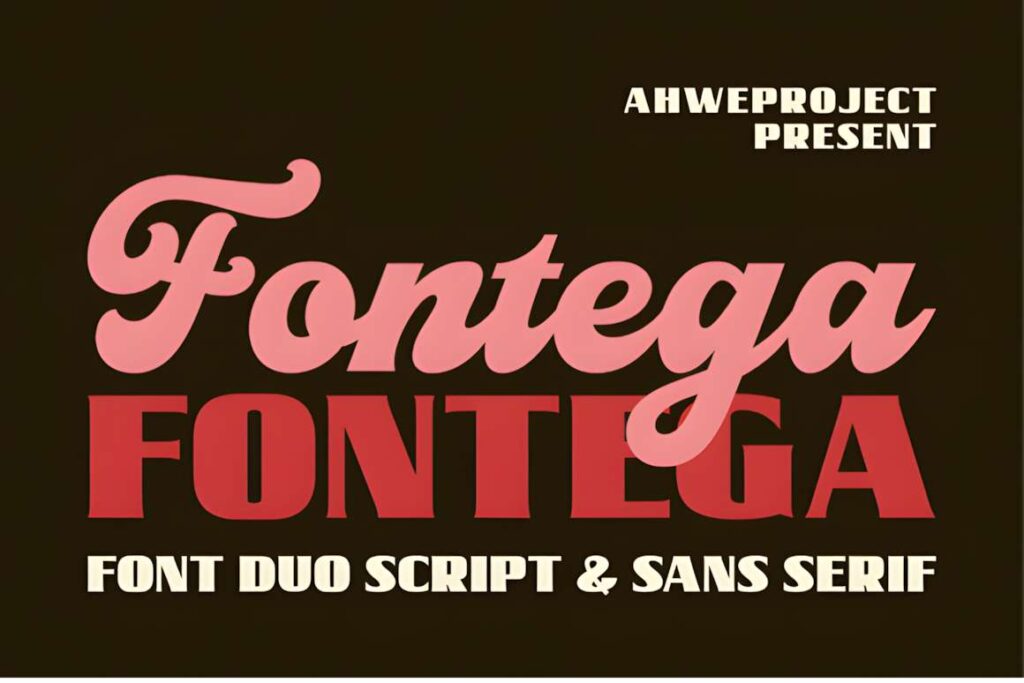
Fontega places a structured serif beside cursive lettering, a familiar but workable formula for jewelry, gifting, and invitation-related branding. Use the serif to keep the name stable and the script to make a seasonal detail personal.
For small engraving or narrow label spaces, a simpler lettering treatment may be clearer.
23. Meadow & Villager Club Duo
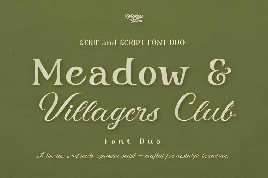
This pairing brings a country-inspired serif together with an expressive handwritten companion. It suits handcrafted food packaging, garden shops, and regional lifestyle brands where a formal corporate sans would feel misplaced.
The nostalgic personality is quite specific; it may not translate to technology-forward identities.
See Meadow & Villager Club Duo
24. Casvatio Duo
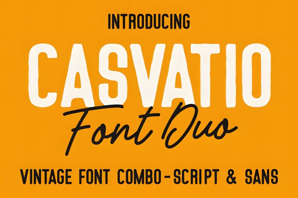
Casvatio uses a bold, slightly rounded rugged sans against a flowing signature script. That gives a brewery or artisan brand a substantial main wordmark and a loose secondary line.
The rugged lettering and script are better suited to prominent labels than small mandatory packaging text.
25. Ceglar
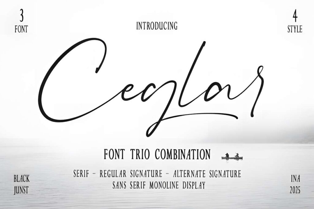
Ceglar contains serif display, monoline sans, and signature-script styles, including a script alternate. The combination can support a campaign headline, clear descriptor, and short handwritten brand note.
Define a primary style before applying the whole set, or the identity may become inconsistent.
Compare the 25 Font Pairings
| Product | Best for | Font Style / Personality | Best Project Fit |
|---|---|---|---|
| Indigo Font Duo | Modern retail logos | Bold sans + outline | Modern retail logos |
| Troemys Font Trio | Heritage packaging | Decorative Victorian trio | Heritage packaging |
| Cornelia Font Duo | Boutique stationery | Luxury serif + script | Boutique stationery |
| Selina Daniel Duo Font | Playful boutique branding | Light script + chunky sans | Playful boutique branding |
| Pablo Duo | Fashion and beauty logos | Elegant serif + script | Fashion and beauty logos |
| Fujinstall Font Duo | Wedding-service identities | Sans + script | Wedding-service identities |
| Signature Trio | Artisan logos | Vintage-leaning handwriting trio | Artisan logos |
| Bronx Simpul Duo | Photography wordmarks | Outlined serif + fluid script | Photography wordmarks |
| Fine Art Duo | Creative studio branding | Hand-painted + elegant | Creative studio branding |
| Orleans Script Font Duo | Coffee-shop signage | Brush script duo | Coffee-shop signage |
| Shalimar Font Duo | Vintage apparel branding | Grunge brush + companion | Vintage apparel branding |
| Hajime Font Duo | Urban lifestyle brands | Condensed sans + handwriting | Urban lifestyle brands |
| Clemore Duo | Elegant service logos | Clean serif + smooth script | Elegant service logos |
| Tropica Marisol Duo | Hospitality and cafe branding | Retro script + modern sans | Hospitality and cafe branding |
| Seriffity Duo | Editorial brand identities | Modern serif + script | Editorial brand identities |
| Brampton Trio | Flexible vintage branding | Monoline script + serif + sans | Flexible vintage branding |
| Corlita Trio | Full identity systems | Serif + sans + script | Full identity systems |
| Second Mark Duo | Wellness branding | Organic serif + handwriting | Wellness branding |
| Friday Edition Duo | Friendly product packaging | Rounded serif + handwriting | Friendly product packaging |
| Claudia Sansbert Duo | Floral boutique branding | Tall sans + feminine script | Floral boutique branding |
| Premium Look Duo | Luxury product launches | High-contrast serif + script | Luxury product launches |
| Fontega Duo | Jewelry and gift brands | Serif + script | Jewelry and gift brands |
| Meadow & Villager Club Duo | Farmhouse product labels | Vintage serif + natural script | Farmhouse product labels |
| Casvatio Duo | Craft beverage branding | Rugged sans + signature script | Craft beverage branding |
| Ceglar | Multi-format boutique systems | Display serif + monoline sans + script | Multi-format boutique systems |
How to Build a Consistent Brand System with Two Fonts
Use the display font for one clearly defined job. In a serif-and-script duo, the serif can carry the official brand name while the script supplies a signature or collection label. In a sans-and-script duo, the sans can handle short promotional titles and the script can identify one featured phrase. The two should not swap roles randomly from one design to the next.
Draw up a simple type hierarchy before producing assets: the primary wordmark, a secondary display line, small functional labels, and paragraph text. A display font duo may cover the first two jobs but not the latter two. If a font is too ornate for instructions, choose a plainly readable text family for that role rather than trying to force decorative lettering to do everything.
Scale changes the answer. A loop in a script that looks graceful on a website banner may collapse in a tiny social profile image. A thin outlined letter may work well at poster size but disappear against textured packaging. Test in black and white first: if the hierarchy only works because of color, the type contrast probably needs adjustment.
Spacing also deserves attention. Give tall, narrow caps enough breathing room and inspect the gaps around A, V, W, and other diagonals. With swash-heavy scripts, check the first and last letters of your actual business name, not only the specimen text. A sample that looks balanced with the word “hello” may behave differently with your logo wording.
For three-font kits, avoid assuming that all styles belong in a single logo. Choose one primary voice and one secondary voice for a given application. The third can be kept for longer campaign layouts, where it serves a distinct purpose rather than becoming extra decoration.
Before committing, make practical versions of the identity: a one-color wordmark, a horizontal and stacked logo, a compact avatar, and a mock package label using realistic small text. Also confirm the exact file formats, character coverage, and license scope on the font product page. A visually suitable font is not automatically cleared for every type of commercial distribution.
Which Pairing Should You Choose?
For a modern retail wordmark, Indigo Font Duo offers a controlled solid-and-outline variation. For a delicate boutique identity, Cornelia Font Duo gives the serif the structured role and the script the personal one. A brand producing many coordinated touchpoints may prefer Corlita Trio, provided each style has a clear purpose.
Hospitality projects with a nostalgic character can look at Tropica Marisol Duo; craft beverage packaging with a heavier presence may suit Casvatio Duo. Whichever direction you pick, approve the pairing at your smallest real-world display size—not just in its largest preview.
Frequently Asked Questions
What font styles pair well for a professional brand?
A serif with a restrained script, or a clear sans with a complementary handwritten face, can produce a professional brand hierarchy. The more structured font usually carries the name or important information; the expressive font supplies a limited accent. Match the pair to your audience and test the exact brand name at small sizes before choosing.
Can I use a script font in a business logo?
Yes, a script font can work in a business logo when the letterforms remain recognizable at the sizes you actually use. Scripts with large swashes or closely connected letters often need more space than a straightforward serif or sans. A companion font can handle the tagline and practical information so the script does not need to carry everything.
Should a brand use two fonts or three?
Two fonts are enough for many small-brand identities because they establish contrast without increasing the number of typography rules. Three coordinated styles can help when a business produces packaging, campaigns, and editorial materials, but each style should have an assigned role. A trio does not mean all three belong in every single layout.
Are Creative Fabrica font duos licensed for commercial logos?
Commercial logo use depends on the current license terms attached to the specific font and the intended use. Review those terms before producing client identities, printed merchandise, packaging, or distributed digital assets. Also check whether the font files and available character set suit your software and brand name; a font preview alone cannot establish license coverage.