ℹ️ Affiliate Disclosure: This article may contain affiliate links. If you book or purchase through these links, we may earn a commission at no additional cost to you.
Choosing the Best Vintage Calligraphy Alphabet Fonts for Practice Sheets
Vintage calligraphy alphabet fonts can make printable practice sheets look polished, but decorative scripts are not equally useful for tracing, letter study, and repeat-writing exercises. Long swashes may overlap guide lines, very thin hairlines can disappear in light worksheet printing, and highly irregular letterforms can make it harder to compare one character with the next.
For printable practice, I would focus first on clear uppercase and lowercase shapes, a visible baseline rhythm, enough contrast to study thick and thin strokes, and decorative extras that can be removed when they distract from the core alphabet. The fonts below range from restrained copperplate-inspired scripts to more expressive Victorian and antique lettering, giving you options for beginner reference sheets, tracing alphabets, flourish drills, and vintage-style practice pages.
A broader range of calligraphy fonts exists, while this shortlist concentrates on vintage-looking letterforms that can serve clearly different printable practice needs.

The most useful vintage calligraphy fonts for printable practice are usually clean copperplate-inspired scripts for basic letter study, moderate-flow scripts for connected-word drills, antique handwriting styles for historical character, and more ornamental fonts reserved for advanced flourish practice. For beginners, start with the least decorated forms before introducing alternate characters and extended swashes.
Quick Picks
For classic copperplate study: Classical Calligraphy — a restrained vintage script with clear traditional influence and useful alternate forms.
For historical handwriting sheets: Vintage Manuscript — designed around the appearance of antique correspondence and old handwritten documents.
For cleaner thin-line drills: Marley Heritage — a lighter vintage calligraphy script that keeps the page airy.
For ornate uppercase practice: Victorian Signature — useful when you want loops and sweeping vintage cursive forms.
For advanced alternates: Kattalin Osane — a copperplate-inspired option with alternates and ligatures for expanding beyond the basic alphabet.
Vintage Calligraphy Alphabet Fonts for Practice Sheets
1. Classical Calligraphy
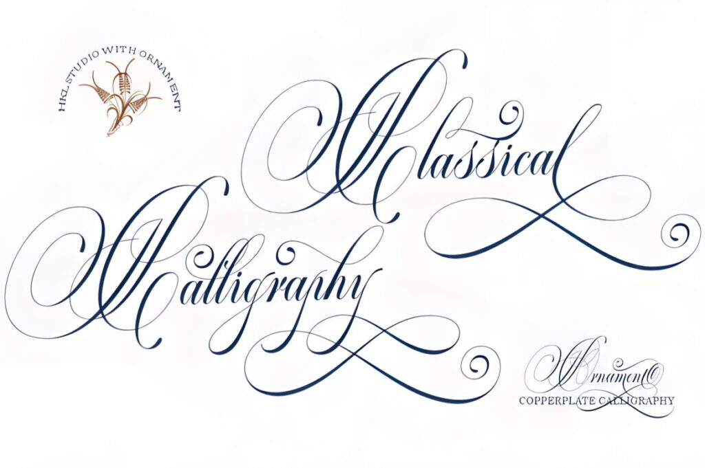
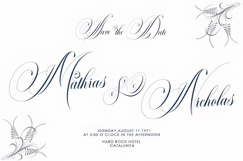
Classical Calligraphy is a vintage calligraphy script with a strong copperplate influence, making it a sensible starting point for printable alphabet reference sheets. Its flowing construction gives learners visible examples of how traditional script letters can connect without requiring every practice line to become heavily ornamental.
I would use the simpler characters for uppercase and lowercase tracing first, then introduce alternate characters or swashes on a separate advanced page. That separation keeps beginning worksheets easier to read while still giving the font room to demonstrate more decorative calligraphic forms.
2. Kattalin Osane
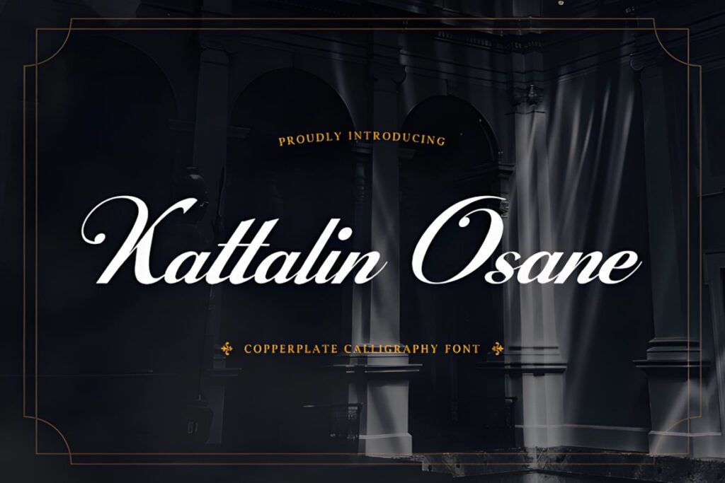
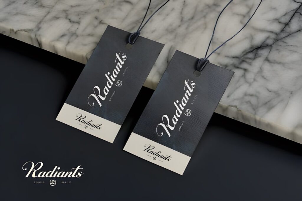
Kattalin Osane is a copperplate-inspired calligraphy typeface with high-contrast strokes and flowing connections. That makes it particularly useful for practice pages focused on recognizing the rhythm between heavier downstrokes and finer connecting strokes.
The font also includes stylistic alternates and ligatures, so it can support a progression from basic alphabet sheets to more advanced connected-letter exercises. Keep the alternate forms off early tracing pages, however, because too many versions of the same character can distract beginners who are still learning the basic structure.
3. Vintage Manuscript
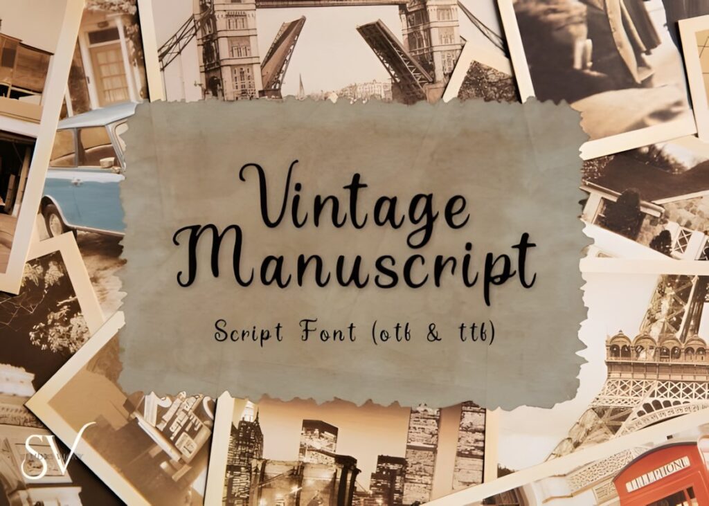
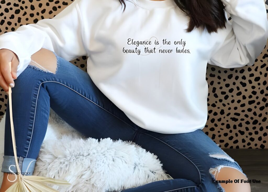
Vintage Manuscript is an antique-style script inspired by historical letters, old book pages, and traditional handwritten correspondence. It makes sense for printable exercises where the goal is not only elegant calligraphy but also an unmistakably old-world handwriting appearance.
Use it for alphabet reference pages, historical-style copywork, names, dates, and short quotations. Its period character gives worksheets more atmosphere than a neutral modern script. For pure foundational calligraphy drills, a cleaner copperplate option such as Classical Calligraphy may be easier to analyze.
4. Victorian Signature
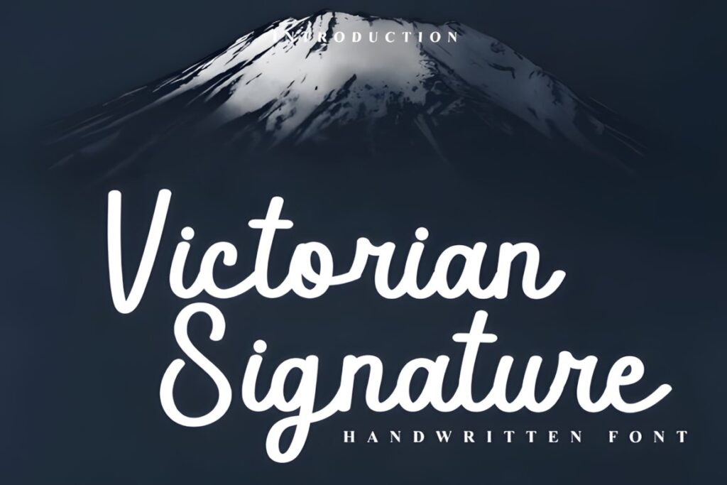

Victorian Signature combines looping vintage cursive with a relatively clean handwritten structure. The dramatic entry strokes, connected forms, and sweeping details make it more appropriate for intermediate practice than for the very first alphabet sheet.
Consider this font for capital-letter drills, signature-style names, flourish exploration, and exercises showing how one letter can lead naturally into another. If your printable needs compact tracing boxes or very short guide lines, a less expansive script will leave more usable writing space.
5. Victorian Heritage
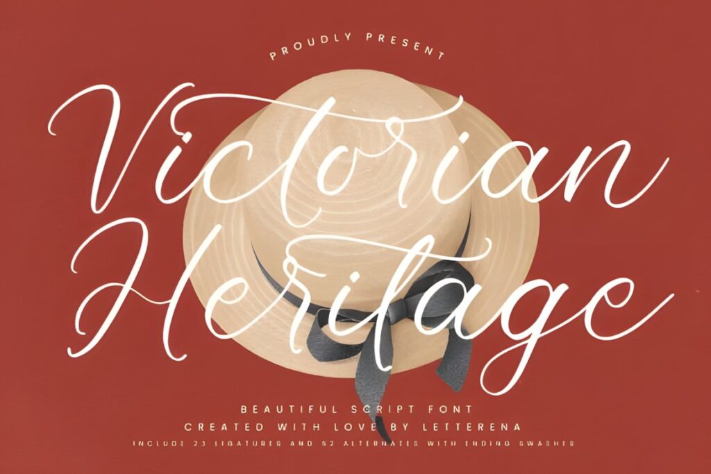
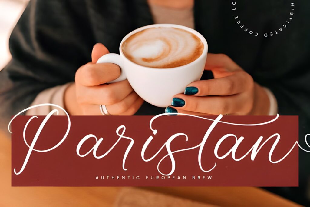
Victorian Heritage uses elegant flowing script forms with a distinct vintage character. It works well when a printable alphabet needs to look traditional and decorative without moving completely into dense ornamental lettering.
I would use it for repeated lowercase practice, capital-and-lowercase pairing, short names, and vintage stationery exercises. The finer curves deserve enough print size to remain clear, so avoid shrinking detailed reference characters merely to fit more examples onto one page.
6. Marley Heritage
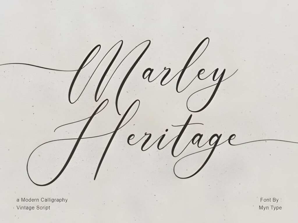
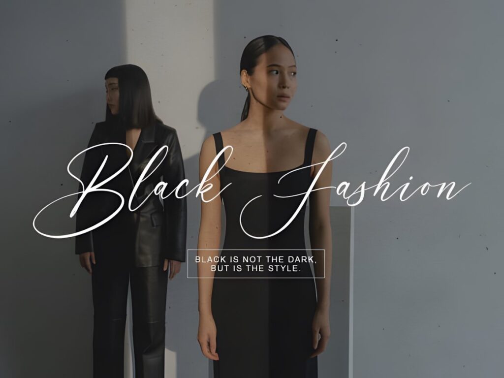
Marley Heritage is a thin-line vintage calligraphy script suited to practice pages that need a lighter, more delicate visual reference. The restrained stroke weight keeps dense alphabet layouts from feeling as heavy as they might with bold brush scripts.
This makes sense for tracing words, wedding-style names, graceful lowercase repetition, and elegant quote-copying sheets. Thin strokes can become weak when printed too lightly, though, so test your worksheet opacity before using pale gray tracing text.
7. Malograh
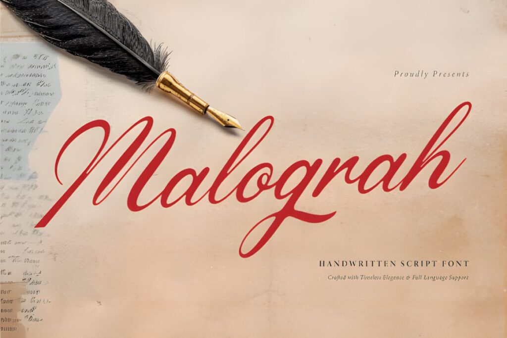
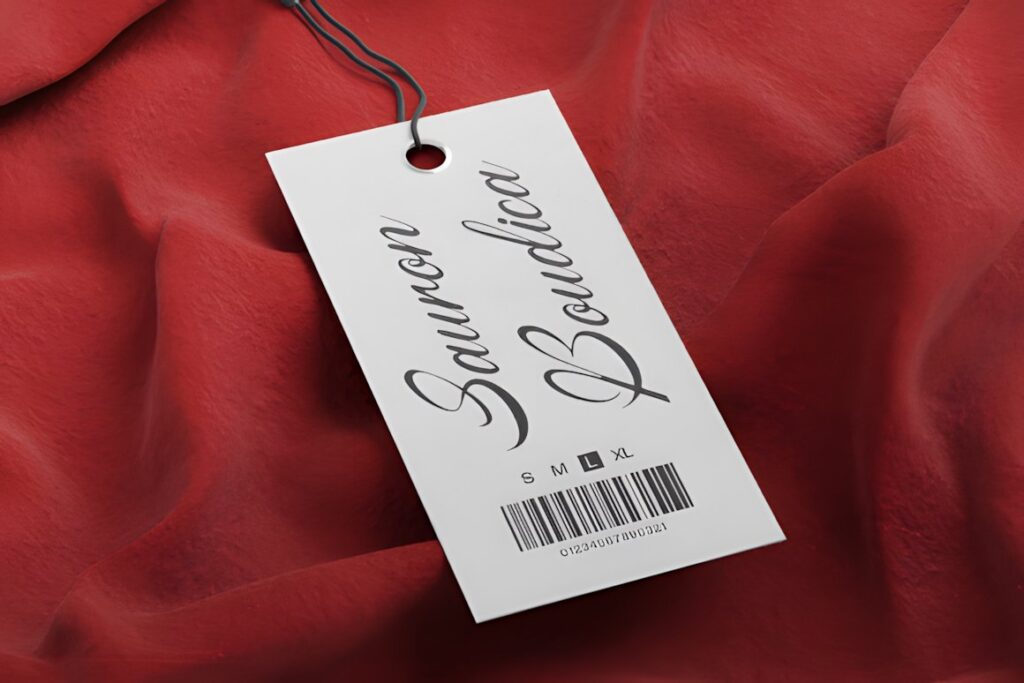
Malograh has a dip-pen-inspired appearance with connected strokes, sweeping loops, and classic penmanship character. For printable practice, it offers a useful bridge between formal alphabet study and the more expressive movement associated with vintage handwritten correspondence.
It suits large tracing examples, loop drills, romantic words, and longer handwriting samples where the connections between letters matter. Because several characters have expressive extensions, give each example generous horizontal spacing rather than crowding many words onto a single line.
8. Antique Vintage
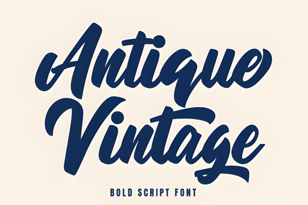

Antique Vintage is a heavier brush script with prominent connected strokes. Compared with delicate copperplate styles, its thicker construction can be easier to see on bold tracing sheets, classroom printables, or practice pages produced on ordinary home printers.
The stronger weight also changes the lesson: this is better for studying broad script shapes and connected rhythm than for demonstrating fine pointed-pen contrast. Choose a thinner font elsewhere in the roundup when hairline control is the main focus.
9. The Antique
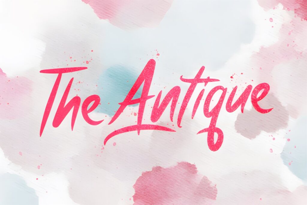
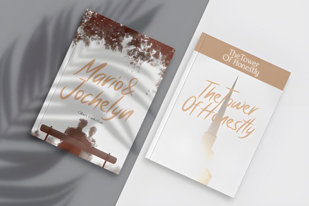
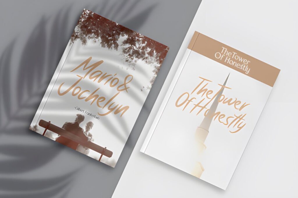
The Antique is a bold vintage script that gives alphabet practice a stronger sign-painter or display-lettering feel. Its weight makes individual letter shapes easy to identify, especially when worksheets are printed at moderate sizes.
Use it when the exercise is about reproducing broad flowing forms, vintage headings, labels, or decorative words rather than delicate formal penmanship. It is less suitable when you specifically want learners to study extreme thin-to-thick copperplate transitions.
10. Antique
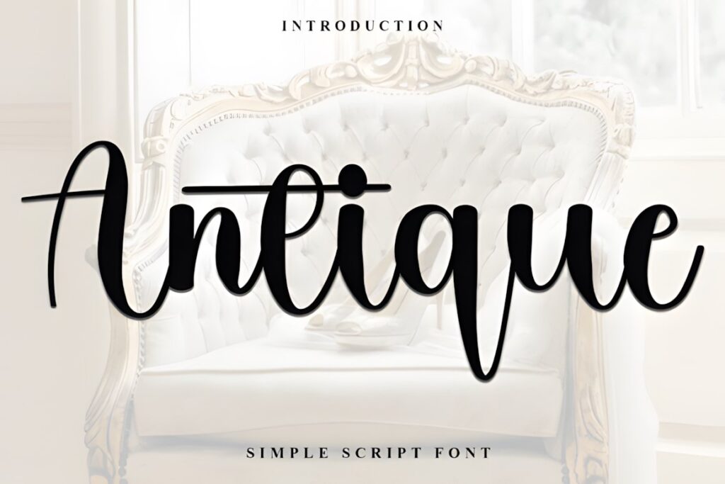
Antique is a graceful script with smooth curves and a classic-calligraphy influence. The comparatively clean construction makes it useful for learners who want a vintage mood without immediately dealing with the most exaggerated Victorian flourishes.
Try it for capital-and-lowercase reference rows, simple word tracing, greeting-card phrases, and name-writing practice. Decorative alternate characters can be introduced after the standard alphabet so students can compare how embellishment changes the silhouette of the same basic letter.
11. The Calligraphy
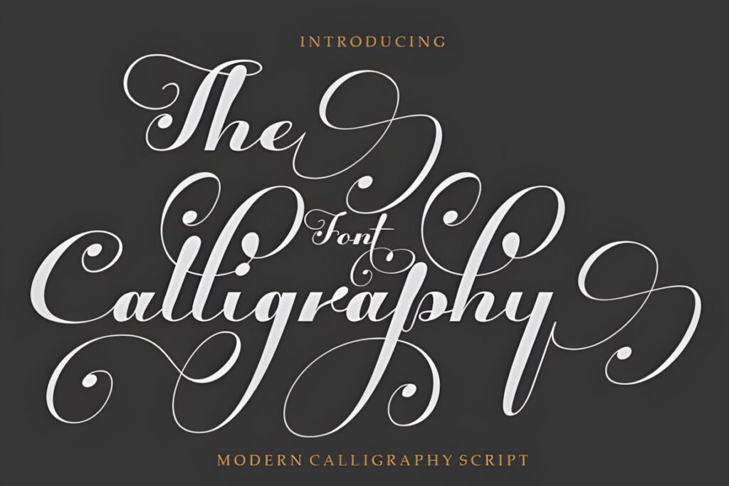
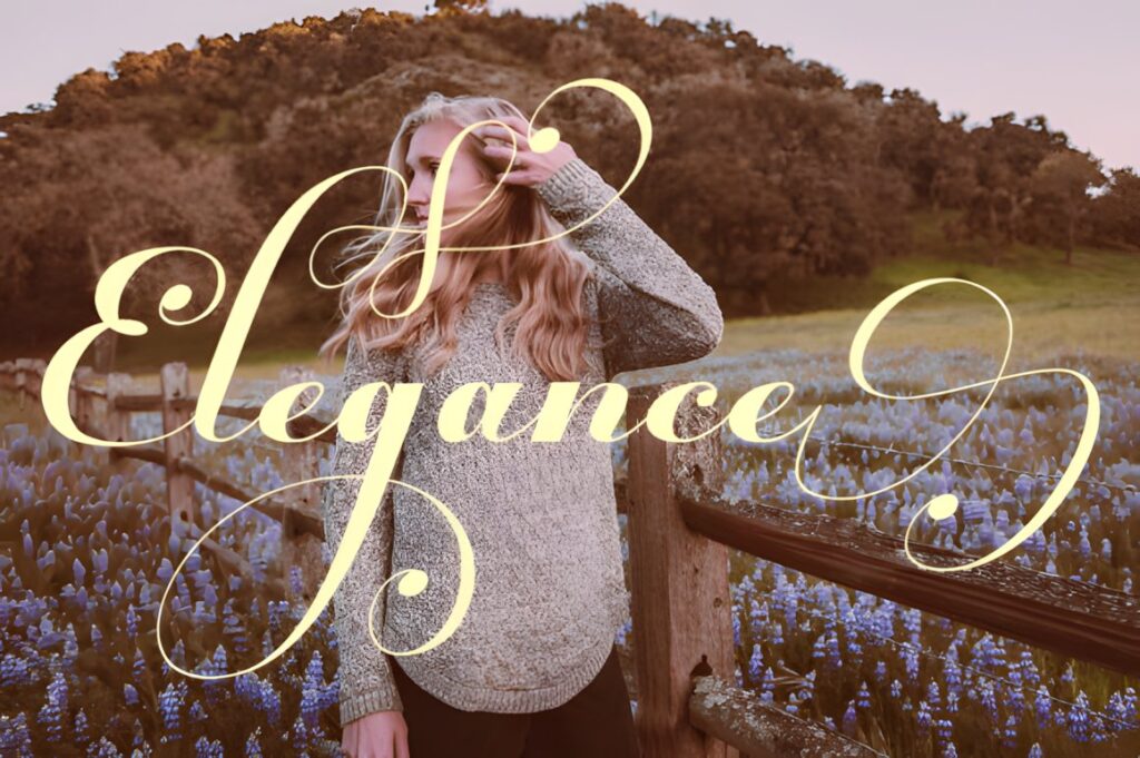
The Calligraphy uses balanced script forms inspired by traditional calligraphy without pushing the strokes toward either an extremely thin or extremely heavy appearance. That middle ground is practical for general-purpose printable exercises.
It can work for alphabet tracing, repeated words, names, and introductory swash examples. When you want a worksheet that introduces decorative calligraphy but still leaves the underlying characters easy to identify, this restrained approach may be easier to work with than highly elaborate signature scripts.
12. Calligraphy Script
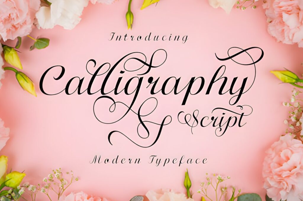
Calligraphy Script is a flowing handwritten font with a varied baseline, smooth forms, alternates, and swashes. It makes sense for practice sheets that progress from standard characters into a more personal, less rigid style of connected lettering.
The changing baseline gives words liveliness, but that same quality makes it less useful when you need every character to sit on an identical guideline. Use it for creative copying exercises and flourish exploration after learners are comfortable with more structured script forms.
13. Valentina Calligraphy
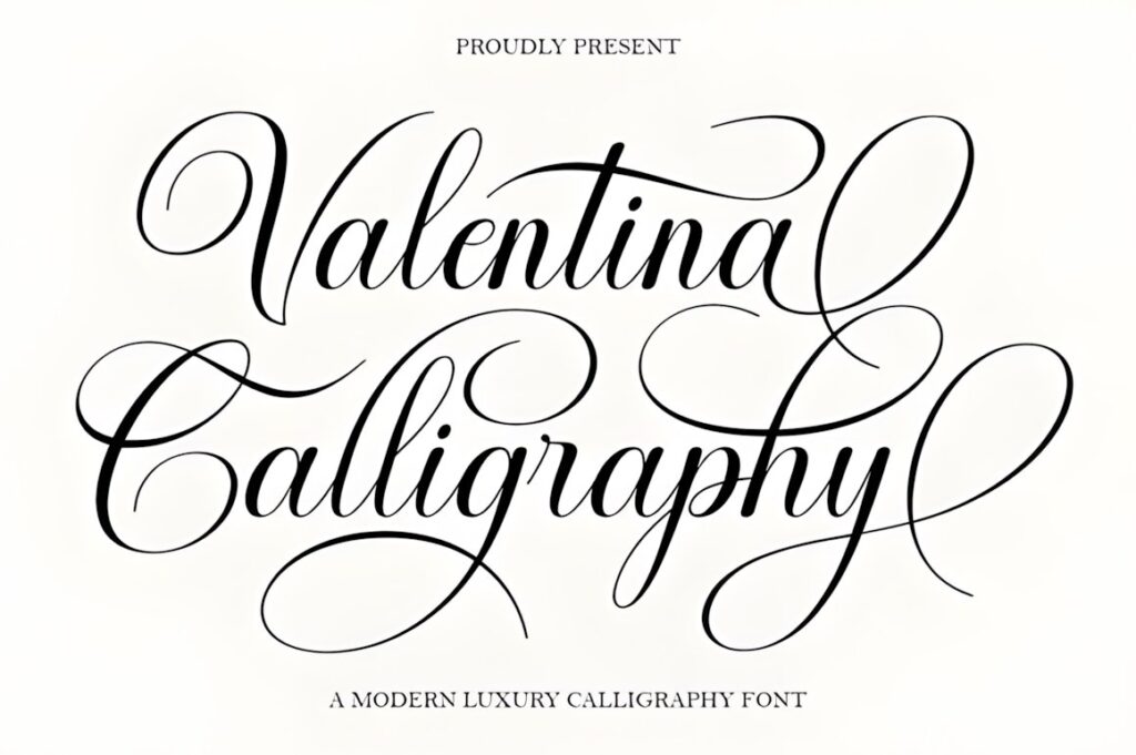
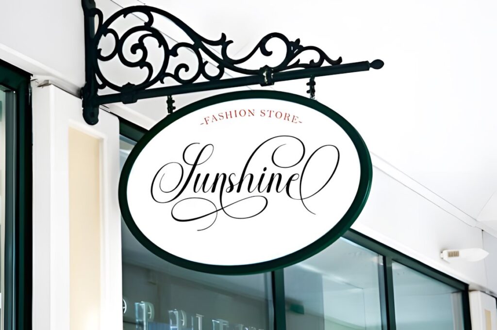
Valentina Calligraphy mixes classic decorative copperplate influence with smooth modern refinement. Its connected script forms and stylistic alternatives make it useful for learners who are ready to compare a plain letterform with a more embellished variation.
For practice printables, keep standard characters on the primary alphabet page and reserve flourishes for separate exercises. That approach prevents a visually elegant font from becoming unnecessarily difficult for someone who is still concentrating on proportion and consistency.
14. Enchanting Calligraphy
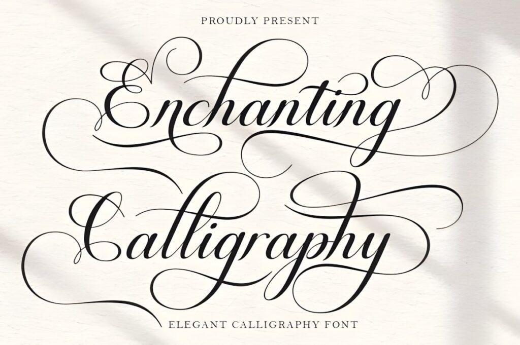
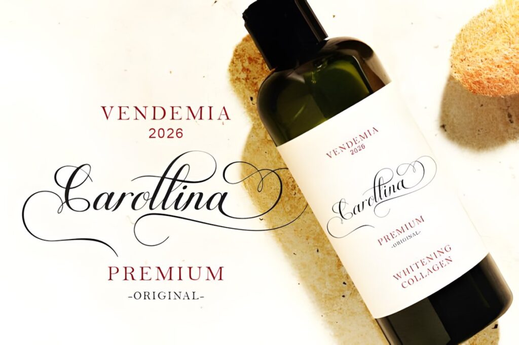
Enchanting Calligraphy is another decorative copperplate-influenced script, with smooth connections and a refined formal appearance. Its balanced combination of structure and ornament works well for sophisticated printable worksheets aimed beyond the absolute beginner stage.
Use larger characters when studying capitals and flourishes so learners can see where curves begin and end. For compact lowercase drills, remove unnecessary decorative characters and concentrate on repeated base shapes before creating full words.
15. Belastia Calligraphy
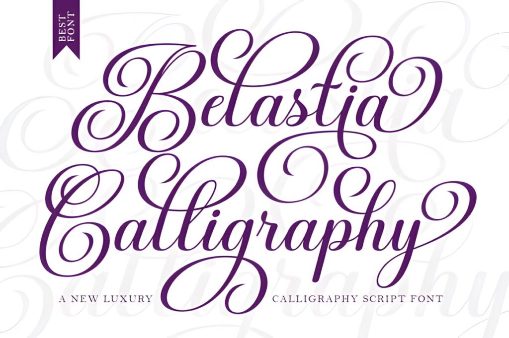
Belastia Calligraphy brings a bolder interpretation to decorative copperplate-style lettering. The stronger strokes can reproduce more clearly on tracing worksheets than extremely delicate scripts, especially when the finished page is printed on a basic home printer.
This font makes sense for larger alphabet models, short phrase practice, and worksheets where readability matters more than replicating the finest pointed-pen hairlines. Choose Marley Heritage or another lighter script when delicacy is the main visual goal.
16. Syiterlla Outline
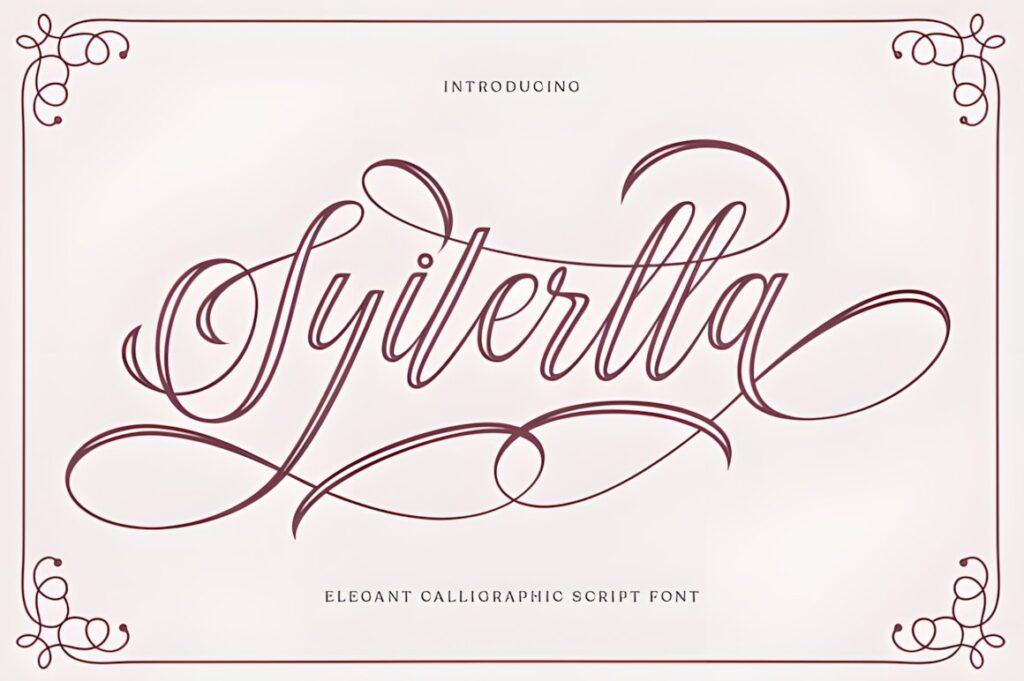
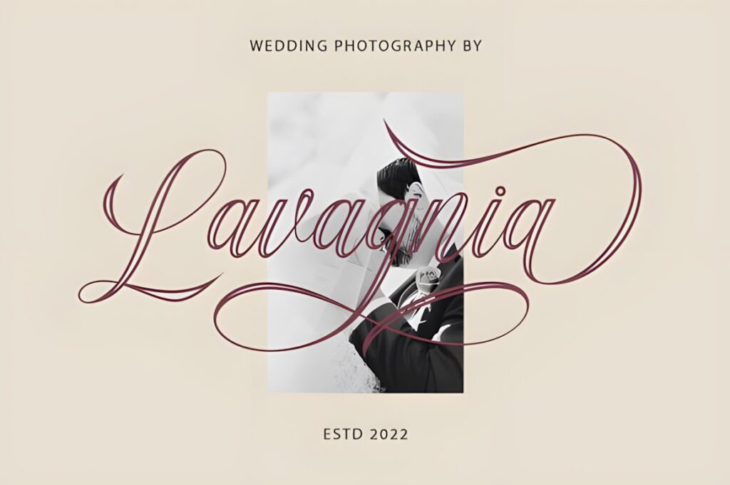
Syiterlla Outline is a vintage calligraphy script influenced by copperplate lettering and hand lettering, with alternate characters and decorative connections. Its outlined presentation makes it visually different from the solid scripts in this roundup.
That distinction can be useful for large letter-shape exercises where the learner studies the outer contour of a character. It is more specialized than a standard tracing font, so I would use it as a supplemental practice style rather than the only alphabet model in a workbook.
17. Vintage Script
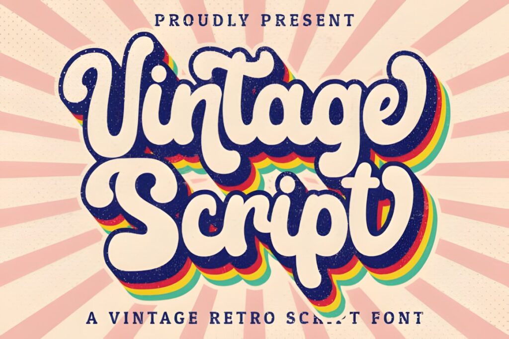
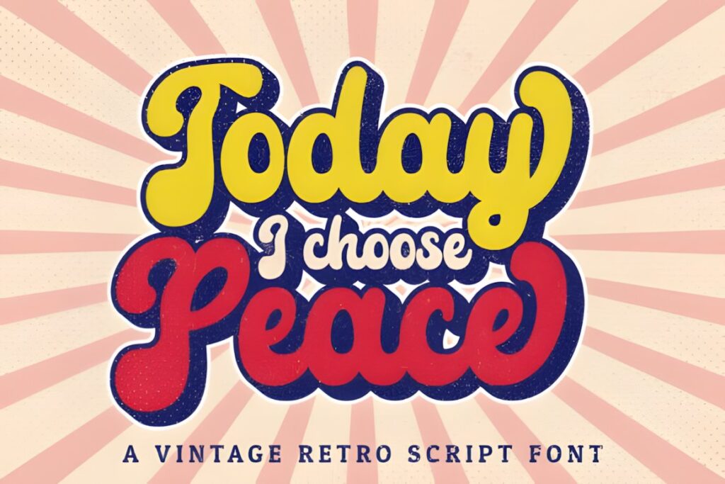
Vintage Script is a handwritten script with a clear retro personality and accessible swash characters. It is useful for practice pages that should feel more like vintage lettering or stationery than strict formal copperplate exercises.
Try it for short words, labels, names, and decorative phrase copying. The playful retro style gives it more personality than a restrained foundational model, so another font may make more sense for teaching a single standardized calligraphy alphabet from the beginning.
18. Vintage Font
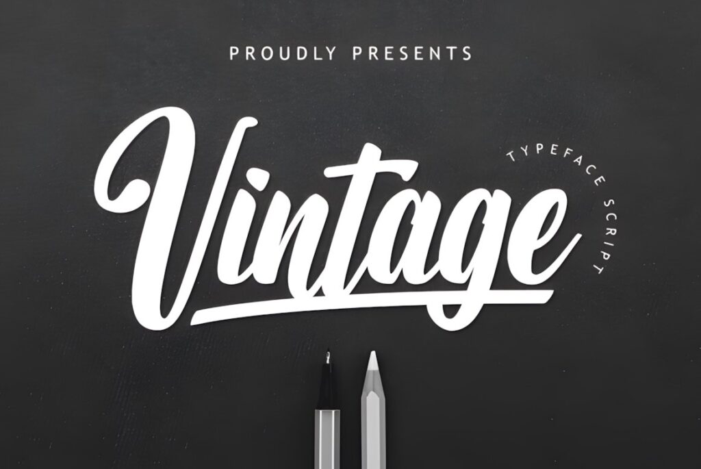

Vintage Font is a cursive script with an assertive decorative appearance. Its connected rhythm works well for repeated words and retro-style lettering exercises where the goal is to imitate an expressive finished script rather than isolated school-style handwriting.
Because the visual personality is strong, use it selectively in a practice workbook—perhaps for challenge pages, headings, or final-copy exercises after basic letter drills. More restrained scripts are easier when consistency and comparison between individual characters are the priority.
19. Vintage Calligraphy
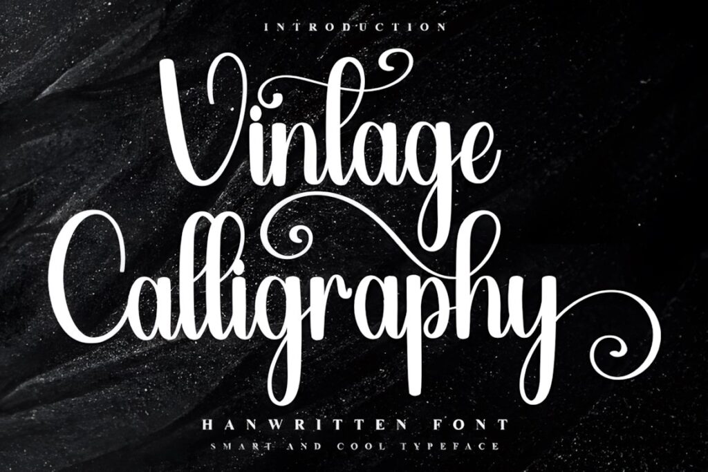

Vintage Calligraphy is a decorative handwritten script with nostalgic character and additional glyphs and ligatures. It closes the roundup as a more expressive option for worksheets that combine alphabet practice with finished decorative lettering.
I would place the standard alphabet first, then use its more decorative characters for a second-stage exercise involving names, greeting-card phrases, or short quotations. That keeps the basic learning objective clear instead of presenting every flourish at once.
Quick Comparison for Printable Practice
| Font | Best for | Style | Key visual trait | Practice fit |
|---|---|---|---|---|
| Classical Calligraphy | Foundational reference sheets | Copperplate-inspired | Balanced traditional flow | Alphabet and connected letters |
| Kattalin Osane | Stroke-contrast study | Formal calligraphy | High contrast and alternates | Intermediate drills |
| Vintage Manuscript | Historical copywork | Antique script | Old-letter character | Words and quotations |
| Victorian Signature | Flourished capitals | Victorian cursive | Long loops and sweeps | Advanced practice |
| Marley Heritage | Delicate worksheets | Thin vintage script | Light flowing strokes | Names and tracing |
| Antique Vintage | Bold tracing | Brush script | Thicker connected forms | Large letter models |
| The Calligraphy | General practice pages | Classic script | Moderate stroke weight | Beginner to intermediate |
| Syiterlla Outline | Contour study | Outlined calligraphy | Visible letter boundaries | Supplemental drills |
How to Build a Useful Printable Alphabet Practice Sheet
Start with one large reference character followed by several lighter repetitions for tracing. Keep uppercase and lowercase practice separate at first, especially with Victorian scripts where capitals can be much more decorative than the lowercase alphabet.
Add baseline, x-height, ascender, and descender guides when they help the learner understand proportion. Leave enough horizontal space for long exit strokes rather than squeezing ornate characters into narrow boxes. A page with fewer well-spaced repetitions is often more useful than one packed with tiny examples.
For multi-page sets, a practical progression is basic alphabet → repeated letter families → short connections → common words → names and phrases → alternate characters and flourishes. This gives decorative vintage scripts a clear learning role instead of turning the worksheet into a collection of ornamental examples.
Swashes, Alternates, and Ligatures
Extra characters can make a vintage calligraphy font visually interesting, but they should not replace the standard alphabet on beginner practice sheets. Learners need a consistent base form before comparing several decorative versions of the same letter.
Use alternates as a separate exercise. For example, place one standard capital beside two alternate versions and ask the learner to compare the entry stroke, loop, terminal, and overall width. Ligatures work better after individual letters and common joins have already been practiced.
Long swashes also need extra room. Test them with the actual words you intend to print because an attractive isolated capital can become crowded when placed beside neighboring letters or close to another practice line.
Common Mistakes With Calligraphy Practice Fonts
- Starting with the most ornamental characters. Begin with recognizable standard forms before adding flourishes.
- Printing delicate scripts too small. Thin strokes and tight counters can lose clarity on inexpensive printers.
- Using a font as a complete calligraphy lesson. Typeface outlines do not explain stroke order, nib angle, or pressure technique.
- Crowding connected scripts. Give ascenders, descenders, and exit strokes enough white space.
- Mixing several alphabets on one beginner page. One consistent model usually makes repetition easier to understand.
- Ignoring the final use of the worksheet. A decorative lettering challenge needs different letterforms from a foundational tracing page.
Choosing the Right Vintage Style for Your Practice Pages
If your priority is a recognizable traditional calligraphy structure, Classical Calligraphy or Kattalin Osane makes sense. Both keep the connection to formal copperplate-style lettering visible enough for focused alphabet study.
For historical-looking copywork, Vintage Manuscript gives the page a stronger antique-document personality. If you want thinner, graceful practice models, Marley Heritage provides a lighter alternative.
For learners moving into decorative capitals and flourishes, Victorian Signature offers more dramatic movement. When reliable print visibility matters more than delicate hairlines, Antique Vintage or Belastia Calligraphy provides stronger strokes.
Before distributing or selling finished worksheets, check the current license for the specific font and the exact way you intend to use it, particularly when the font itself is embedded, redistributed, or incorporated into editable digital products.
Frequently Asked Questions
Are vintage calligraphy fonts good for printable handwriting practice?
Vintage calligraphy fonts can work well as visual references and tracing models when their letterforms are clear enough to study. Cleaner scripts are usually easier for basic alphabet practice, while Victorian and heavily flourished styles make more sense for later decorative exercises. A font shows the finished letter shape, but it does not replace instruction on stroke order, pen angle, or pressure.
Should swashes be included on beginner calligraphy worksheets?
Swashes are usually better introduced after the standard letterforms. Beginner worksheets benefit from consistent characters that make proportions, baselines, and repeated shapes easy to compare. Once those forms are familiar, separate pages can introduce alternate capitals, extended entry and exit strokes, ligatures, and decorative swashes without making the foundational alphabet unnecessarily confusing.
What size should calligraphy letters be on tracing sheets?
Calligraphy reference letters should be large enough for thin strokes, counters, loops, and connections to remain clearly visible after printing. Decorative vintage scripts generally need more room than plain handwriting fonts. Test a printed sample before building the complete workbook, especially when using pale gray tracing text, delicate hairlines, long swashes, or narrow spaces between connected characters.
Can I sell printables made with these calligraphy fonts?
Selling a finished printable may require checking the current license for the specific font and your intended product format. Pay particular attention to rules covering commercial products, editable files, font embedding, redistribution, and products that could allow another person to extract or reuse the font. Review the current product license before publishing or selling a worksheet set.