ℹ️ Affiliate Disclosure: This article may contain affiliate links. If you book or purchase through these links, we may earn a commission at no additional cost to you.
Choosing vintage calligraphy alphabet fonts that enhance storefront signage
A storefront name has to do more than look decorative. It needs enough personality to make the business memorable while remaining recognizable from across a sidewalk, through a shop window, or on a relatively narrow fascia. Vintage calligraphy alphabet fonts can create the hand-painted character associated with old cafés, barbershops, bakeries, neighborhood markets, boutiques, and heritage brands, but highly ornamental scripts are not automatically good signage fonts.
For storefront work, the useful differences are stroke weight, overall width, letter connections, capital complexity, slant, and the amount of decorative movement around the word. Bold sign-painter scripts can carry short names from a distance, while cleaner calligraphic styles give boutiques and specialty shops a more refined personality.
Many more vintage scripts are available, while this selection concentrates on fonts with distinct signage uses, readable display forms, and clearly different retro personalities.

The most practical vintage calligraphy fonts for storefront signage usually fall into four groups: bold sign-painter scripts for maximum presence, smooth retro scripts for approachable shops, refined calligraphy for boutique identities, and layered or paired families for signs that need stronger hierarchy. The right choice depends especially on viewing distance, business-name length, and how much decorative lettering the available sign area can support.
Quick Picks for Different Storefront Styles
For classic painted-shop character: Cowtail Brush uses flowing brush forms inspired specifically by vintage sign lettering.
For a bold retro storefront: Vintage King combines thick connected forms with the dramatic movement associated with old advertising scripts.
For cafés and neighborhood food shops: Core Rush brings a chunky brush-script personality suited to bodega, café, and grocery-style identities.
For layered vintage lettering: Signature Creation provides several coordinated styles that can create dimensional sign treatments.
For storefront signage with a companion face: Lebold Sign combines script lettering with a bold sans-serif style for easier hierarchy.
Vintage Calligraphy Alphabet Fonts for Storefront Signage
1. Cowtail Brush
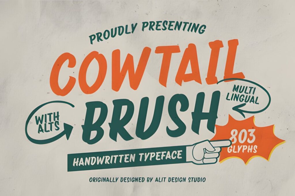
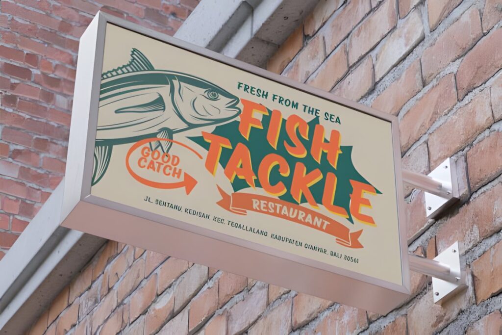
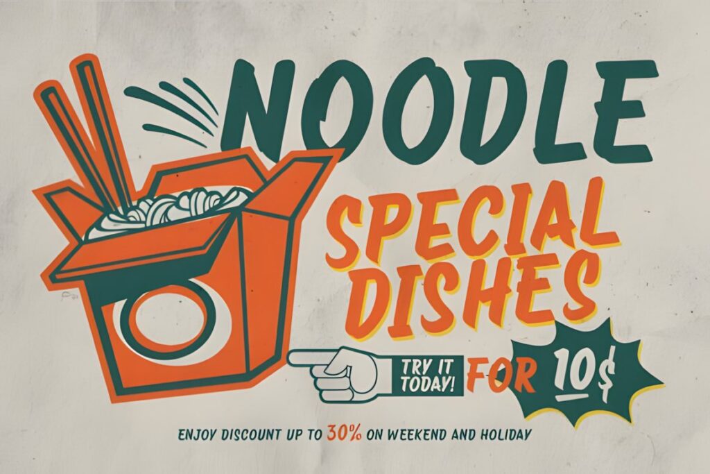
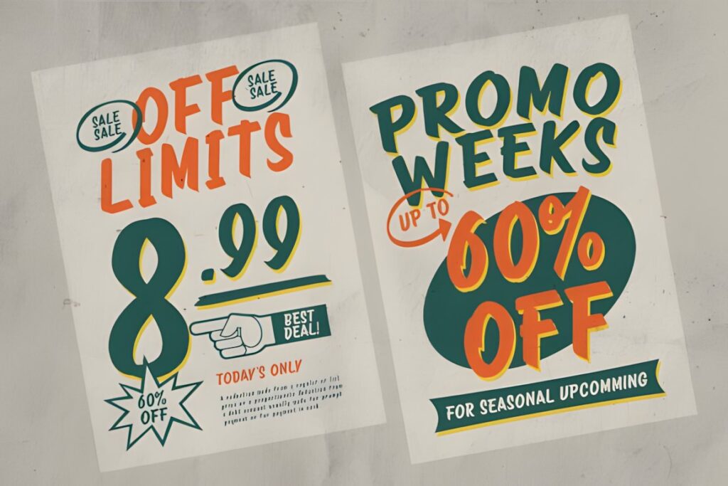
Cowtail Brush is a brush sign font built around vintage hand-painted lettering, making it one of the most direct fits for shop names that should feel crafted rather than digitally typeset. Its fluid strokes and organic curves work especially well for cafés, barbershops, restaurants, workshops, and heritage-inspired brands. The product also includes ligatures and alternate characters for changing the rhythm of individual words. :chatgpt-content-reference{index=”0″}
The expressive construction favors display-sized names. For a storefront carrying a long company name plus substantial supporting text, use Cowtail Brush for the main identifying words and let a simpler companion typeface handle the informational layer.
2. Signs Painted
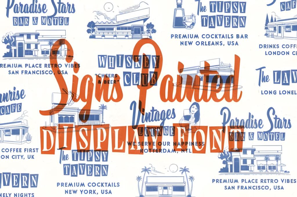
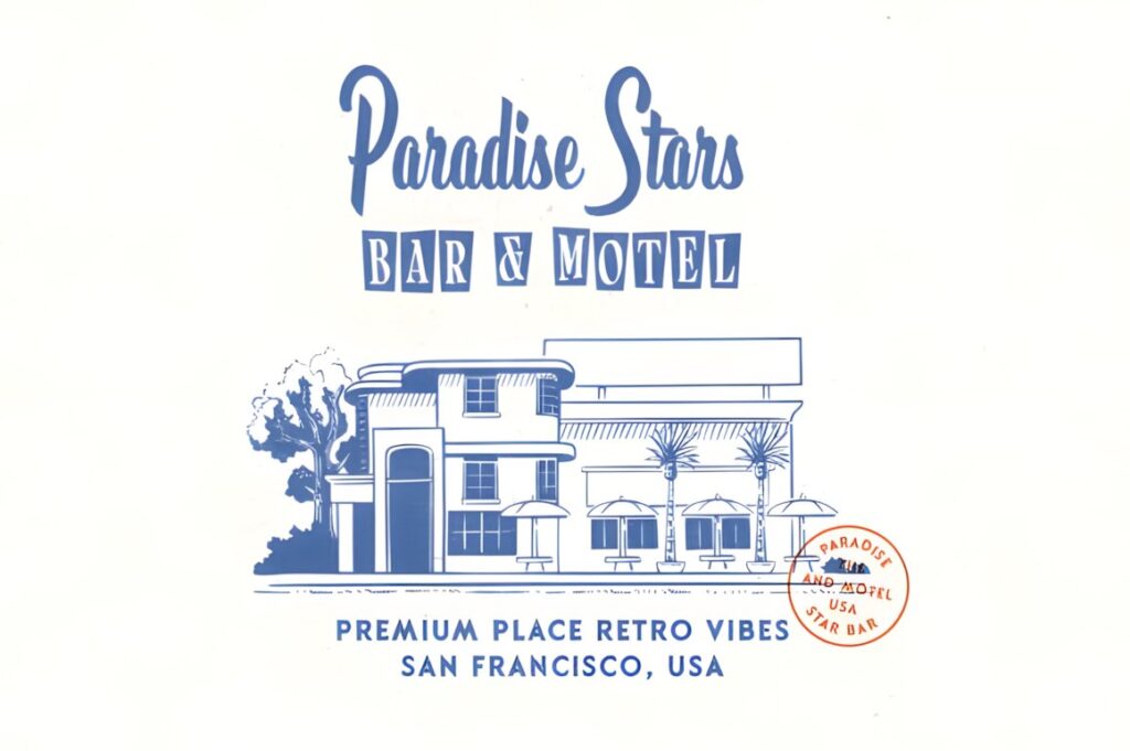
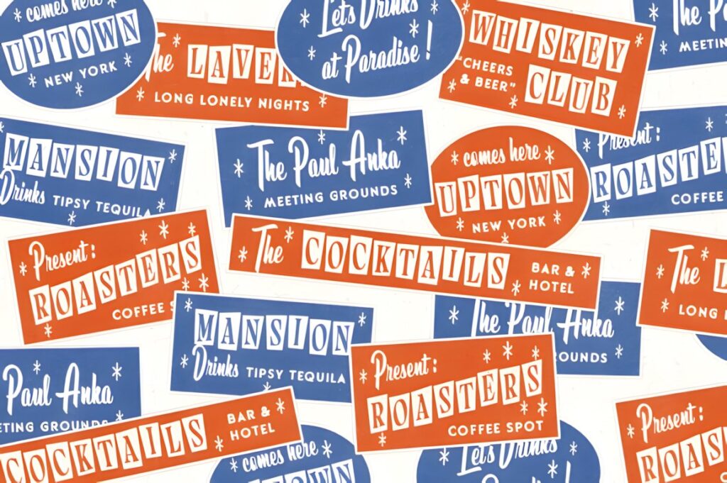
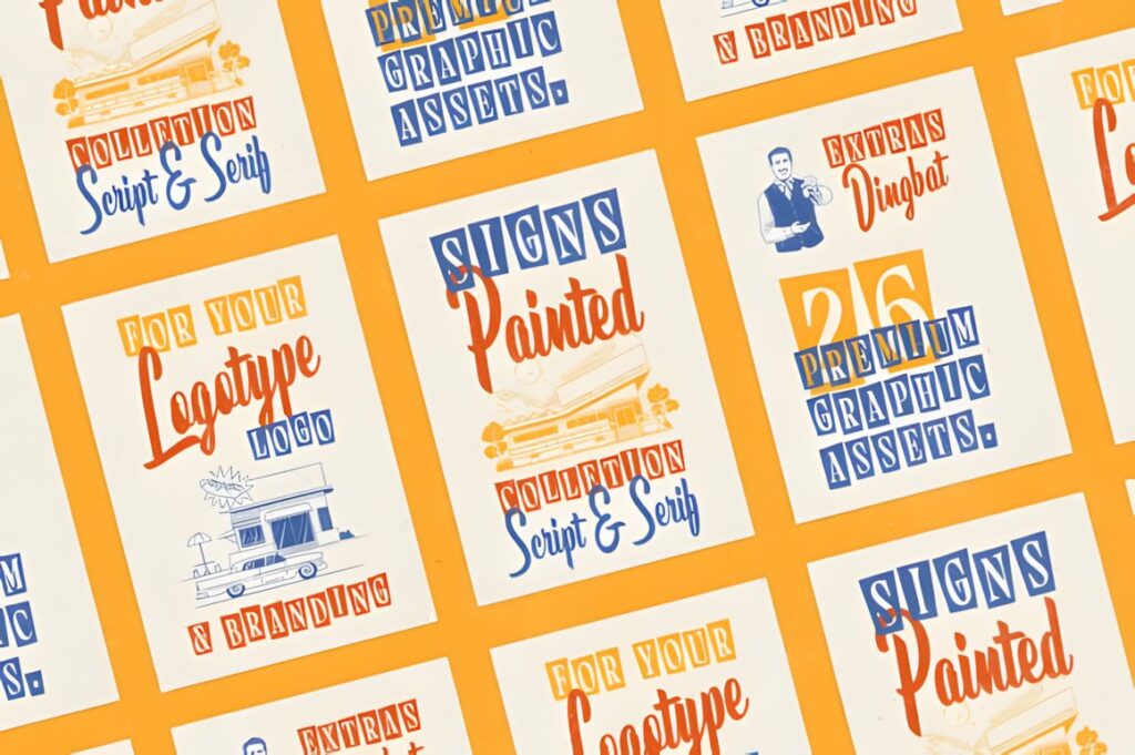
Signs Painted combines a script with a serif companion and deliberately references vintage restaurant, hotel, and hand-lettered sign aesthetics. That built-in contrast gives a storefront designer an easy way to separate the business name from descriptors such as “Bakery,” “Coffee,” or “Established 1985.” The package also includes themed illustrations. :chatgpt-content-reference{index=”1″}
Choose it when the sign needs a complete old-storefront identity rather than a single isolated word. If the brand needs a cleaner, more restrained exterior, a standalone script such as Rathern will create less visual activity.
3. Lebold Sign
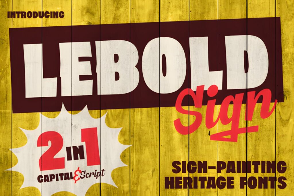
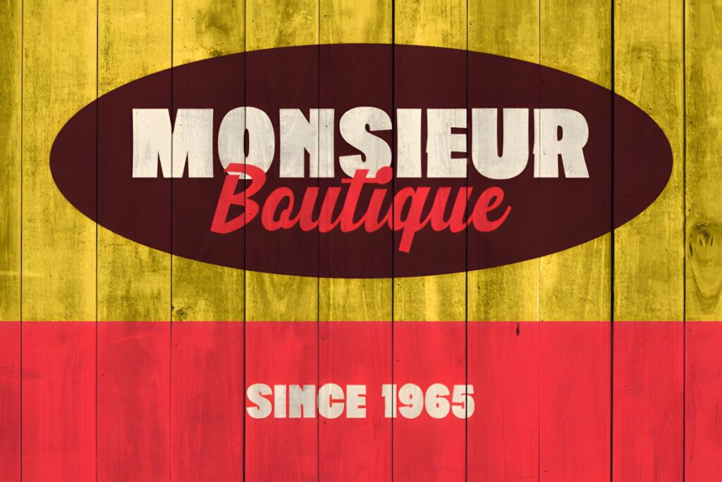
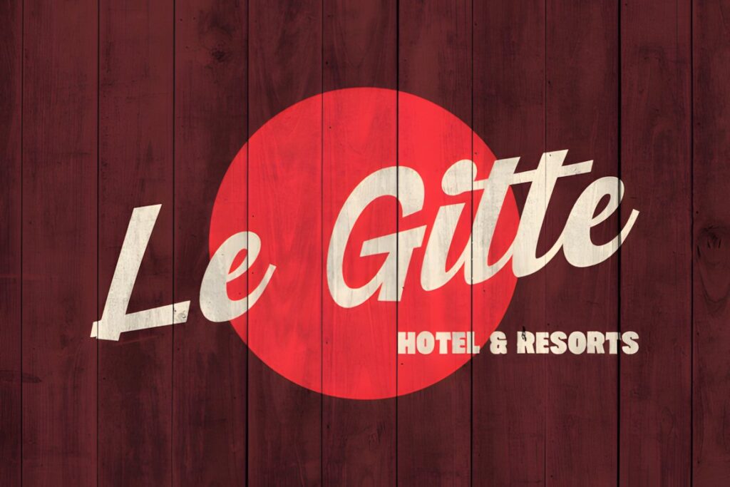
Lebold Sign is a two-font family inspired by hand-painted storefronts, motel signs, posters, and advertising from the 1960s and 1970s. It pairs a bold sans serif with a flowing script, which makes it particularly useful when a storefront needs both personality and highly legible supporting information. :chatgpt-content-reference{index=”2″}
The script can carry the memorable brand word while the heavier companion face handles a category or secondary line. That makes Lebold Sign more flexible for multi-line signs than a highly decorative calligraphy font used on its own.
4. Rathern Vintage Script
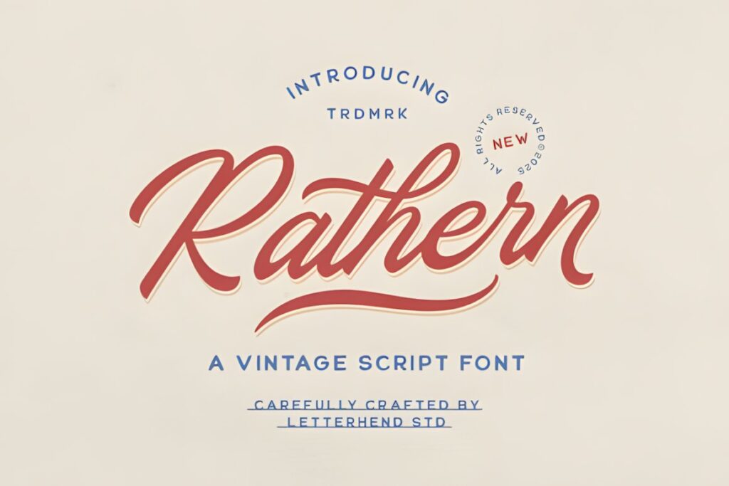
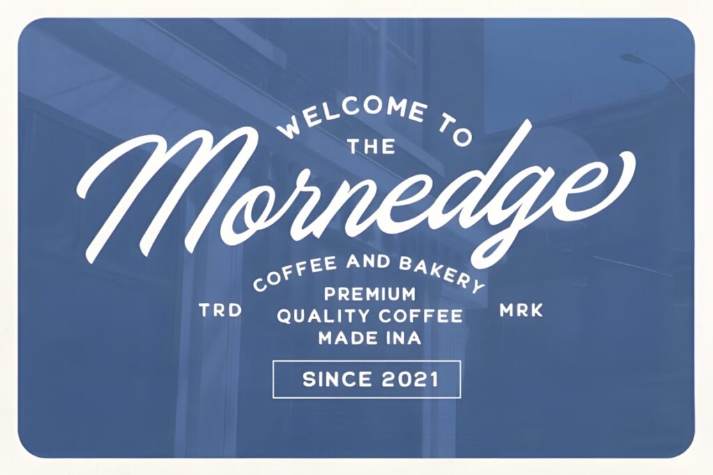
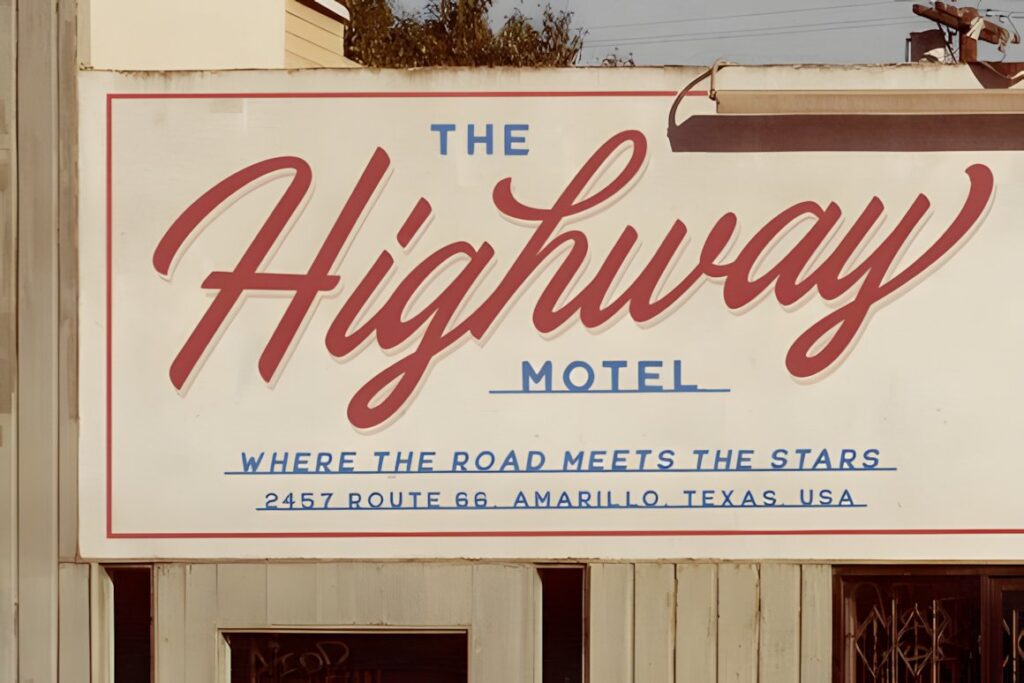
Rathern uses bold curves and smooth connected lettering influenced by the golden era of sign painting. Its vintage character is noticeable without making every letter excessively ornate, which suits restaurant names, specialty retailers, packaged-goods shops, and heritage branding. The product lists uppercase and lowercase letters, numbers, punctuation, alternates, ligatures, multilingual support, and PUA encoding. :chatgpt-content-reference{index=”3″}
This is a useful middle ground when Cowtail Brush feels too handcrafted and a more formal calligraphic style feels too delicate. Keep the most elaborate alternates for large initial or final letters where they have room to breathe.
5. Core Rush
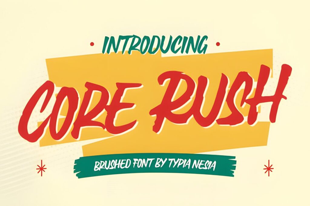
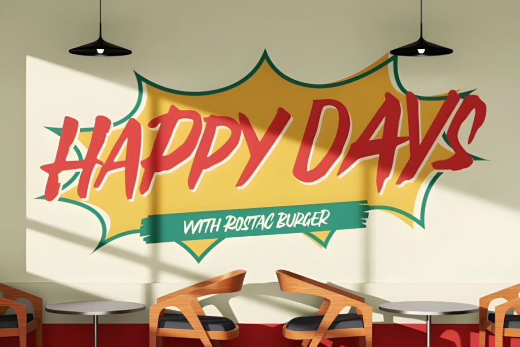
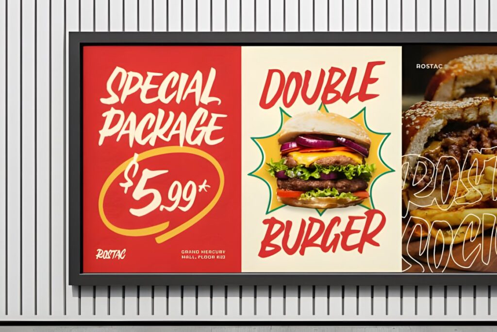
Core Rush is a bold retro brush script influenced by sign painting and classic advertising. Its heavier, energetic strokes were designed for logos, food branding, café identities, bodega branding, grocery-market signage, packaging, and promotional display work, so the aesthetic translates naturally to neighborhood storefronts. :chatgpt-content-reference{index=”4″}
Its strong personality fits short names and casual businesses especially well. A luxury boutique or delicate beauty brand may benefit from a calmer script, while Core Rush makes sense when the sign should feel warm, handmade, and immediately noticeable.
6. Wonderful Vintages
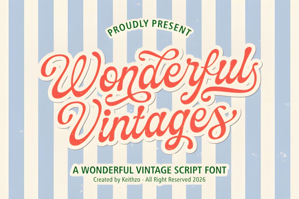
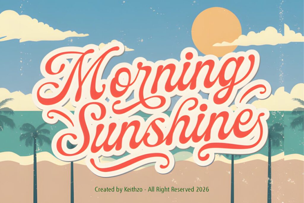
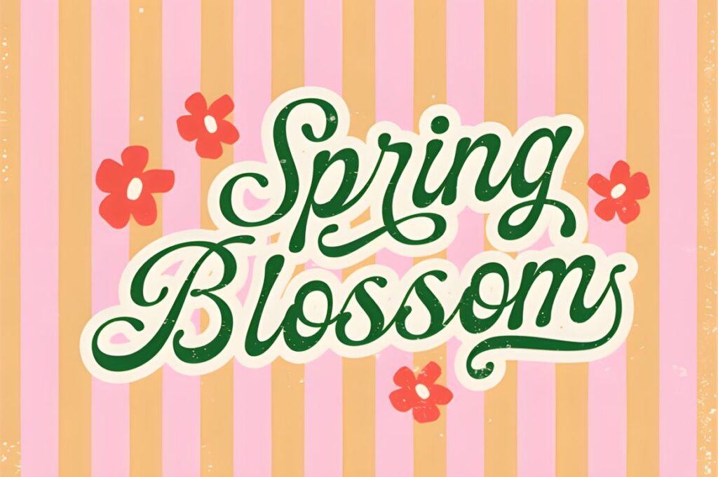
Wonderful Vintages draws on 1950s and 1960s signage, mixing hand-lettered curves with a polished retro-script rhythm. The listed character set covers uppercase, lowercase, numerals, and symbols, with multilingual support also noted on the product page. :chatgpt-content-reference{index=”5″}
The result suits storefronts that need nostalgia without the roughness of a dry-brush font. Consider it for cafés, boutiques, confectionery brands, salons, or traditional specialty shops. Very long names should still be tested at the final sign width because flowing scripts consume horizontal space quickly.
7. Winter Sign
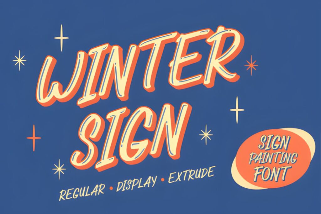
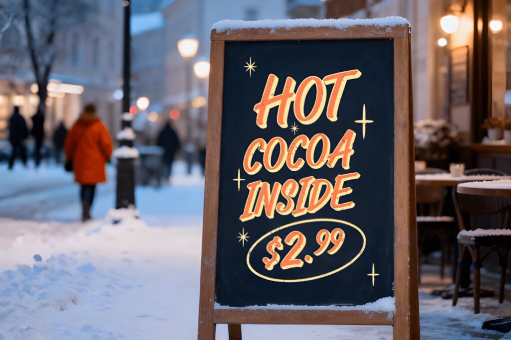
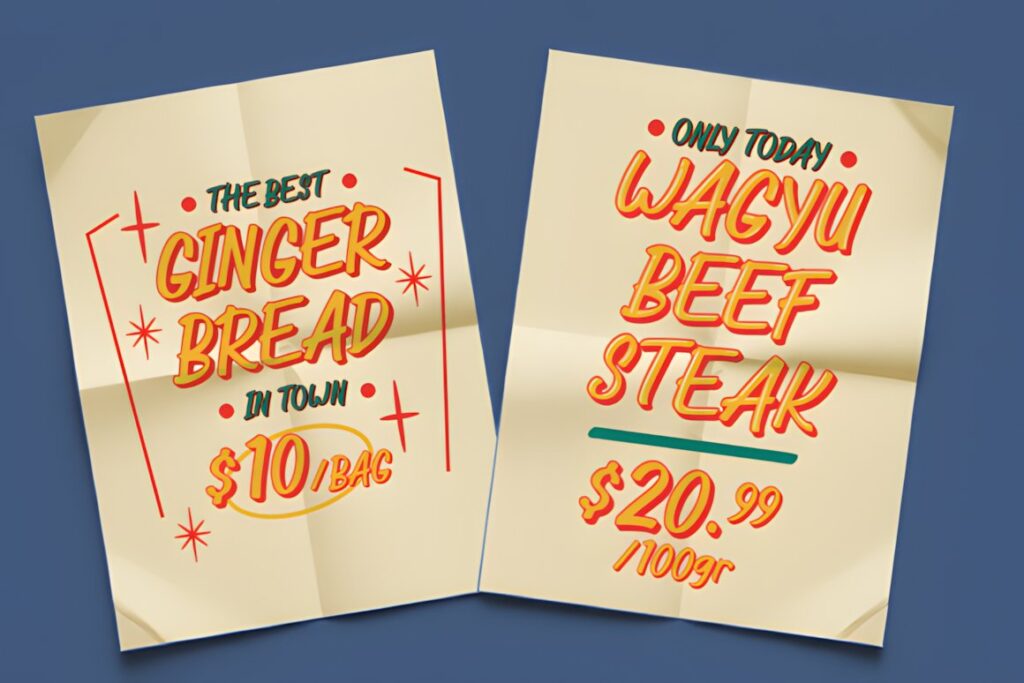
Winter Sign was created around vintage sign painting and specifically references hand-painted American storefront lettering. Its flowing italic construction comes in Regular, Display, and Extrude variations, providing options for simple lettering or more dimensional retro treatments. The product description also lists storefront signage and café menus among its intended uses. :chatgpt-content-reference{index=”6″}
Those variations are useful when the same identity has to move between a main exterior sign, window lettering, and promotional graphics. Keep layered effects large enough that outlines and shadows remain visually distinct rather than collapsing together.
8. Firstone
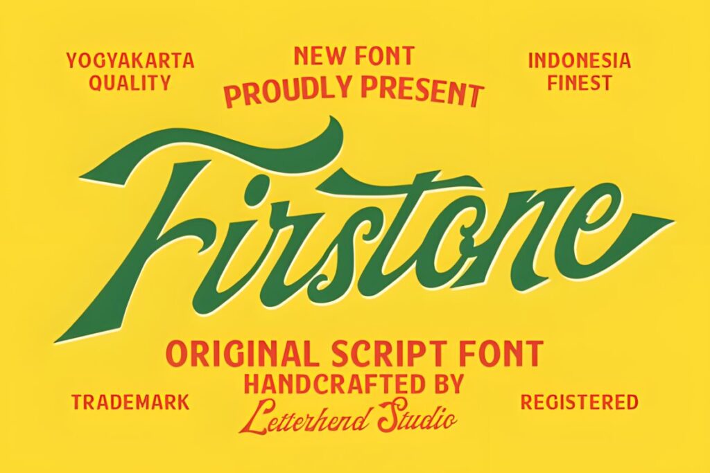
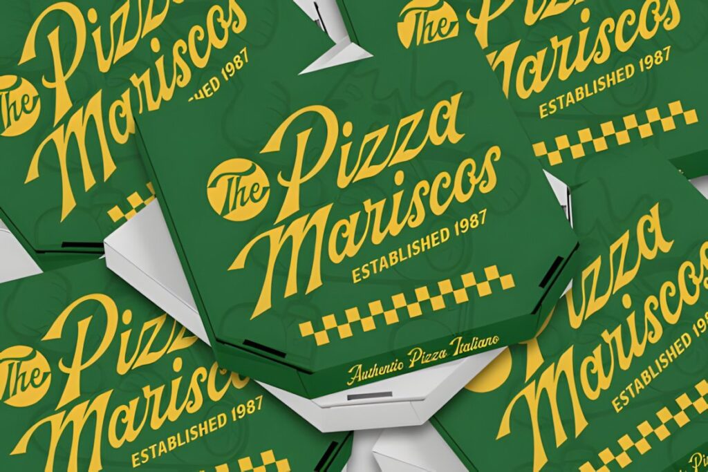
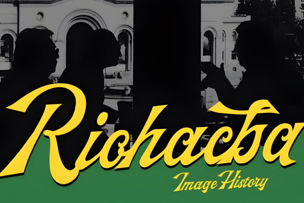
Firstone is a bold retro script rooted in mid-century sign painting and ballpark lettering. Connected strokes, chunky downstrokes, tapered returns, prominent capitals, and a strong rightward slant give it considerably more movement than a restrained calligraphy face. :chatgpt-content-reference{index=”7″}
It makes sense for energetic businesses such as barbershops, casual restaurants, apparel stores, sporting-goods brands, or automotive-inspired retail. The athletic character may be less appropriate for quiet luxury branding, but it gives short storefront names substantial visual presence.
9. Vintage King
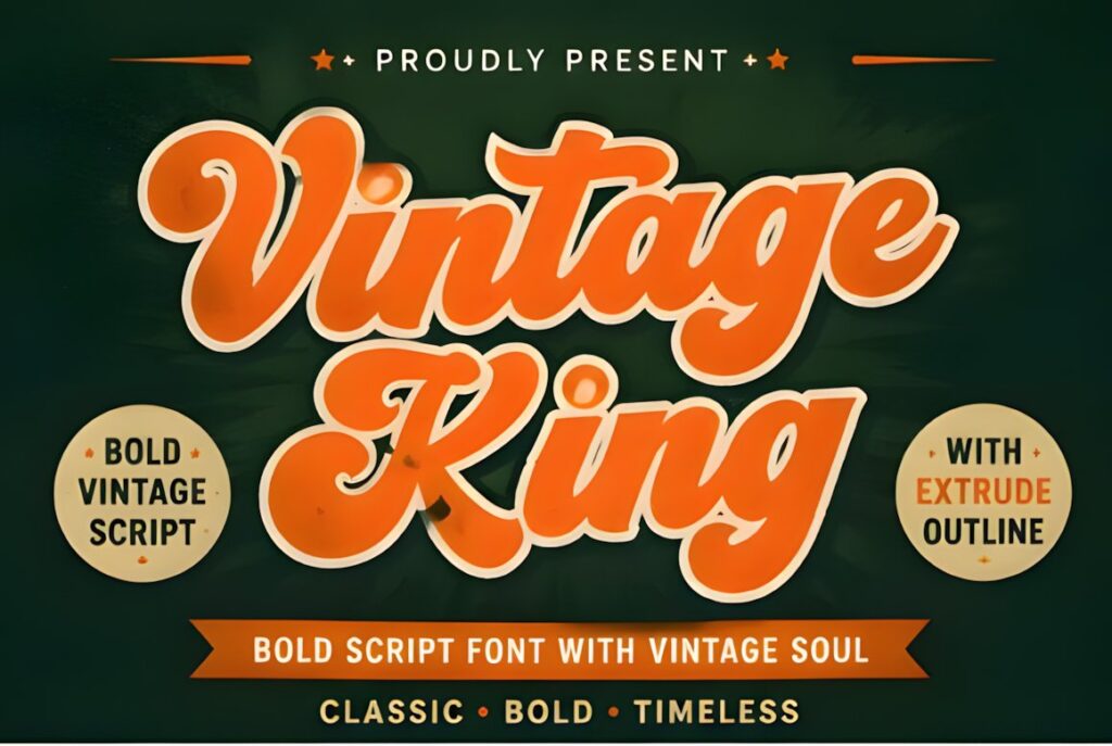
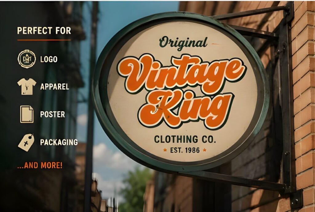
Vintage King is a bold script influenced by traditional sign painting, old advertisements, and handcrafted lettering. Thick connected strokes and prominent swashes give words a classic display quality, while the product presentation also demonstrates outline, extrusion, shadow, and layered styling possibilities. :chatgpt-content-reference{index=”8″}
This makes Vintage King appealing when the storefront should look more like a deliberately constructed vintage sign than simple handwriting. Use restraint with the longest swashes on narrow fascia boards, where decorative extensions can consume valuable spacing.
10. Signature Creation
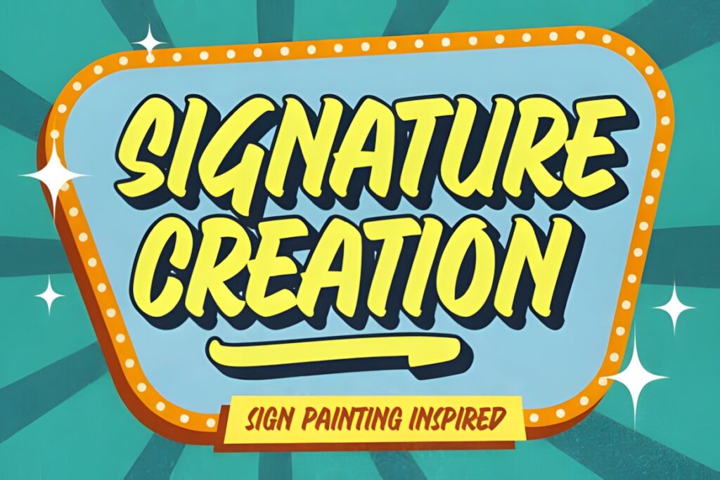
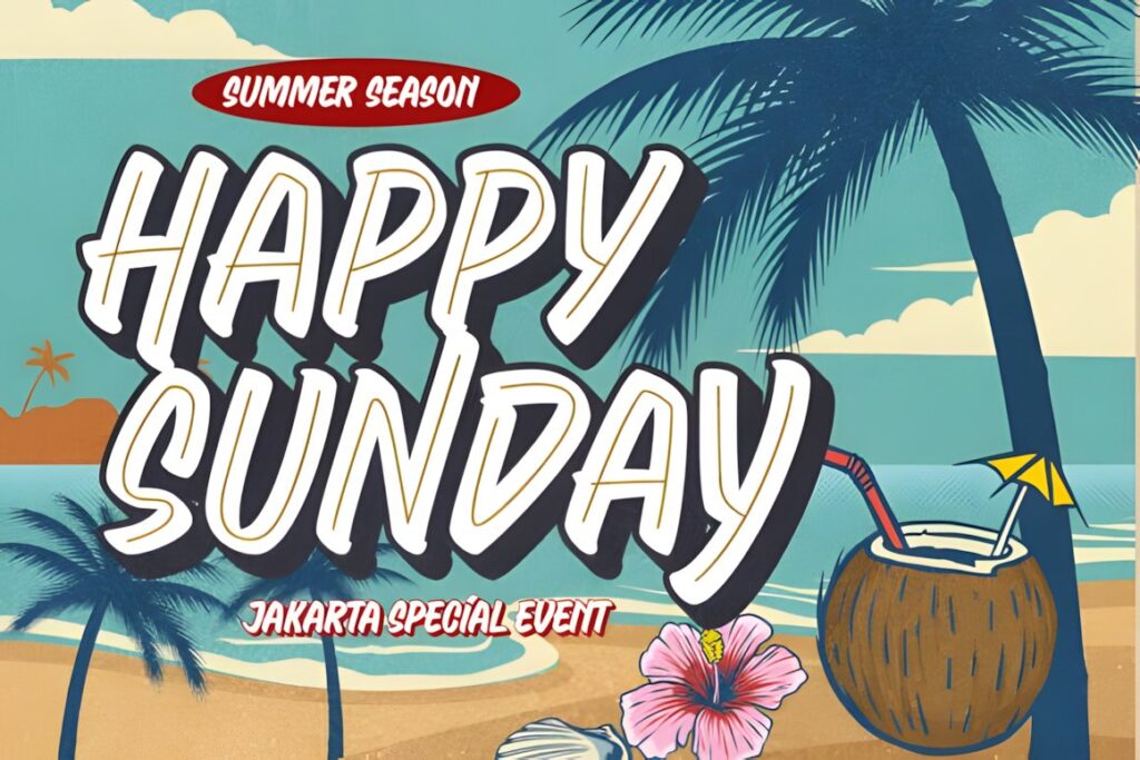
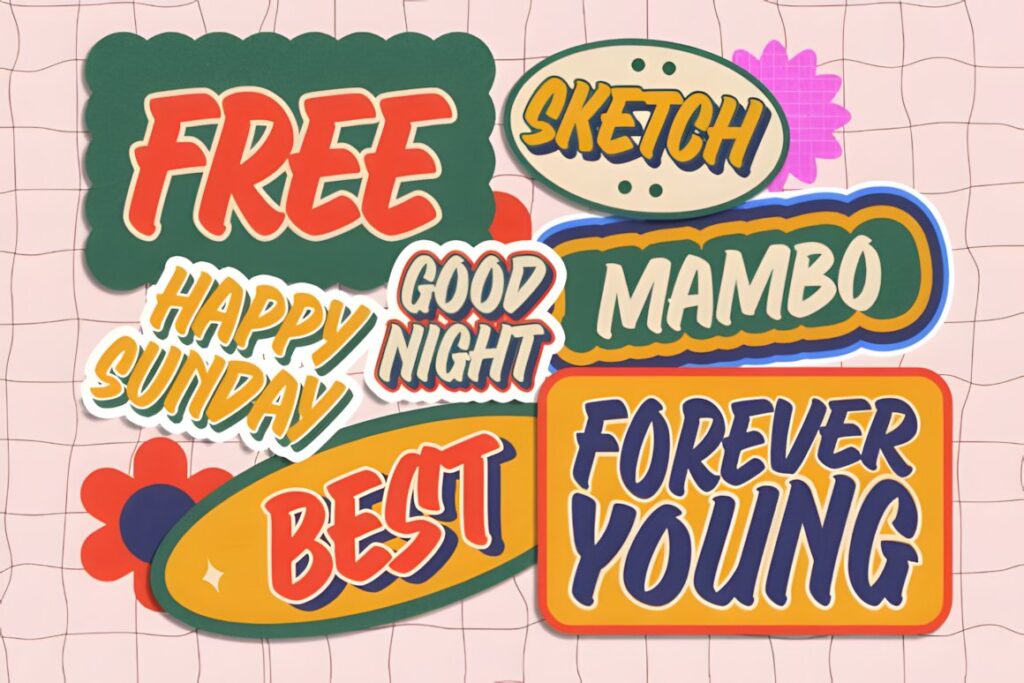
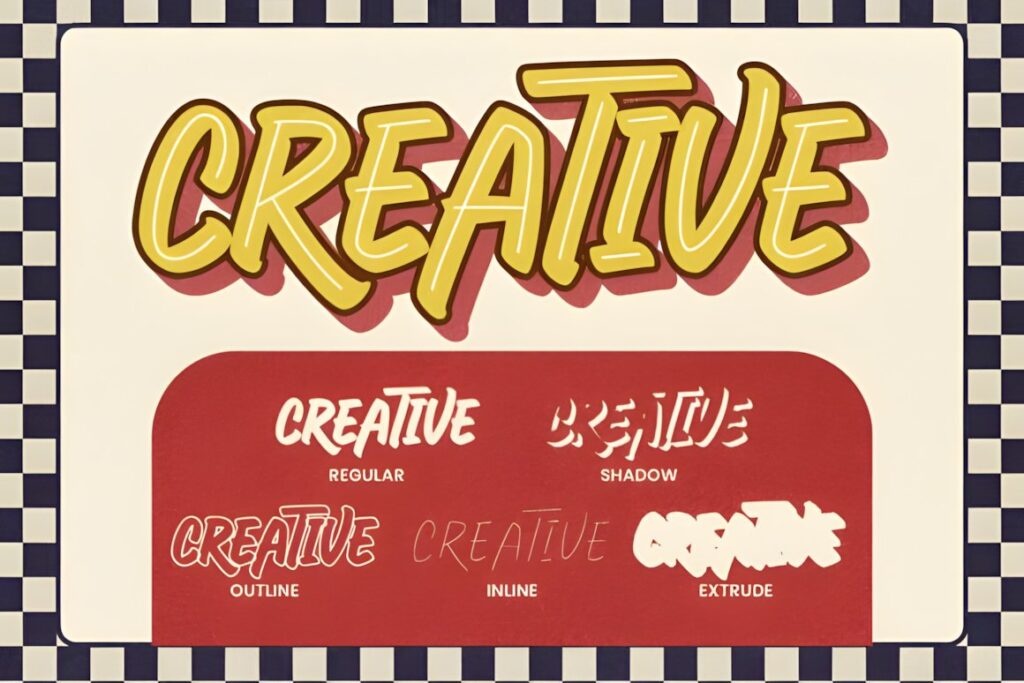
Signature Creation is a nostalgic display font based on vintage sign painting and supplied in five coordinated styles: Regular, Inline, Shadow, Outline, and Extrude. The layers can interact to produce the dimensional effects frequently associated with painted windows, retro badges, and traditional commercial signage. :chatgpt-content-reference{index=”9″}
Choose it when dimensional treatment is part of the storefront concept rather than an afterthought. A flat, minimal identity does not need all five styles, but a restaurant, workshop, pub, or heritage retailer can use the system to build a much stronger period look.
11. Molly Beats
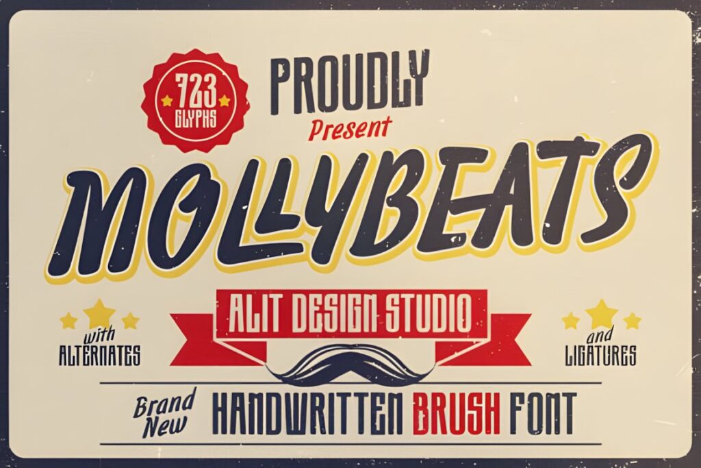
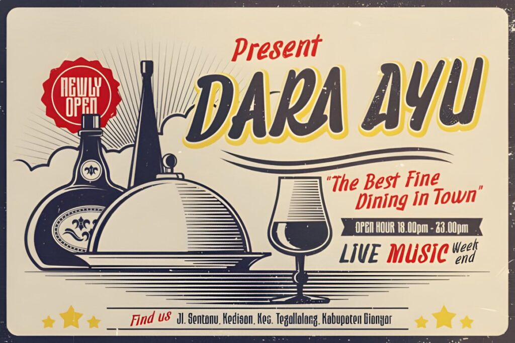
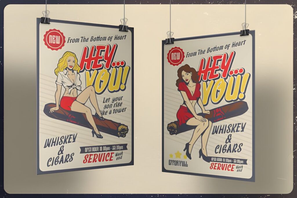
Molly Beats is a retro handwritten script whose smooth brush strokes reference mid-century signage and classic sign painting. Its less formal rhythm gives shop names a relaxed personality without moving completely into distressed or rough lettering. :chatgpt-content-reference{index=”10″}
That balance works for vintage clothing shops, record stores, casual cafés, barbers, and lifestyle retailers. For a traditional luxury storefront, Rathern or a more restrained calligraphic option may communicate refinement more effectively.
12. Script Retro
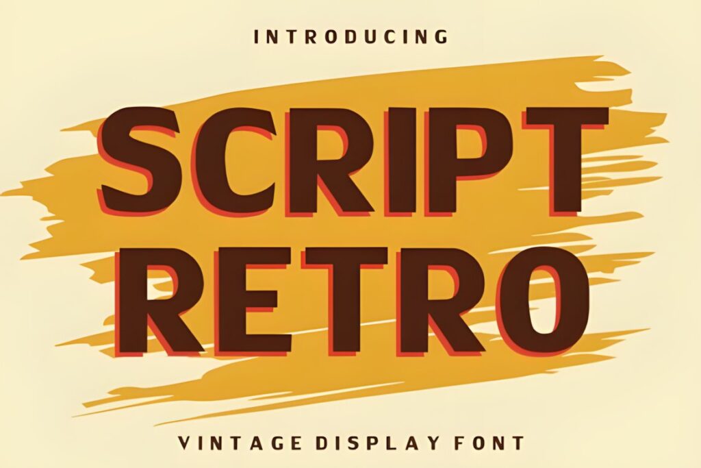
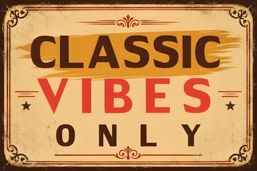
Script Retro is a bold vintage display font inspired by retro signage and nostalgic advertising. Its strong forms and playful curves are intended for short, attention-led applications such as logos, headlines, packaging, posters, and branded display work. :chatgpt-content-reference{index=”11″}
On a storefront, that visual weight is useful when the business name needs to remain prominent amid window graphics or a busy streetscape. It is less suited to dense informational copy, so reserve the expressive lettering for the name or a short identifying phrase.
13. Belvona Vintage
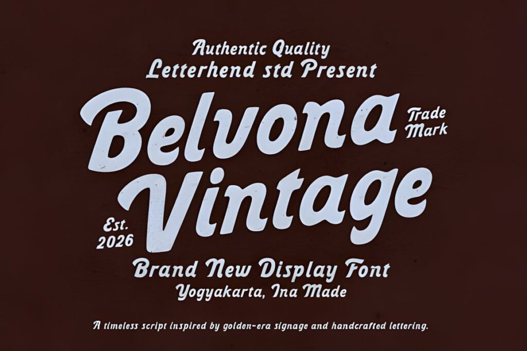
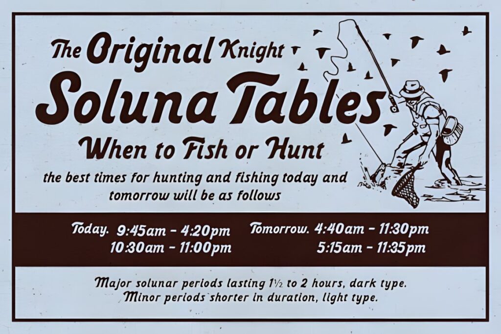
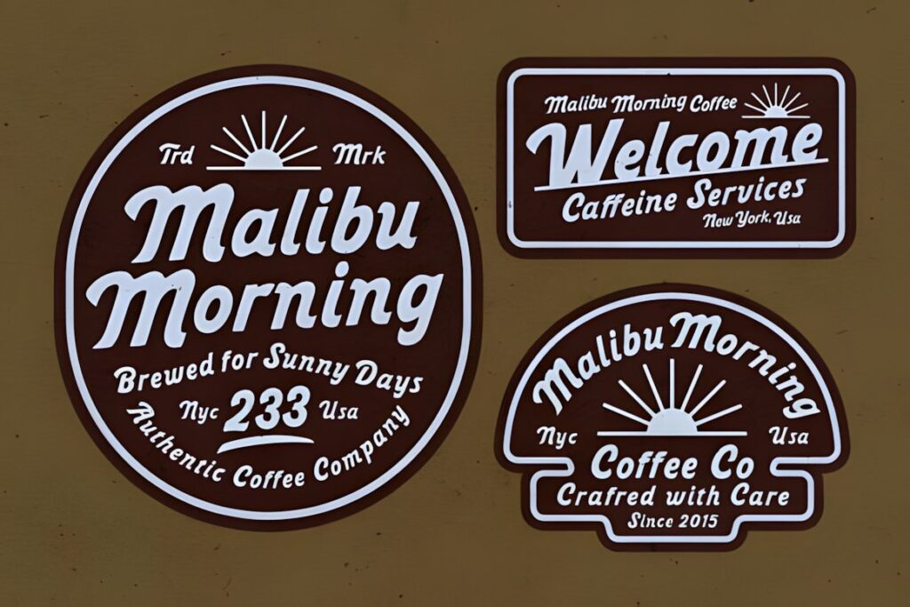
Belvona Vintage takes direct inspiration from classic signage and old storefront lettering. Its nostalgic, handcrafted character was developed with uses such as steakhouse signs, heritage logos, café identities, and retro posters in mind. :chatgpt-content-reference{index=”12″}
The style is particularly convincing for businesses whose physical space already contains wood, painted panels, traditional awnings, or other heritage details. In a highly minimalist modern storefront, the same nostalgia will become a dominant brand statement rather than a subtle accent.
14. Signage Heritage
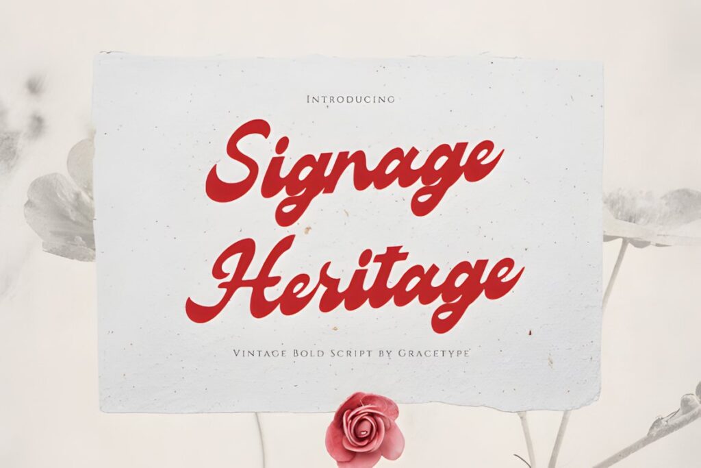
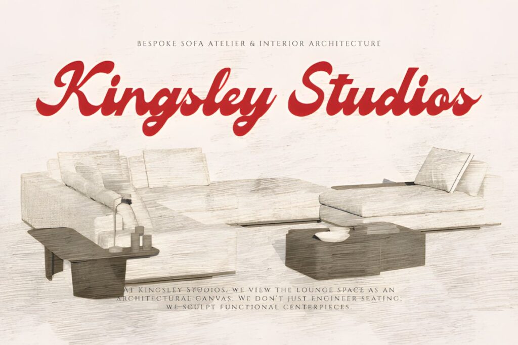
Signage Heritage is a vintage bold script supplied with standard glyphs, alternates, and ligatures in OTF and TTF formats. Its heavier script construction makes it useful for logos, labels, packaging, posters, and brand-led display typography where decorative lettering still needs visual substance. :chatgpt-content-reference{index=”13″}
For storefront use, the boldness is the main advantage: it can give a short boutique or food-business name more presence than a thin signature font. Avoid filling every letter with an alternate or ligature; a few distinctive substitutions usually preserve readability better.
15. Youngboy
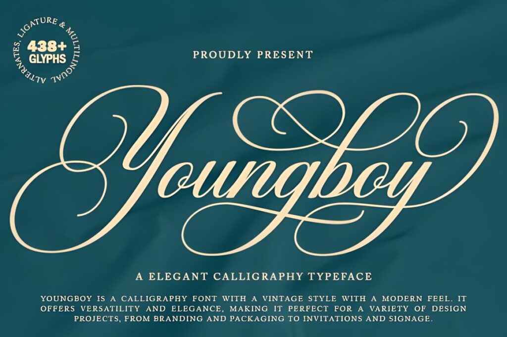
Youngboy is a vintage-style calligraphy font with decorative script influences and connected lettering. The product is positioned for branding, packaging, restaurant menus, labels, logos, advertising, and signage, making it useful when a storefront should lean toward classic elegance rather than rugged sign-painter texture. :chatgpt-content-reference{index=”14″}
Its more polished personality suits salons, boutiques, bakeries, fashion businesses, and specialty retailers. Because decorative connections can make a long wordmark visually dense, test the full business name rather than judging the font from individual alphabet characters.
16. Strimbey
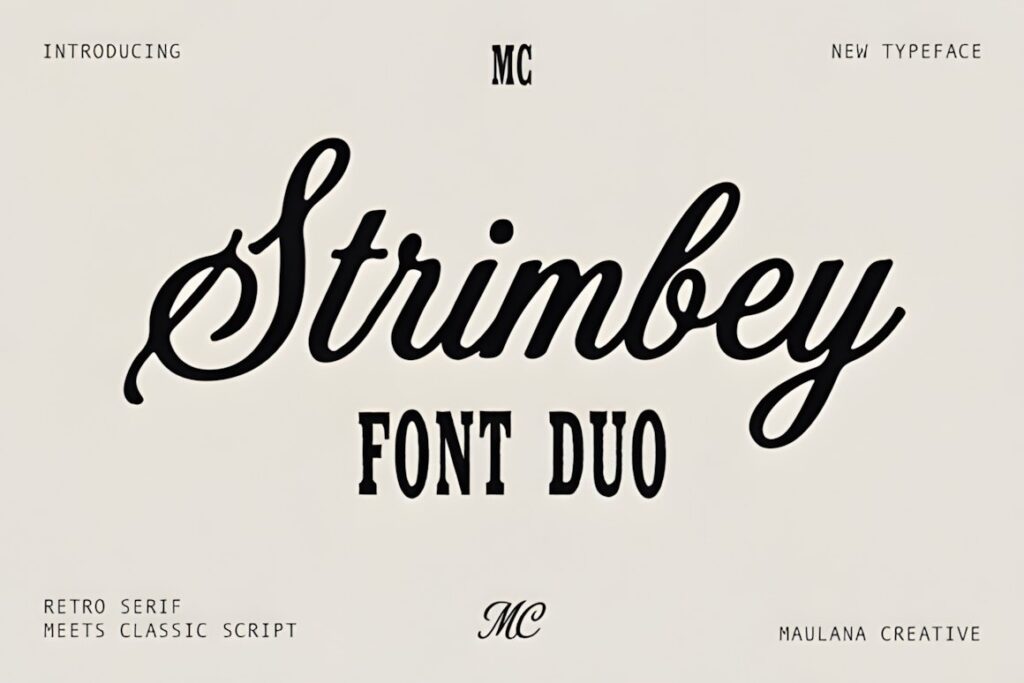
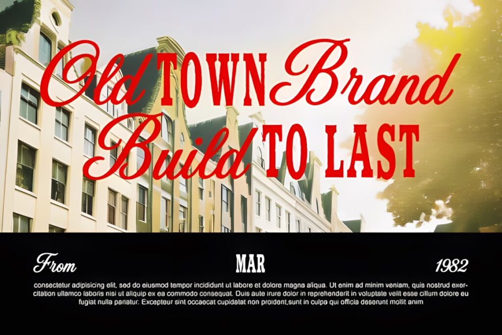
Strimbey combines strong condensed letterforms with smoother cursive calligraphy, giving a designer two contrasting typographic voices inside one package. The combination was developed for branding, logos, packaging, signage, labels, posters, and other display compositions. :chatgpt-content-reference{index=”15″}
It is especially useful when a long shop name makes an expansive script impractical. The condensed component can organize secondary wording while the cursive face provides the vintage signature. This creates clearer hierarchy without introducing an unrelated type family.
17. Vintage
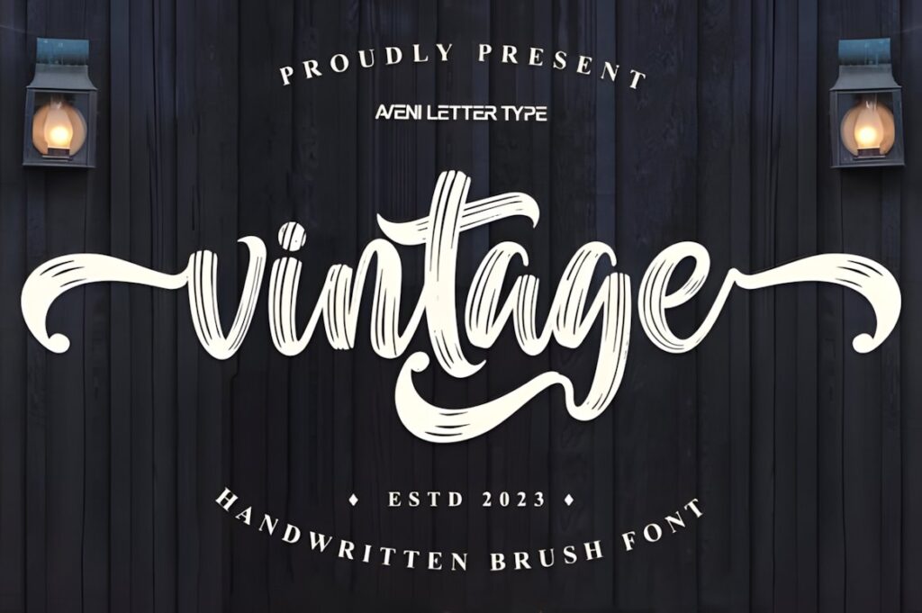
Vintage by Aveni Letter Type is a brush script with rough edges and natural irregularities designed to create a handmade, aged character. The texture distinguishes it from the smoother sign-painter fonts in this roundup and makes it a useful choice for rustic retail identities, handmade goods, food packaging, and casual storefront graphics. :chatgpt-content-reference{index=”16″}
The roughness is part of the personality, so it makes less sense when the business requires polished luxury lettering. Use it where visible imperfection reinforces the brand rather than appearing accidental.
18. Retro Script
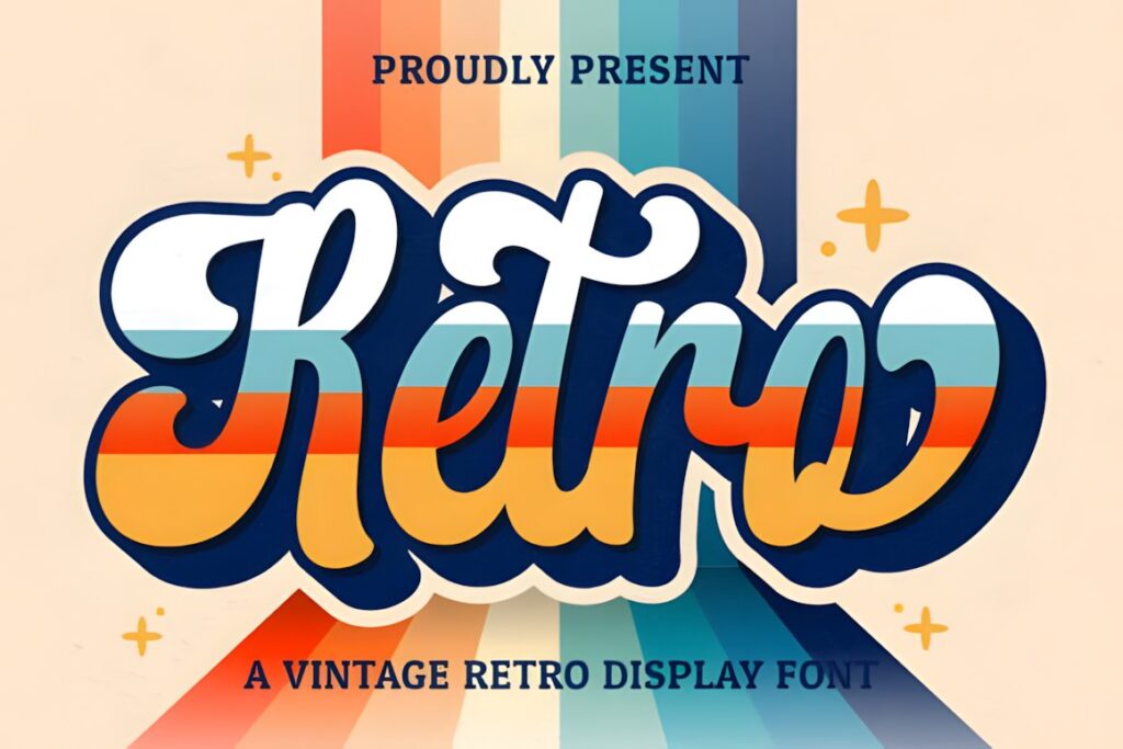
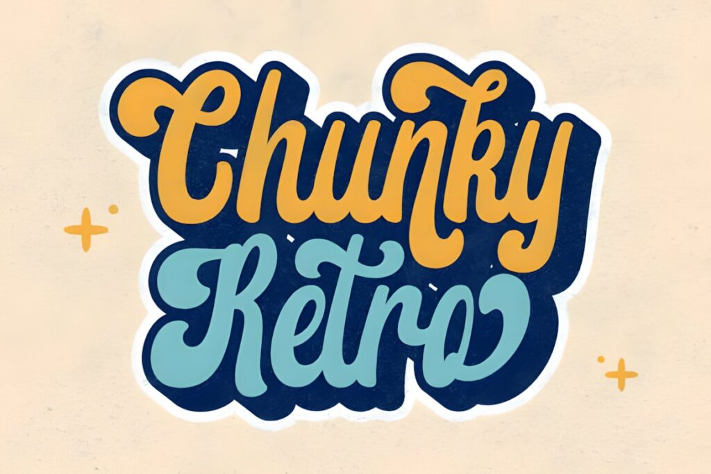
Retro Script by Hoperative Design is a vintage-style handwritten font with a strong retro personality. Its popularity signals are also comparatively established on the current product page, but the more important storefront advantage is its straightforward handwritten display character rather than intricate formal calligraphy. :chatgpt-content-reference{index=”17″}
Consider it for casual shops, cafés, vintage merchandise, lifestyle brands, and window lettering where an approachable handwritten impression matters. For a more explicitly sign-painted aesthetic with dimensional options, Winter Sign or Signature Creation offers a stronger period-specific direction.
19. Vintage Script
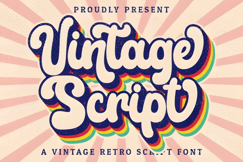
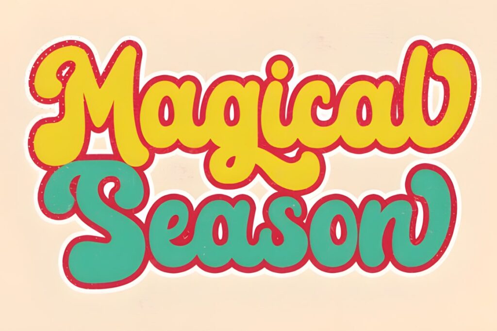
Vintage Script by Hoperative Design is a handwritten retro font with accessible swashes and glyph variations through PUA encoding. Its softer character works well when a storefront needs nostalgia without the visual weight of a chunky brush script. :chatgpt-content-reference{index=”18″}
This makes it a useful choice for boutiques, gift shops, bakeries, salons, or smaller specialty businesses where the sign can be viewed relatively close. For large roadside or high-mounted lettering, one of the heavier sign-painter options may retain its shape more confidently.
Quick Comparison by Storefront Need
| Font | Best for | Style | Key visual trait | Project fit |
|---|---|---|---|---|
| Cowtail Brush | Traditional shop lettering | Brush script | Organic painted strokes | Cafés, barbers, restaurants |
| Lebold Sign | Multi-line storefronts | Script + sans | Built-in contrast | Motels, cafés, retail |
| Core Rush | Food and neighborhood shops | Bold brush script | Chunky energetic rhythm | Bodegas, groceries, cafés |
| Rathern Vintage Script | Refined retro identity | Vintage script | Smooth bold curves | Restaurants, boutiques |
| Winter Sign | Dimensional sign effects | Sign-painter script | Multiple coordinated styles | Storefronts, cafés |
| Firstone | Energetic branding | Bold retro script | Strong slant and swashes | Barbers, apparel, sports |
| Signature Creation | Layered painted signs | Display script | Inline, shadow and extrude styles | Restaurants, pubs, workshops |
| Youngboy | Elegant shop names | Calligraphy script | Decorative connected forms | Boutiques, salons, bakeries |
| Vintage | Rustic handmade branding | Brush script | Rough natural edges | Craft and specialty shops |
Readability and Viewing Distance
Judge a storefront font using the complete business name, not an alphabet specimen. Individual capitals may look clear at large preview sizes even when several connected lowercase letters become difficult to distinguish inside a real word.
For a sign seen from farther away, favor substantial strokes, recognizable counters, and a silhouette that remains understandable when details disappear. Cowtail Brush, Core Rush, Vintage King, Firstone, and other heavier scripts naturally put more visual material into each letter. Delicate scripts become more practical on door glass, window graphics, reception signs, or storefronts where pedestrians encounter the lettering from close range.
Also test the lettering at the physical proportions of the sign. A wide preview on a monitor can disguise how quickly an italic script runs out of horizontal room on a narrow fascia.
Swashes, Ligatures, and Decorative Capitals
Alternates and swashes are most effective when they solve a composition problem. An extended opening capital can fill unused space at the left edge of a sign, while a terminal flourish can visually close a short word. Ligatures can also make certain awkward letter pairs flow more naturally.
The mistake is treating every available alternate as something that must appear. Too many flourishes blur the word shape and make the storefront resemble a lettering demonstration rather than a business identifier. Build the readable version first, then introduce one or two decorative substitutions and compare the result from a distance.
Leave sufficient clearance around long tails and underlines as well. A swash that looks balanced by itself can collide with an awning edge, icon, window frame, or secondary line once the entire sign is assembled.
Pairing a Calligraphy Storefront Name With Supporting Type
Give the decorative font one clear job: identifying the business. Supporting information such as “Coffee & Bakery,” “Fine Goods,” opening dates, addresses, or service categories normally benefits from a simpler serif or sans serif.
The contrast should be functional rather than decorative for its own sake. A flowing script already provides movement, so the secondary typeface can be quieter, more compact, and easier to scan. Lebold Sign and Strimbey are particularly interesting when you prefer a coordinated package that already contains contrasting typographic roles. :chatgpt-content-reference{index=”19″}
Avoid placing two expressive scripts together. Competing slants, swashes, and stroke rhythms make the hierarchy harder to understand and weaken the main business name.
Common Storefront Font Selection Mistakes
- Choosing from one decorative capital. Test every letter in the actual business name because repeated connections can change readability dramatically.
- Ignoring sign width. Wide italic scripts can force a long business name to become too small.
- Using swashes everywhere. Keep decorative forms away from borders, icons, and secondary copy.
- Setting all information in script. Opening hours and business descriptors usually need simpler supporting typography.
- Designing only at screen size. Review a reduced version for distance readability and a full-scale section for stroke and spacing balance.
- Assuming the license covers every intended use. Check the current product license for the exact storefront, client, merchandise, or other commercial application you plan.
Choosing the Right Vintage Style for Your Storefront
If the goal is an unmistakable traditional sign-painter appearance, Cowtail Brush or Rathern Vintage Script gives the business name flowing handcrafted character. For a bold neighborhood café, grocery, or food shop, Core Rush brings more weight and casual energy.
Choose Signature Creation or Winter Sign when layered outlines, shadows, and dimensional lettering are central to the retro treatment. If the sign needs multiple text levels, Lebold Sign or Strimbey provides contrasting styles that can simplify hierarchy.
For an elegant boutique, salon, bakery, or specialty retailer, Youngboy moves closer to classic calligraphy. The deciding test should still be the finished business name at the intended sign proportions: the font that preserves a recognizable word shape while delivering the right personality will usually serve the storefront better than the option with the most ornament.
Frequently Asked Questions
What type of vintage calligraphy font works best for storefront signage?
A bold or moderately weighted vintage script usually works most effectively for storefront signage because the main business name needs a recognizable silhouette at a practical viewing distance. Sign-painter and brush styles suit casual or heritage businesses, while smoother calligraphy works well for boutiques and salons. Always test the complete business name at the intended sign width rather than choosing from an alphabet preview alone.
Are thin calligraphy fonts suitable for exterior shop signs?
Thin calligraphy fonts can work on exterior shop signs when the lettering is sufficiently large and customers view it from relatively close range. Fine hairlines become less prominent as viewing distance increases, so heavier scripts are generally easier to preserve visually on small fascia signs or busy streets. Thin lettering often makes more sense for window graphics, door signs, and other close-view applications.
How many swashes should a storefront logo use?
A storefront logo usually benefits from using swashes selectively rather than decorating every available letter. One distinctive opening capital, terminal flourish, or underline can establish a vintage sign-painter character without obscuring the business name. Build a plain readable version first, then add decorative alternates individually and check that they do not collide with borders, icons, secondary wording, or architectural elements.
Can vintage calligraphy fonts be used for business signage?
Vintage calligraphy fonts can be used for business signage when the chosen font suits the required readability, layout, and brand personality. Licensing is a separate consideration from visual suitability, so check the current license associated with the individual font before using it for client work, physical business signage, merchandise, or other commercial applications. License terms can differ by product and intended use.
:chatgpt-content-reference{index=”20″}