ℹ️ Affiliate Disclosure: This article may contain affiliate links. If you book or purchase through these links, we may earn a commission at no additional cost to you.
Choosing the Right Vintage Calligraphy Fonts for Boutique Packaging
Vintage calligraphy alphabet fonts can give boutique packaging the handcrafted character that plain type often lacks, but decorative lettering creates a practical problem: the font that looks elegant in a large logo may become crowded on a narrow candle label, cosmetic box, hang tag, or small product sticker. For packaging, the useful differences are not just how ornate a script looks. Letter width, stroke contrast, swash density, spacing, and the length of the brand or product name all affect the finished result.
This selection focuses on vintage and calligraphy-inspired scripts that can fill different packaging roles, from graceful boutique wordmarks to bolder retro labels and highly decorative statement lettering. The goal is to help you separate fonts suited to compact branding from those that make more sense when the lettering has room to breathe.
Many more vintage script fonts are available, while this shortlist concentrates on styles with distinct packaging uses, readable letterforms, and clearly different personalities.

For boutique packaging, flowing scripts such as Vintage Signature and Saideira suit refined brand names, while Vintessia and Moilenka provide stronger retro presence. Highly ornamented choices such as Black Forrest work better for larger focal labels, and duo families such as Fresco Vintage Duo can help build hierarchy when one script alone cannot handle every line of packaging text.
Quick Picks
For refined boutique branding: Vintage Signature — flowing calligraphy with a polished, personalized appearance suited to short premium brand names.
For feminine product packaging: Cheltine — combines vintage script character with a cleaner contemporary rhythm.
For retro labels: Vintessia — uses fuller strokes and a stronger vintage-signage personality that holds attention on packaging fronts.
For strong packaging hierarchy: Fresco Vintage Duo — combines script and bold sans styles so display lettering and supporting typography can work together.
For ornate statement packaging: Black Forrest — a much more decorative option for larger labels, gift boxes, and vintage-inspired focal typography.
Vintage Calligraphy Fonts for Boutique Packaging and Labels
1. Vintage Signature
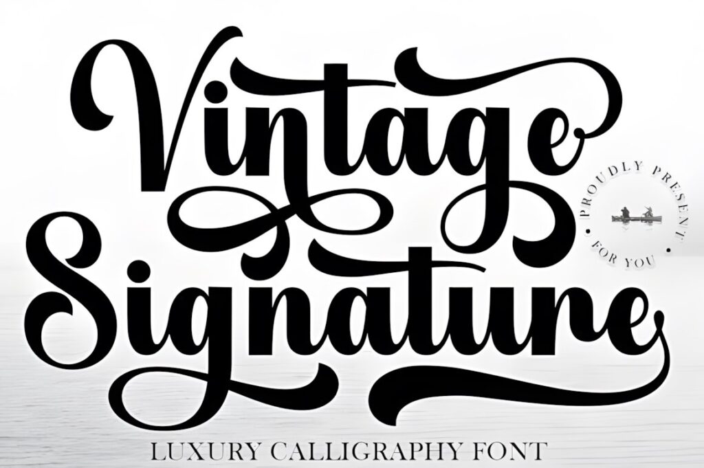
Vintage Signature is a luxury-oriented calligraphy font with sweeping curves and a polished handwritten rhythm, making it well suited to boutique logos, cosmetic packaging, product labels, and other designs where the brand name needs to feel personal rather than typeset.
The graceful strokes work especially well for short names with enough surrounding space. On compact packaging, keep the script focused on the primary wordmark rather than using it for several information levels. Its decorative personality makes more sense for the focal identity than for tiny supporting copy.
2. Youngboy
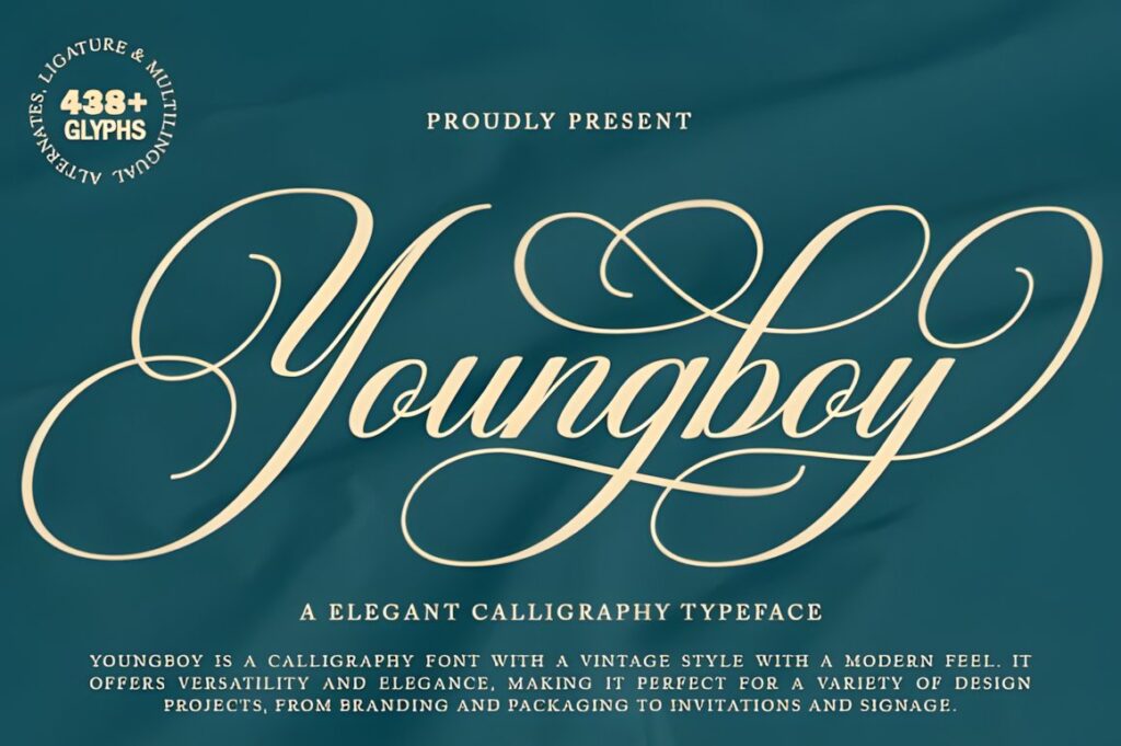
Youngboy is a vintage-style calligraphy font with a classic decorative feel and a smoother modern finish. Its elegant connecting forms make it useful for fashion, beauty, stationery, product labels, and boutique packaging that needs a traditional script presence without looking entirely historical.
This option makes sense when you want a flowing wordmark that still feels structured. The decorative connections can add sophistication to a short product or brand name, but longer wording should be tested carefully so the script does not become too dense after reduction.
3. Vintage Calligraphy
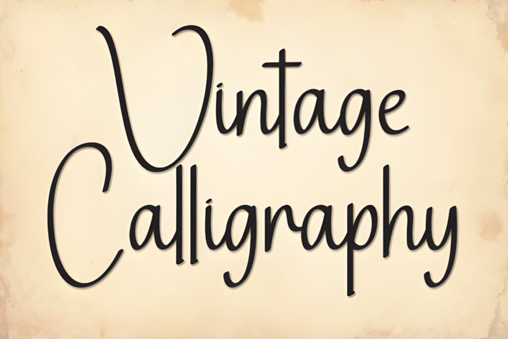
Vintage Calligraphy uses fluid brush-like curves and expressive script forms that fit packaging needing an artistic, hand-lettered character. It can work particularly well for boutique labels, logo lettering, gift packaging, and product fronts where the lettering itself carries much of the personality.
Compared with more formal calligraphy in this list, its movement feels freer and less rigid. Choose it when the brand should appear creative and handcrafted. For very small or information-heavy labels, pair the script with a simpler supporting face rather than forcing the same font into every line.
4. Vintage Script
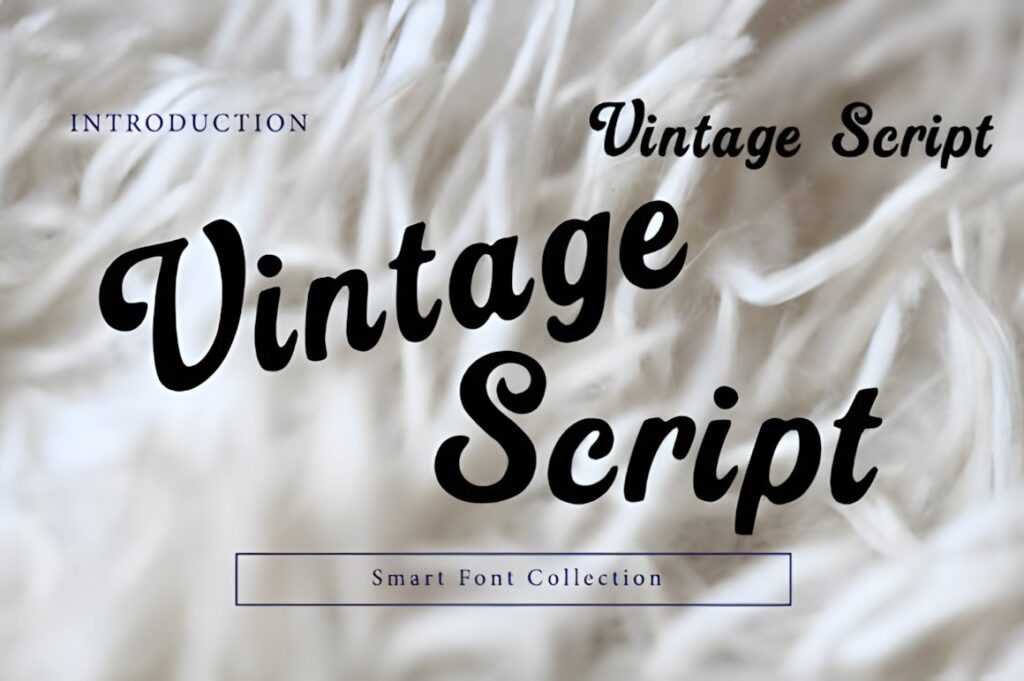
Vintage Script by Wow Magic is a smooth retro handwritten font with rounded strokes and connected lettering. The stronger construction gives it more visual weight than delicate signature scripts, making it a useful choice for handmade-product packaging, café labels, boxes, jars, and nostalgic brand identities.
Its friendly old-school appearance works well when boutique packaging should feel approachable rather than formal. The heavier shapes can remain visually distinct at smaller display sizes, although they may overpower very minimal luxury layouts where a thinner calligraphic option such as Vintage Signature would feel more restrained.
5. Sentiny Lovelyn
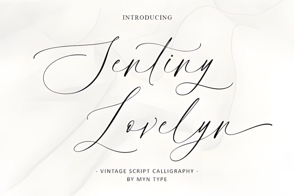
Sentiny Lovelyn is a flowing vintage-inspired script with intricate strokes and a romantic calligraphic character. It suits boutique packaging that needs to communicate softness, tradition, or refined femininity, including candles, beauty products, stationery, and gift-oriented labels.
The flourished appearance gives short names a distinctive signature quality. It is less practical for dense information or very long lines, so use it selectively for the brand or product name and create contrast with simpler typography elsewhere on the package.
6. Cheltine
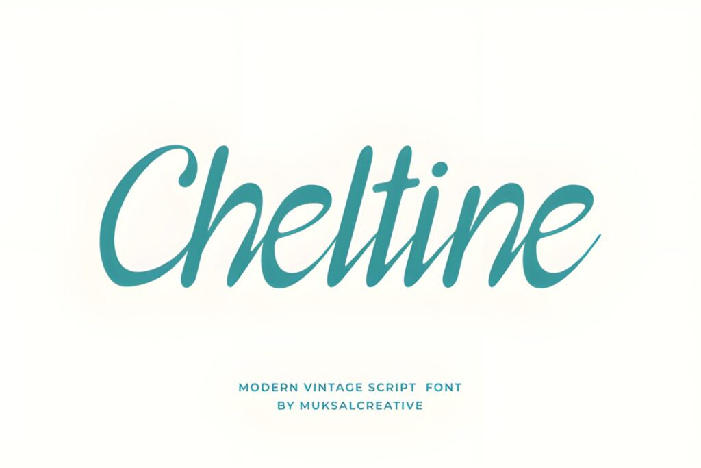
Cheltine combines vintage script structure with a more contemporary feminine finish. Its flowing curves are particularly compatible with beauty, fashion, boutique, and lifestyle packaging where the brand needs vintage warmth without appearing heavily retro.
Consider Cheltine for cosmetic labels, small boxes, swing tags, or boutique wordmarks where graceful lettering should remain the visual focus. Compared with highly ornamental scripts such as Black Forrest, it creates a cleaner result and is easier to integrate into modern packaging systems.
7. Vintessia
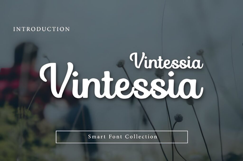
Vintessia is a bold vintage-inspired script with smooth curves and a confident retro-branding character. It works particularly well when packaging needs a visible, recognizable wordmark rather than delicate decorative lettering.
Use it for product labels, café or bakery packaging, boxes, bags, or other boutique goods where a nostalgic identity is part of the concept. Its fuller strokes create stronger visual presence than Sentiny Lovelyn or Aureline-style signature scripts, making it useful when the brand name must compete with illustrations, patterns, or colored packaging.
8. Saideira
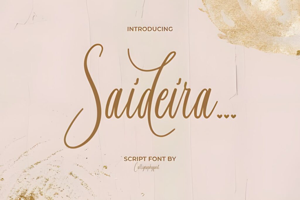
Saideira is an elegant calligraphy-inspired script built around soft flowing strokes, alternate characters, and ligatures. Its refined personality makes it especially relevant for boutique branding, jewelry, cosmetics, florists, skincare, fashion products, and other packaging that needs a graceful handcrafted accent.
The alternates can help a short wordmark feel customized without changing the entire identity system. Use decorative forms selectively, particularly on narrow labels. Too many flourished characters in one word can make small packaging busier than necessary.
9. Vintage Glory
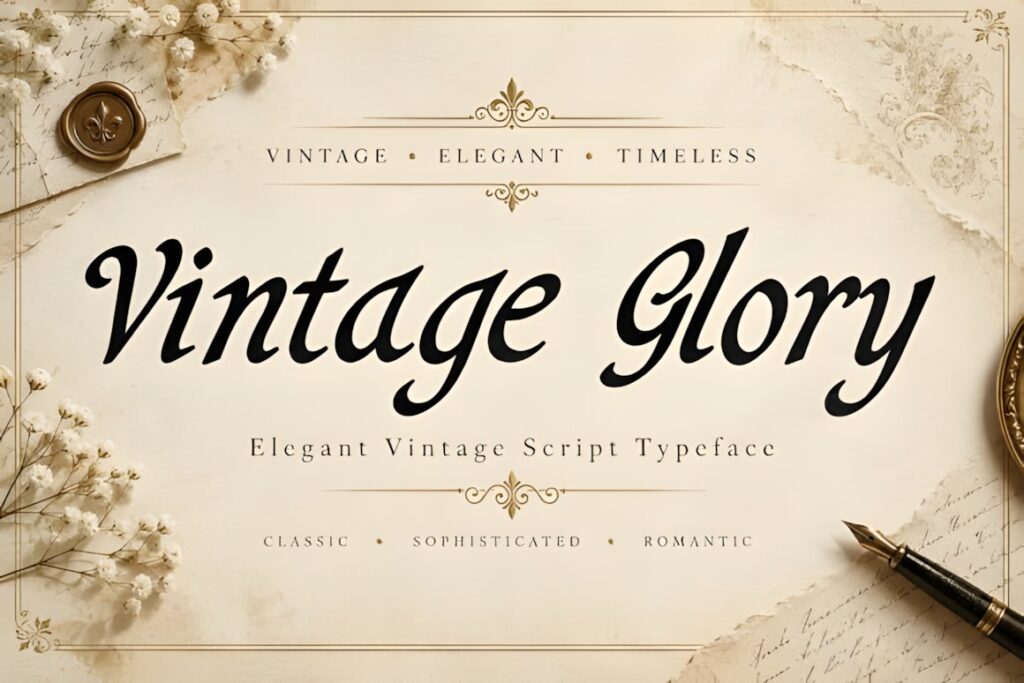
Vintage Glory is an elegant vintage script with pronounced thick-and-thin strokes, graceful curves, and an intentionally classic calligraphic appearance. It fits luxury-oriented boutique packaging, perfume or cosmetic labels, stationery products, and packaging where the main name needs a romantic editorial tone.
The contrast between thin and heavy strokes gives it more formality than rounded retro scripts such as Vintessia. That same contrast means it deserves adequate print size. For tiny jars or miniature labels, test the fine details carefully before choosing it over a more robust script.
10. Tartaglia
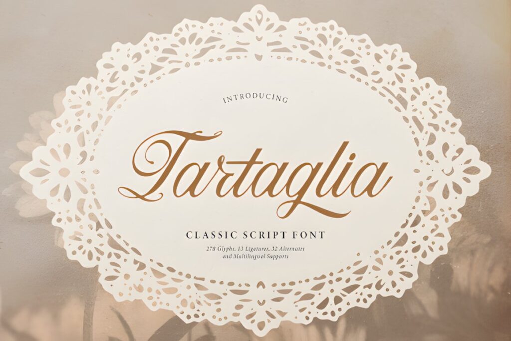
Tartaglia is a classic script font with looped capitals, connected lowercase forms, and delicate swash accents. It can give boutique labels, luxury product packaging, logo designs, and romantic stationery a more traditional calligraphy mood.
This font makes the most sense when the package has room around the wordmark and the lettering is allowed to act as a decorative element. If the brand name is long or the label is extremely narrow, a less looped option such as Cheltine may create a cleaner silhouette.
11. Moilenka
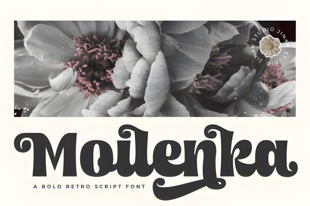
Moilenka is a bold retro script inspired by sign painting, nostalgic packaging, and vintage commercial lettering. Thick flowing forms and expressive swashes make it useful for bakery labels, café identities, cosmetics, fashion packaging, and product fronts that need a strong visual signature.
Choose Moilenka when the package needs more impact than a delicate calligraphy font can provide. Its heavier construction suits medium and larger display text especially well. For very restrained luxury packaging, however, the playful retro curves may communicate more personality than the layout requires.
12. Black Forrest
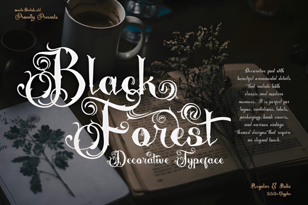
Black Forrest is a highly decorative vintage typeface with ornamental swashes, curls, bold forms, and early-1900s-inspired character. It is a statement choice for packaging that intentionally leans into heritage, apothecary, fantasy, tattoo, coffee, bottle-label, or ornate luxury aesthetics.
This is not the option for understated tiny labels. Its ornamentation needs space, so it is better suited to front panels, gift boxes, larger bottle labels, or a limited number of prominent words. When packaging requires cleaner small-scale reproduction, Vintage Script or Cheltine will usually create less visual congestion.
13. Fresco Vintage Duo
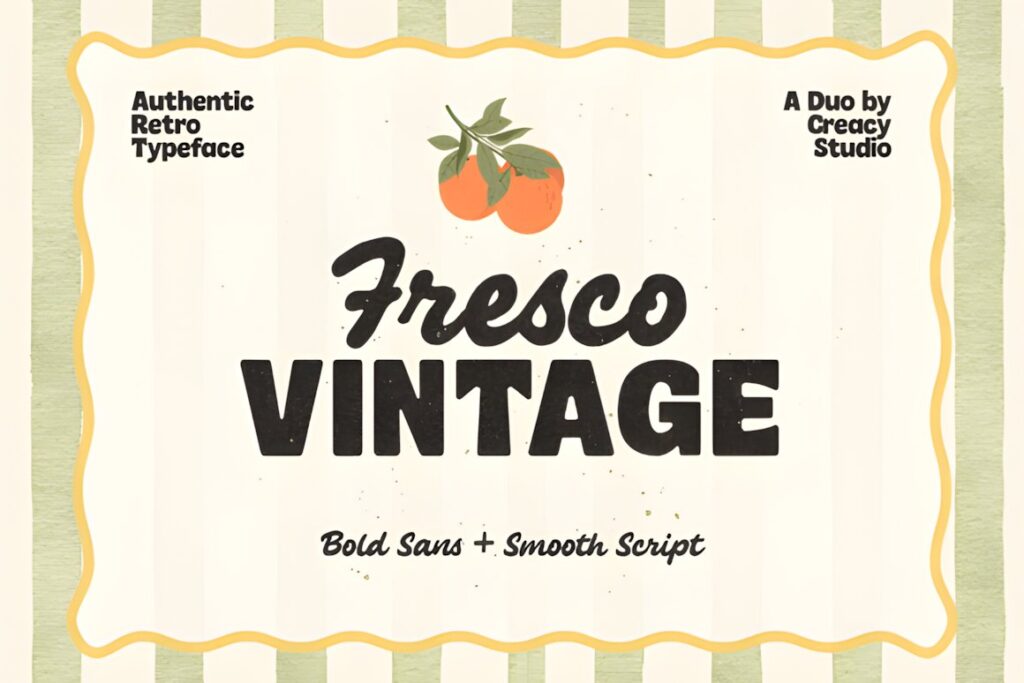
Fresco Vintage Duo combines a bold geometric sans serif with a smooth interconnected retro script. That pairing is particularly useful for packaging because the script can carry the expressive brand gesture while the sans style handles stronger headings or secondary information.
The family draws on vintage grocery signage and mid-century packaging, making it a natural fit for food labels, café branding, beverage packaging, restaurant products, and nostalgic boutique goods. Choose it when you want coordinated hierarchy without sourcing an unrelated supporting font separately.
14. Ardenta Calligraphy
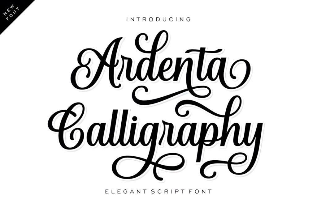
Ardenta Calligraphy uses looping cursive strokes and elongated terminal swashes to create a polished boutique-script appearance. Its refined structure is suited to fragrance packaging, cosmetic identities, floral brands, premium stationery, and other products where the main lettering should feel graceful and personal.
The elongated details can make a short name memorable, but they also expand the visual footprint of the wordmark. Leave enough clear space around the lettering, and avoid squeezing dramatic swashes between borders or densely packed packaging information.
15. Creative Signature
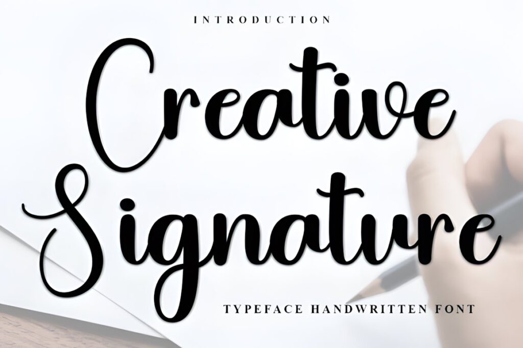
Creative Signature is an upright flowing script built around graceful loops and a relatively clean signature-style rhythm. It works well for boutique wordmarks and bespoke product packaging where the goal is personal elegance rather than elaborate historical ornament.
Its restrained construction makes it easier to combine with modern packaging layouts than heavily decorated alternatives. Consider it for skincare, fashion, stationery, gift products, or minimalist boxes where one handwritten accent can soften an otherwise structured design.
16. Warehouse
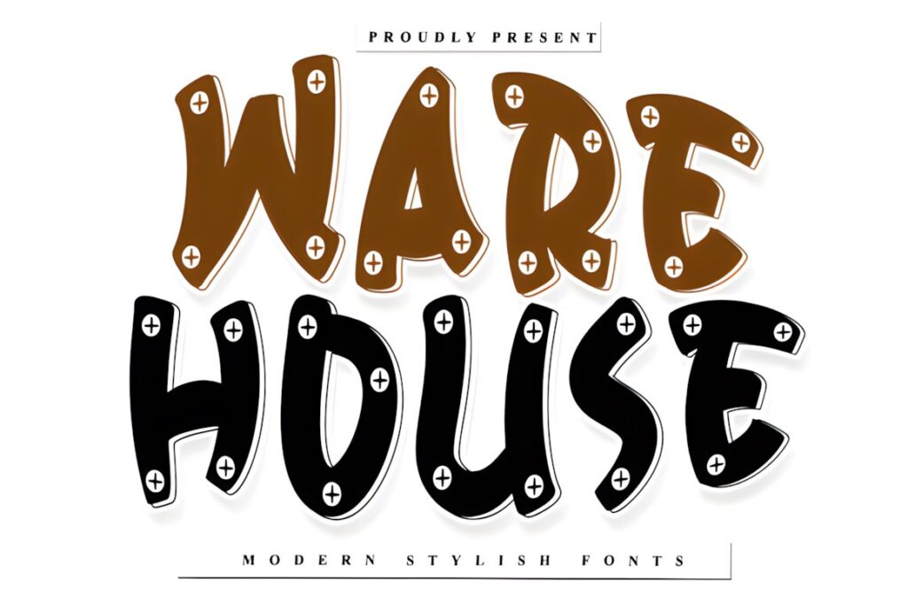
Warehouse is a rhythmic calligraphic script with prominent looping ascenders and an organic handcrafted feel. It has enough movement to give boutique product packaging an artisanal character without relying on distressed textures or overtly rustic effects.
It makes particular sense for specialty food, handmade goods, lifestyle brands, and packaging where craftsmanship is part of the story. Because the tall loops contribute significant visual detail, allow sufficient vertical space rather than compressing the wordmark into a shallow label band.
17. Optimal
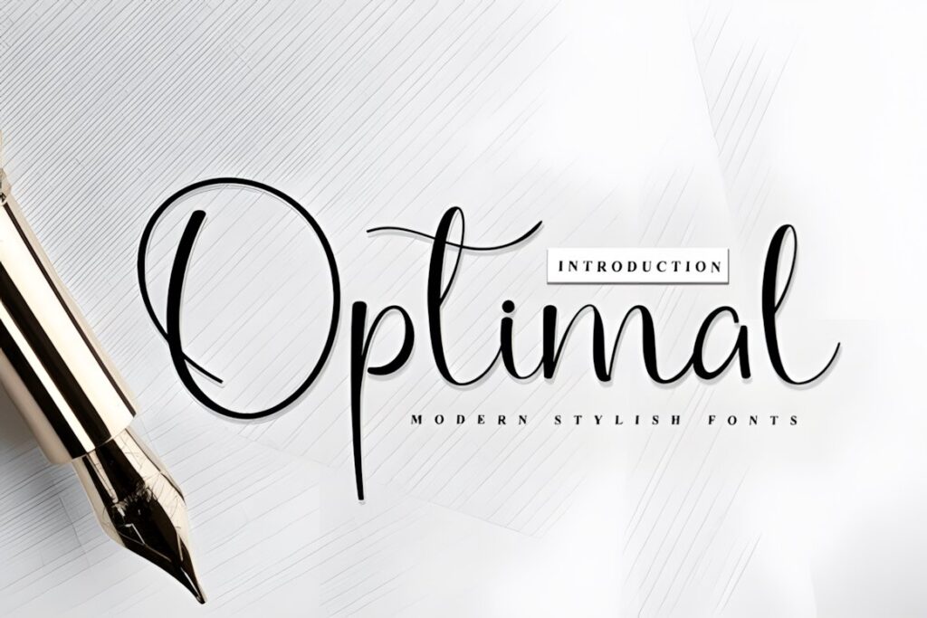
Optimal is another organic calligraphic script built around sweeping ascenders and flowing connections. Its artisanal tone suits product packaging, lifestyle branding, food labels, and editorial-style boutique products that need a handwritten focal point.
Use it where the lettering can remain comfortably sized and surrounded by negative space. If your package has a very compressed logo area or several long words, the tall flourishes may require more layout adjustment than a compact script such as Vintage Script.
18. Modern Calligraphy
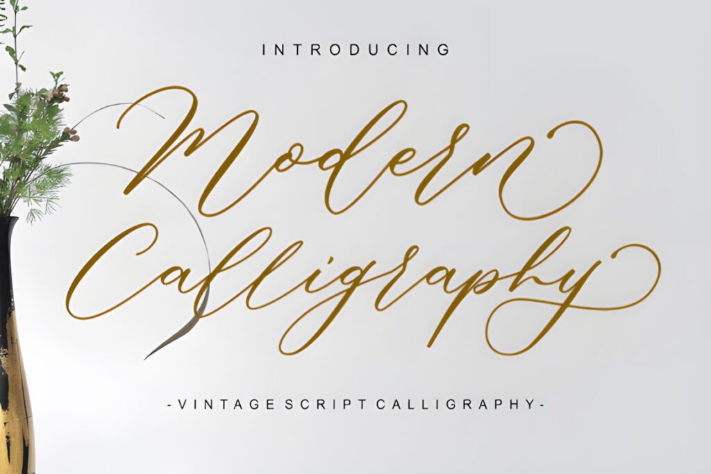
Modern Calligraphy blends flowing calligraphic strokes with a vintage-script mood and decorative swashes. It fits branding and packaging that need romance and sophistication without committing to the denser ornament of a historical display face.
The font works naturally for boutique names, gift products, beauty packaging, event products, and stationery. Keep its most elaborate letterforms in the primary display line and use simpler typography for details. This preserves the script’s personality while protecting readability elsewhere on the package.
19. Calligraphy
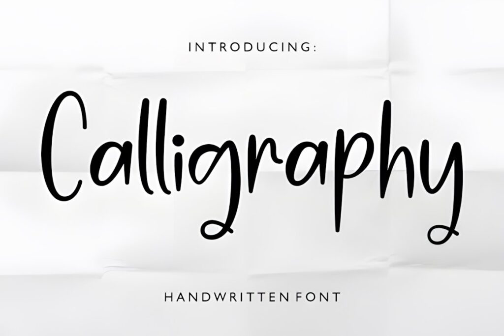
Calligraphy by Fania Studio is a polished script aimed at sophisticated branding contexts, including boutique identities, organic product packaging, stationery, and other designs where a hand-inked appearance should soften the overall presentation.
This style works well when the script is treated as a deliberate accent rather than a complete typography system. Pairing it with a restrained serif or minimalist sans serif can keep ingredients, specifications, or supporting product information clear while the calligraphy handles the emotional brand voice.
Quick Comparison for Packaging Projects
| Font | Best for | Style | Key visual trait | Project fit |
|---|---|---|---|---|
| Vintage Signature | Boutique wordmarks | Luxury calligraphy | Sweeping curves | Cosmetics, labels |
| Vintage Script | Readable retro branding | Bold handwritten script | Rounded connected strokes | Labels, handmade goods |
| Cheltine | Feminine packaging | Modern vintage script | Clean flowing curves | Beauty, fashion |
| Vintessia | Strong retro logos | Vintage script | Fuller bold strokes | Boxes, bags, labels |
| Saideira | Refined boutique names | Elegant calligraphy | Ligatures and alternates | Jewelry, skincare |
| Moilenka | Retro statement labels | Sign-painter script | Thick playful curves | Food, café, cosmetics |
| Black Forrest | Ornate heritage looks | Decorative vintage | Dense flourishes | Bottles, gift boxes |
| Fresco Vintage Duo | Full packaging hierarchy | Script and sans duo | Coordinated contrast | Food and beverage |
| Ardenta Calligraphy | Elegant product names | Fluid calligraphy | Long terminal swashes | Fragrance, cosmetics |
| Creative Signature | Minimal boutique layouts | Signature script | Clean upright flow | Fashion, skincare |
Packaging and Label Considerations
Decorative calligraphy should usually occupy the most important level of a boutique packaging hierarchy, not every level. A script brand name can feel distinctive because it contrasts with quieter supporting typography. If the product name, description, scent, ingredients, and weight all use equally expressive lettering, the package quickly loses that hierarchy.
Compact labels also change how a font behaves. Long ascenders and descenders consume vertical space, while wide capitals can force a brand name to shrink more than expected. Before finalizing a font, type the actual longest product name in the collection and test it inside the smallest package format you expect to use.
For product lines with multiple scents, flavors, or variants, keep the typography system consistent even if individual names vary in length. Adjust spacing and scale cautiously rather than making each package look like a separate brand.
Readability and Size
A calligraphy font can look clear at presentation size and become difficult to read once the packaging is printed. Thin strokes, tight connections, elaborate swashes, and compressed spacing are the first details to watch. This is why decorative script is generally more dependable for short display text than for ingredients, instructions, legal copy, or longer descriptions.
Print a physical test whenever possible. Check the label at normal viewing distance rather than zooming into a screen preview. If several letters begin to merge, simplify the alternate characters, increase the wordmark size, shorten the line, or move to a less ornate script.
Long boutique names can also benefit from a font with moderate width. Shrinking an elaborate script until a long name fits often removes the very detail that made the font attractive. A cleaner script at a larger size can produce a more convincing premium result than an ornate typeface forced into too little space.
Font Pairing Tips for Boutique Packaging
Treat the calligraphy font as the personality layer and give the supporting font a different job. A restrained sans serif can handle product descriptions and compact informational text, while a quieter serif can reinforce a traditional or editorial identity without competing directly with the script.
Avoid pairing two highly decorative scripts simply because both look vintage. Similar levels of ornament compete for attention and can make the label feel improvised. Instead, create contrast through structure: flowing script against upright sans serif, decorative calligraphy against a controlled serif, or a bold retro script against neutral secondary typography.
Fresco Vintage Duo is useful when you want those roles coordinated within one product. For the other fonts, choose a supporting face according to function rather than trying to match every curve or historical detail.
Common Calligraphy Font Mistakes on Packaging
- Using script for too much information: keep decorative lettering focused on the brand, collection, or short product name.
- Judging only from large previews: test the actual label dimensions before deciding that thin strokes or flourishes are readable.
- Adding every available swash: one carefully chosen alternate can personalize a wordmark; several can overcrowd it.
- Ignoring long product names: test the longest real wording in the range, not only a short sample word.
- Leaving too little clear space: decorative capitals and terminal flourishes need room away from borders, icons, and other copy.
- Forgetting the supporting type: the calligraphy font does not need to solve ingredients, specifications, warnings, and descriptive copy.
Choosing the Right Style for Your Packaging
If you want a refined boutique wordmark with a personal luxury feel, Vintage Signature or Saideira makes sense. For feminine packaging that still needs a cleaner modern structure, Cheltine is easier to integrate into contemporary layouts.
For stronger retro presence, choose Vintessia or Moilenka. If the entire package needs a coordinated vintage hierarchy rather than a standalone script logo, Fresco Vintage Duo provides both expressive and supporting typography.
When ornament is the central design feature, Black Forrest offers the most elaborate direction in this group. Give it sufficient space and reserve it for prominent display lettering instead of trying to reduce its decorative forms into tiny packaging copy.
Frequently Asked Questions
What type of vintage calligraphy font works best for boutique packaging?
A vintage calligraphy font with clear letter connections, controlled flourishes, and enough visual weight for the intended print size is usually the most practical choice. Delicate scripts can suit cosmetics, jewelry, and stationery, while bolder retro scripts work well for food, café, or handmade-product packaging. Test the actual brand name because word length and packaging size can change which style remains readable.
Can calligraphy fonts be used on small product labels?
Calligraphy fonts can work on small product labels when they are reserved for short display text and remain readable at the final printed size. Thin strokes, tight spacing, large loops, and elaborate swashes can lose clarity after reduction. Use the script for the brand or product name, then set ingredients, weight, directions, and other small information in a simpler supporting typeface.
What should I pair with a vintage calligraphy font on packaging?
Pair a vintage calligraphy font with a restrained serif or sans serif that performs a different role. The script can provide personality in the wordmark or product name, while the supporting typeface handles descriptions and informational text. Strong structural contrast usually works better than pairing two ornate scripts, which can make a small package feel crowded and weaken the visual hierarchy.
Can I use these fonts for products I sell?
The permitted use of a font depends on the current license attached to that specific product. Check the license details on the product page before using a font for client work, physical products, print-on-demand items, editable digital products, or other commercial applications. Do not assume that every font or every type of product use is covered by identical terms.