ℹ️ Affiliate Disclosure: This article may contain affiliate links. If you book or purchase through these links, we may earn a commission at no additional cost to you.
Discover Vintage Calligraphy Alphabet Fonts Perfect for Victorian Projects
Victorian-inspired projects can quickly look cluttered when every letter competes for attention. The most useful vintage calligraphy alphabet fonts balance historical character with enough legibility for invitations, antique labels, book covers, certificates, posters, monograms, and period-style branding. Some projects benefit from flowing penmanship; others need ornate capitals, engraved-looking serifs, or darker blackletter forms.
The 25 options below cover several sides of Victorian typography, from delicate copperplate-inspired scripts to ornamental alphabets and dramatic display lettering. Pay particular attention to flourish density, stroke contrast, letter width, and how decorative capitals interact with the rest of a composition.
Many more historical and ornamental fonts are available, while this selection concentrates on styles with distinct Victorian project uses, readable letterforms, and clearly different personalities.

The strongest Victorian font choice depends on the project: flowing calligraphy works well for correspondence and invitations, ornate display alphabets suit labels and monograms, while blackletter-inspired designs create stronger period character for posters, book covers, certificates, and decorative headlines.
Quick Picks
- For unmistakable Victorian ornament: Victoriana — ornate serifs and decorative curves give headlines immediate period character.
- For formal handwritten projects: Vintage Manuscript — suited to old letters, stationery, journals, and historical correspondence.
- For elegant copperplate styling: Classical Calligraphy — a smoother choice for formal invitations and refined labels.
- For dramatic decorative capitals: Alica — highly ornamental letterforms suit monograms and heritage-style display work.
- For darker old-world projects: Old Master — blackletter structure and ornamental detailing create a stronger historical mood.
Vintage Calligraphy Alphabet Fonts for Victorian-Style Designs
1. Old Vintage Victorian
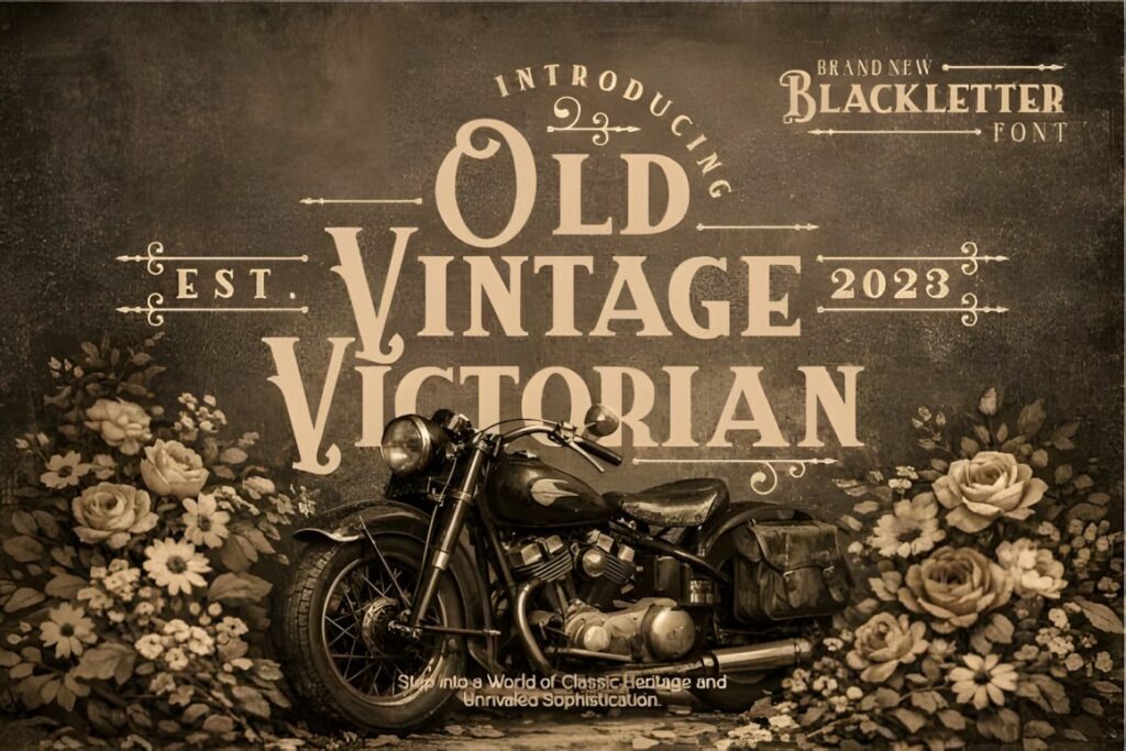
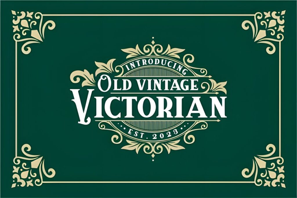
Old Vintage Victorian is a decorative Victorian-style typeface built for designs that need obvious nineteenth-century character. Its detailed letterforms make sense for certificates, signs, antique labels, poster headings, and historical display compositions.
Use it where the lettering can remain reasonably large. For dense information or compact packaging, pair its decorative headline treatment with a quieter supporting typeface rather than setting every line in the same style.
2. Old Victorian Vol 2
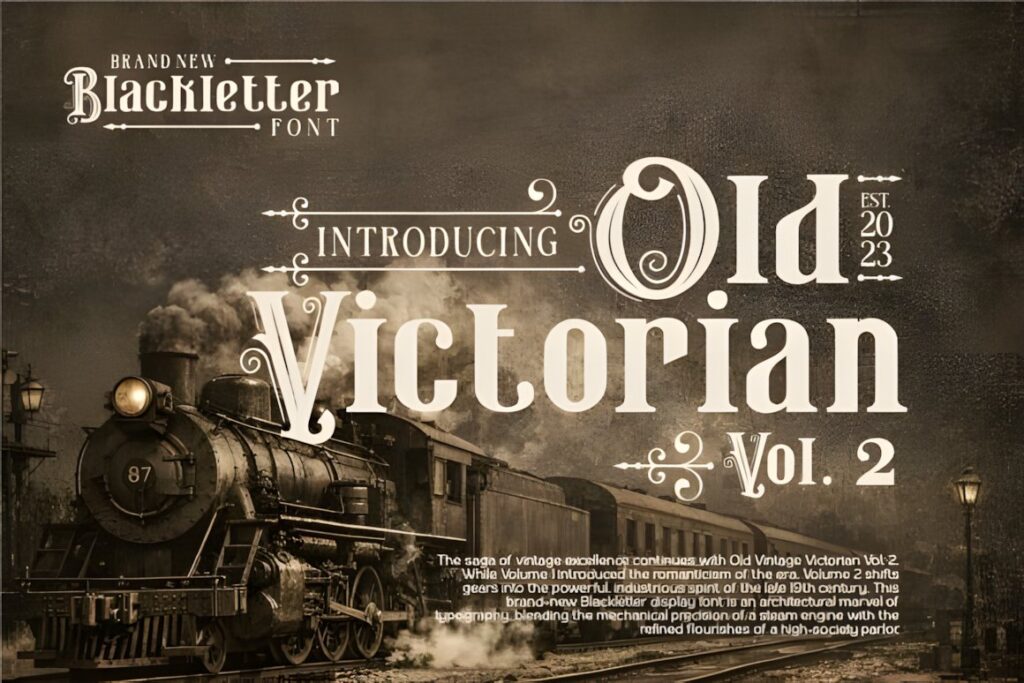
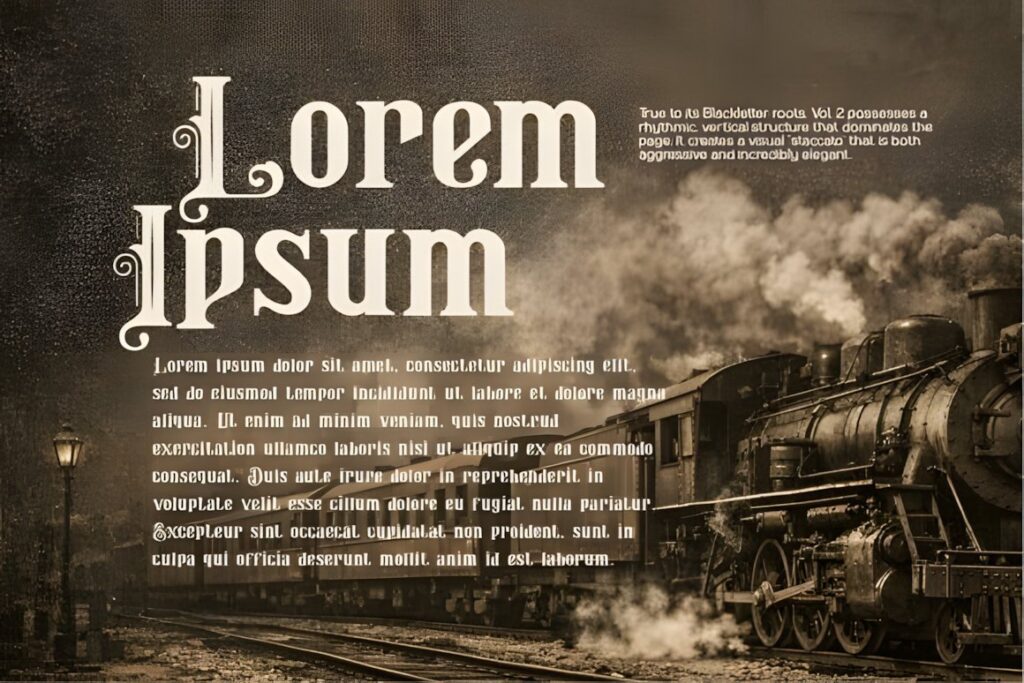
Old Victorian Vol 2 leans into decorative period typography with intricate details and a distinctly historical appearance. It suits Victorian posters, title cards, packaging, certificates, and signage where the typography itself needs to carry much of the theme.
Choose this over a delicate script when you want stronger structure and heavier visual presence. For romantic correspondence or flowing names, one of the script-focused fonts later in the list will feel lighter.
3. Victoriana
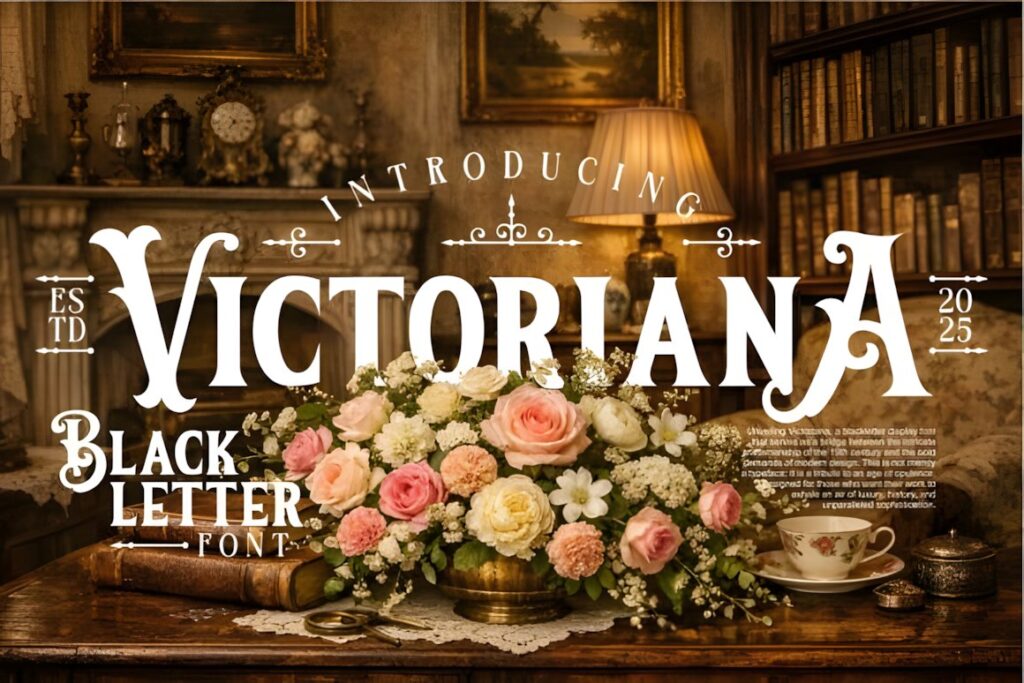
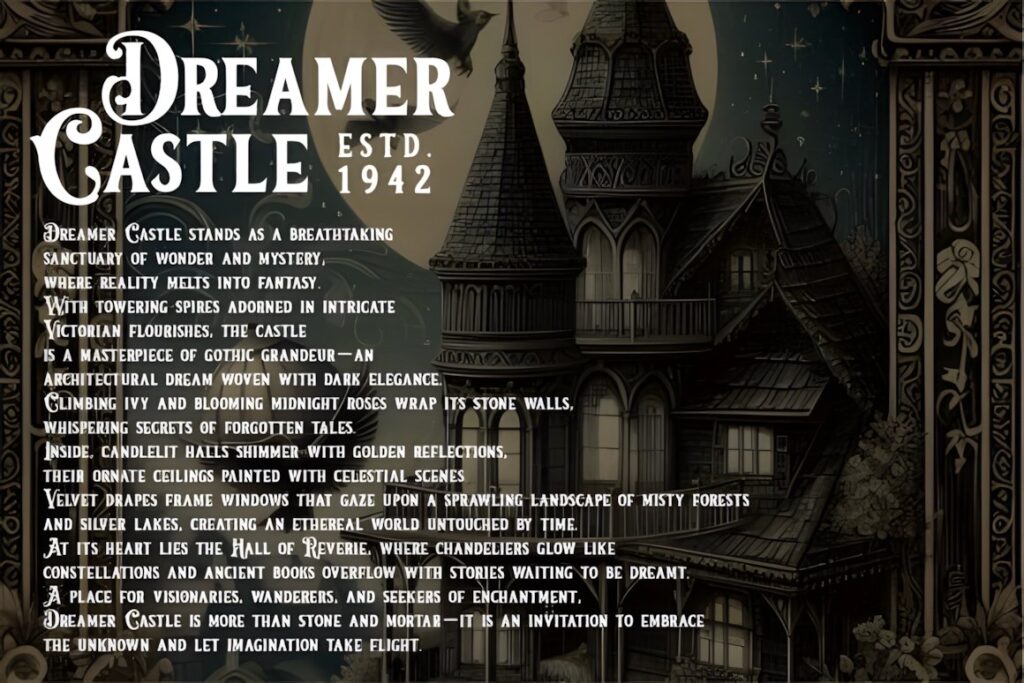
Victoriana combines ornate serifs, decorative curves, and period-inspired flourishes for a more opulent Victorian presentation. It works particularly well in short display text where individual letters can remain visible and expressive.
Consider it for book titles, premium labels, vintage signage, decorative stationery, or a prominent initial. Avoid crowding the lettering with equally elaborate borders and illustrations; giving the characters room usually produces a stronger result.
4. Victorian
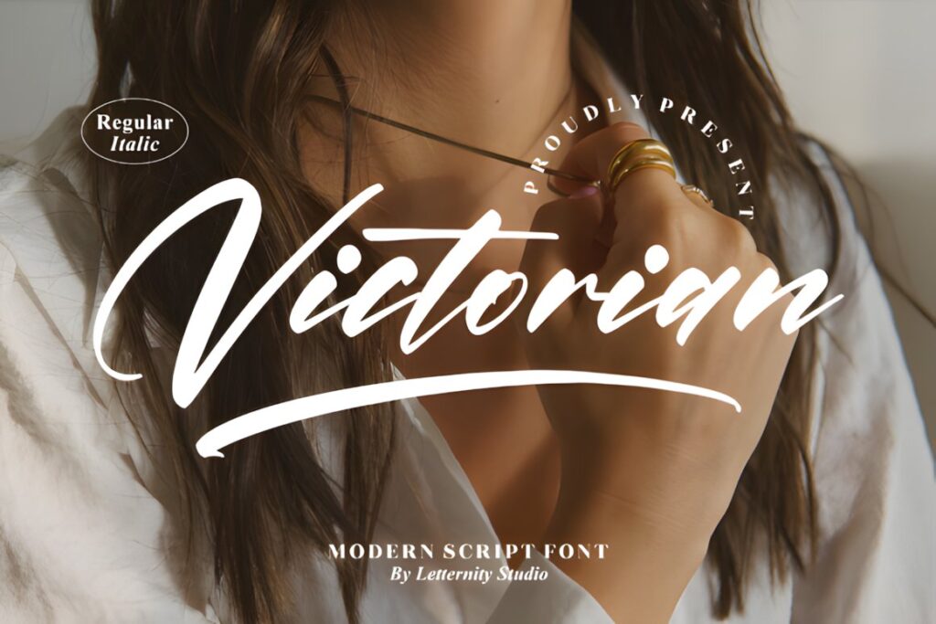
Victorian by Letternity is a thin, graceful script font with a much lighter personality than the heavier ornamental alphabets above. The product includes PUA-encoded extra characters and ligatures, giving decorative compositions more flexibility.
This makes more sense for invitations, formal names, quotations, correspondence-inspired graphics, and romantic Victorian projects. Because the strokes are relatively delicate, reserve the most elaborate lettering for sizes where the details remain visible.
5. The Victorian
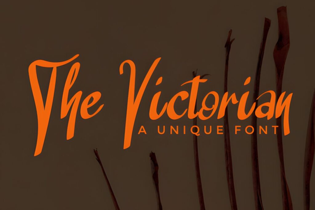
The Victorian is a handwritten font with flowing letterforms that can bring historical flavor to logos, quotes, stationery, and decorative titles without the visual weight of blackletter.
Its handwritten direction works well when a project should feel personal rather than mechanically engraved. For a more architectural Victorian label or certificate heading, Victoriana or Kelluhan provides a more structured alternative.
6. Victorian Signature
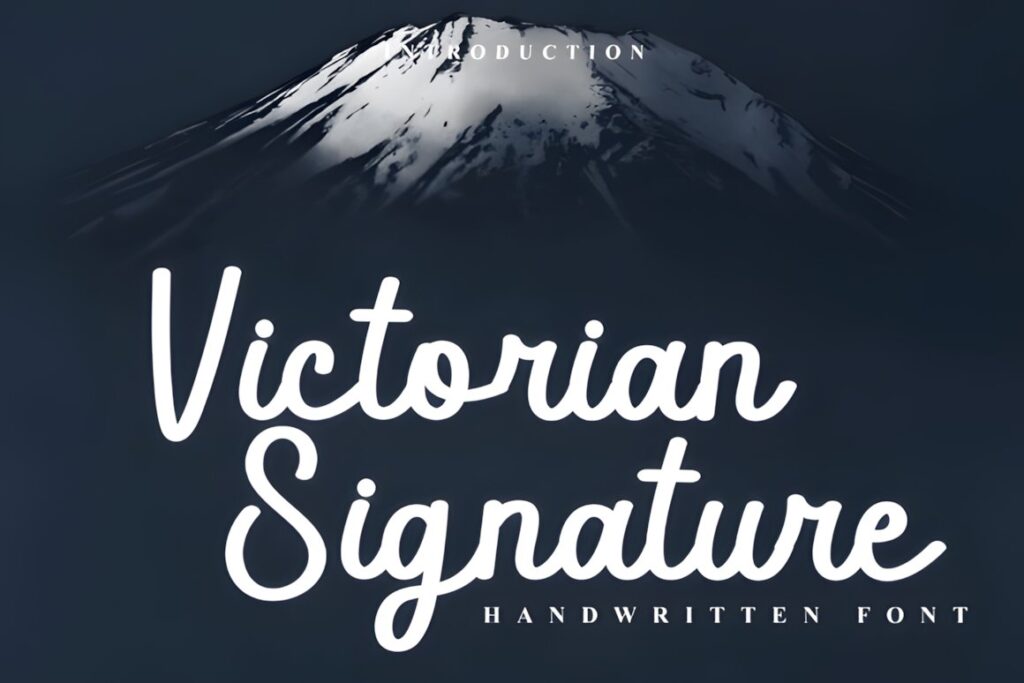
Victorian Signature uses looping connected strokes and long sweeps to approximate the personality of historical cursive correspondence. The product is PUA encoded and includes access to additional glyphs, swashes, and alternate characters.
It is particularly useful for signature lines, wedding names, boutique labels, stationery, and editorial accents. Limit the longest flourishes when text sits inside narrow frames or near decorative borders.
7. Victorian Heritage
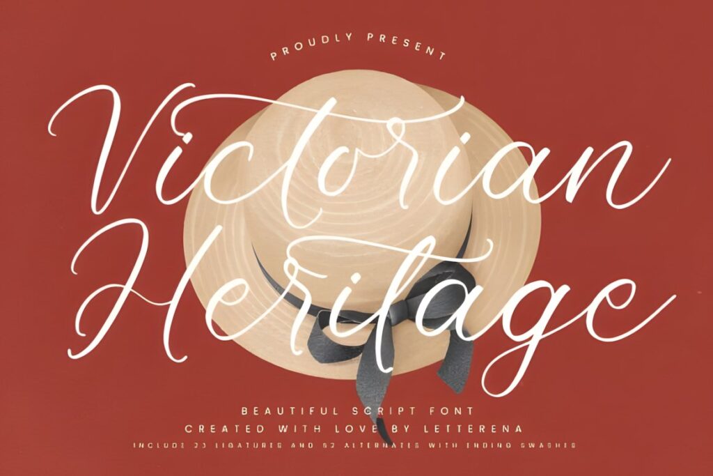
Victorian Heritage is a flowing vintage script designed around elegant curves and graceful letter connections. It gives period-inspired work a softer, more refined mood than the heavily decorated display choices.
Choose it for invitations, names, small-brand wordmarks, greeting cards, and sentimental historical projects. It is less suited to designs that need the dense engraved appearance associated with Victorian advertising or theatrical posters.
8. Vintage Manuscript
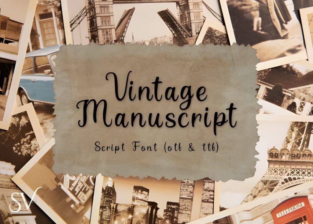
Vintage Manuscript is an antique-style script inspired by historical letters, old book pages, and traditional penmanship. That makes it one of the more direct choices for correspondence, diary pages, period props, literary graphics, and printable Victorian projects.
Its value is the handwritten historical impression rather than heavy ornament. If the design needs decorative capitals to dominate the composition, Alica or Zoe offers a stronger ornamental direction.
9. Classical Calligraphy
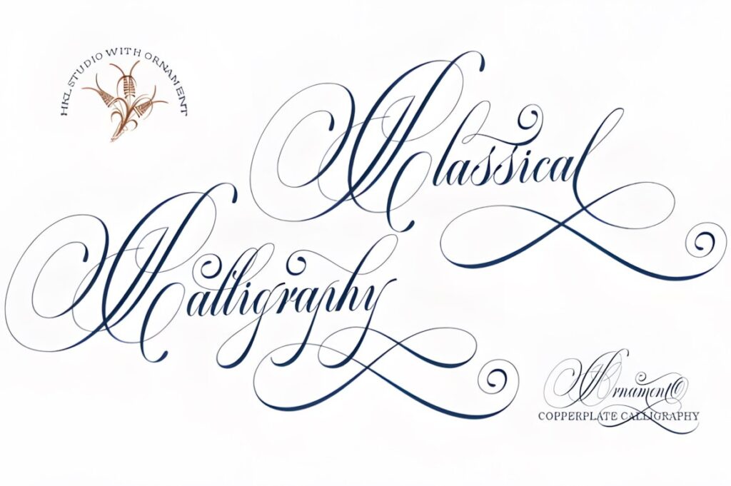
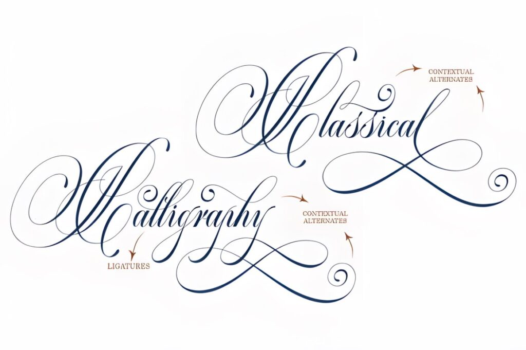
Classical Calligraphy combines copperplate-style calligraphy with a handwritten rhythm and includes alternative characters plus PUA-encoded extras. The overall result is polished, flowing, and less visually dense than many ornamental Victorian display faces.
Use it for formal cards, elegant labels, wedding stationery, vintage-inspired logos, and names that need to remain readable. It also makes a useful contrast to engraved borders and decorative Victorian illustrations.
10. Alica
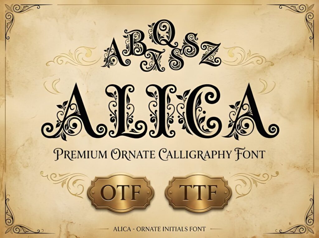
Alica is an ornate calligraphic display font built around elaborate capitals, sweeping swashes, and botanical details. Its visual character closely matches Victorian projects where the initial letter or short name functions almost like an illustration.
It makes sense for monograms, heritage logos, decorative wine labels, invitation headings, and framed initials. Keep supporting text restrained; using the same degree of ornament throughout a layout can quickly reduce hierarchy.
11. Zoe
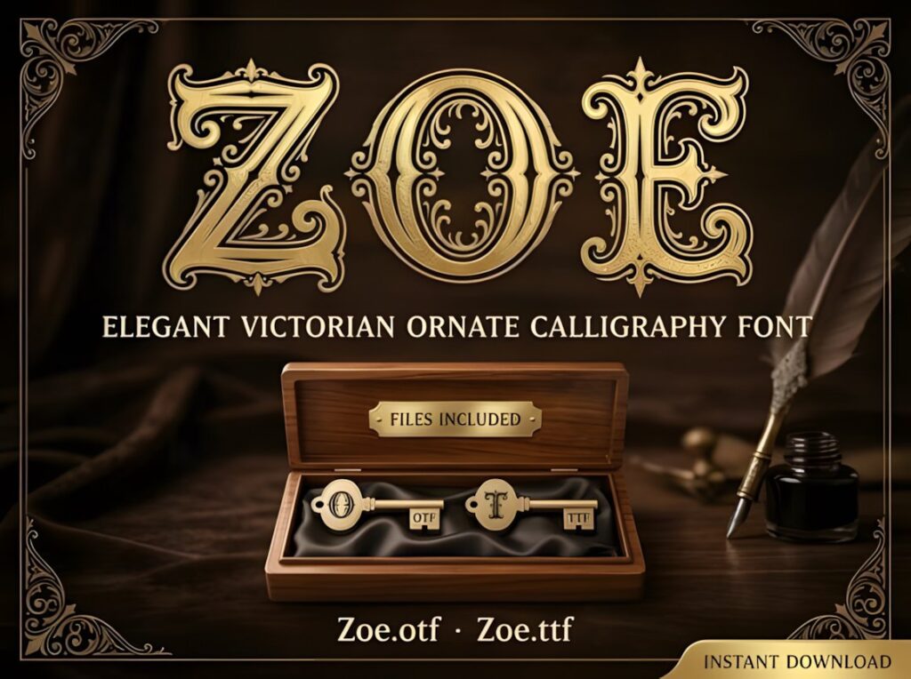
Zoe takes Victorian ornament in a highly decorative direction with filigree, scrollwork, and detailed internal flourishes. It is designed primarily as statement typography rather than inconspicuous supporting text.
Choose Zoe for antique book covers, spirit labels, boutique branding, decorative initials, poster headings, or premium packaging. The intricate forms need generous scale, so simpler options such as Victorian Heritage are easier to manage when space is tight.
12. Dominic
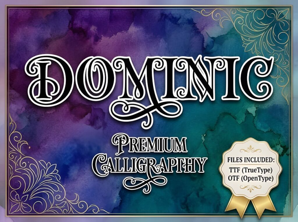
Dominic combines high-contrast serif construction with dramatic Victorian swashes and calligraphic flourishes. The result falls between ornate display lettering and formal historical typography.
This is a strong fit for stately labels, formal invitations, vintage branding, decorative packaging, and large headings. Because the letterforms already contain substantial visual information, keep textures, borders, and ornamental frames under control around the text.
13. Kelluhan
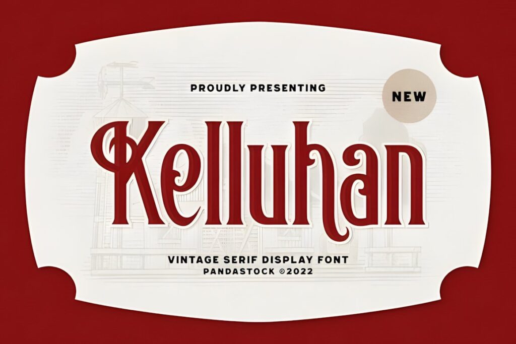
Kelluhan is a tall vintage serif typeface with ornamental swashes and curved serif detailing modeled on Victorian display typography. Its proportions suit old posters, certificates, theater-inspired layouts, book covers, signage, and heritage packaging.
Kelluhan is especially useful when you want period character without relying entirely on connected cursive. Choose a flowing script instead when the project should resemble handwritten correspondence rather than printed Victorian advertising.
14. Nomer Samvilan
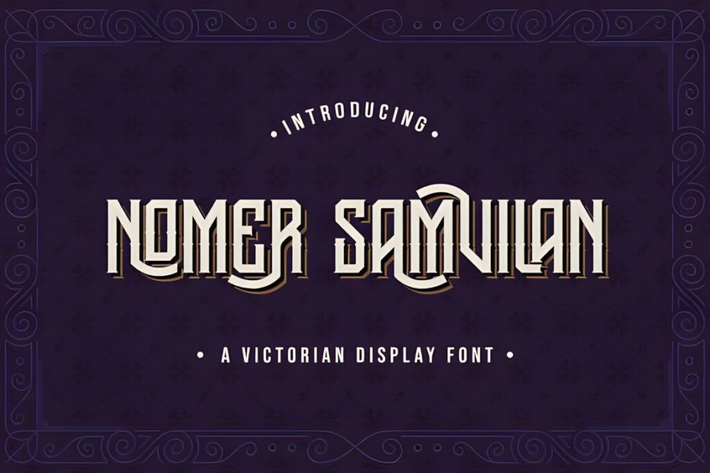
Nomer Samvilan is a Victorian-style blackletter font that combines bold historical structure with ornamental swashes. The font is PUA encoded, providing access to its extra glyphs and decorative characters.
Its darker personality works for vintage tattoo lettering, dramatic certificates, old pub graphics, posters, packaging, and gothic-Victorian themes. For romantic stationery or delicate feminine projects, Classical Calligraphy provides a considerably softer alternative.
15. Old Master
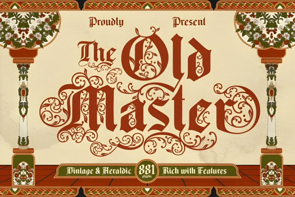
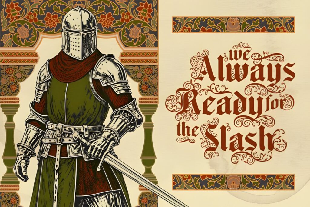
Old Master is a richly ornamental blackletter typeface influenced by historical calligraphy and old-world lettering traditions. Decorative uppercase forms and sharper lowercase shapes create a strong manuscript and heritage feel.
Use Old Master for book covers, theatrical posters, certificates, labels, formal crests, or historical branding where drama is intentional. The elaborate details can overwhelm small text, so keep longer explanations in a more restrained companion face.
16. Cleve
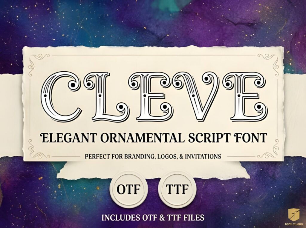
Cleve is an ornamental display font with high contrast, inline detailing, curled terminals, and a distinctly Victorian architectural flavor. It works especially well when the typography needs to look engraved, decorative, and formal.
Try it on invitation titles, boutique logos, ornamental packaging, vintage signage, or editorial display text. For a more authentic handwritten impression, Vintage Manuscript or Victorian Signature will feel less constructed.
17. Victorian Alphabets
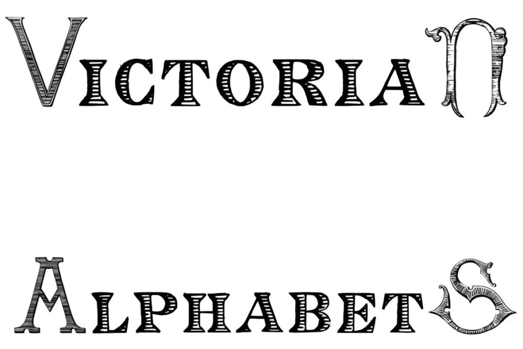
Victorian Alphabets is a bold display font intended to give short text a commanding decorative presence. Its alphabet-focused presentation makes it useful for initials, decorative headings, poster titles, labels, and printable typography projects.
This makes more sense for strong display work than delicate penmanship. Keep the wording short enough for the shapes to remain recognizable, especially when the design already contains period borders or illustrations.
18. Victorian Letterhead
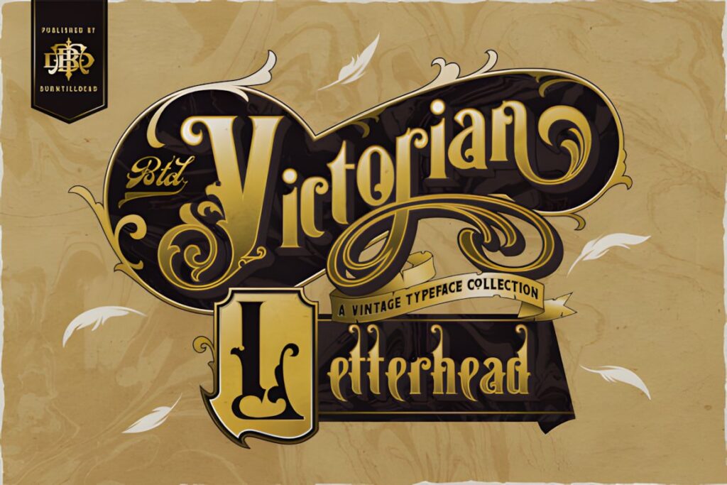
Victorian Letterhead is a font duo combining serif and display styles, giving one product more flexibility for building hierarchy within a historical composition. It is also PUA encoded for access to extra glyphs and swashes.
The duo format suits letterheads, labels, certificates, posters, menus, and vintage packaging where related display treatments need to work together. It is less focused on flowing handwritten calligraphy than Victorian Signature or Classical Calligraphy.
19. Victorian Vintage
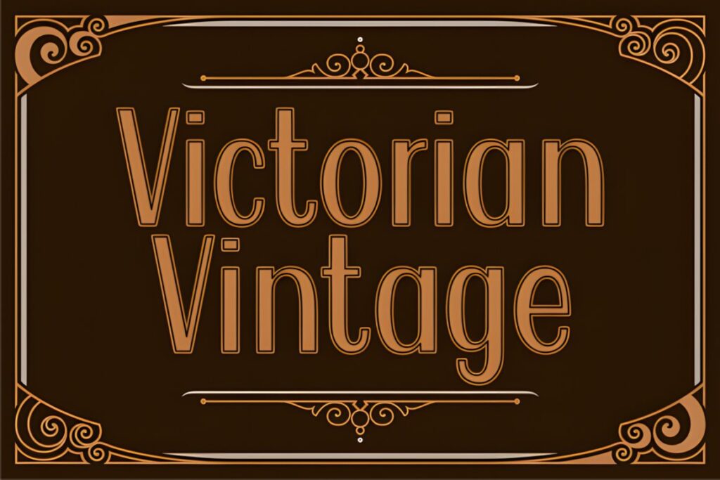
Victorian Vintage is an outlined display typeface with clean, decorative character shapes. Compared with more elaborate blackletter choices, its outline treatment provides historical flavor while keeping the overall silhouette relatively controlled.
It fits printable titles, signs, labels, headings, and Victorian-inspired craft projects where a clear decorative alphabet matters more than handwritten authenticity. For elaborate monograms, Alica supplies much richer flourish work.
20. Piaro Glen
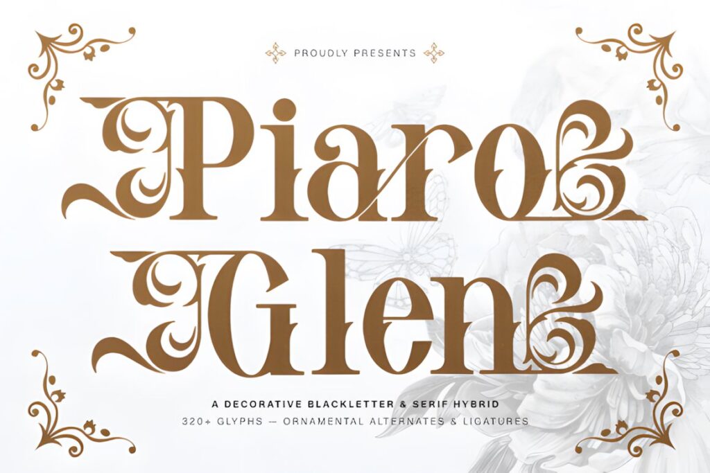
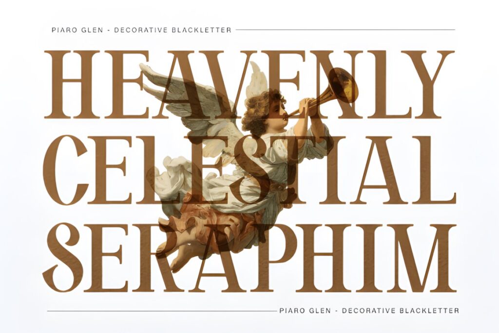
Piaro Glen combines blackletter construction with ornamental serif details and graceful flourishes. Its visual language sits between historical manuscript lettering and more polished Victorian display typography.
Use it for wine labels, book titles, dramatic stationery, boutique branding, posters, or dark-academia projects. The heavier historical mood makes it less suitable when your Victorian design needs airy, delicate penmanship.
21. Ornate Victorian Blackletter
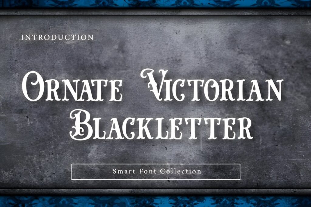
Ornate Victorian Blackletter is a decorative display font featuring sharp serifs, high-contrast strokes, curls, and an antique engraved appearance. Its strong silhouette is suited to designs where the typography should feel ceremonial or imposing.
Consider it for book covers, certificates, labels, posters, gothic invitations, apparel graphics, or historical signage. Use shorter phrases at generous sizes because the decorative structure becomes harder to scan when compressed.
See Ornate Victorian Blackletter
22. Kattalin Osane
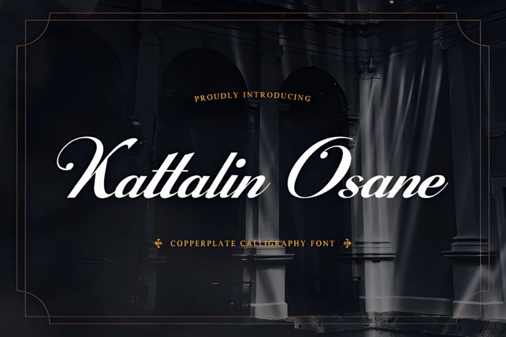
Kattalin Osane is a copperplate-inspired calligraphy typeface with contrasting strokes, flowing connections, swashes, stylistic alternates, ligatures, numerals, punctuation, and multilingual support.
Those formal script characteristics make it useful for Victorian-inspired invitations, packaging, editorial titles, stationery, and identity work that needs elegance without extremely ornate letter construction. It is a cleaner alternative to highly embellished display alphabets such as Zoe.
23. Ubel Amour
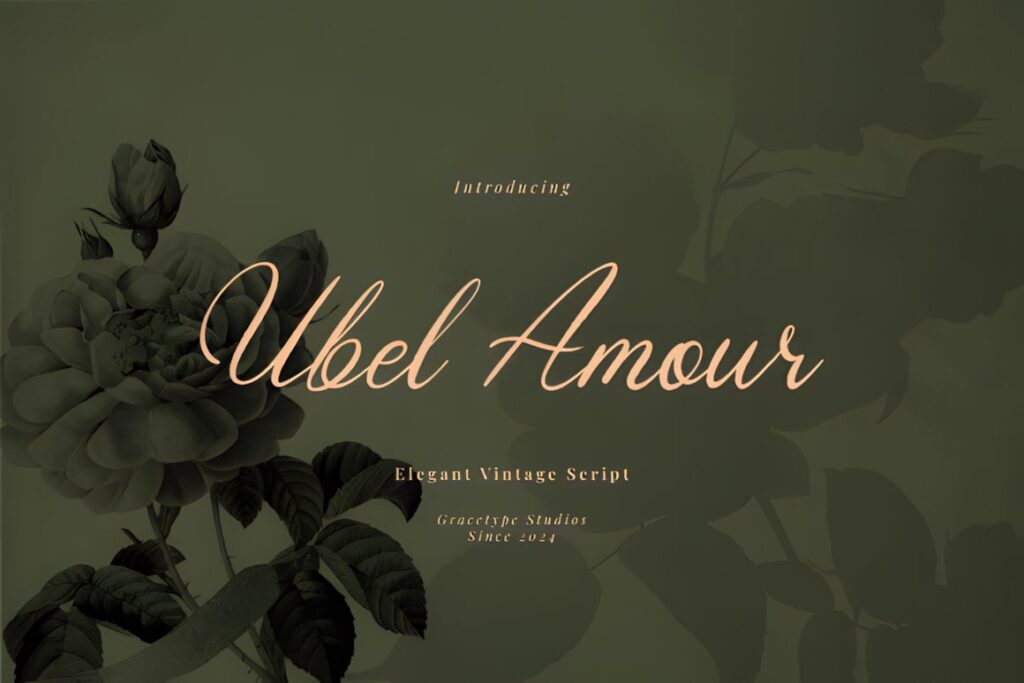
Ubel Amour is a vintage script with copperplate-inspired connections, delicate terminals, and a controlled slant. Its restrained rhythm gives heritage projects a romantic historical tone without relying on dense ornamental construction.
It works well for perfume-style labels, classic book covers, wedding stationery, names, correspondence graphics, and refined packaging. Choose a heavier display face such as Kelluhan when the lettering must compete with larger illustrations or strong decorative borders.
24. Wonderful Vintages
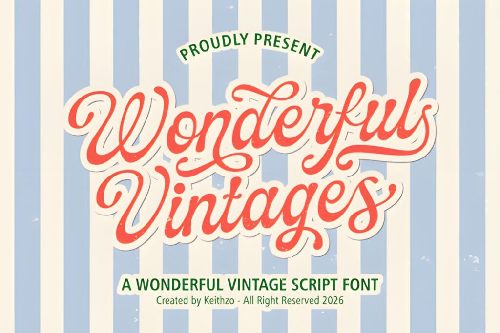
Wonderful Vintages is a flowing vintage script designed around retro calligraphic character. Compared with formal copperplate choices, it has a more expressive and nostalgic personality.
Use it for decorative signs, labels, greeting cards, titles, branding accents, and Victorian-inspired projects that can tolerate a slightly less formal historical interpretation. For strict period-document styling, Vintage Manuscript creates a more archival impression.
25. The Antique
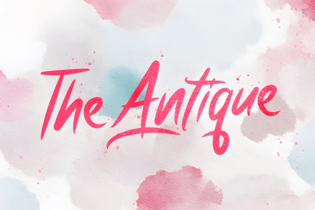
The Antique is a bold script typeface with a pronounced vintage character. Its heavier handwritten construction works well when delicate calligraphy would disappear against textured backgrounds, illustrations, or decorative period framing.
It suits labels, headings, logos, signs, packaging, and larger printable titles. Choose Victorian Heritage or Classical Calligraphy when a project needs a more refined, formal, and lightly drawn appearance.
Quick Comparison by Victorian Project Style
| Font | Best for | Style | Key visual trait | Project fit |
|---|---|---|---|---|
| Victoriana | Period headings | Ornamental display | Decorative serifs | Posters, labels, books |
| Vintage Manuscript | Historical correspondence | Antique script | Old-letter character | Letters, journals, printables |
| Classical Calligraphy | Formal stationery | Copperplate-inspired script | Smooth connections | Invitations, cards, labels |
| Alica | Decorative initials | Ornate calligraphy | Botanical swashes | Monograms, heritage logos |
| Kelluhan | Victorian advertising look | Ornamental serif | Tall display forms | Certificates, posters, signs |
| Old Master | Dark historical themes | Ornamental blackletter | Decorative capitals | Books, posters, labels |
| Victorian Signature | Names and signatures | Connected script | Long sweeping strokes | Stationery, branding |
| Zoe | Maximum ornament | Decorative display | Filigree detailing | Book covers, luxury labels |
| Kattalin Osane | Refined formal text | Copperplate calligraphy | High stroke contrast | Invitations, editorial work |
| Ornate Victorian Blackletter | Dramatic display | Blackletter | Sharp ornamental strokes | Certificates, posters, gothic themes |
Swashes, Capitals, and Ornamental Details
Decorative capitals are one of the easiest ways to create a Victorian impression without sacrificing the readability of an entire layout. A large initial from Alica, Zoe, or Old Master can establish the historical mood while the remaining information uses a simpler serif.
Long swashes need more planning. Check how an alternate capital behaves beside the next letter and whether an ending flourish collides with a border, illustration, or neighboring line. Swashes are usually most effective when they frame the word rather than weaving through every available space.
For names and short headings, alternates can create a custom-lettered impression. For addresses, dates, instructions, or descriptive copy, clarity should usually take priority. Recent font-identification discussions also show that designers actively look for separate ornamental capitals and swash forms when trying to recreate historical compositions.
Display Lettering vs Longer Victorian Text
Most ornate Victorian fonts work most effectively as display faces. Use them for a business name, chapter title, certificate heading, product name, invitation names, or short quotation. Long paragraphs magnify every decorative irregularity and can make reading unnecessarily tiring.
A practical hierarchy is to let the ornamental font handle the first level of information, then introduce a calmer serif for supporting text. On a Victorian invitation, for example, the couple’s names could use Classical Calligraphy while dates, location details, and RSVP information use a restrained companion face.
The same approach works on packaging. A decorative display alphabet can carry the product name, while ingredients, volume, instructions, and other small information stay in a simpler typeface. This preserves the period mood without asking one decorative font to perform every job.
Common Victorian Font Selection Mistakes
- Using elaborate script for every line. The historical mood becomes stronger when decorative lettering has a clear role.
- Choosing by ornament alone. Test the actual words you plan to use, particularly long names and repeated capitals.
- Shrinking intricate capitals too far. Internal lines and small curls need enough space to remain distinct.
- Mixing several equally decorative fonts. One dominant Victorian face plus a quieter companion usually creates clearer hierarchy.
- Ignoring the project mood. Copperplate script, ornamental serif, and blackletter can all feel historical, but they communicate very different personalities.
- Assuming identical usage rights. Check the current license attached to the specific font for the exact personal, client, product, or commercial use you have planned.
Choosing the Right Victorian Style for Your Project
If you want the typography itself to create an unmistakable Victorian statement, Victoriana or Kelluhan gives the composition stronger period display character.
For letters, journal pages, historical stationery, or projects intended to resemble handwritten correspondence, Vintage Manuscript is the more natural direction. Formal invitations and refined labels can benefit from the cleaner copperplate character of Classical Calligraphy or Kattalin Osane.
When the initial letter needs to function as a decorative centerpiece, Alica provides much richer ornament. For dark, ceremonial, or gothic-Victorian work, Old Master and Ornate Victorian Blackletter move the design toward a heavier historical mood.
Frequently Asked Questions
What fonts work well for Victorian-style projects?
Victorian-style projects usually work well with ornamental serifs, copperplate-inspired calligraphy, historical scripts, and decorative blackletter fonts. Choose according to the finished project rather than the period label alone. Flowing scripts suit correspondence and invitations, while heavier ornamental alphabets make more sense for posters, certificates, book covers, labels, and prominent display headings.
Are ornate Victorian fonts readable at small sizes?
Highly ornate Victorian fonts can lose clarity at small sizes because thin strokes, internal details, curls, and swashes become compressed. Reserve the most decorative font for a name, initial, heading, or short label, then use a simpler supporting typeface for small information. Always preview the exact wording at the approximate finished print or screen size before committing to the layout.
How should I pair a Victorian calligraphy font?
Pair a Victorian calligraphy font with a quieter typeface that performs a different job. Use the decorative script or display alphabet for names, titles, or short phrases, then let a restrained serif or sans serif handle dates, descriptions, addresses, and other supporting information. The contrast preserves the historical personality while making the overall design easier to scan.
Can I use Victorian fonts for products or client work?
Product and client use depends on the current license attached to the individual font. Do not assume that every vintage or Victorian font carries identical permissions simply because it is downloaded from the same marketplace. Check the current product license for the exact activity you plan, especially client projects, resale, print-on-demand products, templates, or editable digital files.