ℹ️ Affiliate Disclosure: This article may contain affiliate links. If you book or purchase through these links, we may earn a commission at no additional cost to you.
Choosing the Right Vintage Merry Christmas Fonts for Seasonal Branding
Vintage Merry Christmas fonts can give seasonal branding warmth and nostalgia, but the right typeface depends on where the identity needs to appear. A chunky retro display font that works beautifully on a storefront poster may overwhelm a small gift label, while an elegant handwritten style can lose impact on large promotional graphics. For holiday branding, the most useful differences are letter width, texture, decorative detail, readability, and how naturally the font works with supporting type.
This selection covers distressed slab serifs, rounded retro display fonts, handwritten lettering, decorative Christmas styles, and softer nostalgic options for logos, packaging, tags, social graphics, cards, and seasonal product collections.
Many more vintage Christmas fonts are available, while this shortlist concentrates on styles with distinct branding roles, readable personalities, and noticeably different retro directions.

The most useful vintage Christmas fonts for seasonal branding combine a recognizable retro personality with enough clarity for the intended application. Bold slab serifs and rounded display styles work well for prominent logos and campaign headlines, distressed lettering suits rustic packaging, while restrained handwritten fonts make more sense for secondary marks, gift labels, and personalized holiday collections.
Quick Picks
For classic textured branding: Vintage Christmas by Jasa (7NTypes) — a substantial slab-serif direction with an aged seasonal feel.
For rounded retro campaigns: Christmas Retro by keng graphic — softer 1970s/1980s-inspired forms suit cheerful headline-led branding.
For playful seasonal branding: Retro Merry by Font Fiesta — bubbly shapes create a friendlier nostalgic personality.
For rustic packaging: Vintage Christmas by Infinity art Studio — weathered hand-painted lettering gives packaging and labels an intentionally worn character.
For cleaner retro elegance: Merry Christmas by Shape Studio — a serif-based option that mixes retro character with more contemporary geometry.
Vintage Christmas Fonts for Logos, Packaging, and Seasonal Branding
1. Vintage Christmas by Jasa (7NTypes)
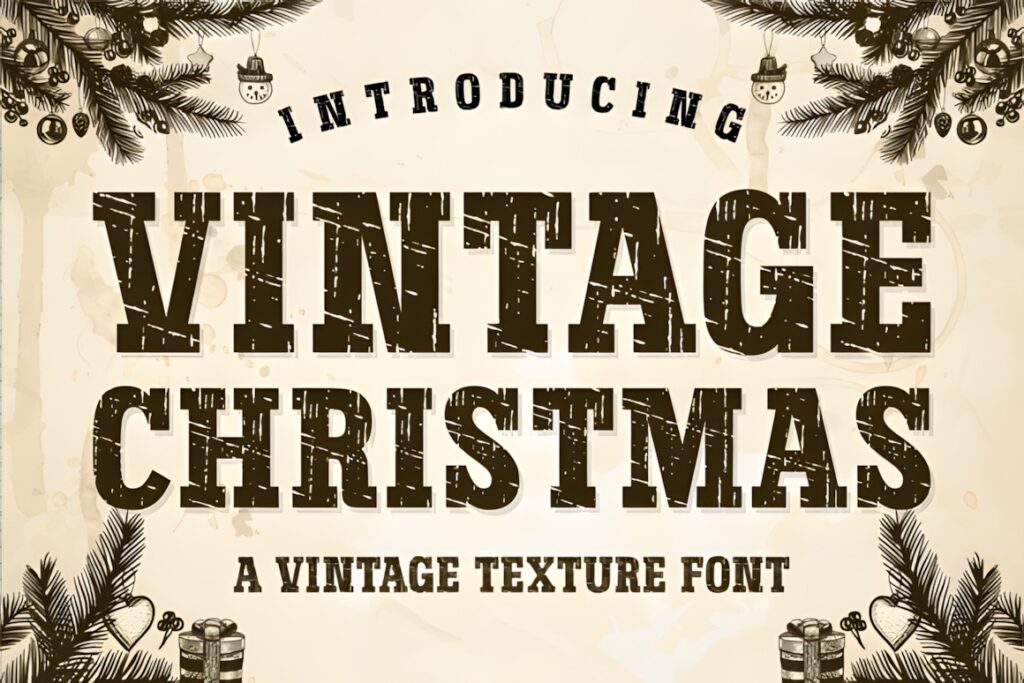
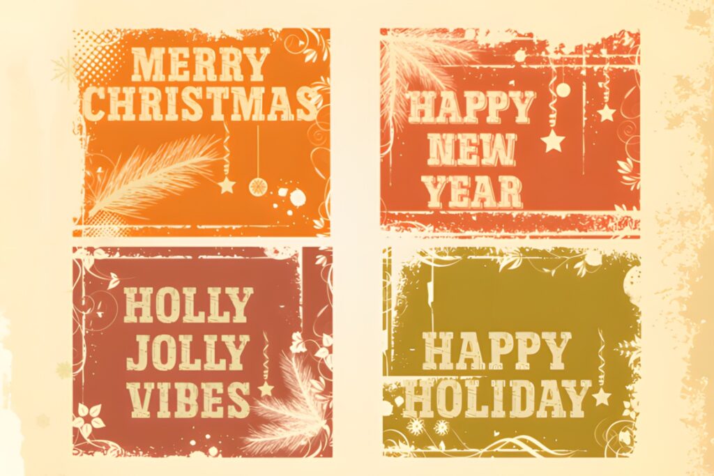
Vintage Christmas is a textured slab-serif font suited to holiday branding that needs the weight and familiarity of old printed packaging. Its sturdy letterforms create a strong silhouette, while the distressed treatment adds enough age to keep a logo, sign, or package front from feeling overly polished.
I would favor it for rustic food packaging, Christmas market graphics, gift-box labels, seasonal badges, and large promotional headlines. The texture contributes much of the personality, so very small applications may benefit from simpler supporting typography instead of repeating the distressed style throughout the entire design.
2. Christmas Retro by keng graphic
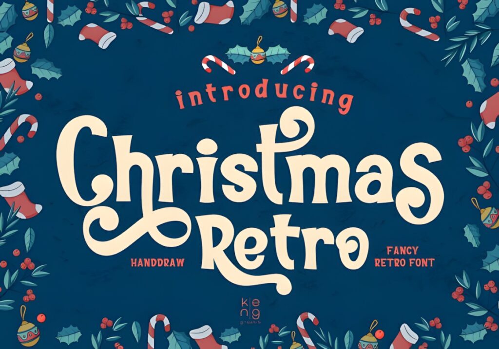
Christmas Retro uses smooth, rounded display lettering influenced by 1970s and 1980s retro typography. The softened corners make it feel approachable rather than rustic, which gives it a useful role in cheerful holiday identities, promotional graphics, and product collections with a colorful nostalgic direction.
Choose this when the brand needs obvious retro character without relying on distressed texture. Its expressive shapes are better suited to logos, headlines, package fronts, and short seasonal messages than dense informational text. For ingredient lists, prices, dates, or longer copy, pair it with a neutral supporting face.
3. Vintage Christmas by Digital Creative Art
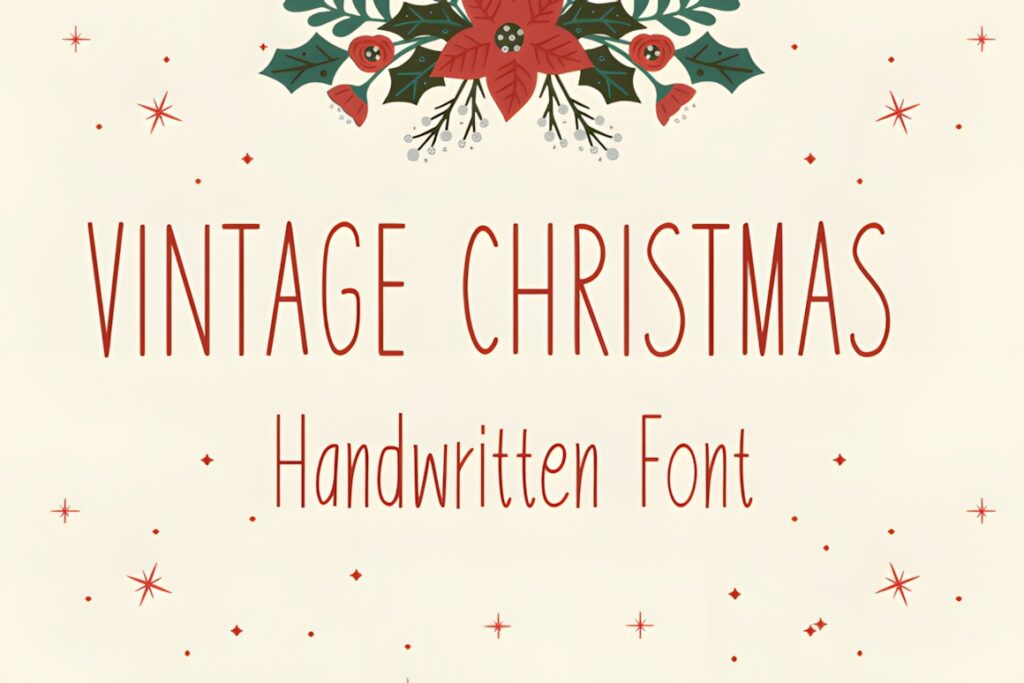
This Vintage Christmas font takes a friendlier handwritten-display approach. Its informal shapes can soften a seasonal identity that might otherwise feel too formal, making it useful for gift collections, small creative businesses, handmade-product branding, greeting cards, and casual holiday graphics.
The main advantage is personality rather than heavy visual authority. It makes more sense for approachable branding and decorative phrases than for a rigid heritage-style identity. If the design needs the stronger presence of old signage or traditional packaging, a slab serif such as Vintage Christmas by Jasa offers a more structured alternative.
4. Vintage Holidays by Jasa (7NTypes)
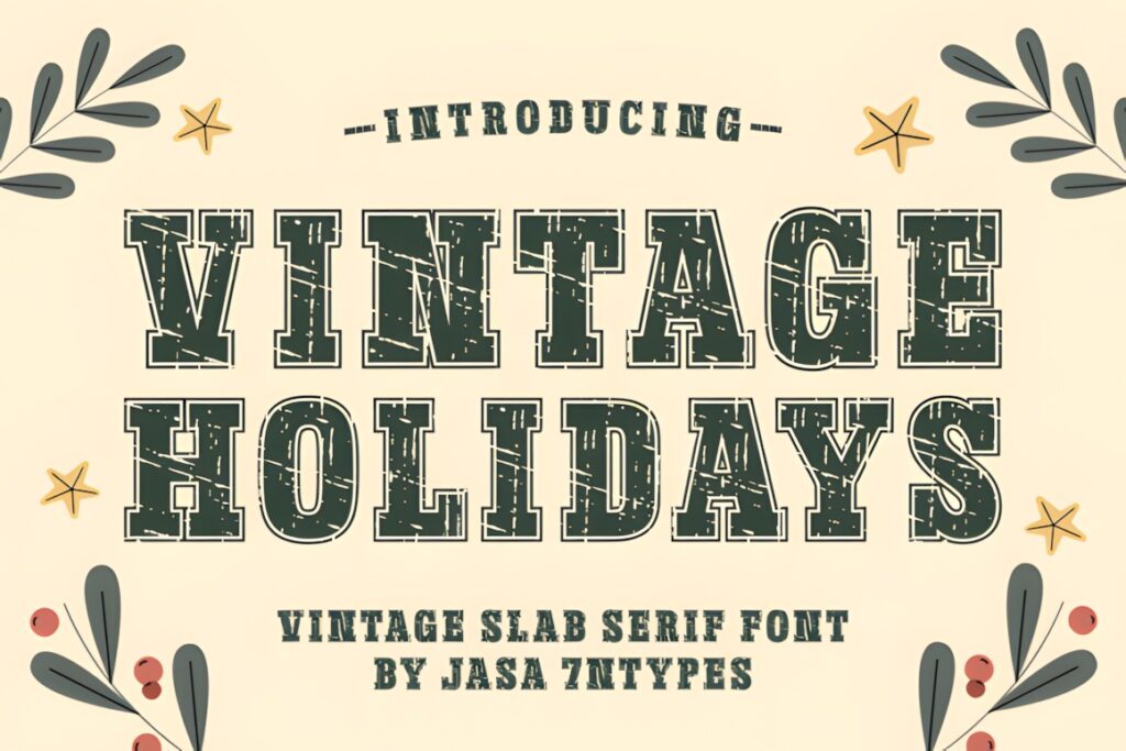
Vintage Holidays is a bold slab serif with distressed texture and Western-influenced edges. It feels especially suited to Christmas branding built around rustic shops, heritage packaging, lodge-inspired products, market signage, and handcrafted seasonal collections.
Its broad forms can establish a strong main wordmark without requiring additional decorative graphics. That makes it useful when typography needs to carry most of the visual identity. For elegant gift packaging or delicate stationery, however, its rugged personality can become too dominant; a lighter handwritten option will create a softer result.
5. Retro Christmas by Art cafe
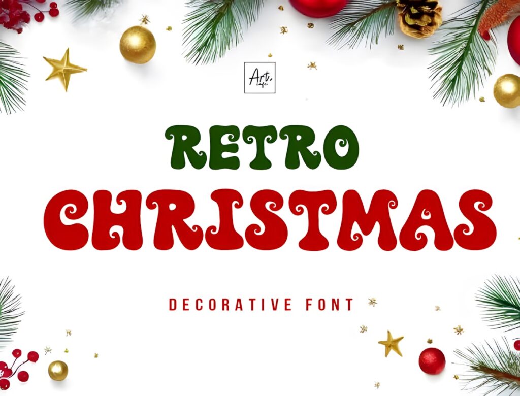
Retro Christmas is a decorative font that combines vintage influence with a more whimsical Christmas personality. Compared with heavier slab-serif choices, it creates a lighter and more obviously festive impression that suits cards, seasonal labels, decorative packaging, social graphics, and short promotional phrases.
This makes sense when the brand should feel nostalgic without looking rough or industrial. Decorative character is its main strength, so keep surrounding typography quieter. Using another highly stylized typeface for supporting copy would compete with the display lettering and make the hierarchy less clear.
6. Retro Merry by Keithzo (7NTypes)
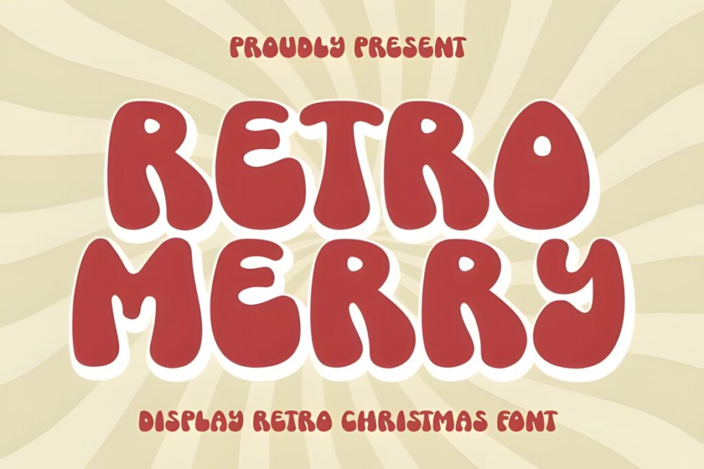
Retro Merry is a vintage-inspired Christmas display font with a whimsical identity. It is particularly useful for signage, cheerful retail promotions, cards, product labels, and branding that needs an immediately recognizable seasonal tone without moving into formal calligraphy.
Use it for short brand names or campaign phrases where the lettering has room to become a visible design element. If a layout contains long product names or substantial supporting copy, restrict Retro Merry to the primary headline and let a cleaner companion font handle the informational layer.
7. Retro Merry by Font Fiesta
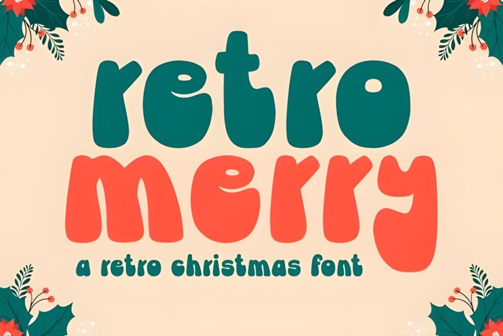
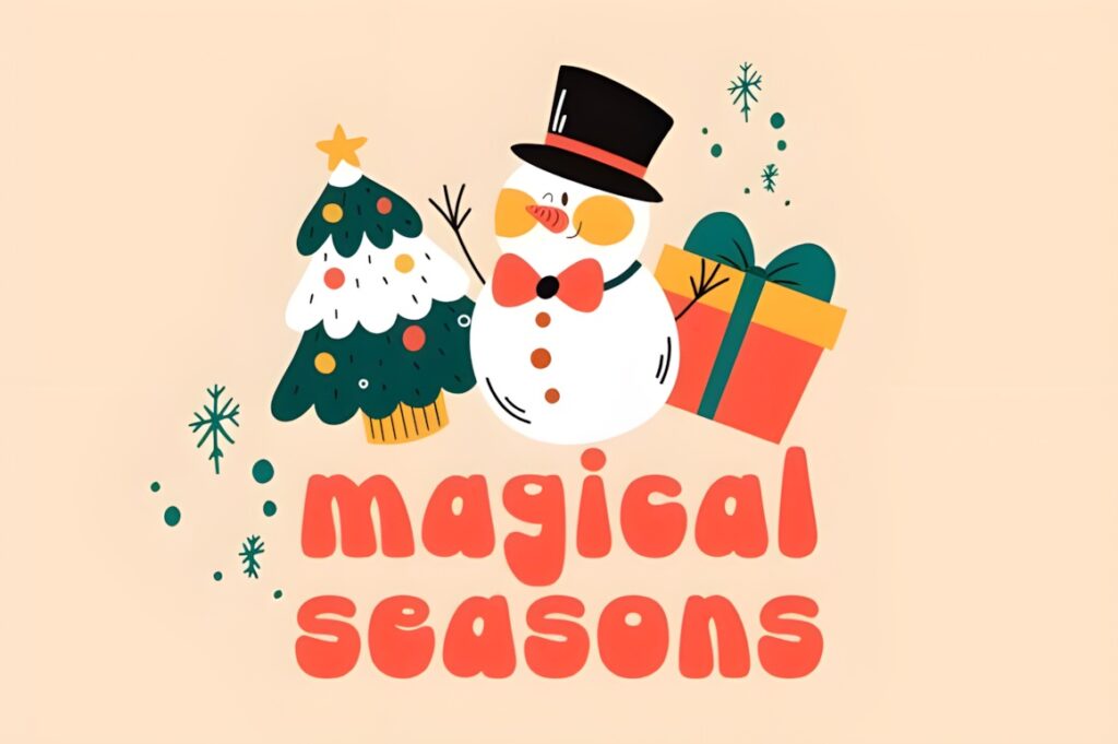
Font Fiesta’s Retro Merry uses bold, bubbly letterforms inspired by vintage holiday graphics. The rounded construction makes the font feel warm and playful, which suits seasonal branding for candy, gifts, children’s products, cheerful apparel, party goods, and colorful Christmas campaigns.
Best for: branding that should feel friendly and visibly retro rather than refined or rustic. Its bubbly shapes naturally demand attention, so I would reserve it for the primary logo, product name, or headline. More restrained lettering will work better for descriptions and practical package information.
8. Retro Christmas by Densu Creative
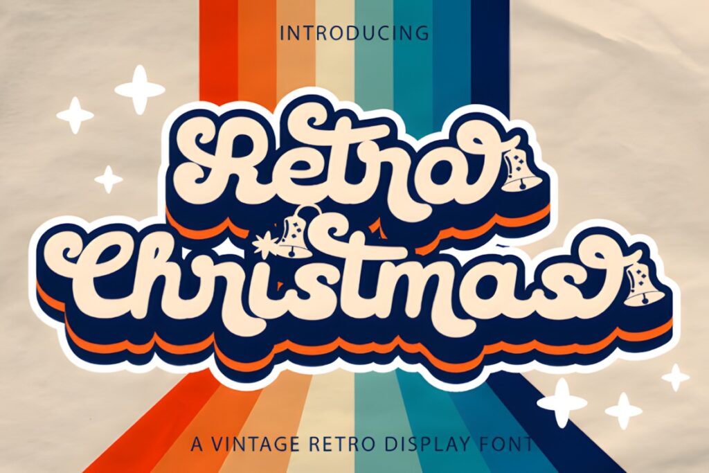
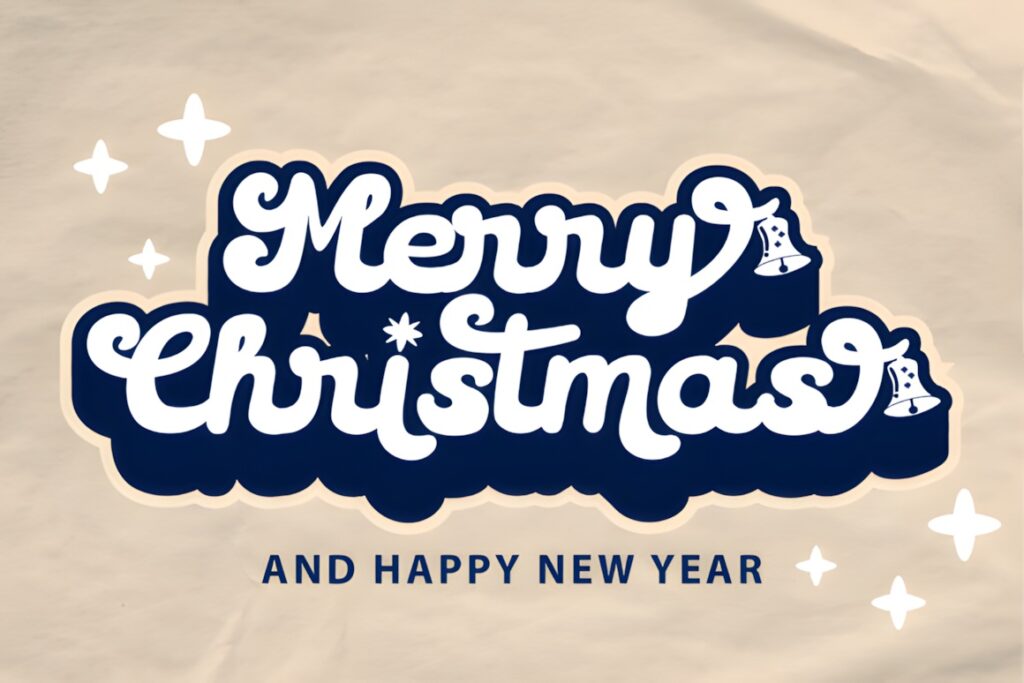
Retro Christmas is a vintage-style handwritten font designed for projects such as logos, branding, invitations, stationery, and social graphics. Its flowing handwritten character gives a seasonal identity more movement than a blocky display font, making it suitable for boutique packaging and decorative wordmarks.
The font is listed as PUA encoded, giving access to additional glyphs and swashes. Those extras can help customize a short brand name, but decorative flourishes should be used selectively: too many around a long wordmark can reduce clarity, especially on small product labels or mobile graphics.
9. Vintage Christmas by Infinity art Studio
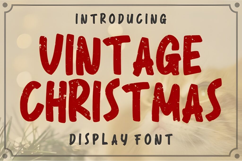
Vintage Christmas uses bold, hand-painted letterforms with a weathered texture. That combination gives it the appearance of older printed holiday advertising and makes it a strong candidate for rustic gift packaging, seasonal apparel, store signs, badges, and retro-inspired product labels.
Choose this when a polished geometric font would feel too clean for the brand. The worn surface already contributes considerable visual texture, so surrounding illustrations, backgrounds, and secondary type do not need to be equally distressed. Keeping the rest of the system simpler helps the lettering remain deliberate rather than visually noisy.
10. Christmas Evergreen by Kernova Fonts
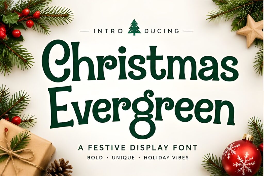
Christmas Evergreen is a bold holiday display font with rounded, vintage-inspired letterforms and decorative details. Its handcrafted personality can give logos, packaging, stickers, signs, merchandise, and promotional graphics an intentionally cheerful Christmas identity.
The rounded construction makes it less rugged than the distressed slab-serif options in this list and more suitable for family-friendly or playful branding. Because decorative details are part of the visual effect, test the final brand name at its smallest intended size before relying on those details as an essential part of the identity.
11. Merry Christmas by Shape Studio
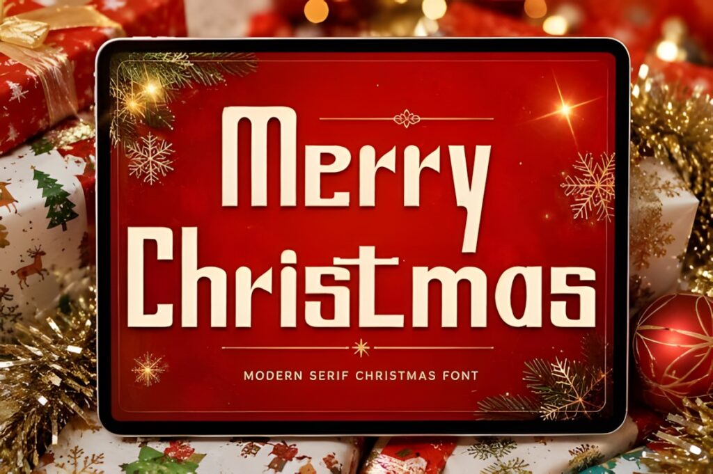
Merry Christmas combines a modern serif structure with retro flair and geometric character. It provides a useful middle ground for brands that want seasonal nostalgia without making every element look distressed, handwritten, or overtly rustic.
This makes it especially practical for gift-box branding, seasonal stationery, premium-looking labels, social campaigns, and holiday product collections that need a cleaner visual system. If the goal is deliberately handmade or weathered, Vintage Christmas by Infinity art Studio creates a rougher alternative; this font makes more sense when the brand needs retro personality with cleaner edges.
12. Merry Christmas by Infinity art Studio
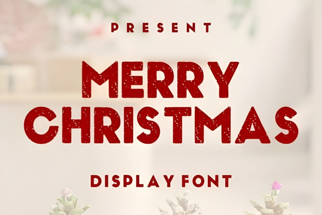
This Merry Christmas font uses chunky all-caps display lettering with distressed edges and a hand-stamped appearance. The look recalls woodblock or rubber-stamp printing, making it particularly effective for rustic promotional graphics, gift tags, apparel, posters, badges, and bold package fronts.
Its strength is immediate visibility rather than subtlety. Short names and strong holiday statements suit it well, while long elegant wordmarks may feel too heavy. For branding that needs a more refined retro tone, the serif-based Merry Christmas by Shape Studio provides a calmer direction.
13. Vintage Christmas by Inermedia STUDIO
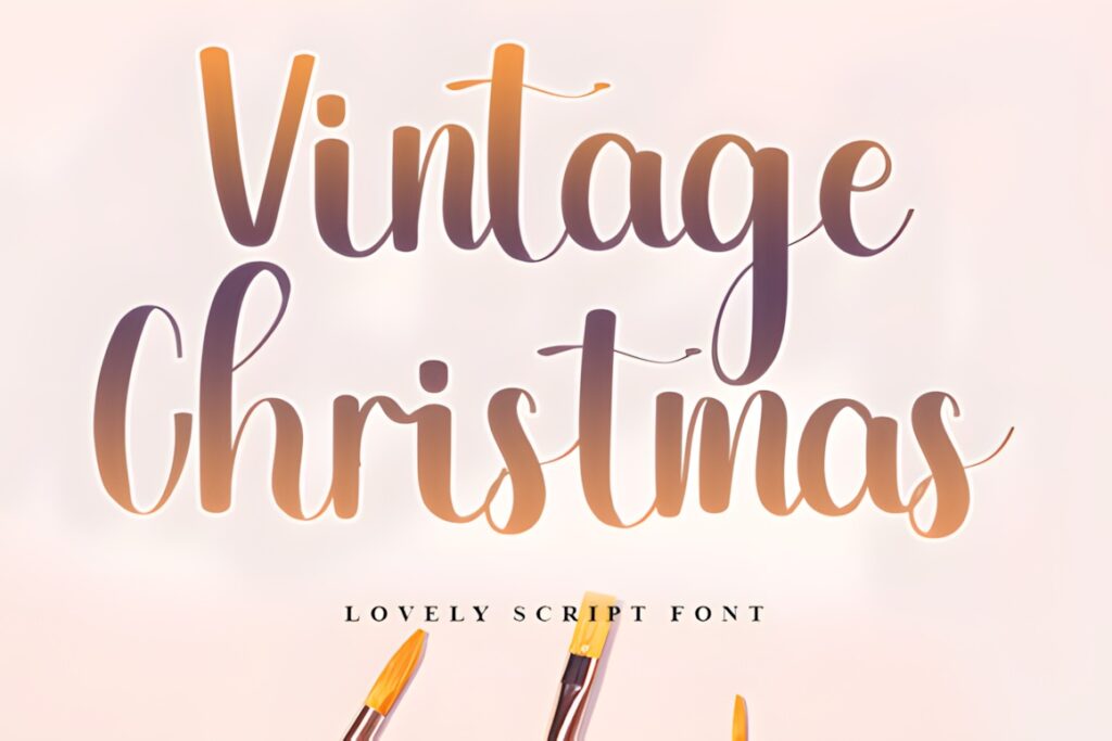
Vintage Christmas is an elegant handwritten font that provides a softer alternative to the heavy retro display styles in this roundup. Its personalized appearance makes sense for boutique holiday identities, greeting-card collections, gift labels, stationery, and seasonal marks that should feel decorative rather than loud.
Consider it when the brand already contains strong illustrations, ornaments, or textured backgrounds and the typography needs to add warmth without competing for the same visual weight. For large retail posters where the lettering itself must dominate, a heavier display or slab-serif option will usually create clearer hierarchy.
14. Christmas Vintage by Roronoa zoro.S.P.D
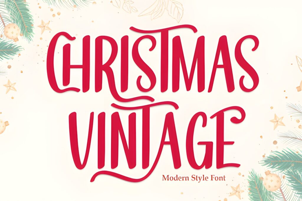
Christmas Vintage is a festive display font built around a traditional, nostalgic holiday personality. It works well for seasonal messaging where the design should communicate Christmas immediately while still retaining an old-fashioned visual direction.
I would consider it for package titles, shop graphics, promotional banners, simple holiday logos, and short product-collection names. Its role is more straightforward than the heavily textured or bubbly choices here, which can be useful when illustrations and colors already provide much of the brand personality. For a more dramatic retro statement, Christmas Retro or Retro Merry will stand out more strongly.
15. Christmas Retro by VividDoodle
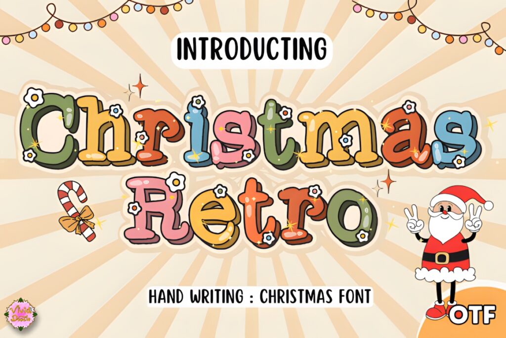
Christmas Retro takes a hand-lettered approach to festive typography. Its informal rhythm gives branding a crafted and personal quality, making it useful for seasonal boutiques, handmade goods, greeting collections, gift packaging, and social graphics where a rigid geometric logo would feel too corporate.
This style makes the most sense when personality is more important than strict uniformity. Use it for the brand name or central Christmas message, then establish structure with simpler supporting type. If the identity needs a cleaner 1970s-inspired look instead, Christmas Retro by keng graphic offers a more polished rounded-display direction.
16. Vintage Christmas by Creativewhitee
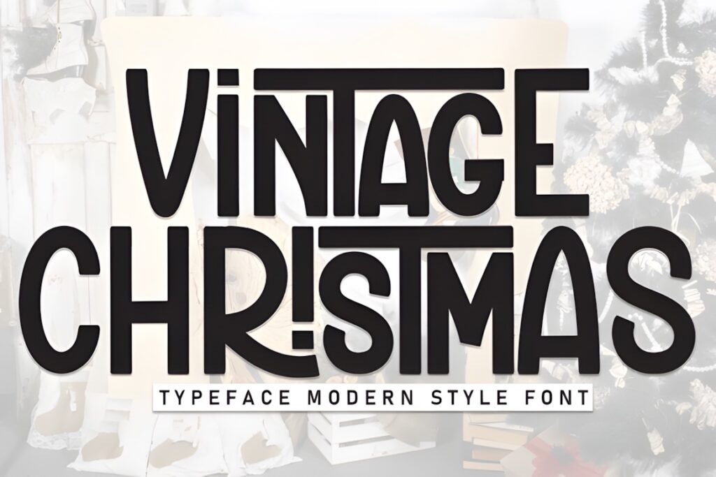
Vintage Christmas is a retro display font with a clearly festive personality. It is a useful choice when a seasonal identity needs nostalgic character but does not require the pronounced roughness of a grunge or stamp-style face.
That balance can work for Christmas cards, promotional graphics, product packaging, decorative labels, and simple seasonal branding systems. Keep the display type prominent and avoid surrounding it with several equally decorative elements. If the finished design needs stronger rustic texture, the weathered Infinity art Studio option or Vintage Holidays will create more visible age.
17. Retro Snow by Pui Art
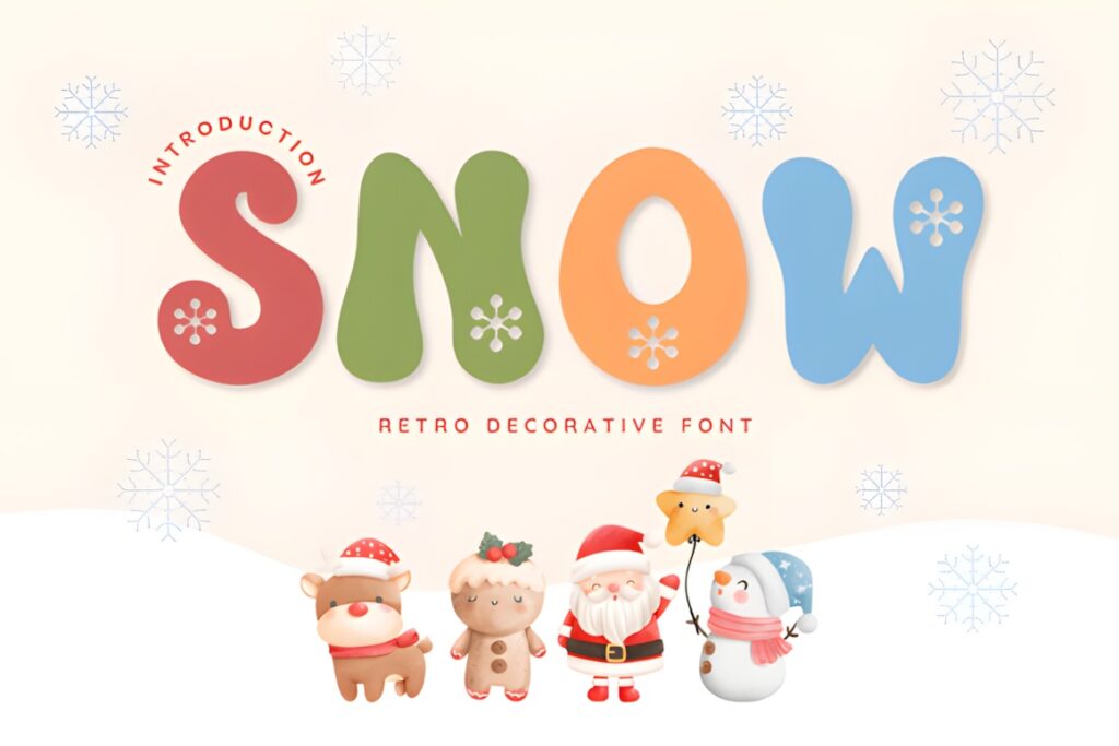
Retro Snow is a playful winter display font with retro styling and snowflake details. Those decorative elements make the seasonal connection visible even before supporting illustrations are added, which can be useful for winter promotions, Christmas cards, shop graphics, craft branding, and festive poster designs.
Choose it when an explicitly winter-themed identity is more useful than a versatile year-round retro font. The snow details narrow its application, so it is less suitable for a brand mark that needs to remain unchanged after the holiday season. For a reusable retro identity with seasonal color changes, Christmas Retro or Merry Christmas by Shape Studio offers greater flexibility.
Quick Comparison for Different Branding Styles
| Font | Best for | Style | Key visual trait | Project fit |
|---|---|---|---|---|
| Vintage Christmas | Heritage branding | Textured slab serif | Sturdy aged lettering | Packaging, signage, badges |
| Christmas Retro | Colorful retro branding | Rounded display | Soft retro corners | Logos, campaigns, packaging |
| Retro Merry | Playful brands | Bubbly display | Rounded nostalgic shapes | Gifts, candy, apparel |
| Vintage Holidays | Rustic seasonal identity | Distressed slab serif | Western-style edges | Signs, labels, posters |
| Retro Christmas | Boutique wordmarks | Handwritten | Flowing retro lettering | Logos, stationery, labels |
| Vintage Christmas | Weathered packaging | Hand-painted display | Worn printed texture | Apparel, labels, badges |
| Merry Christmas | Clean retro branding | Modern serif | Retro geometric character | Packaging, stationery, social |
| Retro Snow | Winter-specific campaigns | Decorative display | Snowflake details | Posters, cards, promotions |
Branding and Logo Considerations
Retro Christmas typography works best when the lettering reflects the rest of the brand rather than acting as an isolated seasonal decoration. For an established brand, consider whether the Christmas font should replace the main wordmark or simply support it in campaign headlines. A temporary seasonal display font is often easier to manage than redesigning every brand touchpoint around highly decorative lettering.
For a new holiday-specific brand, test the actual name rather than judging a typeface from its specimen alone. The letters in “North Pole Bakery,” for example, may interact very differently from those in a short word such as “Merry.” Pay particular attention to repeated letters, unusual capitals, spacing, and how recognizable the name remains when reduced to a social avatar or small label.
Font Pairing Tips for Retro Christmas Designs
Give the vintage font one clear job. A bubbly display face can handle the product name while a restrained sans serif carries ingredients, dates, pricing, or supporting copy. A distressed slab serif can form the main badge while a simpler serif handles secondary information. The contrast in function usually matters more than trying to find two fonts with the same retro personality.
Avoid pairing two highly decorative Christmas fonts simply because both match the theme. Competing swashes, textures, irregular shapes, or festive details can weaken hierarchy. One expressive typeface paired with one quiet supporting face generally makes the seasonal styling easier to recognize and the practical information easier to read.
Readability and Size
A vintage font can look convincing at poster size and still fail on a two-inch gift tag. Before committing to a seasonal identity, test the same wording on the smallest application you expect to use: product labels, stickers, social thumbnails, package seals, or narrow banner graphics.
Chunky, uncomplicated shapes generally survive reduction more easily than delicate handwritten details or heavy distressing. Decorative snowflakes, swashes, and textured edges can remain part of the larger campaign system even when a simplified logo treatment is used at compact sizes. This keeps the retro personality without forcing every detail into applications where it no longer reads clearly.
Common Vintage Christmas Font Mistakes
- Choosing by mood alone: test the exact brand name, especially unusual capitals and repeated letters.
- Using display lettering for everything: reserve expressive fonts for the hierarchy levels where personality matters most.
- Adding too much texture: a distressed font, distressed background, vintage illustration, and worn border can quickly compete with one another.
- Ignoring small applications: check labels, stickers, avatars, and thumbnails before building the full identity.
- Using two competing retro fonts: pair the decorative face with simpler supporting typography instead.
- Treating every retro era as interchangeable: rounded 1970s lettering communicates something different from rustic slab serifs or old hand-painted signage.
Choosing the Right Retro Christmas Style for Your Brand
If the priority is traditional packaging with visible age and weight, Vintage Christmas by Jasa (7NTypes) or Vintage Holidays makes sense. For a brighter 1970s-style personality, Christmas Retro by keng graphic gives the branding softer rounded forms.
For playful gift, candy, or family-focused branding, Retro Merry by Font Fiesta provides a bubbly nostalgic direction. A boutique identity can take a softer route with Retro Christmas by Densu Creative, while Merry Christmas by Shape Studio is better suited to a cleaner serif-led system that still carries retro character.
For the most flexible result, choose the typeface based on the smallest and most frequently used brand application—not only the largest holiday poster. A distinctive seasonal font is most useful when the logo, packaging, social graphics, and supporting typography still feel like parts of the same identity.
Frequently Asked Questions
What type of vintage Christmas font works best for seasonal branding?
A display font with a clear retro personality and readable letter shapes is usually the most practical starting point for seasonal branding. Rounded retro fonts suit playful identities, textured slab serifs work well for rustic or heritage branding, and handwritten styles create a more personal boutique feel. The right choice should also remain recognizable on packaging, social graphics, tags, and other small brand applications.
Can I use a decorative Christmas font for a logo?
A decorative Christmas font can work for a logo when the brand is seasonal or when the decorative treatment is part of a temporary holiday identity. Test the complete name at several sizes before committing to it. Detailed swashes, snowflakes, distressed edges, or irregular shapes may work beautifully at large sizes but become less clear on package seals, profile images, and small labels.
What should I pair with a retro Christmas display font?
Pair a retro Christmas display font with a quieter serif or sans serif that performs a different job. Let the decorative typeface handle the logo, product name, or main campaign message, then use the supporting font for descriptions, dates, prices, ingredients, and other practical information. Strong functional contrast usually creates clearer hierarchy than combining two equally decorative seasonal fonts.
Can vintage Christmas fonts be used on products for sale?
The permitted use depends on the current license attached to the specific font product. Before using a font for client work, products for sale, print-on-demand items, editable templates, or other commercial applications, check the current product license and make sure the planned use is covered. Licensing terms can differ by platform and use case, so avoid assuming that every downloaded font carries identical rights.