ℹ️ Affiliate Disclosure: This article may contain affiliate links. If you book or purchase through these links, we may earn a commission at no additional cost to you.
Choosing the Best Vintage Calligraphy Fonts for Greeting Card Sets
Vintage calligraphy alphabet fonts can give a greeting card the warmth of hand-lettered correspondence without forcing every sentiment into the same formal style. The challenge is balancing character with readability: dramatic capitals and long swashes look striking on a card front, but too much ornament can make names and short greetings harder to scan once the design is printed at a smaller size.
For greeting card sets, the most useful choices usually combine a recognizable vintage personality with clear lowercase forms, controlled flourishes, and enough variety to separate birthday, thank-you, holiday, romantic, and keepsake cards. This selection focuses on scripts that can take different roles across a coordinated stationery collection rather than simply repeating the same decorative look.
Many more vintage-inspired scripts are available, while this shortlist concentrates on fonts with distinct card-making roles, readable letterforms, and clearly different calligraphic personalities.

The most useful vintage calligraphy fonts for greeting card sets include restrained scripts for longer sentiments, flourish-heavy styles for names and short phrases, nostalgic lettering for holiday cards, and bold retro scripts for statement covers. Use the most decorative face as display lettering and keep supporting copy simpler when readability becomes more important than ornament.
Vintage Calligraphy Fonts for Distinct Greeting Card Styles
1. Vintage Calligraphy by Inermedia STUDIO
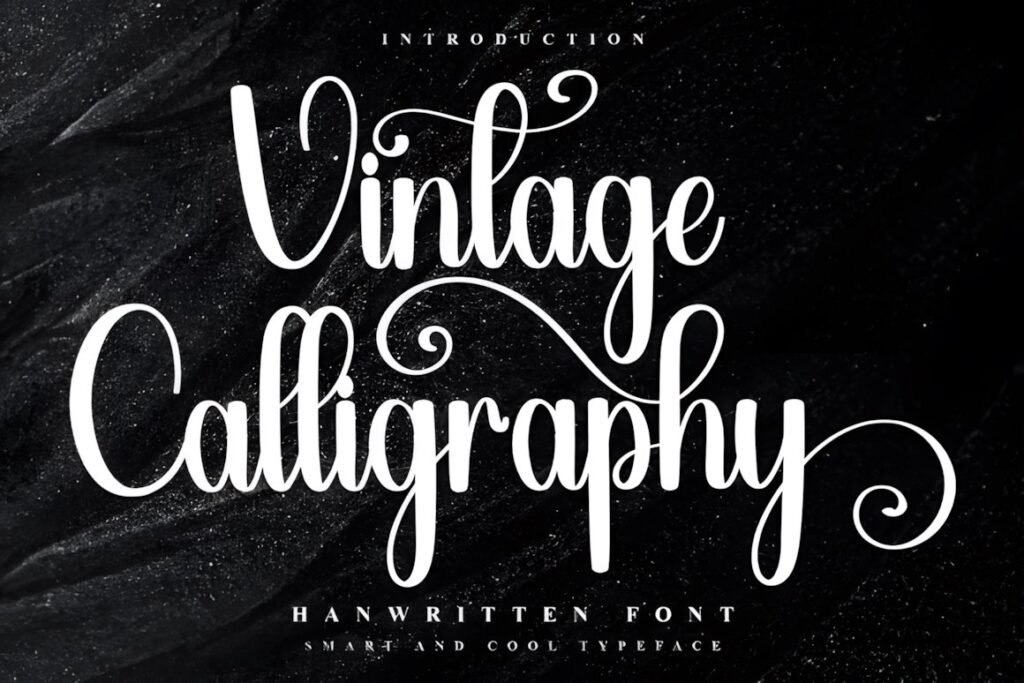
Vintage Calligraphy is a decorative script with a cheerful nostalgic character that makes particular sense for holiday greeting cards, gift labels, and coordinated seasonal stationery. The product page specifically positions the font around festive projects and confirms access to additional glyphs and ligatures through PUA encoding.
Use it when the card front needs more personality than a restrained everyday script, especially for short seasonal phrases where decorative letterforms can remain prominent. For longer interior messages, pair it with a quieter serif or sans serif rather than repeating ornate calligraphy throughout the card.
2. Vintage Signature
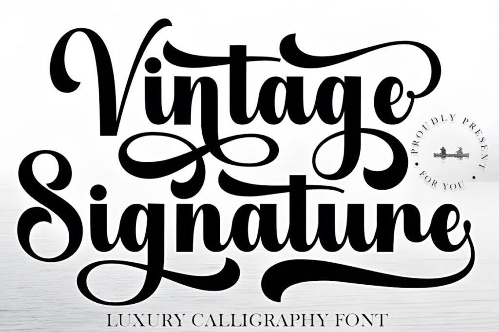
Vintage Signature brings a refined signature-style rhythm to cards that need to feel personal rather than heavily ornamental. Creative Fabrica describes it as a luxury calligraphy font with sweeping curves and lists stationery, product labels, editorial headers, and similar elegant applications among its intended uses. PUA encoding is also specified for accessing special characters.
This makes sense for sophisticated thank-you sets, bridal stationery, anniversary cards, or a handwritten-looking sender name on the back of a coordinated collection. Its flowing personality is better reserved for prominent words and names than dense informational copy.
3. Vintage Script
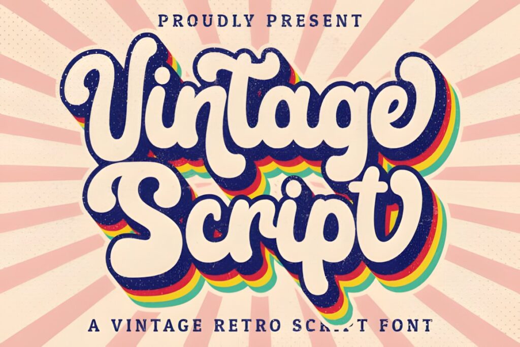
Vintage Script is a handwritten vintage-style font suited to stationery, invitations, branding, and other retro-inspired designs. Its product listing confirms PUA encoding for additional glyphs and swashes, giving card makers room to alter prominent beginnings and endings instead of setting every sentiment identically.
Choose this for a greeting card collection that needs an obvious retro flavor without moving into a highly formal penmanship style. Swashes can help distinguish hero phrases such as names or celebratory words, but simpler forms will usually be easier to manage on smaller cards.
4. Vintage Glory
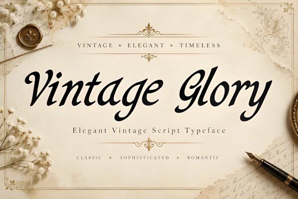
Vintage Glory uses pronounced thick-and-thin strokes, flowing connections, and decorative calligraphic detailing for a more formal vintage appearance. The listing specifically includes greeting cards, wedding stationery, invitations, product labels, packaging, and other elegant applications, and identifies the supplied file as OTF.
It makes sense when a card needs a strong central phrase with romantic or traditional character. Because the script carries substantial visual detail, give the lettering generous surrounding space instead of competing with busy illustrations or several other decorative typefaces.
5. Rathern Vintage Script
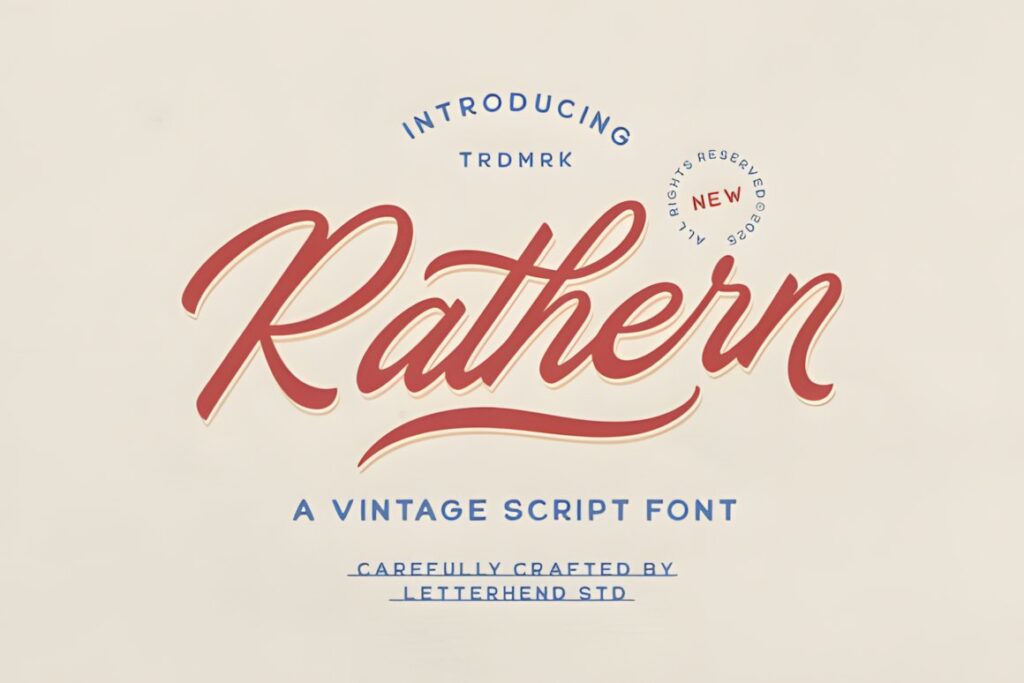
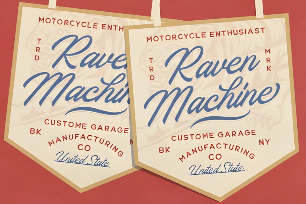
Rathern Vintage Script takes inspiration from traditional sign-painter lettering, combining broad curves with a confident connected flow. Its verified features include uppercase and lowercase characters, numbers, punctuation, alternates, ligatures, multilingual support, and PUA encoding.
The stronger retro personality gives it a different role from delicate romantic calligraphy. Consider Rathern for birthday cards, masculine stationery, retro congratulations, or boxed sets where the headline should feel substantial. For tiny cards or long phrases, test the lettering carefully because visually assertive scripts can consume horizontal space quickly.
6. Tartaglia
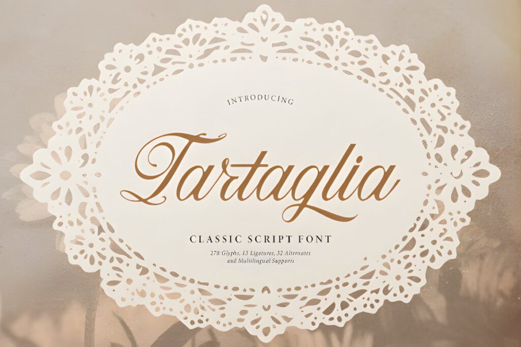
Tartaglia is a classic script built around looped capitals, connected strokes, and delicate swash accents. Its product description places it in vintage-inspired stationery, invitation, packaging, quote-art, and craft contexts, giving it a natural role in cards that need traditional calligraphic formality.
This is a useful choice for anniversaries, wedding congratulations, formal thank-you notes, or keepsake card sets. Let the capital letters provide most of the decorative impact. If every word receives a flourish, the script’s elegance can turn into visual congestion, particularly on compact A6-style layouts.
7. Vintage Melinda
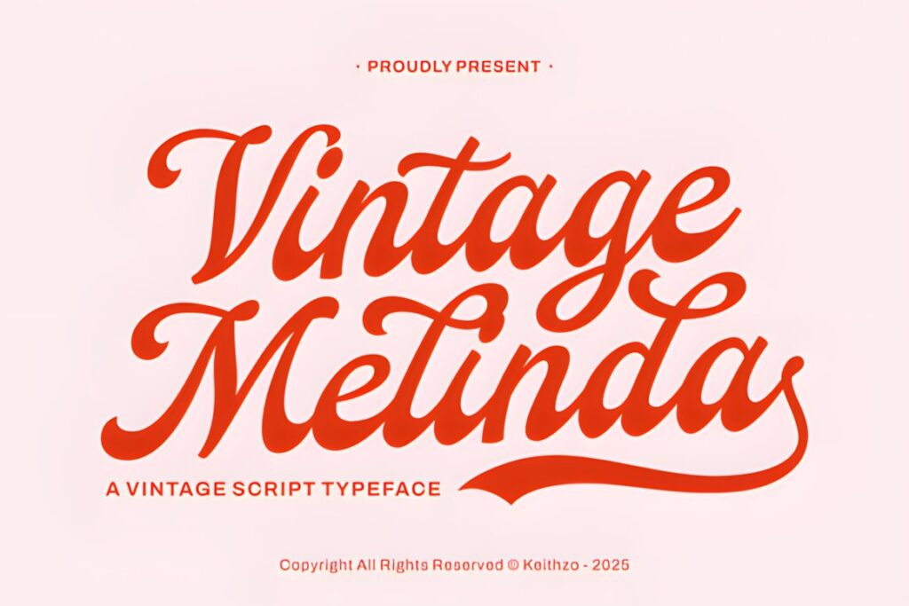
Vintage Melinda blends traditional calligraphy with a mid-century-inspired vintage mood. The product description specifically highlights greeting cards, wedding invitations, romantic stationery, swashes, and flowing transitions, making the style well aligned with affectionate card sets rather than purely decorative retro typography.
Use it for love notes, Mother’s Day cards, anniversaries, or sentimental boxed stationery where a soft handwritten impression supports the message. Compared with a heavier sign-painter style such as Rathern, Vintage Melinda makes more sense when romance and graceful movement matter more than bold headline impact.
8. Sentiny Lovelyn
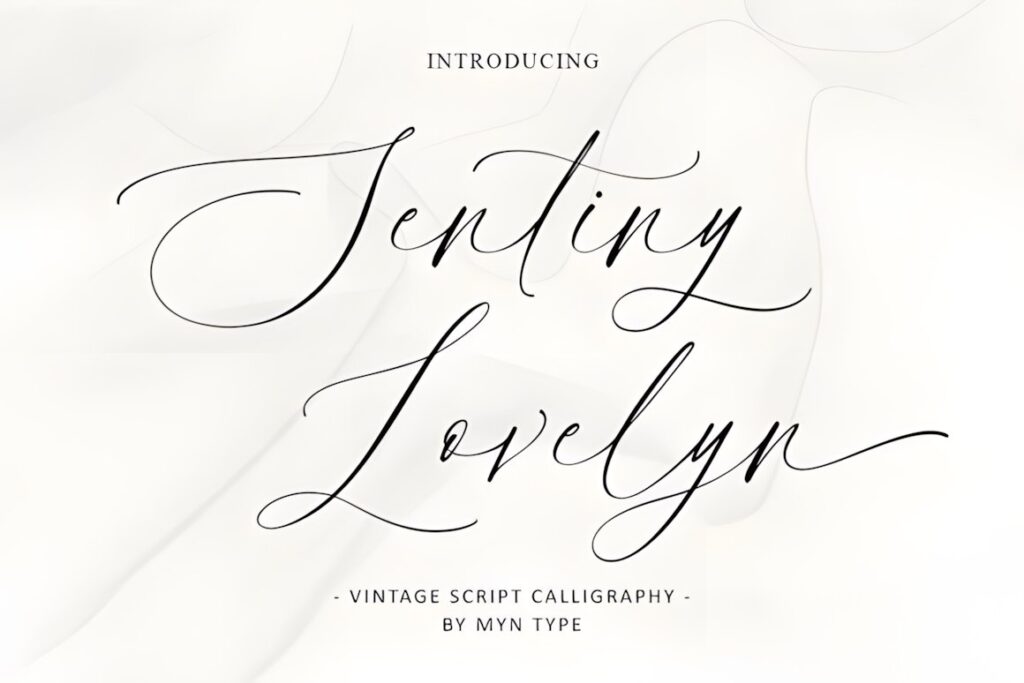
Sentiny Lovelyn uses intricate flowing strokes and decorative swashes to imitate the polished character of older script handwriting. Its listing connects the font with vintage styling, signage, branding, wedding stationery, and packaging and provides instructions for accessing its swash forms.
For greeting cards, this style is most effective when the typography itself is a major decorative element. A single phrase centered on an otherwise restrained front can show the script’s details more clearly than a layout filled with ornaments, borders, and illustration. Consider a simpler option when the card needs several lines of copy.
9. Vintage Calligraphy by AA Studio
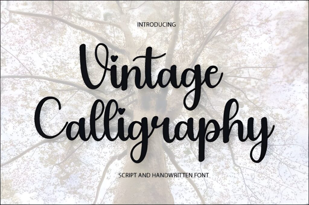
AA Studio’s Vintage Calligraphy combines traditional script styling with softer handwritten forms. The product page explicitly lists wedding invitations and greeting cards among its uses and confirms PUA encoding for glyphs, swashes, and alternate characters.
That combination makes it practical for coordinated stationery where several cards should share the same typeface but still use different decorative endings or capitals. Keep the alternates selective: one customized word can make a design feel intentional, while multiple competing swashes often weaken hierarchy.
10. Vintage Calligraphy by Inermedia STUDIO
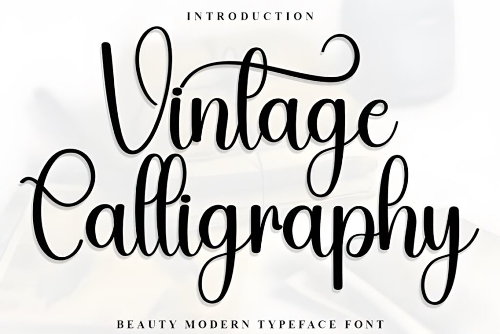
This separate Vintage Calligraphy release is presented as an elegant script intended for handwritten-looking projects including thank-you cards, greeting cards, wedding invitations, logos, and business cards.
Its role in a card collection is straightforward: use it where you want conventional calligraphic elegance without pushing the layout toward an especially bold retro theme. It can work particularly well for thank-you stationery and multipurpose blank cards. For novelty birthdays or strongly nostalgic packaging-style cards, a heavier retro script may establish the theme more quickly.
11. Vintage Calligraphy by Heidi Vargas-Smith
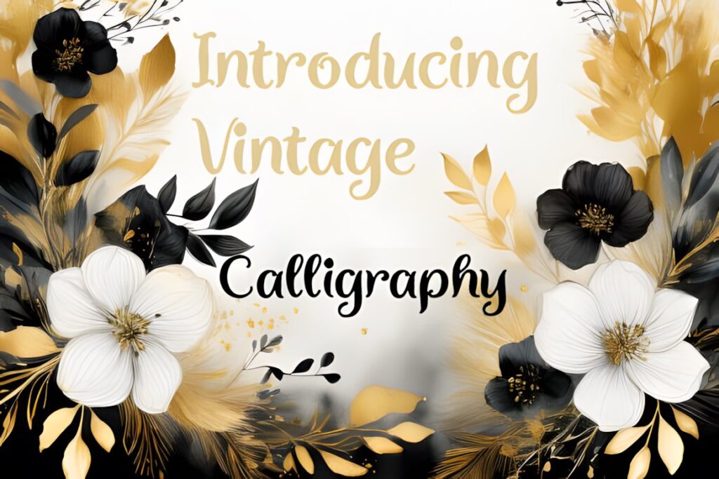
Heidi Vargas-Smith’s Vintage Calligraphy is positioned as a classic-meets-contemporary script for a wide range of creative work, with greeting cards specifically listed among the suggested projects.
This broad visual role can be useful when building an assorted card set instead of a collection tied to one holiday. Try it for general congratulations, personal notes, or cards that combine a vintage headline with contemporary illustration. Because the script carries its own decorative identity, keep secondary typography restrained so the handmade effect stays intentional rather than busy.
12. Vintage Calligraphy by PiPi Creative
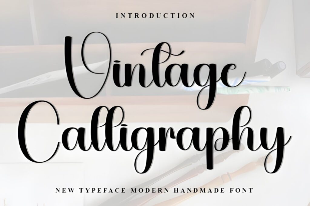
PiPi Creative’s Vintage Calligraphy has a festive, decorative personality aimed particularly at greeting cards, gift tags, and holiday-themed designs. The listing also confirms PUA encoding for additional glyphs and ligatures.
Choose it when the greeting itself needs to establish a nostalgic seasonal mood before any illustration is added. It makes more sense for Christmas and winter card fronts than for a restrained corporate thank-you set. For a coordinated series, vary the accent glyphs while keeping placement and scale consistent across cards.
13. Bastille Fields
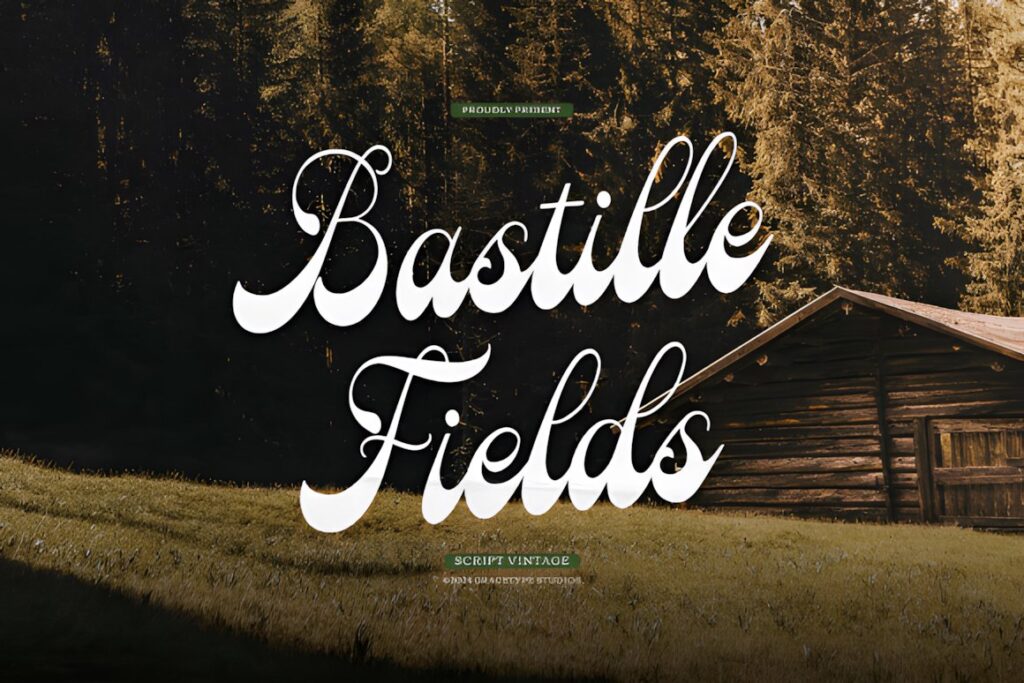
Bastille Fields is explicitly described as a vintage script suitable for invitation cards, greeting cards, labels, packaging, posters, quotes, and other nostalgic projects. Its handwritten style offers enough retro character to work beyond weddings or romantic themes.
Consider it for multipurpose boxed cards where you need a script that can move between birthdays, thank-you notes, and celebratory messages. It is especially useful when the lettering shares space with an illustration because the style can establish the vintage direction without requiring an elaborate ornamental frame.
14. La Vintage
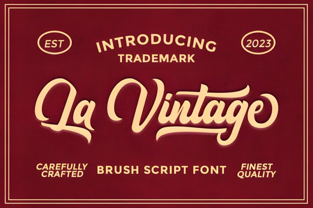
La Vintage is a handwritten brush script with an artistic flow and ligature-based details. Its listing identifies greeting cards, wedding invitations, posters, labels, logos, book covers, quotes, and social graphics among its possible uses.
The brushier personality makes La Vintage useful when a traditional pointed-pen look feels too formal. It can give birthday greetings, casual thank-you cards, or retro lifestyle stationery more movement. When designing a multi-card set, use the font consistently for the primary sentiment and let illustration or color distinguish individual occasions.
15. Antonia Retro
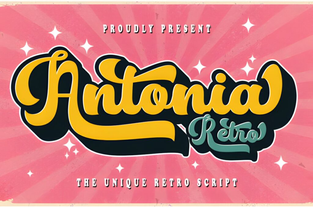
Antonia Retro is a bold script influenced by 1960s lettering and includes an extruded version for creating stronger retro effects. Creative Fabrica lists greeting and wedding cards, invitations, stationery, packaging, magazines, labels, and logos among its applications and confirms PUA encoding for glyph and swash access.
This is the option to consider when a card collection needs a visibly different final style rather than another delicate formal script. It fits celebratory, nostalgic, and fashion-influenced cards especially well. Because of its visual weight, give Antonia Retro a short headline and enough negative space instead of squeezing it into long multiline sentiments.
Quick Comparison
| Font | Best for | Style | Key visual trait | Project fit |
|---|---|---|---|---|
| Vintage Calligraphy | Holiday greetings | Decorative script | Festive flourishes | Seasonal card sets |
| Vintage Signature | Personalized cards | Signature calligraphy | Sweeping curves | Thank-you and romantic sets |
| Rathern | Bold retro cards | Sign-painter script | Confident curves | Birthdays and statement fronts |
| Tartaglia | Formal sentiments | Classic script | Looped capitals | Anniversary and keepsake cards |
| Vintage Melinda | Romantic stationery | Vintage calligraphy | Soft flowing swashes | Love and Mother’s Day cards |
| Vintage Calligraphy | Christmas sets | Festive script | Decorative glyphs | Holiday greetings and gift tags |
| Bastille Fields | Mixed occasions | Vintage script | Adaptable handwritten look | Boxed multipurpose sets |
| La Vintage | Casual retro cards | Brush script | Hand-lettered movement | Birthdays and thank-you cards |
| Antonia Retro | 1960s-inspired designs | Bold retro script | Strong headline presence | Celebratory statement cards |
Readability and Size
Vintage calligraphy works most reliably as display lettering. Use it for the main sentiment, recipient name, occasion, or one emphasized phrase rather than assuming decorative script should carry every line on the card.
Always preview the wording at the actual finished size. A capital with a dramatic loop may look balanced on a large monitor but compete with neighboring letters after reduction. Thin connecting strokes can also lose visual strength when printed very small. Community discussions around card typography repeatedly return to the same practical concern: attractive cursive can become difficult to read once flourishes, close spacing, or reduced scale interfere with recognizable letterforms.
For longer inside messages, switch to a restrained serif or sans serif. Repeating the display script in body copy rarely creates more cohesion; matching color, alignment, and spacing usually does that job more effectively.
Using Swashes, Ligatures, and Alternates
Extra characters are most useful when they solve a compositional problem. An alternate final letter can fill an awkward open corner, while a restrained entry swash can frame a short centered word. The goal is not to use every decorative glyph available.
Start by typesetting the plain version of the sentiment. Then test one decorative change at a time. This makes it easier to see whether a flourish strengthens the silhouette of the phrase or simply adds visual noise. Designers unfamiliar with large alternate sets can otherwise spend considerable time cycling through swashes without improving the hierarchy.
In a greeting card set, consistency matters more than identical ornament. You can use different alternates on individual cards while keeping the same font size, baseline position, supporting typeface, and general amount of negative space.
Font Pairing Tips for Card Sets
Let the calligraphy font handle emotion and let the supporting font handle information. A decorative script can carry “Happy Anniversary,” while a restrained serif or sans serif handles a subtitle, date, sender line, or longer message.
Avoid pairing two expressive scripts simply because both look vintage. Their competing rhythms often weaken the focal point. Instead, create contrast in function: expressive lettering for the sentiment, quieter typography for everything the recipient needs to read quickly.
For a boxed card collection, one consistent supporting typeface can also tie together several vintage scripts. That approach lets birthday, holiday, thank-you, and romantic cards feel related without making every design visually identical.
Common Greeting Card Font Mistakes
- Using calligraphy for every line. Reserve the decorative face for the message that deserves attention.
- Choosing flourishes before setting the phrase. Build readable typography first, then add alternates where they improve the shape.
- Judging only on screen. Preview or print the lettering close to its intended physical size.
- Crowding the card front. Vintage lettering often benefits from more empty space than a plain sans serif.
- Ignoring long names and phrases. A wide script that works for “Joy” may be awkward for “Congratulations on Your Anniversary.”
- Assuming every license has identical terms. Check the current product license for the exact personal, client, resale, or product use you have planned.
Choosing the Right Style for Your Card Set
If the collection centers on Christmas or nostalgic holiday greetings, Vintage Calligraphy by Inermedia STUDIO or Vintage Calligraphy by PiPi Creative gives the theme an immediate seasonal script character.
For romantic and keepsake stationery, Vintage Melinda or Tartaglia makes more sense because the softer flowing forms support names, anniversaries, and sentimental phrases. Choose Rathern Vintage Script when you want stronger retro personality, or Antonia Retro when a bold 1960s-inspired headline is part of the concept.
For a general-purpose boxed set covering several occasions, Bastille Fields or Vintage Calligraphy by Heidi Vargas-Smith offers a broader stylistic role. The final choice should follow the actual message length, card dimensions, and amount of surrounding decoration rather than the number of swashes included.
Frequently Asked Questions
Are vintage calligraphy fonts suitable for complete greeting card sets?
Vintage calligraphy fonts can work well across a greeting card set when the script is given a consistent role. Use the calligraphy for main sentiments, names, or short decorative phrases, then keep longer supporting text in a simpler typeface. A coordinated set does not require every card to use identical flourishes; consistent scale, placement, color, and supporting typography can provide the visual connection.
How can I keep decorative calligraphy readable on small cards?
Keep decorative calligraphy readable by limiting it to short phrases and previewing the design at its actual printed size. Watch for thin strokes, tight connections, crowded capitals, and long swashes that overlap nearby letters. If a phrase becomes difficult to recognize after reduction, simplify the alternates, increase the lettering size, or use a less ornate script for that card.
Should I use every swash included with a calligraphy font?
No. Swashes work best when they support the shape of a specific word or solve a spacing problem. Start with ordinary letterforms, then test a decorative initial, ending, or alternate one at a time. Using several elaborate flourishes together can crowd a compact greeting card and make the typography harder to read, even when each individual character looks attractive on its own.
Can I use these fonts on greeting cards that I plan to sell?
Check the current license attached to the specific font before producing greeting cards for sale. Licensing terms can affect physical products, client work, print-on-demand products, editable files, and redistribution in different ways. Do not assume that every font or marketplace product carries identical permissions simply because the typefaces appear in the same roundup.