ℹ️ Affiliate Disclosure: This article may contain affiliate links. If you book or purchase through these links, we may earn a commission at no additional cost to you.
Choosing Vintage Calligraphy Fonts for Classic Tattoo Art
Vintage calligraphy alphabet fonts for classic tattoo art need more than ornamental curves. Tattoo-inspired lettering usually has to hold together in short names, banners, flash-style compositions, studio logos, and bold decorative phrases without losing the hand-drawn character that makes the style convincing. Very thin flourishes can disappear at smaller sizes, while dense blackletter forms may become difficult to read when a word is long.
This selection separates flowing Chicano-influenced scripts, traditional blackletter, old-school tattoo display lettering, and cleaner calligraphic options. That makes it easier to choose according to the finished composition rather than picking thirteen fonts that all create essentially the same result.
Many more tattoo and vintage lettering fonts are available, while this shortlist concentrates on styles with distinct roles, readable forms, and noticeably different decorative personalities.

The strongest vintage calligraphy fonts for classic tattoo art usually fall into four useful groups: flowing script for names and phrases, blackletter for darker traditional lettering, old-school display faces for flash-inspired headings, and restrained calligraphy when ornamental artwork already provides most of the detail.
Quick Picks
- For traditional tattoo identity: Classic Tattoo — a direct traditional tattoo-style choice for bold names and branding.
- For flowing lettering: Tattoo Lettering — ornate loops and Chicano-influenced movement suit short decorative phrases.
- For cleaner calligraphy: Classical Calligraphy — useful when the illustration already carries much of the visual weight.
- For dark blackletter: Vintage Tattoo — thick Gothic construction gives short lettering a heavier vintage presence.
- For old-school flash character: Northman — clear, retro tattoo styling works well for traditional-inspired display text.
Vintage Calligraphy Alphabet Fonts for Tattoo-Inspired Lettering
1. Classic Tattoo
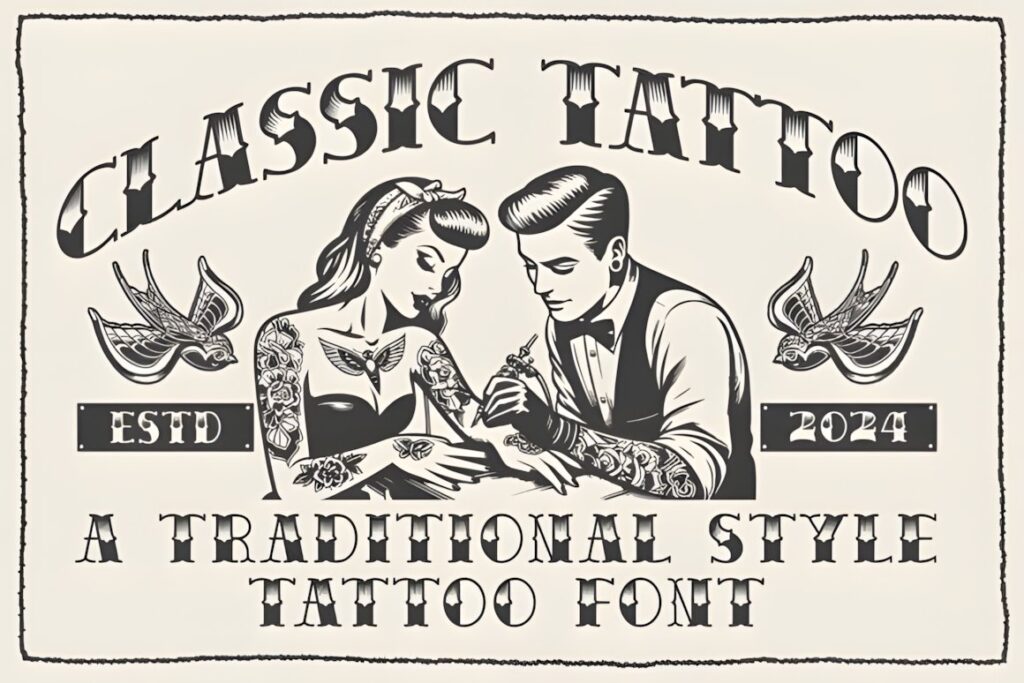
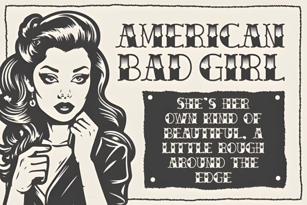
Classic Tattoo is a traditional tattoo-style font suited to prominent names, studio marks, poster lettering, badges, and compositions that need an unmistakable old-school direction. Its strongest advantage is that the tattoo influence is built into the basic letterforms, so the design does not depend on adding excessive decorative effects afterward. :chatgpt-content-reference{index=”1″}
I would use it for a short central word surrounded by roses, banners, swallows, or other traditional flash elements. For longer explanatory text, choose a simpler supporting font rather than asking this decorative face to carry the entire layout.
2. Chicano
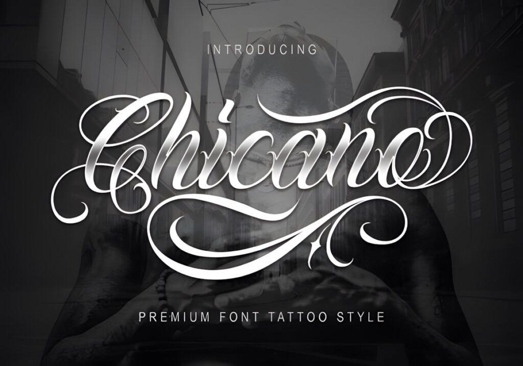
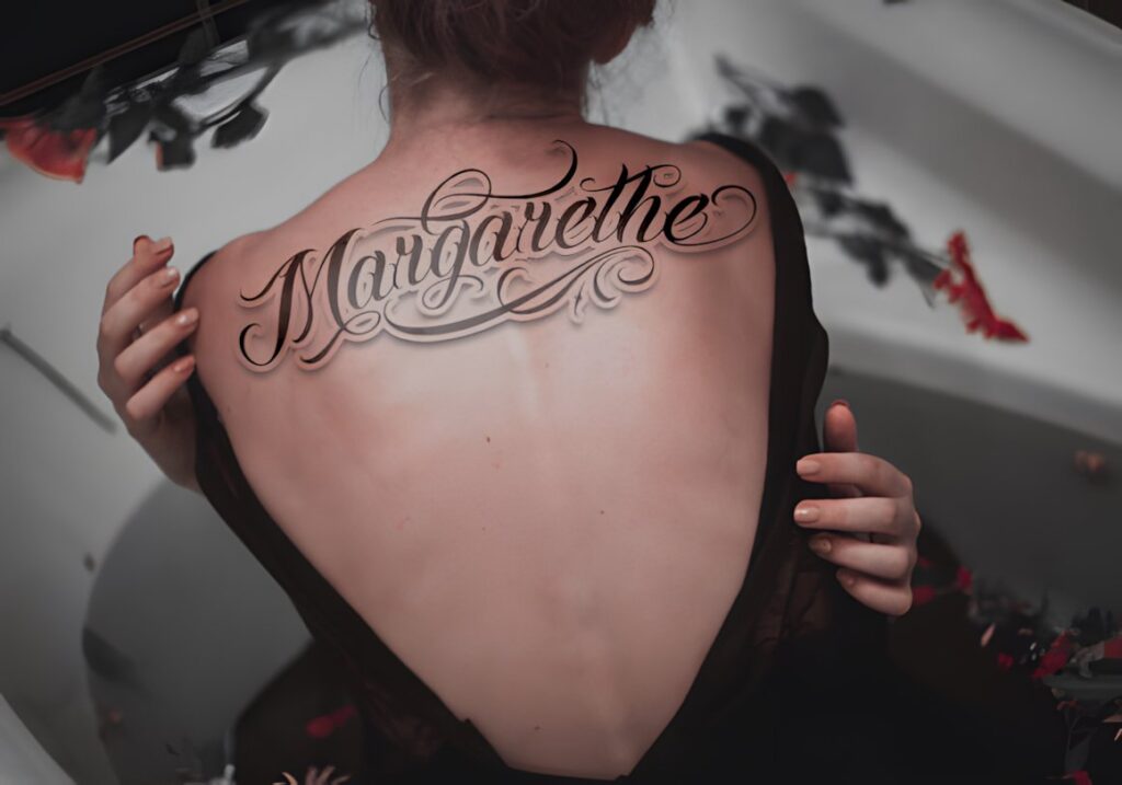
Chicano is a handwritten font explicitly inspired by classic tattoos, making it a useful alternative when rigid blackletter feels too formal. Its personality comes from stronger handwritten movement and a bold overall construction rather than medieval-style geometry. :chatgpt-content-reference{index=”2″}
It makes the most sense for names, memorial-style lettering, short phrases, lowrider-influenced graphics, or tattoo artwork where the text should feel drawn instead of typeset. Keep surrounding ornament relatively controlled so the shapes of the letters remain the focal point.
3. Tattoo Lettering
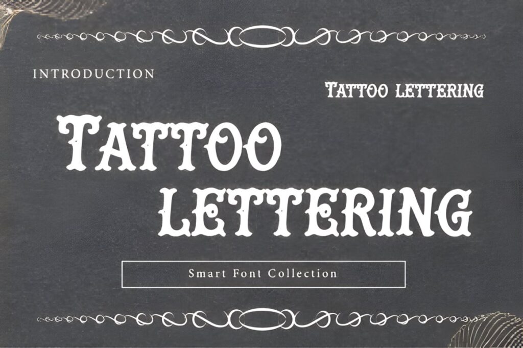
Tattoo Lettering takes the selection in a more flowing direction. Its design references traditional West Coast and Chicano-style lettering, with ornate loops, strong contrast, and prominent flourishes that create a hand-drawn calligraphic rhythm. :chatgpt-content-reference{index=”3″}
This is the kind of font I would favor for one or two emotionally important words, a name, or a compact phrase that can become part of the illustration itself. Because the decorative movement already occupies space around the letters, very long wording or dense surrounding artwork can make the composition feel crowded.
4. Floating Script
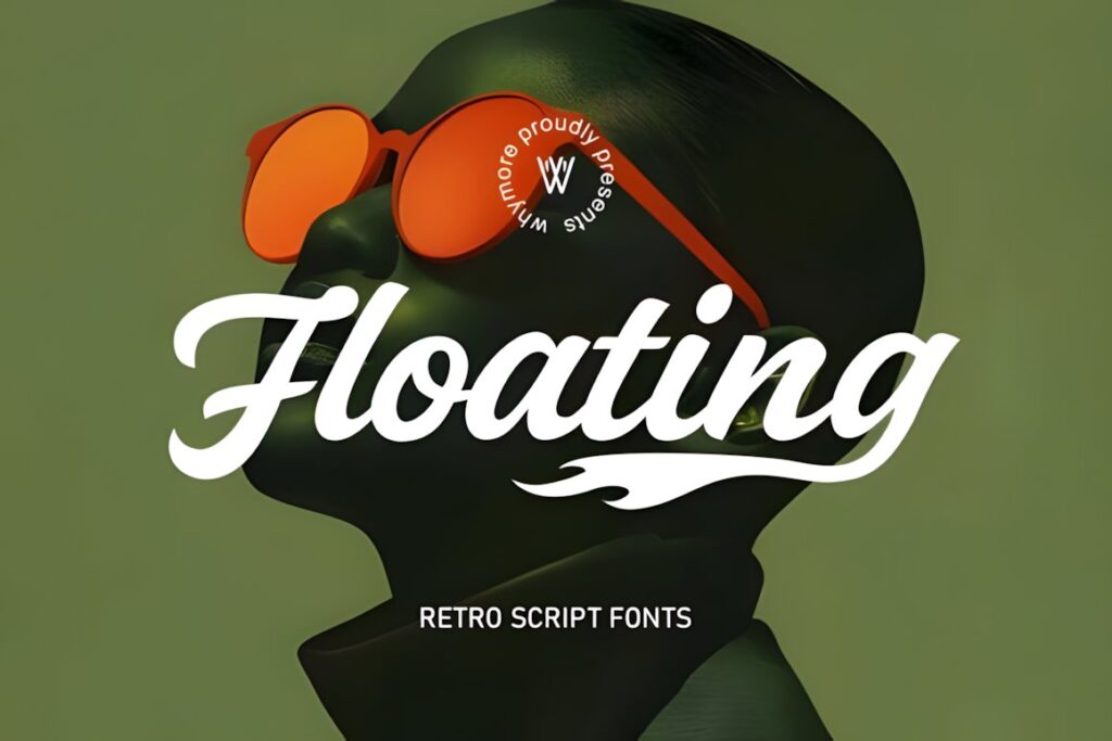
Floating Script combines retro script construction with influences from Chicano lettering, vintage signage, and tattoo typography. The result is particularly useful when you want tattoo attitude without moving fully into dense Gothic blackletter. :chatgpt-content-reference{index=”4″}
Consider it for tattoo-studio identities, short banner lettering, apparel graphics, or compositions influenced by lowrider and street-lettering culture. Its flowing forms already add substantial movement, so it works better when the text has enough open space than when squeezed into a narrow multi-line block.
5. Nocthane
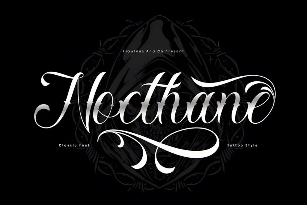
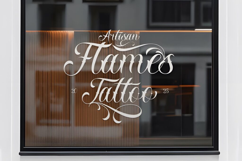
Nocthane is a classic tattoo-style script with elegant letterforms, sharper decorative accents, and pronounced swashes. It sits between refined calligraphy and rebellious tattoo lettering, which makes it useful when a design needs both ornament and a strong visual edge. :chatgpt-content-reference{index=”5″}
A short name across a banner or beneath a central illustration is a natural use. Compared with Classic Tattoo, Nocthane creates more flowing movement; compared with Tattoo Lettering, it can feel sharper and more dramatic. Leave enough space around extended strokes so they look intentional rather than clipped.
6. Manciety
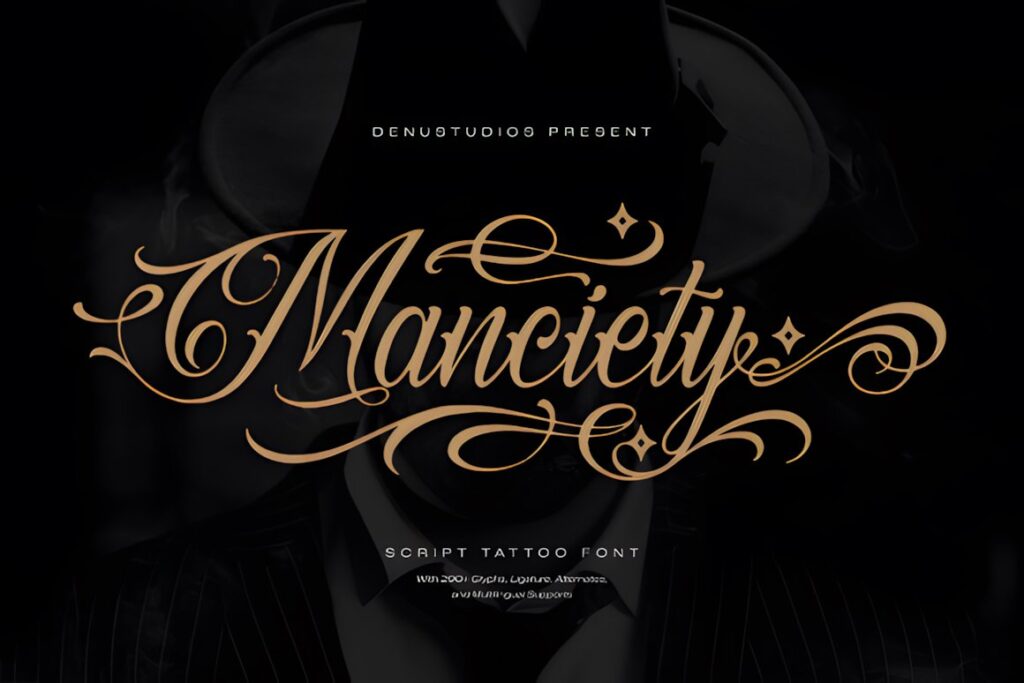
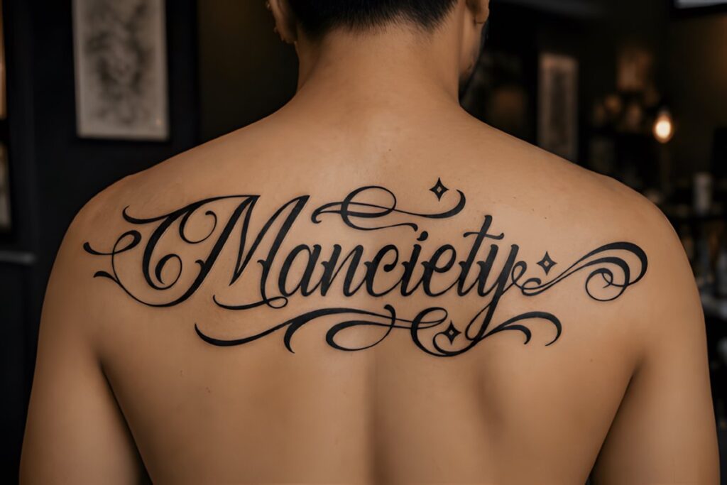
Manciety is a script tattoo font built around high-contrast calligraphic strokes and long sweeping flourishes associated with classic Chicano-style lettering. It gives short wording a polished, ornamental character without relying on blocky blackletter forms. :chatgpt-content-reference{index=”6″}
Use it when the lettering itself needs to provide a large share of the visual decoration, such as a central surname, studio name, or short motto. The dramatic stroke extensions deserve room, so compact layouts with several surrounding motifs may work better with Chicano or one of the simpler old-school options.
7. Classical Calligraphy
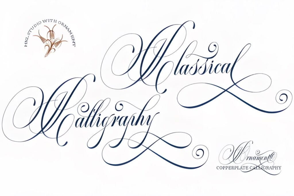
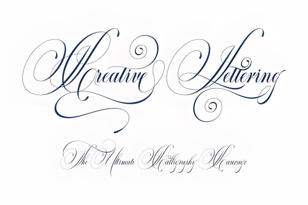
Classical Calligraphy offers a cleaner vintage calligraphy direction based on copperplate-influenced handwriting. The product includes alternative characters, and its smoother structure provides a useful contrast to the rougher and heavier tattoo fonts in this list. :chatgpt-content-reference{index=”7″}
This makes more sense when roses, frames, banners, daggers, or other artwork already supply strong tattoo imagery and the wording needs refinement rather than additional aggression. It is also useful for secondary names or dates. For a darker Gothic result, Vintage Tattoo or Tattoo Nobaga will create a much heavier impression.
8. Vintage Tattoo
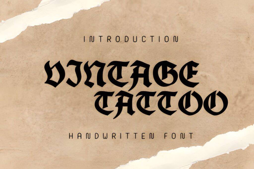
Vintage Tattoo is a bold, thick blackletter font for projects that need traditional Gothic structure rather than flowing script. Its dense strokes and decorative letter shapes give short words a forceful presence, and the font includes accessible glyphs and swashes through PUA encoding. :chatgpt-content-reference{index=”8″}
This style suits prominent initials, names, short mottoes, biker-influenced artwork, or dark flash compositions where the text needs to compete visually with heavy illustration. Long sentences are less natural territory because blackletter detail accumulates quickly; reserve it for the words that deserve the strongest emphasis.
9. Narch Tattoos
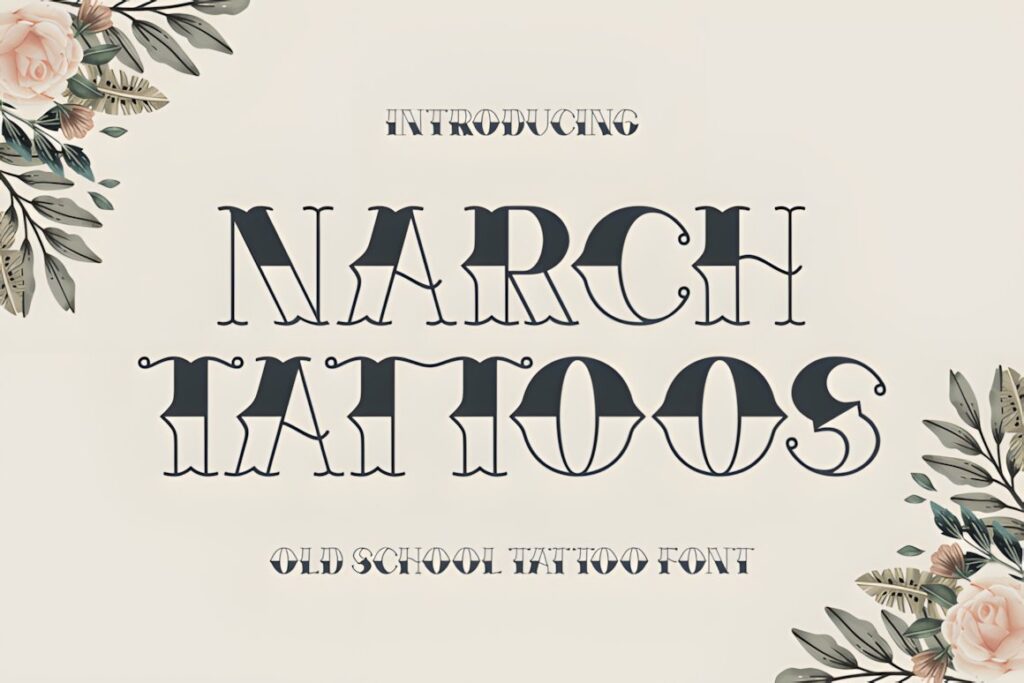
Narch Tattoos leans toward old-school tattoo typography with strong lines and a clearly retro personality. Instead of relying primarily on long script swashes, it creates impact through sturdy letterforms that fit traditional tattoo-inspired logos and vintage display compositions. :chatgpt-content-reference{index=”9″}
Choose it when the wording should feel bold and established rather than elegant. It can sit comfortably beside classic flash elements and works especially well for short shop names, badge layouts, or headline-style text. For more graceful personal lettering, Tattoo Lettering or Manciety provides considerably more calligraphic motion.
10. Northman
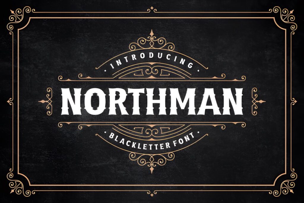
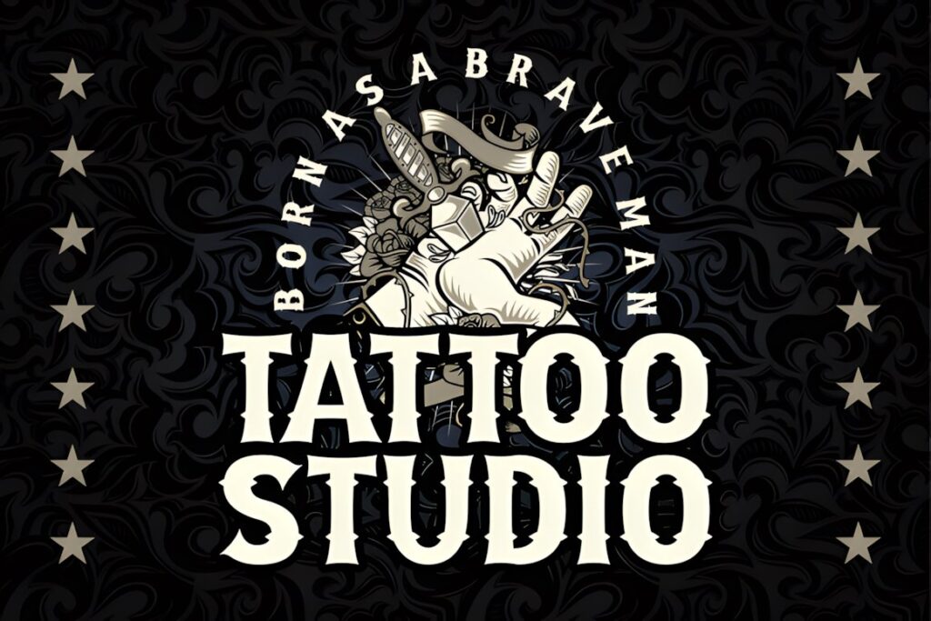
Northman is an old-school tattoo font created around the bold retro character associated with traditional tattoo art. Strong, clear lines give it a practical advantage when the design needs a recognizable vintage tattoo mood without making every character extremely ornate. :chatgpt-content-reference{index=”10″}
I would consider Northman for traditional flash headings, short slogans, shop graphics, or a word placed on a ribbon beneath a central illustration. Its more direct construction can be easier to balance with detailed artwork than an elaborate swash-heavy script. Choose a flowing option when the lettering itself needs to become the decorative centerpiece.
11. Tattoo Art
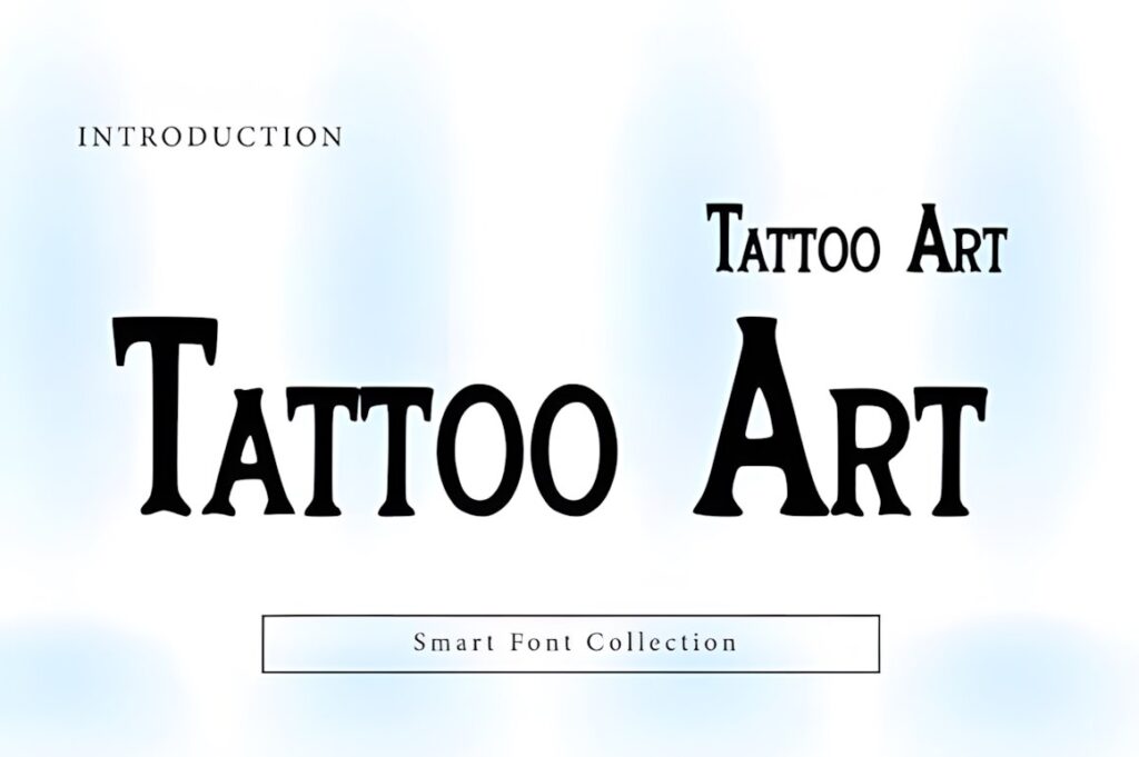
Tattoo Art is a bold display serif inspired by classic tattoo lettering and old-school ink art. Strong strokes, decorative curves, and a vintage edge make it a useful break from the script and blackletter-heavy options elsewhere in this roundup. :chatgpt-content-reference{index=”11″}
It is particularly suitable when you need a headline, label, poster title, or central word that feels traditional without looking like formal Gothic calligraphy. Pair it with illustrative tattoo motifs rather than adding too many typographic flourishes. If the goal is delicate personal lettering, one of the script faces will provide more natural movement.
12. Tattoo Notes
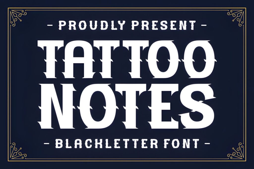
Tattoo Notes mixes traditional Gothic blackletter with a more hand-drawn tattoo quality and touches of Western styling. That hybrid character makes it useful when pure medieval blackletter feels too historical but conventional script feels too soft. :chatgpt-content-reference{index=”12″}
Use it for tattoo-parlor identities, rock-oriented graphics, vintage emblems, or short text placed within a strong symmetrical composition. Because the letterforms already combine several visual influences, simple surrounding typography usually gives the design more hierarchy. For a more straightforward traditional tattoo face, Northman provides a cleaner alternative.
13. Tattoo Nobaga
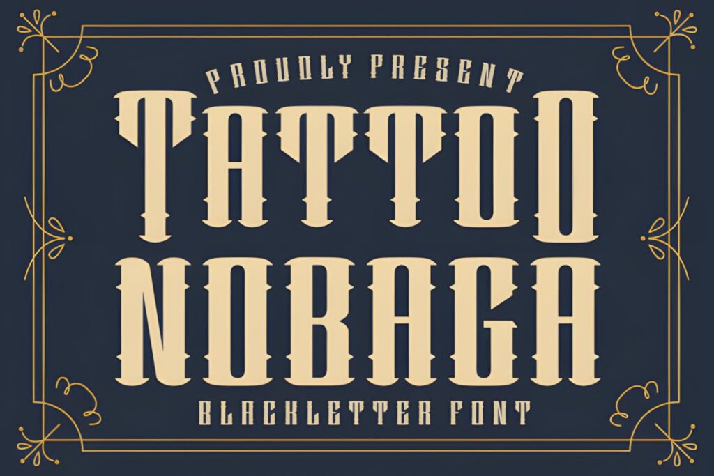
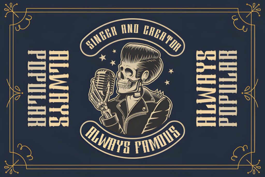
Tattoo Nobaga combines Gothic blackletter intricacy with rugged hand-drawn tattoo qualities and a slight Western influence. The mixture gives it a traditional but less formal personality than rigid historical blackletter, making it suitable for rebellious logos, tattoo-shop artwork, and alternative apparel graphics. :chatgpt-content-reference{index=”13″}
Consider this option when you want the letters to carry visual texture as well as structure. It works most naturally for short display wording where individual shapes remain visible. If readability and open space matter more than Gothic atmosphere, Tattoo Art or Northman can provide a simpler visual foundation.
Quick Comparison
| Font | Best for | Style | Key visual trait | Project fit |
|---|---|---|---|---|
| Classic Tattoo | Traditional compositions | Tattoo display | Old-school character | Names, logos, posters |
| Chicano | Hand-drawn lettering | Handwritten | Bold personal rhythm | Names and short phrases |
| Tattoo Lettering | Ornamental wording | Chicano-influenced script | Loops and flourishes | Short decorative phrases |
| Nocthane | Dramatic script | Tattoo script | Sharp decorative swashes | Names and banners |
| Classical Calligraphy | Refined supporting lettering | Vintage calligraphy | Smooth copperplate influence | Names, dates, secondary text |
| Vintage Tattoo | Heavy Gothic lettering | Blackletter | Thick ornate forms | Short names and mottoes |
| Northman | Traditional flash text | Old-school tattoo | Strong clear lines | Banners and headlines |
| Tattoo Art | Readable vintage display text | Decorative serif | Bold curved forms | Labels and poster titles |
Script, Blackletter, or Old-School Display?
Choose a flowing script when the wording needs to feel personal and hand-lettered. Tattoo Lettering, Manciety, Nocthane, Chicano, and Floating Script are better suited to this role than a rigid Gothic face. They work especially well when a name or short phrase is supposed to interact visually with a banner or illustration.
Blackletter changes the mood immediately. Vintage Tattoo, Tattoo Notes, and Tattoo Nobaga create stronger vertical structure, darker texture, and more historical weight. They make sense for short wording that needs authority, but dense letterforms need additional room as the word gets longer.
Old-school display styles such as Classic Tattoo, Northman, and Tattoo Art sit between those extremes. They can communicate traditional tattoo influence without requiring long calligraphic swashes or dense Gothic construction, which often makes them easier to combine with detailed flash illustrations.
Readability and Size in Tattoo Lettering
The most decorative font is not automatically the strongest choice at every scale. Small lettering reduces the open areas inside characters and brings neighboring strokes closer together. A design that looks balanced as a large title may become visually dense when reduced.
For compact compositions, start with the base alphabet before adding alternates or swashes. Check the narrowest counters, the spacing between connected letters, and any hairline details. If the lettering becomes difficult to recognize, simplify the treatment rather than forcing every ornamental feature into the final design.
For large flash-inspired posters, apparel graphics, or studio branding, there is more room to use exaggerated capitals and sweeping terminals. Even then, one dominant flourish usually creates a clearer hierarchy than several strokes competing around every letter.
How to Pair Vintage Tattoo Fonts
Treat the decorative tattoo font as the display voice rather than asking it to handle every piece of information. A strong script or blackletter can carry a name, phrase, or central title, while a restrained serif or sans serif can handle dates, locations, supporting copy, and smaller labels.
The pairing works because the two fonts have different jobs. If both typefaces use elaborate swashes, distressed texture, or strong historical detail, the hierarchy becomes less obvious. Contrast the decorative font with something quieter rather than trying to find a second face with the same personality.
In traditional flash-inspired compositions, typography also has to share space with illustrations. If the roses, eagle, snake, dagger, or banner already contains substantial detail, a slightly simpler lettering style such as Northman or Tattoo Art may balance the image more effectively than an elaborate script.
Common Tattoo Font Selection Mistakes
- Choosing by alphabet preview alone. Type the actual word or phrase because letter combinations change the spacing and overall silhouette.
- Using too many swashes. Decorative strokes should support the composition rather than cover neighboring letters.
- Ignoring word length. Wide capitals and flourishes can turn a long name into an awkwardly stretched layout.
- Making every line decorative. Give secondary information a simpler supporting typeface.
- Reducing intricate blackletter too far. Always inspect ornate characters at the approximate final size before committing to the layout.
- Assuming licensing terms are identical. Check the current product license for the exact use you intend, especially client work, merchandise, or editable products.
Choosing the Right Style for Your Tattoo Artwork
If you want an immediately recognizable traditional tattoo direction, Classic Tattoo or Northman gives the composition a strong old-school base without depending on extreme flourishes.
For flowing names and personal phrases, Tattoo Lettering, Manciety, or Nocthane makes more sense because the script movement becomes part of the artwork. When you need a darker Gothic atmosphere, Vintage Tattoo shifts the design toward dense blackletter.
If the illustration is already highly detailed, Classical Calligraphy provides a more restrained vintage option, while Tattoo Art works when you want bold retro display lettering with less script complexity.
Frequently Asked Questions
What font style works best for classic tattoo lettering?
Classic tattoo lettering commonly works with old-school display fonts, flowing tattoo scripts, and blackletter. Choose old-school lettering for traditional flash-inspired designs, script for names and personal phrases, and blackletter when the artwork needs a darker Gothic character. Word length and finished size should influence the choice as much as visual style.
Are vintage calligraphy fonts readable in small tattoo-style designs?
Vintage calligraphy fonts can remain readable at smaller sizes when the letterforms have enough open space and the ornamentation is controlled. Very thin strokes, tight counters, elaborate capitals, and overlapping swashes can become difficult to distinguish when reduced. Preview the exact wording near its intended finished size before finalizing the layout.
How should I use swashes in tattoo lettering?
Use swashes to frame or balance important lettering rather than decorating every available character. A long entry stroke, underline, or terminal flourish can help fill negative space around a short name. Too many overlapping swashes compete with the alphabet itself and can make a compact tattoo-inspired composition harder to read.
Can I use these tattoo fonts for products, logos, or client work?
Usage rights depend on the current license attached to the individual font product. Before using a font for merchandise, a logo, client work, print-on-demand products, or editable digital files, check the current product license and confirm that your intended use is covered. Do not assume every downloadable font carries identical permissions.