ℹ️ Affiliate Disclosure: This article may contain affiliate links. If you book or purchase through these links, we may earn a commission at no additional cost to you.
Choosing the Best Halloween Fonts for Canva Party Invitations
A Halloween party invitation needs to feel spooky before anyone reads the date, address, or dress code. The problem is that heavily decorated Halloween fonts can quickly make a Canva invitation harder to scan, especially when long party names, small mobile previews, and multiple lines of event information compete for space. For most invitations, the strongest approach is to use a Halloween font for the main headline while keeping the supporting details in a simpler typeface.
The Halloween fonts below cover chunky display lettering, ghost-inspired characters, witchy shapes, dripping horror styles, playful seasonal designs, and cleaner spooky options. The selection focuses on fonts that can give Canva party invitations distinct personalities without forcing every line of the invitation into decorative lettering.
Many more Halloween fonts are available, while this selection concentrates on styles with clearly different invitation uses, readable display lettering, and distinct spooky personalities.

For Canva spooky party invitations, bold display fonts work well for large event titles, playful ghost and pumpkin styles suit family-friendly parties, and sharper horror lettering fits haunted-house or adult Halloween events. Keep decorative typography concentrated in the headline, then use a restrained supporting font for dates, addresses, RSVP details, and other information that needs fast readability.
Quick Picks
For a classic spooky invitation: Halloween Font — thick display lettering that gives the main party title immediate seasonal character.
For dramatic horror: Scary Spooky — a darker display option suited to haunted parties and October event graphics.
For a cleaner layout: Ghost Halloween — tall, relatively simple letterforms that leave more room for invitation information.
For playful illustrated lettering: Halloween — decorative seasonal characters with witch, bat, web, and skull details.
For a witchy theme: Halloween Witches — sharper supernatural lettering for darker invitation concepts.
Halloween Fonts for Canva Spooky Party Invitations
1. Halloween Font
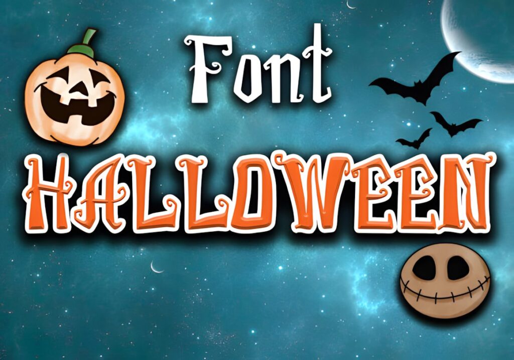
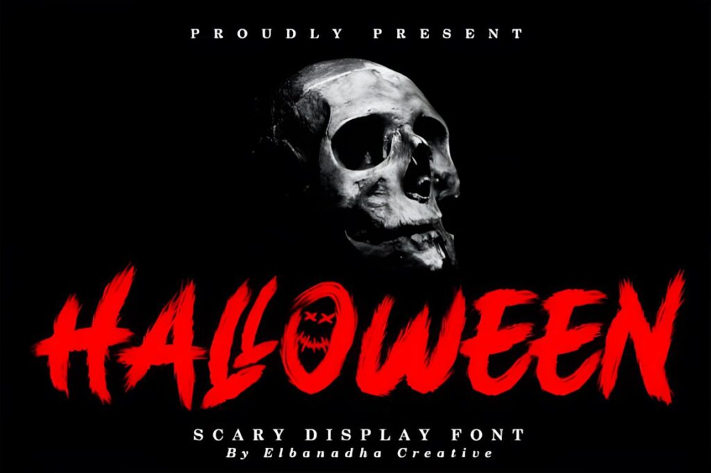
Halloween is a thick spooky display font that makes sense for the largest text on a party invitation. Its substantial letterforms give short headings such as “Halloween Bash” or “Spooky Party” enough visual weight to stand apart from the date and RSVP information.
This is a useful direction when the headline needs obvious Halloween personality without relying on a delicate script. Because the lettering already carries strong seasonal character, pair it with restrained supporting typography rather than another decorative font.
2. Scary Spooky
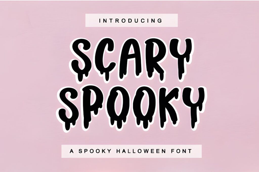
Scary Spooky is a Halloween display font aimed directly at dramatic October projects, including party invitations. It works particularly well when the invitation needs a stronger haunted-event mood rather than a cute pumpkin-and-ghost aesthetic.
Use it primarily for the event name or one short statement where the spooky silhouette has room to read clearly. Invitations with several decorative illustrations may benefit from a simpler headline option instead, since too many competing Halloween elements can weaken the hierarchy.
3. Halloween Party
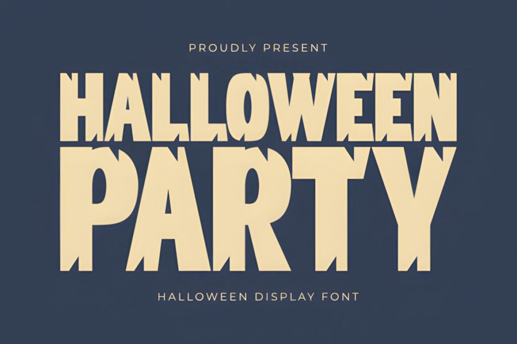
Halloween Party is designed around seasonal event typography, making it a natural candidate for invitation headlines, party posters, and similar October designs. Its strong display presence works well when the invitation needs an obvious focal point above smaller informational text.
Consider this font for layouts where typography does much of the decorative work. If your Canva template already uses large pumpkins, ghosts, frames, and textured backgrounds, reducing the amount of decorative text can keep the design from becoming visually crowded.
4. Halloween Font
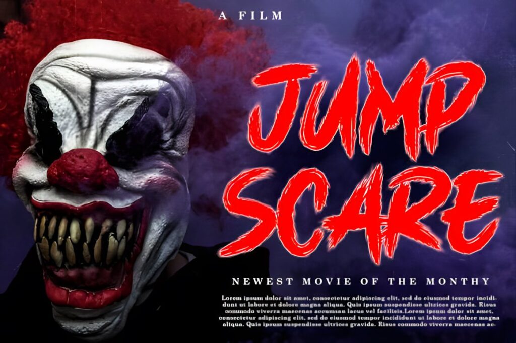
This Halloween display font has a creepy, quirky character that suits October party invitations, greeting cards, and social graphics. It is particularly useful when the invitation should look spooky without committing to an extremely dark horror style.
The font’s unusual personality is most effective in short display text. Give longer event details a simpler companion font so guests can quickly find the time, location, costume instructions, and RSVP information.
5. Secret Halloween
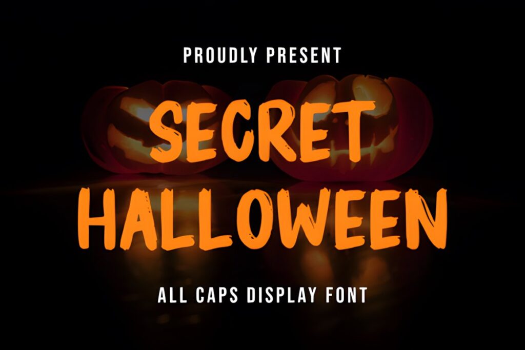
Secret Halloween combines creepy and quirky display lettering for invitations that need an unmistakably seasonal headline. Its character is well suited to October parties, Halloween cards, and other designs where the type itself should reinforce the theme.
Choose this direction when you want personality without turning the entire invitation into horror typography. Keep names and short headlines decorative, then switch to cleaner lettering for logistical information that guests need to read quickly.
6. Horror Party
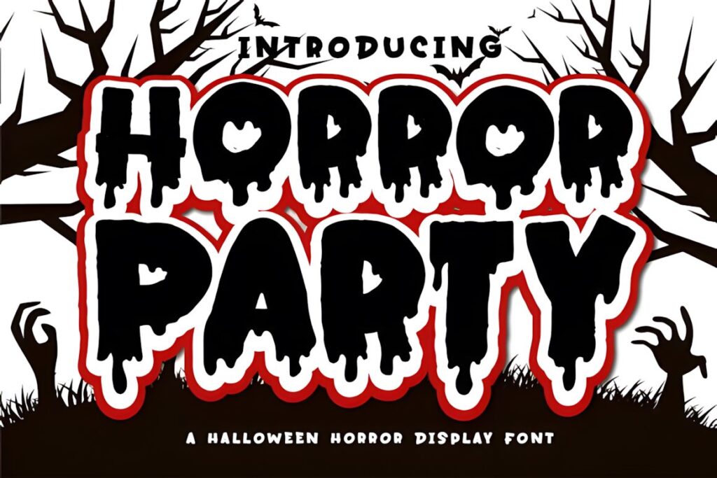
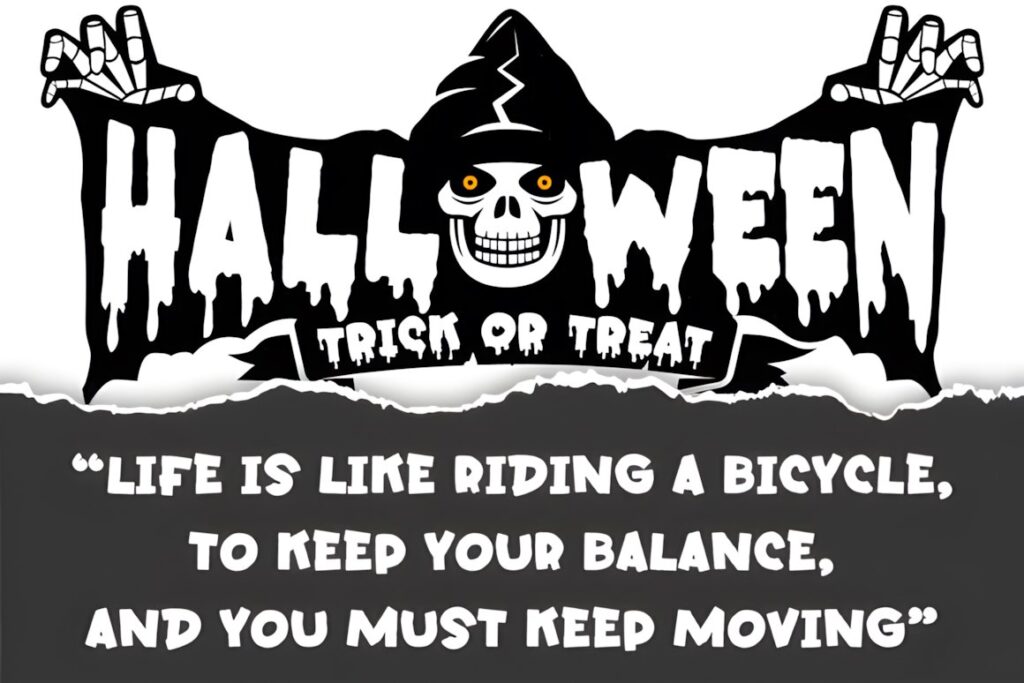
Horror Party is a Halloween display typeface built for darker seasonal projects, including party invitations. Its macabre direction makes more sense for haunted-house events, horror movie nights, or adult Halloween parties than for soft and cute children’s invitations.
Let the font carry the main title while quieter typography handles the details. For an invitation dominated by black, red, smoke, or distressed textures, Horror Party can reinforce the atmosphere without requiring extra decorative words.
7. Midnight Halloween
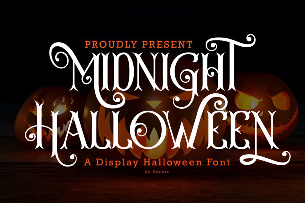
Midnight Halloween fits party invitations that need a mysterious seasonal feel without the roughest horror treatment. Its theme works naturally with moonlit backgrounds, dark purple palettes, black cats, stars, candles, and other nighttime Halloween imagery.
This style is useful when the invitation should feel more atmospheric than cartoonish. Give the headline enough breathing room, particularly when using textured or illustrated Canva backgrounds that could compete with the letter shapes.
8. Sinister Chapter
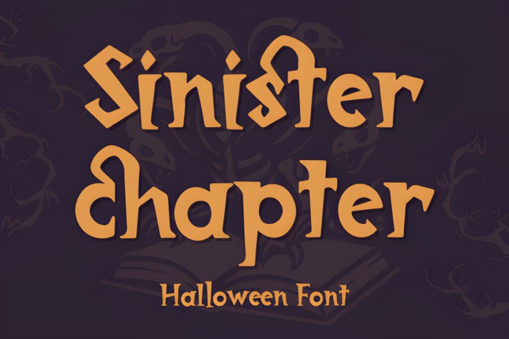
Sinister Chapter uses eerie curves and sharper shapes to create a Halloween display style with more of a horror-story mood. It suits spooky invitations, haunted event titles, seasonal promotions, and other designs where the headline should appear dramatic but still structured.
The product information lists uppercase and lowercase letters, numbers, punctuation, ligatures, and multilingual support. That broader character set can be useful for invitation layouts, although highly decorative text should still be reserved for headings rather than dense event information.
9. Halloween Night Party
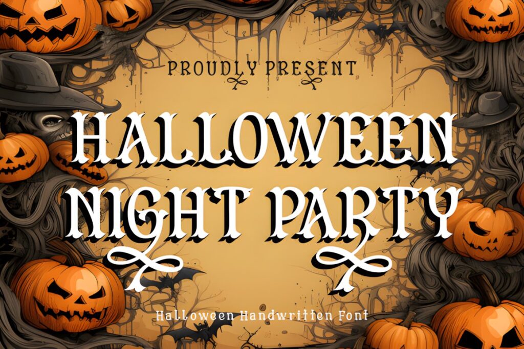
Halloween Night Party brings a handwritten character to spooky invitation design, giving it a lighter and more personal feel than heavy horror display fonts. It can work especially well for cocktail parties, neighborhood gatherings, or stylish seasonal events.
Because handwritten lettering creates a different rhythm from chunky decorative fonts, it can soften dark Canva backgrounds and Halloween illustrations. For maximum readability, keep the longest informational lines in a simple sans serif or restrained serif instead.
10. Witch Spooky
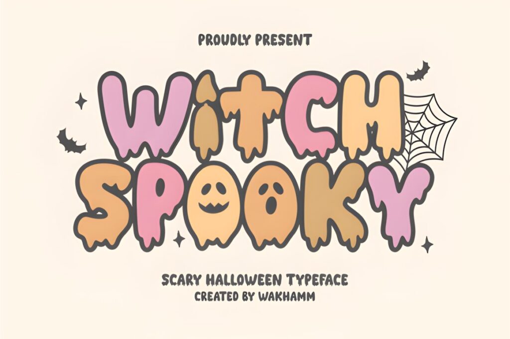
Witch Spooky is a bold Halloween display font with a witchy, vintage-leaning personality. It fits invitations built around potions, spell books, moons, witches, occult-inspired decorations, or other supernatural party themes.
Use it when the headline needs to establish the concept immediately. A cleaner font may make more sense for minimalist invitations or very long event names, since bold themed typography needs enough empty space around it to retain its impact.
11. Ghost Halloween
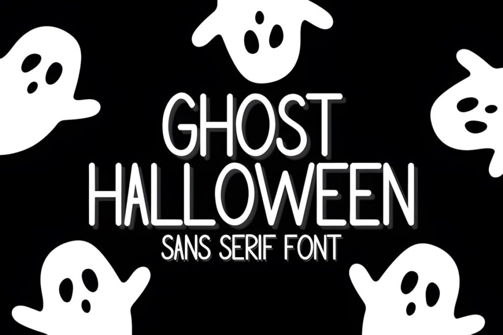
Ghost Halloween uses clean, rounded, relatively narrow sans-serif letterforms with a playful spooky character. Compared with heavily illustrated Halloween fonts, it can give a Canva invitation more breathing room while still communicating the seasonal theme.
This makes sense for modern ghost-themed invitations, minimalist layouts, or designs that already contain several illustrations. Its taller proportions can also help with narrower headline areas where a very wide chunky typeface would force awkward line breaks.
12. Pumpkin Halloween
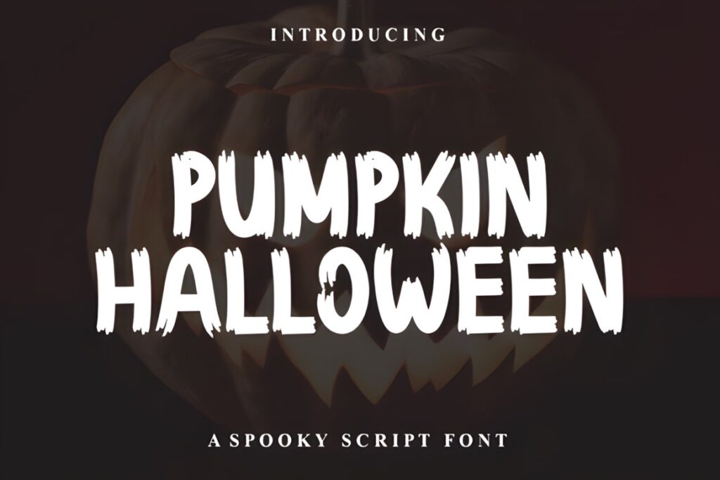
Pumpkin Halloween has bold, jagged lettering aimed at seasonal invitations, haunted signage, and other Halloween projects. The irregular edges give short phrases more energy than a clean geometric font while retaining the weight needed for a prominent headline.
Consider it for pumpkin-carving parties, costume nights, and invitations with classic orange-and-black imagery. If the layout needs an elegant witchy or gothic mood, another option in the roundup will create a more appropriate personality.
13. Halloween Witches
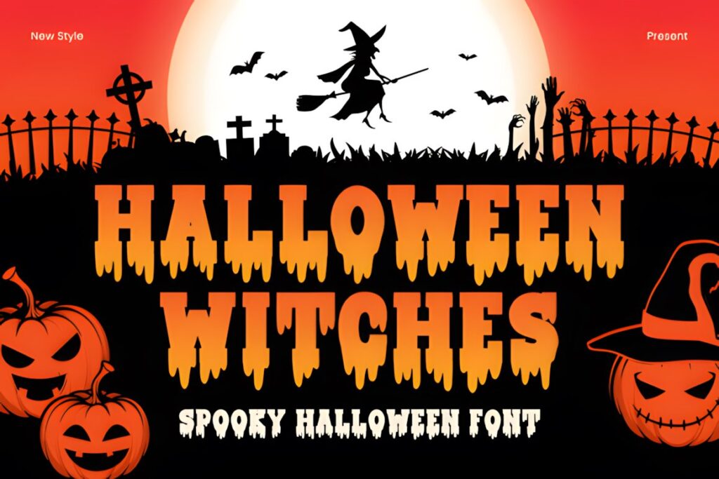
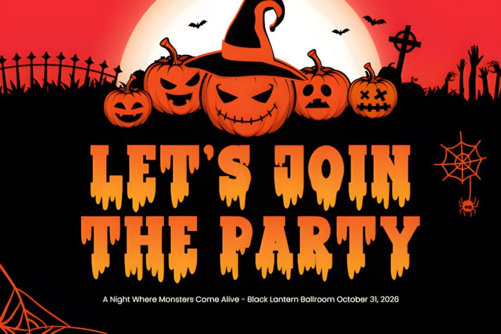
Halloween Witches is a horror display font built around sharp edges, spooky curves, and witch-inspired details. Its darker supernatural appearance suits haunted invitations, witch parties, Halloween night events, and designs in which large typography is meant to become the main visual element.
This is a stronger choice for dramatic themes than for friendly children’s invitations. Keep supporting text quiet and readable so the distinctive headline does not have to compete with the address, time, RSVP line, and costume instructions.
14. Halloween Ghost
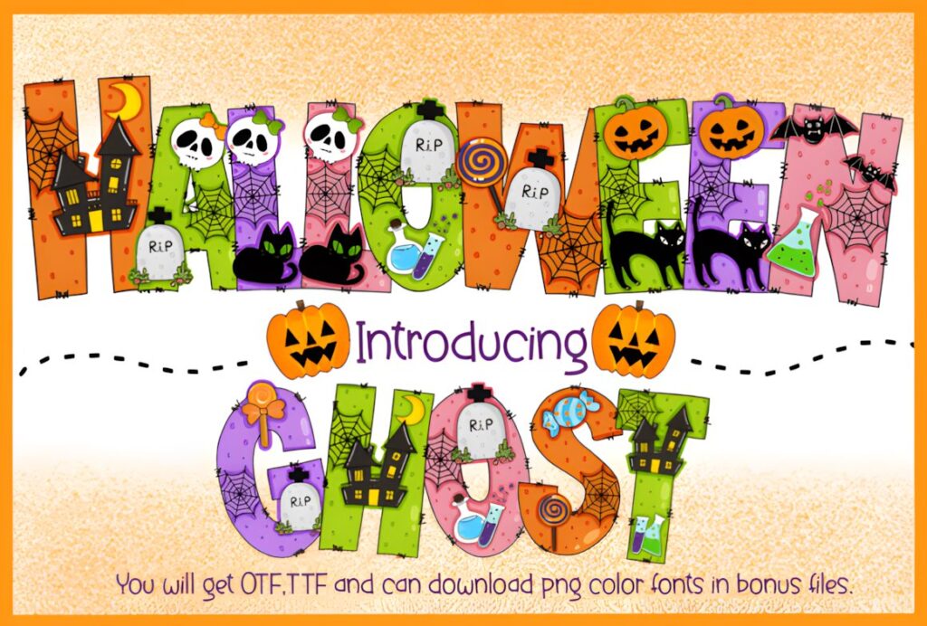
Halloween Ghost is a decorative font that integrates familiar seasonal motifs such as ghosts, bats, pumpkins, and cobwebs into the lettering. That illustrated treatment can turn a simple invitation title into part of the artwork rather than leaving typography and decoration completely separate.
It is particularly suited to playful party designs and invitations where the headline can be fairly large. For compact mobile invitations or long event names, simpler lettering will usually preserve readability better.
15. Ghost
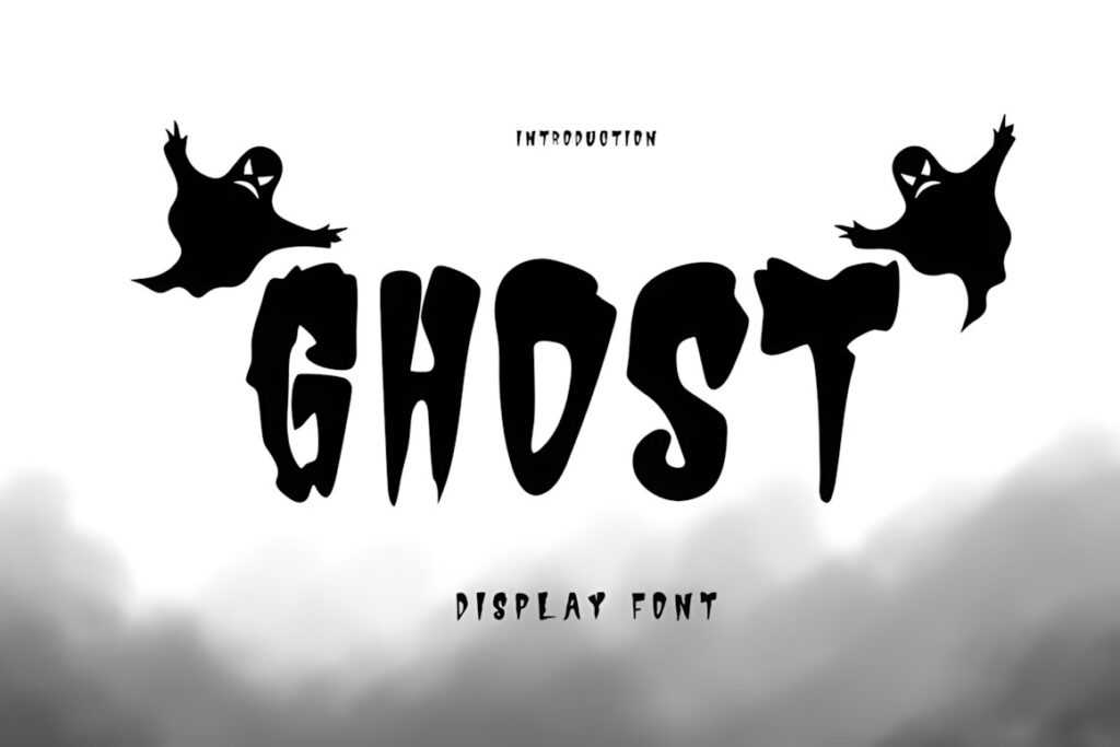
Ghost uses distorted and uneven display letterforms with a playful supernatural appearance. The irregular shapes feel spooky without requiring realistic horror imagery, making the font useful for costume parties, ghost nights, haunted invitations, and other seasonal Canva graphics.
Its personality is strongest at display size. Use it for one or two important lines rather than every piece of text, especially when the invitation also contains multiple icons, illustrations, or decorative borders.
16. Halloween Ghost
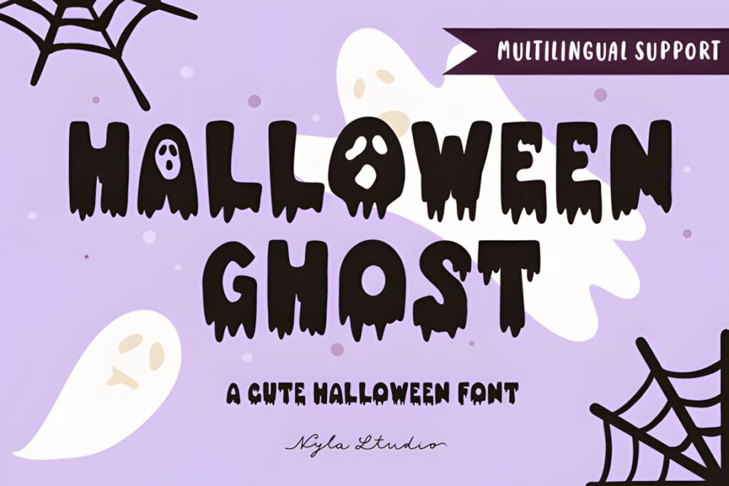
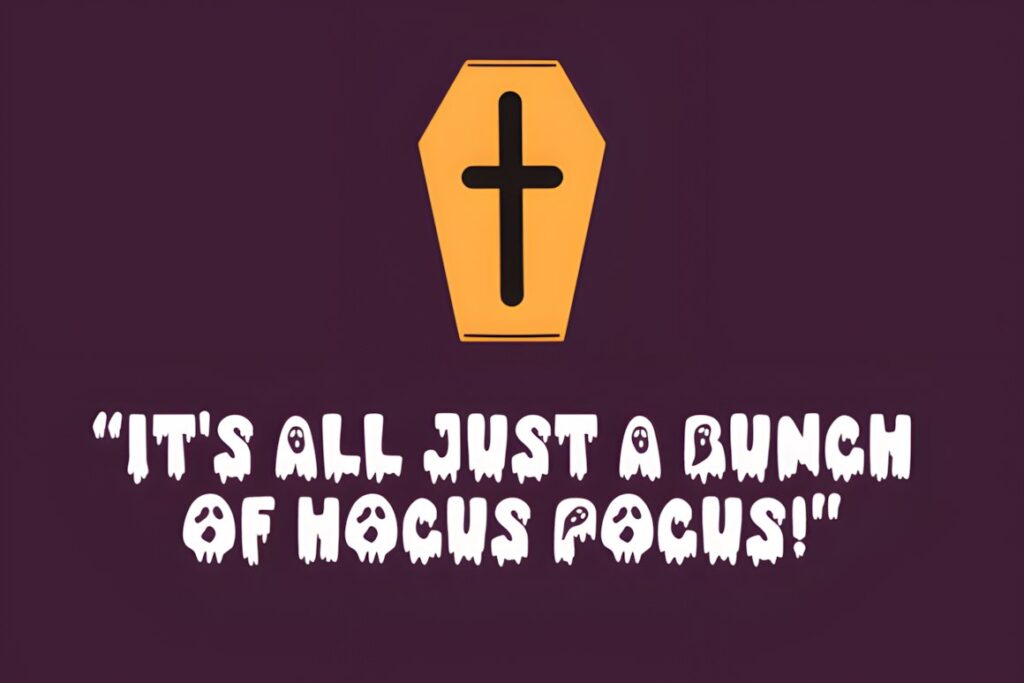
This Halloween Ghost font uses a dripping style that pushes an invitation toward a more obvious spooky or horror aesthetic. It makes sense for large titles, playful haunted graphics, Halloween greetings, and invitations where the headline needs a melting or slimy visual treatment.
Because dripping details add visual complexity, avoid shrinking the headline excessively. If the invitation title is long or the template has limited vertical space, the cleaner Ghost Halloween option can provide a more efficient alternative.
17. Halloween
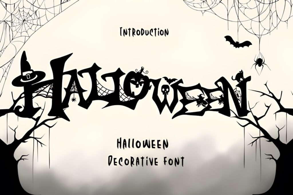
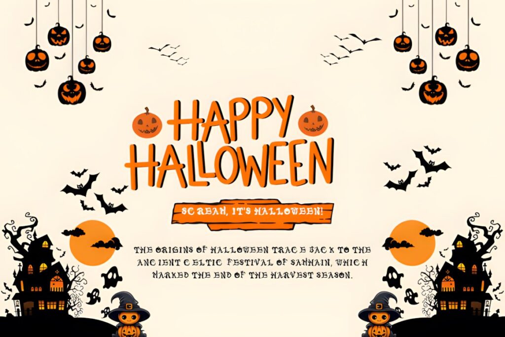
Halloween is a highly decorative font that incorporates seasonal illustrations such as witch hats, spider webs, bats, and skulls into the letters. It can give party invitation headlines a ready-made illustrated effect without requiring every Halloween symbol to be added separately around the text.
This style works best when the typography is large enough for those details to remain visible. For very small digital invitations or information-heavy layouts, use a less intricate font and let separate Canva graphics supply the decorative theme.
18. Spooky Halloween
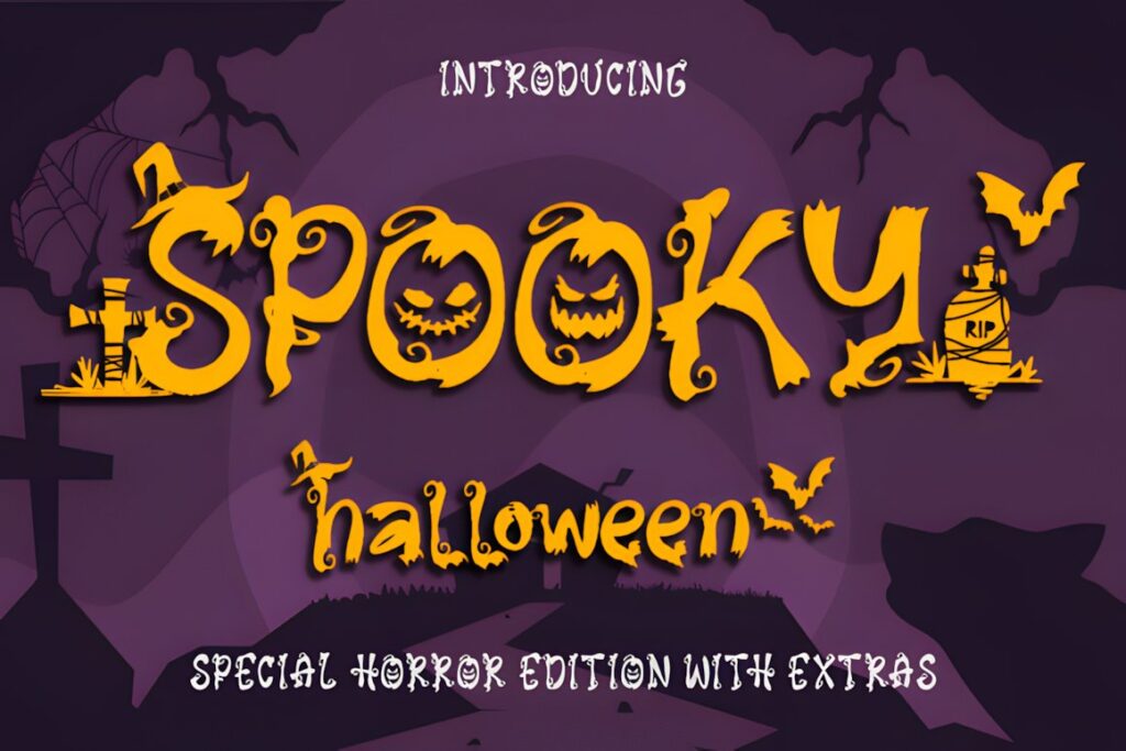
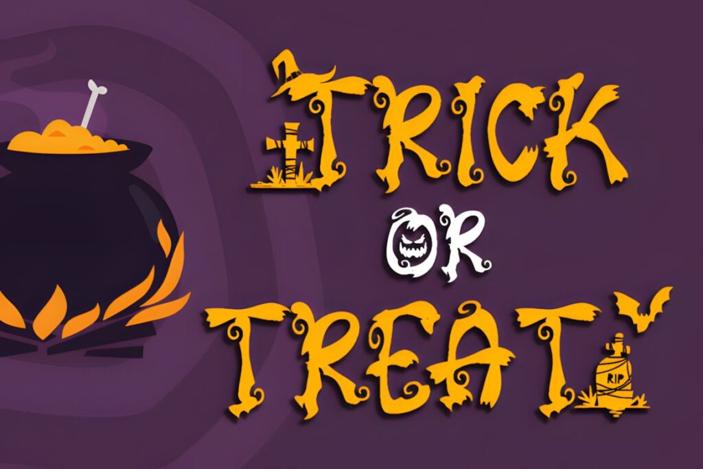
Spooky Halloween is a scary decorative font intended for October projects and includes regular, italic, and extras styles on its product page. That variety can help establish a stronger themed headline system when one invitation needs more than a single typographic treatment.
Use the most decorative elements selectively. A prominent event name plus a restrained secondary font usually creates a cleaner hierarchy than filling the invitation with multiple spooky treatments at similar sizes.
19. Creepy Drip
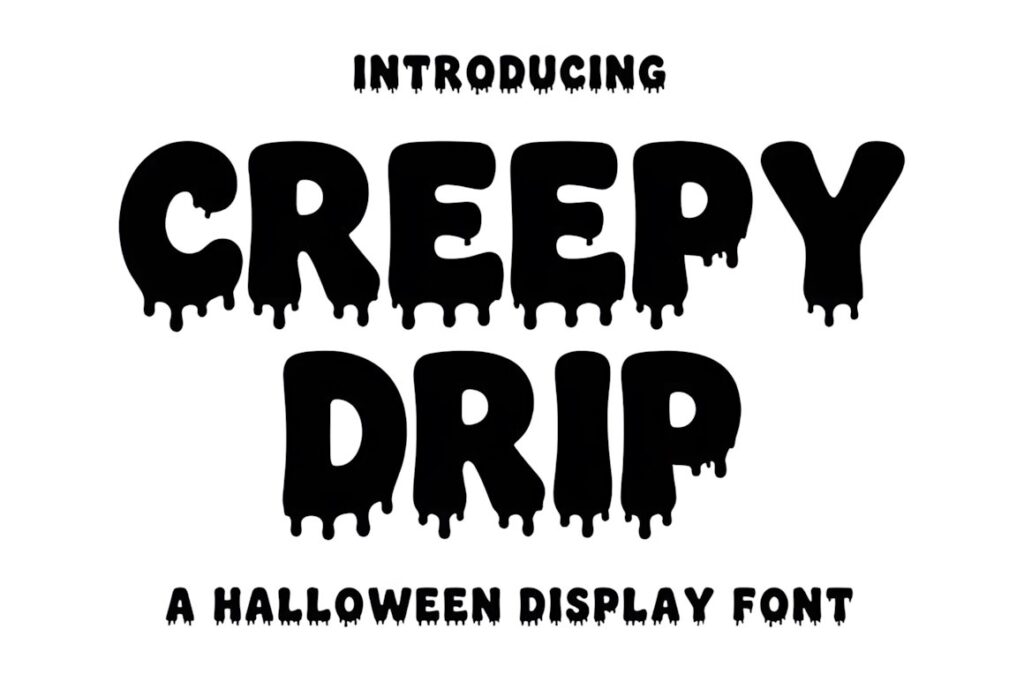
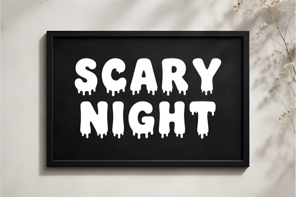
Creepy Drip combines chunky lettering with melting details for invitations that need a recognizable horror treatment. It suits haunted parties, monster themes, Halloween night events, and Canva layouts inspired by slime, dripping paint, or vintage horror titles.
The heavy shapes are most effective in short phrases. If you need to place a long party title across a narrow invitation, a condensed or cleaner spooky font will usually create fewer line-break problems.
20. Spooky Scary Creepy
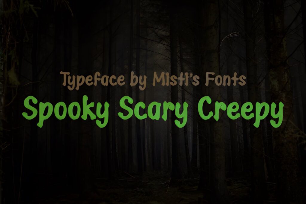
Spooky Scary Creepy uses rough, distorted edges to produce a more aggressive Halloween appearance. It suits horror invitations, scary movie parties, haunted events, and designs that need texture in the lettering rather than cute illustrated Halloween motifs.
Choose this when a polished or elegant font would make the invitation feel too tame. For kid-friendly events or layouts with small type, a rounded ghost or pumpkin-inspired option will usually make the invitation feel more approachable.
21. Witchink
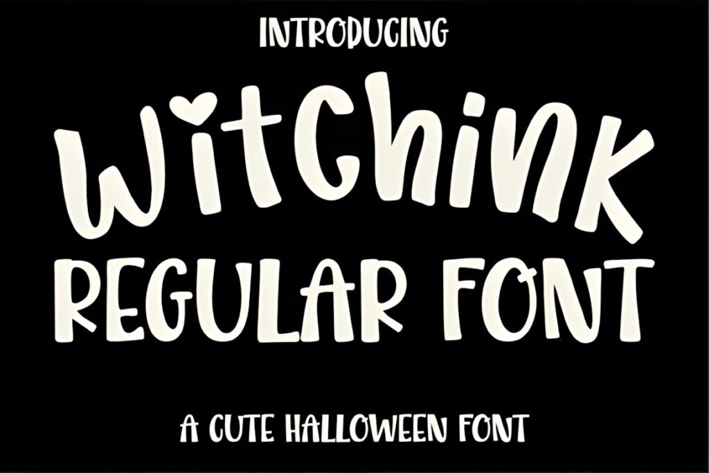
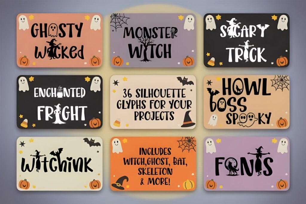
Witchink is a hand-drawn Halloween display font designed for party invitations and other spooky projects. The product includes uppercase and lowercase characters, numbers, punctuation, and a set of Halloween-themed silhouette glyphs featuring subjects such as witches, ghosts, bats, pumpkins, and skeletons.
Those extra motifs make Witchink useful when you want the lettering and small decorations to feel visually related. Avoid loading every available symbol into one invitation; a few carefully placed details generally create a clearer Canva composition.
Quick Comparison for Different Invitation Styles
| Font | Best for | Style | Key visual trait | Invitation fit |
|---|---|---|---|---|
| Halloween Font | Classic spooky parties | Display | Thick lettering | Large central headline |
| Scary Spooky | Haunted events | Display | Dramatic spooky character | Dark themed invitations |
| Halloween Night Party | Stylish gatherings | Handwritten | Playful flowing rhythm | More personal invitation look |
| Ghost Halloween | Modern ghost themes | Sans serif | Tall clean shapes | Information-heavy layouts |
| Halloween Witches | Witch parties | Horror display | Sharp supernatural forms | Dramatic main titles |
| Halloween | Illustrated invitations | Decorative | Halloween motifs in letters | Large playful headlines |
| Creepy Drip | Monster and horror parties | Display | Melting details | Short bold titles |
| Witchink | Hand-drawn witch themes | Display | Seasonal silhouette glyphs | Decorative invitation accents |
Using Downloaded Halloween Fonts in Canva
Canva supports custom font uploads in OTF, TTF, and WOFF formats on Canva Pro, Canva Teams, Canva Business, Canva Education, and Canva for Nonprofits. A downloaded font package may contain one or several files, so confirm that the specific product you choose provides a file Canva accepts before building the entire invitation around it.
Do not assume that every alternate, decorative symbol, or specialty feature shown in a font preview will behave identically inside Canva. If a design depends on unusual glyphs or swashes, test those characters early. For a straightforward invitation, ordinary uppercase and lowercase characters are often easier to work with than elaborate alternates.
Licensing is a separate issue from technical compatibility. Check the current license associated with the downloaded product for your exact intended use, especially when the invitation is being created for a client, sold as an editable template, or incorporated into another commercial product.
Keep Spooky Invitation Text Readable
Decorative Halloween lettering normally works better as display text than as the font for the complete invitation. Use the spooky font for the event name, one short phrase, or perhaps the host name. Dates, addresses, RSVP information, start times, and costume instructions should remain easy to read at a glance.
Before exporting the final Canva invitation, check it at roughly the size someone will see on a phone. Fine spiderweb details, narrow counters, distressed edges, and miniature decorative shapes can disappear when the design is reduced. If the headline loses clarity, increase its size, shorten the wording, or move to a cleaner Halloween font.
Contrast also matters. A detailed black font against a busy dark-purple background can lose much of its shape. Give decorative lettering a cleaner area of the layout, use sufficient contrast, or reduce the amount of imagery immediately behind the text.
Pairing Halloween Fonts Without Making the Invitation Too Busy
The easiest pairing strategy is to give each typeface one job. Let the Halloween font create atmosphere in the headline, then use a restrained sans serif or serif for the practical information. The contrast between decorative and simple lettering usually creates stronger hierarchy than combining two equally dramatic fonts.
For a witchy or vintage invitation, a spooky display heading can sit above a restrained serif used for the date and venue. For a playful ghost invitation, combine the illustrated or distorted headline with a clean rounded sans serif. Horror and dripping fonts usually need an especially plain supporting typeface because the headline already contains substantial texture.
Avoid using a new font for every information level. Size, weight, spacing, capitalization, and alignment can create hierarchy without introducing three or four unrelated typefaces.
Common Halloween Invitation Font Mistakes
- Using the spooky font for every line. Decorative lettering becomes tiring when guests must decode addresses and RSVP details.
- Shrinking detailed letters too far. Bats, webs, drips, and tiny horror details may disappear in mobile previews.
- Choosing the font before deciding the invitation mood. Cute ghosts and jagged horror letters communicate very different kinds of parties.
- Ignoring headline length. Chunky fonts that look good with “Boo Bash” may become awkward with a long event name.
- Depending on specialty glyphs before testing them. Confirm that the characters you need work correctly in the software and file you plan to use.
- Forgetting license checks. Technical compatibility does not automatically establish permission for every commercial or template-based use.
Which Halloween Font Fits Your Invitation?
If you want a straightforward spooky headline with strong visual weight, Halloween Font is an easy place to start. For a darker haunted-event aesthetic, Scary Spooky or Halloween Witches brings more dramatic character.
For an invitation that needs to remain comparatively clean, Ghost Halloween provides a more restrained spooky personality. Playful illustrated designs can use Halloween, while Halloween Night Party makes more sense when you want handwritten seasonal character instead of heavy horror lettering.
The strongest choice ultimately depends on the invitation hierarchy. Pick the Halloween font that communicates the party theme in the headline, then let simpler supporting typography make the practical details effortless to read.
Frequently Asked Questions
What type of Halloween font works best for Canva party invitations?
A Halloween display font usually works best for the main party title, while a simpler supporting font should handle the date, address, time, and RSVP details. Chunky and illustrated styles suit playful parties, sharper horror fonts fit haunted themes, and cleaner spooky sans serifs work well when the invitation contains more information or already uses several decorative graphics.
Can I upload downloaded Halloween fonts to Canva?
Canva supports custom font uploads in OTF, TTF, and WOFF formats on eligible Canva plans. Check the downloaded product files before designing because not every font package necessarily contains the same formats. Canva also advises users to make sure the font license permits the intended use and embedding before uploading a custom font.
How many fonts should I use on a Halloween invitation?
Two typefaces are usually enough for a Halloween invitation: one decorative font for the headline and one restrained font for supporting information. Additional hierarchy can come from changes in size, weight, spacing, or capitalization rather than adding more typefaces. This keeps the event name distinctive while allowing guests to quickly read the practical details.
Are decorative Halloween fonts readable on mobile invitations?
Decorative Halloween fonts can remain readable on mobile when they are used at a sufficiently large size and limited to short display text. Fine webs, drips, distressed edges, and illustrated details may become unclear when reduced. Preview the finished Canva invitation at phone size and simplify the headline or choose a cleaner spooky style when necessary.