ℹ️ Affiliate Disclosure: This article may contain affiliate links. If you book or purchase through these links, we may earn a commission at no additional cost to you.
Choosing the Best Halloween Fonts for Flyers and Haunted House Signs
Halloween fonts for flyers and spooky haunted house signs have to do two jobs at once: create an eerie atmosphere and keep the main message readable from a distance. A dramatic typeface can look suitably frightening at poster size yet become difficult to scan when the letters are too narrow, distressed, jagged, or covered in decorative details. For event flyers and signs, the most useful choices balance a recognizable horror personality with strong display shapes.
This selection includes dripping horror lettering, condensed movie-style type, scratchy hand-drawn forms, sharp display serifs, outlined letters, and crooked haunted-house styles. That range makes it easier to match the typography to everything from an intense scare attraction to a playful neighborhood Halloween event.
Many more Halloween fonts are available, while this shortlist concentrates on styles with distinct flyer and signage uses, readable display shapes, and clearly different spooky personalities.

For haunted house flyers and signs, bold display fonts with recognizable silhouettes are usually the most practical starting point. Dripping letters create an immediate horror cue, condensed fonts help fit longer attraction names, rough textures suit distressed posters, and cleaner sharp-edged styles work when readability needs to remain the priority.
Quick Picks
For classic dripping horror: Haunted Halloween — bold melting forms make the Halloween theme obvious on large signs and poster headlines.
For readable event promotion: Halloween Screams — dramatic letterforms combine sharp horror character with a relatively strong display structure.
For distressed haunted-house flyers: Rough Creepy — scratchy hand-drawn strokes create a rougher, less polished horror-poster effect.
For narrow headlines: Killer Horror — condensed proportions help longer attraction names occupy less horizontal space.
For retro haunted-house character: Building Haunted — crooked condensed shapes provide spooky personality without relying on dripping-blood effects.
Halloween Fonts for Haunted House Flyers and Spooky Signs
1. Haunted Halloween
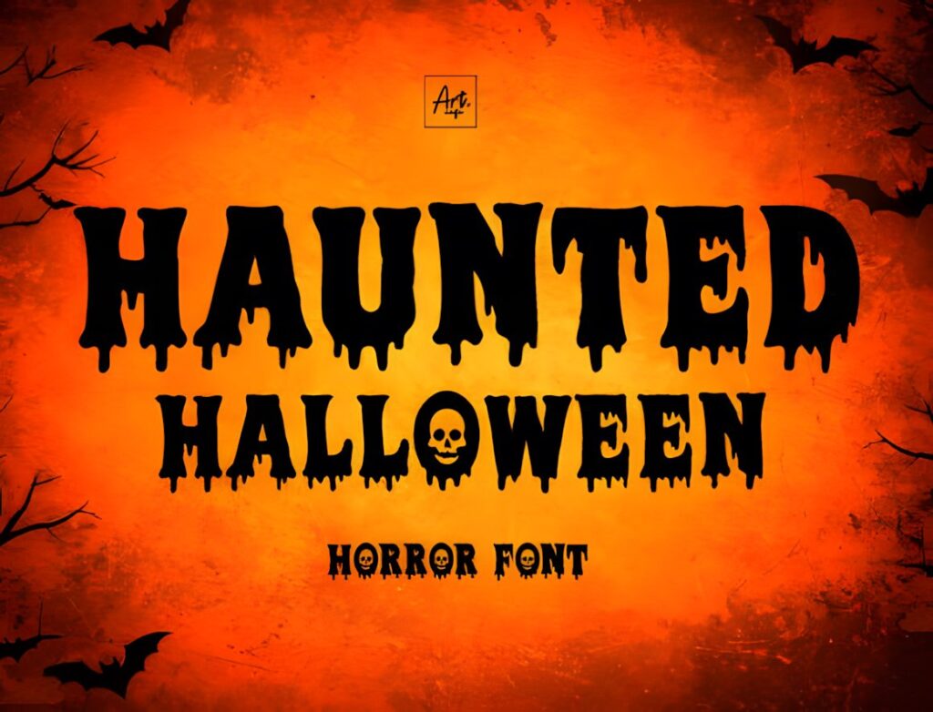
Haunted Halloween is a bold dripping display font suited to attraction signs, Halloween posters, party banners, and large flyer headlines. Its letterforms use a blood-or-slime-inspired melting treatment, giving the typeface an immediately recognizable haunted-event personality.
This makes sense when the headline itself needs to establish the horror theme before the viewer notices supporting graphics. The heavy decorative treatment is better reserved for short display text than schedules, addresses, ticket information, or other details that need fast scanning. For a sharper and less fluid horror appearance, Halloween Darkness offers a useful contrast.
2. Halloween Screams
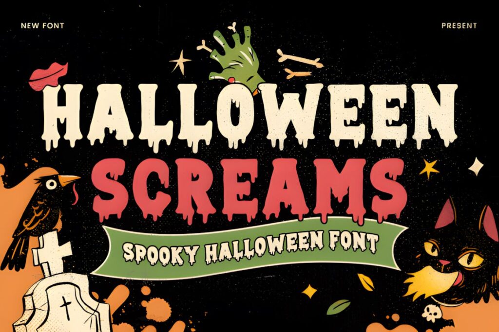
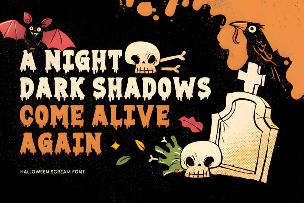
Halloween Screams is a horror display font designed around sharp edges, distorted shapes, and eerie detailing, making it particularly relevant to haunted house signage, party flyers, banners, and event promotions. Its bold structure gives the lettering enough visual presence to function as the focal point of a flyer.
Consider this style when you want frightening typography without making dripping effects the entire concept. The angular shapes can complement dark photography, abandoned-house imagery, fog, or restrained Halloween graphics. Keep supporting copy in a simpler font so the distorted headline remains the intentional focal point rather than competing with equally decorative text.
3. Scary Spooky
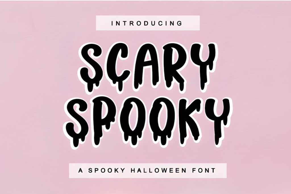
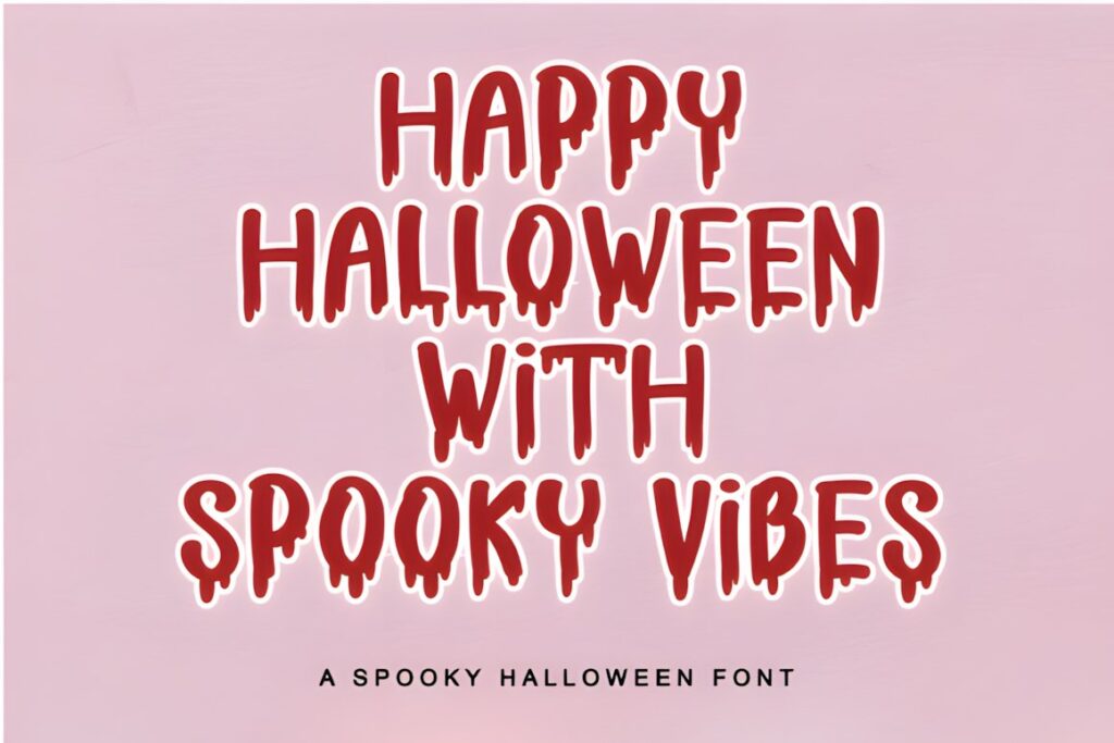
Scary Spooky is a dramatic Halloween display font that works well for seasonal party graphics, decorations, and flyer-style layouts where the mood should feel spooky without becoming overwhelmingly gruesome. Compared with the more aggressive horror fonts in this roundup, its role is broader and easier to adapt to general October events.
Use it for a Halloween event title, short promotional phrase, or decorative heading while letting a neutral supporting typeface handle dates and venue information. If the project needs an unmistakably bloody haunted-attraction aesthetic, Scary Horror or Haunted Halloween communicates that direction more directly.
4. Scary Horror
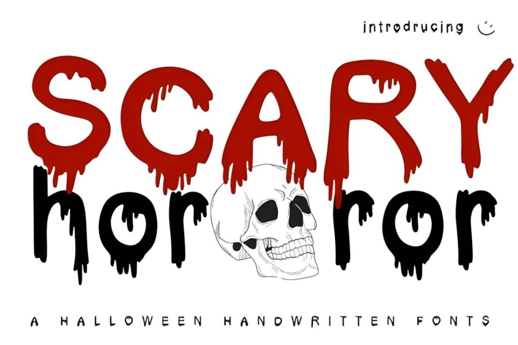
Scary Horror is a Halloween display font built around prominent blood-dripping letterforms and is specifically suited to haunted house flyers and similarly intense seasonal designs. The dripping shapes make even a simple attraction name feel connected to classic slasher and haunted-event imagery.
The effect is strongest when the words are large and relatively short. Give the letters enough surrounding space rather than placing them over a highly detailed background. For a flyer containing a longer headline, Killer Horror’s narrower construction may be easier to fit; for a less graphic Halloween mood, Scary Spooky provides a broader seasonal alternative.
5. Halloween Darkness
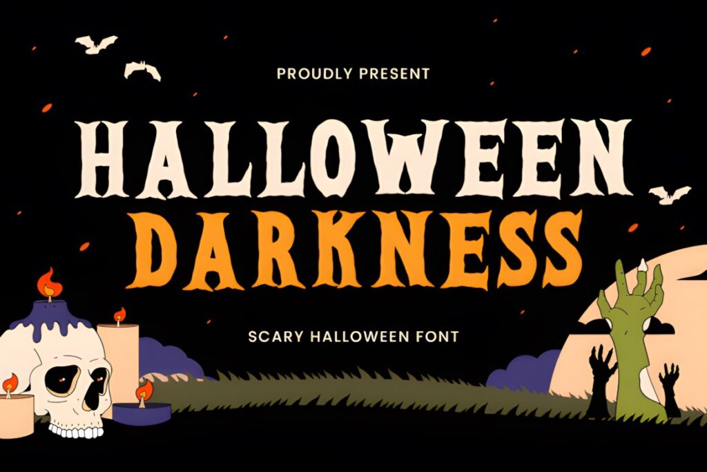
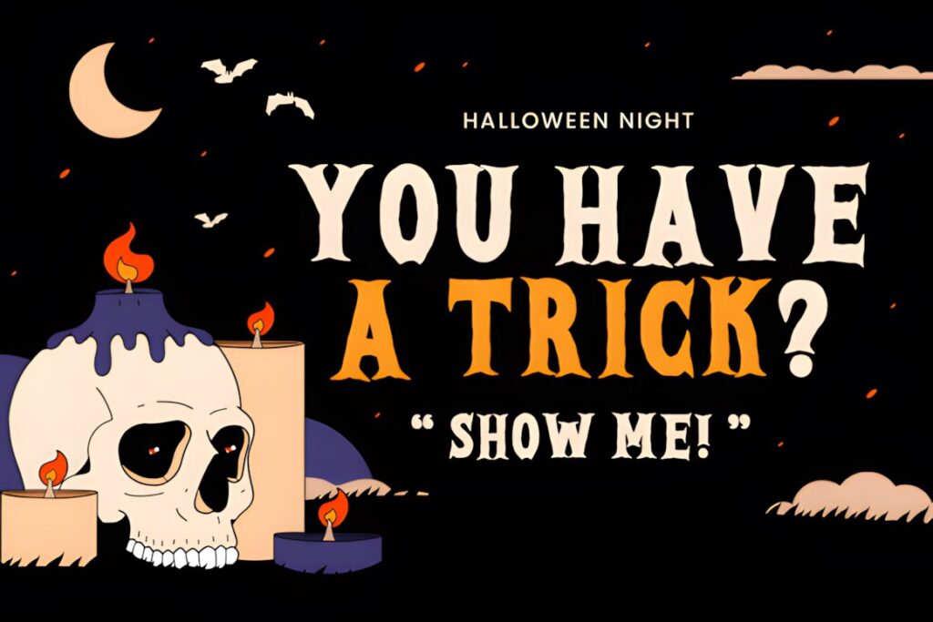
Halloween Darkness is a high-contrast display serif with sharp terminal points, jagged internal details, and a vintage horror-movie stance. It suits haunted house posters, monster-event flyers, banners, and prominent headers where a dark cinematic atmosphere matters more than a playful Halloween look.
Its pointed structure creates tension without depending on a dripping-blood motif, which can help a series of promotional materials feel more distinctive. Use it at generous sizes so the sharper details remain visible. If you need a rough handmade texture instead, Rough Creepy moves the design toward scratched horror artwork rather than theatrical serif typography.
6. Killer Horror
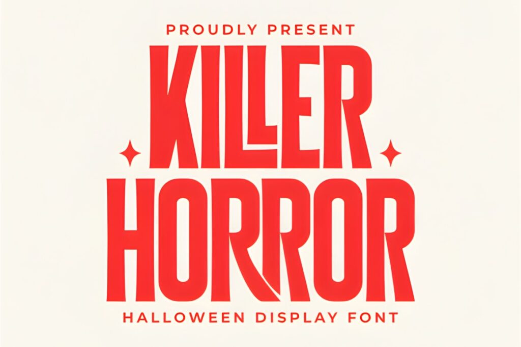
Killer Horror is a bold condensed display font with sharp serifs and slightly distorted forms, giving it the feel of a horror-film title. Its narrower construction is particularly useful for posters, event promotions, and haunted attraction names that contain more characters than a wide decorative font can comfortably accommodate.
The font also includes PUA-encoded access to its glyphs, swashes, and alternate characters. For flyer design, however, restraint is useful: a clean version of the headline will usually read faster than one using decorative alternatives on every letter. Choose Horror Outline instead when you want a similarly tall silhouette with a more graphic outlined treatment.
7. Rough Creepy
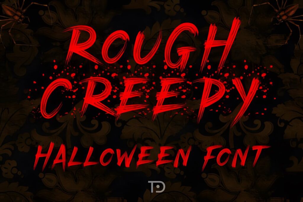
Rough Creepy is a bold Halloween display font with scratchy, hand-drawn strokes, jagged forms, and a deliberately chaotic texture. That construction makes it a strong fit for haunted house flyers, scary movie-inspired posters, horror titles, and designs that should feel distressed rather than polished.
Picture it over cracked textures, dark photography, or a simple high-contrast background where the rough letter edges can remain visible. The distressed character may lose some impact when the type is reduced too far, so keep practical details in a cleaner companion font. Halloween Screams makes more sense when you need dramatic horror lettering with a more structured overall appearance.
8. Horror Outline
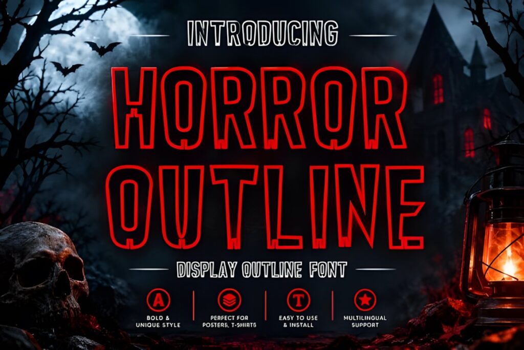
Horror Outline is a tall, condensed Halloween display font combining outlined letterforms with subtle distressed details. Its open graphic treatment gives it a different visual role from the solid dripping fonts, especially on posters, party decorations, invitations, social graphics, and large seasonal headlines.
This style is worth considering when a flyer already contains heavy illustrations and another solid black headline would make the composition feel too dense. Because outlines depend on visible edge definition, avoid shrinking the title until its interior and exterior contours begin to merge. Killer Horror is the stronger alternative when a solid condensed headline is more important than the outlined effect.
9. Dripping
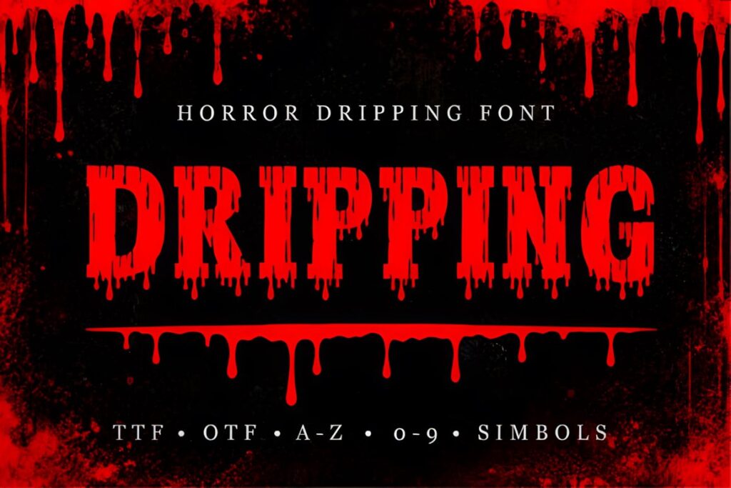
Dripping is a bold horror display font inspired by blood, melting ink, and familiar Halloween lettering. It includes uppercase and lowercase letters plus numbers, and its distressed dripping details make it useful for horror posters, party decorations, creepy headlines, and haunted-house graphics.
The mix of cases gives you more composition choices than an all-caps-only visual approach, although the dripping treatment should still be concentrated in prominent text. Try it for the attraction name while keeping the address, opening hours, age guidance, and ticket information visually quieter. Choose Halloween Darkness when a sharper vintage-horror look would fit the event better than liquid letterforms.
10. Building Haunted
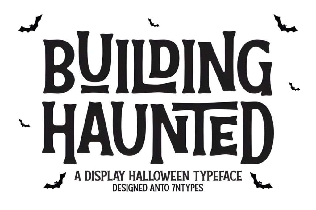
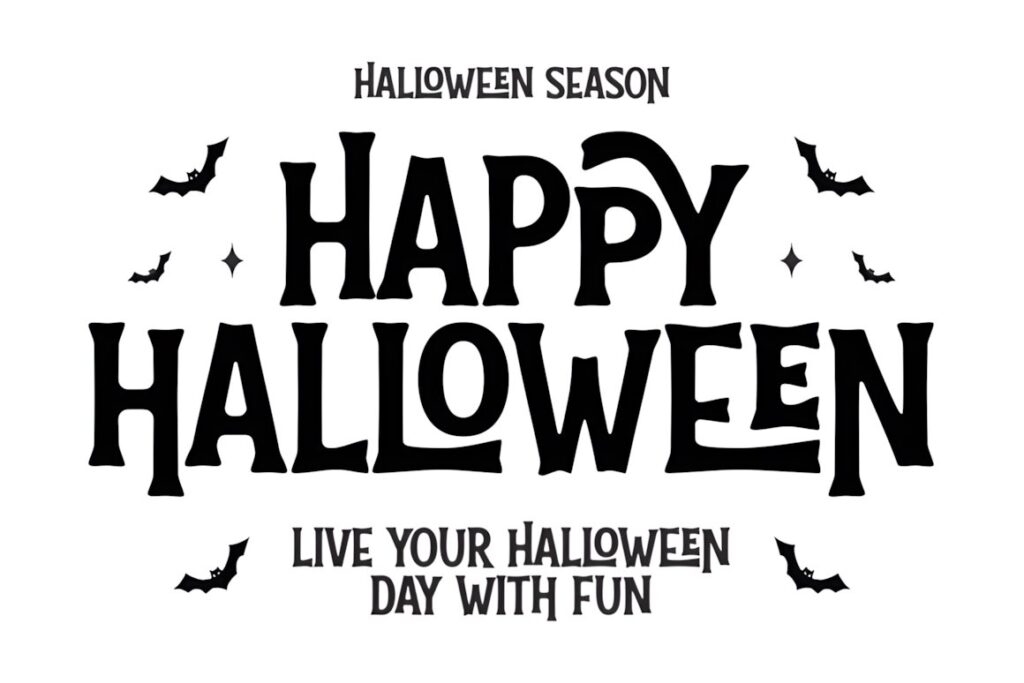
Building Haunted is a tall condensed Halloween display typeface with flared monster-like stems, a wavy baseline, crooked shapes, and nesting ligatures. Its retro haunted-house personality works particularly well for seasonal flyers, attraction graphics, pumpkin-patch signs, invitations, and designs that should feel spooky without becoming gruesome.
This is the playful alternative to the bloodier fonts in the roundup. The narrow silhouette can accommodate relatively long headlines, while the irregular forms keep the lettering from looking ordinary. Use the distinctive ligatures selectively when instant readability matters. For a darker attraction aimed at a more intense horror aesthetic, Scary Horror or Rough Creepy creates a noticeably harsher mood.
Quick Comparison
| Font | Best for | Style | Key visual trait | Project fit |
|---|---|---|---|---|
| Haunted Halloween | Large attraction signs | Dripping display | Heavy melting forms | Signs and posters |
| Halloween Screams | Event promotion | Horror display | Sharp distorted shapes | Flyers and banners |
| Scary Spooky | General Halloween events | Spooky display | Dramatic seasonal character | Flyers and decorations |
| Scary Horror | Intense haunted themes | Dripping horror | Blood-like drips | Haunted house flyers |
| Halloween Darkness | Cinematic headlines | Display serif | Sharp pointed forms | Posters and flyers |
| Killer Horror | Longer attraction names | Condensed display | Sharp narrow silhouette | Posters and promotions |
| Rough Creepy | Distressed horror layouts | Rough display | Scratchy jagged texture | Flyers and posters |
| Horror Outline | Graphic poster layouts | Outlined display | Tall outlined letters | Posters and invitations |
| Dripping | Classic Halloween headlines | Dripping display | Liquid distressed details | Posters and graphics |
| Building Haunted | Playful haunted events | Condensed retro display | Crooked wavy forms | Flyers and signs |
Readability and Viewing Distance
A spooky font does not need to be plain, but the silhouette of each word should remain recognizable. For a haunted house entrance sign, test the headline at the approximate distance from which visitors will first see it. Long drips, distressed edges, and narrow counters can look dramatic up close while becoming less distinct farther away.
Flyers create the opposite challenge because the finished design may be viewed on a phone or printed relatively small. Make the event name substantially larger than the supporting information and avoid asking one decorative font to carry the entire hierarchy. A horror display face can establish the theme while a restrained serif or sans serif handles the practical information.
Short headlines tolerate more decoration. “Haunted Manor” can support stronger distortion than a long sentence containing dates, prices, and location details. When the event name itself is long, condensed options such as Killer Horror or Building Haunted give you more horizontal room before the type has to be reduced.
Pairing Horror Fonts on Halloween Flyers
Treat the Halloween font as the voice of the attraction and the supporting font as the information system. The decorative typeface can handle the haunted house name, a short warning, or one promotional phrase. Dates, addresses, ticket details, URLs, and longer descriptions usually benefit from simpler lettering.
Contrast is more useful than trying to find two equally spooky fonts. Pair a jagged or dripping headline with a restrained sans serif when you want a contemporary event flyer. A sharp horror serif can work with a neutral sans serif for a cinematic poster hierarchy. A crooked retro font can be paired with a simple serif or sans serif to keep a playful Halloween design from becoming visually chaotic.
Avoid stacking multiple highly distressed fonts in the same layout. When every line drips, scratches, bends, or uses decorative alternates, there is no clear visual priority. One strong horror typeface usually creates more impact when the surrounding typography gives it room to stand out.
Common Halloween Sign Typography Mistakes
The first common mistake is choosing a font from a large preview and assuming it will remain equally clear on the finished piece. Test the actual attraction name at its final approximate size, especially when using outlined, scratched, or highly distressed letters.
Another problem is letting decorative effects compete with the message. Fog, blood splatters, distressed textures, ghosts, bats, and horror lettering can all support the same theme, but they do not all need equal emphasis. Keep enough contrast around the headline for its shape to remain obvious.
Also consider the audience. A family pumpkin event and an intense haunted attraction may both need Halloween typography, but their visual language should not be identical. Building Haunted or Scary Spooky can support a lighter seasonal mood, while Scary Horror, Rough Creepy, and Haunted Halloween push the design toward a more aggressive horror direction.
Choosing the Right Style for Your Haunted Event
If the main goal is an unmistakable haunted-house sign with a dripping horror effect, Haunted Halloween gives the lettering a bold melting appearance. For a flyer that needs frightening character while preserving a strong headline structure, Halloween Screams is a useful direction.
Choose Rough Creepy when scratches and handmade distress better match the attraction’s visual identity. For longer event names where horizontal space is limited, Killer Horror provides condensed proportions. If the event should feel more quirky and retro than gruesome, Building Haunted shifts the mood toward playful haunted-house typography.
Whichever style you choose, preview the exact wording before committing to the flyer or sign. Decorative Halloween letterforms can behave very differently depending on word length, capitalization, spacing, and finished size. Check the current product license as well when the font will be used for client work, merchandise, resale-related projects, or other commercial applications.
Frequently Asked Questions
What kind of font works best for a haunted house sign?
A bold display font with a recognizable silhouette works well for a haunted house sign because the main words need to read quickly while still establishing the theme. Dripping, sharp, distressed, or crooked letterforms can create the horror mood, but keep the attraction name large and relatively short. Practical information such as directions, hours, and warnings should usually use simpler supporting typography.
Can I use the same Halloween font for a flyer headline and body text?
A decorative Halloween font is usually better reserved for the flyer headline rather than the body text. Horror display fonts rely on distortion, drips, outlines, sharp details, or unusual proportions that can slow down longer reading. Use the themed font for the event name and short callouts, then switch to a restrained serif or sans serif for dates, addresses, descriptions, and ticket information.
How do I keep a spooky font readable from a distance?
Keep a spooky font readable by using large type, strong contrast, adequate spacing, and a relatively simple background around the headline. Test the actual wording at the intended viewing distance instead of judging only from a large on-screen preview. Condensed or heavily distressed letters may need extra size, while intricate drips and outlines can lose definition when they are reduced too far.
Can Halloween fonts be used on commercial event flyers and signs?
Commercial usage depends on the current license attached to the specific font product. Before using a Halloween font for paid events, client projects, merchandise, print-on-demand products, or other commercial work, review the current license terms on its product page. Do not assume that every downloadable font has identical permissions simply because the fonts appear in the same marketplace or seasonal category.