ℹ️ Affiliate Disclosure: This article may contain affiliate links. If you book or purchase through these links, we may earn a commission at no additional cost to you.
Discover Halloween fonts alphabet styles for unique spooky hand lettering
A Halloween alphabet needs more than a few jagged edges to feel convincing. For spooky hand lettering, the hardest part is balancing character with readability: scratchy strokes can become muddy, elaborate swashes can crowd short words, and heavily decorated letters may look impressive individually but compete with each other in a full phrase. These Halloween fonts alphabet styles cover handwritten scripts, irregular brush lettering, gothic forms, chunky monster letters, decorative characters, and horror-inspired display alphabets so you can match the lettering to the mood of the project rather than using the same generic spooky typeface everywhere.
Many more themed fonts are available, while this selection concentrates on alphabet styles with clearly different lettering personalities, readable display shapes, and practical uses for spooky seasonal typography.

For spooky hand lettering, start with a handwritten or brush-style Halloween font when you want an organic marker or inked appearance. Choose chunky decorative alphabets for playful signs, sharp horror lettering for darker headlines, or gothic and blackletter shapes when the project needs an older, witchy atmosphere. The strongest choice depends on phrase length, finished size, and how much decorative detail the layout can handle.
Quick Picks for Different Spooky Lettering Styles
For a handwritten-and-serif combination: Halloween by Tedha Studio combines two contrasting styles in one Halloween-themed duo.
For monster-style alphabet letters: Spook Halloween fills uppercase characters with teeth, eyes, and other playful details.
For brushy horror lettering: Spooky Halloween by Art Cafe uses a rugged, handwritten-looking texture suited to bold titles.
For old-world witch lettering: Witch brings sharp blackletter forms and a darker medieval character.
For dramatic condensed horror text: Killer Horror uses narrow, sharp letterforms that make short words feel taller and more intense.
Halloween Fonts Alphabet Styles for Spooky Lettering Projects
1. Halloween by Tedha Studio
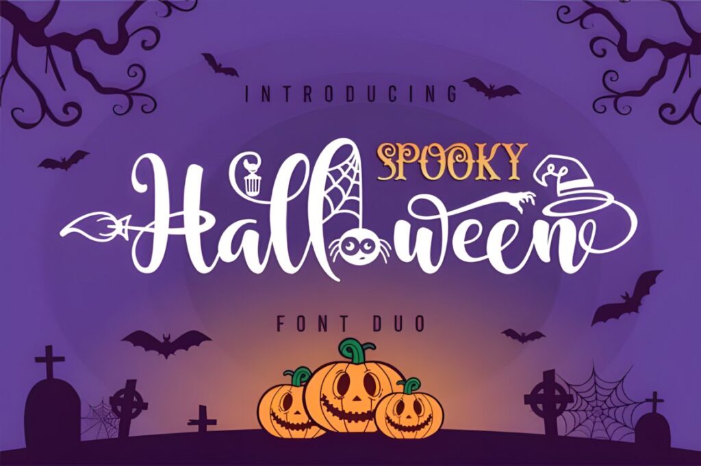
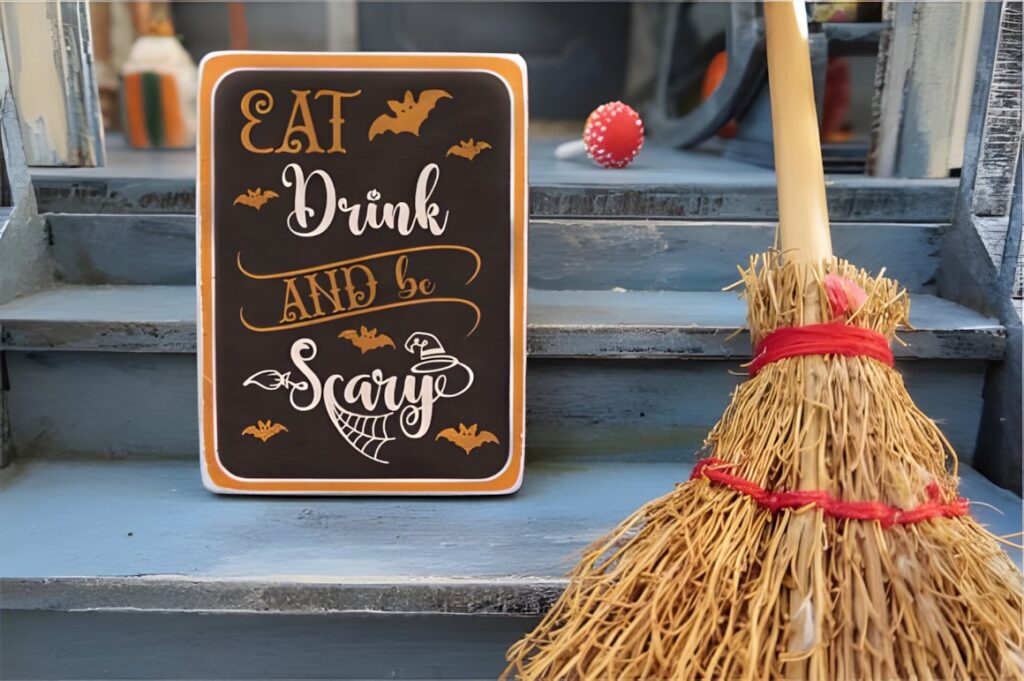
Halloween by Tedha Studio is a decorative Halloween duo combining handwritten and serif lettering, making it useful when one design needs both expressive display text and a contrasting secondary style. The playful shapes lean toward cute-spooky rather than realistic horror.
The product page also identifies the font as PUA encoded, providing access to its included glyphs and swashes. That extra ornamentation suits names, short Halloween sayings, party lettering, and personalized seasonal designs, but keep the decorative characters restrained when several words appear together.
2. Spooky Halloween by ABBAsalam
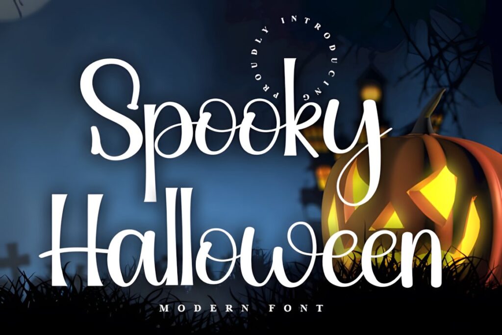
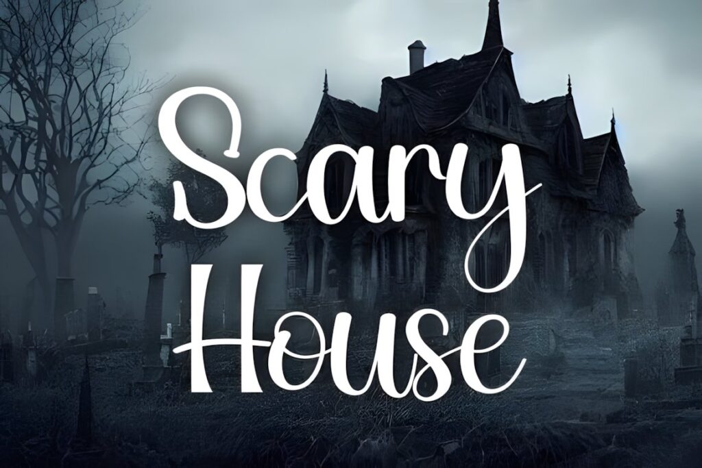
Spooky Halloween is a friendly handwritten font with an informal rhythm that works well when you want seasonal lettering without turning every character into a horror illustration. It is a useful direction for cards, labels, quotes, or playful Halloween phrases where recognizable handwriting matters.
Compared with the more aggressive horror fonts later in this list, this option feels lighter and easier to combine with pumpkins, ghosts, bats, or illustrated backgrounds. Choose a darker display face instead when the lettering itself needs to carry most of the scare factor.
3. Spooky Halloween by Creaditive Design
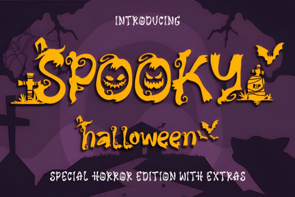
This Spooky Halloween font is a decorative display style designed specifically around eerie October typography. Its letterforms create more visual activity than a plain handwritten alphabet, making it useful for prominent words on invitations, signs, seasonal graphics, and decorative lettering compositions.
The product includes regular, italic, and extras styles in its preview and is identified as PUA encoded. Those choices provide more room for building a layered typographic composition, although using too many extras in one small phrase can make the lettering feel crowded.
4. Halloween by Nongyao
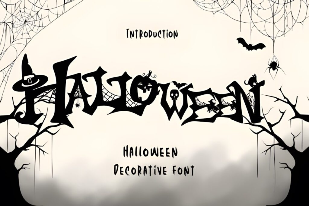
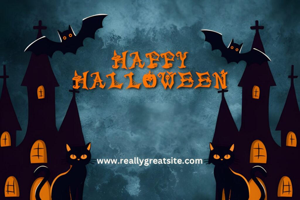
Halloween by Nongyao turns individual letters into miniature seasonal illustrations. Witch hats, spiderwebs, bats, skulls, and other Halloween motifs are integrated into the alphabet, so the characters become part lettering and part decoration.
This makes the font especially effective when you want the alphabet itself to provide the visual theme instead of surrounding a simpler typeface with extra graphics. Keep phrases short and reasonably large so the illustrated details remain visible; for compact text, a cleaner handwritten option will usually read faster.
5. Spook Halloween
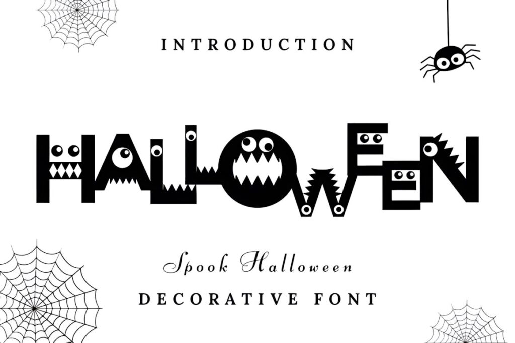
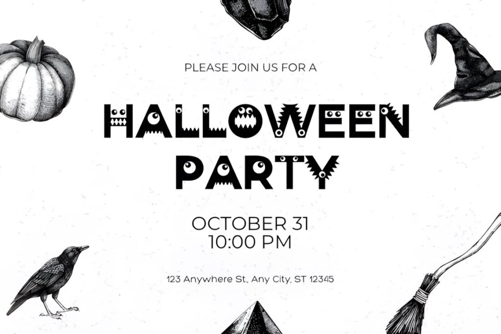
Spook Halloween uses bold geometric letter shapes filled with monster-inspired eyes, teeth, cutouts, and other playful details. The uppercase alphabet carries most of the character, while the lowercase is comparatively simpler, giving you two levels of visual intensity within one font.
That difference makes it useful for kid-friendly party titles or cartoon-spooky hand-lettering layouts: use uppercase for the main word and quieter lowercase forms when you need visual relief. It is less suited to an elegant witchcraft aesthetic, where a script or blackletter face would feel more coherent.
6. Halloween by Lisna.Craft
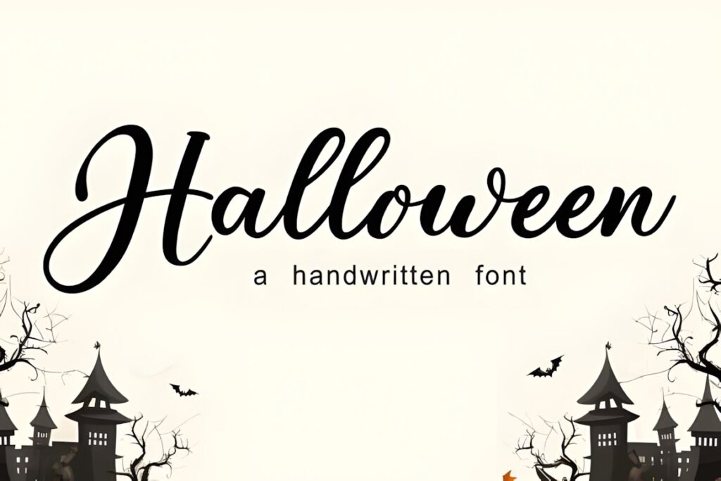
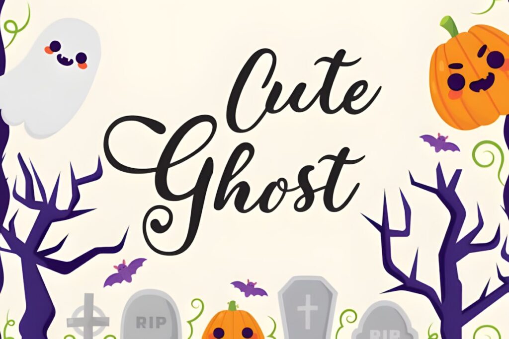
This Halloween Script font combines a handwritten script personality with a playful seasonal mood. Its softer curves make it useful when the goal is spooky-cute lettering rather than distressed horror typography.
Use it for names, short quotes, greeting cards, treat labels, or titles that benefit from flowing shapes. Since script lettering naturally creates more movement than block capitals, allow enough surrounding space and avoid placing other highly decorative elements directly against the word.
7. Halloween Script by AEN Creative Studio
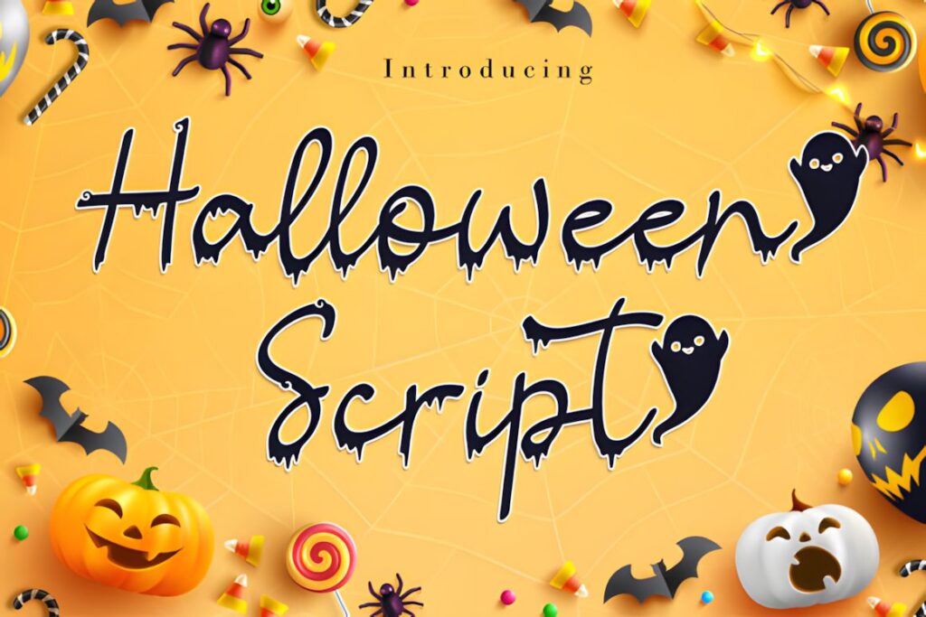
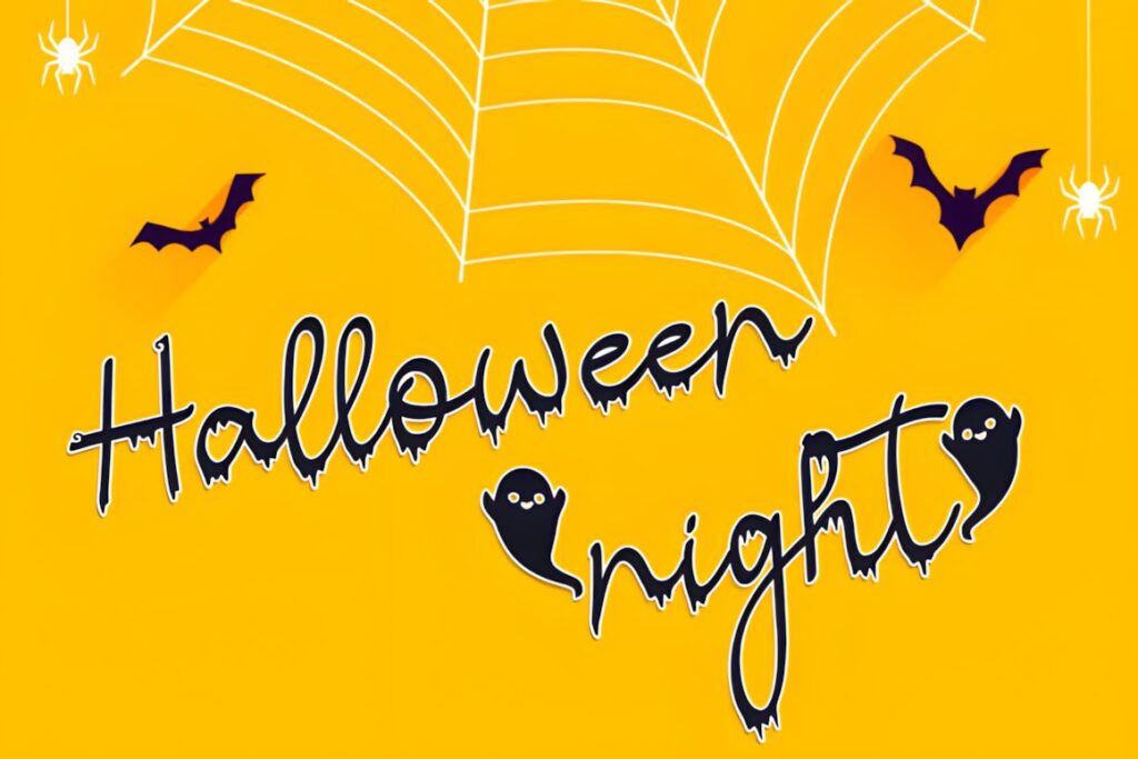
Halloween Script is a spooky handwritten font intended for seasonal craft and display lettering. The product preview includes regular and italic versions, giving you a straightforward way to vary the slant while keeping the same overall alphabet personality.
It is also described as PUA encoded, so its included glyphs and swashes can be accessed more easily in supported workflows. Those flourishes are most effective on the first or last letter of a short phrase; placing elaborate swashes inside every word can reduce the natural handwritten flow.
8. Spooky Halloween by Misti
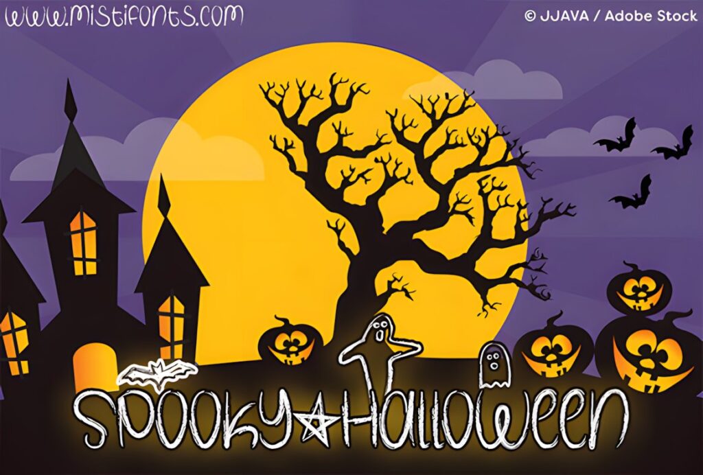
Spooky Halloween by Misti brings a chalky, crayon-like surface to the alphabet, giving typed text a rougher hand-rendered appearance. It also includes special symbols mapped to characters such as a star, bat, and ghost, which can be worked into short lettering compositions.
This style makes sense when you want lettering that appears intentionally imperfect rather than polished. The textured detail can become visually dense at small sizes, so preview the final project scale before using it for compact labels or tightly spaced text.
9. Spooky Halloween by jinanstd
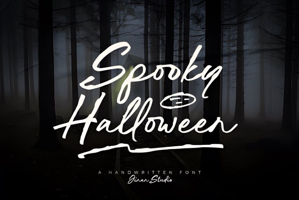
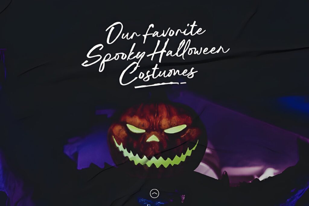
Spooky Halloween by jinanstd uses a raw handwritten brush character that suits typography meant to feel painted, scratched, or quickly lettered by hand. Its irregular appearance gives otherwise simple words more movement without relying on illustrated pumpkins or monster shapes.
It fits haunted event titles, dark seasonal quotes, poster lettering, and dramatic social graphics. Give the edges enough breathing room so the rough forms stay distinct, and choose a heavier block font when you need cleaner geometry or extremely compact lettering.
10. Spooky Halloween by Art Cafe
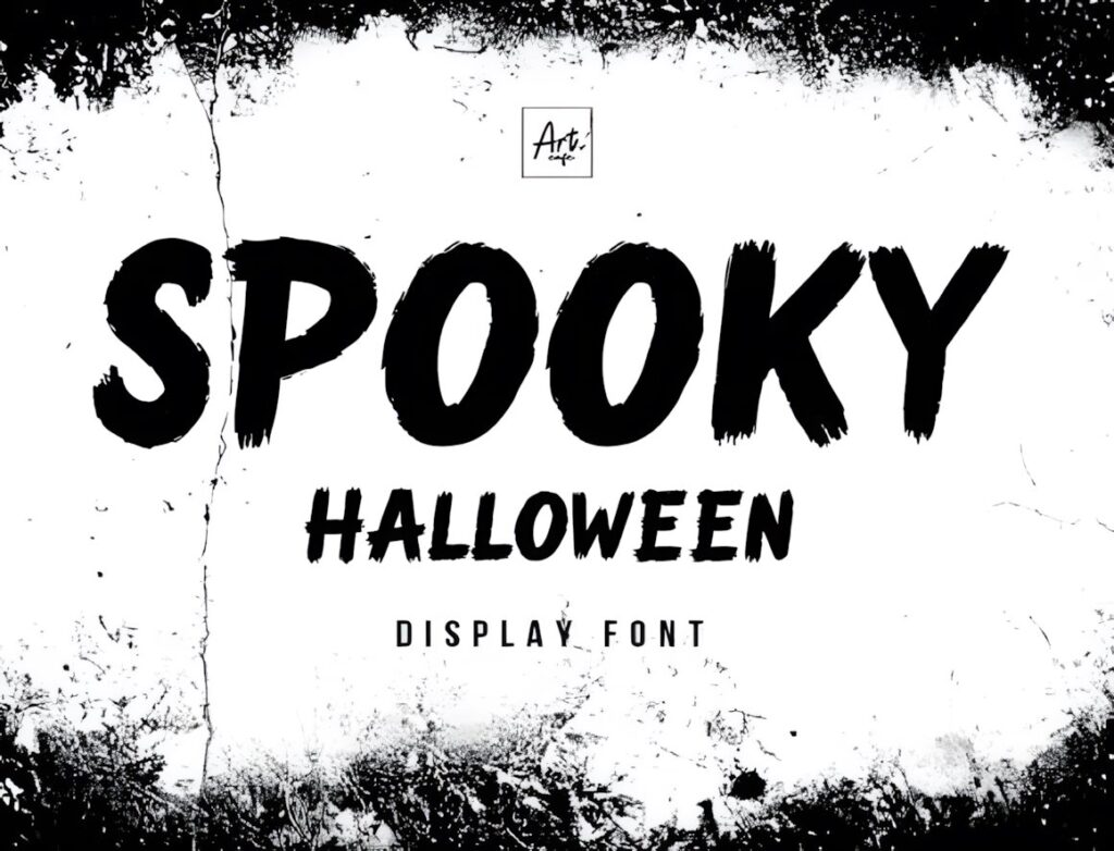
This Spooky Halloween display font mixes bold letterforms with a rugged, grungy surface inspired by spontaneous handwritten brush strokes. It provides more visual weight than a thin script, making it easier to let the lettering dominate a Halloween poster or large headline.
The rough texture supplies most of the atmosphere, so pair it with simple surrounding graphics rather than stacking several distressed effects together. For delicate invitation lettering, one of the smoother handwritten scripts will create a quieter result.
11. Halloween by Khim08Studio
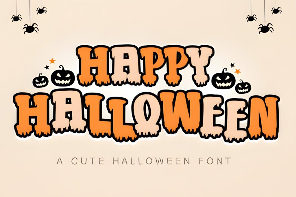
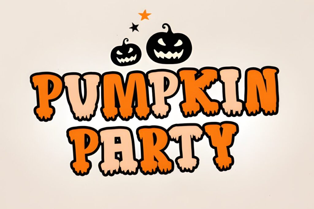
Halloween by Khim08Studio is a quirky display alphabet with a mysterious seasonal personality. Its role in this collection is straightforward: it gives short Halloween words a recognizable spooky shape without pushing into highly detailed illustration or formal calligraphy.
Use it for short headlines, party wording, stickers, or graphic lettering where the font needs to stand out quickly. If your composition depends on an unmistakably hand-drawn brush effect, Spooky Halloween by jinanstd or Art Cafe offers a rougher visual direction.
12. Halloween Spooky Font by Farz Studio
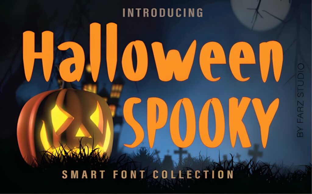
Halloween Spooky is a chunky display font for lettering that needs thick, immediately visible character shapes. The heavy forms work particularly well for single words and compact Halloween phrases where a thinner handwritten style could disappear against illustrations or textured backgrounds.
Its quirky construction is better suited to playful Halloween work than elegant calligraphy. Consider it for bold signs and large craft lettering, then switch to one of the scripts when the design needs longer names or a more flowing rhythm.
13. Halloween by sakwarin art
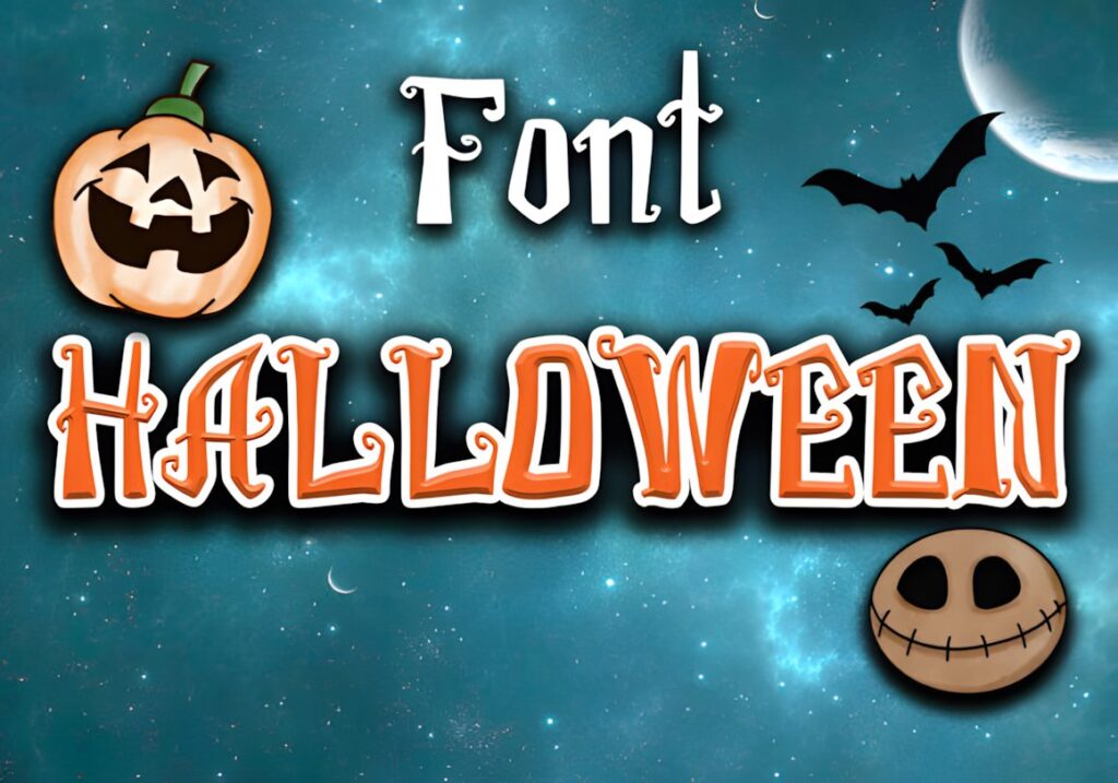
This Halloween font uses thick spooky display lettering with enough visual mass for large seasonal words. It is a practical option when the typography has to compete with pumpkins, ghosts, photographs, or decorative backgrounds and still remain easy to notice.
The heavier alphabet is more forgiving for short display text than fine decorative scripts, but it also occupies more horizontal and vertical space. Test long phrases before finalizing the layout, especially when the lettering must fit inside a narrow sign or badge.
14. Creepy Halloween by Farz Studio
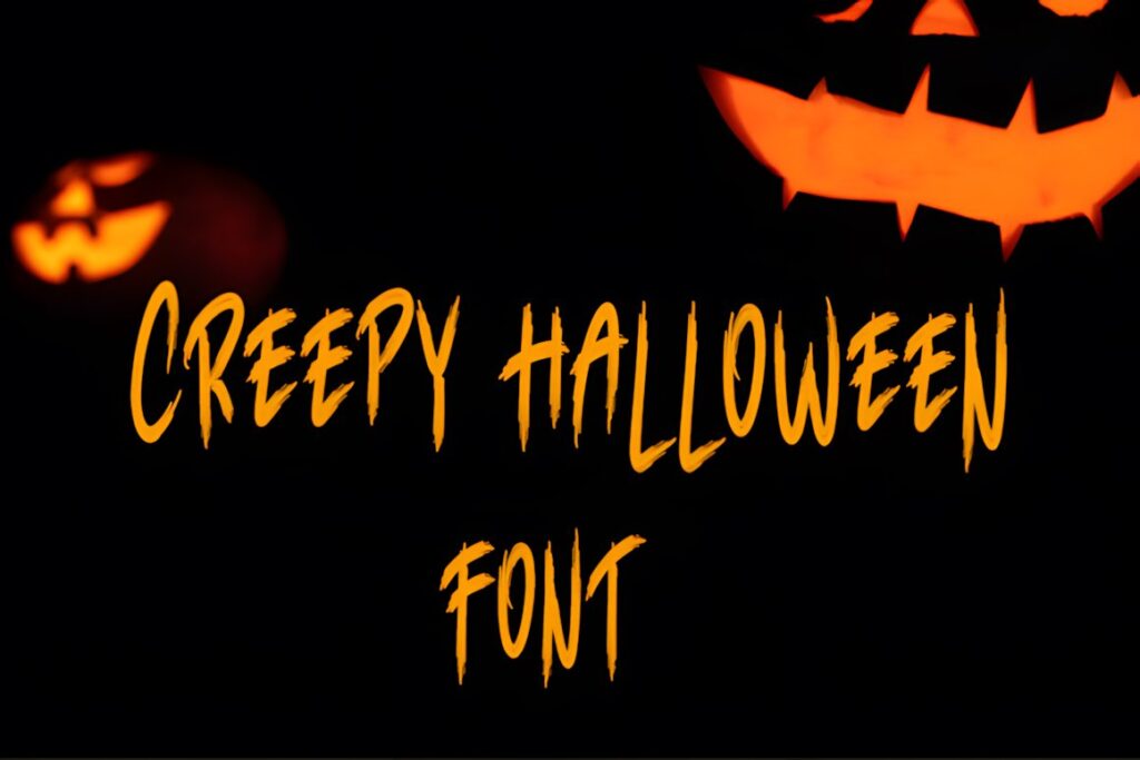
Creepy Halloween is another thick-lettered display option, but its role is to push a design further toward an intentionally creepy seasonal look. It suits short titles and craft phrases where the word shape itself should immediately signal Halloween.
Choose this type of heavy display alphabet for large lettering with relatively few words. A casual handwritten font will usually give you more flexibility for multi-line messages, while Creepy Halloween makes more sense when the typography acts almost like a graphic element.
15. Scary Spooky
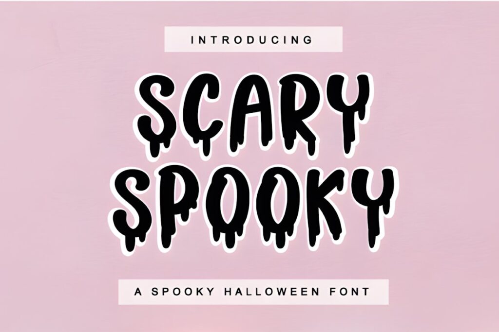
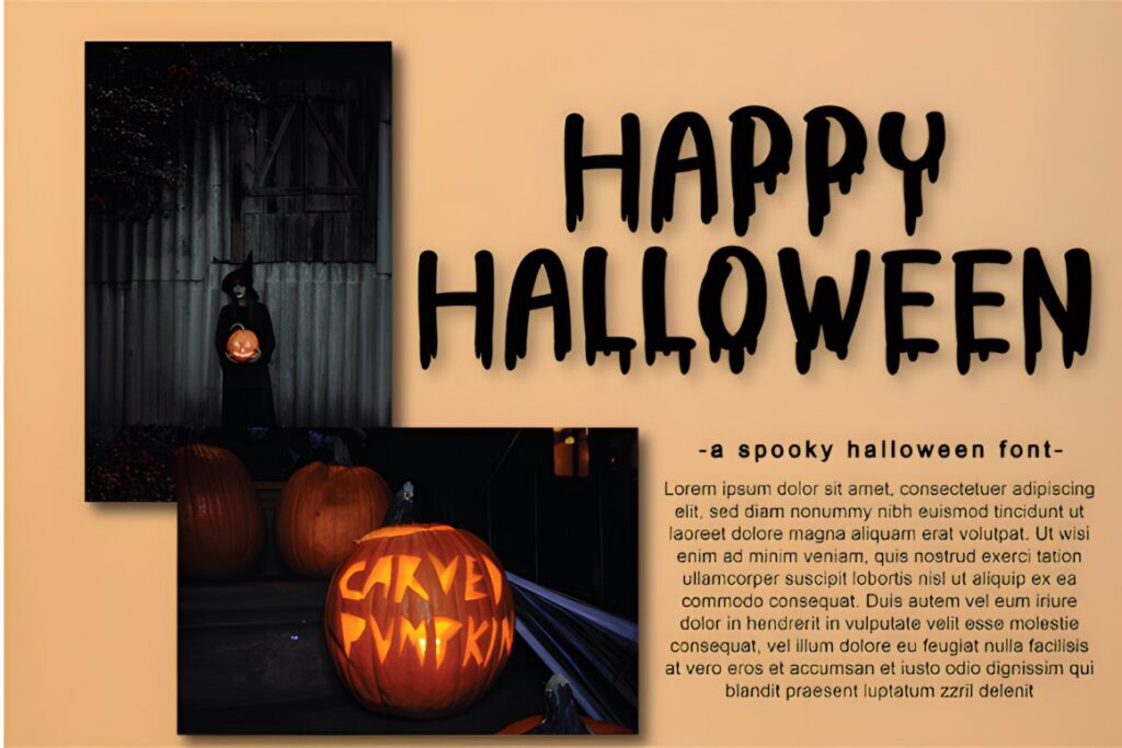
Scary Spooky is a dramatic Halloween display font aimed at invitations, web graphics, decorations, and other October projects. The overall character is more theatrical than casual handwriting, making it useful when the lettering needs stronger stage-poster energy.
Use it for prominent headings and let a simpler supporting font handle details below. That separation keeps the decorative alphabet from becoming tiring across several lines and gives the main phrase a clearer visual role.
16. Horror by ABBAsalam
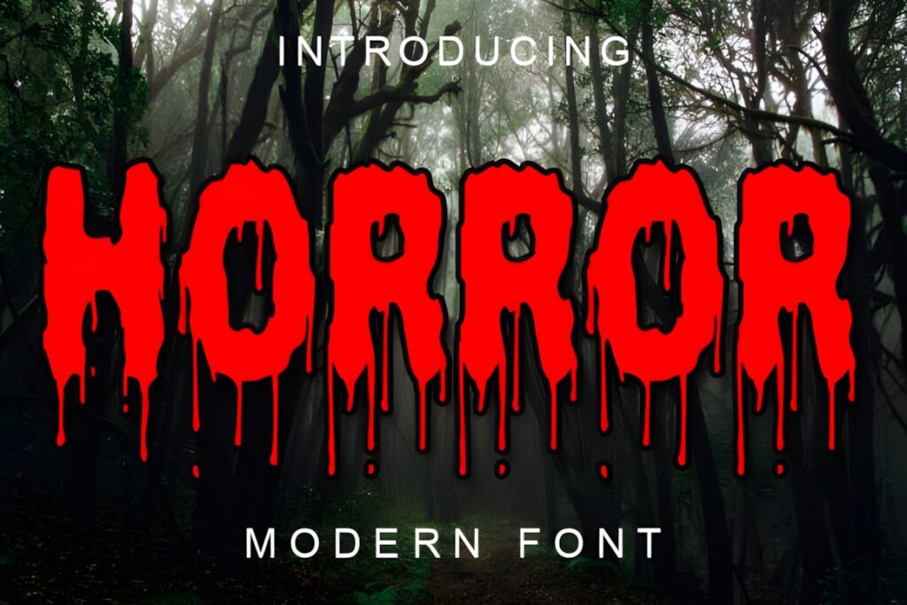
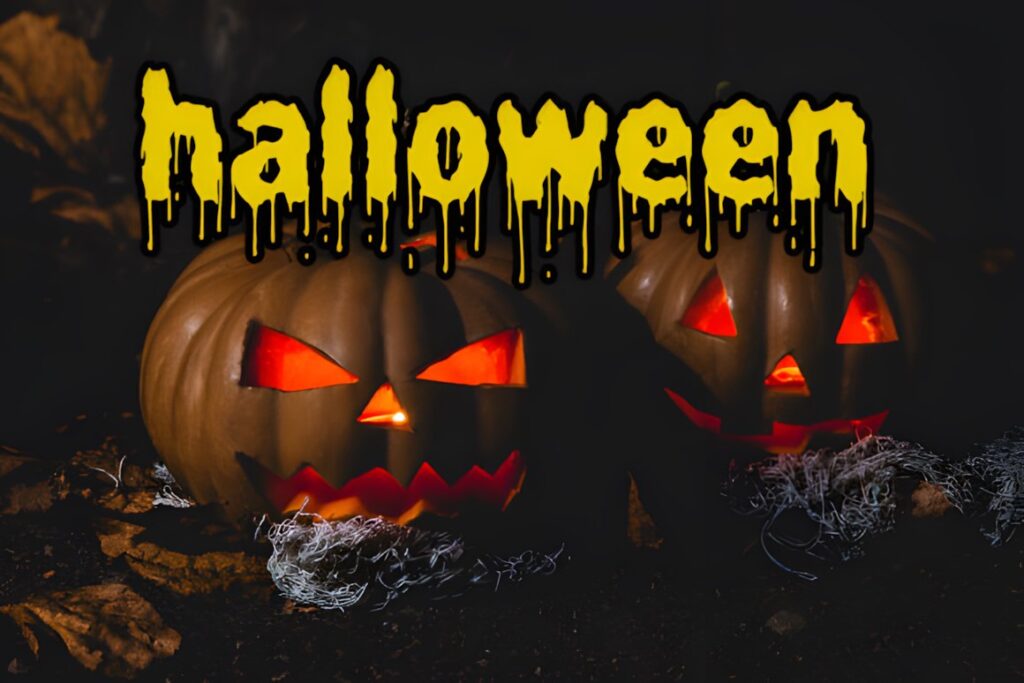
Horror is a spooky display alphabet that favors a straightforward horror mood over cute Halloween decoration. It works when your lettering needs to feel darker but you do not want every letter filled with icons or elaborate seasonal illustrations.
That makes it easier to combine with your own background art, photography, or other graphic elements. Keep it primarily for headlines and short display copy; if the project needs a natural handwritten impression, a brush or script selection will communicate that idea more directly.
17. Scary Horror
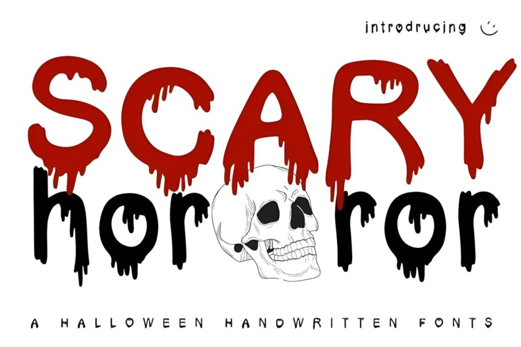
Scary Horror uses a dripping-blood treatment across its display letters, creating one of the most literal horror alphabets in this selection. It is suited to haunted-house titles, horror party graphics, slasher-inspired lettering, and short phrases where the dripping detail is part of the concept.
The effect is strong enough that it rarely needs additional decorative treatment. Keep the surrounding composition restrained and avoid using the font for information-heavy copy, where the dripping forms would compete with basic readability.
18. Killer Horror
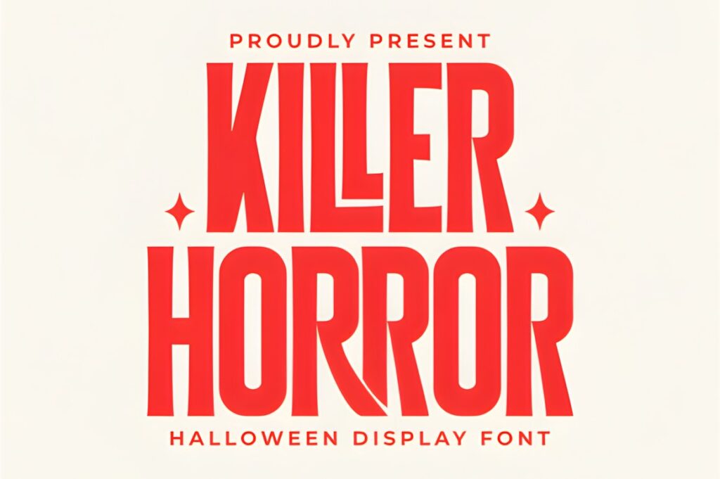
Killer Horror is a bold condensed display font with sharp serif forms and a slightly distorted horror-movie character. Its narrow proportions are useful when you want tall dramatic lettering but have limited horizontal space.
The product is described as PUA encoded with access to its included glyphs, swashes, and alternate characters. Use those features selectively on prominent words. The condensed structure already creates considerable tension, so additional decorative forms work best when they have enough room around them.
19. Halloween Witch by Mas Anis
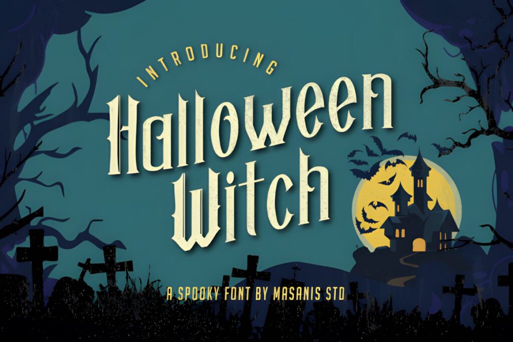
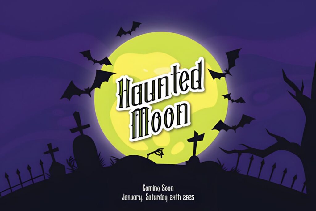
Halloween Witch is a vintage spooky display font that moves away from modern cartoon Halloween lettering. Its older-looking personality fits witch-themed labels, apothecary-inspired graphics, spellbook titles, retro signs, and seasonal projects that need a more traditional supernatural atmosphere.
Choose it when the theme is witches, potions, haunted history, or vintage Halloween rather than playful monsters. Keep supporting type simpler so the period-inspired display alphabet remains the recognizable focal point.
20. Halloween Witch by Tedha Studio
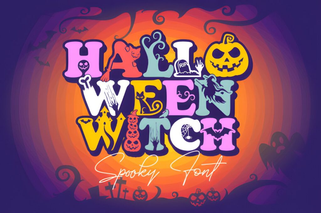
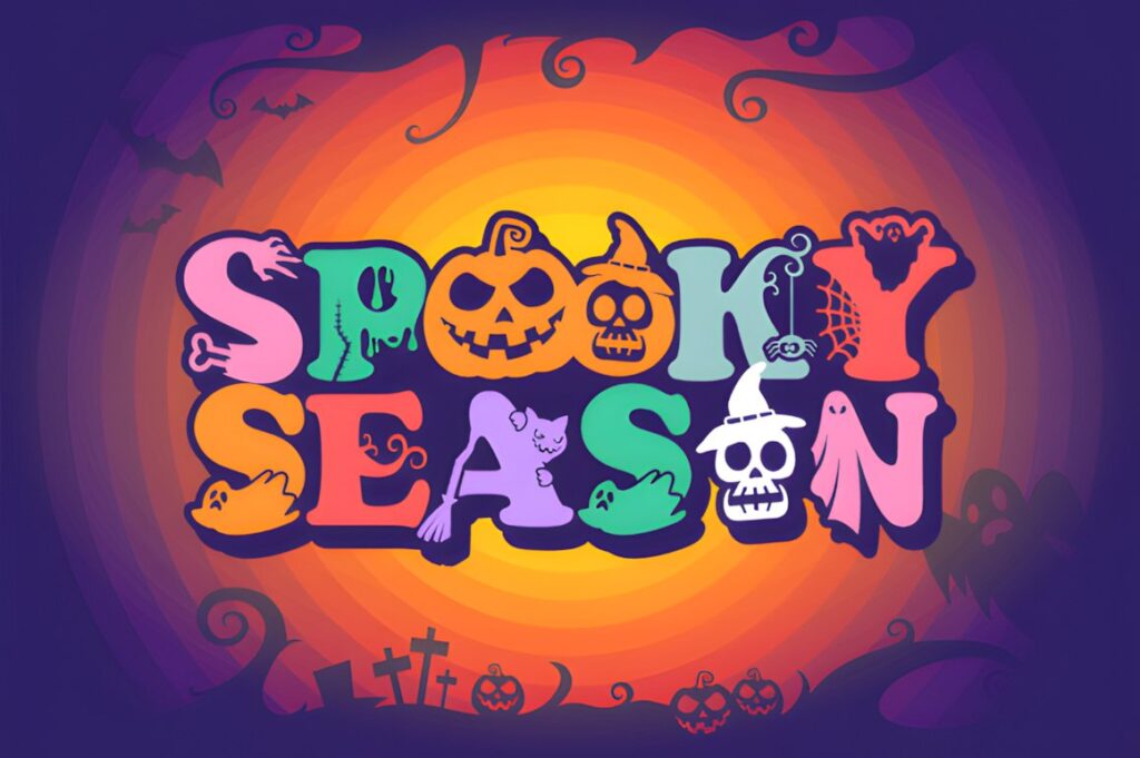
This Halloween Witch font takes a much more playful approach, integrating seasonal details such as bats, spiders, and cobwebs into the characters. It is a strong fit for lettering where the font needs to provide both the word and part of the decoration.
That makes it useful for party graphics, classroom Halloween designs, signs, and short decorative phrases. Because the letterforms already contain visual motifs, leave enough empty space around the text instead of adding a second layer of equally detailed clipart.
21. Witch
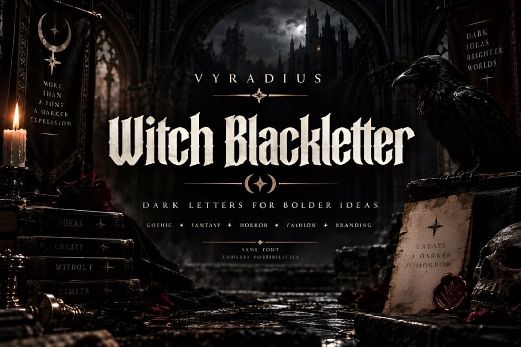
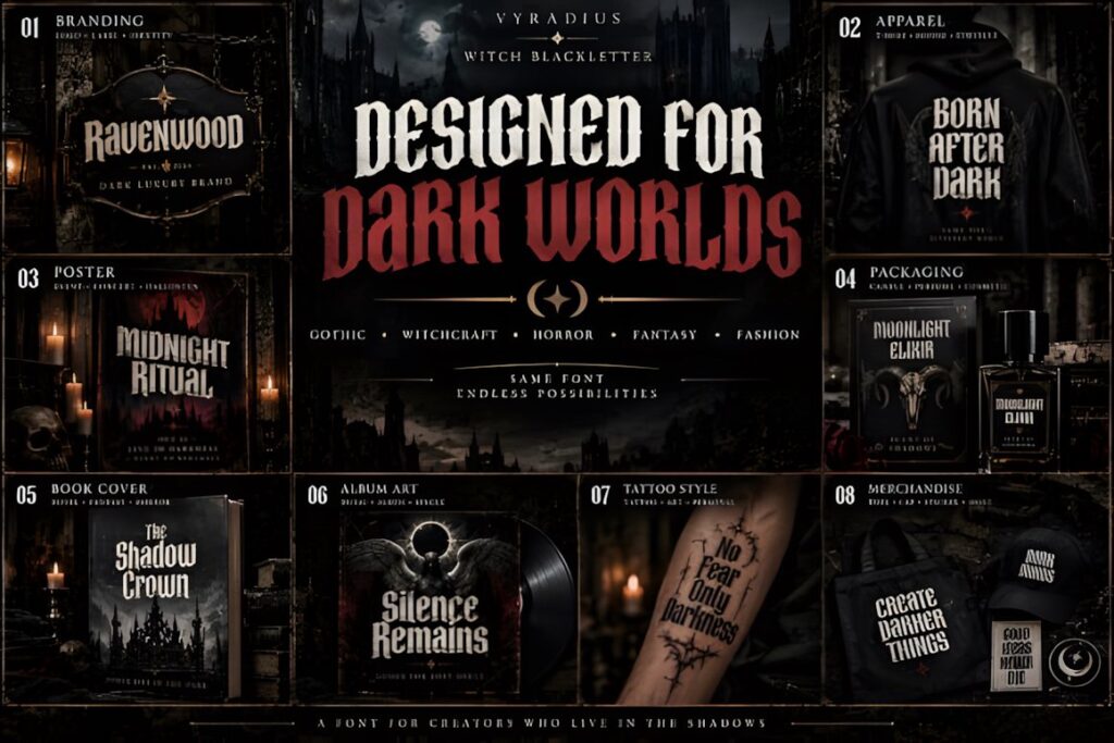
Witch is a bold blackletter display font with sharp, high-contrast forms influenced by medieval typography, gothic design, witchcraft, and dark fantasy. It is one of the strongest choices here for lettering that should feel occult, historical, or dramatically gothic rather than cartoonish.
Blackletter works especially well for short names and titles, but dense shapes can slow down reading in long phrases. Use Witch for the main statement and pair it with a restrained supporting face for secondary information.
22. Horror Outline
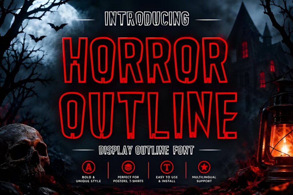
Horror Outline uses tall condensed letters with an outlined construction and subtle distressed details. The combination gives large words an open interior while keeping the outer shape bold enough for posters, stickers, shirts, invitations, and seasonal headline graphics.
The outline is the distinguishing feature, so avoid adding another heavy outline effect unless you have tested the result at final size. If the lettering needs a solid chunky mass instead, Halloween Spooky or Creepy Halloween provides a more filled-in appearance.
23. Halloween by WAP
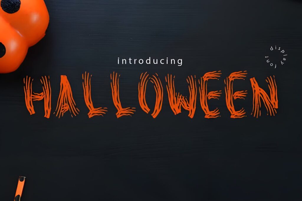
Halloween by WAP is a quirky display font that works as a flexible final option when you want unusual seasonal lettering without committing to dripping blood, gothic blackletter, or heavily illustrated characters. Its display personality keeps short words visually distinctive while leaving more freedom for your own Halloween graphics.
Use it for headings, signs, labels, and short decorative phrases. If the concept requires an obvious handwritten texture, one of the brush or script options earlier in the list will communicate hand lettering more strongly.
Quick Comparison by Lettering Style
| Font | Best for | Style | Key visual trait | Project fit |
|---|---|---|---|---|
| Halloween by Tedha Studio | Mixed lettering layouts | Handwritten + serif duo | Two contrasting personalities | Names, quotes, seasonal designs |
| Spook Halloween | Playful monster lettering | Decorative | Eyes, teeth, and character details | Kids’ signs, party graphics |
| Spooky Halloween by jinanstd | Organic horror lettering | Handwritten brush | Raw brushstroke appearance | Posters, quotes, titles |
| Spooky Halloween by Art Cafe | Large distressed words | Rugged display | Grungy handwritten texture | Headlines, horror graphics |
| Scary Horror | Slasher-inspired lettering | Horror display | Dripping letter details | Haunted-house and party titles |
| Killer Horror | Tall dramatic titles | Condensed horror | Sharp distorted serifs | Posters, merchandise, headlines |
| Halloween Witch by Mas Anis | Vintage supernatural themes | Vintage display | Old-fashioned spooky character | Witch labels and retro signs |
| Witch | Dark gothic lettering | Blackletter | Sharp medieval structure | Occult, fantasy, witch themes |
| Horror Outline | Open condensed headlines | Outline display | Tall outlined forms | Posters, shirts, stickers |
Handwritten, Brush, Decorative, or Horror Display?
Handwritten Halloween fonts are the easiest choice when the project should feel personal, casual, or hand-lettered. They work well for quotes, names, cards, and phrases where the individual words still need to read naturally.
Brush styles create more energy. Rough edges and irregular strokes can make typed words look closer to painted or inked lettering, especially at poster scale. The tradeoff is that distressed texture can blur together when the text becomes small.
Decorative alphabets make each character part of the illustration. Fonts with bats, monsters, skulls, webs, or internal motifs are useful when you want the lettering itself to carry the Halloween theme, but they need more space and usually work better with shorter wording.
Horror display and blackletter fonts create the darkest mood. Use them for large titles and focal words rather than long reading passages. A condensed horror face can also solve a practical layout problem when a dramatic headline has to fit into a narrower area.
How to Make Digital Fonts Feel More Like Hand Lettering
The easiest mistake is leaving every character exactly as typed. Hand lettering usually contains small changes in spacing, scale, baseline, and ornament placement, so a perfectly mechanical line can reveal the digital source even when the font itself looks handmade.
- Test alternate glyphs or swashes only where the font actually provides them.
- Adjust spacing around unusually wide or decorative characters.
- Use slight line-height changes in stacked phrases instead of forcing every line into the same width.
- Let one or two characters provide the decorative emphasis rather than ornamenting every letter.
- Keep enough margin around long swashes, drips, pointed serifs, and illustrated letter details.
For a believable hand-lettered composition, visual rhythm matters more than filling every empty area. A little open space can make irregular lettering feel intentional instead of cluttered.
Readability and Size for Spooky Alphabet Fonts
Halloween lettering often sacrifices some neutrality for atmosphere, but it should still communicate the word quickly enough for the project. Decorative complexity becomes especially important at small sizes.
Before finishing a design, preview it at approximately the size people will actually see. A font that looks clear at full-screen editing size may lose tiny webs, scratches, drips, interior cuts, or thin swashes when reduced.
Spacing also changes readability. Community discussions around decorative type repeatedly return to legibility and visual crowding: increasing space between complex characters can make stylized alphabets easier to recognize. Treat that as a layout decision rather than assuming the font’s default spacing will suit every phrase.
For long wording, reserve the Halloween alphabet for the main phrase and move smaller supporting text to a restrained serif or sans serif. The contrast makes the decorative headline feel stronger while keeping the complete design easier to scan.
Swashes, Alternates, and Decorative Glyphs
Swashes and alternate characters can make a digital font feel more custom, but placement matters. Long entry and exit strokes usually work most naturally at the outer edges of a word or phrase, where they can extend into open space instead of colliding with neighboring letters.
Decorative extras such as ghosts, bats, or alternate characters can also replace separate illustrations in a simple layout. Use them as accents rather than trying to showcase every available extra in one composition.
Not every font in this roundup includes alternates, swashes, or special characters. Check the current product details for the exact font you plan to use rather than assuming a feature from the preview artwork alone.
Choosing the Right Halloween Alphabet Style
If you want lettering that still feels naturally handwritten, Spooky Halloween by ABBAsalam or Halloween Script gives you a softer starting point.
For playful characters that do part of the illustrating for you, Spook Halloween and Halloween by Nongyao make the alphabet itself the decorative focus.
If the priority is a rough hand-painted horror impression, Spooky Halloween by jinanstd or Spooky Halloween by Art Cafe makes more sense. For a darker cinematic result, Killer Horror and Scary Horror move further into horror typography.
For witchcraft, gothic, or old-world supernatural designs, Witch provides the clearest blackletter direction, while Halloween Witch by Mas Anis offers a more vintage Halloween interpretation.
Frequently Asked Questions
What type of Halloween font looks most like hand lettering?
Handwritten and brush-style Halloween fonts usually create the strongest hand-lettered impression because their strokes are less mechanically uniform than conventional display type. Look for irregular baselines, brush texture, casual spacing, or script movement. Decorative display fonts can still look handmade, but their illustrated shapes often read more like themed typography than natural lettering.
Are decorative Halloween fonts readable at small sizes?
Highly decorative Halloween fonts are usually clearer at larger display sizes. Webs, drips, scratches, thin swashes, internal illustrations, and distressed edges can disappear or merge when lettering is reduced. Preview the finished design at its actual viewing size and simplify the font choice when small labels or secondary information need faster readability.
How should I use swashes in spooky hand lettering?
Use swashes selectively, usually around the outside edges of a word or short phrase where they have room to extend. Too many interior flourishes can collide with neighboring letters and make an already decorative Halloween composition feel crowded. Only use alternate characters or swashes that the specific font actually includes.
Can I use these Halloween fonts for products or client work?
Licensing depends on the current license attached to each specific font product. Check the product page before using a font for client projects, products for sale, print-on-demand items, editable digital products, or other commercial work. Do not assume that every font or every type of finished product is covered by identical terms.