ℹ️ Affiliate Disclosure: This article may contain affiliate links. If you book or purchase through these links, we may earn a commission at no additional cost to you.
Explore the Best Grunge Halloween Fonts for Distressed Horror Posters
Grunge Halloween fonts can give a horror poster convincing age, damage, and unease without forcing you to build every scratch and broken edge manually. The difficult part is choosing a distressed typeface that still reads clearly once it sits over grainy photography, dark backgrounds, paper textures, or chaotic Halloween artwork. Some fonts rely on cracked surfaces, some use scraped edges, and others push further into splatter, dripping, or irregular hand-drawn shapes.
For distressed horror poster style, I would prioritize strong silhouettes first and texture second. A title should still register from a distance before the viewer notices the worn details. This selection concentrates on fonts that create different versions of the same gritty horror mood, from vintage pulp decay to aggressive scratched lettering and rough contemporary Halloween headlines.
Many more horror fonts are available, while this shortlist concentrates on distinctly distressed styles that serve different poster moods without becoming visually interchangeable.

The most useful grunge Halloween fonts for horror posters combine a recognizable title shape with controlled damage. Choose chunky distressed lettering for large cinematic titles, condensed or jagged forms for tense compositions, splattered fonts for extreme grunge, and rough vintage styles when you want the poster to feel printed, weathered, or pulled from an old horror archive.
Quick Picks
For classic distressed Halloween titles: Halloween Grunge — bleeding texture gives it an immediate seasonal horror identity.
For vintage horror-comic energy: Horror Scratch — rough grunge styling connects naturally with older horror and metal-influenced poster aesthetics.
For extreme splatter texture: Sporetype — the scattered distressed surface works when the type itself needs to become a major visual texture.
For cracked haunted-house posters: Creepy Souls — rough edges and uneven forms give it a weathered supernatural character.
For aggressive modern horror: Tremor Shock — chunky scraped shapes create a harsher, more kinetic headline.
Grunge Halloween Fonts for Distressed Horror Posters
1. Halloween Grunge
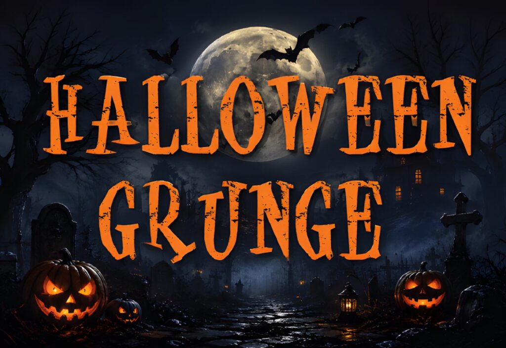
Halloween Grunge is a distressed display font suited to posters that need unmistakably seasonal horror lettering rather than a generic weathered texture. Its letterforms use a bleeding, eroded surface treatment that introduces damage without completely destroying the recognizable shapes of the characters. Creative Fabrica presents it specifically as a Halloween-themed grunge display font.
This makes sense for haunted-house posters, October event graphics, horror-themed flyers, or title treatments placed over relatively simple photography. Because the Halloween styling is already built into the letters, avoid stacking too many additional scratch overlays directly on top. If you want a more neutral distressed title that can lean toward music or streetwear as well as Halloween, Grunge Horror is the broader alternative.
2. Grunge Horror
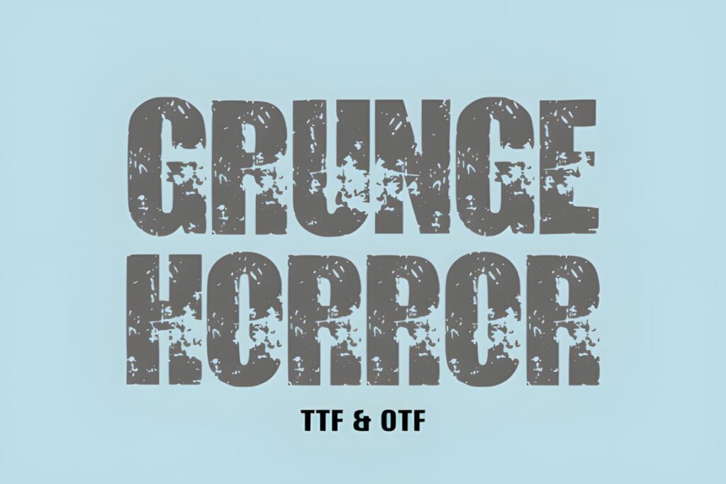
Grunge Horror is a bold sans-serif horror font built around broken, sinister surface texture. The underlying shapes stay substantial while rough lines interrupt the strokes, giving a poster the worn appearance associated with distressed print, scratched film graphics, and darker alternative artwork. Creative Fabrica specifically positions the font for poster graphics and other bold display uses.
Choose Grunge Horror when the headline needs to feel gritty without becoming strongly tied to pumpkins, ghosts, or another literal Halloween motif. That flexibility is useful for psychological horror, thriller posters, metal-inspired Halloween events, and darker editorial graphics. For a more obviously seasonal result, Halloween Grunge communicates Halloween faster.
3. Horror Scratch
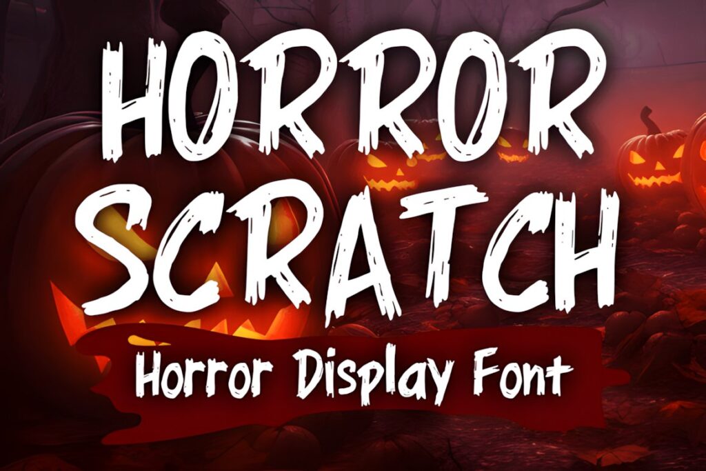
Horror Scratch is a grunge horror display font influenced by vintage horror movies, horror comics, and metal typography. That combination makes it especially useful when the goal is not merely “spooky” lettering but a poster that feels rough, old, and slightly underground. The product is presented for horror and Halloween projects including posters, banners, merchandise, and related display work.
I would favor Horror Scratch for retro movie-night posters, Halloween concert graphics, pulp-inspired covers, or distressed titles paired with aged paper and halftone imagery. Its stronger personality makes it less suitable for layouts where the headline needs to look polished or restrained. Gothic Horror offers a more gothic-vintage direction when you want drama without the same metal influence.
4. Gothic Horror
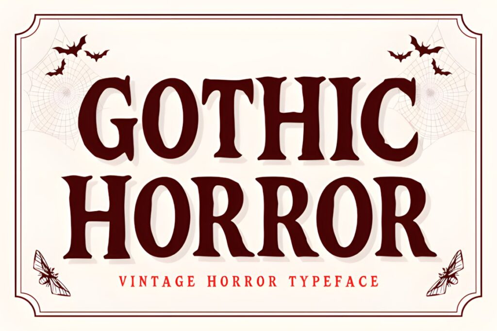
Gothic Horror is a distressed hand-drawn typeface shaped around vintage horror-film and gothic-story aesthetics. Jagged ink edges and irregular forms make it a good fit for posters that should feel older, theatrical, or literary rather than aggressively modern. Its Creative Fabrica page specifically lists horror movie titles and Halloween posters among its intended uses.
A Dracula-inspired screening poster, gothic book event, haunted mansion graphic, or vintage Halloween advertisement would suit this style particularly well. Pair it with restrained secondary type so the handmade irregularity remains the focal point. For a more brutal scraped look, Tremor Shock pushes the texture further and feels less historically influenced.
5. Creepy Souls
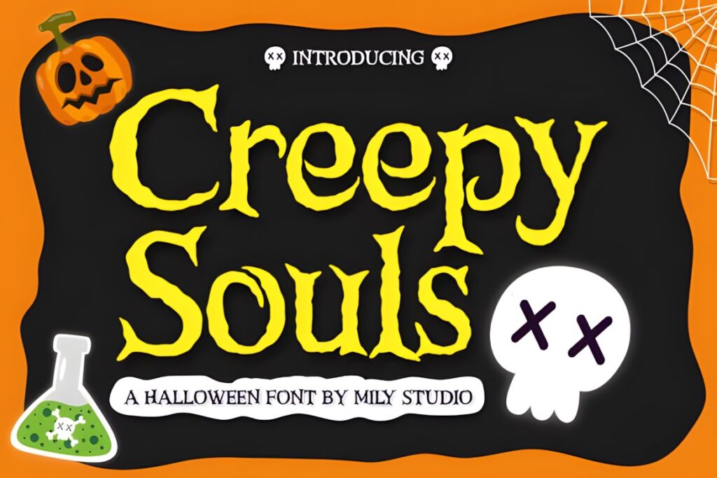
Creepy Souls uses bold, rough letterforms with distressed edges and slightly unstable shapes. The result sits between vintage Halloween lettering and a more contemporary haunted display style, making it useful when the poster needs obvious macabre character but still depends on a substantial headline silhouette. Its listed uses include horror posters, event invitations, merchandise, labels, and book covers.
This font works particularly well with restrained background imagery because its uneven edges already contribute plenty of texture. Use it for séance themes, supernatural events, haunted attractions, or distressed potion-label-inspired posters. If the composition already contains chaotic splatter, consider a cleaner distressed font rather than adding another highly active texture layer.
6. Scary Halloween
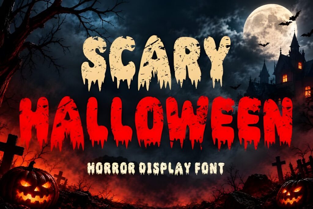
Scary Halloween combines heavy horror letterforms with dripping shapes and scratched distressing. That layered treatment gives the font a more explicit fright-night appearance than a neutral grunge typeface. Its strong silhouette is designed for high-impact Halloween and horror display work, including posters, movie-style graphics, haunted-house promotions, and other dark seasonal designs.
Use Scary Halloween when you want the title itself to provide much of the visual horror effect. It can work especially well with short phrases such as an attraction name or movie title. Longer headings may become visually busy because the distressed and dripping details repeat across many characters. Grunge Horror is easier to use when the wording needs more restraint.
7. Rotingham
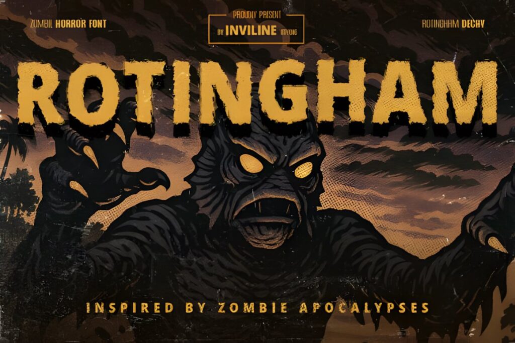
Rotingham is a distressed horror display font inspired by zombie decay, pulp horror comics, and uneven vintage printing. Rough edges and inconsistent ink texture make the letters appear physically weathered rather than simply covered with a digital scratch pattern. Creative Fabrica describes it for eerie poster titles, game interfaces, Halloween packaging, and grindhouse-style movie typography.
This makes Rotingham a strong direction for zombie posters, retro exploitation themes, survival-horror events, or fake aged movie one-sheets. The vintage print character is the main reason to choose it. For a cleaner modern horror composition, Horror Outline or Grunge Horror will generally give you more structural simplicity.
8. Sporetype
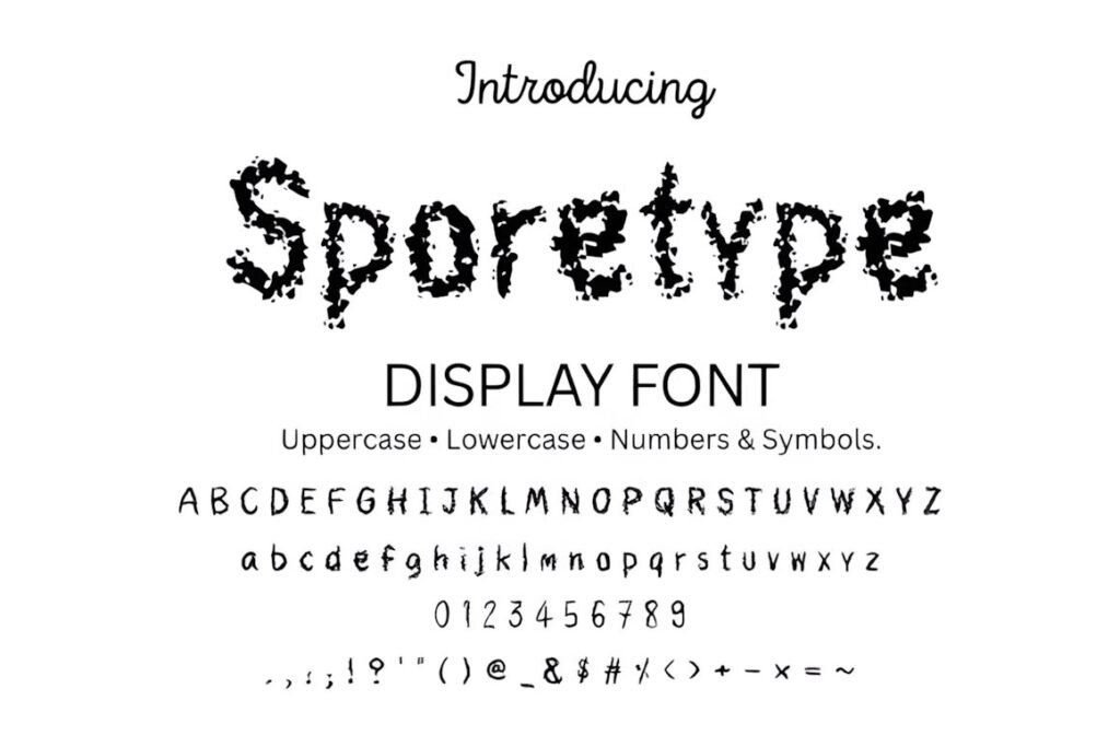
Sporetype takes the grunge idea in a splattered direction. Its display letters use scattered, spore-like texture that can make a horror title feel contaminated, dirty, or chemically degraded. The product is specifically described for horror posters, Halloween invitations, thriller covers, game titles, and similarly dark display work, with uppercase, lowercase, numbers, and symbols listed on the product page.
Consider Sporetype for infection themes, toxic-horror posters, dystopian events, creature features, or artwork with biological and industrial imagery. Because the texture is already visually dense, give the headline room around it and avoid placing small supporting copy in the same font. Creepy Souls is the less splattered alternative when you still want rough edges.
9. Tremor Shock
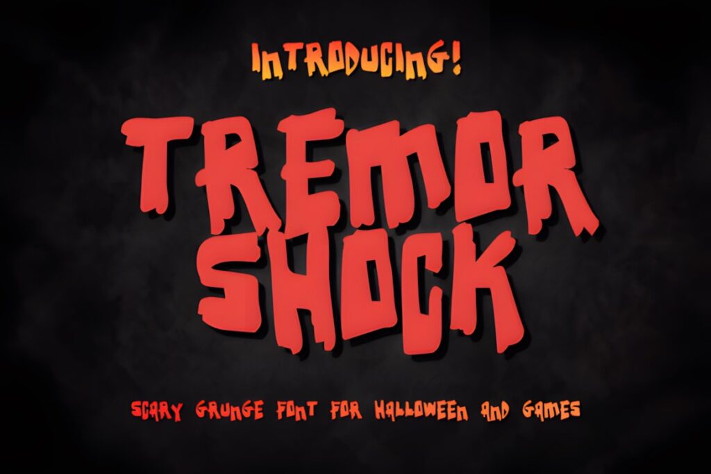
Tremor Shock uses chunky, heavily distressed forms with irregular jagged outlines. Instead of suggesting subtle aging, the letters look scraped, hacked, or violently worn away. Creative Fabrica describes the font as a raw display style built around horror media and grunge art, which makes it particularly suitable when a poster needs force rather than nostalgic Halloween charm.
I would use Tremor Shock for slasher events, extreme horror titles, metal-adjacent Halloween posters, or large typographic compositions where the headline needs to dominate the artwork. The aggressive outline can overpower delicate illustrations, so it makes more sense beside bold photography, large silhouettes, or simple graphic shapes.
10. Ghost Grunge
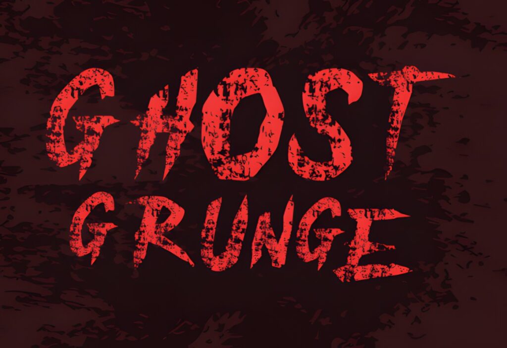
Ghost Grunge is a horror-inspired display font with rough brush traces and ghostly irregularity. Compared with the heavier scratched fonts in this roundup, its texture feels more handmade and spectral, giving posters an uneasy supernatural mood instead of a purely violent one. The font is presented for Halloween posters, invitations, postcards, and macabre headings.
It suits paranormal events, ghost stories, haunted photography, occult-inspired posters, and darker Halloween graphics where rough lettering should still feel atmospheric. For zombie or grindhouse themes, Rotingham provides a more decayed printed appearance; Ghost Grunge makes more sense when the design needs brushy imperfection and supernatural tension.
Quick Comparison
| Font | Best for | Style | Key visual trait | Project fit |
|---|---|---|---|---|
| Halloween Grunge | Seasonal poster titles | Distressed Halloween | Bleeding texture | Haunted events and October graphics |
| Grunge Horror | Versatile horror headlines | Rough sans serif | Broken surface texture | Posters and dark editorial graphics |
| Horror Scratch | Retro horror | Grunge display | Scratched vintage character | Pulp, metal, and movie-night posters |
| Gothic Horror | Gothic movie themes | Hand-drawn distressed | Jagged ink edges | Vintage and literary horror |
| Creepy Souls | Haunted graphics | Rough display | Uneven distressed edges | Supernatural events and labels |
| Scary Halloween | Explicit Halloween horror | Heavy distressed | Drips and scratches | Haunted houses and scary posters |
| Rotingham | Zombie and grindhouse themes | Retro distressed | Uneven printed decay | Pulp and survival-horror graphics |
| Sporetype | Extreme texture | Splattered grunge | Scattered spore effect | Toxic and dystopian horror |
| Tremor Shock | Aggressive headlines | Chunky distressed | Jagged scraped outline | Slasher and heavy horror posters |
| Ghost Grunge | Paranormal themes | Brushy horror | Ghostly irregular strokes | Occult and haunted designs |
Readability and Size
Distress is easiest to control when the font is used large. Scratches, gaps, splatter, and broken outlines that look convincing in a movie-poster title can merge together when the same word is reduced to a small social-media thumbnail. Before committing to a layout, test the title at the smallest size in which people are likely to encounter the design.
Short words tolerate more texture than long titles. A four- or five-letter movie name can carry exaggerated damage because the viewer recognizes the overall silhouette quickly. Longer event names usually benefit from a font with a simpler interior texture or slightly more breathing room between letters.
Background detail matters just as much as the font. Recent poster critiques from designers repeatedly point to loss of legibility when narrow or decorative type competes with heavy background noise. A distressed title often becomes stronger when you reduce the texture immediately behind the letters rather than adding extra effects to the typography itself.
Font Pairing Tips for Distressed Horror Posters
Treat the grunge font as a special-effect typeface. Let it handle the movie title, haunted-attraction name, or one short phrase, then give informational text a quieter role. A restrained sans serif can handle dates, ticket details, addresses, credits, or supporting lines without competing with the damaged headline.
For retro pulp or gothic horror, a comparatively restrained serif can support the main display face while preserving an older editorial mood. The key is functional contrast: the distressed font establishes personality, while the supporting font communicates information quickly.
Avoid pairing two equally distressed fonts just because both look “horror.” Their textures tend to compete rather than build hierarchy. If the headline is already irregular, scraped, or splattered, keep secondary typography more consistent. That distinction also makes the grunge treatment look deliberate rather than like a filter applied to every element.
Common Grunge Horror Font Mistakes
- Distressing every line of text: keep heavy texture for display lettering and use cleaner type for practical information.
- Adding texture over an already distressed font: built-in erosion may be enough; extra scratches can destroy counters and letter recognition.
- Ignoring thumbnail size: a title that works on a full poster may turn into an indistinct shape on Pinterest or social media.
- Using low contrast behind the headline: busy photography and grunge lettering need separation through value, placement, or a calmer area of the image.
- Choosing style before mood: splatter, gothic decay, zombie print texture, and scratched metal aesthetics communicate different kinds of horror.
- Making every element equally loud: the title should usually have stronger personality than dates, credits, subtitles, and supporting copy.
Choosing the Right Distressed Style for Your Poster
If you want unmistakable Halloween texture with a traditional distressed treatment, Halloween Grunge is an easy place to start. For a broader horror aesthetic that can move beyond seasonal graphics, Grunge Horror offers a rougher but less literal direction.
Choose Horror Scratch or Rotingham when the poster should reference vintage horror, pulp printing, or grindhouse artwork. Gothic Horror makes more sense for theatrical, gothic, and classic-film moods.
For a more aggressive contemporary composition, Tremor Shock gives the headline heavier scraped energy, while Sporetype turns the texture itself into a major part of the artwork. The final choice should depend on the kind of damage your poster needs—not simply which font looks the most distressed at full size.
Frequently Asked Questions
What makes a grunge font suitable for a Halloween horror poster?
A useful grunge Halloween font keeps a recognizable headline silhouette while adding rough edges, scratches, cracks, splatter, or other distressed details. The texture should reinforce the poster mood without making the main title difficult to identify. Short display text can handle heavier damage, while longer titles usually benefit from simpler letterforms and more controlled texture.
Should I use a distressed horror font for all the text on a poster?
A distressed horror font usually works better as display type than as the font for every line. Use it for the main title or another short focal phrase, then switch to a cleaner supporting serif or sans serif for dates, credits, locations, and other information. This creates hierarchy and prevents the poster from becoming visually noisy.
How can I keep a grunge Halloween font readable over a textured background?
Give the distressed title a calmer area of the composition and maintain strong contrast between the letters and the image behind them. Avoid stacking heavy scratches, grain, and splatter directly beneath an already damaged font. Testing the finished design at thumbnail size is also useful because small-scale viewing quickly reveals when texture has started to overpower the letterforms.
Can I use these Halloween fonts for products, client work, or commercial designs?
Licensing should be checked on the current product page before using a font in commercial work. The exact permitted uses can matter for client projects, merchandise, print-on-demand products, editable digital files, and other resale situations. Review the current license associated with the specific font and intended project rather than assuming every typeface carries identical usage terms.