ℹ️ Affiliate Disclosure: This article may contain affiliate links. If you book or purchase through these links, we may earn a commission at no additional cost to you.
Choosing the Best Halloween Fonts for Scrapbooking and Album Layouts
Halloween scrapbook pages can become visually crowded fast. Between patterned paper, photos, stickers, pumpkins, ghosts, journaling cards, and layered embellishments, the lettering still needs enough personality to feel spooky without competing with everything around it. The most useful Halloween fonts for scrapbooking therefore serve different jobs: chunky display lettering for page titles, playful styles for photo captions, handwritten fonts for journaling, and highly decorative faces reserved for short accents.
For spooky album layouts, scale matters just as much as style. Intricate letters can look dramatic across a large title strip but lose clarity on a tiny label, while simpler rounded or handwritten lettering tends to work better beside photos and smaller embellishments.
Many more Halloween fonts are available, while this shortlist concentrates on styles with distinct scrapbook uses, readable letterforms, and clearly different spooky personalities.

The strongest choices for Halloween scrapbook layouts include chunky spooky display fonts for main page titles, playful ghost and monster lettering for kids’ albums, handwritten styles for captions and journaling, and darker horror fonts for dramatic October spreads. Using different levels of decoration helps create hierarchy instead of making every piece of text compete for attention.
Quick Picks
For whimsical spooky page titles: Witch Mystery — decorative enough to establish the Halloween theme without relying on an especially harsh horror look.
For bold classic Halloween lettering: Spooky Halloween — a strong decorative choice for large scrapbook titles and layered title clusters.
For cute ghost-themed albums: Ghost Halloween — cleaner rounded shapes make it easier to combine with illustrations and photo-heavy layouts.
For handwritten captions: Pumpkin Halloween — a cursive handwritten direction that contrasts naturally with heavier Halloween display fonts.
For darker horror spreads: Killer Horror — condensed, sharp lettering gives short titles a more intense horror-movie character.
Halloween Fonts for Scrapbooking and Spooky Album Layouts
1. Witch Mystery
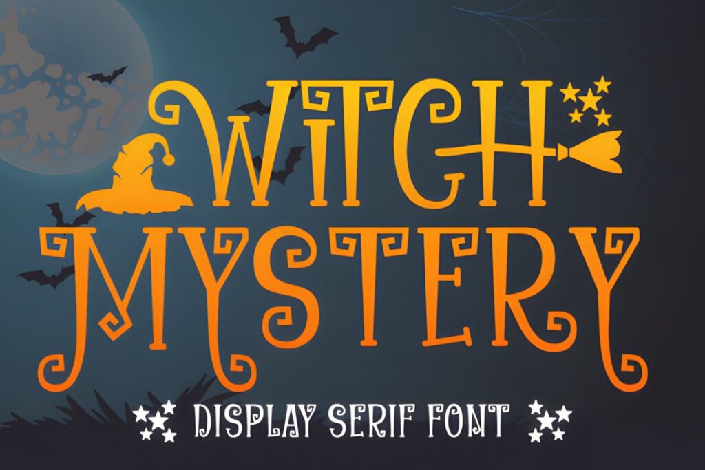
Witch Mystery is a whimsical spooky display font that suits scrapbook titles, Halloween memory pages, and decorative phrase cards. Its personality lands between playful and mysterious, making it easier to use with family trick-or-treat photos than a heavily distressed horror face.
The font also includes accessible glyph and swash features according to its product page, which can help when a short title needs one decorative flourish. Keep those extras selective on busy scrapbook spreads; a cleaner option such as Ghost Halloween makes more sense when the lettering needs to sit close to patterned paper, stickers, or several small photos.
2. Spooky Halloween
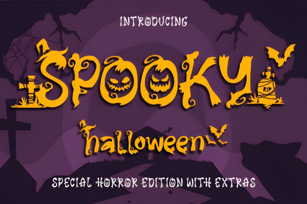
Spooky Halloween by Creaditive Design is a decorative Halloween font built for pages where the title should immediately establish an October theme. The letterforms have enough visual character to work as a focal point across a large scrapbook heading, cover page, or section divider.
The product includes additional glyph and swash access, so short words can be personalized without adding separate graphic elements. That decoration is more useful at generous sizes than in tiny captions. For journaling strips or photo dates, pair it with restrained supporting lettering rather than reducing the decorative font until its details become cramped.
3. Halloween
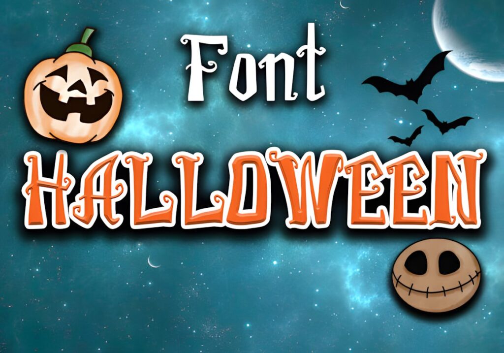
Halloween by sakwarin art is a thick-lettered spooky display font that makes sense for bold scrapbook titles, October section pages, and short phrases placed above photo clusters. The heavy construction gives the lettering enough presence to remain visible when the surrounding layout contains several decorative elements.
Choose it when you want the typography to behave like another substantial scrapbook embellishment rather than a subtle caption. Because the letters already carry strong visual weight, longer journaling passages can feel dense. A handwritten font such as Pumpkin Halloween is a more natural companion for supporting notes underneath a large Halloween heading.
4. Halloween Witch
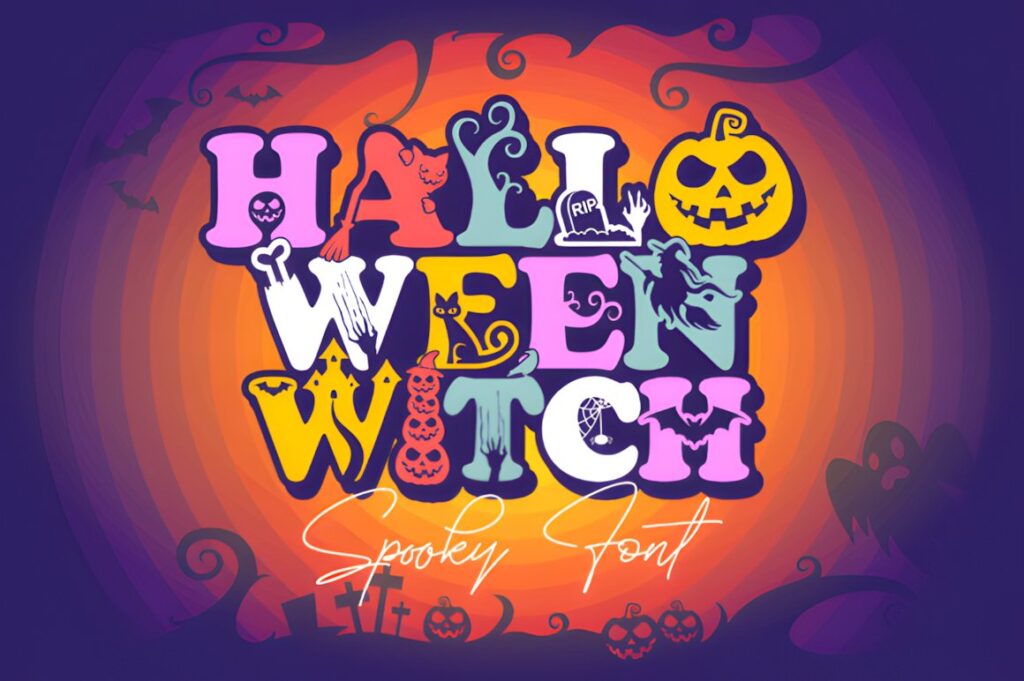
Halloween Witch by Tedha Studio is a playful decorative font incorporating Halloween motifs such as bats, spiders, and cobweb-inspired details. That makes it particularly useful for scrapbook pages where the lettering itself needs to contribute to the embellishment layer.
Try it for a short witch-themed title, a decorative pocket-page card, or a single phrase beside costume photos. Because the characters contain obvious seasonal details, giving them breathing room is important. Pages already filled with intricate die cuts, stickers, and patterned backgrounds may benefit more from a simpler spooky typeface so the photos remain the primary focus.
5. Halloween Script
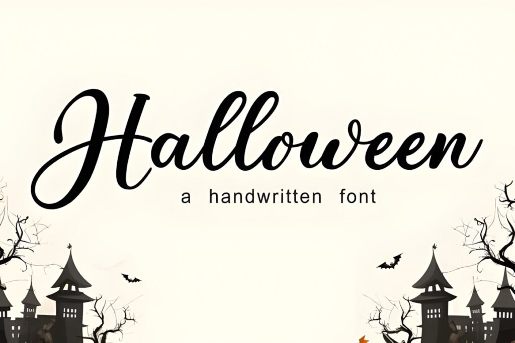
Halloween Script by Lisna.Craft brings a friendlier handwritten direction to spooky album layouts. Instead of turning every letter into an obvious monster or horror motif, the script styling can soften family Halloween pages while still keeping the typography connected to the season.
This is the kind of option to consider for names, short scrapbook captions, decorative labels, or a secondary phrase underneath a chunky headline. Script forms need enough size and spacing to remain easy to read, especially when printed over patterned backgrounds. For a main title that needs much stronger contrast from several feet away, choose one of the heavier display fonts in the roundup.
6. Ghost Halloween
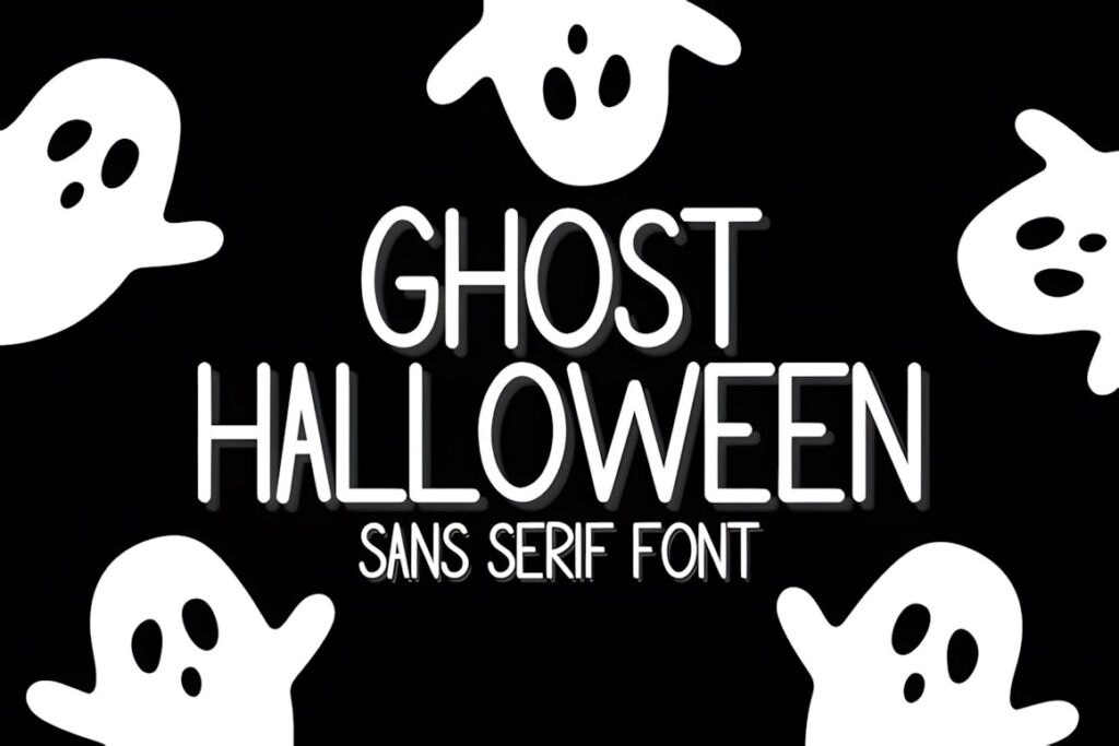
Ghost Halloween by Chonada is a playful spooky sans serif with rounded forms, tall proportions, and a subtle hand-drawn quality. Its cleaner construction makes it useful when a scrapbook layout already contains obvious Halloween illustrations and the typography needs character without adding another dense decorative layer.
It works especially well for photo captions, small title blocks, labels, and clean modern Halloween spreads. The narrower proportions also help when a phrase is longer than the typical two-word scrapbook title. Choose a more decorated option such as Halloween Witch when the letters themselves need to act as the main Halloween graphic.
7. Monster Halloween
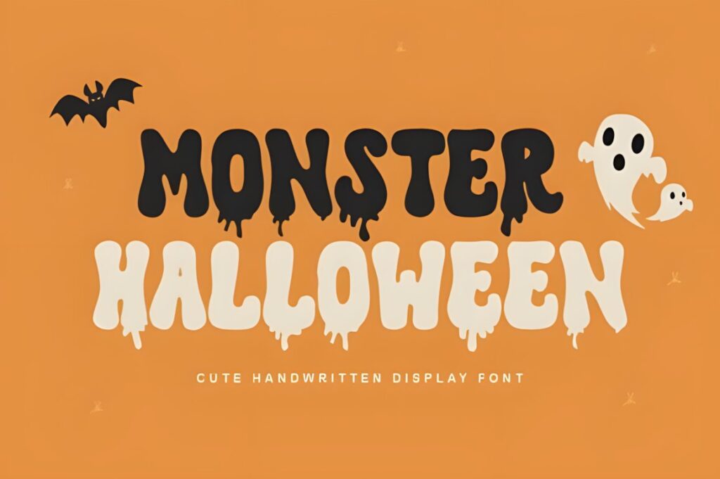
Monster Halloween by Reyrey Blue is a dripping display font for scrapbook pages that need a recognizable monster or slime-inspired Halloween look. Its bold shapes suit short titles, labels, and photo-page headings where playful creepiness matters more than subtlety.
The dripping detail is most effective when the lettering is large enough for the silhouette to remain obvious. That makes Monster Halloween a natural choice for a main phrase such as “Monster Mash” or “Trick or Treat,” while smaller journaling and dates should stay in a cleaner companion font. For a less cartoon-like horror mood, Killer Horror creates a sharper and more aggressive direction.
8. Halloween Spooky
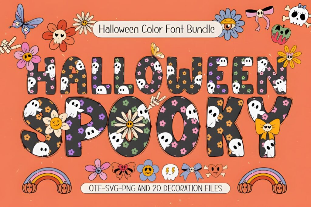
Halloween Spooky by Issie_Studio is a themed color-font product built around cute ghosts and autumn-Halloween imagery. Four font styles and matching bonus graphics are listed with the product, giving scrapbookers more flexibility when building coordinated title cards and decorative album elements.
This option makes the most sense for cheerful trick-or-treat pages, children’s albums, or layouts where colorful lettering is part of the design concept. Color-font compatibility is more limited than ordinary font use, and the product page specifically notes separate considerations for its color version. Check your intended software workflow before making this font central to an entire album.
9. Spooky Halloween
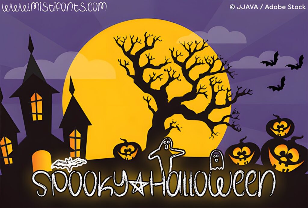
Spooky Halloween by Misti brings a chalky, crayon-like handmade texture to seasonal lettering. The product also provides special keyboard symbols for a star, bat, and two ghost shapes, which can be useful when building small scrapbook title treatments without adding separate decorative artwork.
The textured construction works naturally with distressed paper, hand-drawn embellishments, and handmade album styles. The product page notes that the detailed texture may make the font slower to load than a regular typeface, so this is a more specialized choice than a plain supporting font. Use it where the handmade texture is visible rather than for tiny metadata or lengthy journaling.
10. Halloween Ghost
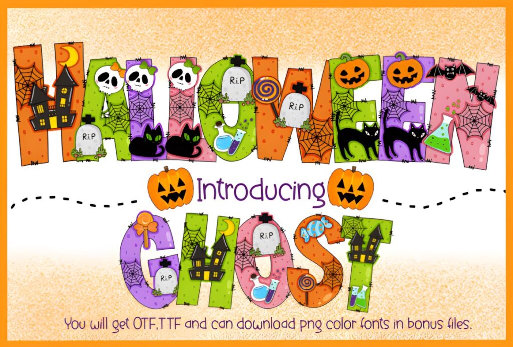
Halloween Ghost by Itme_digitalart is a decorative font filled with recognizable Halloween elements including ghosts, bats, pumpkins, and cobweb-inspired details. It can take over the role normally filled by alphabet stickers or decorative chipboard letters on a scrapbook spread.
Use it for one short focal phrase rather than every text element on the page. Because so much seasonal information is already built into the letters, simple cardstock, restrained embellishments, and larger type sizes give the design more room to work. For multi-photo layouts with many competing details, Ghost Halloween by Chonada provides a cleaner alternative.
11. Pumpkin Halloween
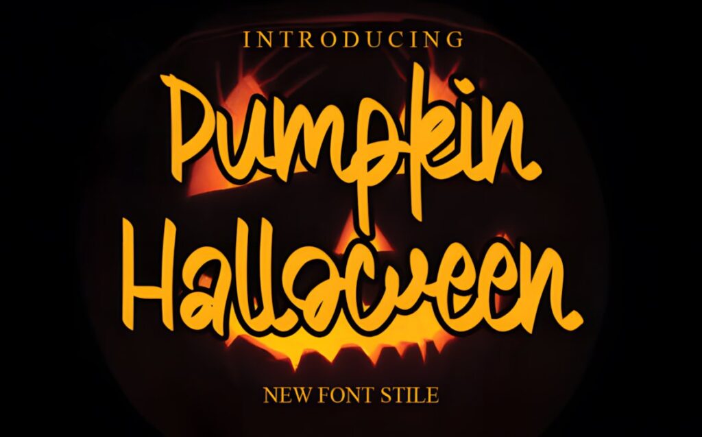
Pumpkin Halloween by Garcio is a cursive handwritten font suited to scrapbook titles, decorative names, stationery-style cards, and smaller text accents. Its handwritten rhythm provides a useful contrast to the thick monster and ghost fonts that dominate many Halloween designs.
This is especially useful when an album page needs something personal rather than theatrical—for example, a child’s name, a location, or a secondary line beneath a large title. Connected cursive shapes should still be kept at a comfortable size, particularly over patterned backgrounds. For a bold primary title, combine this type of handwritten lettering with a heavier display option rather than forcing the script to carry the whole page.
12. Halloween Pumpkin
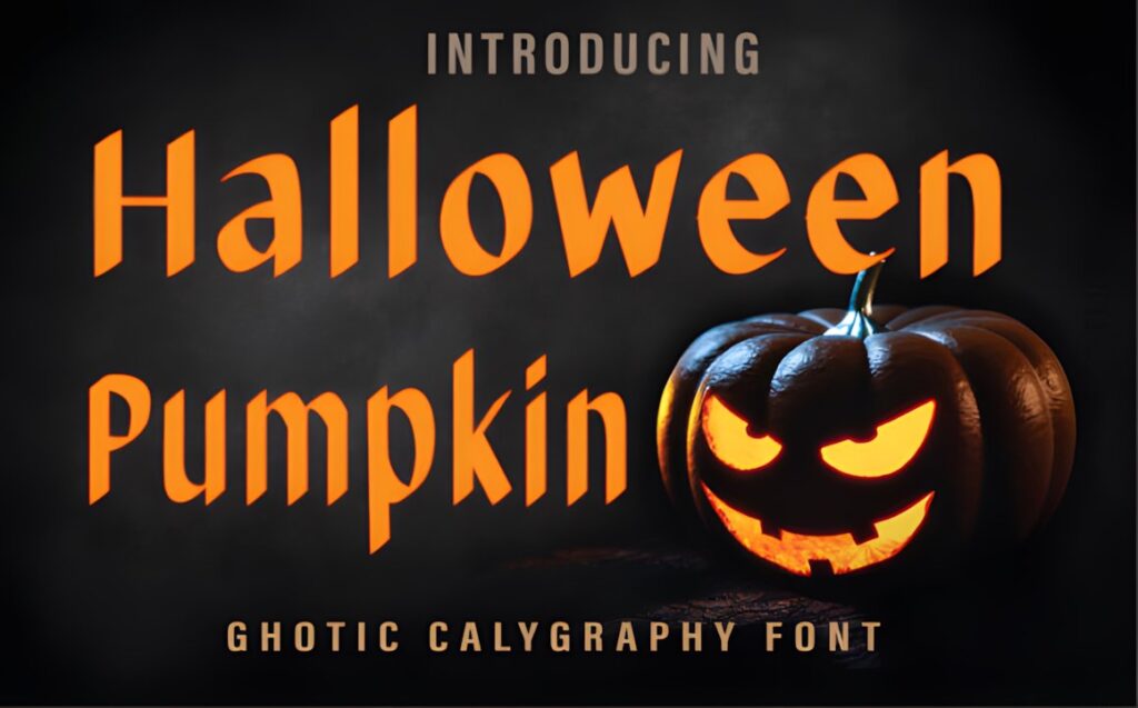
Halloween Pumpkin by Farz Studio is a bold blackletter font that brings an older, darker typographic mood to scrapbook layouts. Its traditional gothic influence is a strong fit for witchcraft themes, haunted-house photography, vintage Halloween ephemera, and album pages inspired by antique labels or old storybooks.
Blackletter works most clearly in short bursts, so use it for a compact title, date card, or dramatic decorative word rather than long journaling. Its formal structure can also feel too serious for cute children’s costume photos. In that situation, Witch Mystery or Monster Halloween creates a lighter seasonal personality.
13. Scary Horror
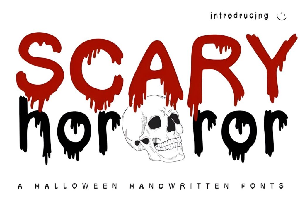
Scary Horror by Jan Jao studio is a dripping Halloween display font designed for a deliberately creepy result. Its blood-drip styling gives album titles immediate horror character, making it more appropriate for haunted attractions, horror costumes, scary movie nights, or adult Halloween parties than for soft and whimsical scrapbook themes.
Because the dripping shapes are the main visual feature, short lettering at a generous size will show the style most clearly. Use a restrained supporting font for dates, journaling, and captions so the page does not become visually exhausting. Monster Halloween is the better alternative when you want dripping lettering with a more playful monster-like mood.
14. Killer Horror
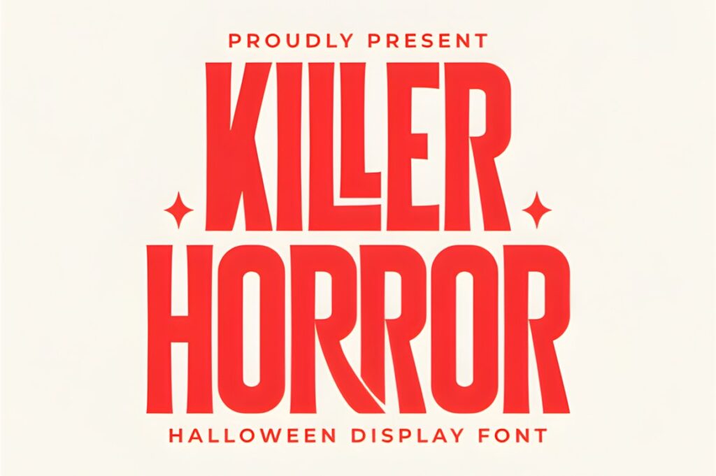
Killer Horror by Pian45 is a bold condensed Halloween display font with sharp serif details and a distorted horror-movie appearance. The narrower width is useful for scrapbook headings that need strong impact but must fit into a limited horizontal space above a photo row or inside a tall title panel.
The product page also lists PUA-encoded glyph, swash, and alternate access. Those extras can help make a single focal word more distinctive, but the font’s aggressive personality is already strong without heavy embellishment. Choose Halloween Pumpkin for a historical gothic feel instead, or Ghost Halloween when the album should remain playful and approachable.
Quick Comparison for Halloween Scrapbook Layouts
| Font | Best for | Style | Key visual trait | Project fit |
|---|---|---|---|---|
| Witch Mystery | Whimsical page titles | Spooky display | Decorative, magical character | Family Halloween albums |
| Spooky Halloween | Large focal titles | Decorative display | Strong seasonal personality | Layered title clusters |
| Halloween Witch | Embellishment-style words | Decorative | Bats, webs, and spooky details | Witch and haunted layouts |
| Ghost Halloween | Cleaner spooky text | Sans serif | Tall rounded letterforms | Photo-heavy layouts |
| Monster Halloween | Monster themes | Dripping display | Playful drip effect | Kids’ trick-or-treat pages |
| Halloween Spooky | Colorful ghost themes | Color font | Cute seasonal graphics | Cheerful Halloween albums |
| Pumpkin Halloween | Names and captions | Handwritten script | Cursive rhythm | Supporting text |
| Halloween Pumpkin | Vintage spooky pages | Blackletter | Dark historical structure | Witchy and antique layouts |
| Scary Horror | Intense horror pages | Dripping display | Blood-drip effect | Haunted and scary themes |
| Killer Horror | Narrow dramatic titles | Condensed horror display | Sharp distorted lettering | Dark cinematic layouts |
Using Decorative Fonts Without Overcrowding the Page
Scrapbook layouts already contain more visual layers than most flat graphic designs. A Halloween font with ghosts, spiderwebs, dripping edges, or ornamental swashes effectively becomes another embellishment, so give it the same visual space you would give a sticker cluster or large die-cut title.
One practical approach is to reserve the novelty font for the largest phrase and keep dates, captions, and journaling comparatively quiet. A decorative title can then sit above photos without every text element demanding equal attention.
Background contrast matters too. Fine internal details are easier to see on plain cardstock or low-contrast patterned paper. If the background is already covered with pumpkins, stars, ghosts, or typography, simplify the font choice rather than adding another layer of intricate detail.
Display Titles vs Journaling and Photo Captions
Most fonts in a Halloween roundup are display faces, which means their strongest role is short text rather than paragraphs. A phrase such as “Trick or Treat,” “Haunted Night,” or “Pumpkin Patch” gives decorative letterforms enough room to be noticed without forcing the reader through a long block of novelty typography.
For scrapbook journaling, simpler lettering usually preserves the story better. Handwritten or relatively clean options can handle names, locations, dates, and short notes while the more decorative font establishes the visual theme.
This separation also creates useful hierarchy: the decorative type answers “what is this page about?” while the supporting type handles the details someone may want to read years later.
Pairing Halloween Fonts in an Album
Pair fonts by function rather than trying to find two designs with equally strong Halloween styling. If the title font is dripping, illustrated, distressed, or blackletter-inspired, give the supporting font a calmer job and simpler structure.
A handwritten face can soften a thick monster title and works naturally for names or personal notes. A straightforward sans serif can support highly decorative ghost or witch lettering without introducing another competing theme. For vintage pages, a blackletter title can be balanced by restrained supporting text rather than another ornamental historical face.
Repeating the same pairing across several pages can also make an entire Halloween album feel cohesive even when the photographs and embellishments change from spread to spread.
Common Halloween Scrapbook Font Mistakes
- Using novelty lettering everywhere: keep the strongest spooky font for titles and accents instead of every caption.
- Shrinking decorative details too far: ghosts, drips, swashes, and distressed textures need enough size to remain recognizable.
- Ignoring the background: intricate lettering can disappear against heavily patterned scrapbook paper.
- Mixing several competing themes: a dripping monster font, gothic blackletter, and cute ghost font on one page can weaken the hierarchy.
- Choosing style before readability: preserve clear names, dates, and journaling even when the main title is highly decorative.
- Assuming every font works identically in every program: check the current product details, especially for color-font features or specialized glyph access.
Choosing the Right Font for Your Spooky Album
If you want a broadly usable whimsical Halloween title, Witch Mystery balances spooky character with a playful tone. For a chunky focal heading that needs to hold its own against layered embellishments, Halloween offers heavier visual weight.
For children’s trick-or-treat pages, Monster Halloween gives the layout an obvious monster-inspired personality, while Ghost Halloween is easier to use when photos and decorations already provide most of the Halloween theme.
Choose Halloween Pumpkin for old-fashioned gothic layouts or Killer Horror when the album deliberately leans into darker horror imagery. For secondary names and personal captions, Pumpkin Halloween creates a softer handwritten contrast to those heavier display styles.
Frequently Asked Questions
What type of Halloween font works best for scrapbook page titles?
A bold display font usually works best for short Halloween scrapbook titles because it creates a clear focal point above photos and embellishments. Chunky, dripping, ghost-themed, or decorative lettering can all work when the phrase is short. If the page already has complex patterned paper or many stickers, choose a cleaner spooky display font rather than adding more visual detail.
Can I use a decorative Halloween font for scrapbook journaling?
Decorative Halloween fonts are usually better for short phrases than long scrapbook journaling. Detailed ghosts, drips, blackletter shapes, and swashes can become tiring to read across several sentences. Use the novelty font for the page title or a small accent, then switch to simpler handwritten, serif, or sans serif lettering for the story, dates, names, and photo captions.
How many fonts should I use on one Halloween scrapbook layout?
Two font roles are usually enough for a Halloween scrapbook layout: one expressive display font and one simpler supporting font. The decorative face establishes the spooky theme, while the supporting type handles captions and journaling. A third font can work when it has a clearly different function, but several competing novelty styles can make a photo-heavy page feel cluttered.
Should I check the font license before using Halloween fonts in products?
Yes. Check the current license associated with each font before using the lettering in products, client work, print-on-demand items, editable files, or other commercial projects. Scrapbooking for personal use and selling a finished design can involve different usage considerations, so rely on the current product license for the exact project you plan rather than assuming identical rights across every font.