ℹ️ Affiliate Disclosure: This article may contain affiliate links. If you book or purchase through these links, we may earn a commission at no additional cost to you.
Choosing the Right Luxury Logo Fonts for Perfume Brands and Labels
A luxury perfume logo has to communicate personality in very little space. The same wordmark may need to work across a bottle, narrow fragrance label, folding carton, website header, and social profile, so the most decorative font is not automatically the most useful. For perfume branding, letter width, contrast, spacing, distinctive capitals, and small-size readability matter as much as the overall luxury aesthetic.
This selection of luxury logo fonts for perfume brands includes refined high-contrast serifs, narrow editorial styles, romantic scripts, and more expressive display faces. The goal is to give different fragrance identities—from restrained niche scents to feminine florals and dramatic couture collections—a typography direction that makes visual sense.
Many more luxury fonts are available, while this shortlist concentrates on styles with distinct fragrance-brand uses, recognizable letterforms, and meaningfully different personalities.

The strongest perfume logo fonts usually fall into a few practical groups: high-contrast serifs for classic luxury, condensed display faces for narrow labels, elegant scripts for personal or romantic identities, and decorative serifs for statement packaging. The right choice depends on how long the brand name is, how small the final label becomes, and how much typography needs to compete with other packaging information.
Choosing a Font for Perfume Branding and Labels
Start with the bottle and label size. Thin hairlines and elaborate swashes can look striking on a presentation board but disappear quickly on a compact bottle. If the brand name will frequently appear small, favor clear silhouettes and reserve the most decorative typography for larger packaging.
Consider the length of the fragrance or brand name. Wide editorial serifs can give a short four- or five-letter name considerable presence, while condensed fonts make longer names easier to place on narrow vertical labels.
Decide how expressive the wordmark needs to be. A minimalist fragrance identity can rely on proportion, spacing, and restrained serif details. A romantic or artisanal line may benefit from script movement, while an avant-garde scent can support sharper, more unusual display forms.
Test typography at actual size. Small-scale readability is a recurring concern in fragrance-logo design: details that work on large packaging artwork can lose clarity on bottles, caps, samples, and social avatars. A simplified wordmark or secondary mark may be useful when the primary lettering is highly decorative.
Quick Picks
For timeless high-end packaging: Richmond Grovelyn — a refined serif and italic combination suited to polished perfume branding.
For long names on narrow labels: Libertalios — its strongly condensed proportions make efficient use of horizontal space.
For romantic fragrance identities: Perfume — flowing handwritten forms and swashes create a softer signature-style direction.
For dramatic couture packaging: Glorious Fire — a high-contrast display serif with expressive decorative movement.
For minimal beauty branding: Norevia — delicate hairline serif forms suit airy, restrained layouts.
Luxury Logo Fonts for Perfume and Fragrance Brands
1. Richmond Grovelyn
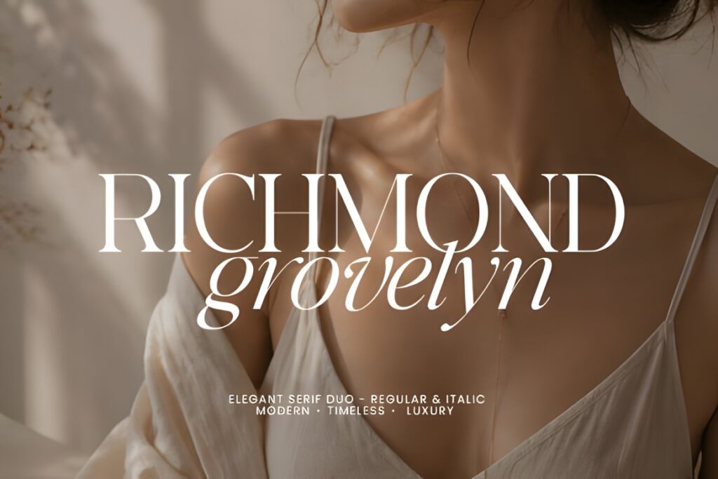
Richmond Grovelyn is an elegant serif duo suited to fragrance houses that want a polished fashion-editorial identity. Its high-contrast serif is paired with an italic companion, giving designers two closely related voices for a brand name, scent collection, or supporting packaging line.
The product includes uppercase and lowercase characters, numbers, punctuation, multilingual support, and OTF and TTF files. Choose it when you want the main fragrance wordmark to remain formal while retaining an italic option for secondary names or limited editions.
2. Perfume
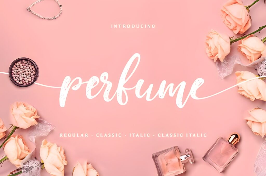
Perfume is a handwriting font for fragrance identities that need a personal, flowing character instead of a traditional fashion serif. It works particularly well when the brand direction is romantic, feminine, handcrafted, or centered on a signature-style name.
The font comes in Regular and Classic versions, each with an italic version, and includes long swashes. Those flourishes can create an expressive hero wordmark, although restrained versions will usually be easier to manage on compact bottle labels.
3. FT Mythoria
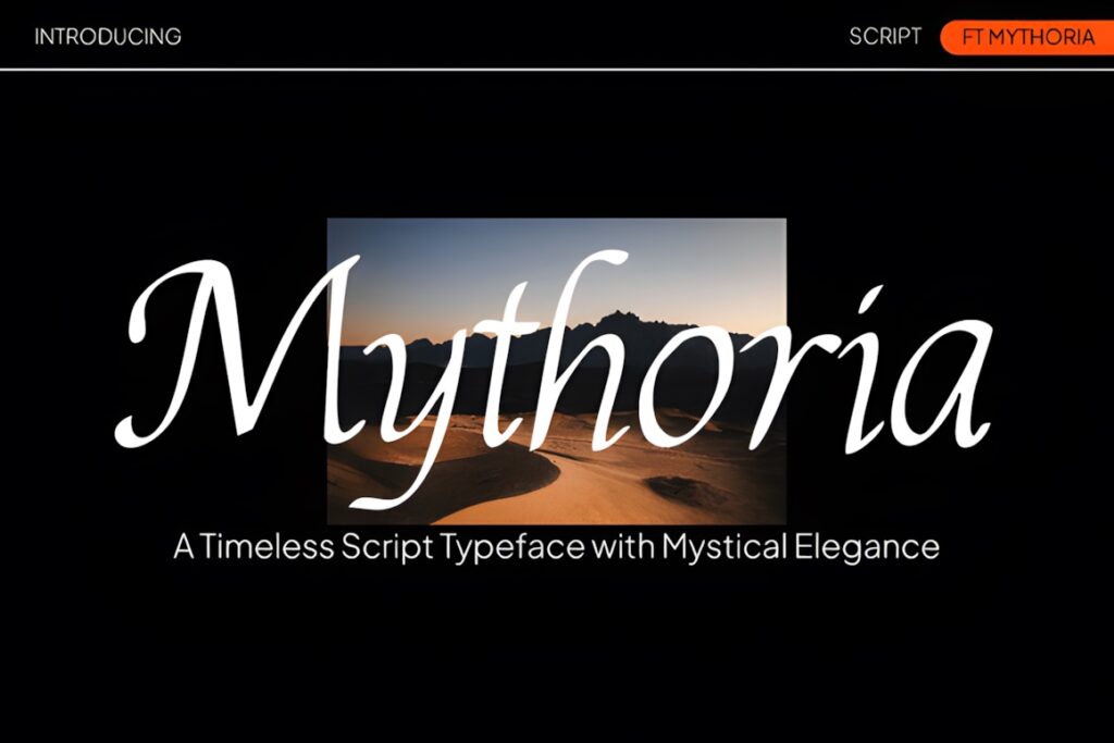
FT Mythoria is a high-contrast serif with sharp serif details and graceful curves. The combination suits perfume packaging that needs a recognizable editorial presence without moving completely into script typography.
Its product page specifically positions the typeface for perfume packaging, beauty and fashion branding, high-end labels, editorial headlines, and elegant logos. Consider it for a fashion-led fragrance house; choose a quieter serif when the packaging already contains highly decorative artwork.
4. Velmor
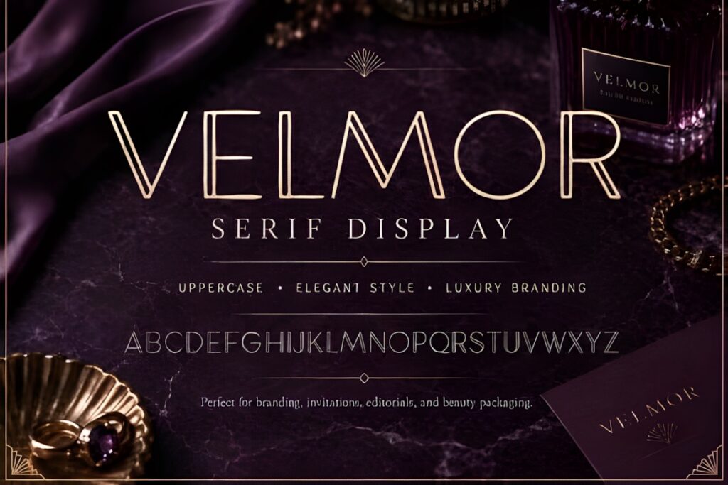
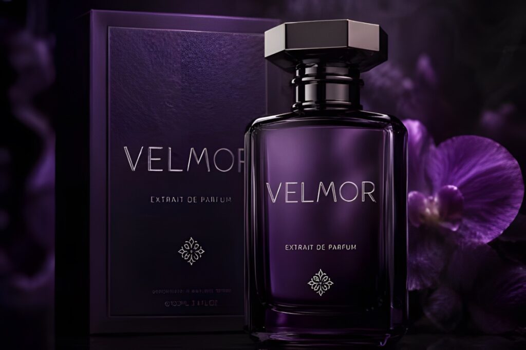
Velmor is a display option for fragrance packaging that leans toward classic luxury rather than casual boutique branding. Its structured presentation gives short perfume names enough visual weight to stand alone on bottles and cartons.
The typeface is presented for luxury branding, perfume and beauty packaging, boutique logos, premium product labeling, and editorial work. It makes the most sense when the wordmark needs to carry the packaging; a softer script may suit a more intimate or handmade scent identity.
5. Strage
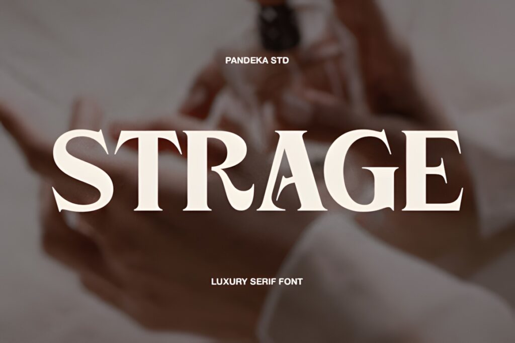
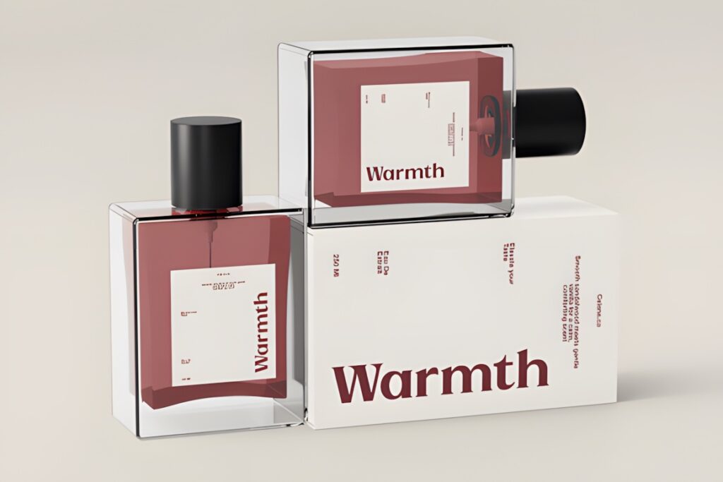
Strage is a modern luxury serif with a useful distinction for packaging systems: it includes Regular and Outline styles. That allows the same typographic personality to appear solid on the primary bottle and more lightly on boxes, cards, or campaign graphics.
The typeface uses elegant contrast and refined curves and is specifically suggested for perfume branding and packaging. The outline version is more decorative, so test it carefully at small label sizes where fine details can lose clarity.
6. Romatic Collection
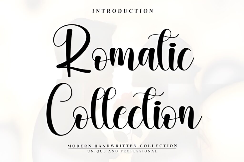
Romatic Collection takes a calligraphic route with sweeping flourishes and handwritten movement. It fits perfume collections built around romance, gifting, florals, weddings, or an intentionally ornate boutique aesthetic.
The product is explicitly positioned for perfume branding and luxury packaging. Its expressive strokes deserve room around the wordmark, so it is better suited to a featured brand or fragrance name than dense ingredient, concentration, or volume information.
7. Glorious Fire
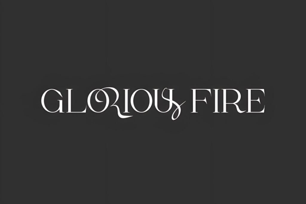
Glorious Fire is an avant-garde display serif with dramatic contrast and sweeping decorative forms. It suits a perfume brand that wants typography to feel theatrical, fashion-forward, and less restrained than the typical minimalist luxury wordmark.
The font includes ligatures, extended tails, and PUA-encoded decorative characters, and its listing specifically mentions luxury perfume branding. Use its more expressive details on larger cartons or campaigns; simpler letter combinations will usually translate more reliably to small bottles.
8. Libertalios
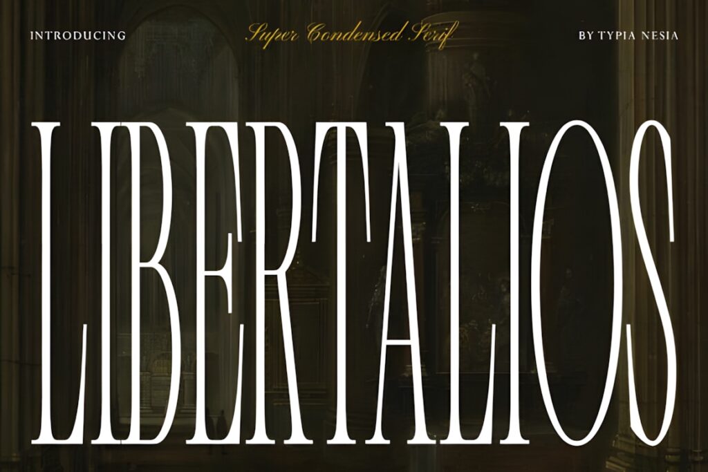
Libertalios is a super-condensed serif with tall proportions and strong vertical emphasis. This shape is particularly useful when a long fragrance or house name must fit a narrow front label without shrinking the typography excessively.
Its high-contrast forms are intended for luxury packaging, perfume branding, editorials, and prestige identities. The narrow silhouette can create a distinctive bottle presence, but very long blocks of supporting copy should use a simpler companion face instead.
9. Cethique
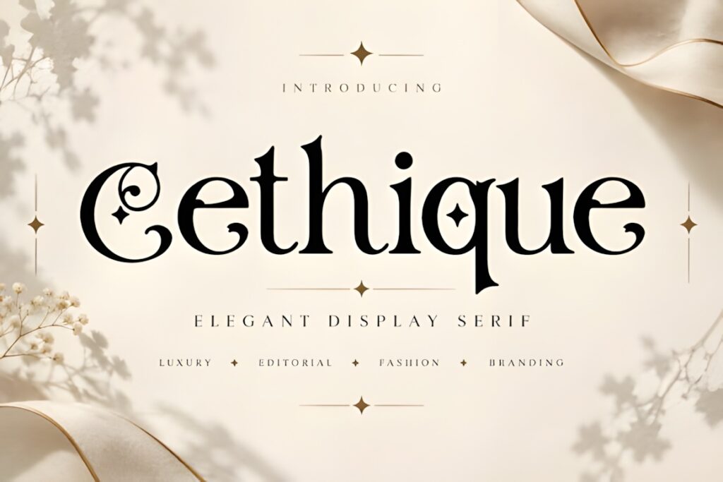
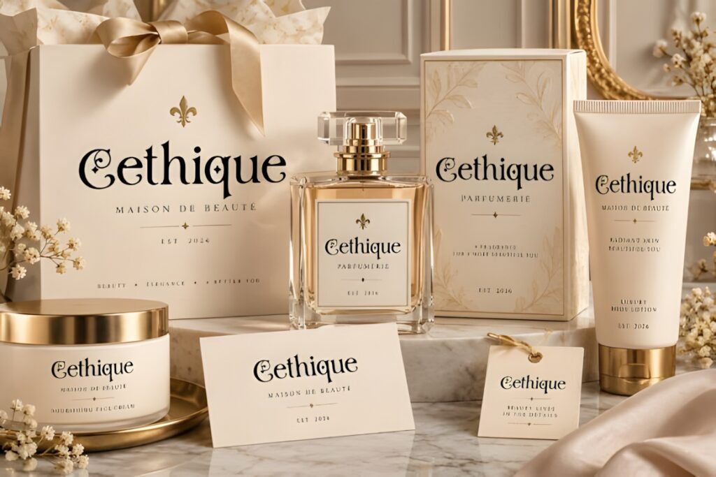
Cethique is an elegant display serif designed for brand names, headings, and short statements. Its fashion-oriented appearance is a natural match for fragrance lines that share visual language with beauty and cosmetics.
The listing identifies perfume and fragrance packaging, product packaging, boutique branding, and logo identity among its uses and specifies an OTF file. Use it prominently for short naming systems; a restrained secondary font will make small technical label information easier to organize.
10. Moarilla
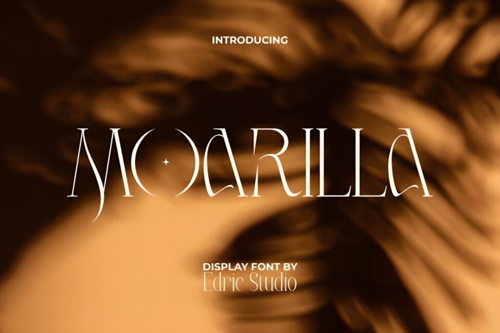
Moarilla is a decorative display font for perfume brands that want a more mysterious or avant-garde personality. Sharp serif details create stronger visual drama than a restrained editorial face, making it useful when typography is the main piece of artwork.
The designer positions Moarilla for perfume packaging and recommends giving its intricate forms enough scale and visual space. It also includes PUA encoding. Consider another option for extremely small labels where the distinctive fine details cannot be reproduced clearly.
11. Norevia
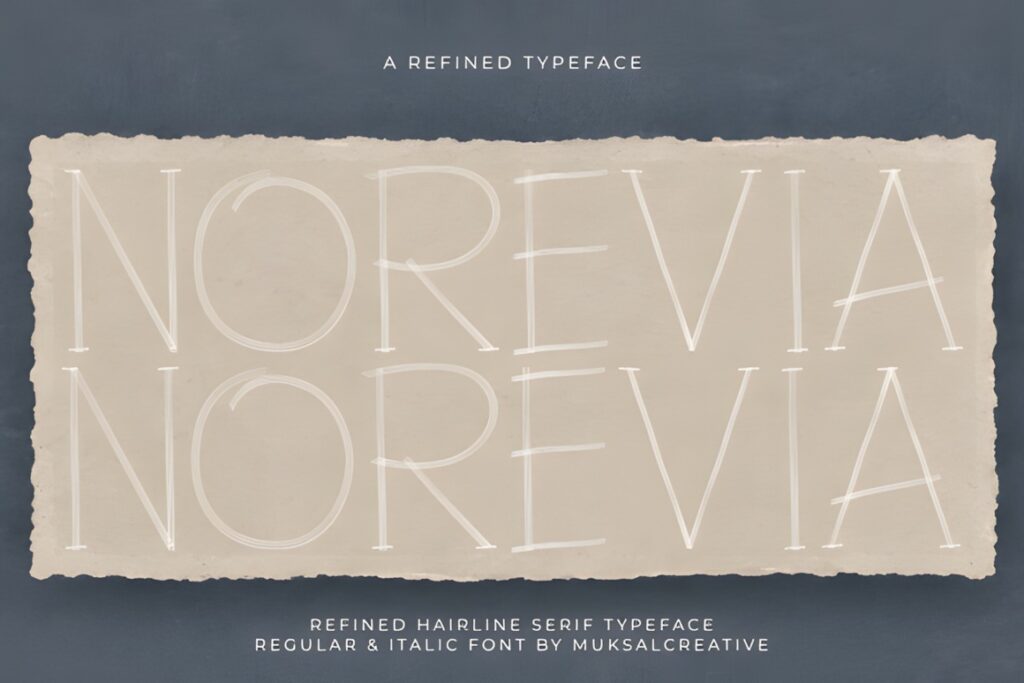
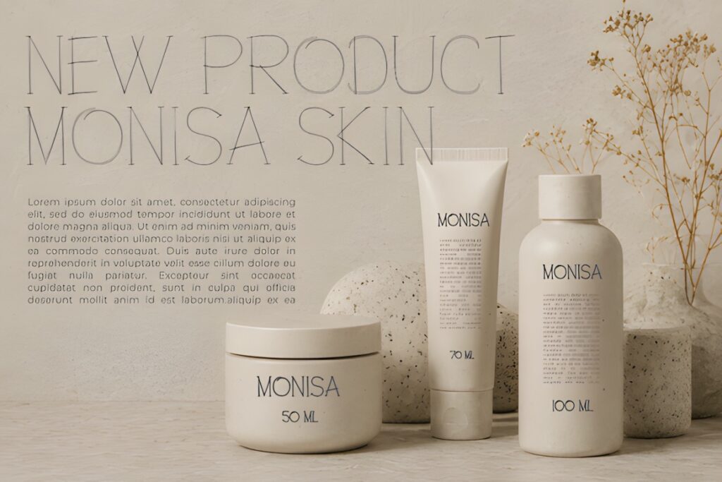
Norevia is a hairline serif display face aimed at refined visual identities. Its delicate structure fits fragrance brands built around understated packaging, generous negative space, architectural layouts, and a quieter interpretation of luxury.
The font is presented for logos, fashion identities, perfume and beauty packaging, jewelry branding, hospitality, and editorial work. Because hairline details naturally become more fragile at small sizes, test the exact bottle label and printing method before committing to a very small wordmark.
12. Montegar
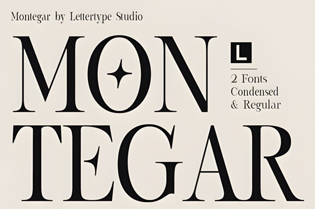
Montegar gives fragrance designers both regular and condensed typographic possibilities. That flexibility is useful for a packaging family where the same identity must move between wider cartons and slim bottle labels.
The font’s listed uses include luxury branding, perfume and beauty packaging, fashion editorial work, and boutique hospitality identity. The condensed style can solve tight horizontal layouts, while the regular version can create a more spacious hero wordmark.
13. Cherluxe
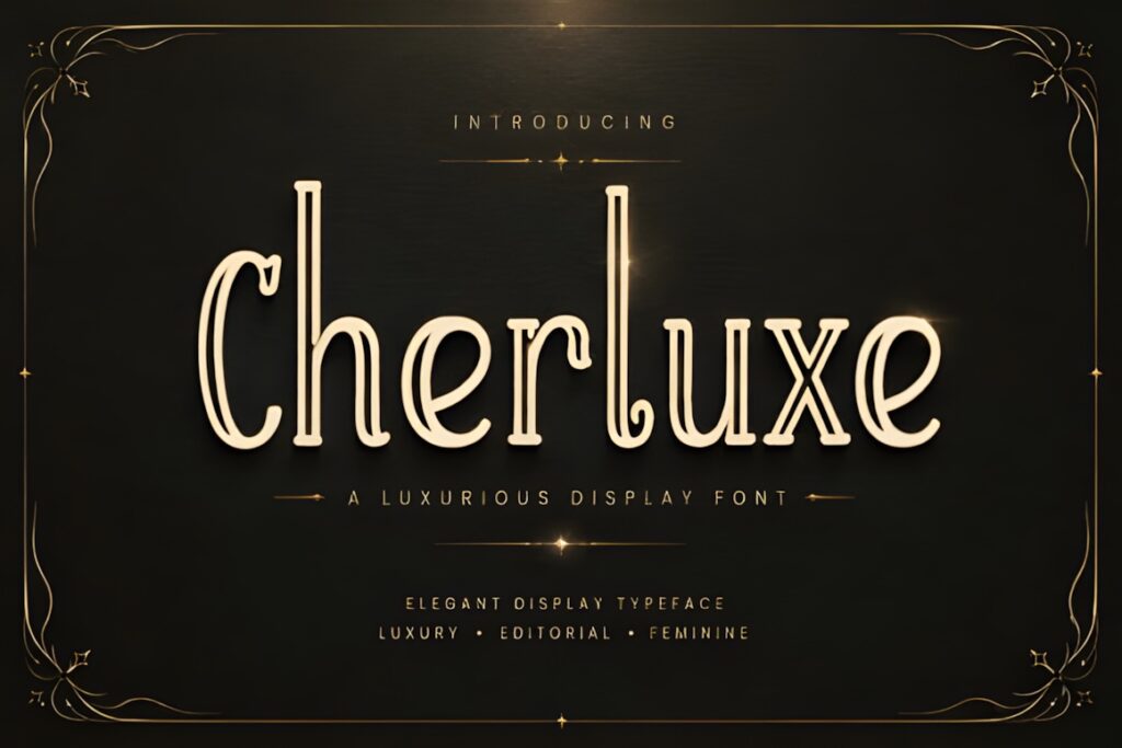
Cherluxe is an ornate display font for fragrance brands that want visible decorative character without switching to handwriting. Its elegant curves work well on perfume cartons, boutique identities, beauty campaigns, and prominent wordmarks.
The product page directly lists perfume packaging, luxury logos, beauty branding, editorial design, and social content among its intended uses. Its more intricate personality is most effective when surrounding packaging stays relatively restrained.
14. Fairmont Fishtail
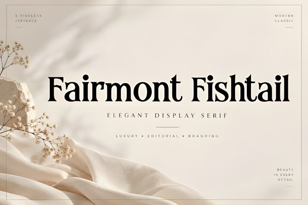
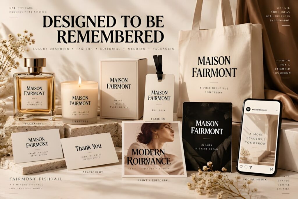
Fairmont Fishtail is a high-contrast display serif aimed at prominent logos, taglines, and brand statements. It can give a fragrance identity a more ornate traditional-luxury tone without using a fully connected script.
The product specifically lists perfume packaging, product labels, beauty campaigns, editorial layouts, and brand identities among its applications and is supplied in OTF format. Use it for display typography rather than packing too much supporting information into the same decorative style.
15. Velmora
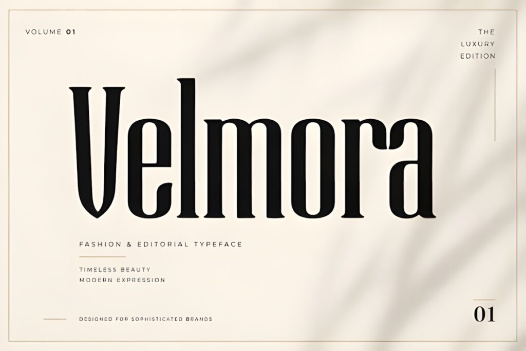
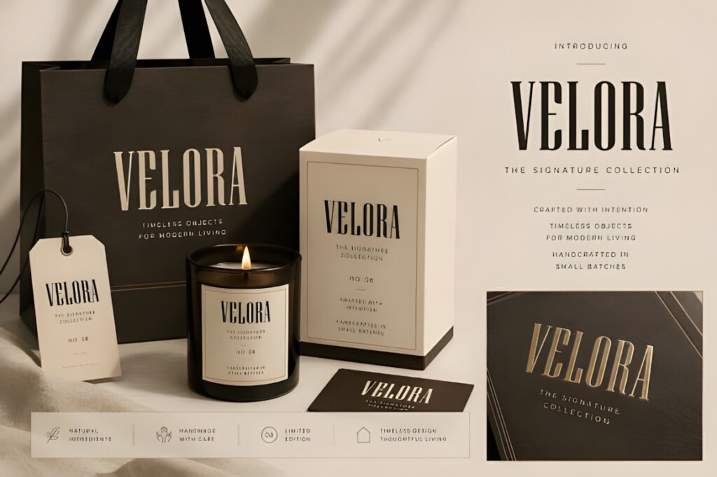
Velmora is an elegant display font with contemporary proportions suited to perfume, beauty, jewelry, and home-fragrance identities. It offers a useful middle ground between stark minimal typography and heavily decorative luxury lettering.
The product includes an OTF file plus uppercase, lowercase, numbers, and punctuation, and specifically lists perfume branding and home-fragrance packaging among its applications. It makes sense for a coordinated scent range where typography needs to feel polished without dominating every label.
16. Selora
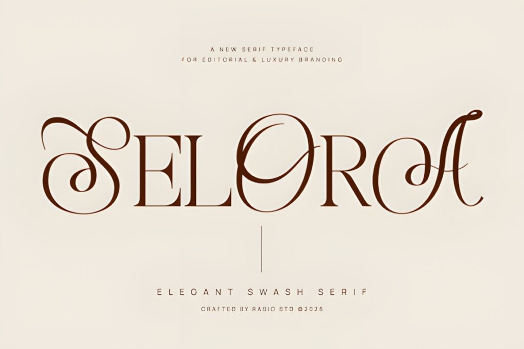
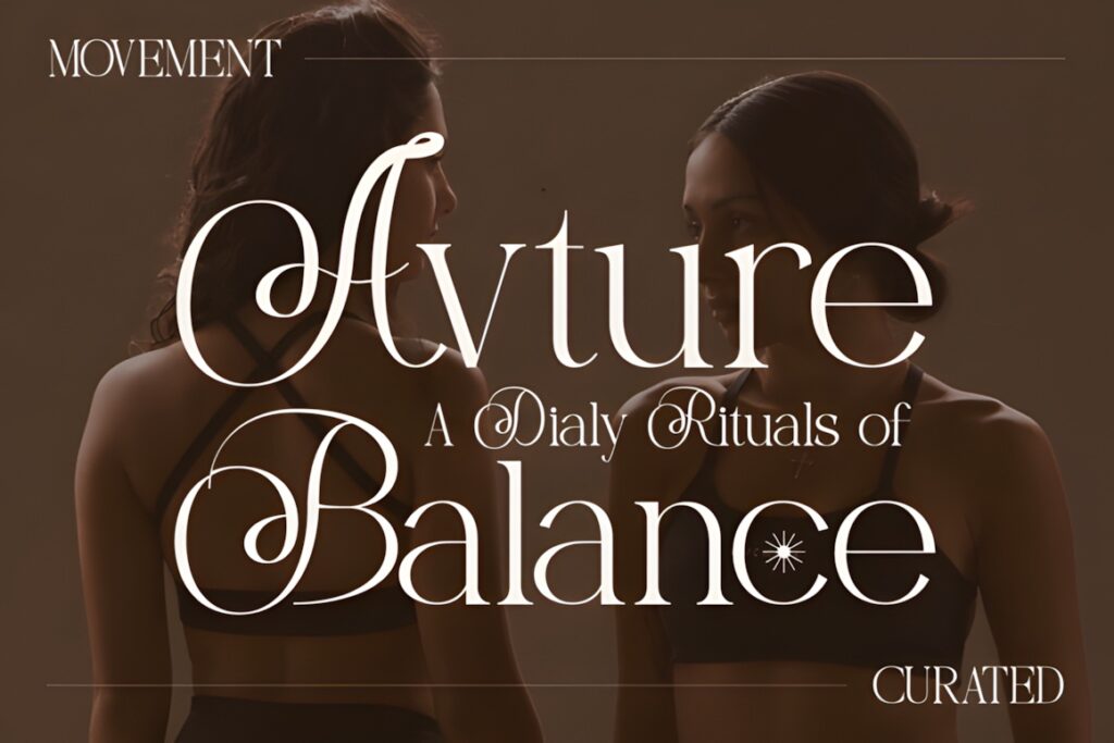
Selora is a high-contrast swash serif that mixes structured editorial lettering with calligraphic movement. It is particularly suited to boutique perfume packaging where the wordmark should feel established but still carry a noticeable decorative signature.
The designer positions Selora for luxury branding, fashion headlines, perfume packaging, winery labels, and wedding stationery. The swashes can make short names memorable, but use them selectively when the fragrance name is long or the bottle has limited clear space.
17. French Clover
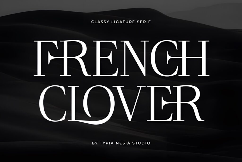
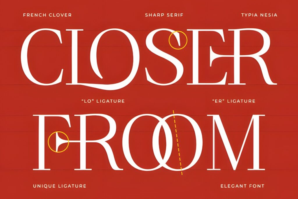
French Clover is a luxury serif built around high contrast, refined strokes, and stylish ligatures. Its balance of modern and traditional details works well for fragrance packaging that aims for a recognizable European beauty-editorial mood.
The product is specifically intended for perfume branding, skincare packaging, cosmetic labels, boutique identities, and signature logos. Choose it when you want decorative touches within a serif structure rather than the continuous movement of a script.
18. Scriptogram
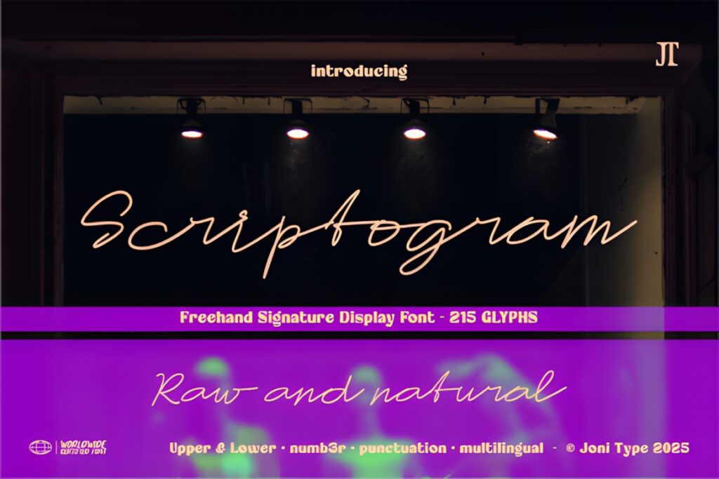
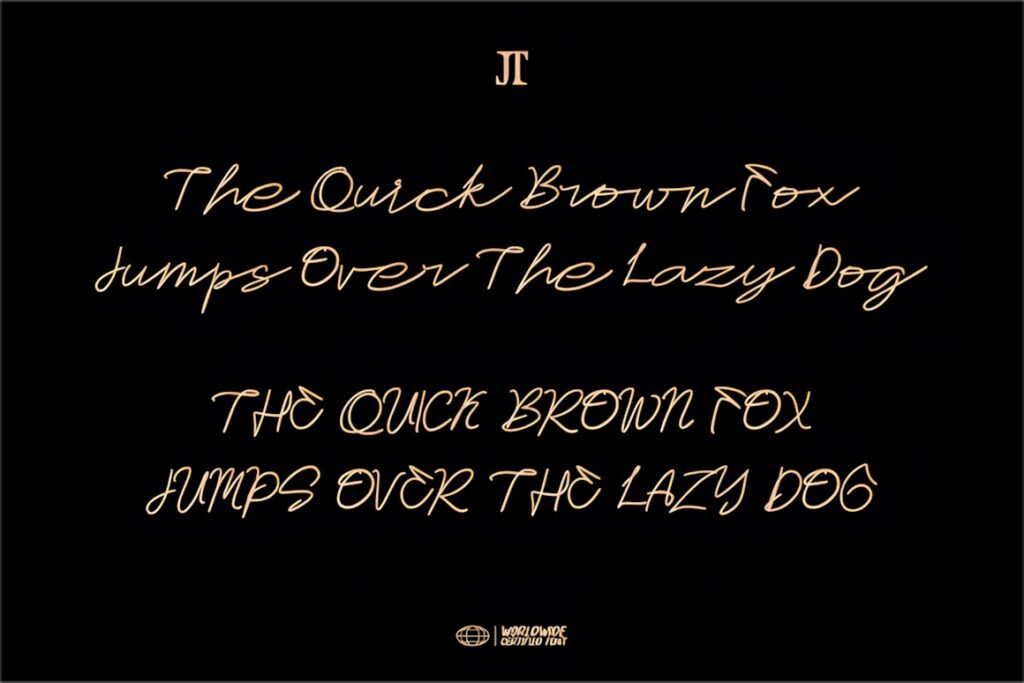
Scriptogram is a signature-style script with smooth connecting strokes. It suits a fragrance label that needs a personal handwritten element, especially for founder-led brands, romantic collections, boutique scents, or a secondary signature beneath a structured logo.
The font includes uppercase and lowercase letters, numbers, punctuation, multilingual support, 215 glyphs, and PUA encoding. Perfume packaging and skincare labels are both listed among its intended applications. For tiny bottle text, pair the script with a simpler supporting font.
19. Aurestria
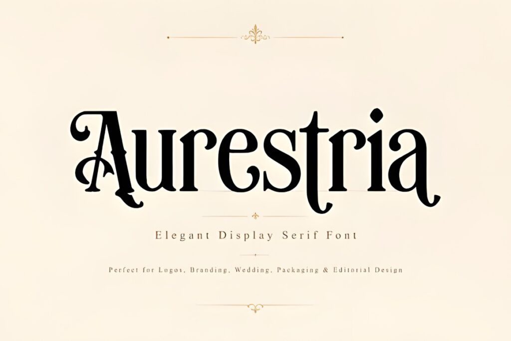
Aurestria is designed around classic elegance with enough personality for fashion, beauty, and fragrance branding. Its letterforms suit a traditional luxury direction where the perfume name should remain the visual focus of a restrained package.
The product page specifically highlights luxury perfume packaging and cosmetic labels and lists uppercase, lowercase, numbers, punctuation, symbols, and PUA encoding. It is worth considering when you need a display font that can support several coordinated beauty products as well as fragrance.
20. Luxury Script
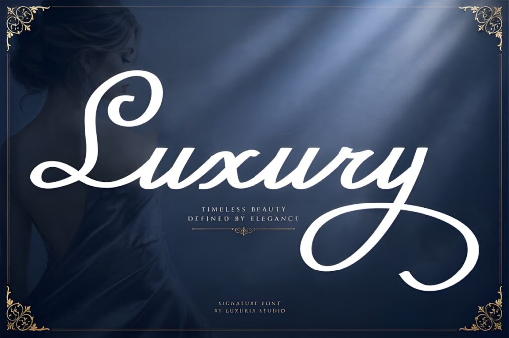
Luxury Script uses flowing curves and graceful swashes to create a distinctly feminine handwritten identity. It works particularly well for perfume brands built around romance, beauty, gifting, florals, or personalized boutique positioning.
The font is explicitly presented for perfume packaging, luxury branding, jewelry, fashion, beauty, logos, and invitations. Its decorative movement can become crowded when squeezed into a narrow label, so give the wordmark adequate whitespace and keep secondary information restrained.
21. Orevell
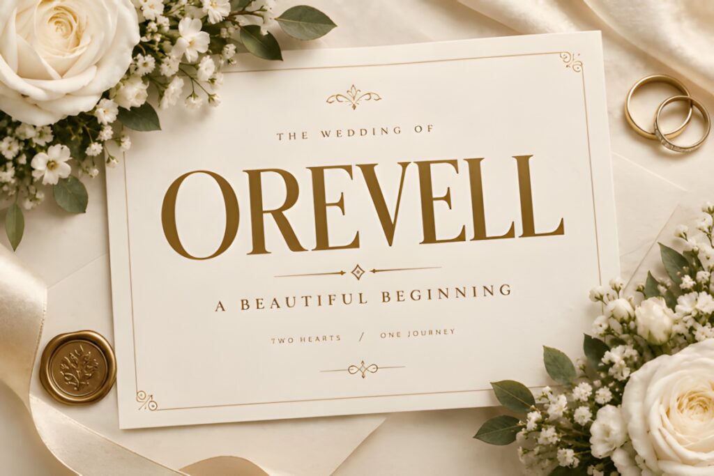
Orevell is a tall high-contrast serif with slender forms and a strong editorial character. Its proportions suit sophisticated fragrance and beauty labels where the typography needs to feel fashion-led without relying on flourishes or handwriting.
The OTF font is positioned for luxury logos, beauty branding, packaging, product labels, magazine covers, and monograms. Choose it when you want a clean couture direction; for an intentionally romantic identity, one of the script options in this list may communicate that mood more directly.
22. Soulmate Vasque
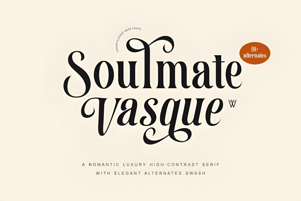
Soulmate Vasque is a high-contrast serif with an overtly romantic luxury character. Dramatic alternates and swashes make it useful for fragrance houses that want the lettering itself to function as a major decorative element.
The font includes more than 91 alternates and swash glyphs and is specifically suggested for beauty, perfume, boutique, packaging, logo, and editorial projects. Those customization options are useful for creating a distinctive wordmark, but restraint will help preserve clarity on small bottles.
23. Galvore
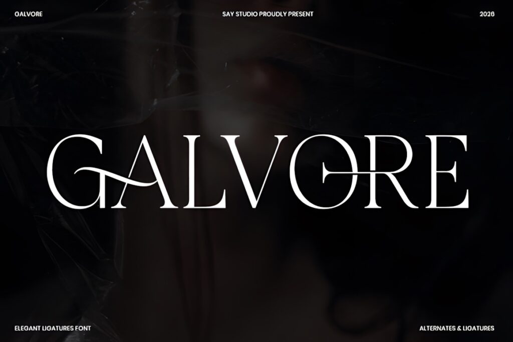
Galvore is an elegant serif built around refined contrast, carefully shaped proportions, ligatures, and stylistic alternates. It makes sense for fragrance brands that want a fashion-editorial identity with enough typographic detail to create a distinctive wordmark.
The font is presented for luxury packaging, beauty products, boutique identities, magazine covers, logos, and premium advertising. It is a versatile closing option in this selection when the goal is sophisticated typography without the more theatrical movement of a swash-heavy display face.
Quick Comparison by Fragrance Brand Style
- Minimal and refined: Norevia, Orevell, and Velmora work well when clean spacing and an understated bottle are central to the identity.
- Fashion and couture: Richmond Grovelyn, FT Mythoria, Galvore, and Cethique lean toward editorial luxury.
- Narrow bottle labels: Libertalios and Montegar offer useful vertical or condensed proportions.
- Romantic and feminine: Perfume, Scriptogram, Luxury Script, and Romatic Collection provide more handwritten movement.
- Dramatic statement packaging: Glorious Fire, Moarilla, Selora, and Soulmate Vasque make typography a stronger decorative feature.
Packaging and Label Considerations
Perfume packaging creates an unusual typography problem because the same identity can appear at several dramatically different scales. The wordmark may be large on a folding carton but only a few centimeters wide on the front of a bottle. Always test the brand name at its smallest realistic reproduction size instead of judging it only from a large-screen preview.
High-contrast serifs can look particularly refined on fragrance packaging, but their thinnest strokes deserve attention. Fine hairlines that appear crisp in a digital mockup may lose definition depending on label stock, printing process, embossing, foil, or the surface of the bottle.
Label hierarchy matters too. Keep the main brand or fragrance name visually distinct, then use a quieter supporting typeface for information such as fragrance concentration, volume, collection name, or descriptive copy. Trying to set every line in the decorative logo font usually weakens rather than strengthens the luxury effect.
Branding and Logo Considerations
A perfume wordmark should still be recognizable away from the bottle. Test possible fonts in a website header, social avatar, sample vial, shipping insert, and monochrome application. If the primary wordmark depends heavily on long swashes or very fine detail, consider creating a simplified secondary version rather than forcing one arrangement into every space.
Short names can often support wider spacing and more dramatic display lettering. Long brand names benefit from more economical widths and fewer flourishes. Condensed faces such as Libertalios can solve width problems, while script fonts generally need additional breathing room so connections and swashes remain clear.
Font Pairing Tips for Fragrance Packaging
Let the luxury font do one important job. Use the distinctive serif or script for the perfume house, fragrance name, or collection title, then pair it with a restrained supporting serif or sans serif for informational text.
The contrast should come from function rather than adding two competing decorative styles. A dramatic swash serif paired with another ornamental script usually creates unnecessary visual noise. A stronger combination is expressive display lettering for the name plus neutral, highly readable typography for concentration, volume, notes, and secondary packaging information.
Readability at Small Bottle Sizes
Small-scale performance should be treated as part of the selection process, not as a final technical check. A recent public perfume-logo critique centered specifically on decorative detail disappearing when the design was reduced for a bottle label and social avatar, with feedback emphasizing simpler silhouettes and clearer small-size versions.
Print your candidate wordmarks at approximately the real bottle width. Check thin strokes, tight counters, closely spaced capitals, and swashes that cross neighboring letters. Then remove unnecessary alternates or increase spacing before abandoning the typeface completely. A font can work well for fragrance branding while still requiring a simplified small-format configuration.
Choosing the Right Luxury Font for Your Perfume Brand
If the goal is a timeless fashion-house identity, Richmond Grovelyn gives you both refined serif and italic directions. For a long name or narrow bottle, Libertalios makes efficient use of width, while Montegar adds the flexibility of regular and condensed forms.
For softer fragrance branding, Perfume and Scriptogram provide signature-style movement. Norevia makes more sense for a restrained minimal package, while Glorious Fire or Moarilla fit identities where expressive typography should become part of the visual concept.
Whichever direction you choose, test the actual brand name—not just the specimen alphabet—and evaluate it on both the largest box and the smallest bottle application before finalizing the identity.
Frequently Asked Questions
What font style works well for a luxury perfume logo?
High-contrast serif fonts are a common fit for luxury perfume logos because they can combine editorial structure with a refined display character. Condensed serifs help with long names, while scripts can create a softer or more romantic identity. The right style should also remain clear at the actual size used on the bottle and label.
Are script fonts suitable for fragrance labels?
Script fonts can work well for fragrance labels when they are used selectively for the main brand or fragrance name. Connected letters, swashes, and fine strokes may become difficult to read at small sizes, so supporting information is usually clearer in a simpler serif or sans serif. Test the script at the final printed label size before committing to it.
How should I pair a luxury perfume logo font?
Pair a decorative perfume logo font with a restrained supporting typeface that performs a different job. The display font can handle the brand or fragrance name, while a cleaner serif or sans serif handles concentration, volume, ingredients, and secondary information. This creates hierarchy without making every line of the label compete for attention.
Can I use these fonts for a commercial perfume brand?
Commercial use depends on the current license attached to the individual font product. Check the license on the product page for the exact uses you plan, especially client branding, packaging, products for sale, print-on-demand applications, or editable digital products. Do not assume that every font has identical licensing terms simply because the files come from the same marketplace.