ℹ️ Affiliate Disclosure: This article may contain affiliate links. If you book or purchase through these links, we may earn a commission at no additional cost to you.
How Display Fonts Shape Logo Design and Brand Personality
A bold logo font has to do more than look heavy. The right display font needs enough personality to make a wordmark recognizable while keeping the business name clear at practical sizes. Width, letter shape, contrast, spacing, and overall mood can change whether the same brand feels playful, technical, nostalgic, rugged, or contemporary.
This selection of display fonts for logo design covers several approaches to strong branding, from compact geometric sans serifs and tall condensed faces to rounded retro lettering and expressive display serifs. The goal is not to find one universally suitable font, but to match the typeface to the personality the logo needs to communicate.
Many more display fonts are available, while this shortlist concentrates on styles with distinct logo uses, recognizable letterforms, and clearly different brand personalities.

For bold logo design, condensed display fonts work well when space is tight, geometric styles can give technology and modern brands a sharper identity, while chunky or retro faces are useful when the brand needs warmth, energy, or nostalgia. Decorative display serifs can add more heritage or editorial character when a plain heavy sans serif feels too neutral.
Quick Picks for Different Brand Personalities
- For expressive retro branding: Retro Lettering — a strong option when the identity needs clear 1970s character.
- For contemporary geometric branding: Playblock — compact, heavy shapes suit sports, streetwear, and modern identities.
- For futuristic logos: Kryvex — angular geometric construction pushes the wordmark toward technology and digital brands.
- For long brand names: Evori — tall condensed lettering creates impact without consuming excessive width.
- For friendly bold branding: Chunky Carm — thick rounded forms create a softer personality than hard-edged display fonts.
Display Fonts for Bold Logos and Brand Identities
1. Retro Lettering
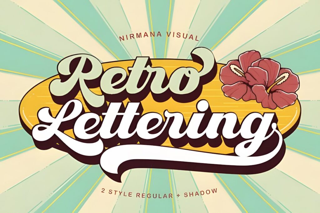
Retro Lettering is a 1970s-inspired display font suited to logos that need an unmistakably nostalgic personality. Its expressive forms make sense for lifestyle brands, cafés, creative studios, apparel, music projects, and other identities where the typography can become a central visual element.
The product includes regular and shadow styles, giving the same lettering two useful levels of visual emphasis. Choose it when retro character matters more than strict minimalism. For a restrained corporate or technology identity, one of the cleaner geometric options below will usually integrate more easily.
2. The Retro
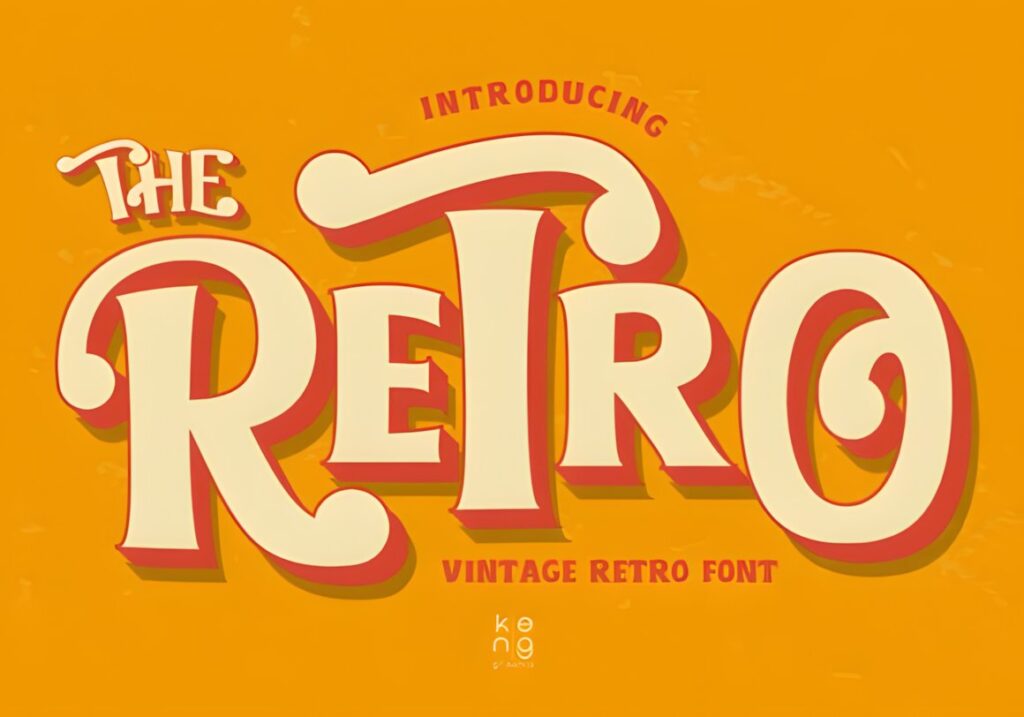
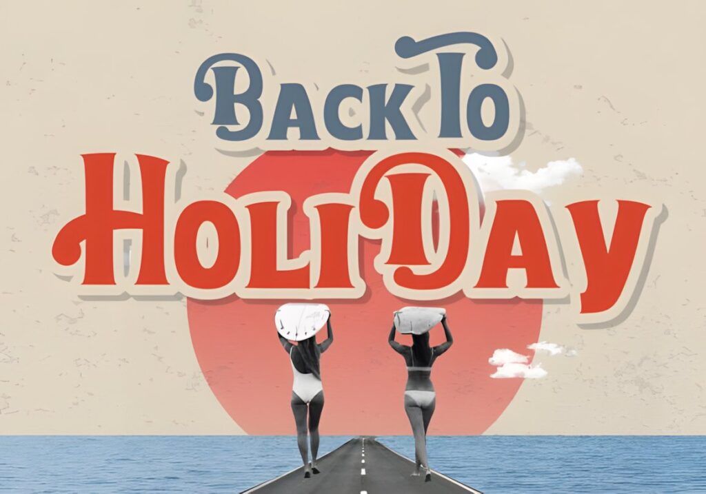
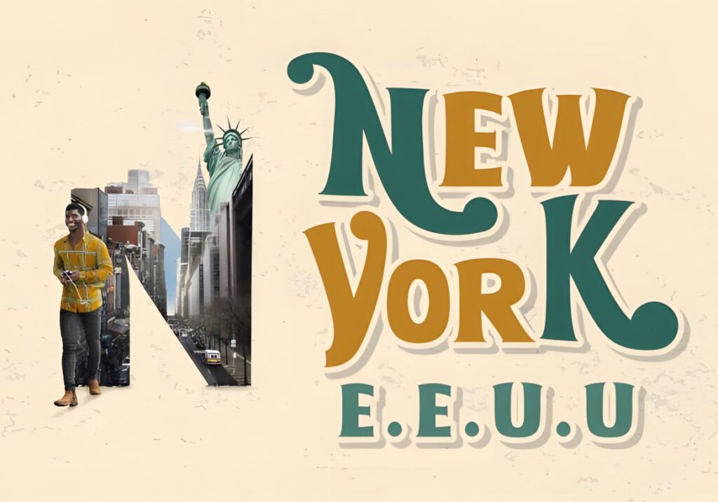
The Retro brings a smoother vintage look influenced by 1970s and 1980s typography. Its rounded character can give a wordmark personality without leaning toward the rigid geometry found in modern tech-oriented display faces.
This makes sense for brands built around nostalgia, casual products, entertainment, food, or colorful lifestyle aesthetics. Keep supporting typography quieter so the wordmark remains the focal point. If the identity needs a more compact silhouette, Condensed or Copzen will occupy less horizontal space.
3. Bold Display
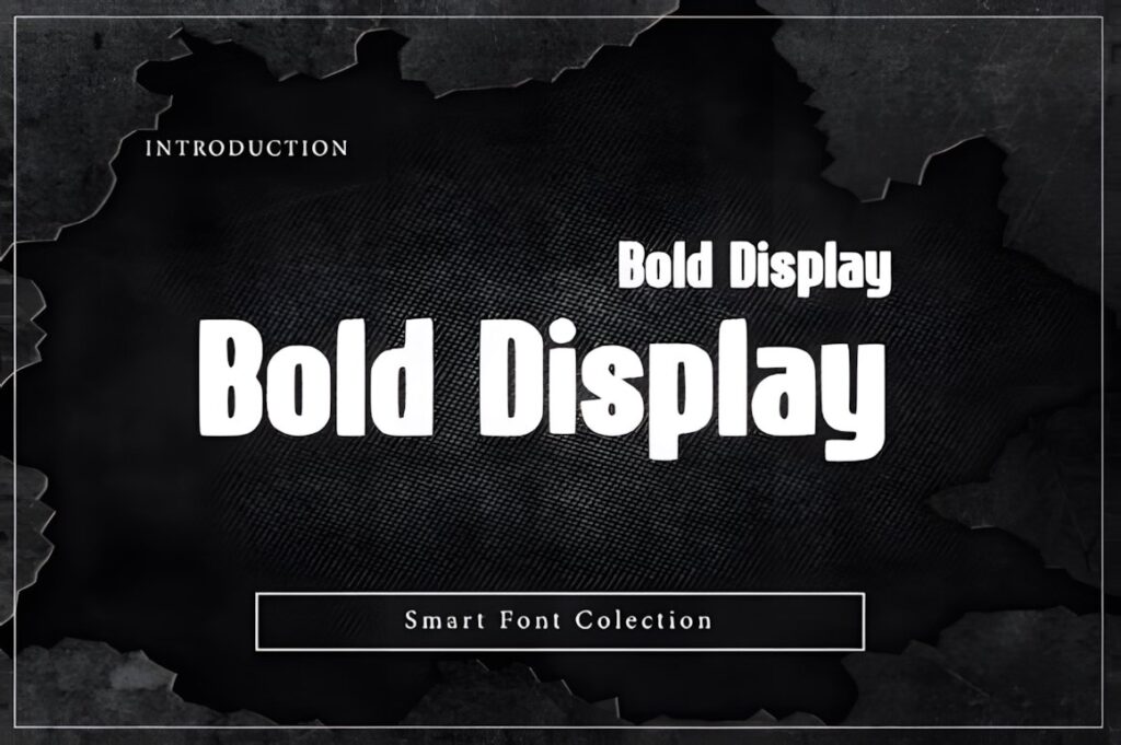
Bold Display uses condensed proportions, sturdy strokes, and softened forms to create a strong modern presence. It is particularly relevant to sports, technology, editorial, and energetic startup identities where the brand name needs to read quickly and occupy a controlled horizontal footprint.
Its dense construction works well for short all-caps wordmarks and dominant initials. Pairing it with significantly lighter supporting type creates clearer hierarchy. If the brand needs more unconventional letter shapes rather than straightforward strength, Kryvex or Morkein provides a more experimental direction.
4. Bold Style
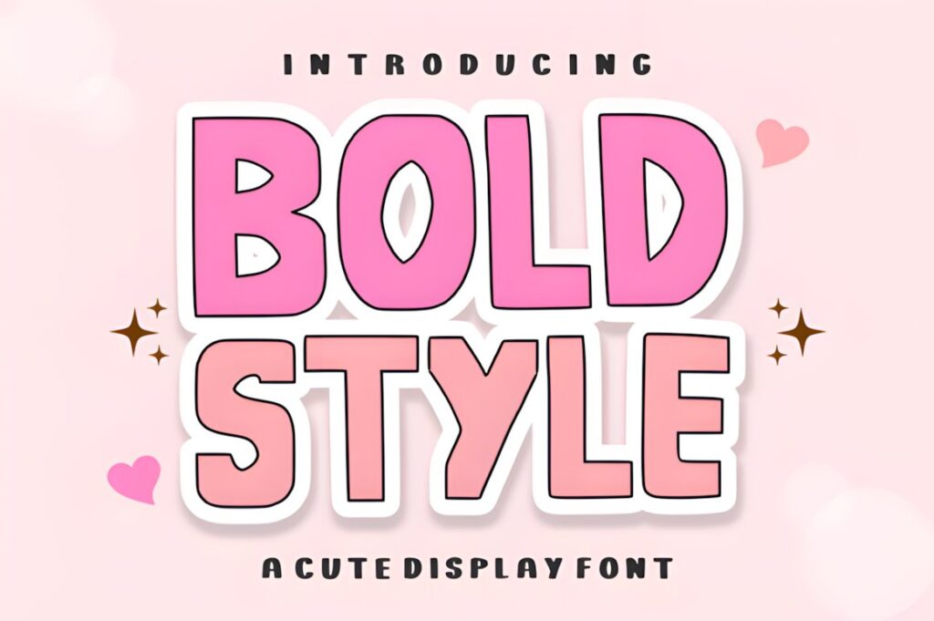
Bold Style is a chunky modern display face built around thick, clean blocks and restrained curves. The straightforward construction gives logos a confident, solid appearance without relying on elaborate decorative elements.
Consider it for athletic brands, merchandise labels, informal businesses, strong initials, or identities that need immediate visibility. Because the visual weight is substantial, surrounding graphics should have enough breathing room. Brands seeking a friendlier rounded character may find Bolding Series or Chunky Carm more suitable.
5. Condensed
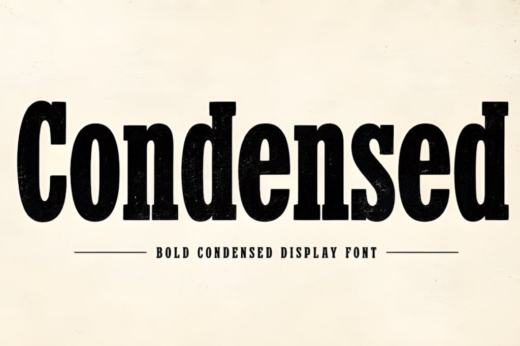
Condensed combines tall narrow letterforms with a vintage-influenced display character. The narrow construction is particularly useful when a logo contains a longer business name but still needs the visual authority of heavy typography.
It suits heritage branding, packaging, apparel, product labels, signage, and wordmarks that need height without excessive width. Its vintage direction is part of the personality, so it is less appropriate when the brief calls for neutral contemporary minimalism. Evori offers a cleaner condensed alternative.
6. Stylish Serif
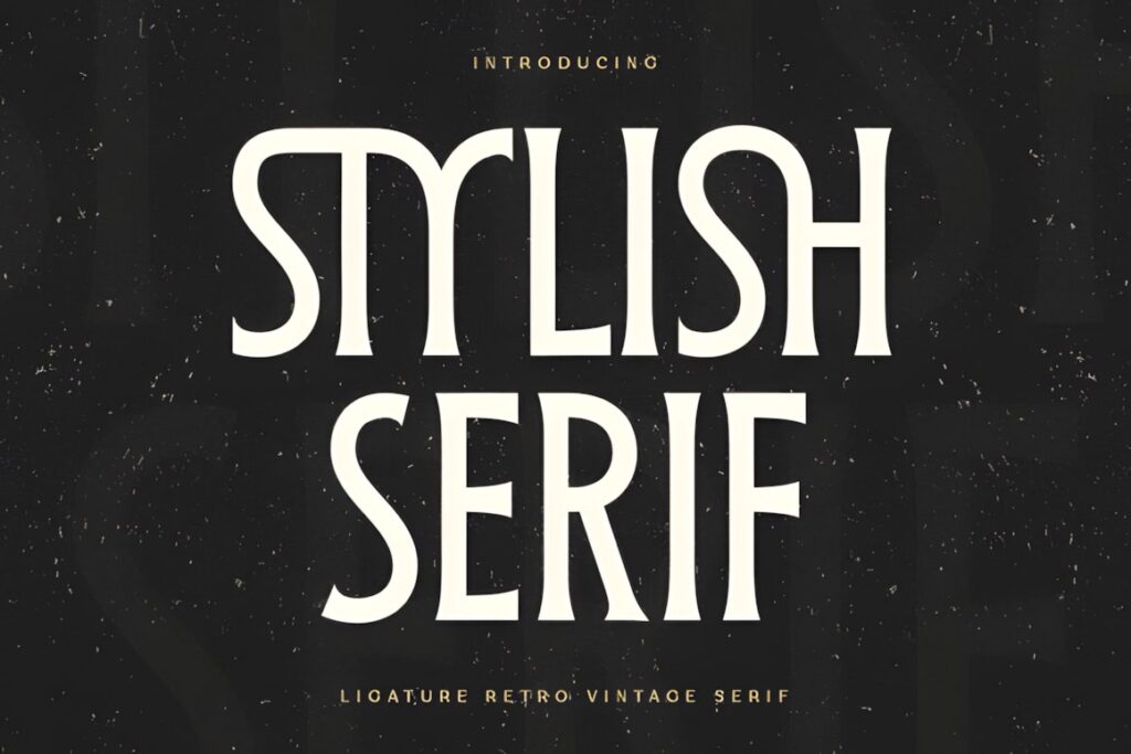
Stylish Serif takes the roundup away from heavy sans serifs with a modern-retro serif treatment designed around display, logo, and branding use. The serif construction gives a wordmark more editorial and heritage character while still functioning as conspicuous display typography.
This direction can suit boutiques, cafés, fashion labels, creative studios, packaging, and businesses that want boldness without an overtly sporty look. Keep small supporting copy in a simpler face. For an even warmer and chunkier retro-serif identity, Retroleta has a more playful silhouette.
7. Chunky Carm
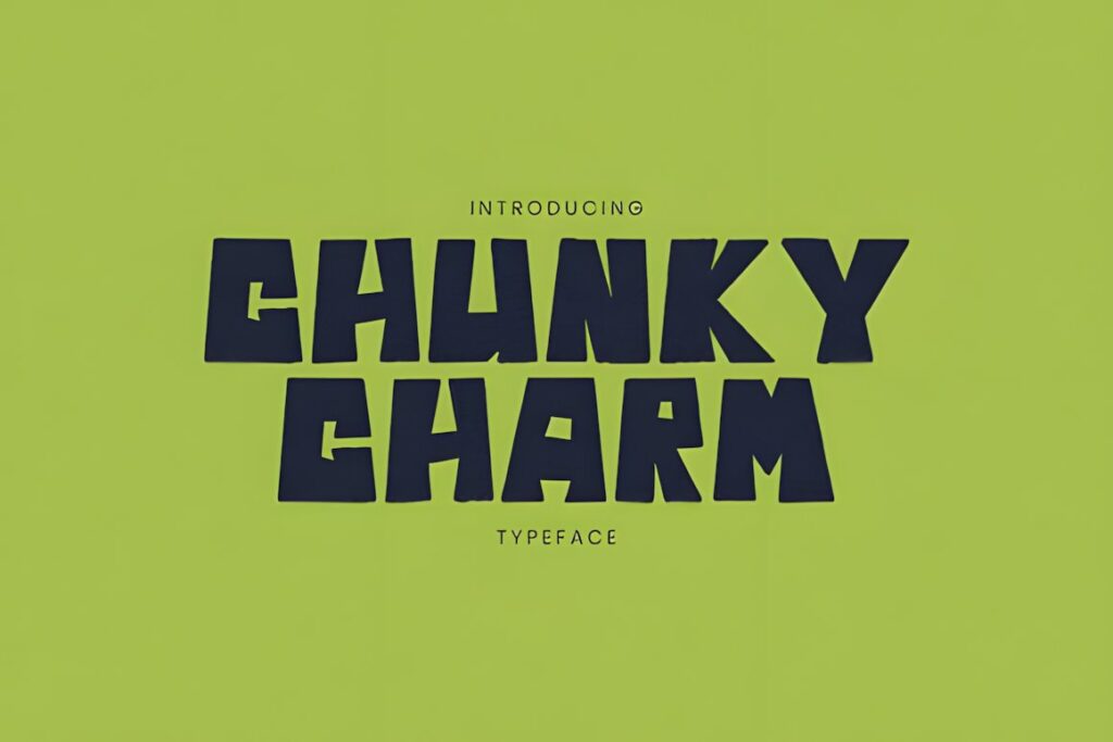
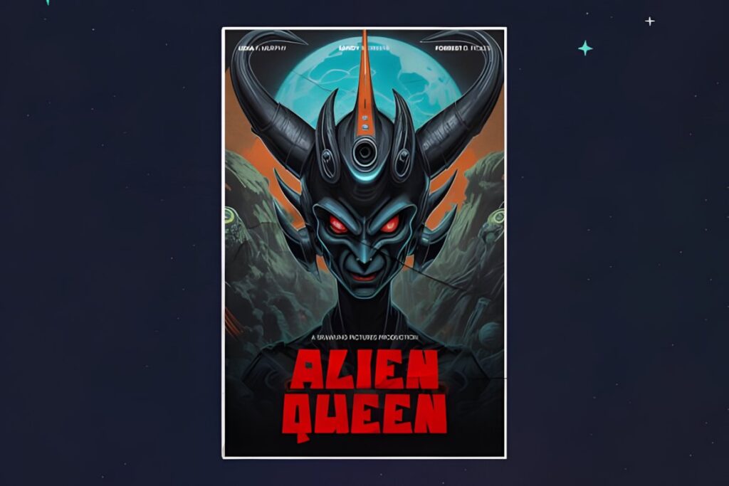
Chunky Carm uses thick rounded letters to give bold typography a friendly, playful personality. It works particularly well for logos where approachable character matters more than precision or formality.
Think casual food brands, children’s businesses, craft shops, cheerful products, events, or lifestyle projects where severe geometric forms would feel too rigid. The substantial rounded shapes can dominate compact layouts, so test longer names carefully. Big Bold Chunky pushes the same playful direction even further.
8. Retroleta
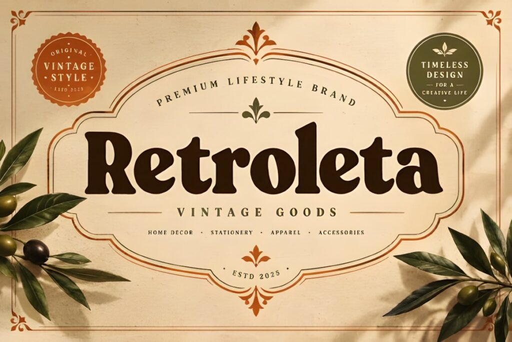
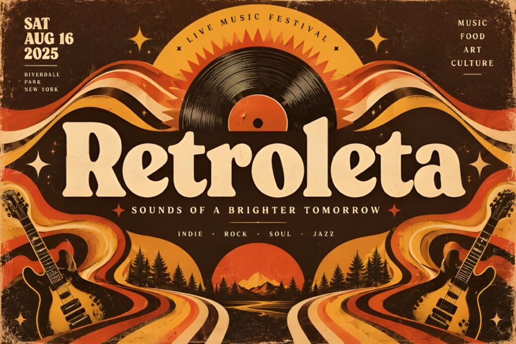
Retroleta is a chunky retro display serif with rounded forms and a warm nostalgic personality. Its combination of serif structure and soft proportions gives logos a different kind of weight from the harder sans-serif options in this list.
It makes sense for cafés, bakeries, food packaging, vintage-inspired retail brands, labels, and storefront identities where typography should feel welcoming as well as noticeable. Because the character is strongly retro, choose a cleaner font when the brand must appear technical, clinical, or highly minimalist.
9. Boldside Display
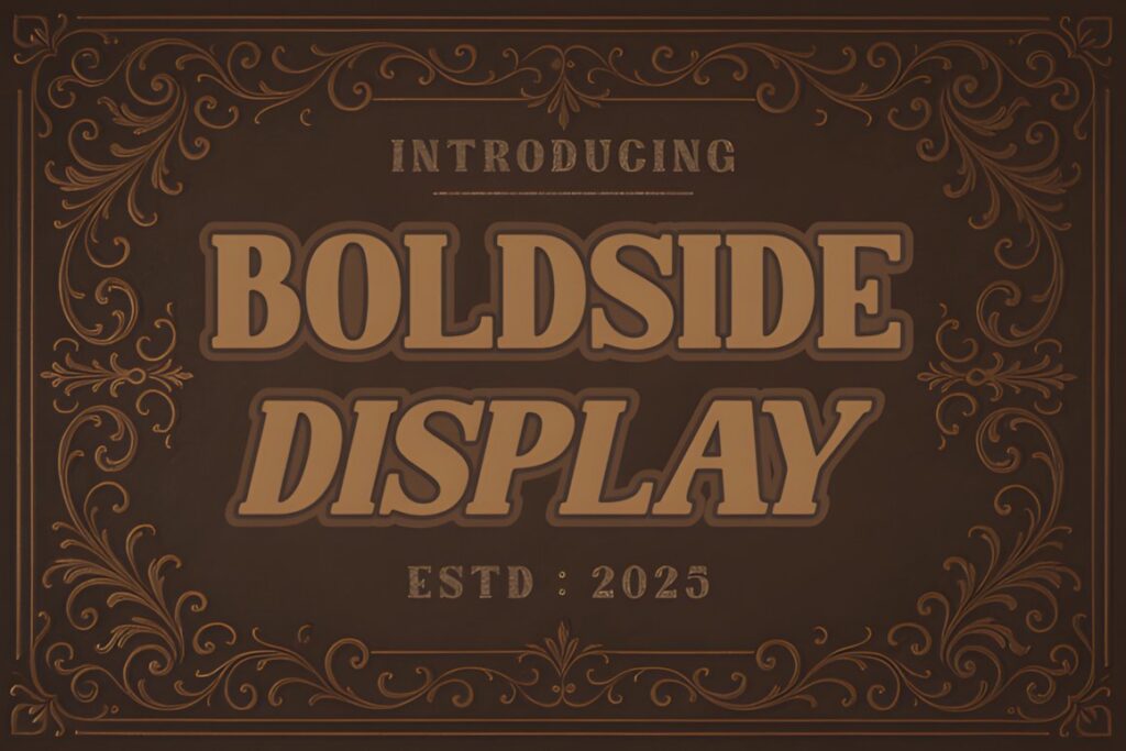
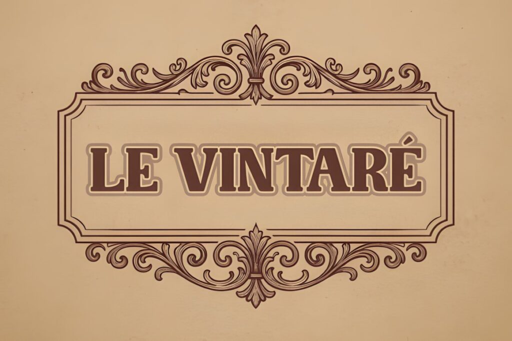
Boldside Display brings a vintage, heritage-oriented voice to bold branding. Thick forms, serif details, and a western-influenced character make it useful for wordmarks that should feel established, handcrafted, or connected to traditional signage.
It can work especially well on beverage labels, restaurants, apparel, barbershops, outdoor brands, packaging, and businesses using a classic Americana direction. Its decorative character needs room to breathe, so a simpler condensed sans may be easier for very small applications or highly modern interfaces.
10. Playblock
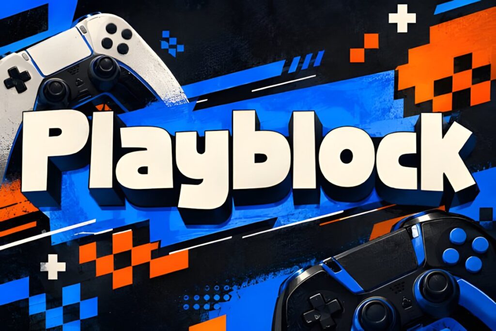
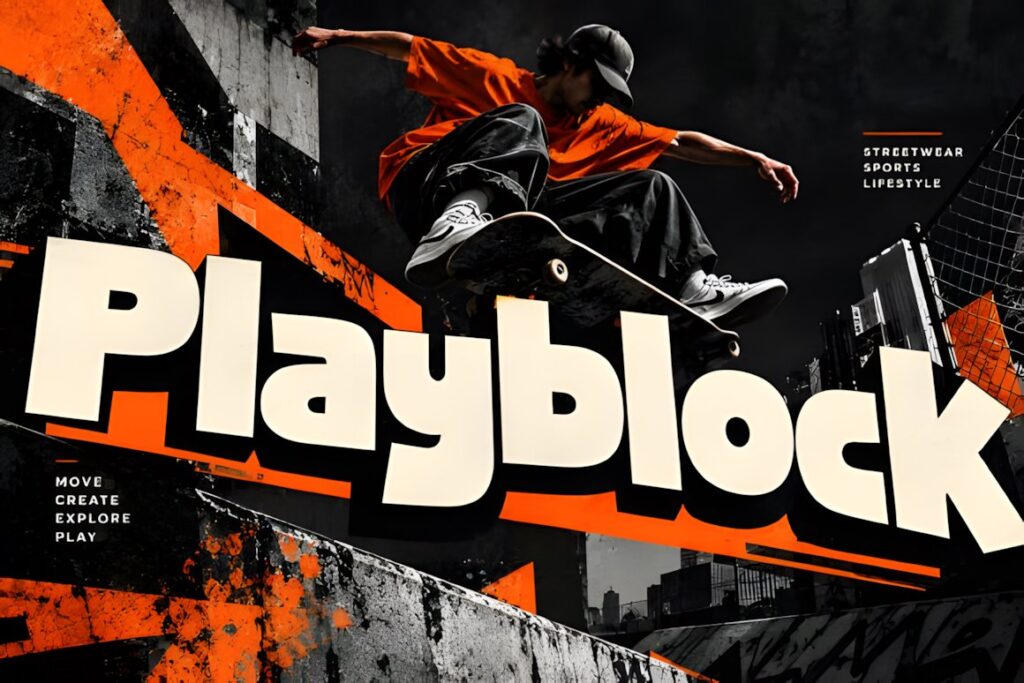
Playblock is a compact geometric display typeface with heavy letterforms and a distinctly contemporary silhouette. It suits identities that need a strong graphic presence without relying on vintage decoration.
The style naturally fits sports, fitness, gaming, streetwear, apparel, music, and modern product branding. Its weight makes short names especially effective, while long words may need additional spacing or a wider layout. For a sharper futuristic personality, Kryvex or Morkein offers more angular detail.
11. Novaret
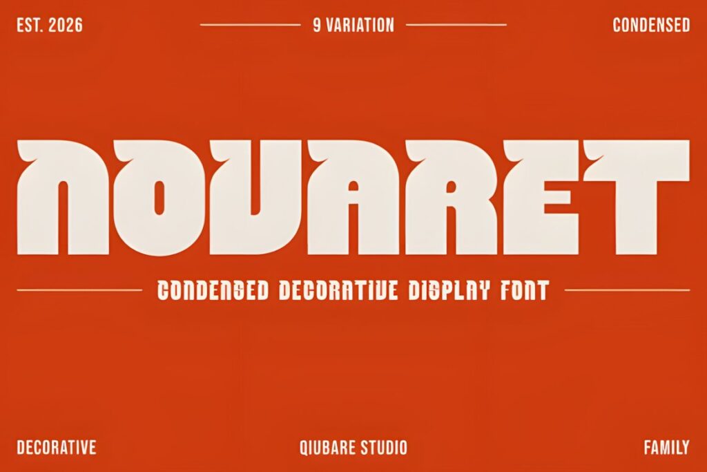
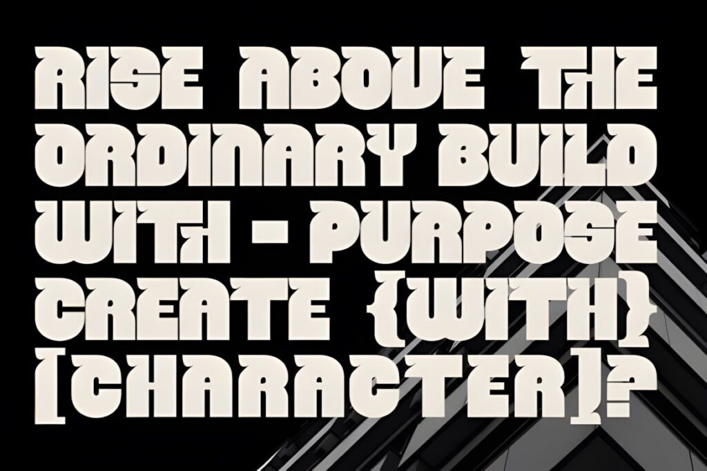
Novaret is a condensed decorative display family with distinctive cuts and a more experimental personality than a conventional narrow sans. Its compact proportions help bold logos remain controlled horizontally while the unusual details give the wordmark recognizable character.
The family includes multiple weights, making it easier to adjust how dominant the identity feels across logos, packaging, posters, and editorial applications. Decorative cuts are most effective when the logo has enough size to show them clearly; choose Evori when simpler shapes are preferable.
12. Kryvex
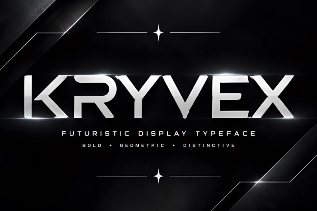
Kryvex is a modern geometric display font characterized by clean lines, sharp angles, and futuristic letterforms. Those architectural shapes make it a strong candidate when the logo needs to communicate technology, digital products, gaming, modern fashion, or forward-looking services.
Use the distinctive forms selectively rather than filling the entire identity with equally futuristic typography. A restrained supporting sans can keep packaging or website copy practical. Brands that need warmth or handmade character will usually be better served by Retroleta, Vantage, or Chunky Carm.
13. Copzen
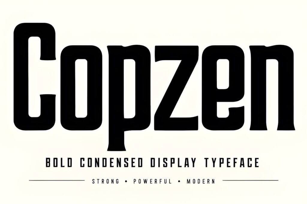
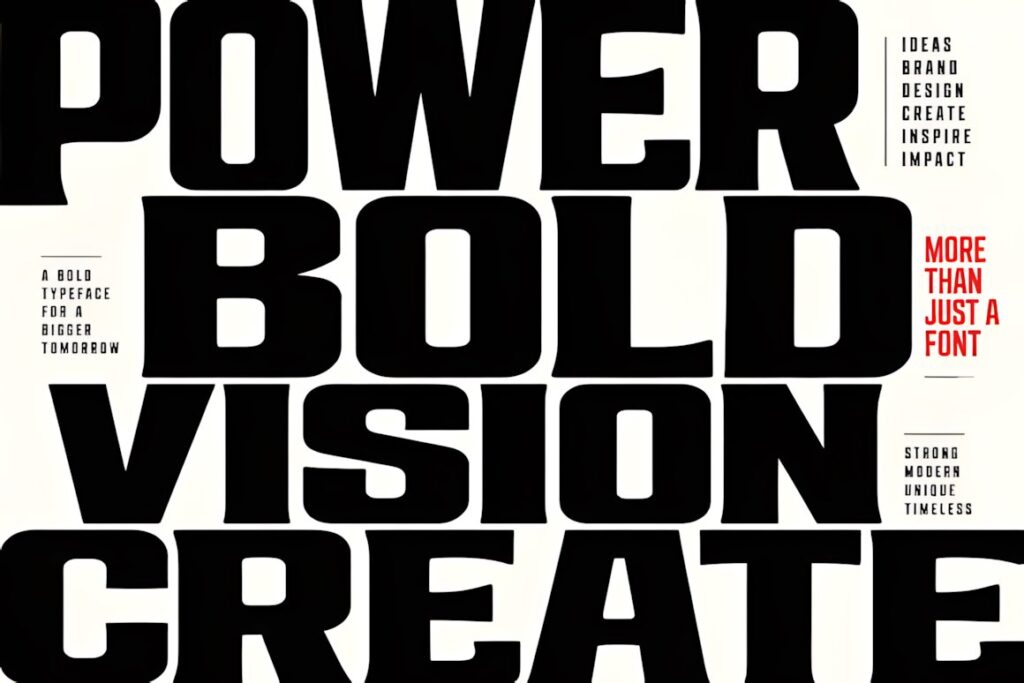
Copzen is a bold condensed display typeface built around compact proportions and assertive letter shapes. It provides the density many logo designers want from heavy display typography while limiting the overall width of the wordmark.
This can help with long company names, packaging panels, vertical layouts, labels, posters, and identities that need a strong urban or editorial voice. The concentrated visual weight may feel intense in smaller layouts, so pair it with generous negative space and restrained secondary typography.
14. Vantage Retro Funk
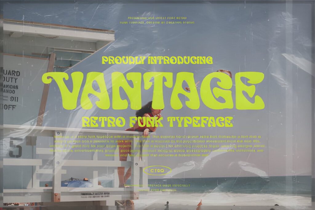
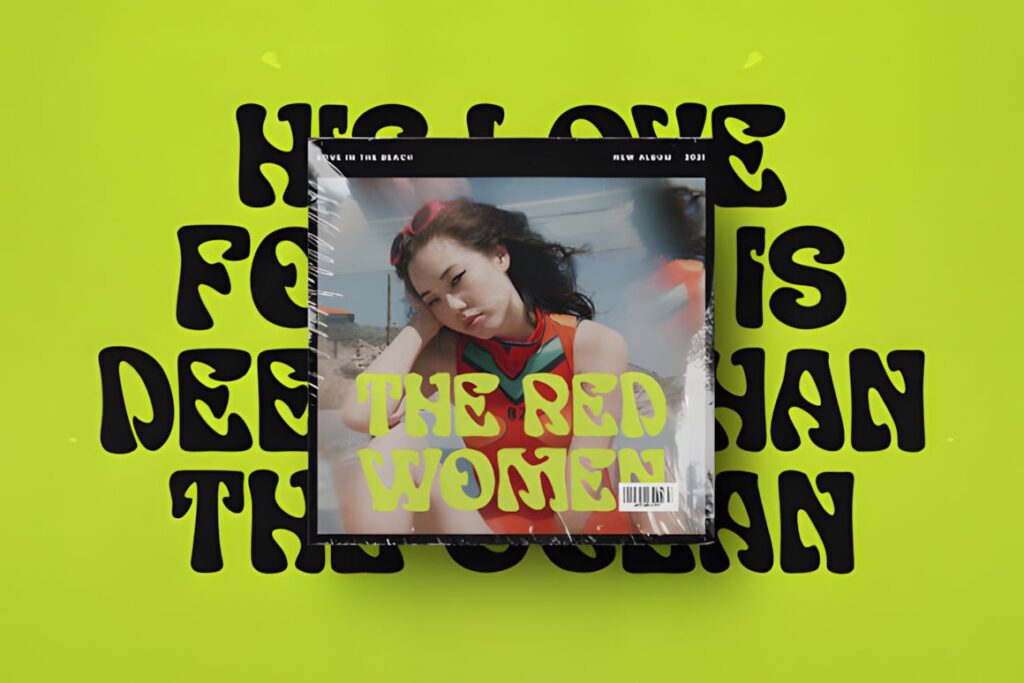
Vantage Retro Funk takes its cues from mid-century psychedelic and retro typography, making it useful when a wordmark should feel expressive rather than restrained. The style lends itself to brands where memorable personality is more important than corporate neutrality.
Consider it for creative studios, music projects, boutiques, hospitality, fashion, events, packaging, or lifestyle businesses with a deliberate retro direction. Its strong stylistic associations can define the entire identity, so a conventional geometric display font makes more sense when the branding needs to stay flexible across unrelated themes.
15. Bolding Series
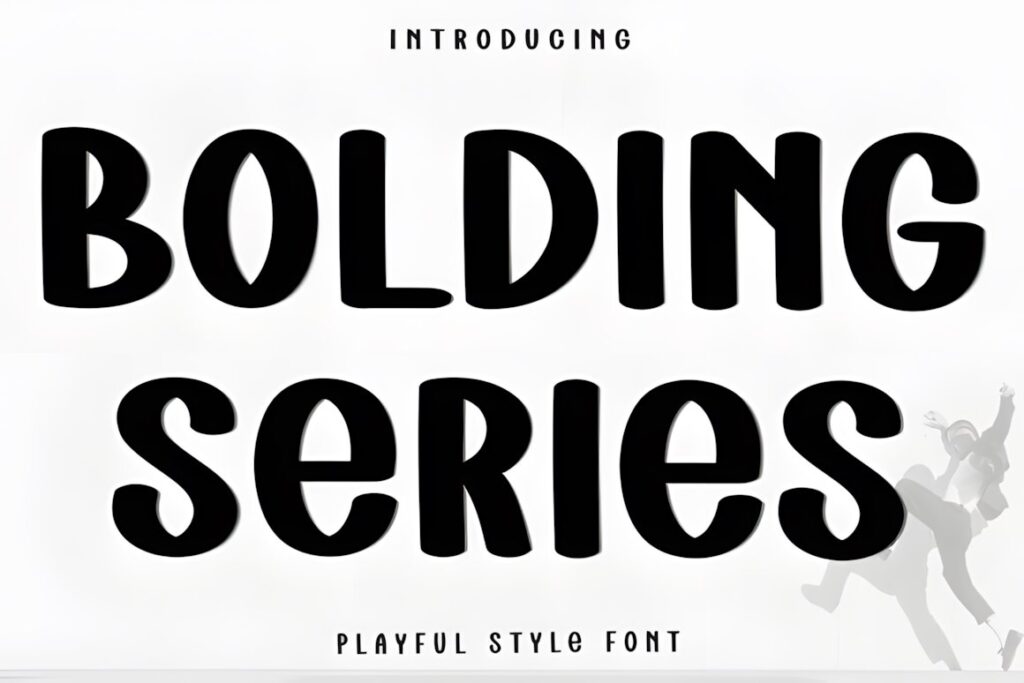
Bolding Series uses ultra-thick rounded forms with small organic notches, creating a balance between industrial weight and a softer, approachable appearance. It can give a logo substantial visual presence without feeling as severe as a sharply constructed geometric sans.
That combination suits food, casual retail, youth-oriented products, packaging, entertainment, and friendly contemporary brands. Because the letters are visually substantial, shorter names have more room to show the font’s character. For more rigid geometry, Playblock provides a cleaner alternative.
16. Morkein Geometric
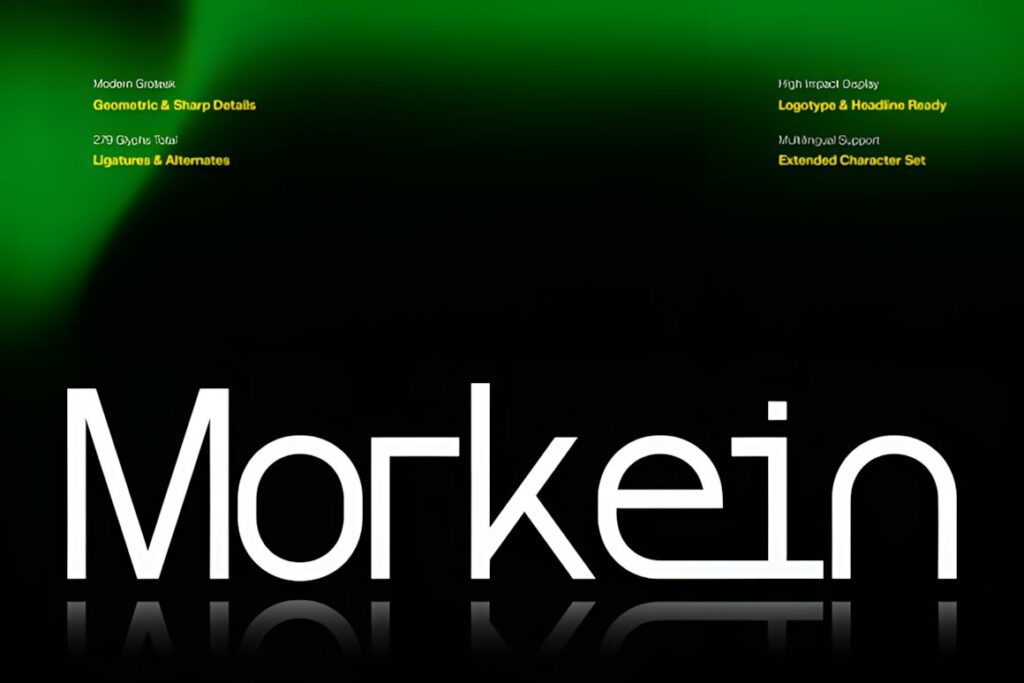
Morkein Geometric combines modern grotesk construction with sharp details, geometric alternates, and distinctive ligatures. It is designed for display situations where the typography should immediately communicate a futuristic or engineered personality.
It makes particular sense for technology, gaming, digital media, architecture, futuristic apparel, and entertainment identities. The unusual forms give a designer more opportunities to customize the wordmark, but they can also become the dominant feature of the brand. Use a simpler companion face for supporting information.
17. Bold Block
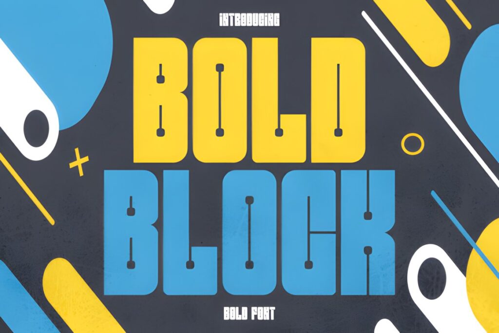
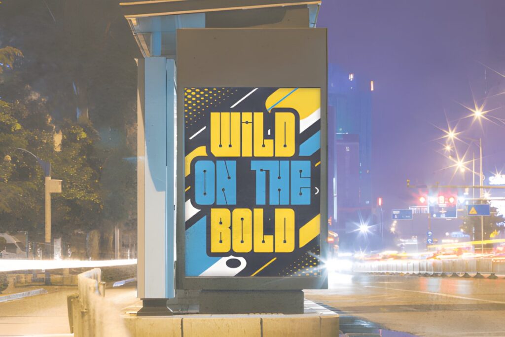
Bold Block combines an ultra-heavy condensed silhouette with rounded corners and unusual mechanical details. The result is deliberately loud, making it appropriate for identities connected to gaming, streetwear, music, sports, merchandise, and pop-influenced branding.
Its dense construction is particularly effective for short all-caps names and emblem-style logos where the type needs to behave almost like a graphic shape. The same density can overwhelm subtle or luxury-oriented identities, where a display serif or lighter geometric structure would leave more visual breathing room.
18. Big Bold Chunky
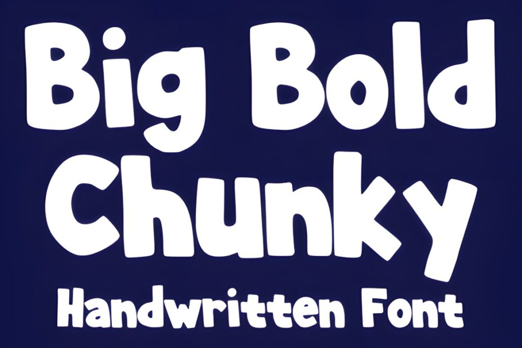
Big Bold Chunky is a thick cartoon-influenced display face intended for cheerful, animated typography. It is useful when a brand needs energy and friendliness instead of the seriousness associated with condensed industrial fonts.
Playful food products, children’s brands, events, stickers, casual merchandise, entertainment, and colorful retail concepts are natural fits. Because its personality is intentionally youthful, it can conflict with businesses that need authority, restraint, or technical precision. For those identities, Bold Display or Colvane is more controlled.
19. Retro 1970
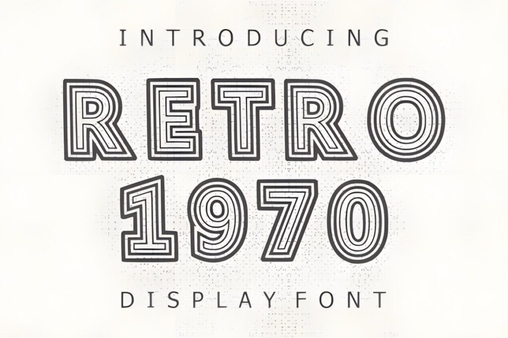
Retro 1970 is a bold vintage display font aimed at projects that need a clear nostalgic reference. Its character makes a wordmark feel more era-specific than a generic heavy sans, which can be useful when retro style is part of the brand concept rather than a decorative afterthought.
Use it for lifestyle brands, cafés, apparel, creative businesses, nostalgic packaging, events, or social identities. The recognizable period influence is also its main limitation: brands that may frequently change visual direction could benefit from a more neutral display foundation.
20. Evori
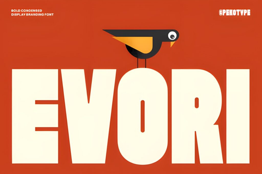
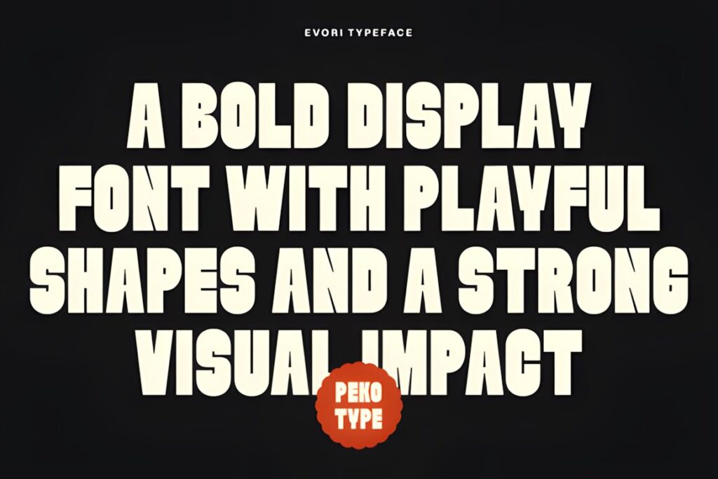
Evori is a tall, bold condensed display font with clean shapes and a confident modern appearance. Its narrow proportions are useful when the logo needs vertical impact but the business name cannot occupy too much horizontal space.
The all-caps construction works naturally for signage, food and beverage brands, events, packaging, editorial identities, and assertive modern wordmarks. Because the style is relatively direct, it leaves more flexibility for supporting graphics than highly decorative fonts. Choose Novaret when the logo needs a more unconventional condensed personality.
21. Colvane
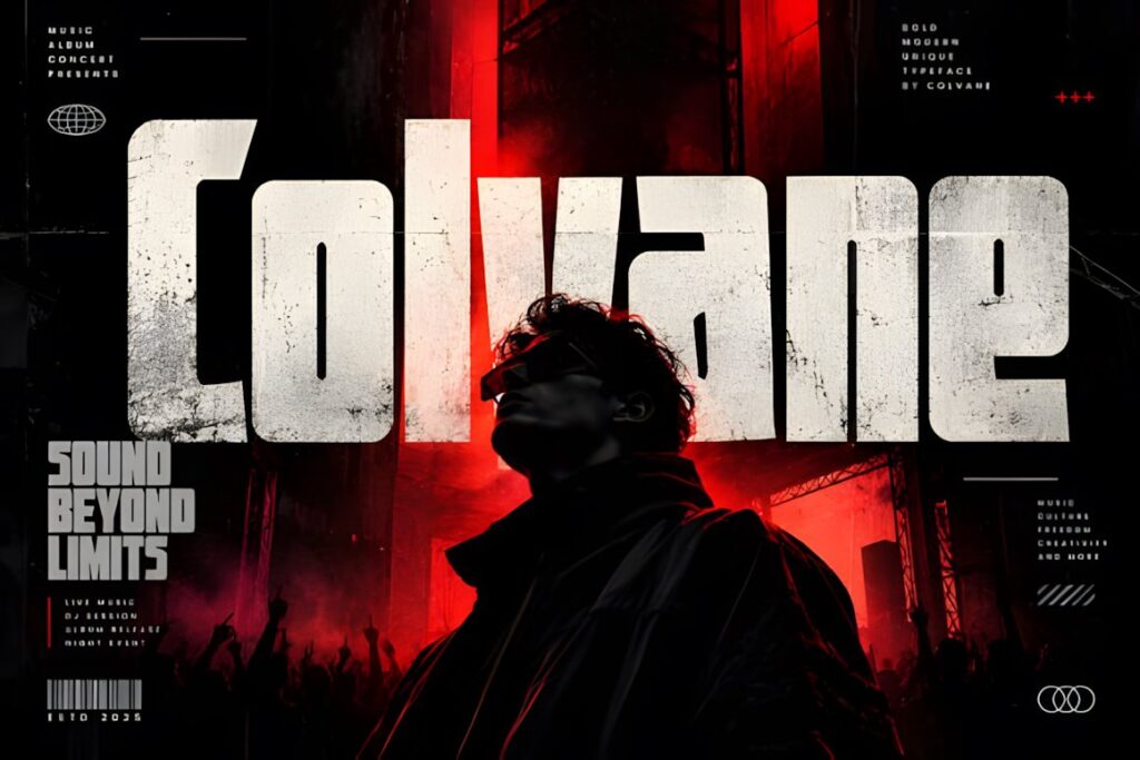
Colvane is a bold condensed display typeface with strong geometric construction and distinctive contemporary forms. The combination gives logo designers a compact wordmark foundation without making the identity feel traditionally vintage.
It fits fashion, editorial, music, streetwear, packaging, events, and modern product identities where the logo should feel assertive and slightly experimental. Its personality becomes clearest at display scale, so test simplified logo applications before relying on fine distinctions in very small placements.
Quick Comparison by Logo Style
| Font | Best for | Style | Key visual trait | Project fit |
|---|---|---|---|---|
| Retro Lettering | Expressive retro identities | Retro display | 1970s personality | Cafés, lifestyle, apparel |
| Bold Display | Strong contemporary wordmarks | Condensed sans | Tall sturdy forms | Sports, tech, editorial |
| Stylish Serif | Editorial brand character | Display serif | Modern-retro serifs | Boutiques, packaging, fashion |
| Chunky Carm | Friendly logos | Rounded display | Thick soft shapes | Food, crafts, casual retail |
| Playblock | Graphic modern identities | Geometric display | Compact heavy forms | Sports, gaming, streetwear |
| Novaret | Distinctive narrow wordmarks | Decorative condensed | Expressive cuts | Packaging, fashion, editorial |
| Kryvex | Futuristic branding | Geometric sans | Sharp angular shapes | Tech, gaming, digital brands |
| Boldside Display | Heritage identities | Vintage display | Classic heavy character | Food, beverage, outdoor |
| Evori | Long bold brand names | Condensed display | Tall clean capitals | Signage, packaging, events |
| Colvane | Experimental modern brands | Condensed geometric | Distinct contemporary forms | Fashion, music, packaging |
Branding and Logo Considerations
A display font can establish personality quickly, but the logo still needs to work as a system rather than one attractive word on a large artboard. Test the brand name at several widths and at the smallest size likely to appear on packaging, website headers, social profiles, or labels.
Short names often tolerate wider and chunkier fonts because each letter has space to become part of the identity. Longer names benefit from condensed proportions such as Evori, Copzen, Condensed, or Colvane. This keeps the wordmark from becoming disproportionately wide before spacing is even adjusted.
A highly distinctive font can also reduce how much additional decoration the logo needs. When letters already include strong retro curves, geometric cuts, or unusual terminals, adding outlines, icons, shadows, and multiple effects at the same time can make the identity harder to recognize rather than more memorable.
Font Pairing Tips for Bold Wordmarks
Let the display font handle the brand personality and give supporting typography a different job. A restrained sans serif can carry navigation, ingredients, prices, captions, or product details beneath a decorative retro logo. A quiet serif can provide contrast below a geometric display wordmark when the identity needs a more editorial tone.
Avoid pairing two fonts that compete for attention in the same way. A chunky logo plus another chunky headline face usually creates weight without hierarchy. Contrast can come from structure, width, weight, or personality: condensed with wide, geometric with humanist, decorative with restrained, or heavy with light.
The supporting font does not need to imitate the logo. Its purpose is to make the identity easier to use across real layouts while allowing the display face to remain distinctive.
Readability and Logo Size
A display font that looks clear at poster scale may behave differently in a small logo lockup. Condensed counters can close visually, unusual cuts can disappear, and decorative details can merge when a wordmark is reduced.
Check the logo in monochrome and at realistic sizes before building the identity around decorative features. If the basic silhouette remains recognizable without color, shadows, or effects, the typography has a stronger foundation for practical brand use.
For compact applications, simpler options such as Evori or Bold Display can be easier to manage than highly expressive retro lettering. Decorative fonts are still useful, but they may benefit from a simplified secondary logo or monogram for avatars, favicons, small labels, and other constrained spaces.
Common Display Font Mistakes in Logo Design
- Choosing weight instead of personality. Two heavy fonts can communicate completely different ideas depending on proportion and letter construction.
- Ignoring the actual brand name. A font that looks convincing in a specimen may become awkward with a long or unusually shaped word.
- Using every decorative feature at once. Strong typography usually needs fewer competing effects.
- Judging only at large size. Always test the wordmark where customers will actually encounter it.
- Pairing with another dominant display face. Supporting typography should create hierarchy rather than compete with the logo.
- Assuming a font license covers every use. Check the current license associated with the font for the exact commercial, client, product, or distribution use you have planned.
Choosing the Right Bold Personality for Your Logo
If the brand needs immediate retro recognition, Retro Lettering gives the wordmark a clear 1970s direction, while Retroleta provides a warmer rounded serif alternative.
For contemporary brands that need a powerful but cleaner identity, Playblock creates a compact geometric look. Evori makes more sense when a longer brand name needs condensed proportions without extensive decoration.
Technology, gaming, and futuristic identities can move toward Kryvex or Morkein Geometric, while friendly consumer brands can soften the same visual impact with Chunky Carm or Bolding Series.
The strongest choice is the font whose proportions and visual language reinforce the intended brand personality before extra effects are added. Test the actual business name, simplify the supporting typography, and check the wordmark at several real-world sizes before committing to the final identity.
Frequently Asked Questions
Are display fonts good for logo design?
Display fonts can work very well for logo design when their distinctive letterforms match the intended brand personality. They are especially useful for short wordmarks, brand names, badges, and identity systems where typography needs to attract attention. Test the chosen display font at small sizes as well as large sizes, because decorative details and narrow spaces can lose clarity when a logo is reduced.
Should a bold logo font be used for all brand text?
A bold display logo font usually works better as the personality font rather than the only typeface in the brand system. Use it for the wordmark or selected headlines, then pair it with a quieter serif or sans serif for navigation, packaging details, captions, prices, and longer copy. This division creates hierarchy and prevents every piece of text from competing with the logo.
How do I choose a display font for a long business name?
A condensed display font is often easier to manage when a business name contains many letters. Narrow proportions help the wordmark remain visually strong without becoming excessively wide. Test the complete name rather than relying on specimen words, and pay attention to spacing, counters, and repeated letters. Cleaner condensed styles may also remain easier to recognize when the logo is reduced.
Can I use a downloaded display font for a commercial logo?
Commercial logo use depends on the current license attached to the specific font, not simply on the fact that the font can be downloaded. Check the product’s current license terms for the exact way you plan to use the typeface, especially for client work, products for sale, editable files, print-on-demand applications, or redistribution. Keep a record of the applicable license when the font becomes part of a brand identity.