ℹ️ Affiliate Disclosure: This article may contain affiliate links. If you book or purchase through these links, we may earn a commission at no additional cost to you.
Choosing the Right Modern Sans Serif Fonts for Logo Design
A modern sans serif font can make a logo feel clear and current, but clean lettering alone does not guarantee a useful brand identity. Some sans serifs are neutral enough for broad corporate systems, while others rely on condensed proportions, unusual geometry, thin strokes, or distinctive letterforms that work better in short wordmarks than in supporting copy.
For logo and branding work, pay attention to the shape of recognizable letters, overall width, weight range, spacing, and how much personality the typeface introduces. The selection below covers restrained geometric fonts, condensed families, polished luxury styles, and stronger display-oriented choices so you can match the typography to the personality of the brand.
Many more modern sans serif fonts are available, while this shortlist concentrates on styles with distinct branding roles, readable forms, and noticeably different visual personalities.

For clean logo and brand identity work, geometric and balanced sans serifs offer the most flexibility, while condensed fonts help with narrow wordmarks and more distinctive display styles can give fashion, technology, or creative brands a stronger signature. The right choice depends on how neutral or recognizable the logo needs to feel.
Quick Picks for Different Brand Styles
- For a versatile identity system: Modern Sans — a multi-weight grotesque family suited to logos plus supporting brand typography.
- For minimalist branding: Minimalist Aesthetic — light geometric lettering with an airy visual tone.
- For luxury branding: Caveline — restrained, refined forms suited to fashion, beauty, and premium packaging.
- For narrow wordmarks: Longline — tall condensed proportions create a strong vertical identity.
- For technology brands: Zentaro — geometric construction and multiple weights provide a more structured contemporary look.
Modern Sans Serif Fonts for Logo and Brand Identity
1. Modern Sans
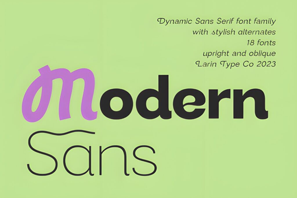
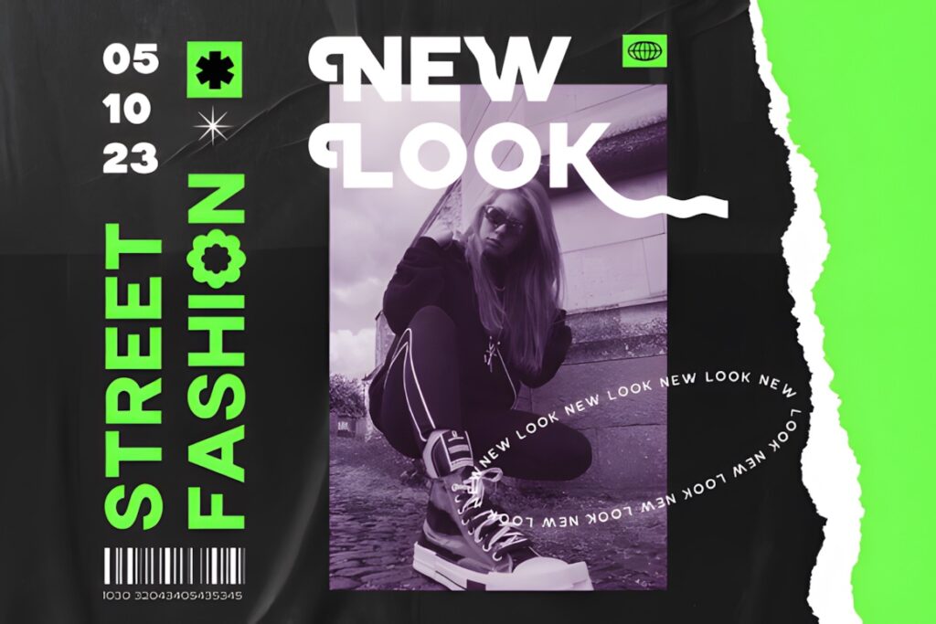
Modern Sans is a versatile grotesque family for brand identities that need one clean typographic system across logos, packaging, websites, labels, and editorial applications. The family includes nine weights from thin through black plus basic and oblique styles, giving you considerably more hierarchy than a single display face. :chatgpt-content-reference{index=”0″}
The fairly universal structure makes sense when the logo should look contemporary without dominating the rest of the identity. It is less appropriate when you want the font itself to provide an immediately unusual or experimental brand signature.
2. Minimalist Aesthetic
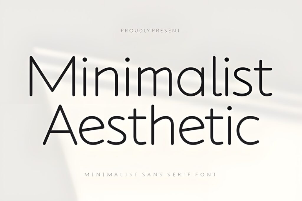
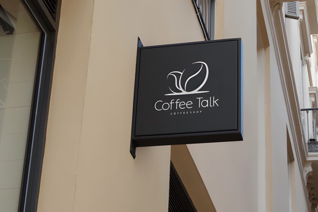
Minimalist Aesthetic is a light sans serif built around clean geometric lines and generous visual breathing room. Its understated appearance fits skincare, lifestyle, interior, stationery, and personal brands that want the logo to feel polished rather than bold. :chatgpt-content-reference{index=”1″}
It makes the most sense for short or medium-length names displayed with enough space around them. Because the visual character depends partly on its light construction, a heavier option such as Thiskloze is more practical when the identity needs forceful signage or very small reproduction.
3. Geometrica Sans
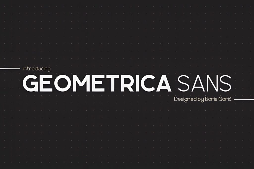
Geometrica Sans uses basic geometric shapes to create a structured family with six weights ranging from Thin to Black. That breadth is useful for identities where the same type family needs to move from a restrained logo to stronger headlines or packaging hierarchy. :chatgpt-content-reference{index=”2″}
The geometry gives logos an ordered, engineered appearance that can work well for architecture, technology, design studios, or contemporary product brands. For a softer luxury identity, Caveline or Qepo introduces a less rigid personality.
4. Parma
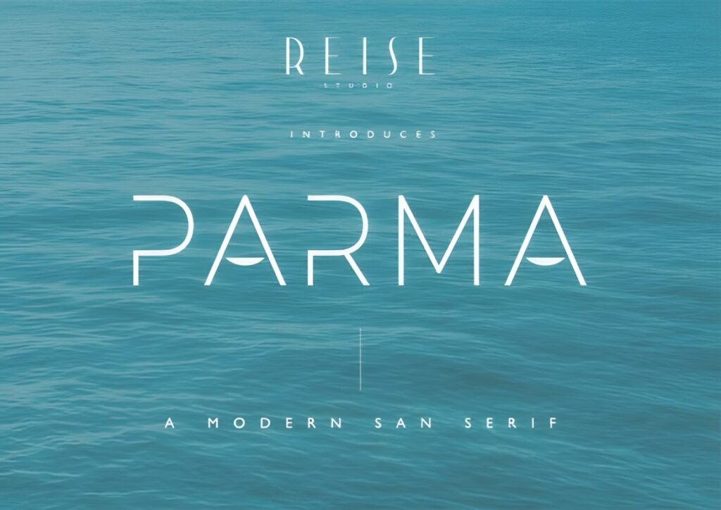
Parma is a minimalist sans serif aimed at logos, branding, packaging, and magazine-style headings. Its simplified forms give a brand a contemporary graphic presence without requiring the heavier weight or technical appearance of some geometric display fonts. :chatgpt-content-reference{index=”3″}
Consider Parma for a brand name that needs a clean identity with a little more character than a purely neutral corporate sans. If you need numerous weights for a large identity system, a broader family such as Modern Sans or Zentaro provides more flexibility.
5. Thiskloze
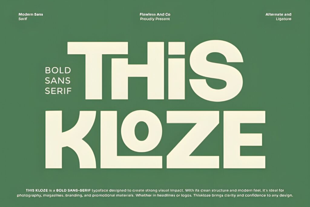
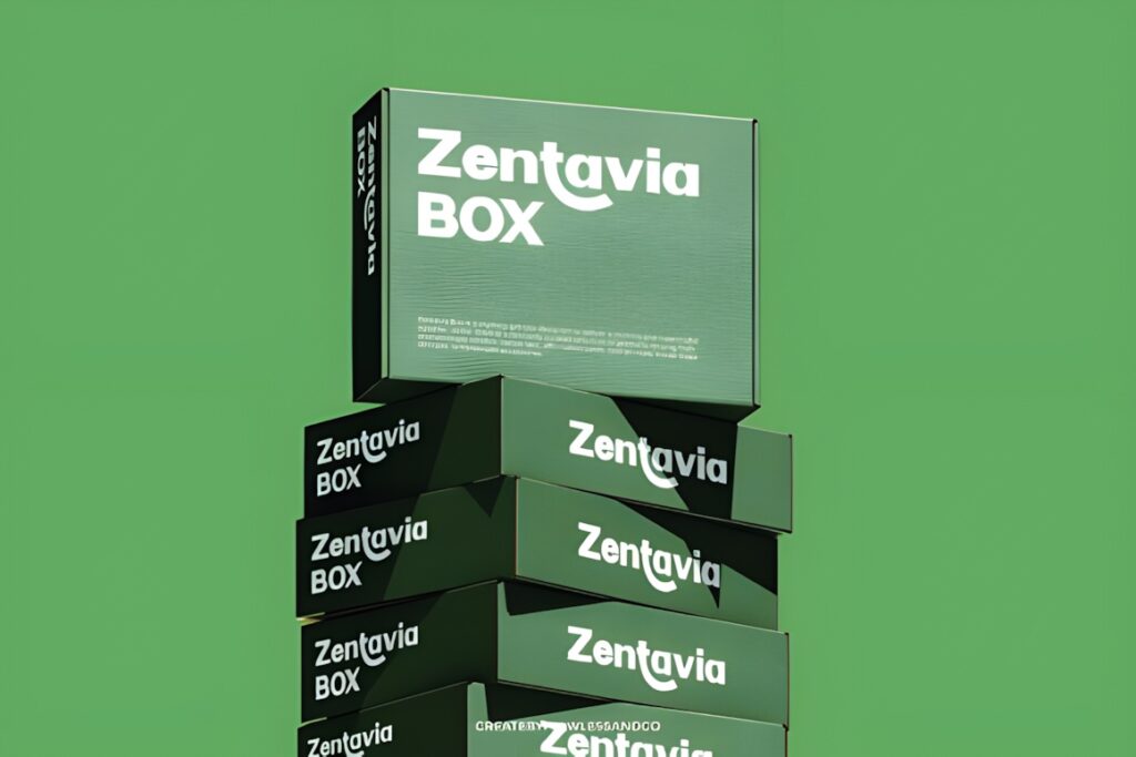
Thiskloze is a bold geometric sans serif intended for strong headlines, logos, and brand identities. Its heavier construction creates immediate visual presence, making it useful when a short brand name needs to remain prominent against photography or busy packaging. :chatgpt-content-reference{index=”4″}
The bold personality is the main reason to choose it, but it can become visually dominant if every part of the identity uses the same treatment. Pair the wordmark with a quieter supporting sans for product details and longer text.
6. Affigue
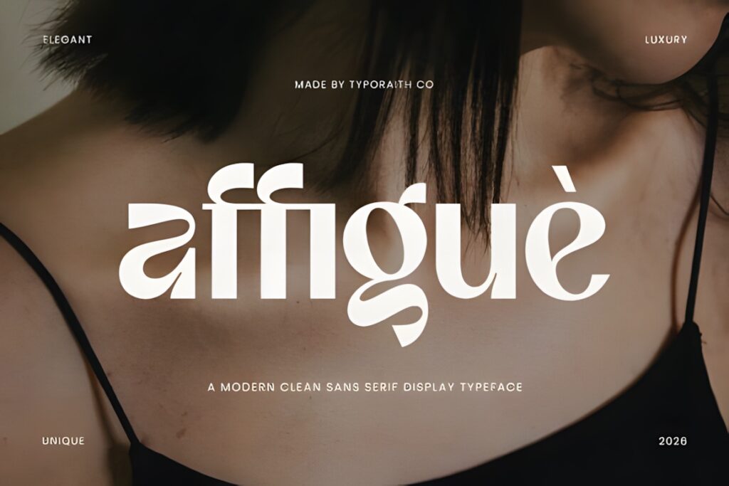
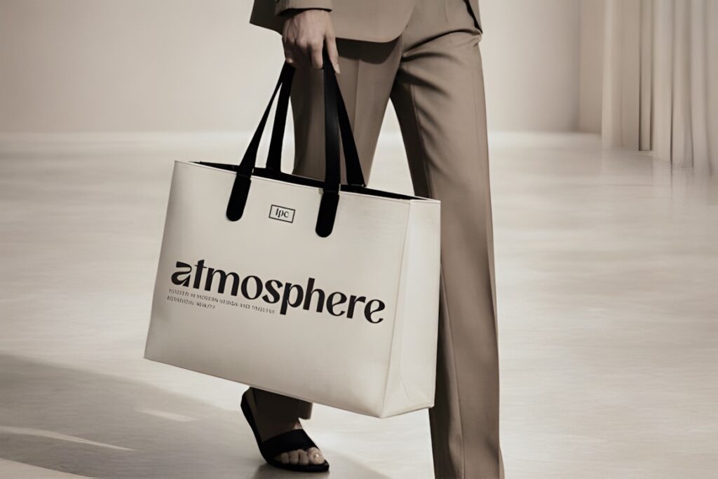
Affigue combines a clean sans serif foundation with a more elegant display personality. It is positioned for fashion branding, luxury logos, beauty products, magazine covers, advertising, and editorial layouts where the wordmark needs more visual polish than a neutral corporate typeface. :chatgpt-content-reference{index=”5″}
Use it most confidently at display sizes where its proportions can shape the identity. For dense product information or a brand that needs an understated utility font, Modern Sans or Atheria is a more restrained direction.
7. Nano
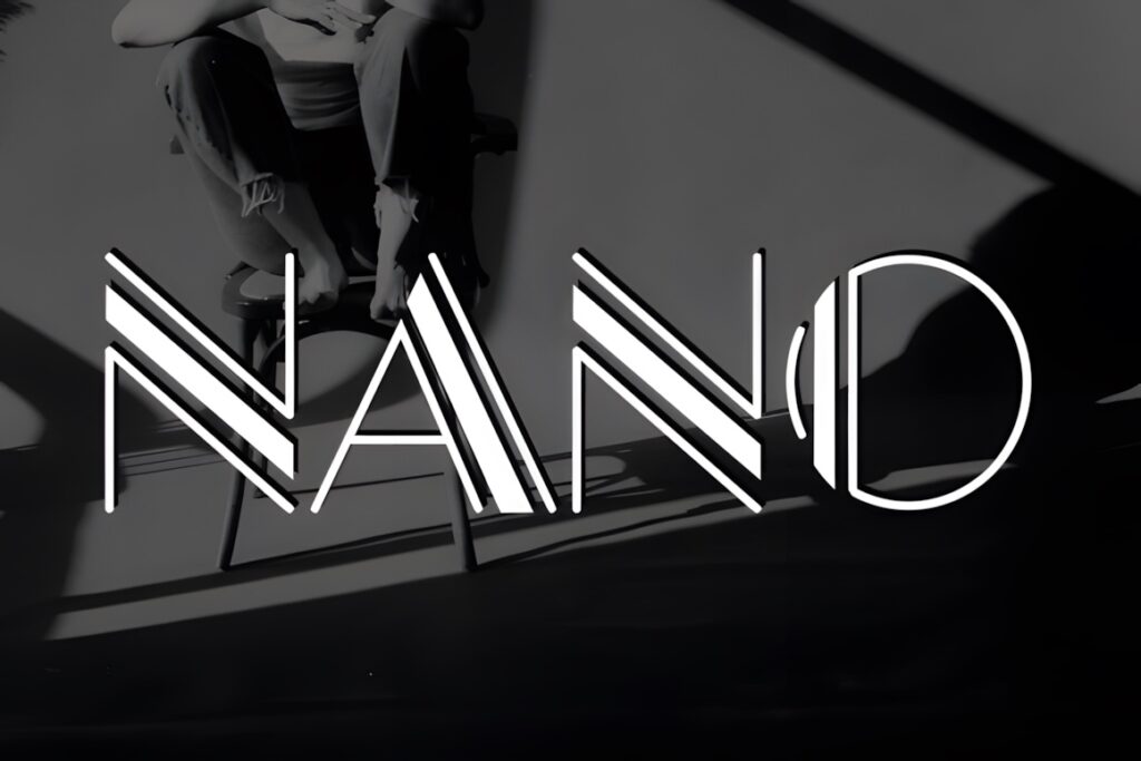
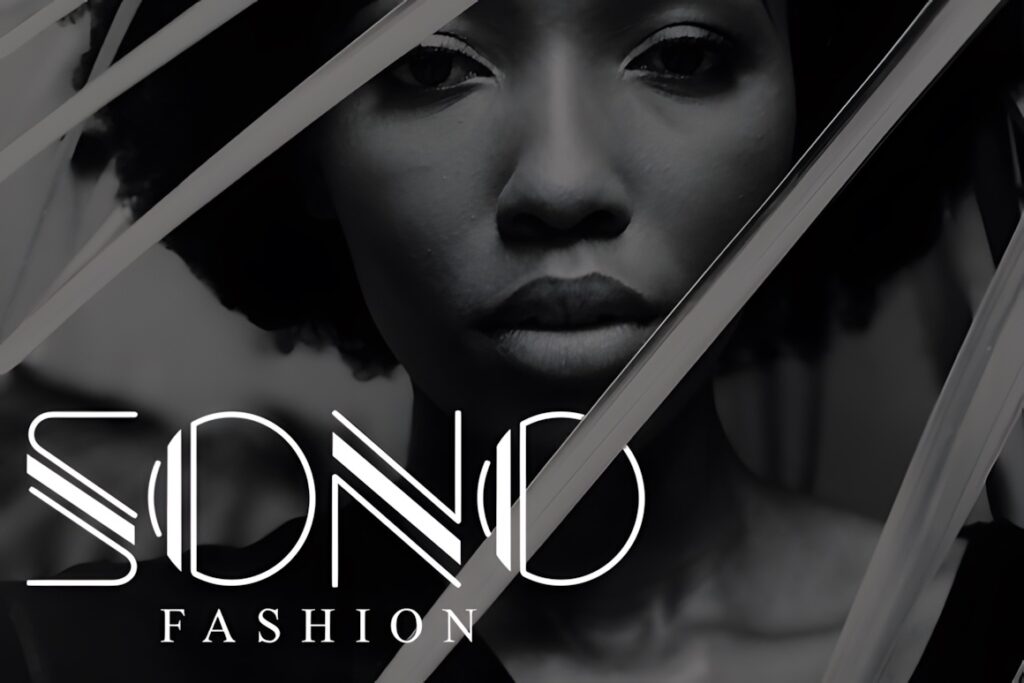
Nano is a modern geometric sans serif suited to advertising, headlines, logos, blogs, and branding. Its straightforward geometry makes it useful for brands that want a fresh contemporary appearance without leaning too strongly toward fashion, luxury, or futuristic styling. :chatgpt-content-reference{index=”6″}
That relative neutrality can be an advantage for small businesses needing a flexible wordmark. If the logo itself must carry a more memorable signature, a font with stronger proportions such as Longline or more distinctive details such as Qepo may provide more personality.
8. Caveline
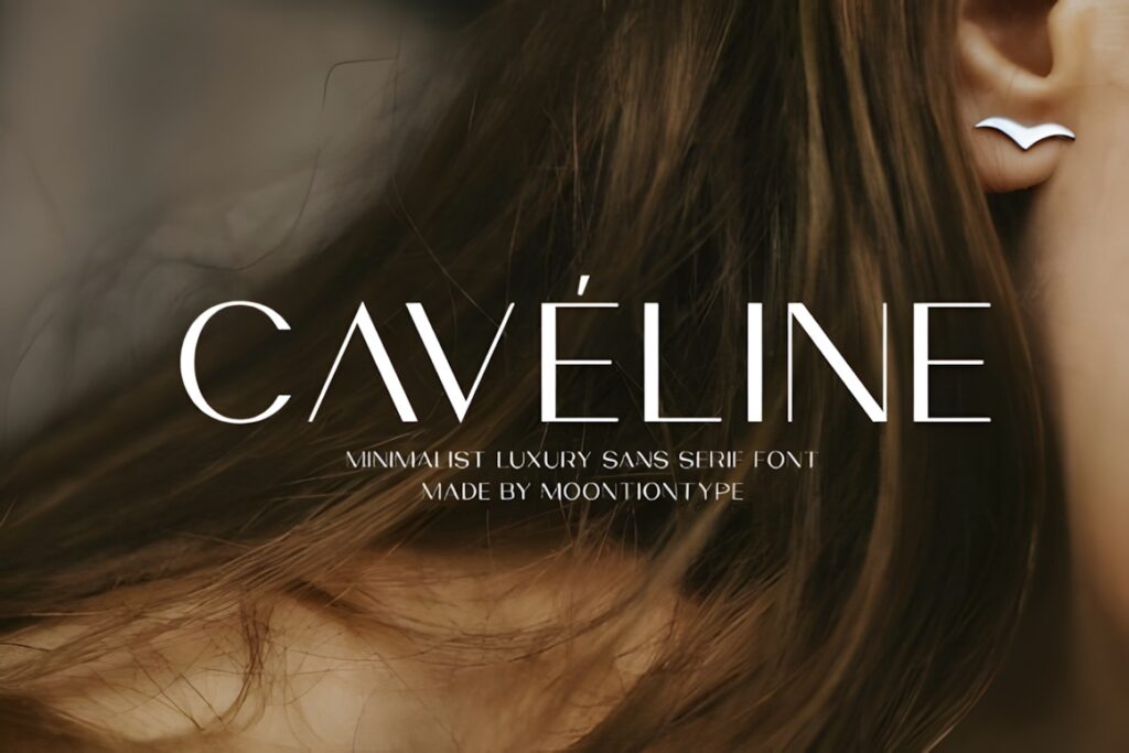
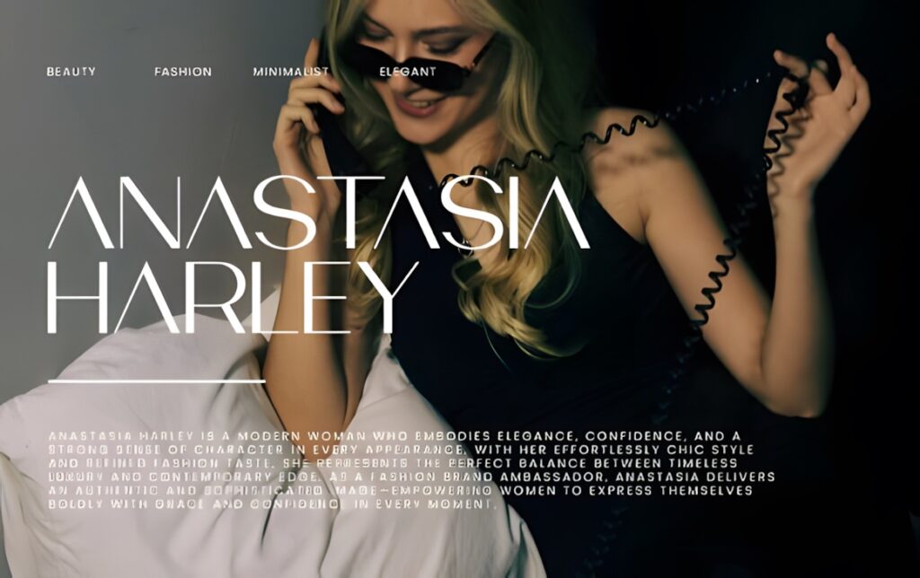
Caveline is a minimalist luxury sans serif with clean lines and refined proportions. Its intended uses include fashion branding, logos, skincare and beauty identities, packaging, editorial layouts, social media graphics, and premium-oriented design. The product includes OTF and TTF files. :chatgpt-content-reference{index=”7″}
The restrained personality works particularly well when whitespace, photography, and packaging materials carry much of the overall brand mood. A bolder option such as Thiskloze or Zentaro is likely to communicate more energy when the logo must command attention independently.
9. Longline
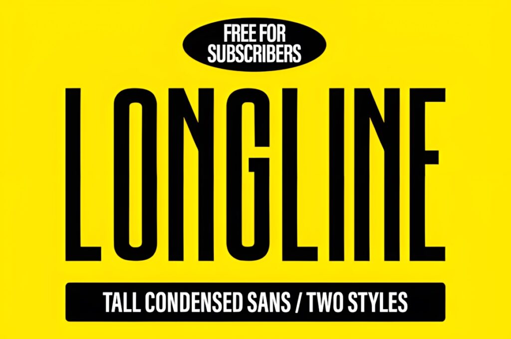
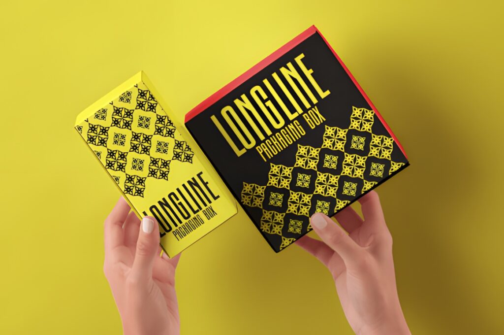
Longline is an extra-tall condensed sans serif designed for bold statements and minimalist layouts. Its narrow structure creates a pronounced vertical rhythm, making it useful for fashion wordmarks, magazine headers, packaging, posters, and brands with longer names that need to fit into restricted horizontal space. :chatgpt-content-reference{index=”8″}
The elongated appearance is intentionally noticeable, so it is most effective when that narrow silhouette supports the brand concept. For a general-purpose corporate identity that needs less stylistic emphasis, Atheria or Modern Sans provides a calmer foundation.
10. Katron
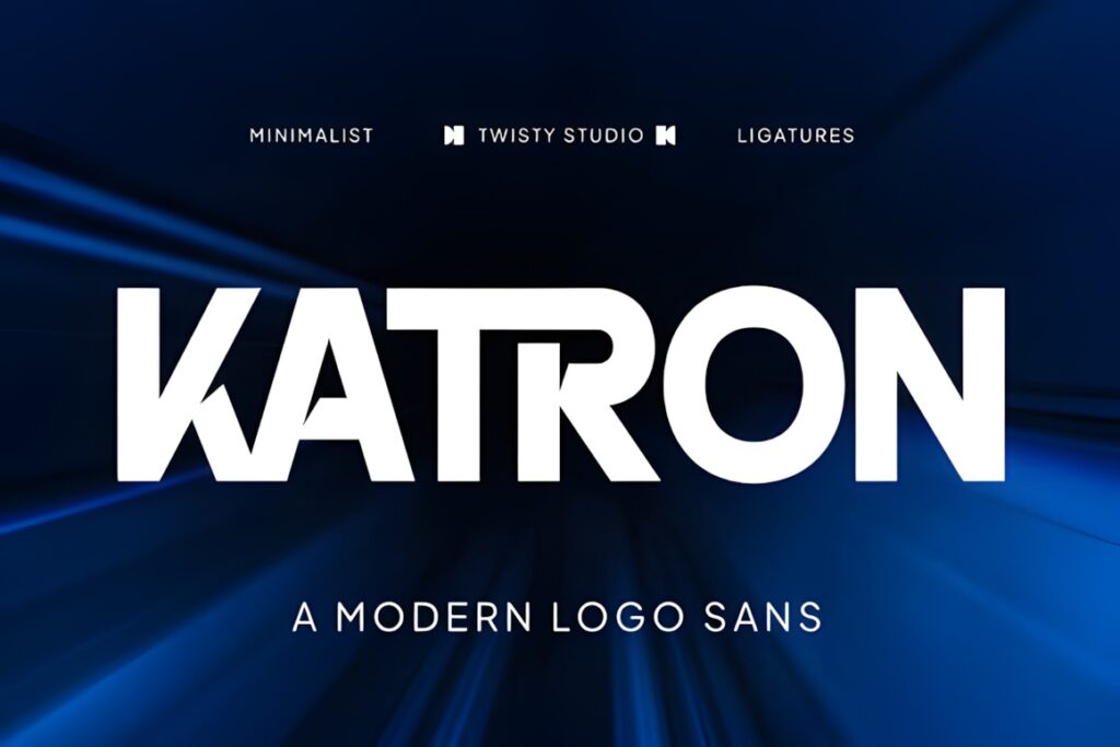
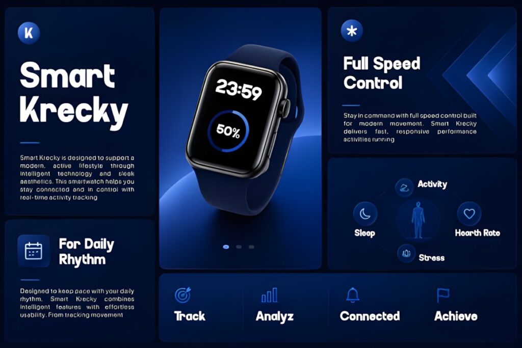
Katron is a minimalist sans serif built around balanced proportions, sleek letterforms, and refined geometric structure. It is specifically positioned for logo design, branding, and digital projects, making it a sensible option for businesses that need a contemporary identity without a highly decorative type treatment. :chatgpt-content-reference{index=”9″}
Its main strength is restraint: the type can support the brand rather than becoming the entire concept. That also means brands seeking a dramatic fashion or technology signature may prefer the sharper personality of Qepo, Zentaro, or Motage.
11. Zentaro
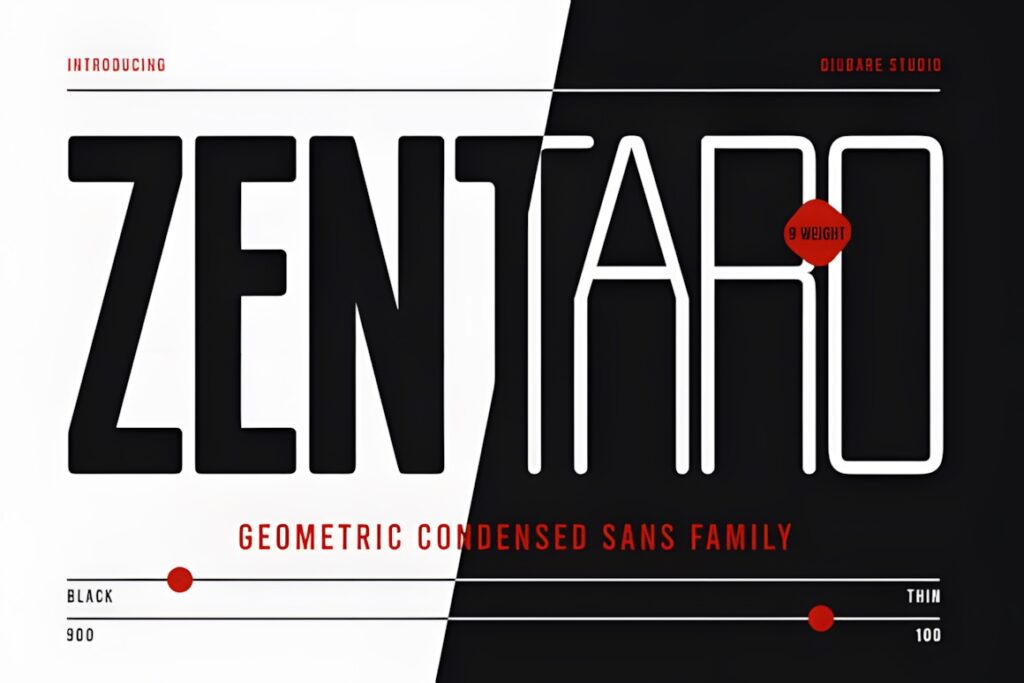
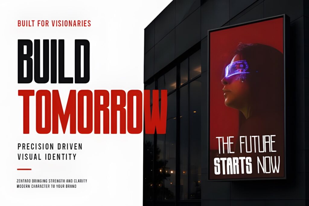
Zentaro is a modern geometric condensed sans serif family with nine weights. Its structured proportions and broad weight range suit technology branding, strong corporate identities, editorial layouts, and visual systems that need a consistent family rather than only a standalone logo font. :chatgpt-content-reference{index=”10″}
The condensed construction is especially useful when space is limited or when the brand benefits from a tighter typographic rhythm. If openness and understated elegance matter more than compactness, Katron or Minimalist Aesthetic moves in the opposite direction.
12. Soltyer
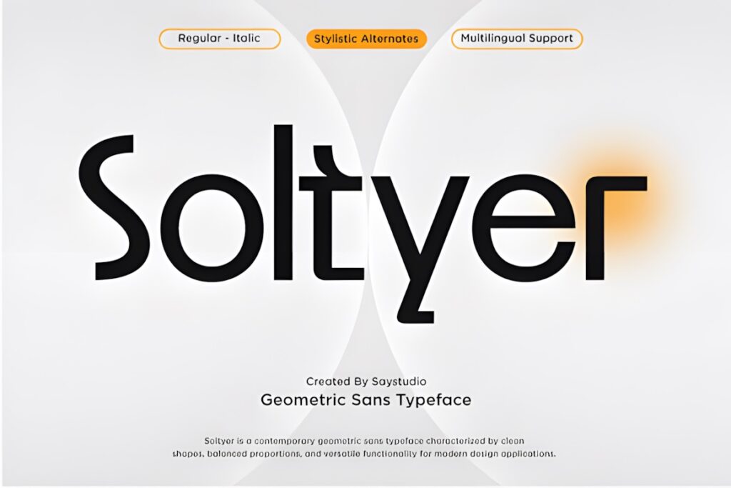
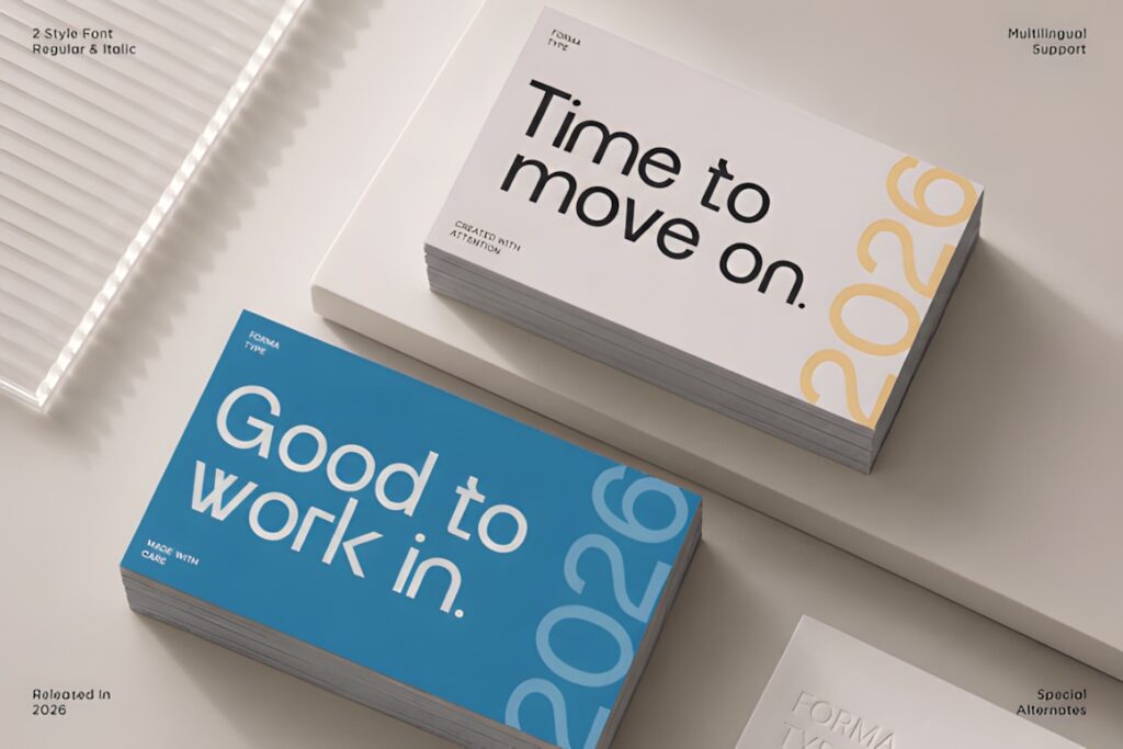
Soltyer is a geometric sans serif with balanced proportions and clean curves. It is designed for contemporary branding across print and digital work, with a professional tone that can suit technology, fashion, editorial, or general business identities. :chatgpt-content-reference{index=”11″}
This is a useful middle ground when you want geometry without an overtly futuristic appearance. Choose a more specialized font when the identity depends on an obvious visual device: Longline for tall condensed lettering, Affigue for fashion-led display work, or Motage for a sharper logo-oriented treatment.
13. Golco
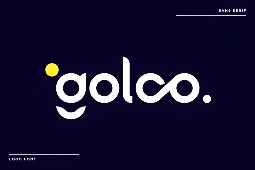
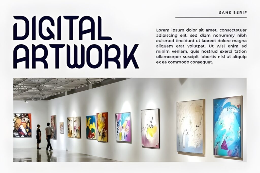
Golco is a minimalist geometric sans serif developed for logo design and visual identity. Its sleek lines and contemporary structure also translate naturally to packaging, editorial headings, websites, and social graphics, which is useful when a logo needs to extend into a broader brand system. :chatgpt-content-reference{index=”12″}
Golco makes sense for creative studios and modern product brands that want a distinct but controlled wordmark. If the design should feel intentionally luxurious rather than simply contemporary, Caveline or Affigue provides a more fashion-oriented direction.
14. Atheria
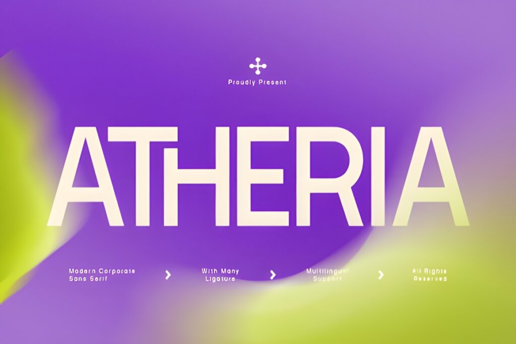
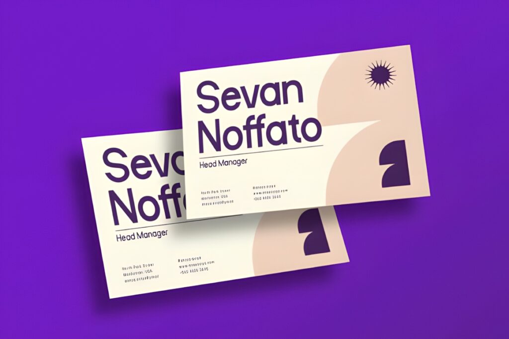
Atheria is a modern corporate sans serif with balanced geometric letterforms, smooth curves, and restrained proportions. That combination fits professional branding where clarity and consistency matter more than decorative novelty. :chatgpt-content-reference{index=”13″}
Consider Atheria for consulting, technology, services, finance-adjacent, or corporate identities that need to feel current without looking trend-driven. It is intentionally quieter than display-focused choices such as Thiskloze or Longline, so another font makes more sense if typography needs to become the dominant brand feature.
15. Qepo
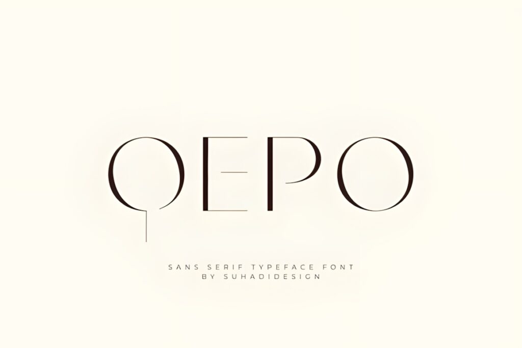
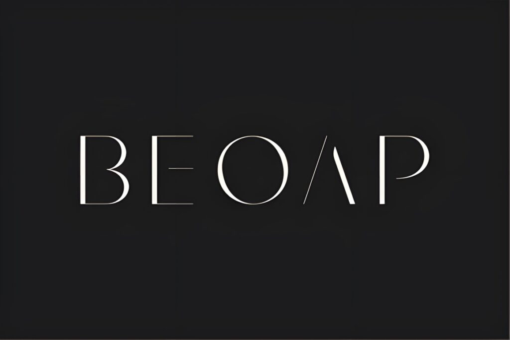
Qepo is a minimalist sans serif that combines clean lines with more avant-garde character shapes. Its high-fashion tone makes it a natural candidate for logos, editorial identities, packaging, and social graphics where a standard geometric sans would feel too anonymous. :chatgpt-content-reference{index=”14″}
The distinctive glyph construction works especially well for short names where individual letters are visible and memorable. For long company names or information-heavy corporate systems, a more conventional structure such as Modern Sans or Soltyer may be easier to extend consistently.
16. Noria
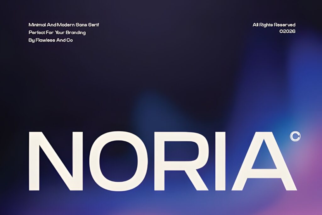
Noria is a minimalist modern sans serif built around clean lines, balanced letterforms, and a restrained structure. Its uncomplicated appearance is particularly suitable for brands that want typography to communicate clarity and confidence rather than a conspicuous stylistic theme. :chatgpt-content-reference{index=”15″}
That makes Noria useful for understated wordmarks and supporting identity typography. A brand in entertainment, gaming, streetwear, or experimental technology may need more visual tension than Noria intentionally provides.
17. Agatic
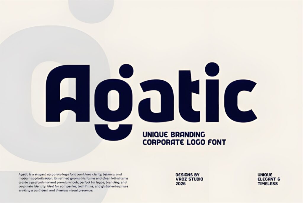
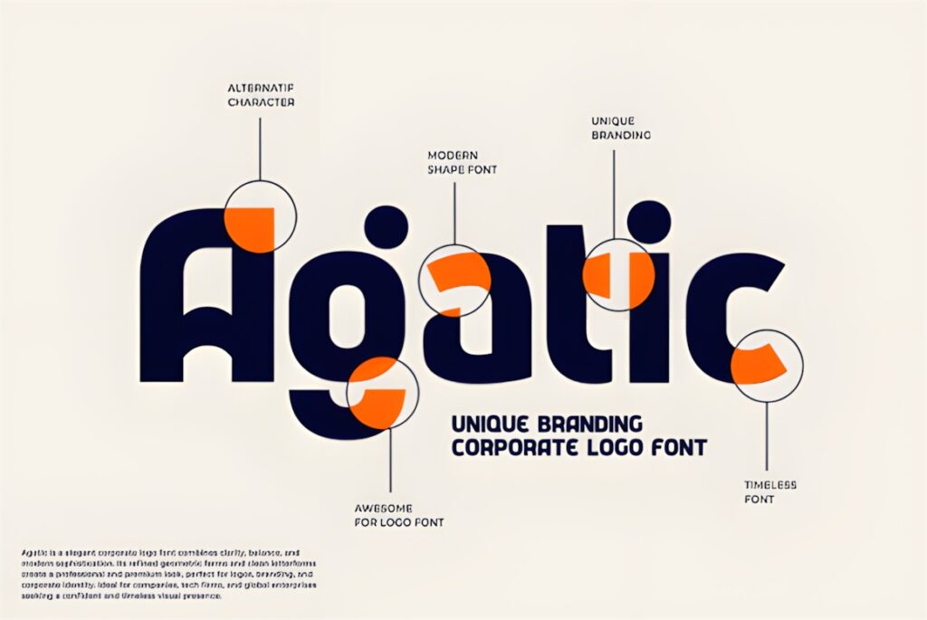
Agatic is a geometric sans serif designed around balance, precision, and a corporate branding role. Its clean construction is intended to remain readable while adding enough geometric personality for modern business, technology, and studio identities. The product also lists multilingual support, ligatures, and alternates. :chatgpt-content-reference{index=”16″}
Those additional character options can be useful when you want to customize selected letter combinations in a wordmark. Keep the customization selective; too many alternate forms can weaken the consistency that makes a brand mark recognizable.
18. Azkelia
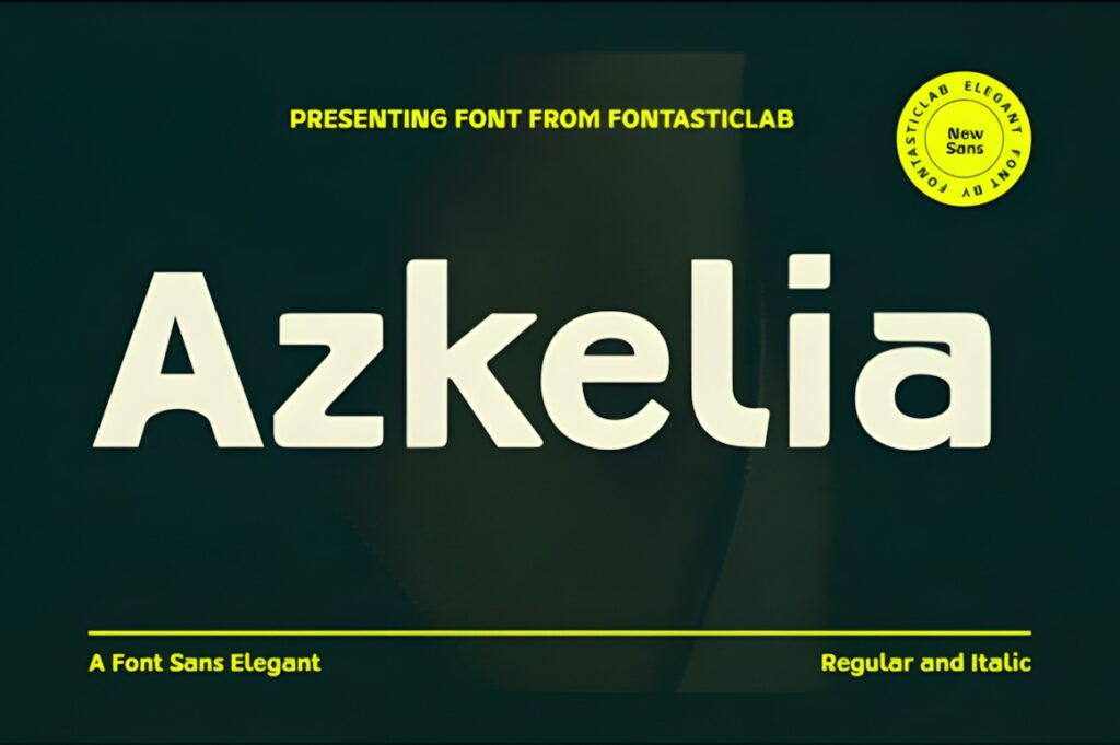
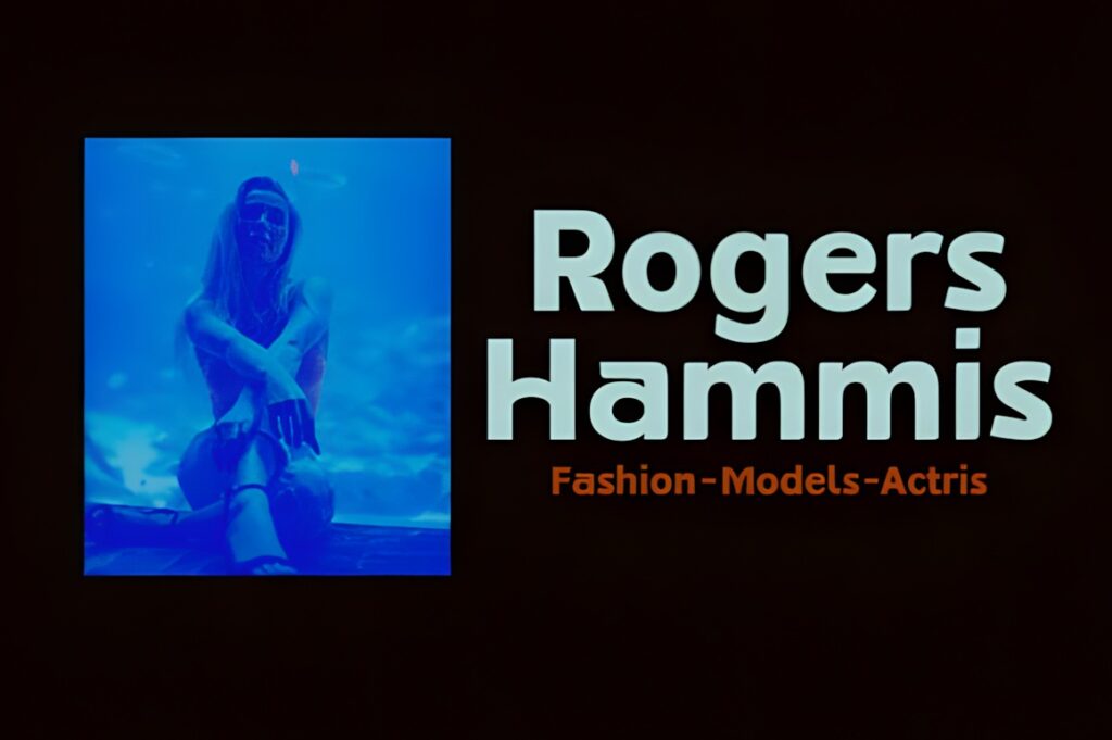
Azkelia combines geometric precision with softer curves and selected angular details, creating a sans serif that looks clean without being entirely neutral. Regular and italic styles are listed, along with alternative glyph options intended for software that supports the relevant OpenType features. :chatgpt-content-reference{index=”17″}
The mixture of structure and character makes Azkelia appealing for contemporary product, editorial, and technology branding. It is worth testing the actual logo letters carefully because the most distinctive shapes may influence a short wordmark more strongly than they influence longer supporting text.
19. Protage
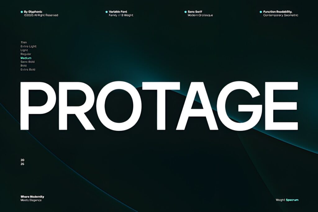
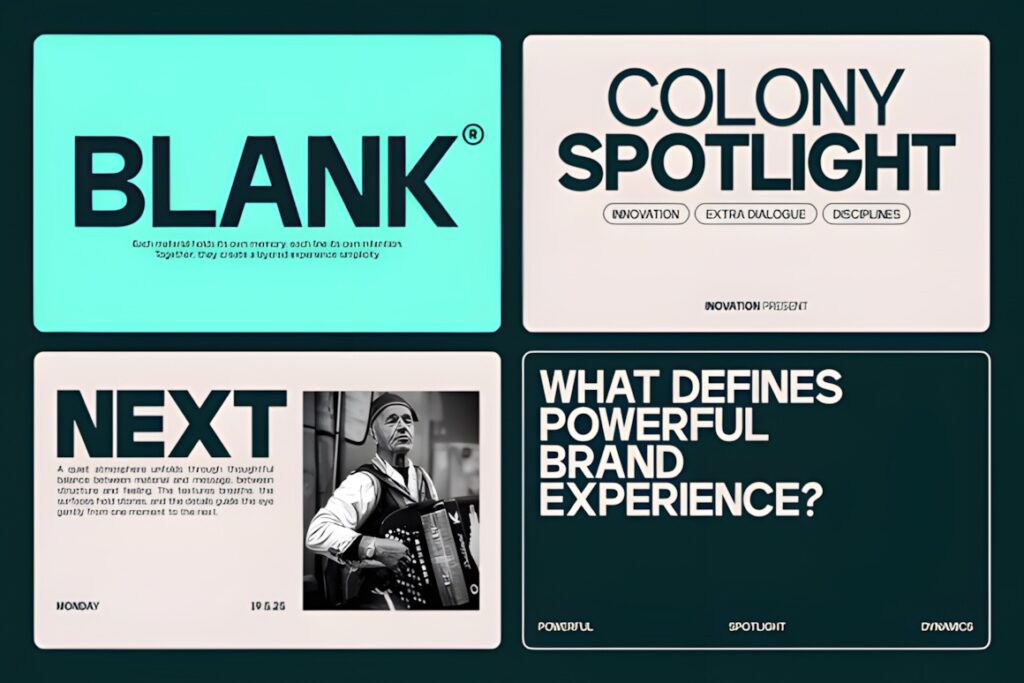
Protage is a contemporary sans serif with clean geometry, balanced proportions, and confident strokes. It is intended for branding, editorial layouts, technology projects, visual identities, interfaces, headlines, and minimalist graphic design. :chatgpt-content-reference{index=”18″}
Its strength is versatility: the lettering can feel modern without immediately tying the identity to one narrow trend. If the logo needs an obvious condensed silhouette or luxury-fashion character, Longline or Affigue offers a more specialized visual direction.
20. Akihiko
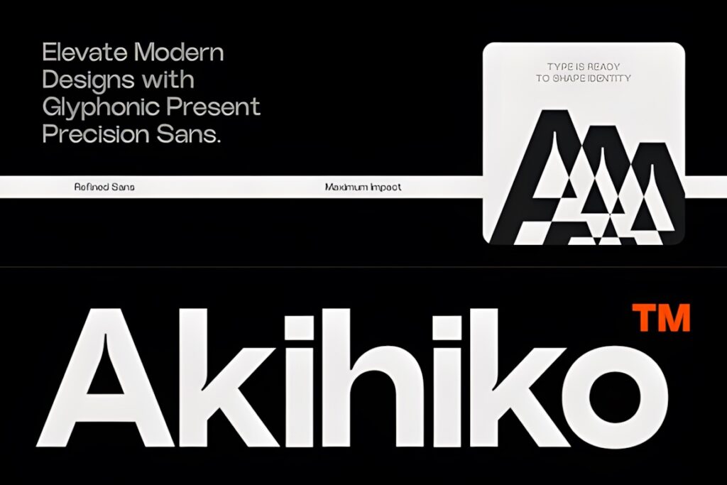
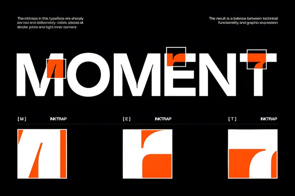
Akihiko is a contemporary sans serif constructed around refined geometry, alignment, and a controlled modern appearance. It is positioned for branding systems, corporate design, editorial layouts, interfaces, and high-impact headings. :chatgpt-content-reference{index=”19″}
Choose Akihiko when the identity needs precision and a more designed appearance without moving into highly decorative territory. A warmer lifestyle brand may find its structured visual tone less appropriate than the softer minimalism of Caveline or Minimalist Aesthetic.
21. Motage
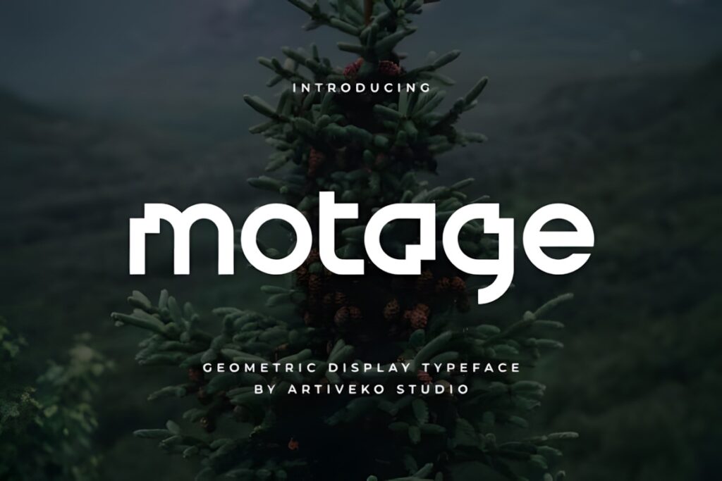
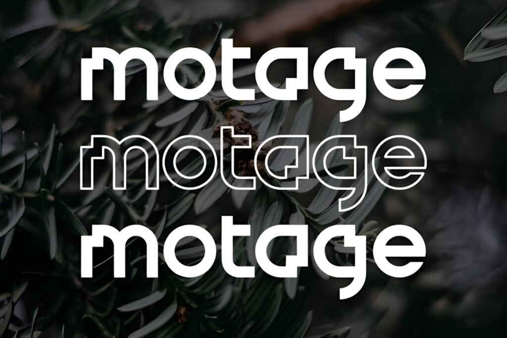
Motage is a geometric logo sans serif developed around clean geometry, balanced proportions, and recognizable contemporary letterforms. Its explicit focus on logos and visual identity makes it useful when you want typography that feels more intentional than a generic system font while remaining firmly within a clean modern aesthetic. :chatgpt-content-reference{index=”20″}
Motage works particularly well as a wordmark candidate for modern businesses and creative brands. Compare it at small sizes with more neutral options such as Katron or Atheria before committing if the identity will frequently appear in compact digital placements.
Quick Comparison by Branding Style
| Font | Best for | Style | Key visual trait | Project fit |
|---|---|---|---|---|
| Modern Sans | Full identity systems | Grotesque | Broad weight range | Logos, packaging, web |
| Minimalist Aesthetic | Lifestyle brands | Minimal | Light, airy geometry | Wordmarks, social graphics |
| Geometrica Sans | Structured identities | Geometric | Basic geometric construction | Corporate, design, tech |
| Caveline | Luxury brands | Minimal luxury | Refined proportions | Beauty, fashion, packaging |
| Longline | Narrow wordmarks | Condensed | Extra-tall silhouette | Fashion, editorial, packaging |
| Zentaro | Tech identities | Geometric condensed | Nine-weight family | Digital brands, headlines |
| Atheria | Corporate branding | Clean geometric | Balanced restrained forms | Services, business identity |
| Qepo | Fashion wordmarks | Avant-garde minimal | Distinctive glyph shapes | Logos, editorial, packaging |
| Agatic | Customizable logos | Geometric | Alternates and ligatures | Corporate, studio, technology |
| Motage | Modern wordmarks | Logo sans | Clean distinctive geometry | Brand identity, logos |
Branding and Logo Considerations
A logo font has to do more than look attractive at presentation size. Test the wordmark at the smallest size you expect to use on a website header, social avatar, product label, business card, or packaging panel. Thin strokes and subtle details that look sophisticated on a large artboard can lose presence when the logo becomes small.
Pay particular attention to the letters that make the brand name recognizable. If the name contains repeated characters, unusual diagonals, or several rounded letters, compare how those shapes interact before choosing a typeface. Two fonts that appear similar in an alphabet specimen can produce very different wordmarks once the actual name is entered.
For a flexible identity system, families with multiple weights give you more options for hierarchy. A distinctive single-style font can still work well for the logo, but it usually benefits from a quieter secondary typeface for supporting copy.
How to Pair a Modern Sans Serif Logo Font
Pair fonts by role rather than simply choosing two typefaces that look different. If the logo uses an unusual geometric sans, the supporting font should normally become quieter so navigation, packaging details, and longer text do not compete with the wordmark.
A condensed logo can pair with a more normally proportioned sans serif to introduce width contrast. A thin luxury wordmark can use a medium-weight supporting face to improve readability for practical information. If the logo already uses a multi-weight family such as Modern Sans or Zentaro, you may not need a completely separate typeface at all; weight and size can create enough hierarchy within one family.
Avoid pairing two highly distinctive display fonts unless the brand concept genuinely needs that level of visual tension. One recognizable typographic voice is usually easier to maintain across a growing identity system.
Readability and Logo Size
Clean sans serif lettering can still become difficult to read when a logo is reduced. Very light strokes may weaken on small labels, while tight condensed lettering can become crowded when a long name is compressed into a narrow space.
Test several realistic applications rather than evaluating only a large wordmark. Try a website header, a square social profile image, a narrow packaging panel, and a small monochrome version. If distinctive letterforms disappear or nearby characters begin to merge, adjust tracking, choose another weight, or consider a less extreme font.
Display-oriented fonts can still be excellent logo choices; they simply do not need to handle every piece of typography in the brand system.
Common Sans Serif Branding Mistakes
- Choosing from the alphabet instead of the brand name. Always preview the exact name because a few key letters may completely change the result.
- Using a very thin logo everywhere. Keep a version that remains clear in small or low-detail applications.
- Adding too many alternates. Custom glyphs can add identity, but excessive variation can make the wordmark harder to recognize.
- Using one display face for every text role. A strong logo font does not automatically make comfortable body copy.
- Ignoring width. Condensed fonts can solve horizontal space problems, while very wide lettering may create unnecessary layout restrictions.
- Skipping the license check. Review the current product license for your intended client, commercial, resale, or product-related use before publishing the final identity.
Which Modern Sans Serif Style Fits Your Brand?
If you want one flexible family for a broader identity system, Modern Sans gives you multiple weights and a relatively neutral grotesque foundation. For minimalist lifestyle or beauty branding, Minimalist Aesthetic and Caveline create a lighter, more restrained direction.
For a narrow, editorial wordmark, Longline makes more sense because its tall proportions become part of the brand silhouette. Zentaro suits identities that need condensed geometry plus a broader weight system, while Qepo works when distinctive letterforms should carry more of the logo’s personality.
The final choice should come from testing the actual brand name rather than choosing the most interesting specimen in isolation. Compare the strongest candidates at large and small sizes, in black and white, and inside the layouts the brand will use most often.
Frequently Asked Questions
Are modern sans serif fonts good for logos?
Modern sans serif fonts work well for logos when their proportions and personality match the brand. Geometric and neutral styles can support clean corporate identities, while condensed or more distinctive sans serifs can create recognizable fashion, technology, or creative wordmarks. Always test the actual company name at several sizes rather than judging the font only from an alphabet specimen.
Should a logo use a geometric or minimalist sans serif?
A geometric sans serif usually gives a logo a more structured appearance, while a minimalist sans serif tends to emphasize simplicity and visual restraint. Choose geometry when precision and strong construction support the brand personality. Choose a quieter minimalist style when photography, packaging, color, or other identity elements should carry more of the visual character.
Can the same sans serif font be used for the logo and brand text?
The same sans serif family can handle both the logo and supporting brand text when it includes appropriate weights and remains readable in longer settings. A multi-weight family can create hierarchy without introducing another typeface. More distinctive display fonts are usually better reserved for the wordmark or headlines and paired with a restrained supporting font for longer information.
What should I check before using a font for commercial branding?
Check the current license attached to the exact font product before using it in commercial branding. Licensing terms can affect client work, products for sale, editable files, redistribution, and other uses. Also confirm that the downloaded font includes the styles and character features your identity needs rather than assuming every previewed feature is included.