ℹ️ Affiliate Disclosure: This article may contain affiliate links. If you book or purchase through these links, we may earn a commission at no additional cost to you.
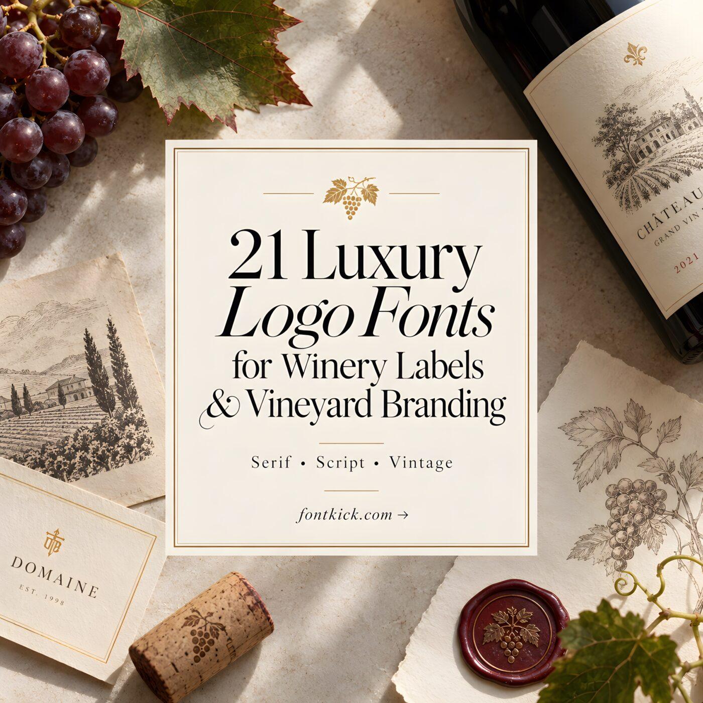
Choosing luxury logo fonts for winery labels and vineyard branding
A winery logo has to carry more than a name. On a bottle label, the type needs enough personality to suggest heritage, craftsmanship, provenance, or modern refinement while remaining recognizable when the label is viewed from a shelf. That makes luxury logo fonts for winery labels unusually dependent on proportion, contrast, spacing, and the length of the vineyard or estate name.
High-contrast serifs can create a polished estate look, traditional display faces can reinforce heritage branding, while selective script lettering can add a more personal signature. The challenge is choosing decorative typography without sacrificing clarity around varietal names, vintages, appellations, and supporting information.
Many more elegant branding fonts are available, while this selection concentrates on styles with distinct roles for winery wordmarks, bottle labels, vineyard identities, and premium packaging.

For winery branding, refined serif fonts are usually the most adaptable choice because they can carry an estate name without overwhelming the rest of a label. Vintage serifs make more sense for heritage-driven brands, while expressive scripts and decorative display faces work particularly well as secondary marks, signatures, or short vineyard names.
Quick Picks for Different Winery Branding Styles
- For polished premium labels: Giventa — high contrast and a fashion-forward structure suit contemporary upscale branding.
- For classic estate branding: Grandeur — a restrained classic serif that works naturally with traditional wine-label layouts.
- For botanical vineyard labels: Bersa Serif — its calligraphic character complements botanical illustrations and artisanal packaging.
- For heritage branding: Victorian Luxury — decorative serif details give short winery names a historic label character.
- For signature-style accents: Cahaya Rembulan — flowing script lettering works as an expressive contrast to restrained supporting type.
Luxury Logo Fonts for Winery Labels and Vineyard Brands
1. Giventa
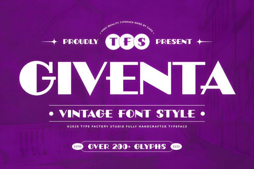
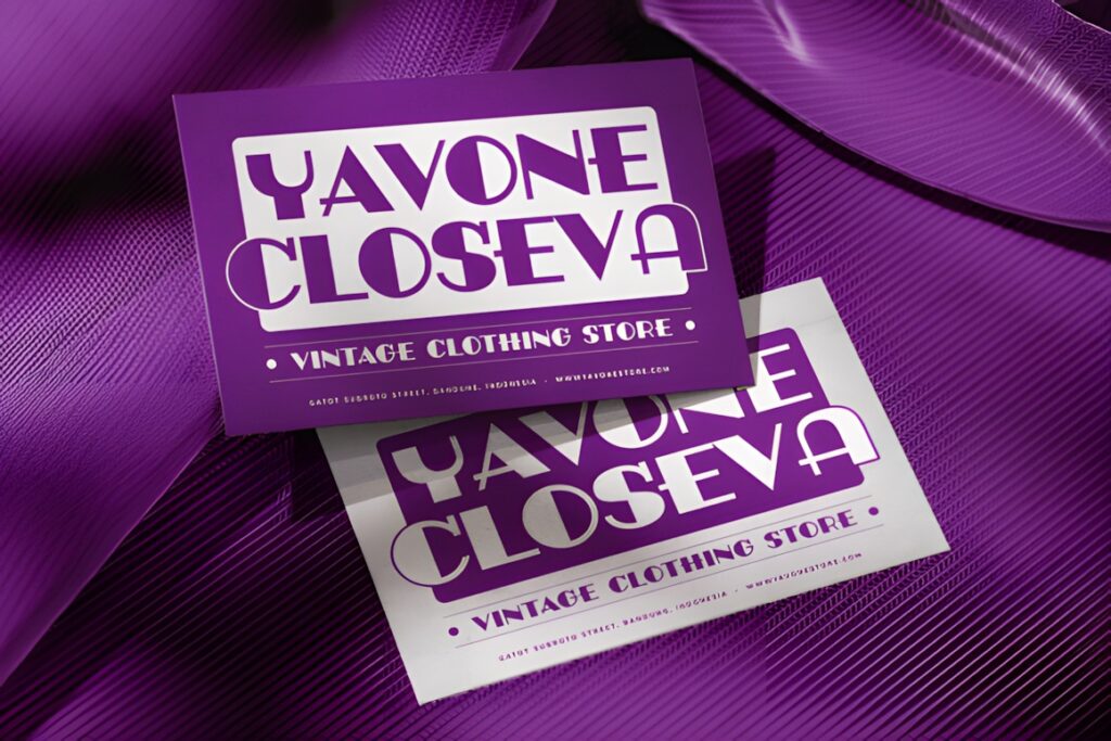
Giventa is a high-contrast serif designed around sophisticated branding and display typography, with distinctive geometric cuts that keep the letterforms from feeling conventionally classical. Its product description specifically identifies premium wine labels among its suitable applications.
The sharper details suit a winery positioned closer to contemporary hospitality, fashion, or boutique luxury than rustic farmhouse branding. Give the name generous spacing and avoid surrounding it with too many ornamental elements. For a more traditional estate identity, Grandeur offers a calmer alternative.
2. Grandeur
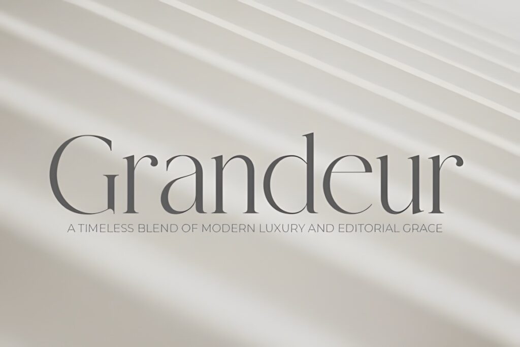
Grandeur is an elegant classic serif whose stated applications include premium wine labels. Its conventional serif foundation makes it particularly useful when a vineyard needs luxury cues without pushing the typography into a highly experimental direction.
This makes sense for estate names paired with crests, vineyard illustrations, foil details, or understated borders. It can carry the main name while leaving visual room for a vintage and appellation beneath it. Choose Giventa instead when the identity needs a more contemporary edge.
3. Dilea
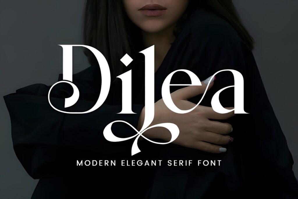
Dilea combines sharp serifs with graceful curves and is presented for luxury branding, including sleek wine-label applications. The typeface also includes access to decorative alternate characters through PUA encoding.
Its strongest role is a spacious modern label where the winery name is allowed to dominate. Decorative alternates can personalize selected letters, but restraint matters on smaller bottles and narrow labels. For dense information hierarchies, pair the main wordmark with a much quieter supporting face.
4. Bersa Serif
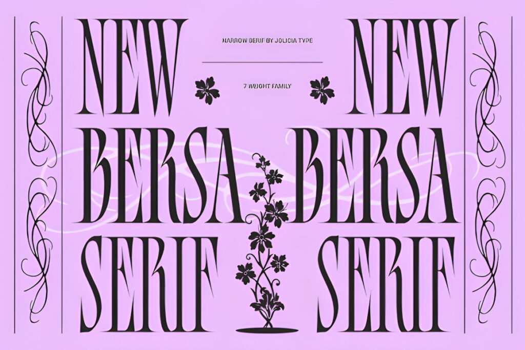
Bersa Serif blends classical calligraphic influence with a subtle blackletter character. The product is specifically described as suitable for boutique wine labels and botanical branding, making it a natural choice for vineyard identities built around grapes, foliage, engraved illustrations, or artisanal detail.
Use it where a straightforward modern serif would feel too restrained. The decorative character gives the winery name more individuality, although the same feature means supporting copy should stay simple. Grandeur or Stockist will be easier choices when maximum restraint is the goal.
5. Golden Title
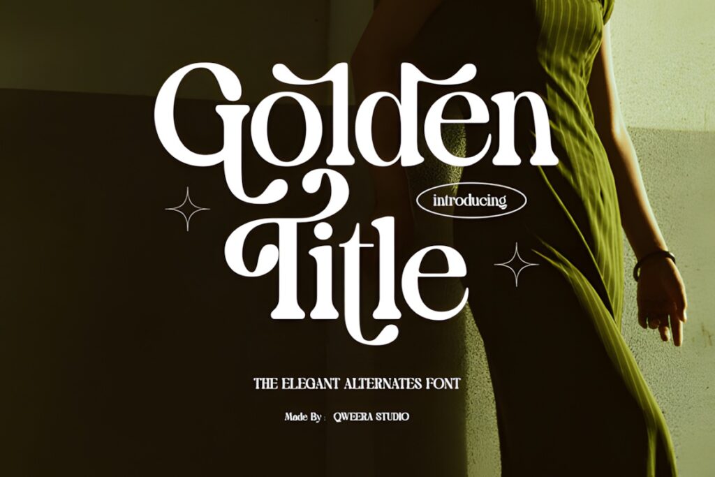
Golden Title is an expressive serif aimed at refined visual identities and explicitly lists premium wine labels among its intended uses. It includes regular and italic styles, while the product page also notes PUA-accessible glyphs, swashes, and alternate characters.
This is worth considering for a winery identity that needs one or two distinctive characters rather than heavy ornament across the entire name. The italic can create secondary contrast, but using too many alternate forms at once may compete with varietal and vintage information.
6. Maffisoy
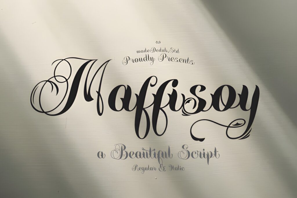
Maffisoy brings a combination of classic elegance and stronger display authority. Its product description specifically suggests premium wine labels along with other upscale branding applications, and both regular and italic styles are shown on the product page.
The stronger presence is useful when the winery name needs to remain visually dominant over illustrations or textured label stock. For an understated minimal bottle, Kervain or Stockist can create a cleaner atmosphere; Maffisoy makes more sense when the typography itself is part of the statement.
7. Lectan Meliona
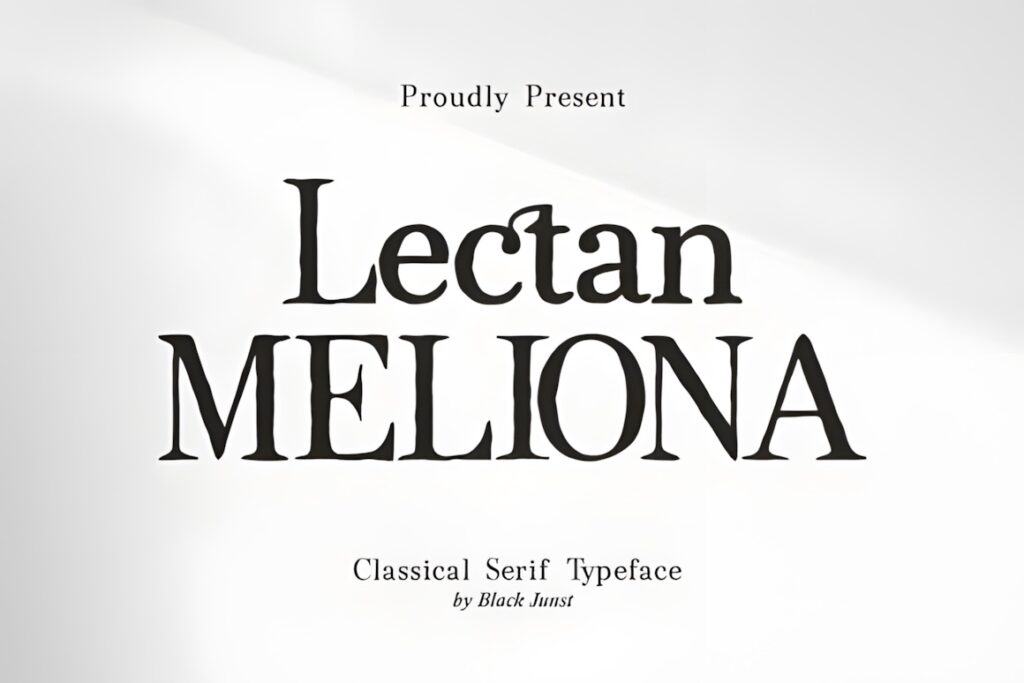
Lectan Meliona is positioned as an upscale display choice and its current product description specifically references premium wine-label design. That gives it a clear role in contemporary winery identities where elegant typography needs to feel polished rather than rustic.
It works naturally for short estate and reserve names with ample negative space around the lettering. Avoid forcing the primary face into every text role on the bottle; detailed origin information and tasting text will generally benefit from a quieter supporting typeface.
8. Selora
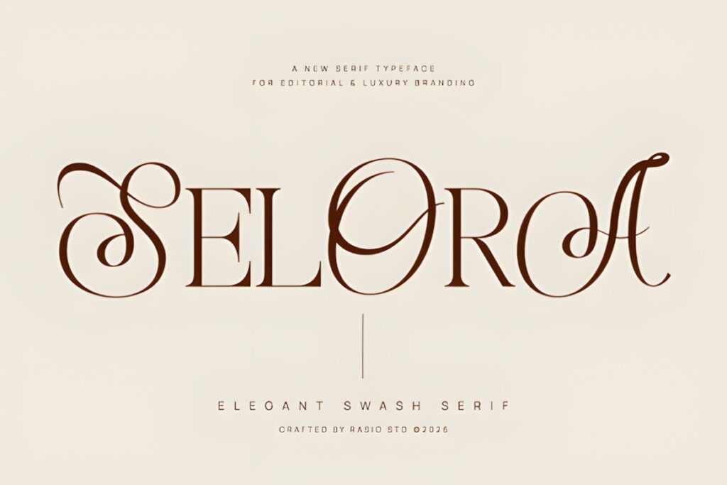
Selora is a high-contrast swash serif created for luxury branding, and upscale winery labeling is specifically listed among its uses. Sweeping calligraphic details give it considerably more movement than a conventional editorial serif.
This font makes sense when the winery name is meant to behave almost like an illustrated wordmark. Keep ornate characters focused around one or two letters rather than filling every word with flourishes. If the label already contains detailed artwork, a simpler serif such as Stockist may keep the hierarchy clearer.
9. Kervain
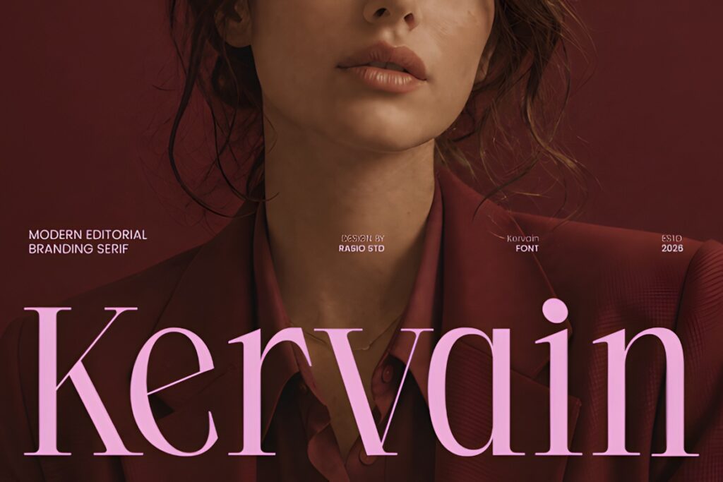
Kervain is a modern editorial serif aimed at luxury logos and sophisticated packaging, with wine-label design named directly among its suitable applications. Its fashion-influenced character is particularly useful for wineries moving away from overtly rustic visual conventions.
Think restrained foil stamping, monochrome labels, broad margins, and a short winery name rather than a heavily illustrated heritage composition. When the identity needs visible age and tradition instead, Victorian Luxury or The Balerus provides a stronger historical cue.
10. Stockist
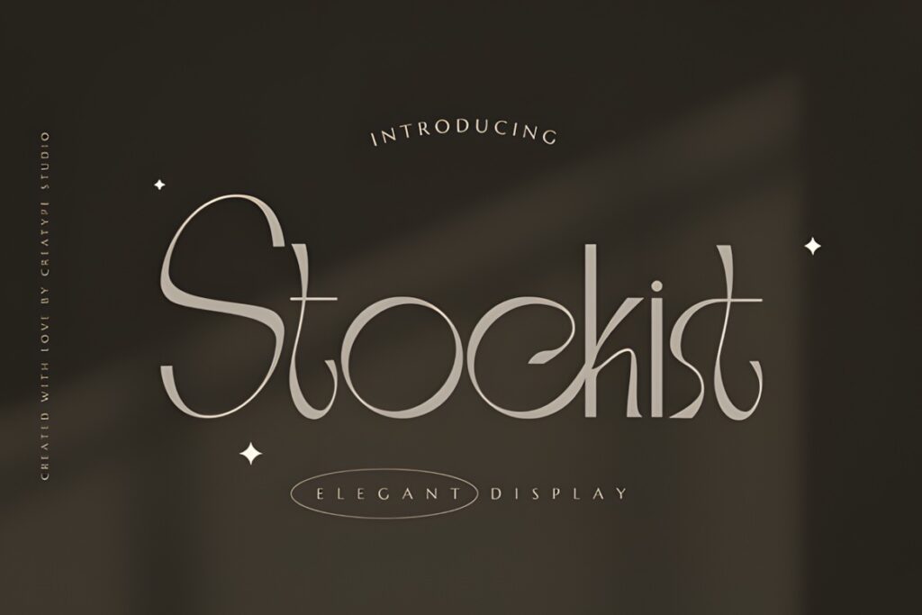
Stockist is an elegant serif intended for logos, branding, product packaging, and labels. Its relatively restrained positioning gives it a practical role in winery systems where the main typography needs sophistication without becoming the only visual element.
Best for: balanced estate branding with illustrations, crests, or decorative borders. Because Stockist is less visually theatrical than Selora or Bersa Serif, it can coexist more easily with other label elements. Choose a more expressive face when typography needs to become the principal decorative feature.
11. Quella
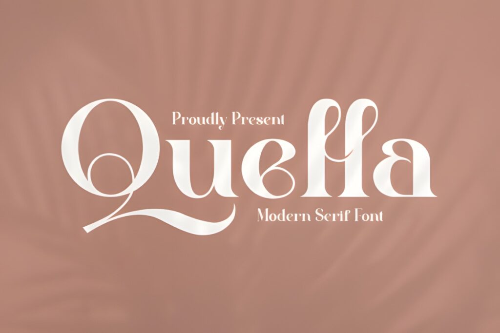
Quella is an elegant serif supplied with regular and italic styles and intended for logos, branding, and labels. The font is PUA encoded, which gives access to its decorative glyphs and swashes for more individualized wordmarks.
The combination works well when a vineyard wants classical structure with a subtle calligraphic touch. Use the regular face for the primary name and reserve the more decorative possibilities for initials or a short secondary phrase. Selora is the more dramatic option when swashes need to dominate.
12. Vintage Capital
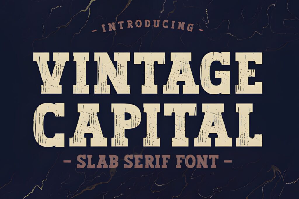
Vintage Capital is a thick slab serif with a deliberately rough texture. Creative Fabrica currently shows it with thousands of favorites, and the product description identifies branding and labels among its suitable uses.
This is a different kind of winery luxury: less fashion-house polish and more cellar, barrel, workshop, or historic merchant character. The rugged texture can add depth to reserve labels or heritage sub-brands, but it may be visually heavy for delicate minimalist packaging.
13. The Balerus
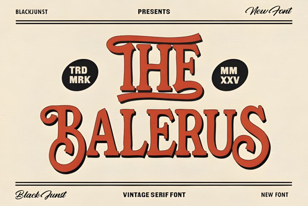
The Balerus is a bold vintage serif influenced by traditional sign painting and classic typography. Its documented features include uppercase and lowercase characters, alternates, ligatures, multilingual support, and OTF, TTF, and webfont formats; labels and vintage beverage branding are among the stated uses.
Its decorative curves fit vineyards leaning into heritage, hospitality, cellar-door culture, or old-world merchant aesthetics. Because it has more visual weight than refined high-contrast serifs, allow breathing room around the wordmark and avoid crowding it with multiple competing display faces.
14. Victorian Luxury
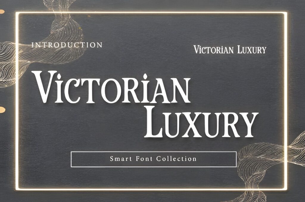
Victorian Luxury is a decorative serif inspired by nineteenth-century typography. The product description specifically positions it for premium spirit labels and heritage branding, with sharp serifs and restrained decorative flares that reference letterpress-era display type.
For a vineyard with an established-date story, crest, historic building, or old-world positioning, this can reinforce the narrative before the customer reads a word of supporting copy. It is less suitable when the desired identity is minimal and contemporary; Kervain handles that direction more naturally.
15. Vintage Boston
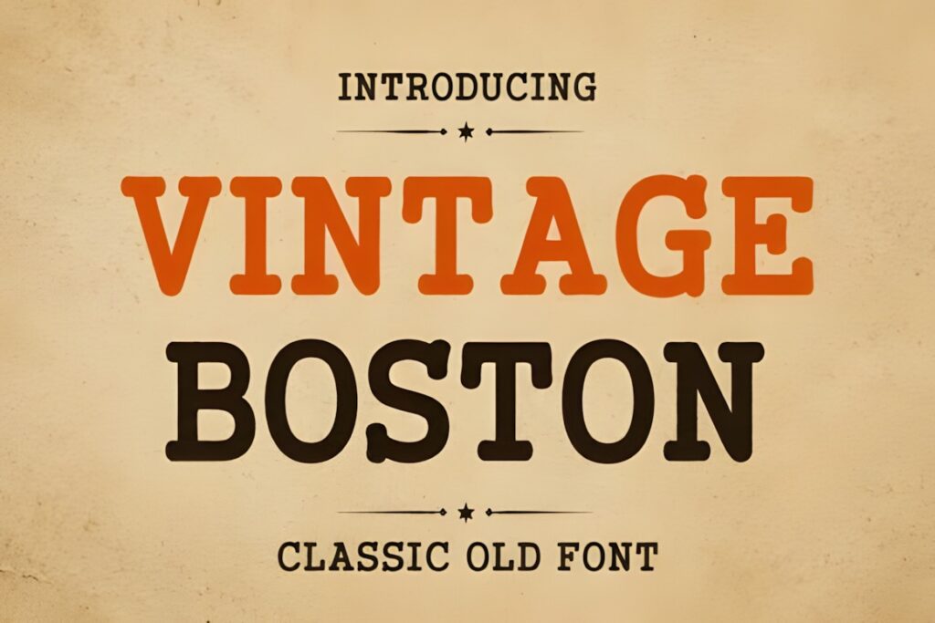
Vintage Boston is a classic display serif influenced by vintage signage and traditional American print design. Its documented uses include logos, branding, packaging, and beverage labels, giving it a practical role for wineries after a warm heritage appearance.
The balanced, substantial letterforms can work for vineyard names that need stronger shelf visibility than a delicate high-contrast serif provides. Consider it for regional, farm-based, or craft-led branding. For a more distressed treatment, Vintage Capital pushes the rustic character further.
16. Vintage Market
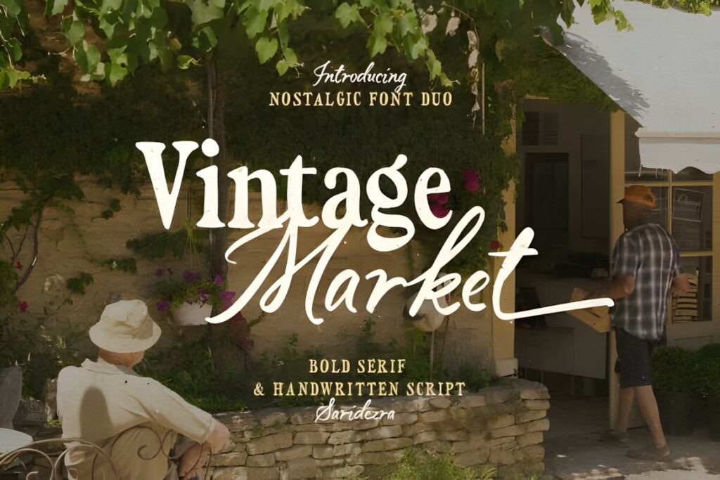
Vintage Market is a font duo combining a bold serif with handwritten script. The script includes ending alternates, and the product description notes multilingual support along with suitability for logotypes and branding.
The duo is useful when one download needs to establish an immediate hierarchy: serif lettering for the estate or product line, then script for a signature, family name, or short accent. Avoid using both styles at equal prominence; one should clearly lead the composition.
17. Stylish Serif
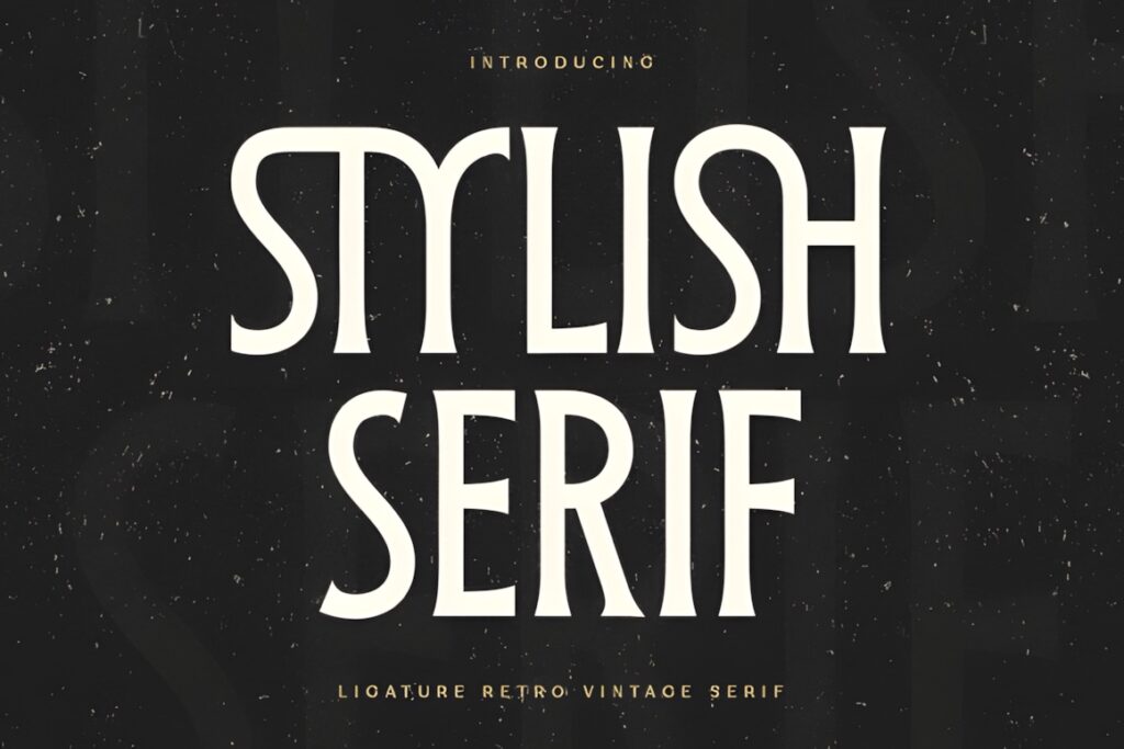
Stylish Serif combines modern, retro, and vintage influences and was created specifically for display, logo, and branding work. Its character makes it useful for wineries that want a recognizable retro tone without moving fully into distressed or Victorian typography.
This can bridge a traditional product category with a more contemporary label system, especially when paired with restrained illustration and generous spacing. For a stronger historic narrative, Victorian Luxury is more explicit; for cleaner prestige, Grandeur is easier to control.
18. Serif Vintage
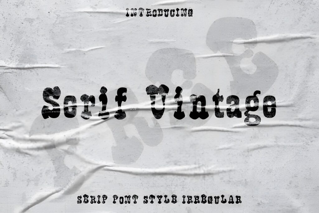
Serif Vintage uses lighter strokes and irregular letter shapes to create a less polished, more individual vintage character. Creative Fabrica currently categorizes it as a serif font and shows active customer engagement on the product page.
It fits limited releases, natural-wine concepts, tasting-room identities, or experimental sub-labels where deliberate irregularity supports the brand. The lighter construction deserves a real-size print check before committing to very small applications. Vintage Boston is a sturdier alternative when stronger presence is required.
19. Vintage
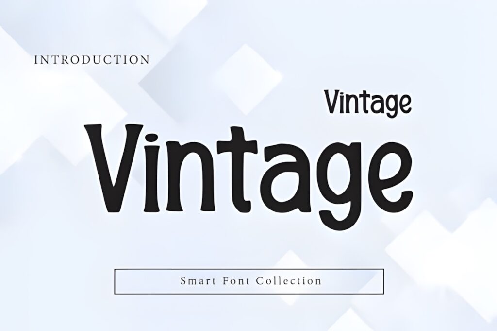
This Vintage serif by Wow Magic uses strong letterforms and softer curves to create a nostalgic display appearance. The product is specifically intended for retro logos, labels, packaging, branding, and signage.
It can support a vineyard brand that wants warmth and familiarity rather than formal luxury. Consider it for casual tasting-room products, approachable regional labels, or a secondary wine range. A high-contrast face such as Giventa will feel noticeably more fashion-led and upscale.
20. Premint
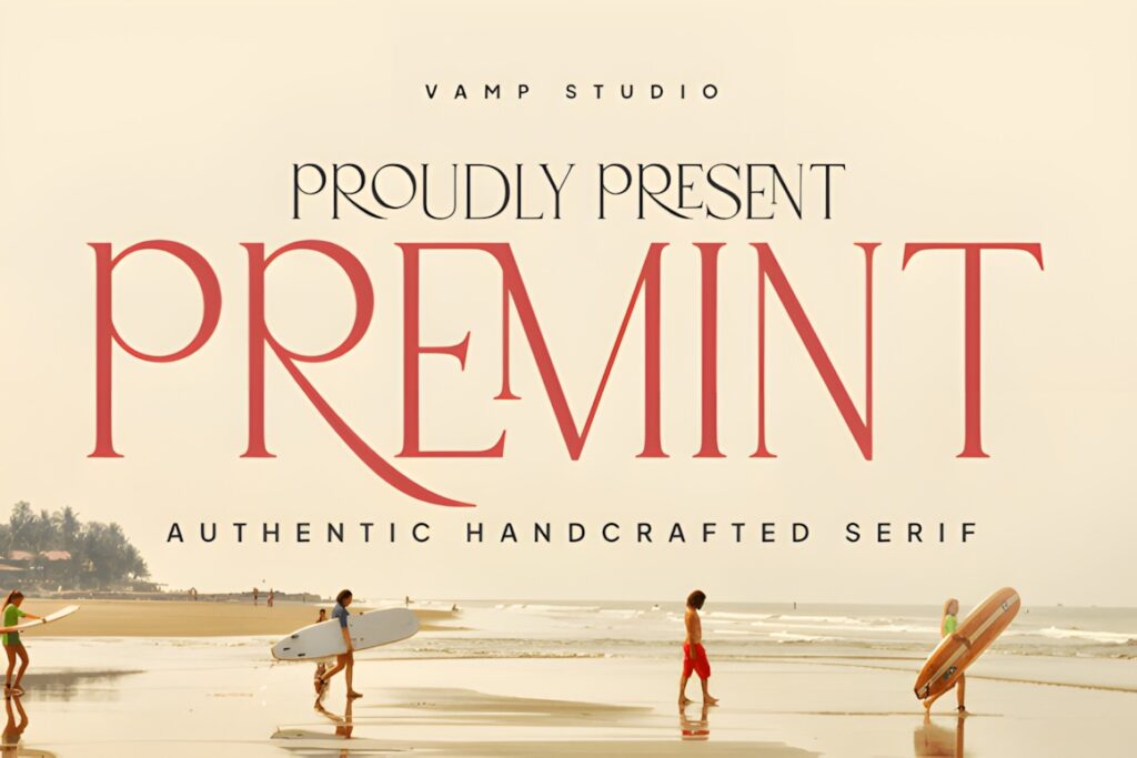
Premint is a clean modern serif positioned for logos, product packaging, product design, and labels. Its simpler visual structure makes it useful when the vineyard identity needs an elegant main typeface that does not compete heavily with photography or illustration.
Consider this when: the bottle uses strong artwork, embossed details, or a prominent emblem and the wordmark needs to support rather than dominate those elements. For typography-first packaging, Dilea or Selora offers more decorative personality.
21. Cahaya Rembulan
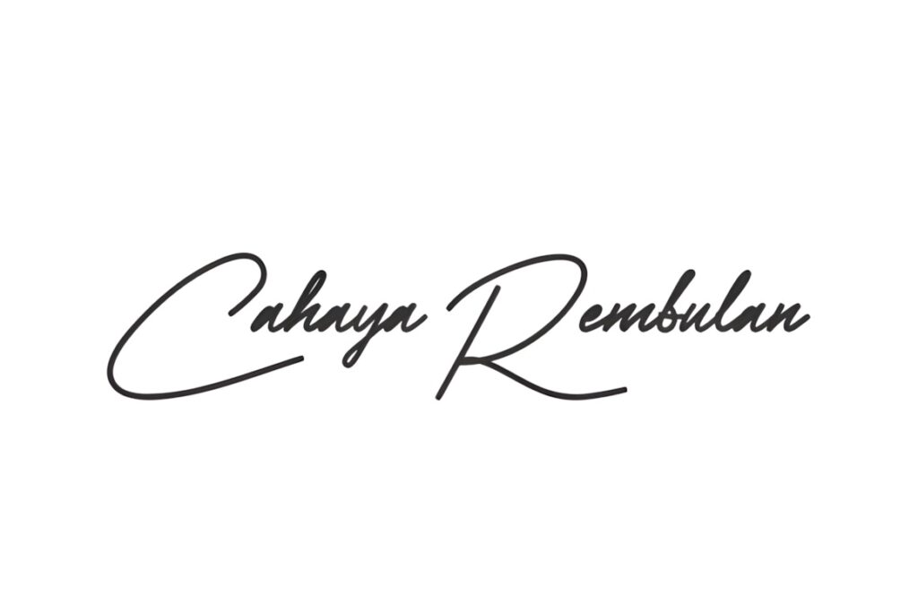
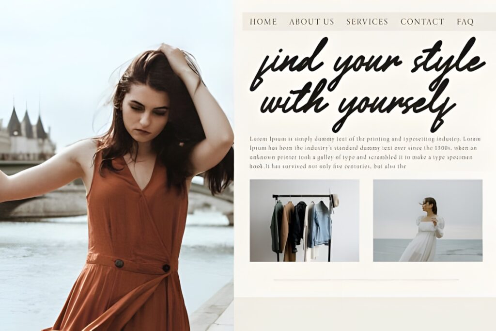
Cahaya Rembulan is a flowing script with connected letters and elongated swashes. Its product description specifically includes boutique wine labels among possible applications and notes PUA encoding for access to decorative characters.
Rather than setting an entire information-heavy label in script, use it as a signature-style winery name, founder name, vineyard designation, or short accent. That gives the lettering room to remain readable. Pairing it with a restrained serif can also create a clearer separation between emotional branding and practical bottle information.
Quick Comparison by Winery Style
| Font | Best for | Style | Key visual trait | Project fit |
|---|---|---|---|---|
| Giventa | Contemporary wineries | High-contrast serif | Geometric details | Modern premium labels |
| Grandeur | Estate branding | Classic serif | Restrained elegance | Traditional bottle labels |
| Bersa Serif | Botanical identities | Decorative serif | Calligraphic influence | Illustrated vineyard labels |
| Selora | Typography-led branding | Swash serif | Expressive flourishes | Luxury wordmarks |
| Kervain | Minimal wineries | Editorial serif | Fashion-led proportions | Clean premium packaging |
| Vintage Capital | Rustic labels | Slab serif | Rough texture | Cellar and heritage concepts |
| Victorian Luxury | Historic identities | Victorian serif | Decorative flares | Heritage estate labels |
| Vintage Market | Layered identities | Serif + script duo | Built-in contrast | Estate and signature combinations |
| Cahaya Rembulan | Signature accents | Script | Flowing swashes | Short vineyard names |
Readability and Size on Wine Labels
Wine labels create an unusual typography problem because the logo may be seen from several feet away on a shelf but also inspected closely in the hand. That means a winery wordmark has to work at both display scale and relatively compact physical dimensions.
Community critiques of real wine-label projects repeatedly raise similar issues: brand names becoming too small, decorative lettering losing clarity, awkward letter spacing, and typography competing with illustrations. These discussions should not be treated as formal design rules, but they highlight practical checks worth making before print.
Print the label at actual bottle size rather than judging it only on a large monitor. Check the winery name, the smallest counters inside letters, the space between difficult pairs, and any thin serif or swash that may lose definition. A beautiful large-screen wordmark is not useful if the brand becomes difficult to identify on the finished bottle.
Building a Clear Label Hierarchy
The primary logo font should not have to perform every typographic job. A wine label may need to communicate the winery, wine name, varietal, vintage, geographic origin, and other required or supporting information. Giving each line equal visual intensity quickly makes the composition difficult to scan.
Use the distinctive serif or script for the winery name, then reduce personality as information becomes more functional. A restrained supporting serif or sans serif can handle vintages and details without competing with the identity. This contrast is particularly important with Selora, Victorian Luxury, Bersa Serif, and Cahaya Rembulan because their decorative characteristics already command attention.
Spacing is part of that hierarchy. A short estate name may benefit from generous tracking in uppercase lettering, while a long vineyard name often needs a narrower composition. Test the actual wording rather than assuming the specimen image represents how your brand name will behave.
Pairing Decorative and Supporting Fonts
A useful wine-label pairing gives the two typefaces different jobs. If the winery name uses an ornate serif, the supporting font should usually be simpler. If the primary identity is a flowing script, a structured serif can give varietal and location information enough authority to balance it.
Contrast does not require choosing two unrelated personalities. Vintage Market demonstrates one practical approach by combining bold serif and handwritten styles in the same product family. With separate fonts, look for contrast in structure and function rather than simply adding another decorative typeface.
For example, use Bersa Serif or Cahaya Rembulan for a short name and a restrained supporting face for the informational hierarchy. With cleaner choices such as Grandeur or Stockist, the label can instead gain personality from illustration, paper texture, embossing, foil, or a vineyard emblem.
Common Winery Font Selection Mistakes
- Choosing from a specimen instead of the real winery name. Test the longest and shortest names that will appear across the product range.
- Using decorative lettering everywhere. The main wordmark needs personality; supporting information usually needs restraint.
- Ignoring reduction. Thin serifs, distressed edges, and swashes can behave differently once the design is printed at bottle-label size.
- Forcing heritage styling onto a modern brand. Victorian and rustic faces communicate a different positioning from minimal editorial serifs.
- Skipping spacing adjustments. Large display lettering often benefits from careful kerning and tracking rather than accepting the default spacing unchanged.
Which Winery Font Style Fits Your Brand?
If the winery is positioned as contemporary and design-led, Giventa, Kervain, or Dilea gives the identity a cleaner luxury direction. For a more classical estate presentation, Grandeur or Stockist keeps the typography sophisticated without excessive decoration.
For labels built around heritage and old-world character, Victorian Luxury, The Balerus, and Vintage Capital communicate history more directly. If the winery needs a personal or signature-style accent, Cahaya Rembulan or the script component of Vintage Market can provide contrast without requiring the entire label to use script typography.
Whichever direction fits the identity, test the exact winery name at actual label size and check the current product license for the intended branding, client, packaging, or commercial use before finalizing the design.
Frequently Asked Questions
What font style works well for a luxury winery logo?
Refined serif fonts are a versatile starting point for luxury winery logos because they can communicate heritage and sophistication without making the label overly decorative. High-contrast serifs feel more contemporary and fashion-led, while classical or vintage serifs reinforce traditional estate positioning. The final choice should be tested with the actual winery name because word length, capitalization, and spacing can substantially change the result.
Can a script font work on a wine label?
A script font can work well on a wine label when it is reserved for short, prominent wording such as the winery name, founder signature, or vineyard designation. Long scripts with elaborate swashes can become difficult to read at small sizes, so supporting details such as vintage, varietal, and region usually benefit from a simpler serif or sans serif. Test the finished composition at actual bottle-label size.
Should winery labels use one font or multiple fonts?
Winery labels can use more than one font when each typeface has a clearly different role. A distinctive display serif or script can carry the winery name while a restrained supporting face handles varietal, vintage, location, and other information. Avoid combining several equally decorative fonts because competing personalities can weaken the hierarchy and make a compact label harder to scan.
Can I use these fonts for commercial winery branding?
Commercial winery branding requires checking the current license attached to the specific font product you plan to use. Licensing terms can affect client work, packaging, editable files, redistribution, and other uses differently. Review the current product license before approving a logo or sending bottle labels to production rather than assuming every font carries identical usage rights.