ℹ️ Affiliate Disclosure: This article may contain affiliate links. If you book or purchase through these links, we may earn a commission at no additional cost to you.
Choosing the Best Halloween Fonts for T-Shirts and Apparel
Halloween fonts for T-shirts need to do more than look spooky on a font preview. Shirt lettering has to remain recognizable from several feet away, work with short phrases, and hold enough visual weight to become the main element of an apparel design. A heavily decorated horror font can create a stronger seasonal mood, while rounded, retro, or bubble lettering often works better for playful Halloween shirts, kids’ apparel, and cute spooky themes.
The fonts below cover chunky display lettering, creepy horror styles, witchy designs, retro Halloween typography, scripts, and softer bubble-letter options. The emphasis is on fonts that can give short shirt phrases a clear personality without relying entirely on separate illustrations.
Many more Halloween fonts are available, while this shortlist concentrates on styles with distinct apparel uses, readable display shapes, and clearly different spooky personalities.

The most useful Halloween T-shirt fonts are usually bold display styles for large phrases, distressed or dripping fonts for horror graphics, playful witchy lettering for retro apparel, and chunky bubble fonts for cute spooky shirts. Match the amount of detail to the print size: elaborate letterforms usually need more space, while simpler heavy shapes can handle compact chest graphics and shorter layouts more comfortably.
Quick Picks
For dramatic gothic apparel: Halloween Font by Umitype — bold Halloween details give large shirt lettering a distinctly eerie personality.
For clean bold typography: Halloween Font by Pian45 — condensed letterforms help longer phrases fit into tighter apparel compositions.
For horror-inspired shirts: Spooky Halloween Font — its vintage horror influence works naturally with darker merchandise concepts.
For playful witchy designs: Witch Halloween Font — groovy shapes suit lighter Halloween shirts and retro seasonal graphics.
For cute spooky apparel: Spooky Bubble Font — rounded all-caps letters and Halloween doodle elements suit friendly ghost and pumpkin themes.
Halloween Fonts for Spooky T-Shirts and Apparel
1. Halloween Font
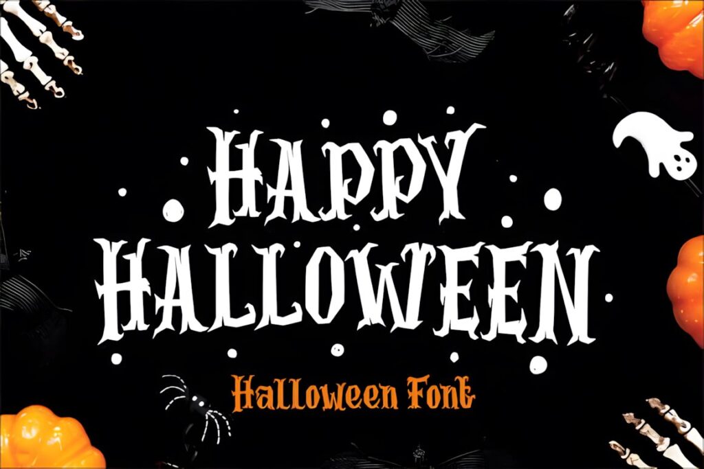
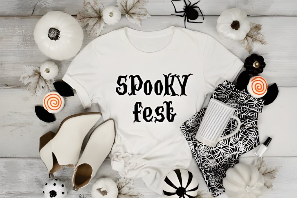
Halloween Font by Umitype is a bold spooky display typeface suited to large T-shirt headlines where the lettering itself needs to establish the Halloween theme. Its gothic-inspired shapes incorporate exaggerated seasonal details, giving short phrases a more theatrical, haunted appearance than a plain heavy display font.
This makes sense for large front prints, event shirts, Halloween merchandise, and compositions where typography shares space with only a few supporting elements. Because the characters contain more decorative personality, keep the wording relatively short and give the letters enough room to remain recognizable. For cleaner or more compact apparel typography, the condensed Pian45 option below is easier to simplify.
2. Halloween Font
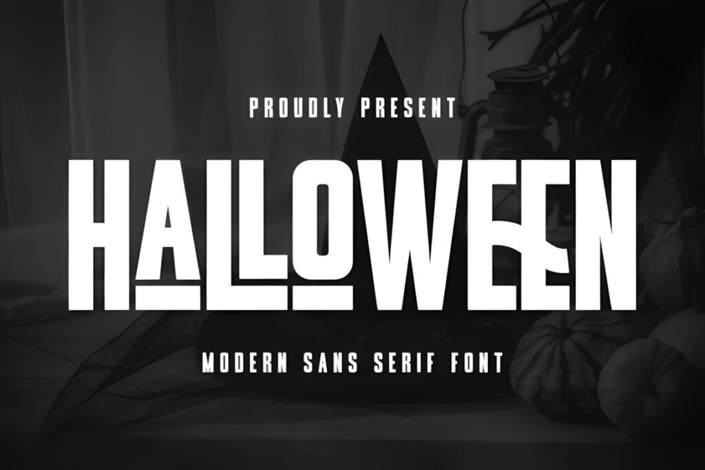
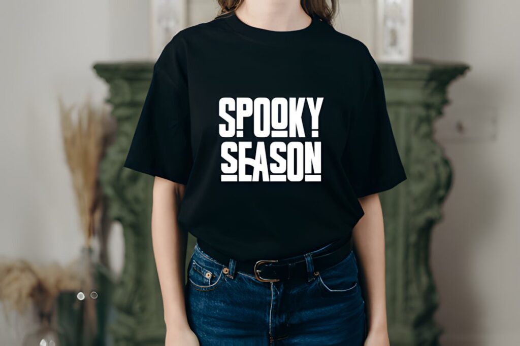
Halloween Font by Pian45 is a bold condensed sans serif created with projects such as T-shirt designs and other craft applications in mind. Its comparatively clean construction gives spooky apparel a modern look while playful cuts and angles prevent the lettering from feeling like an ordinary condensed sans.
The narrower proportions are useful for multiword phrases because more text can fit across a chest print without shrinking the letters as aggressively. Choose this when readability and composition flexibility matter more than elaborate horror decoration. If the shirt needs a distinctly monstrous or hand-drawn personality, one of the decorative fonts later in the roundup will create a stronger theme.
3. Halloween Spooky Font Font
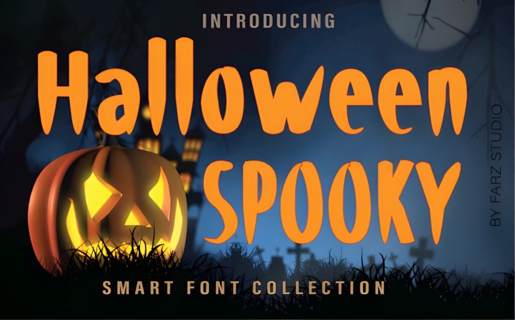
Halloween Spooky Font Font by Farz Studio is a chunky, quirky display style that works well when a Halloween shirt needs substantial lettering without shifting fully into a dark horror aesthetic. The heavy character shapes give simple words and short phrases enough weight to become the center of the print.
It is particularly useful for casual seasonal apparel, family Halloween designs, and craft-oriented typography where a playful mood matters alongside the spooky theme. Chunky letters also pair naturally with small ghosts, pumpkins, or bats positioned around the phrase. For a sharper or more sinister result, Scary Spooky creates a more dramatic direction.
4. Scary Spooky Font
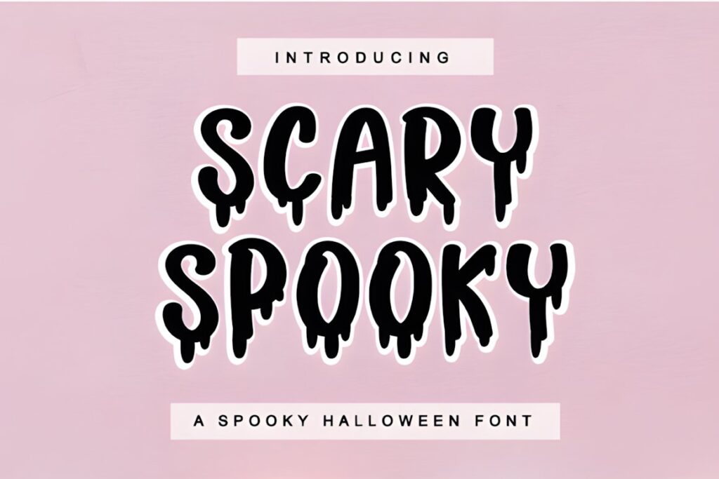
Scary Spooky is a Halloween display font designed for projects that need a more dramatic seasonal presence. Its spooky character makes it a practical choice for large shirt typography, especially short phrases intended to feel darker than cute pumpkin or ghost-themed apparel.
Use it where the words are meant to function almost like an illustration: a single phrase across the chest, a large back print, or a graphic paired with restrained supporting text. Strongly themed fonts can become visually busy when several lines are stacked together, so longer wording may work more comfortably in the cleaner Pian45 font.
5. Spooky Halloween Font
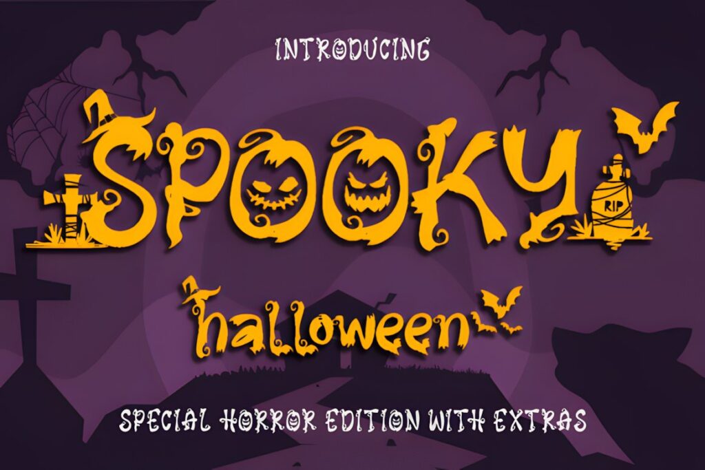
Spooky Halloween by Creaditive Design is a scary decorative font for October-themed designs and includes several styles, including an italic version and extras. That variety gives apparel designers more ways to build a coordinated composition without forcing every word into exactly the same treatment.
This option makes sense for shirts that combine a main phrase with smaller seasonal details or where you want the typography to feel deliberately decorative. Keep an eye on spacing when using extras or more elaborate forms in compact layouts. If the goal is a straightforward heavy headline, Halloween Font by sakwarin art offers a simpler chunky direction.
6. Creepy Spooky Font
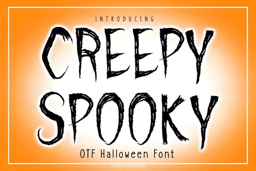
Creepy Spooky is a Halloween font positioned for projects including T-shirt designs, mugs, cards, digital work, and crafts. Its seasonal display personality makes it useful for straightforward Halloween apparel where you want the wording to look themed immediately rather than relying on a separate pumpkin or ghost illustration.
Consider it for slogan shirts, matching Halloween group apparel, or merchandise built around one central phrase. A font this theme-specific is less appropriate when you want subtle autumn styling that can extend beyond Halloween. For a friendlier and more retro direction, Witch Halloween gives the typography a lighter personality.
7. Halloween Font
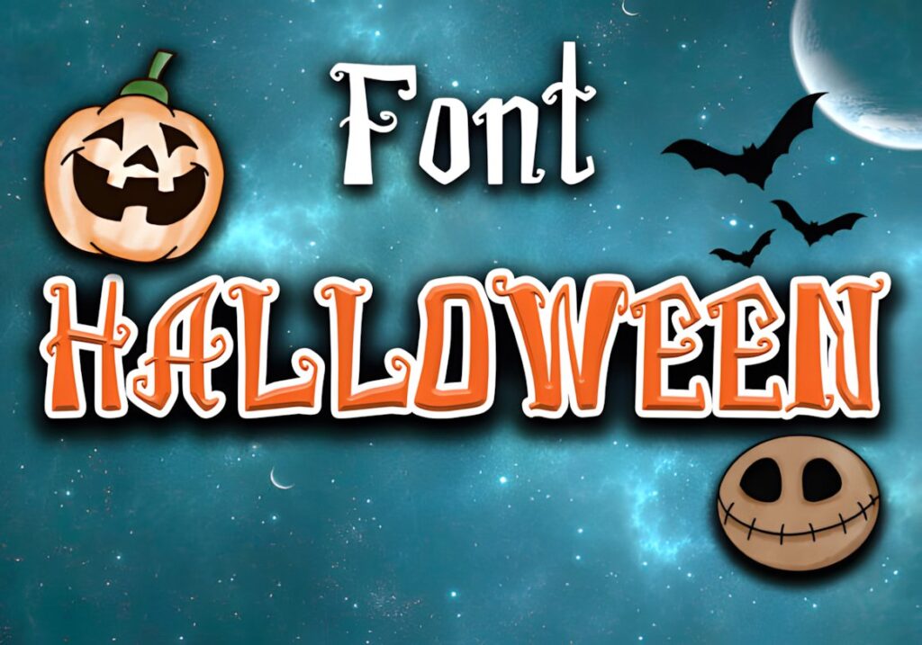
Halloween Font by sakwarin art uses thick spooky display lettering, making it a practical option for shirts where strong type needs to stay visible across a simple composition. The weight gives short phrases a substantial silhouette and leaves plenty of visual room for contrasting seasonal graphics around the text.
Best for: bold Halloween sayings, craft-style shirts, family tees, and layouts that rely on one dominant line of text. Its thick appearance is less delicate than a script, so it suits designs that should read quickly. For a softer handwritten mood, the Lisna.Craft Halloween Font provides a noticeably different approach.
8. Halloween Font
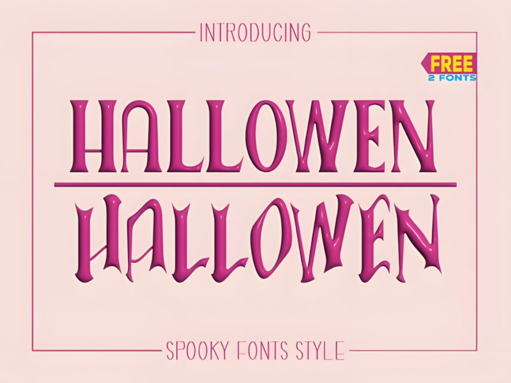
Halloween Font by MistyDesigns is a fun yet spooky display typeface that sits between lighthearted seasonal lettering and a more obvious horror style. That middle ground is useful for apparel intended to feel creepy without becoming too severe or visually aggressive.
A short shirt phrase can carry the full design, while a simple ghost, moon, or pumpkin can reinforce the theme without competing with the letters. Choose it when you need an unmistakable Halloween look but still want room for illustrations. For a design centered on highly decorative letterforms, Spook Halloween pushes the themed details further.
9. Halloween Font
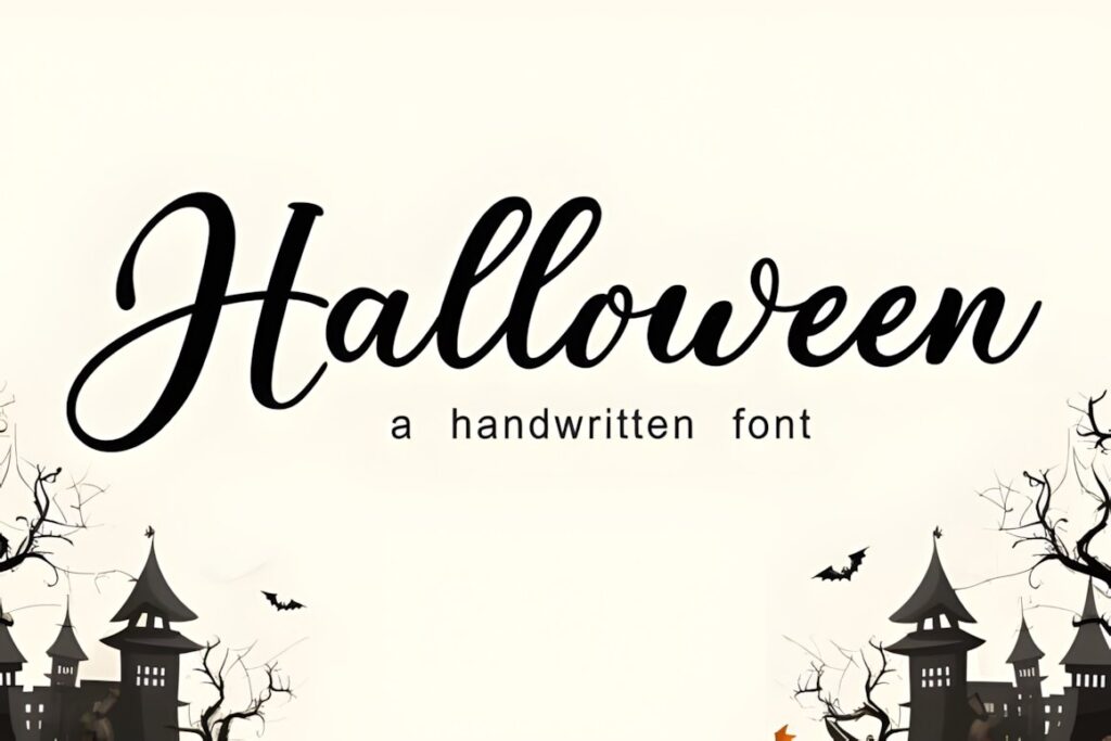
Halloween Font by Lisna.Craft takes the roundup in a script and handwritten direction. Its playful seasonal character is useful when a shirt needs a more casual, personal feeling than a heavy horror headline, particularly for feminine Halloween graphics, family shirts, or softer spooky-season sayings.
Scripts work most comfortably when the phrase is short and the letters have enough breathing room. Avoid packing multiple decorative lines into a small print area, especially when another graphic already dominates the composition. Pair a handwritten Halloween headline with a restrained supporting sans serif rather than another equally expressive display font.
10. Halloween Spooky Font
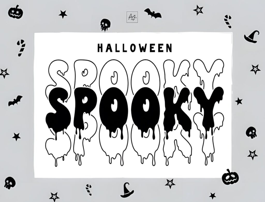
Halloween Spooky by Art cafe is a decorative font with a stacked visual style, making it especially relevant to shirts built around compact blocks of seasonal typography. Instead of stretching a phrase into one long horizontal line, its character can support denser headline arrangements and poster-like apparel compositions.
This works well for chest graphics, centered Halloween slogans, and designs inspired by event posters or spooky signage. The distinctive arrangement already adds visual structure, so surrounding artwork should stay relatively restrained. If you need a more flexible font for long phrases, choose a cleaner or narrower style such as the Pian45 Halloween Font.
11. Spook Halloween Font
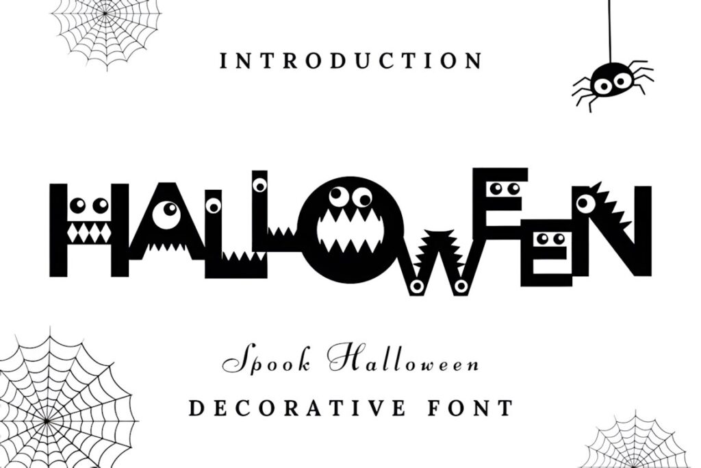
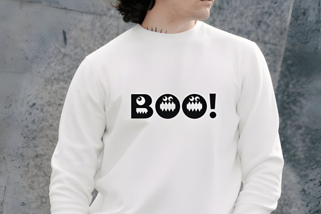
Spook Halloween is a bold decorative typeface whose uppercase letters incorporate monster-like details such as eyes, teeth, and spooky cutouts. The characters themselves can therefore supply much of the illustration in a Halloween T-shirt design, particularly for large names, single words, or short phrases.
The lowercase forms are comparatively cleaner, creating opportunities for mixed-case compositions with a dramatic headline and quieter supporting text. Because the decorative uppercase characters already contain many focal details, avoid surrounding them with an equally busy collection of clipart. For minimalist apparel, one of the simpler chunky display fonts will be easier to control.
12. Witchmist Font
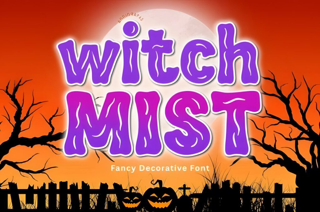
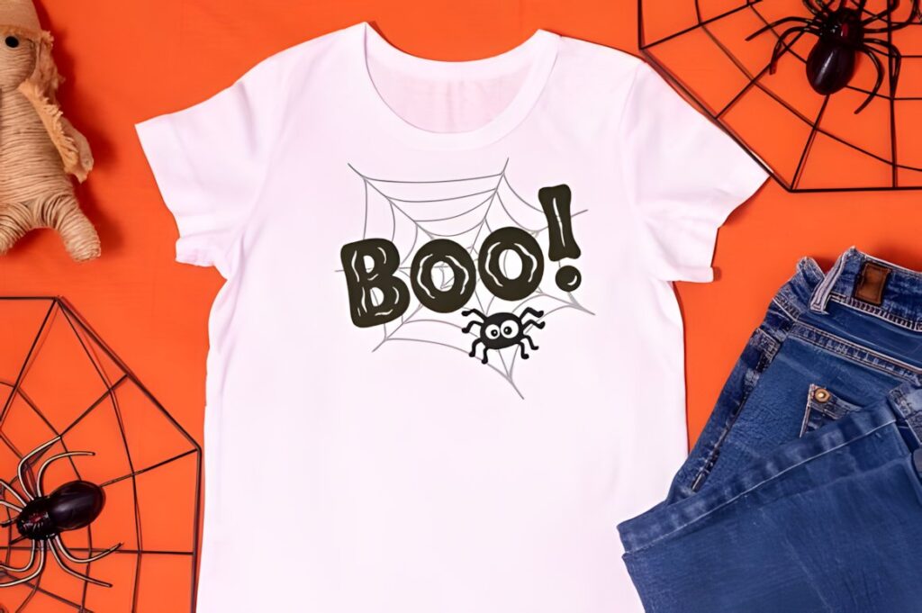
Witchmist is a spooky-cute display font with bold rounded shapes and hand-drawn mist or slime-like streaks. It is specifically suited to projects such as T-shirts, mugs, stickers, posters, treat bags, and sublimation designs, giving it a natural role in playful Halloween apparel.
The rounded construction softens the creepy details, so the finished result can feel fun rather than genuinely frightening. That combination suits kids’ shirts, friendly spooky slogans, and ghost-themed merchandise. Use enough print size for the streak-like details to remain part of the design; for an even softer kawaii direction, Spooky Bubble is the stronger fit.
13. Witchink Font
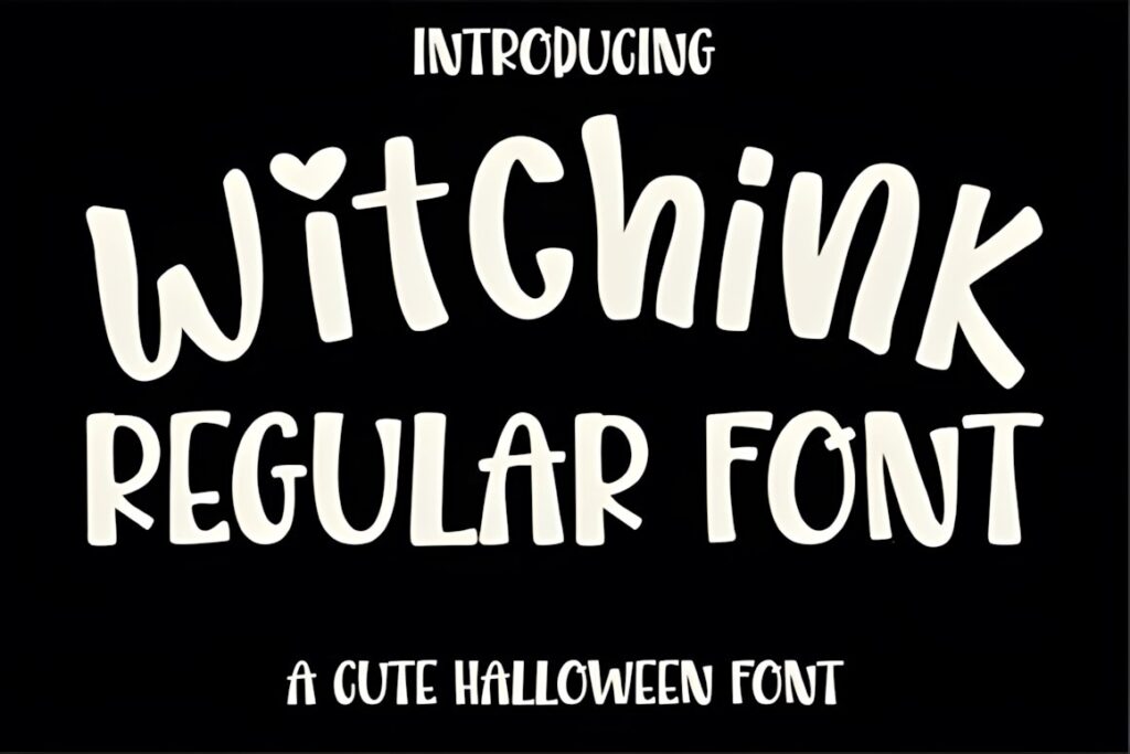
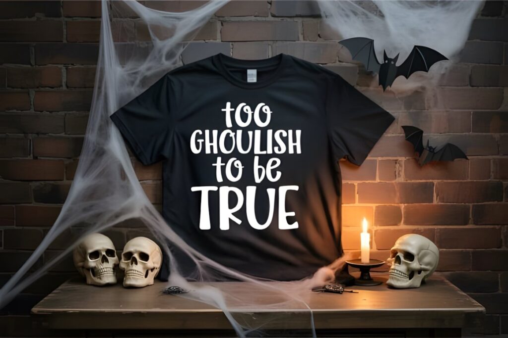
Witchink is a hand-drawn Halloween display font intended for projects including T-shirt designs and party graphics. It includes uppercase and lowercase lettering, numbers, punctuation, and a set of Halloween-themed silhouette glyphs covering motifs such as witches, ghosts, bats, pumpkins, and skeletons.
Those extra symbols are useful when you want typography and small decorative elements to feel stylistically connected. A shirt phrase can stay simple while a bat, ghost, or pumpkin fills empty space around the words. Avoid using too many silhouettes at once; a few accents are easier to balance than turning every available symbol into part of one design.
14. Witch Halloween Font
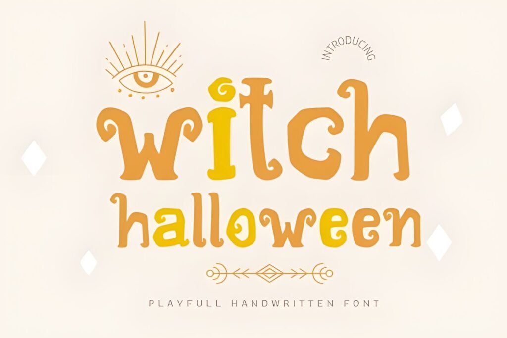
Witch Halloween by Jan Jao studio is a cute display font with groovy, funny styling and is intended for projects including Halloween designs, T-shirts, stickers, crafting, and sublimation. Its retro personality makes it useful when standard horror typography feels too dark for the intended audience.
Choose it for lighthearted witch sayings, matching family apparel, boutique seasonal graphics, or retro-inspired shirts where the typography should feel playful first and spooky second. The groovy character can become visually dominant quickly, so supporting type should remain restrained. Witchmist offers a stronger drippy effect if you want the design to move closer to classic spooky lettering.
15. Spooky Bubble Font
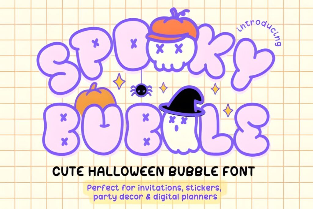
Spooky Bubble Font by narinari32 is an all-caps Halloween bubble font with solid and outline styles plus built-in seasonal dingbat doodles. Its rounded kawaii-inspired lettering offers the clearest cute-spooky alternative in this roundup and is suitable for projects including T-shirts, stickers, party designs, and crafts.
The font makes the most sense for cheerful ghost shirts, kids’ Halloween apparel, cute pumpkin themes, and designs where rounded letters need to remain the central feature. Solid lettering provides more visual weight, while the outline treatment can create a lighter decorative result. For genuinely frightening horror apparel, choose one of the sharper or darker display fonts instead.
Quick Comparison
| Font | Best for | Style | Key visual trait | Project fit |
|---|---|---|---|---|
| Halloween Font | Large spooky phrases | Gothic display | Decorative Halloween forms | Statement shirts |
| Halloween Font by Pian45 | Longer apparel wording | Condensed sans serif | Bold narrow structure | Modern Halloween tees |
| Halloween Spooky | Casual seasonal shirts | Chunky display | Heavy quirky letters | Family and craft apparel |
| Spook Halloween | Character-driven typography | Decorative | Monster details inside letters | Large playful prints |
| Witchmist | Spooky-cute slogans | Rounded display | Mist and slime-like details | Kids and playful tees |
| Witchink | Typography with small icons | Hand-drawn display | Halloween silhouette glyphs | Illustrated shirt layouts |
| Witch Halloween | Retro witch designs | Groovy display | Cute retro shapes | Lighthearted apparel |
| Spooky Bubble | Cute ghost and pumpkin themes | Bubble display | Rounded solid and outline letters | Kids’ and kawaii shirts |
T-Shirt and Apparel Considerations
A font can look impressive at poster size and still lose its personality when reduced to a small shirt graphic. Before finalizing an apparel layout, preview the design close to its intended print proportions rather than judging it only from an enlarged font specimen.
Bold letters are generally easier to make dominant within a chest graphic, but weight alone is not enough. Wide bubble letters can occupy a surprising amount of horizontal space, while condensed lettering lets a longer phrase stay large. Decorative horror fonts often need extra spacing so unusual edges, internal shapes, or thematic details do not merge visually.
The number of words matters just as much as the font. A highly decorated typeface can carry a three-word slogan beautifully but become exhausting across six or seven lines. If the message is long, reserve the Halloween display font for one key phrase and use simpler supporting typography for the remaining text.
Pairing Spooky Display Fonts
Most Halloween display fonts in this list already have enough personality to act as the primary typeface. Pairing two equally decorative fonts usually weakens the hierarchy because both compete to be the focal point.
Use the themed font for the words that carry the joke, mood, or Halloween reference. Supporting information can use a plain sans serif, simple serif, or another restrained typeface with clearly different structure. For example, a chunky “SPOOKY” headline can sit above smaller clean text such as “since 1993” without forcing the secondary wording to compete with the main phrase.
Contrast can also come from scale rather than adding another decorative font. One oversized Halloween word combined with much smaller supporting text is often clearer than several similarly sized lines using different type styles.
Common Halloween Shirt Font Mistakes
- Using too much detail at a small size. Decorative eyes, drips, cuts, and internal shapes need enough space to stay visible.
- Making every line equally expressive. Choose one typographic focal point and let secondary wording support it.
- Ignoring phrase width. A wide bubble font that works for “BOO” may become difficult to fit around a much longer saying.
- Adding too many seasonal graphics. Fonts such as Spook Halloween or Witchink already contain strong Halloween personality, so surrounding artwork can often be simplified.
- Choosing style before audience. A disturbing horror font and a cute ghost bubble font communicate completely different moods even when both are technically Halloween fonts.
- Skipping a full-text preview. Type the actual shirt wording before committing to a font so you can judge letter combinations, capitalization, and overall proportions.
Choosing the Right Halloween Font for Your Shirt
If you want the typography itself to create a dramatic Halloween centerpiece, Halloween Font by Umitype gives large lettering a strongly decorative gothic personality. For longer slogans that need more efficient use of horizontal space, Halloween Font by Pian45 provides a cleaner condensed structure.
For playful spooky apparel, Witchmist combines chunky rounded lettering with drippy seasonal character. Witch Halloween makes more sense for a groovy retro direction, while Spooky Bubble is the clearest choice when the goal is cute ghost, pumpkin, or kid-friendly Halloween typography.
Whichever style you choose, build the design around the actual phrase, audience, and final print scale rather than selecting the most decorative font first. Check the current product license for the exact use you plan, particularly for merchandise, client work, print-on-demand, or products intended for resale.
Frequently Asked Questions
What type of Halloween font works best for T-shirts?
Bold display fonts usually work well for Halloween T-shirts because large, recognizable letterforms give short phrases strong visual presence. Chunky and condensed styles suit straightforward slogans, while dripping, gothic, or monster-inspired fonts create a darker horror mood. Bubble and groovy lettering works better for cute or playful apparel. The final choice should match the phrase length, audience, and intended print size.
Are bubble Halloween fonts suitable for kids’ shirts?
Bubble Halloween fonts are well suited to kids’ shirts when the design calls for a friendly rather than frightening mood. Rounded letters can pair naturally with ghosts, pumpkins, candy, stars, and other playful seasonal motifs. Keep decorative details large enough to remain visible, and avoid crowding the lettering with too many additional graphics. Spooky Bubble and Witchmist are two distinctly playful options in this roundup.
Should a Halloween T-shirt use one font or multiple fonts?
One expressive Halloween font plus one restrained supporting font is usually enough for a clear T-shirt hierarchy. Use the decorative typeface for the main phrase or keyword, then place secondary wording in a simpler sans serif or serif. Combining several spooky fonts can make the composition difficult to scan because every line competes for attention. Scale, spacing, and contrast usually create better hierarchy than adding another decorative typeface.
Can Halloween fonts be used on shirts that will be sold?
Merchandise use depends on the current license attached to the specific font product. Do not assume that every font has identical permissions simply because it appears in a Halloween or T-shirt category. Before producing shirts for sale, review the current license terms for the exact font and intended workflow, especially for print-on-demand, client products, resale, or editable digital products.