ℹ️ Affiliate Disclosure: This article may contain affiliate links. If you book or purchase through these links, we may earn a commission at no additional cost to you.
Choosing Vintage Calligraphy Alphabet Fonts for Award Certificates
Award certificates need lettering that feels ceremonial without making the recipient’s name, achievement, or award title difficult to read. Vintage calligraphy alphabet fonts can create that traditional engraved-document look, but highly decorative scripts vary considerably in stroke contrast, capital flourishes, spacing, and overall formality. For certificates, the strongest choices usually reserve elaborate calligraphy for names and short display lines while leaving dates, descriptions, and signatures to simpler supporting type.
This selection focuses on calligraphic fonts with classical, copperplate-inspired, Victorian, manuscript, or retro characteristics that can give recognition certificates, diplomas, commemorative awards, and presentation documents a more established visual tone.
Many more calligraphy fonts are available, while this shortlist concentrates on styles with distinct certificate uses, readable letterforms, and meaningfully different levels of ornament.

The most useful vintage calligraphy fonts for award certificates combine a formal handwritten character with enough clarity for names and short award titles. Copperplate-inspired scripts work especially well for traditional certificates, restrained classic calligraphy suits professional recognition, and more ornamental Victorian styles make sense when the certificate itself is intentionally decorative.
Quick Picks
- For traditional certificate names: Kattalin Osane — a copperplate-inspired script with formal rhythm and high-contrast strokes.
- For antique document styling: Vintage Manuscript — designed around historical handwriting and old-document character.
- For decorative recognition awards: Tartaglia — flowing connections and looped capitals provide a more ornamental presentation.
- For cleaner formal certificates: The Calligraphy — balanced stroke weight keeps the script decorative without appearing excessively delicate.
- For stronger retro impact: Ardentia — a bold calligraphic interpretation with an intentionally old-world character.
Vintage Calligraphy Alphabet Fonts for Formal Certificates and Awards
1. Vintage Calligraphy
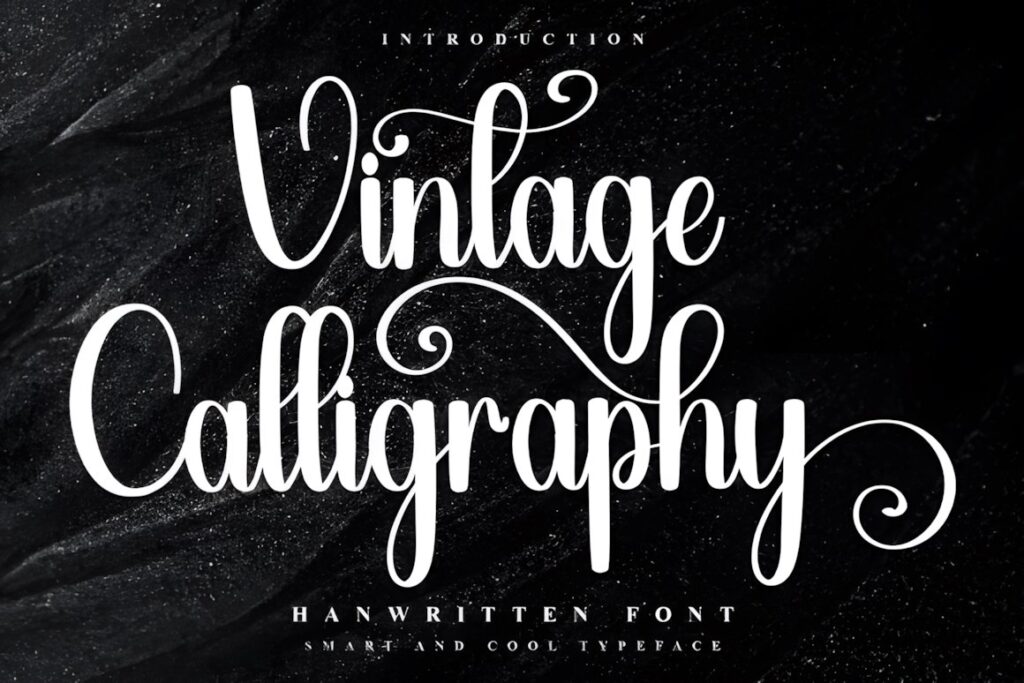
Vintage Calligraphy by Inermedia STUDIO is a decorative script with an unmistakably nostalgic personality, making it useful when a certificate needs more warmth than a strictly institutional copperplate style. Its flowing alphabet works especially well for recipient names, short honorifics, commemorative headings, and creative achievement awards.
The font is PUA encoded and its product page confirms additional glyph and ligature access. Because the lettering has a noticeably decorative character, I would keep supporting details such as dates, award descriptions, and organization names in a restrained serif or sans serif rather than setting the complete certificate in the script. :chatgpt-content-reference{index=”0″}
2. Vintage Signature
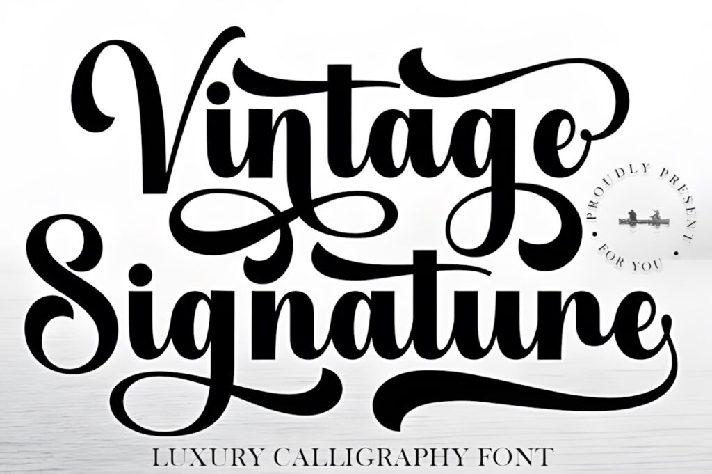
Vintage Signature is a luxury calligraphy typeface built around sweeping curves and balanced handwritten forms. It makes sense for certificates where the recipient’s name should resemble formal penmanship rather than a standard digital heading, particularly for design schools, boutique businesses, creative competitions, and ceremonial presentations.
The more expressive capitals can provide a clear focal point for short names, while longer names may benefit from slightly reduced sizing so the flourishes have breathing room. The font is PUA encoded, giving access to its decorative characters without requiring them on every line. :chatgpt-content-reference{index=”1″}
3. Vintage Manuscript
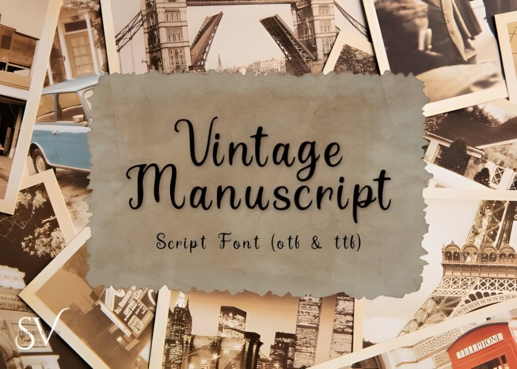
Vintage Manuscript is an antique-style script inspired by historical letters, old book pages, and traditional calligraphy. That makes it one of the more natural choices in this group for certificates designed to resemble archival diplomas, historical society awards, academic acknowledgments, or commemorative documents.
The product includes OTF and TTF files and is specifically positioned for formal and historical projects. Its old-world character is stronger than the softer modern scripts in this list, so it works best when the border, seal, paper texture, and other certificate elements share the same traditional direction. :chatgpt-content-reference{index=”2″}
4. Tartaglia
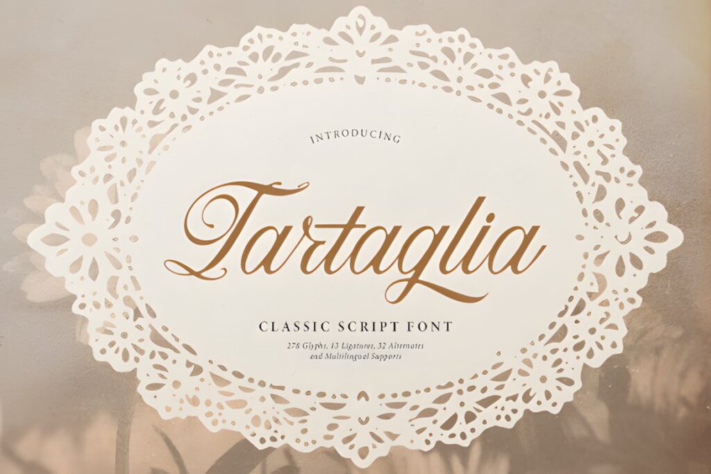
Tartaglia is a refined classic script with looped capitals, flowing connections, and delicate swash accents. On an award certificate, those features make it especially suitable for the recipient’s name, a ceremonial heading, or a short distinction such as “Excellence” or “Achievement.”
Its stronger ornament gives a certificate more romantic or traditional presentation than a minimal institutional style. Choose Tartaglia when decorative elegance is part of the intended design; for highly corporate recognition documents, a quieter script such as The Calligraphy may integrate more easily with restrained layouts. :chatgpt-content-reference{index=”3″}
5. Artistic Script
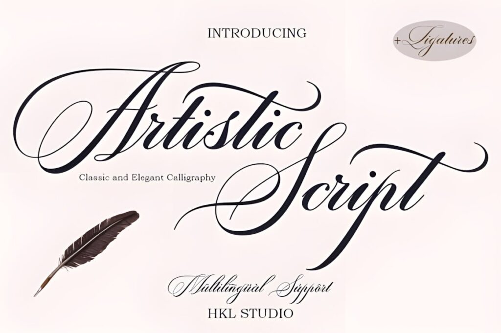
Artistic Script combines decorative copper-style calligraphy with a more contemporary finish. Its changeable characters and classic ornamental direction give designers room to create a distinctive recipient-name line without turning the entire certificate into decorative lettering.
The font is PUA encoded and includes accessible glyphs and swashes. Its formal character is particularly useful for presentation certificates, hospitality awards, fashion or creative-industry recognition, and premium event documentation. Keep elaborate alternates around the main name and allow the remaining certificate typography to provide contrast. :chatgpt-content-reference{index=”4″}
6. The Calligraphy
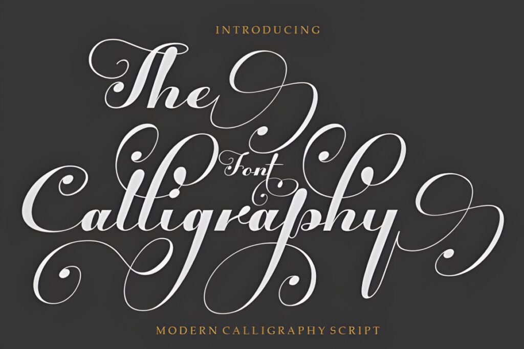
The Calligraphy is an elegant script inspired by classic calligraphy but designed with a balanced, moderate stroke weight. That middle ground is useful for award certificates because it can still communicate ceremony while avoiding some of the fragile appearance of extremely thin formal scripts.
It is PUA encoded and provides additional glyph and swash access. I would consider it for staff awards, graduation-related recognition, training certificates, appreciation documents, and other layouts that need visible calligraphy without making the recipient’s name look overly ornate. :chatgpt-content-reference{index=”5″}
7. Kattalin Osane
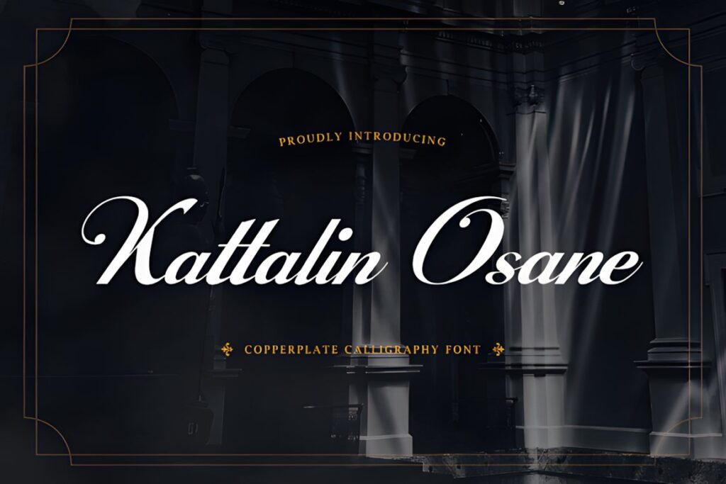
Kattalin Osane is a copperplate-inspired calligraphy typeface with high-contrast strokes, flowing connections, and formal script construction. Those characteristics closely match the visual language traditionally associated with diplomas, official recognition, ceremonial invitations, and engraved documents.
The family includes uppercase and lowercase letters, numerals, punctuation, stylistic alternates, ligatures, and multilingual support according to the product page. The refined rhythm makes Kattalin Osane especially useful when you want a traditional certificate name line without relying on an aggressively distressed or casual vintage effect. :chatgpt-content-reference{index=”6″}
8. Enchanting Calligraphy
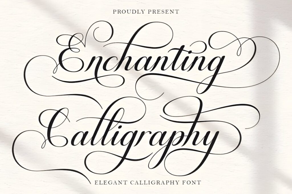
Enchanting Calligraphy blends classic decorative copperplate influences with a cleaner contemporary finish. It is a useful direction for certificates that need traditional formality but will still be viewed in modern digital layouts, presentation PDFs, or polished corporate event materials.
The design includes stylistic alternates and decorative connections, and it is PUA encoded. Because the letterforms retain strong ornament, use the font at a generous display size for names or short award headings rather than forcing it into descriptive copy or qualification text. :chatgpt-content-reference{index=”7″}
9. Belastia Calligraphy
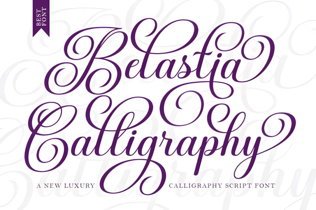
Belastia Calligraphy takes decorative copperplate structure in a slightly bolder direction. The additional visual weight can be helpful when certificates may be printed on ordinary printers or when the name needs to hold its presence against borders, seals, ribbons, or other formal decoration.
The typeface includes decorative letter connections and stylistic alternatives. Compared with very delicate calligraphy, Belastia is a practical option when you still want flowing elegance but need the recipient-name line to remain visually substantial. For understated academic certificates, a lighter script may feel more traditional. :chatgpt-content-reference{index=”8″}
10. Magnolia Calligraphy
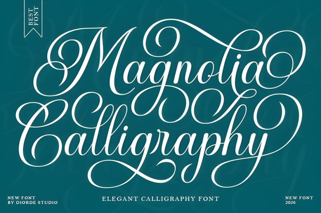
Magnolia Calligraphy is another copperplate-influenced script, but its slightly bold construction gives it a cleaner and more visible presence. It can work particularly well for certificate names that must remain readable when the finished award is printed at a moderate size rather than displayed as oversized lettering.
The font provides stylistic alternatives and decorative connections while maintaining a relatively controlled structure. Consider Magnolia when a thin vintage script feels too fragile but a heavy retro font would pull too much attention away from the certificate’s seal, organization name, or award title. :chatgpt-content-reference{index=”9″}
11. Vintage Melinda
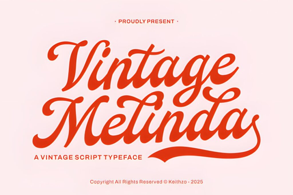
Vintage Melinda combines traditional calligraphic influence with a mid-century-inspired vintage mood. Its fluid lines and refined swashes can soften a certificate that would otherwise feel rigid, making it particularly suitable for creative-business recognition, boutique awards, anniversaries, and presentation documents where warmth matters.
The script is more expressive than a strict copperplate face, so I would use it for the recipient’s name or one short recognition phrase rather than multiple informational lines. For a historical diploma look, Vintage Manuscript offers a more explicitly antique direction. :chatgpt-content-reference{index=”10″}
12. Victorian
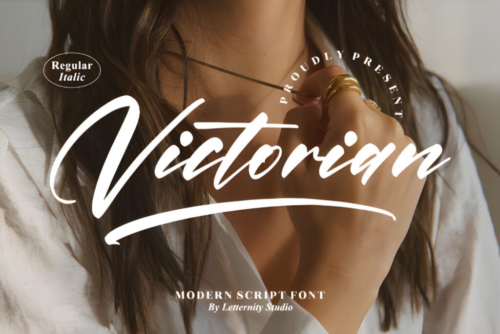
Victorian by Letternity is a thin, graceful script with a distinctly formal and decorative personality. It works when an award certificate intentionally borrows from Victorian stationery, traditional ceremonial documents, ornate borders, or heritage-inspired presentation design.
The font is PUA encoded and provides access to extra glyphs and ligatures. Its thin strokes are part of its appeal, but they also make finished size important. Give the lettering enough scale and contrast rather than shrinking a long recipient name into a narrow space. :chatgpt-content-reference{index=”11″}
13. Calligraphy
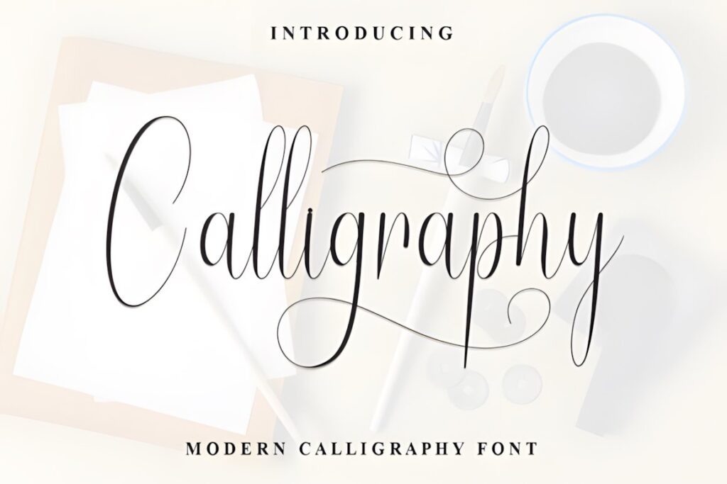
Calligraphy by Roronoa zoro.S.P.D draws directly from traditional copperplate and pointed-pen lettering. Elegant ascenders, sweeping swashes, and high-contrast strokes give it the kind of ceremonial movement that can make a recipient name or distinction line feel intentionally hand-lettered.
The product is PUA encoded and emphasizes a balance between ornament and readability. This makes it worth considering when you want stronger flourishes than Kattalin Osane but still need a recognizably formal calligraphic structure rather than a casual brush-script appearance. :chatgpt-content-reference{index=”12″}
14. Ardentia
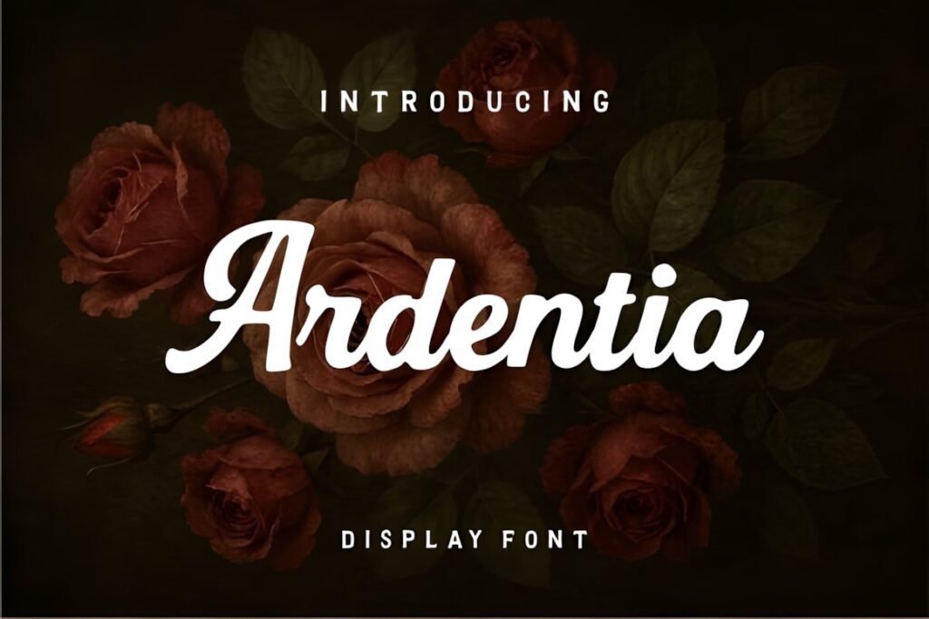
Ardentia is a bold calligraphic font built around retro classic calligraphy and old-world character. Rather than reproducing delicate penmanship, it gives award lettering more visual force, making it a useful alternative for competition certificates, commemorative awards, clubs, societies, or event-based recognition.
The stronger stroke weight can stand up well beside prominent borders and graphic decorations. It is less suited to a quiet, minimalist academic document where delicate copperplate lettering would feel more appropriate, but it offers a clear contrast to the finer scripts throughout this list. :chatgpt-content-reference{index=”13″}
15. Vintage Handmade
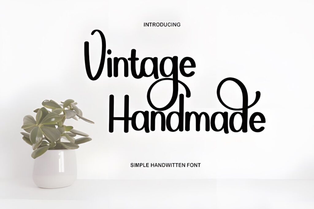
Vintage Handmade is a handwritten font inspired by classic calligraphy but presented with a contemporary finish. Its character is less historically strict than Vintage Manuscript or Victorian, which can make it easier to incorporate into modern certificates that use clean borders, simple seals, and current branding.
Choose Vintage Handmade when the certificate should feel personal and elegant rather than antique. For highly ceremonial recognition, Kattalin Osane offers more explicit copperplate structure; for a friendlier creative award, Vintage Handmade can provide a softer transition between formal and contemporary styling. :chatgpt-content-reference{index=”14″}
Quick Comparison
| Font | Best for | Style | Key visual trait | Certificate fit |
|---|---|---|---|---|
| Vintage Calligraphy | Creative recognition | Decorative vintage script | Flowing nostalgic forms | Names and short headings |
| Vintage Signature | Elegant presentations | Luxury calligraphy | Sweeping curves | Recipient names |
| Vintage Manuscript | Historic certificates | Antique manuscript script | Old-document character | Heritage and academic layouts |
| Tartaglia | Ornamental awards | Classic script | Looped capitals | Decorative certificate names |
| The Calligraphy | Professional recognition | Balanced classic script | Moderate stroke weight | Versatile formal layouts |
| Kattalin Osane | Traditional certificates | Copperplate-inspired | High-contrast formal strokes | Diplomas and award names |
| Belastia Calligraphy | Stronger print presence | Bold copperplate influence | Heavier connected strokes | Names with graphic borders |
| Victorian | Heritage styling | Thin Victorian script | Graceful fine strokes | Large ceremonial names |
| Ardentia | Event awards | Bold retro calligraphy | Old-world visual weight | Decorative competition certificates |
| Vintage Handmade | Modern certificates | Contemporary vintage script | Friendly handwritten form | Creative and business awards |
Readability and Size on Printed Certificates
A certificate usually contains several layers of information: the organization, a phrase such as “Certificate of Achievement,” the recipient’s name, the reason for recognition, a date, and signatures. Vintage calligraphy works most effectively when it owns one of those levels instead of competing with all of them.
For the recipient’s name, test the longest realistic name before finalizing the template. Wide swashes that look balanced around a short sample such as “Anna Lee” can collide with margins when the actual recipient is “Christopher Montgomery.” Reducing decorative alternates is often better than shrinking the entire line until its thin strokes become difficult to reproduce.
Fine Victorian or copperplate styles benefit from generous print size and strong contrast between the lettering and certificate background. Slightly bolder choices such as Belastia Calligraphy or Ardentia can create more visual presence when the layout contains a substantial border or large seal.
How to Pair Vintage Calligraphy With Supporting Type
The easiest certificate hierarchy is to treat calligraphy as display lettering and let another typeface handle information. A traditional serif can reinforce an academic or heritage appearance, while a restrained sans serif makes the same calligraphy feel more contemporary.
For example, use Kattalin Osane or Vintage Manuscript for the recipient’s name, then use a quieter supporting font for “is hereby awarded to,” the achievement description, dates, and administrative details. The contrast gives the calligraphy space to look intentional rather than repetitive.
Avoid pairing two expressive scripts in one certificate. Even if both fonts are attractive individually, competing flourishes can weaken the hierarchy. One decorative alphabet plus one restrained supporting family is usually easier to control.
Swashes, Alternates, and Decorative Capitals
Swashes can make a digital certificate resemble hand-finished lettering, but they work best as controlled accents. Consider adding a decorative initial to the recipient’s first or last name rather than selecting the most elaborate alternate for every letter.
Pay particular attention to descenders on letters such as g, j, and y. Long lower flourishes can interfere with award descriptions placed directly beneath the name. Extended capital strokes can also move beyond the visual center even when the text box itself remains technically centered.
When a font provides alternate characters, build the name first, then adjust individual decorative letters. This preserves readability and lets the certificate remain adaptable for many different recipients instead of being optimized around one sample name.
Common Certificate Font Selection Mistakes
- Using calligraphy for every line. Decorative scripts lose emphasis when headings, names, descriptions, dates, and signatures all use similar lettering.
- Designing around a short sample name. Test long names before fixing the certificate margins and font size.
- Choosing flourishes before setting hierarchy. Establish readable type sizes first, then add swashes where space permits.
- Ignoring the final printing method. Very fine strokes deserve a print test at the actual certificate size.
- Mixing unrelated historical styles. Victorian script, modern geometric sans serif, ornate borders, and unrelated decorative elements can make the certificate feel visually fragmented.
- Assuming every decorative feature must be used. Alternates and ligatures are options, not requirements.
Which Vintage Calligraphy Style Fits Your Certificate?
If you want a traditional copperplate-inspired recipient name, Kattalin Osane gives you formal structure and flowing connections. For a deliberately historic or archival certificate, Vintage Manuscript brings stronger antique-document character.
If the certificate needs more ornament, Tartaglia emphasizes looped capitals and decorative movement. The Calligraphy makes more sense when you need a balanced script that can sit comfortably inside a cleaner professional layout.
For certificates with prominent frames, seals, or event graphics, Belastia Calligraphy or Ardentia provides stronger visual weight. Whatever style you select, test real recipient names and the final print size before turning the design into a reusable certificate template.
Frequently Asked Questions
What type of calligraphy font works best for award certificates?
Copperplate-inspired and restrained classic scripts are usually the easiest vintage calligraphy styles to use on formal award certificates. They provide ceremonial character while keeping recipient names recognizable. More decorative Victorian or retro scripts can work well for themed awards, but they usually need more space around capitals, swashes, and long names.
Should the entire certificate use a calligraphy font?
A calligraphy font is usually more effective when reserved for the recipient’s name or another short focal line. Supporting information such as the award description, date, organization name, and administrative details is easier to scan in a restrained serif or sans serif. This contrast also gives the calligraphic line more visual importance.
How can I keep a decorative script readable on a certificate?
Use the decorative script at a generous size, test long recipient names, and limit unnecessary swashes. Fine hairlines should also be checked at the actual print size because details that look clear on a large monitor may appear lighter in print. Keep strong contrast between the lettering and certificate background.
Can I use these fonts for certificates for clients or businesses?
Check the current license attached to the specific font before using it for client, business, resale, print-on-demand, or editable digital-template work. Licensing terms can affect how a finished certificate or reusable template may be distributed, so the product’s current license information should be reviewed for the exact use you plan.