ℹ️ Affiliate Disclosure: This article may contain affiliate links. If you book or purchase through these links, we may earn a commission at no additional cost to you.
Choosing the Best Vintage Calligraphy Alphabet Fonts for Book Covers
Vintage calligraphy alphabet fonts can give a book cover romance, age, mystery, or literary character, but decorative lettering becomes a problem when the title has to remain recognizable at thumbnail size. A sweeping script that looks impressive across a full-size jacket may turn into tangled strokes on an ebook storefront, while an ornate historical face can overwhelm a long title before the author name is added.
For book cover design, the useful differences are not simply “elegant” versus “vintage.” Letter width, stroke contrast, connected forms, flourishes, texture, and the density of uppercase characters all change how convincingly a font works for romance, historical fiction, gothic stories, memoirs, literary editions, or period-inspired nonfiction.
Many more vintage scripts are available, while this selection concentrates on fonts with clearly different personalities and practical roles for book titles, author names, series branding, and period-inspired cover typography.

The most useful vintage calligraphy fonts for book covers usually fall into four groups: flowing scripts for romance, irregular handwriting for historical or personal stories, ornate Victorian lettering for dramatic display titles, and blackletter-influenced calligraphy for darker period themes. The right choice depends primarily on title length, genre, cover scale, and how much decoration the artwork can support.
Quick Picks
For elegant historical romance: Vintage Signature — flowing calligraphic forms give short romantic titles a refined handwritten presence.
For journals and historical fiction: Heritage Ink — weathered handwriting creates a believable archival and manuscript-inspired mood.
For ornate Victorian covers: Zoe — elaborate internal decoration makes it suitable for short titles that need an antique ornamental centerpiece.
For medieval or Renaissance themes: Old Master — blackletter structure and ornamental detailing create a more formal historical tone.
For bold vintage scripts: Flamboyant — its heavier handwritten character works when delicate calligraphy would disappear against detailed artwork.
Vintage Calligraphy Fonts for Different Book Cover Styles
1. Vintage Signature
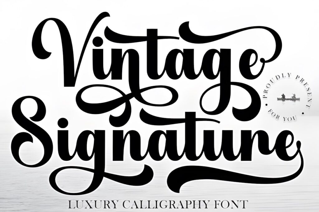
Vintage Signature is a luxury calligraphy font with sweeping curves and a refined handwritten rhythm, making it a strong fit for romance, women’s fiction, memoir covers, and titles that need a polished signature-like treatment. Its calligraphic movement gives a short title an immediate focal point without relying on block lettering.
The font includes PUA-encoded special characters and decorative elements, giving designers more flexibility when building a distinctive first or final letter. Keep the most elaborate forms around one important word rather than filling a long multi-line title with flourishes. For a more weathered historical effect, Heritage Ink offers a less polished alternative.
2. Heritage Ink
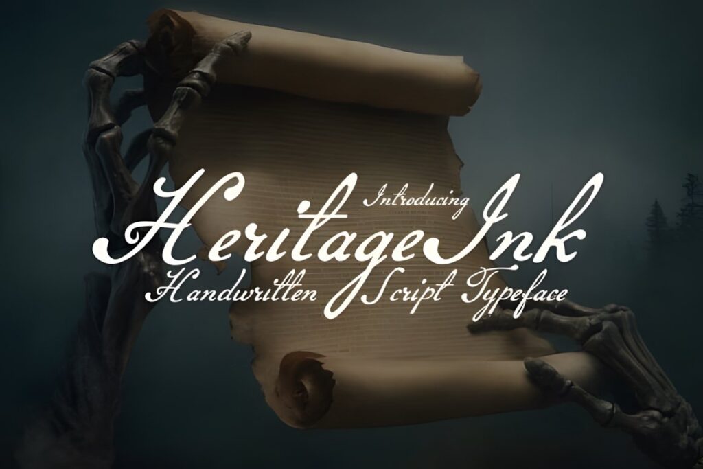
Heritage Ink is a vintage handwritten script built around aged journals, old letters, and historical penmanship. Its irregular flowing strokes make it especially useful for historical fiction, family sagas, fictional diaries, map-inspired covers, and stories where the typography should feel connected to an earlier period.
The texture and natural irregularity provide more atmosphere than a polished wedding-style script, which can help a cover suggest found documents or handwritten correspondence. That character also means small secondary text should usually use something cleaner. Reserve Heritage Ink for the title, a character name, or another deliberate display element rather than dense informational copy.
3. Meighan Script
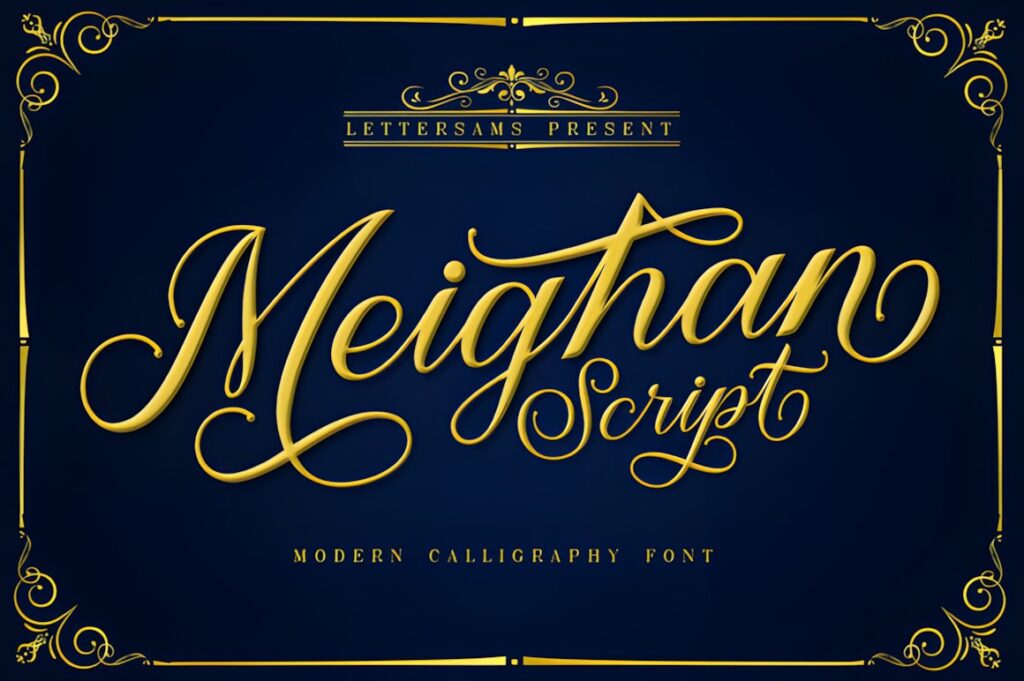
Meighan Script is a thick vintage calligraphy font suited to covers that need handwritten elegance with more visible stroke weight. Its combination of script movement and stronger forms can work well for romantic fiction, lifestyle books, light historical stories, or illustrated covers where very thin calligraphy would struggle for attention.
The product is specifically presented for book covers as well as posters, magazines, labels, and branding. The thicker character makes Meighan particularly useful for medium-length titles. If the artwork is already ornate, however, a more restrained script such as The Antique may create cleaner hierarchy.
4. Zoe
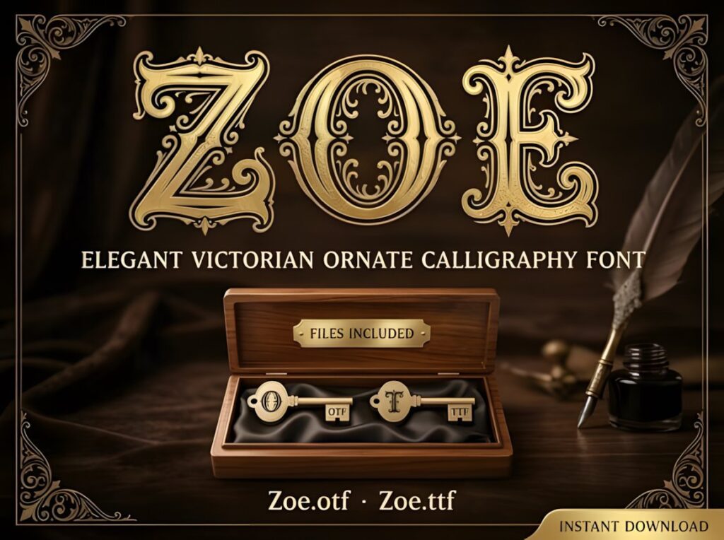
Zoe takes vintage calligraphy in a much more ornamental Victorian direction. Its letterforms use decorative scrollwork and internal flourishes, creating a dramatic display style for antique book covers, gothic romance, historical fantasy, period mysteries, or collector-style editions.
This is the kind of font that works most convincingly when the title is short and given generous space. Intricate detailing can lose definition quickly at small sizes, so avoid forcing an entire subtitle or long author line into the same treatment. Use Zoe when the lettering itself needs to behave almost like an illustration.
5. Old Master
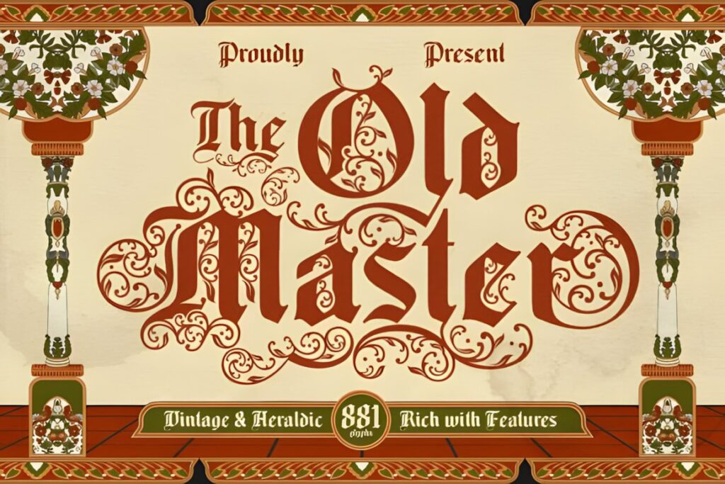
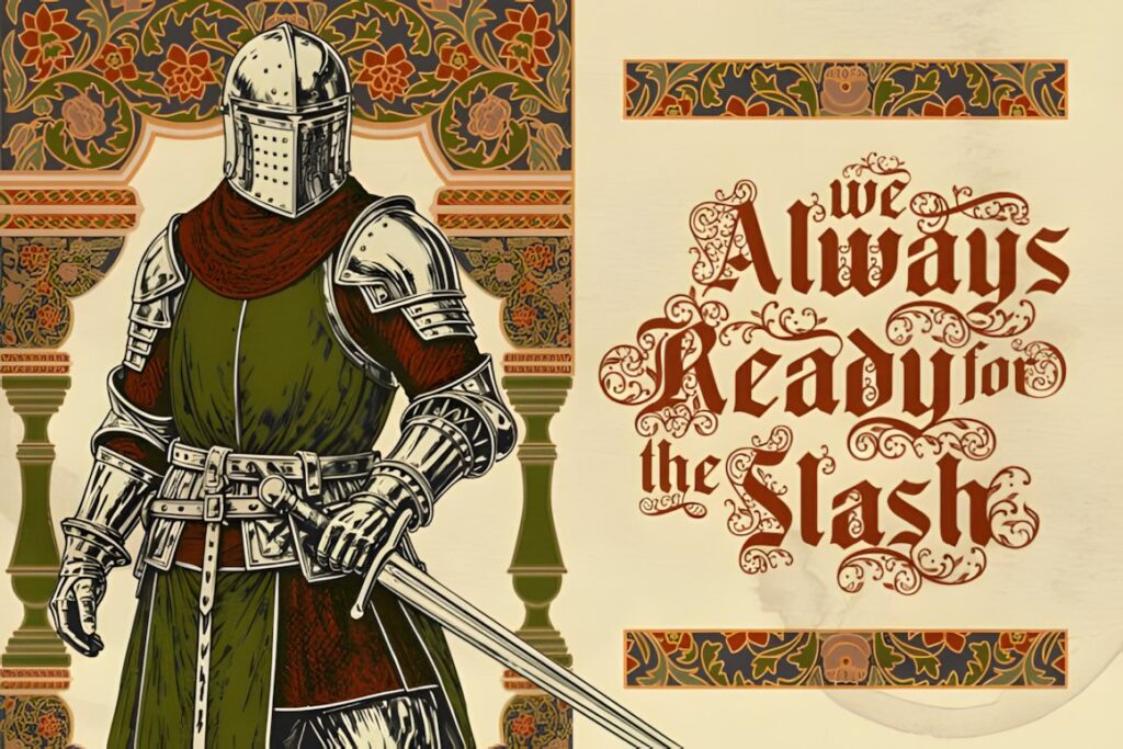
Old Master is an ornamental blackletter typeface inspired by medieval script, Renaissance decoration, and historical calligraphy. For book covers, that makes it useful for medieval fiction, dark historical fantasy, occult themes, legends, period dramas, and editions that need unmistakable old-world authority.
Its elaborate uppercase forms can create a striking initial or compact title lockup, while the sharper lowercase characters maintain a strong historical personality. Because blackletter structures are denser than flowing scripts, spacing and scale deserve extra attention. For something similarly historical but less ornate, Avenford provides a smoother vintage gothic direction.
6. Vintage Script
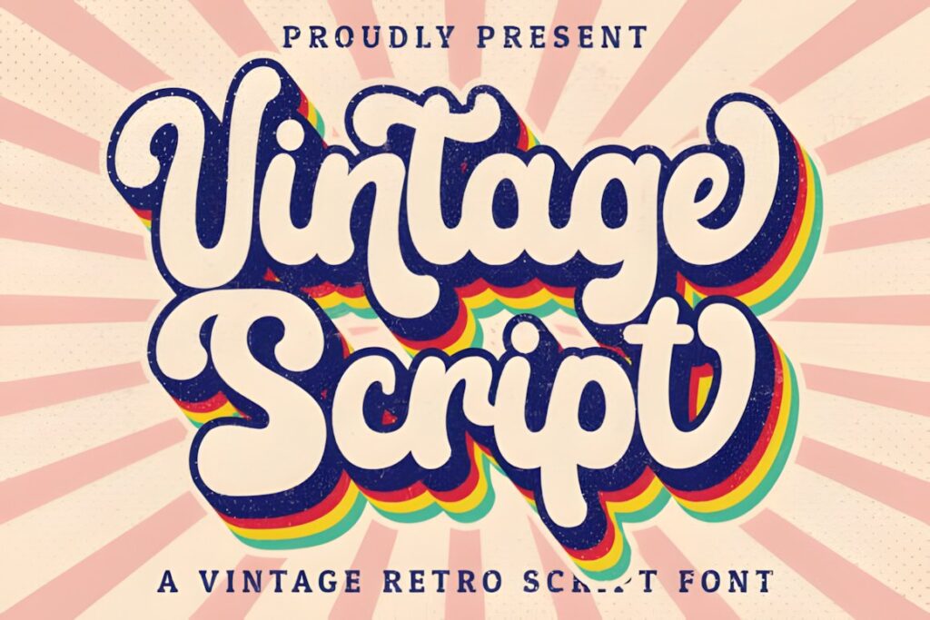
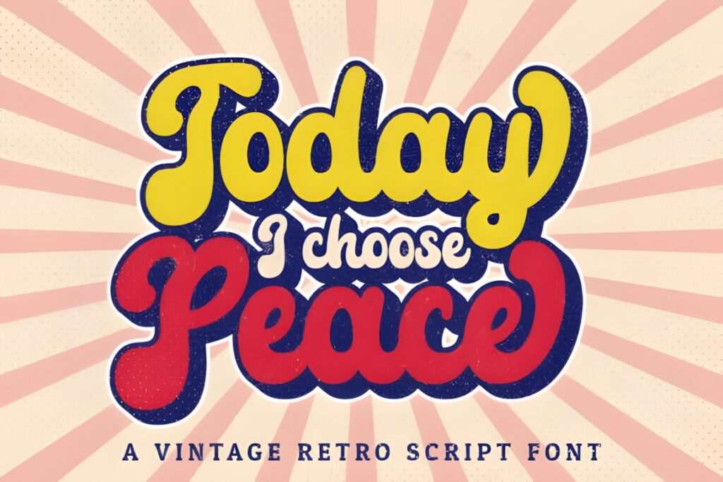
Vintage Script is a handwritten script with a clear retro character and accessible swashes, making it suitable for nostalgic romance, cozy fiction, retro-inspired nonfiction, or illustrated covers that need a friendly rather than formal vintage voice. The lettering feels more casual than the ornate historical choices in this list.
PUA encoding gives access to its additional glyphs and swashes. Those extras are most useful for shaping the opening or ending of a title rather than decorating every word. Consider Vintage Signature instead when the book needs a more polished luxury mood, or Heritage Ink when authenticity and age matter more than smoothness.
7. Malograh
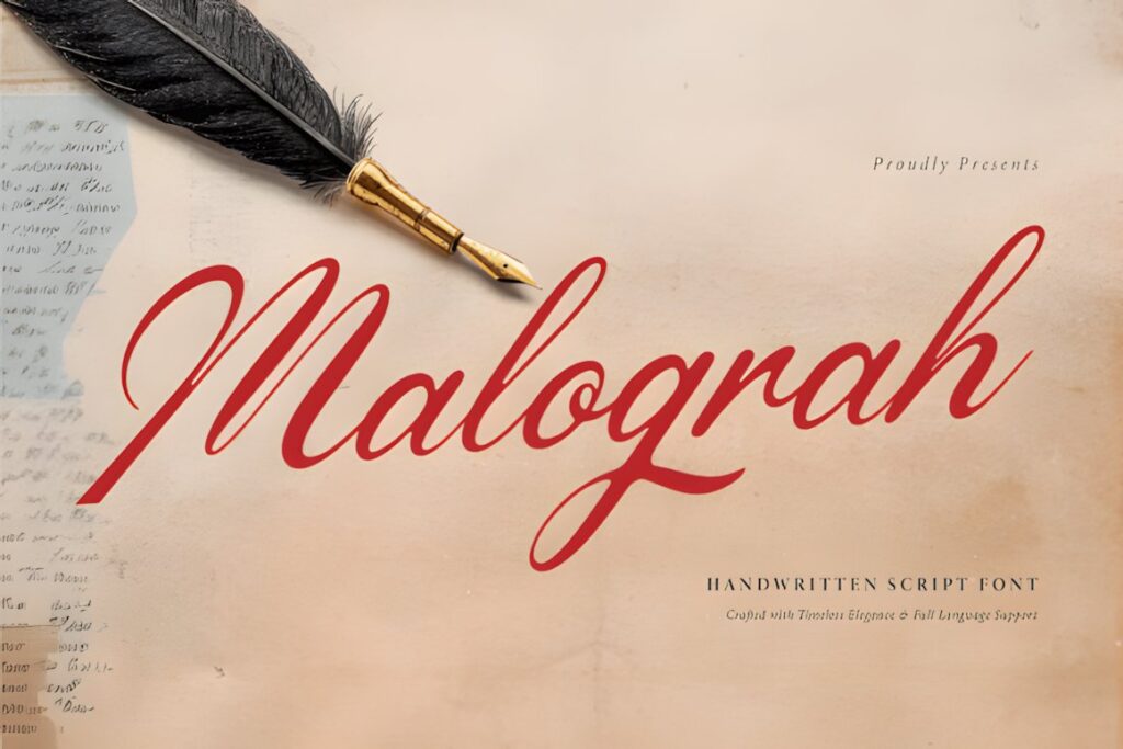
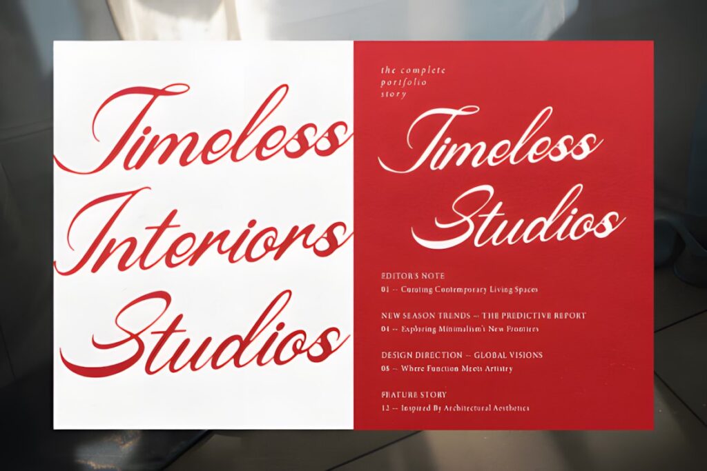
Malograh is a connected handwritten script influenced by classic penmanship and dip-pen calligraphy. Long loops and fluid strokes give it the right character for romantic fiction, poetry collections, sentimental memoirs, heritage stories, and book covers built around an elegant handwritten title.
Its flowing structure is most effective when the title has enough open space around it. Covers with busy photography or several stacked words may need stronger contrast or simplified styling to preserve recognition. Choose Malograh when the handwritten movement is part of the emotional tone; Meighan Script makes more sense when greater stroke weight is needed.
8. Sentiny Lovelyn
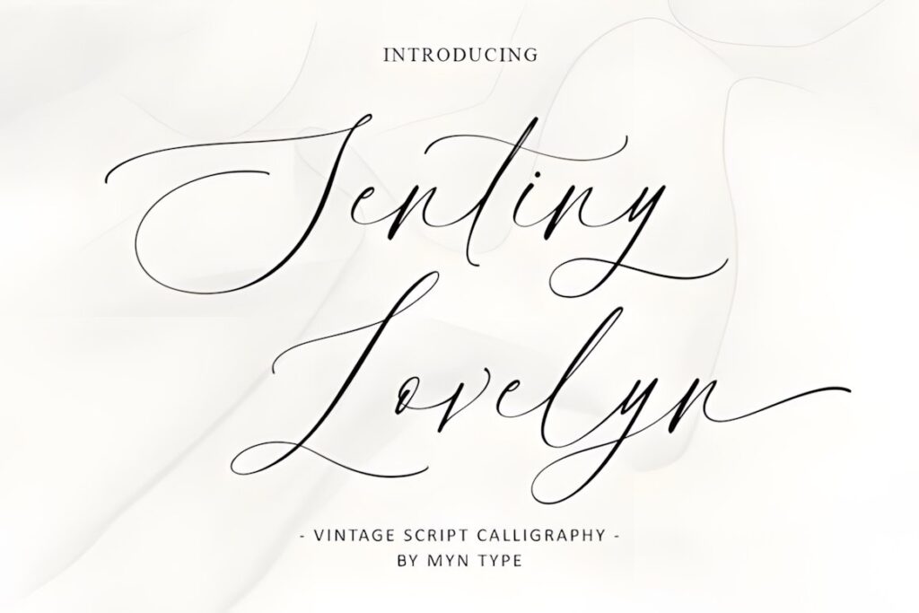
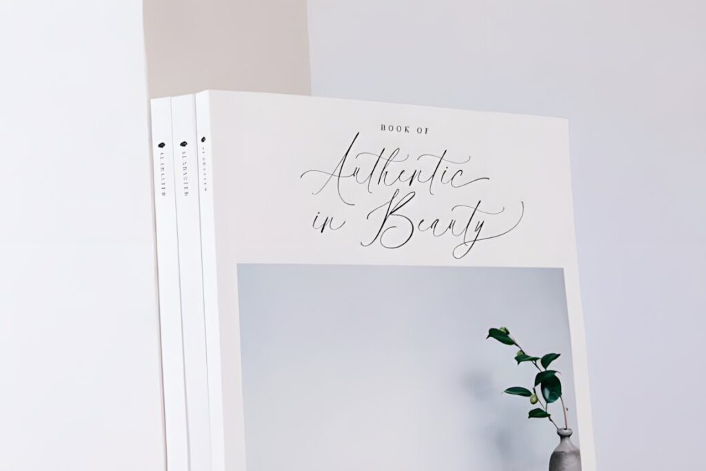
Sentiny Lovelyn uses flowing vintage script forms and decorative swashes for a romantic, traditional appearance. It fits covers where the title should suggest elegance, nostalgia, or ceremony without moving into heavy Victorian ornamentation.
This personality can work especially well for romance, family stories, historical women’s fiction, and gift-book covers. Decorative terminals should be treated as accents rather than requirements; a long title with multiple flourished capitals can become crowded quickly. Keep the calligraphy prominent and let quieter typography handle subtitles and author information.
9. Flamboyant
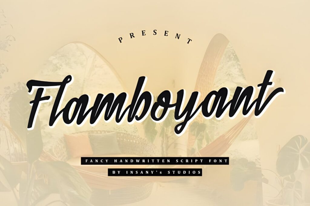
Flamboyant is a bold vintage handwriting script with more visual weight than delicate pen-style calligraphy. That makes it useful when the cover illustration is textured, colorful, or visually active and the title still needs to hold its shape from a distance.
The font is PUA encoded and includes glyphs, ligatures, and alternates, giving designers room to personalize a title without changing the underlying style. Its strong personality suits retro stories, dramatic romance, lifestyle titles, and expressive fiction. For quiet literary covers, a less assertive handwritten font such as Heritage Ink may integrate more naturally.
10. Masterline Calligraphy
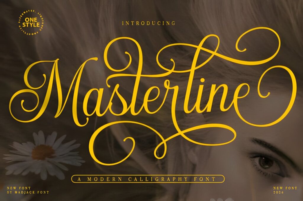
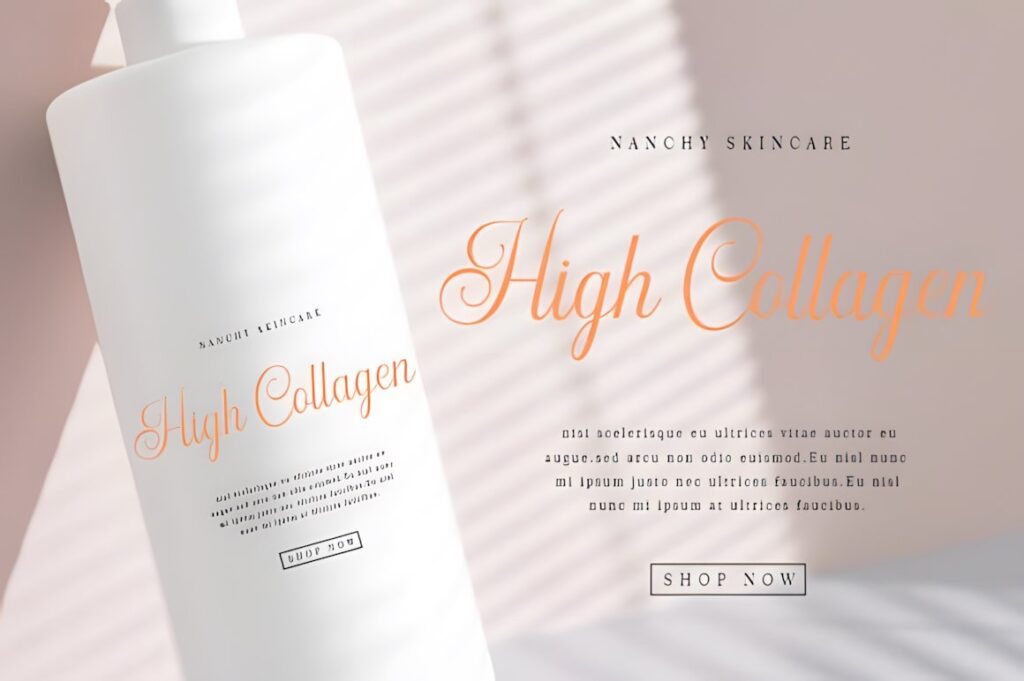
Masterline Calligraphy combines a casual calligraphic structure with decorative swashes and is specifically presented for uses that include book covers, headlines, posters, and quotes. It works well when a title needs readable script movement without committing to a heavily distressed or gothic appearance.
Consider it for contemporary historical romance, poetry, personal essays, or covers mixing vintage lettering with modern illustration. The swashes can help form a distinctive title silhouette, but long flourishes need enough negative space around the edges. For a stronger antique-manuscript feeling, Heritage Ink has a more obviously aged visual direction.
11. Vintage
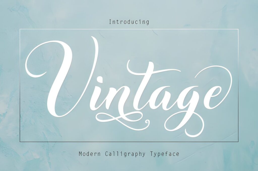
Vintage by Rudistudio is a modern calligraphy typeface built around playful swashes. It provides a lighter, more decorative interpretation of vintage lettering that can suit illustrated romance, whimsical historical fiction, poetry, or book covers where the title should feel handcrafted rather than severe.
The swash-driven character is most useful on short and medium-length words that leave enough room for the letters to extend naturally. Avoid relying on every alternate at once, especially when the title must fit within a narrow portrait composition. For more restrained historical handwriting, Heritage Ink creates less decorative visual noise.
12. The Antique
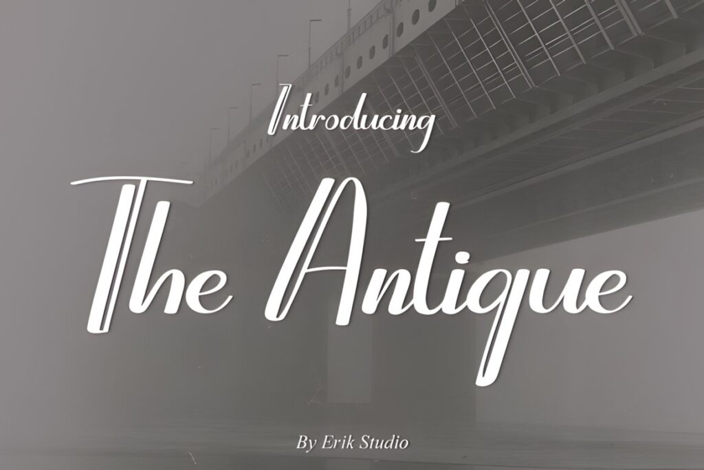
The Antique is a handwritten calligraphy font with traditional influences but a comparatively clean finish. It is useful when a book needs an old-fashioned touch without looking deliberately distressed, highly ornamental, or aggressively gothic.
That balance makes it a practical option for gentle historical romance, heritage nonfiction, classic-inspired fiction, or elegant memoir covers. Its restrained personality also makes pairing easier because a simple serif can handle subtitles and author information without competing with the title. Choose Zoe or Old Master instead when historical ornament needs to dominate the design.
13. Vintage Handwriting
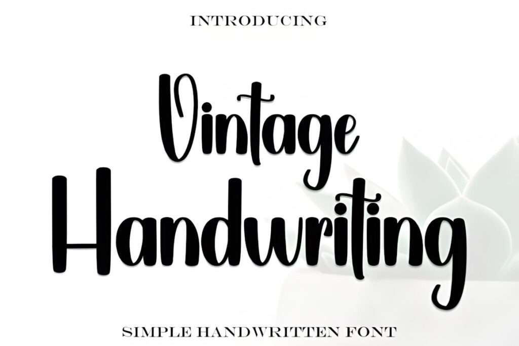
Vintage Handwriting is inspired by classic calligraphy while retaining a contemporary handwritten finish. For book covers, this middle ground can work when the artwork already establishes the historical setting and the title only needs a subtle vintage cue rather than a fully period-authentic effect.
Its softer character suits memoirs, correspondence-inspired stories, gentle historical fiction, and literary covers. Use larger type for the main title and test the design at thumbnail scale before committing to very thin or intricate letter combinations. For a stronger archival mood, Heritage Ink communicates age more directly.
14. Huntesla Gloficka
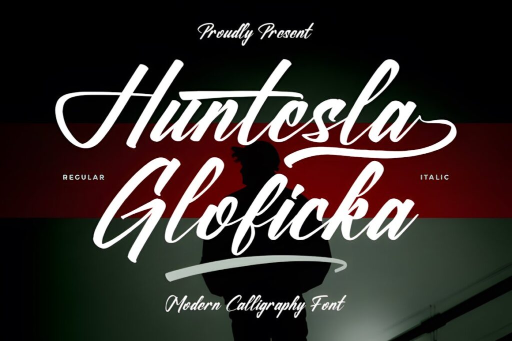
Huntesla Gloficka is a calligraphy font designed for display applications that include book covers, posters, labels, and invitations. Its smooth script personality makes it suitable for titles that need decorative handwriting without the dense historical structure of blackletter.
Use it for romance, inspirational books, personal storytelling, or vintage-inspired lifestyle covers where an expressive handwritten title is more important than strict period authenticity. Keep long subtitles outside the script treatment so the decorative rhythm remains easy to read. If the cover needs greater visual authority, Flamboyant offers a heavier handwritten alternative.
15. Avenford
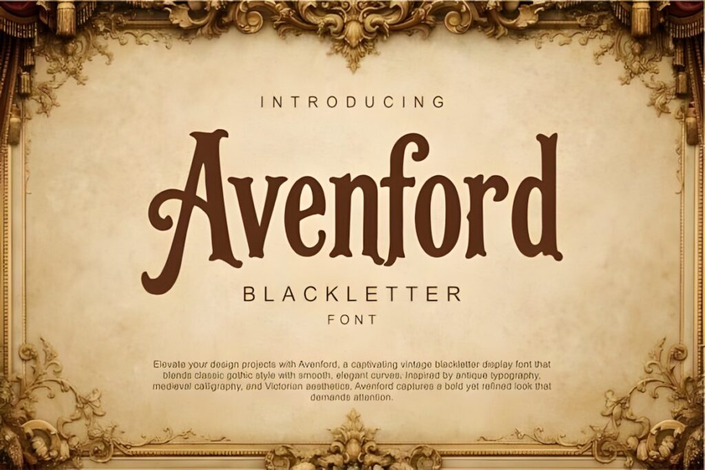
Avenford is a vintage blackletter display font that combines gothic structure with smoother curves. It is designed for book covers and other display work, making it a natural option for historical fantasy, dark academia, gothic stories, medieval themes, and dramatic period fiction.
Compared with Old Master, Avenford has a cleaner visual direction and can make more sense when the illustration already contains substantial ornament. Blackletter remains visually dense, so give the title generous size and spacing instead of squeezing it into several narrow lines. Supporting copy should usually stay much simpler.
16. James
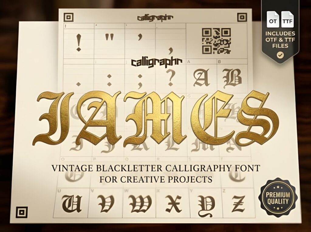
James is a vintage blackletter calligraphy font characterized by sharp angles and dramatic vertical strokes. Its historical character suits covers for epic period fiction, heraldic stories, medieval settings, gothic titles, and narratives where typography needs to communicate authority rather than softness.
This style is strongest on short titles or single prominent words because the dense forms can become difficult to separate when letters are packed together. It can also provide an effective contrast against minimal backgrounds. For a more ornate Renaissance treatment, Old Master adds greater decorative complexity; for smoother gothic lettering, Avenford is less elaborate.
17. Calligraphy Script
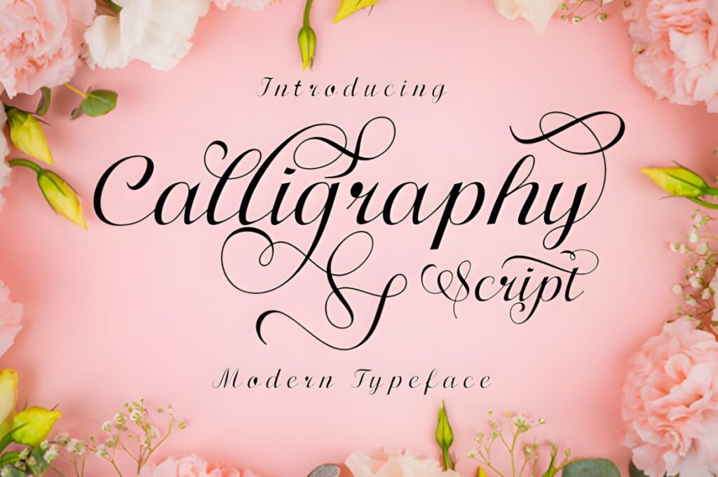
Calligraphy Script is an elegant flowing handwritten font with a varying baseline, smooth letterforms, glyphs, swashes, and alternates. Its classical calligraphic influence gives it enough formality for romance, literary fiction, poetry, biography, or book covers that need a graceful handwritten title without overt gothic styling.
Because the lettering includes decorative alternatives, it can be adjusted to make one title word more distinctive while keeping the rest comparatively restrained. This makes it useful for covers where the typography needs personality but still shares space with illustration or photography. For stronger vintage texture, Heritage Ink offers a more visibly aged approach.
Quick Comparison for Book Cover Projects
| Font | Best for | Style | Key visual trait | Project fit |
|---|---|---|---|---|
| Vintage Signature | Historical romance | Calligraphy script | Sweeping curves | Short elegant titles |
| Heritage Ink | Historical fiction | Vintage handwriting | Weathered penmanship | Journal and manuscript themes |
| Meighan Script | Illustrated romance | Thick vintage script | Stronger strokes | Medium-length titles |
| Zoe | Victorian themes | Ornate calligraphy | Filigree decoration | Short statement titles |
| Old Master | Medieval fiction | Ornamental blackletter | Renaissance detailing | Historical display titles |
| Flamboyant | Bold retro covers | Vintage handwriting | Heavy script presence | Busy artwork |
| The Antique | Classic-inspired fiction | Handwritten calligraphy | Restrained elegance | Clean historical layouts |
| Avenford | Gothic fiction | Vintage blackletter | Smooth gothic curves | Dark period covers |
Readability and Size on Book Covers
A decorative font should be judged twice: once at the full cover size and again at the size readers actually encounter while browsing. At thumbnail scale, thin entry strokes can disappear, counters can close, and several swashes may visually merge into one shape.
For long book titles, consider using the calligraphy only on the emotionally important word. A title such as “The Letters We Left Behind” might give the script treatment to “Letters” or “Left Behind” while placing the remaining words in a quieter supporting face. This preserves the vintage character without forcing five words into a dense calligraphic composition.
Blackletter fonts need similar restraint. Their compressed internal shapes provide dramatic historical personality, but they benefit from larger sizing and clear spacing. Ornate choices such as Zoe also work better when the artwork leaves a relatively calm area around the title.
Font Pairing Tips for Vintage Calligraphy Titles
Pair the decorative font by function rather than trying to find another typeface with the same personality. If the calligraphy handles the title, the supporting font should normally provide contrast and clarity.
- Use a restrained serif for author names, subtitles, historical dates, and literary supporting text.
- Use a clean sans serif when the cover combines vintage lettering with contemporary photography or minimal artwork.
- Keep blackletter away from long secondary copy; a quieter supporting typeface makes the historical title easier to recognize.
- When the script has dramatic swashes, reduce decorative details elsewhere instead of adding another elaborate typeface.
- Use consistent spacing and alignment to connect the title and supporting typography even when their letter styles are very different.
The goal is not to make every element look vintage. The calligraphic title establishes the period or emotional tone; the supporting typography keeps the information usable.
Common Vintage Font Selection Mistakes
Using every available alternate is one of the easiest ways to weaken a calligraphic cover. Swashes and special characters are more effective when they shape one memorable part of the title rather than appearing on nearly every letter.
Another common problem is choosing style before checking the actual title. A highly ornate Victorian font can look convincing in a specimen built from one short word yet become difficult to manage when a book has a seven-word title. Test the real title early, including capitalization and line breaks.
Do not ignore the background either. Thin scripts need sufficient tonal contrast, while heavy blackletter can compete with detailed architecture, florals, or illustrated scenes. Adjust the typography and cover artwork as one composition rather than treating the font as a final decorative layer.
Before using any font in a published book project, check the current product license for the exact publishing, client, print, ebook, or other uses you plan.
Choosing the Right Style for Your Cover
If the cover needs romantic elegance, Vintage Signature or Malograh provide flowing calligraphic movement. For a story built around letters, journals, family history, or archival imagery, Heritage Ink gives the title a more aged handwritten quality.
For Victorian ornament and short dramatic titles, Zoe makes the lettering a major visual feature. Medieval, gothic, and darker historical books can move toward Old Master or Avenford, depending on how much ornamental complexity the cover can support.
When thumbnail visibility is the main concern, heavier choices such as Meighan Script or Flamboyant can hold more presence than delicate pen-style lettering. Whichever direction you choose, test the finished title at small size before building the remaining hierarchy around it.
Frequently Asked Questions
What vintage calligraphy style works best for book covers?
Vintage calligraphy styles work best when their visual character matches the book genre and title length. Flowing scripts suit romance and personal stories, weathered handwriting supports historical or journal-inspired covers, and blackletter works for gothic or medieval themes. Short titles can usually support more ornament, while longer titles benefit from simpler forms and fewer flourishes.
Are decorative calligraphy fonts readable on ebook thumbnails?
Decorative calligraphy fonts can remain readable on ebook thumbnails when the strokes are substantial enough and the title is kept visually simple. Very thin hairlines, overlapping swashes, tight spacing, and ornate capitals can lose definition when reduced. Test the finished cover at small marketplace-thumbnail size and simplify alternates or increase scale when individual words become difficult to recognize.
What should I pair with a vintage script book title?
A vintage script book title usually pairs well with a restrained serif or clean sans serif that handles supporting information. Use the decorative font for the title or another focal phrase, then give the author name, subtitle, series information, and endorsements a quieter typographic role. Functional contrast usually creates clearer hierarchy than pairing two equally decorative vintage fonts.
Can I use these fonts for published books and client cover designs?
Use depends on the current license attached to each font product. Before publishing a print book, ebook, client cover, promotional graphic, or related product, review the current license for the specific font and intended use. Do not assume that identical permissions apply to every font simply because the products are available from the same marketplace.