ℹ️ Affiliate Disclosure: This article may contain affiliate links. If you book or purchase through these links, we may earn a commission at no additional cost to you.
Choosing Vintage Calligraphy Alphabet Fonts for Posters and Prints
Vintage calligraphy alphabet fonts can give a poster the character of hand-lettered signage, antique print advertising, old stationery, or a carefully inked title—but decorative scripts are easy to overuse. Long swashes can collide with artwork, thin strokes may disappear when a print is viewed from across a room, and closely connected letters can turn an expressive headline into a difficult-to-read shape.
For posters and art prints, the most useful vintage scripts balance personality with clear silhouettes. Some work best as oversized one- or two-word headlines, while others have calmer letterforms that can handle quotations, event names, or secondary display text. This selection covers polished copperplate-inspired scripts, casual retro lettering, rough brush styles, Victorian-influenced forms, and decorative calligraphy for more ornamental compositions.
Many more vintage scripts are available, while this shortlist concentrates on fonts with distinct poster roles, readable display shapes, and clearly different levels of ornament.

For posters and prints, choose a vintage calligraphy font according to viewing distance and text length. Bold brush scripts suit large retro headlines, restrained calligraphy works better for quotations and names, while ornate Victorian or swashed styles are strongest when reserved for short focal phrases rather than dense information.
Quick Picks
- For classic poster calligraphy: Classical Calligraphy — polished, flowing forms suit elegant titles and quote prints.
- For bold retro headlines: Vintage by Aveni Letter Type — rough brush lettering gives larger poster text a handmade finish.
- For refined editorial prints: Vintage Signature — sweeping calligraphic shapes suit fashion, boutique, and decorative wall art.
- For old-world compositions: Victorian — thin ornamental script creates a formal period-inspired mood.
- For playful retro posters: Vintage Script by Wow Magic — rounded connected lettering has a friendlier, less formal feel.
Vintage Calligraphy Alphabet Fonts for Poster and Print Designs
1. Vintage Calligraphy by Inermedia STUDIO
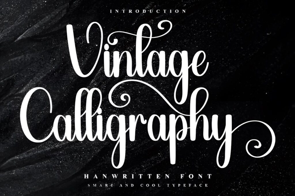
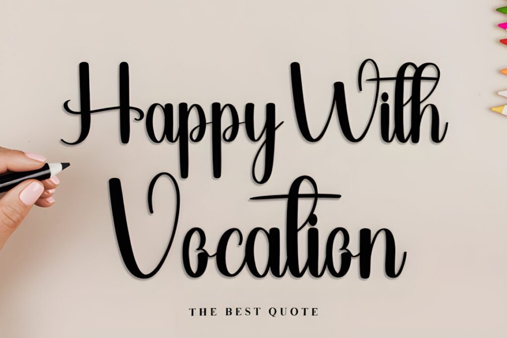
Vintage Calligraphy is a decorative script with an upbeat nostalgic personality that works well for poster headlines where the lettering itself should feel celebratory. Its flowing shapes and ornamental details make it especially useful for seasonal prints, quote posters, gift-themed artwork, and decorative typography pieces.
The font includes decorative glyph and ligature options, so short headlines can be customized without adding separate illustrations. Keep the most elaborate forms around one or two focal words; using every flourish at once can make a longer poster title feel crowded.
2. Classical Calligraphy
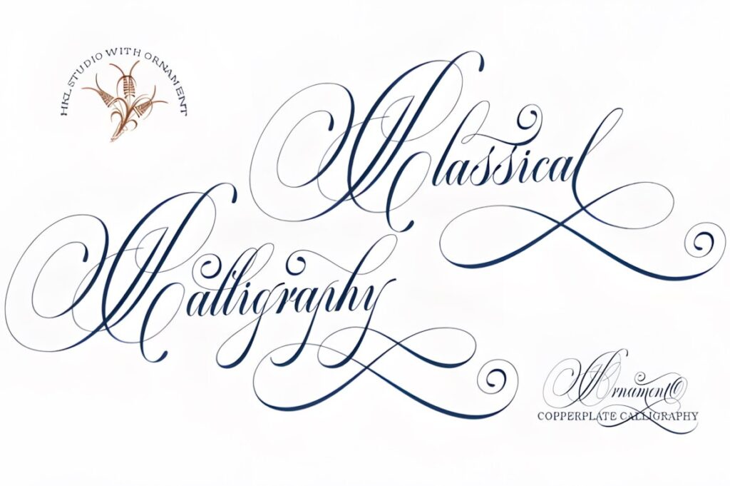
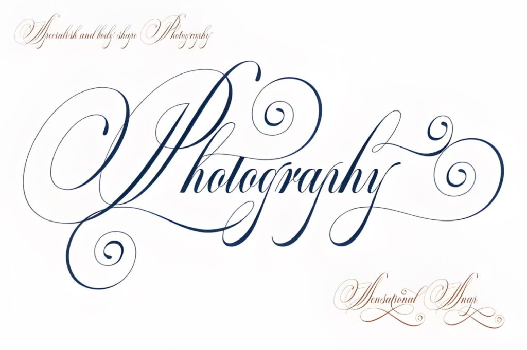
Classical Calligraphy combines a vintage calligraphic appearance with copperplate-inspired elegance, making it a strong fit for sophisticated poster titles, romantic quotation prints, beverage-inspired artwork, and formal event graphics. The smoother rhythm gives it a more composed look than rough brush lettering.
Alternative characters and swashes allow selected letters to carry more visual drama. For posters, that makes the font especially effective when the central word is large and the supporting information uses a simpler typeface. Avoid squeezing long phrases into narrow layouts because the calligraphic movement benefits from generous horizontal space.
3. Vintage Script by Wow Magic
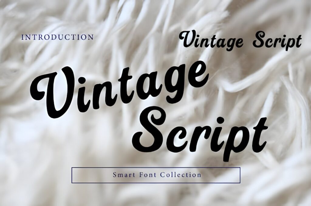
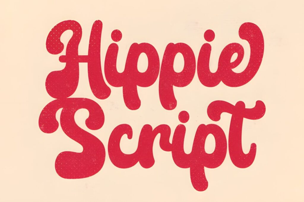
Vintage Script uses rounded strokes and connected retro letterforms that feel warmer and more informal than formal copperplate styles. That makes it useful for café posters, nostalgic product prints, retro quotes, handmade-brand artwork, and typography inspired by mid-century advertising.
The friendly weight helps short phrases hold their shape at larger display sizes. It is a better choice when you want vintage character without a highly ceremonial look. For a formal wedding print or historical-style composition, a thinner calligraphic option such as Classical Calligraphy or Victorian may feel more appropriate.
4. Vintage by Aveni Letter Type
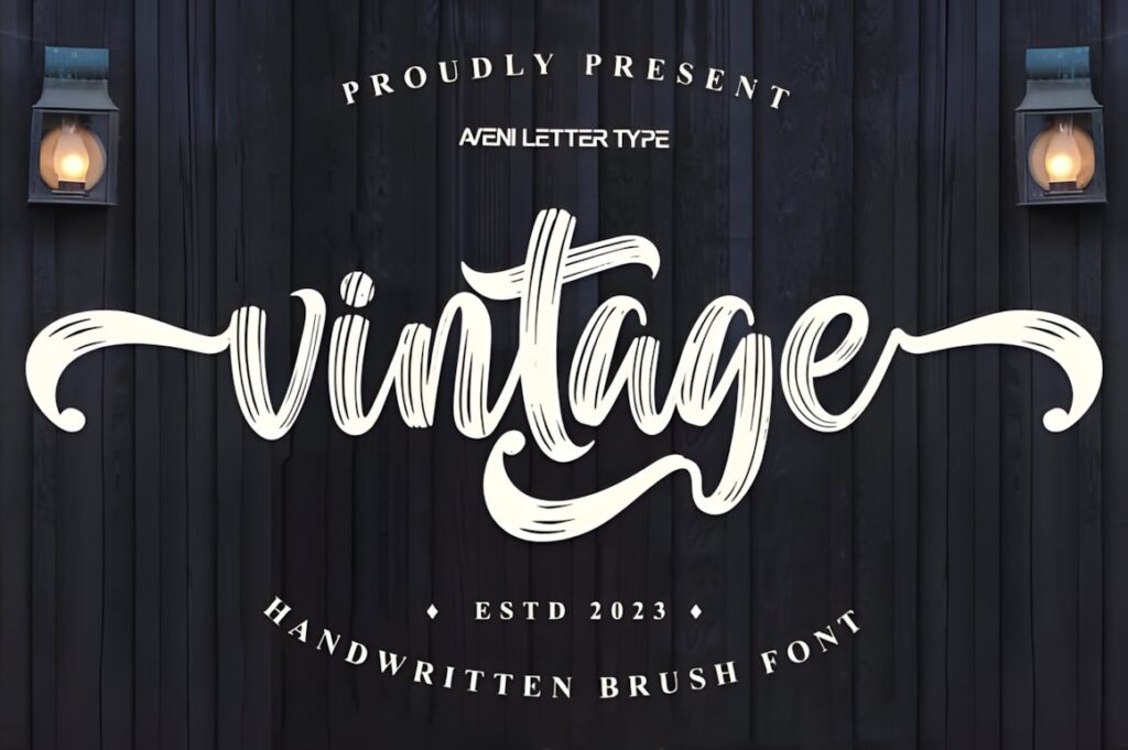
Vintage is a rough-edged brush script designed around a handmade, rustic appearance. Its imperfect outlines give poster lettering more texture than polished digital calligraphy, making it useful for workshop prints, rustic wall art, food and drink posters, handmade product graphics, and retro promotional pieces.
This font makes the most sense when the print needs visible personality even before the viewer reads the entire phrase. The rough texture is part of the appeal, but it can become visually busy at very small sizes, so use it primarily for large titles rather than fine-print information.
5. Vintage Signature
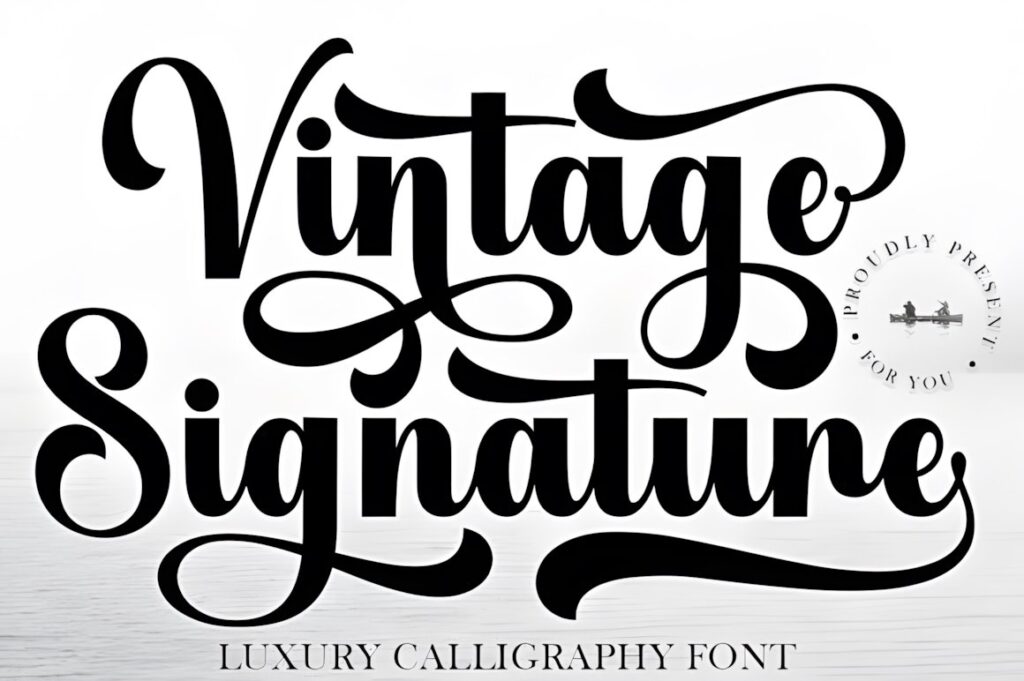
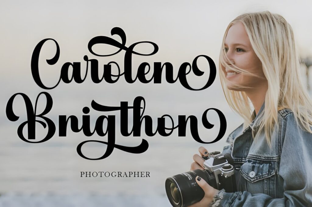
Vintage Signature is a flowing luxury-style calligraphy font with sweeping curves and a polished handwritten rhythm. It suits fashion posters, boutique wall prints, editorial-style artwork, beauty graphics, personalized name prints, and compositions where the title should feel refined rather than rustic.
Decorative characters can turn a short name or phrase into the main visual element of the poster. Because the script has a strong signature quality, it works particularly well for one to four prominent words. For information-heavy prints, pair it with restrained supporting typography instead of forcing the calligraphy into every line.
6. Vintage Script by Hoperative Design
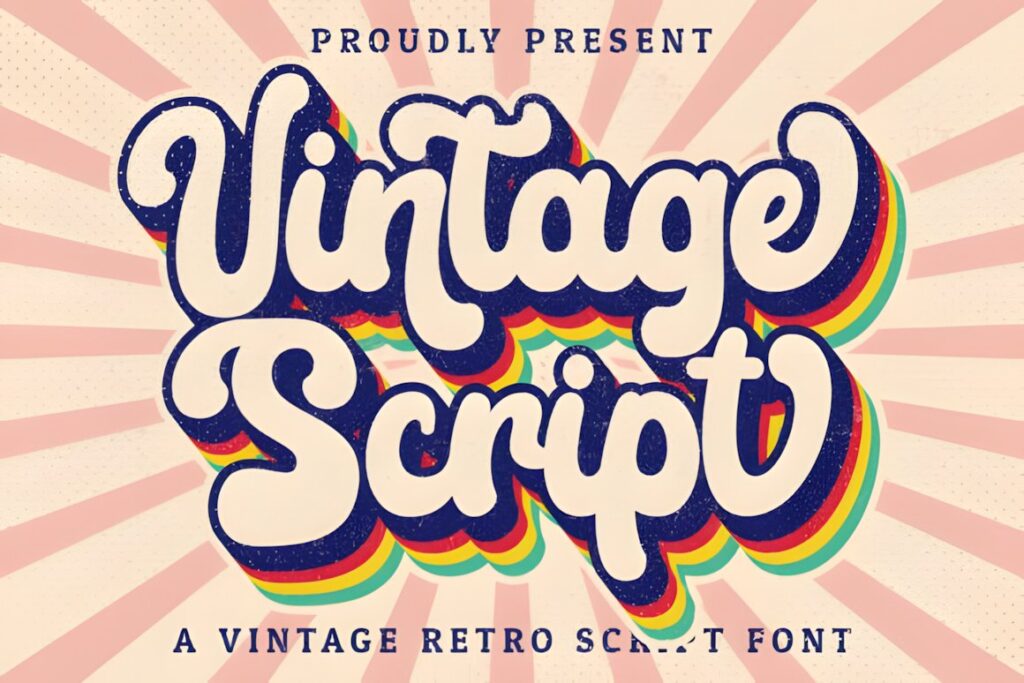
Vintage Script brings a straightforward handwritten retro look to posters that need nostalgic lettering without extremely elaborate decoration. Its connected script form suits quotes, promotional headlines, event titles, personalized wall art, and vintage-inspired branding prints.
Accessible swashes make it possible to add emphasis selectively around initial or ending letters. That flexibility is useful when a poster needs one embellished word and several cleaner supporting words. Keep an eye on spacing when using longer phrases, since decorative endings can quickly consume the negative space around neighboring lines.
7. Vintage Calligraphy by AA Studio
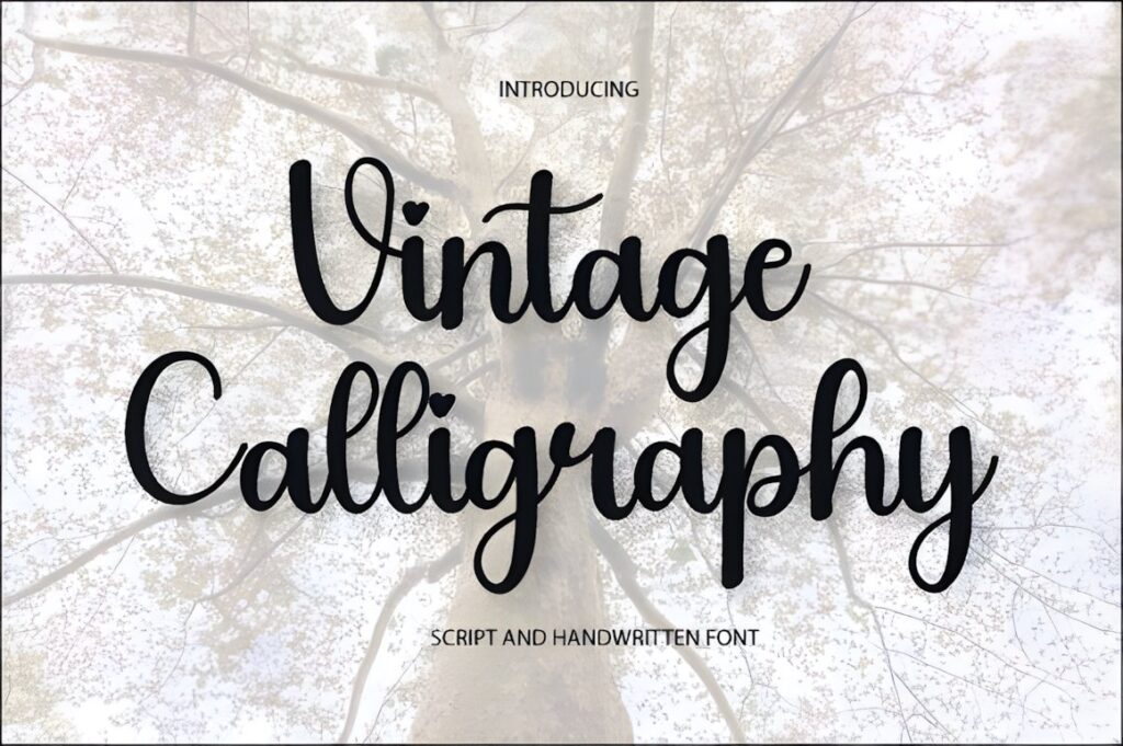
This version of Vintage Calligraphy uses graceful traditional script forms with a softer nostalgic mood. It works well for romantic poster quotes, vintage signage-inspired artwork, wedding prints, personalized names, and decorative compositions where elegant letter movement is more important than heavy visual weight.
Its alternate characters and swashes offer useful control over the final silhouette of a title. Choose it when the poster will be viewed fairly close or printed as decorative art. If the design must remain instantly readable across a large room, a thicker brush option will generally create a stronger outline.
8. Vintage Calligraphy by Heidi Vargas-Smith
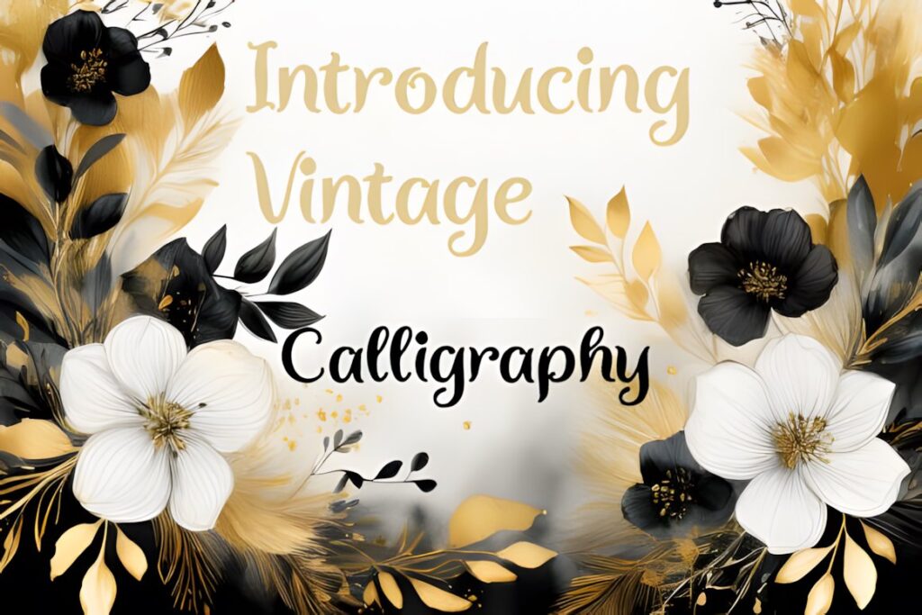
Vintage Calligraphy by Heidi Vargas-Smith offers a classic-meets-contemporary approach that fits posters, magazine-style compositions, greeting prints, apparel graphics, and decorative social artwork. It is particularly useful when you want a handwritten focal point that still feels adaptable across modern layouts.
The style is suited to display use, so let it occupy meaningful space instead of shrinking it into a secondary caption. For a print containing a quotation, consider using the script for the emotional or memorable phrase and setting the remaining words in simpler typography.
9. Vintage Calligraphy by Andikastudio
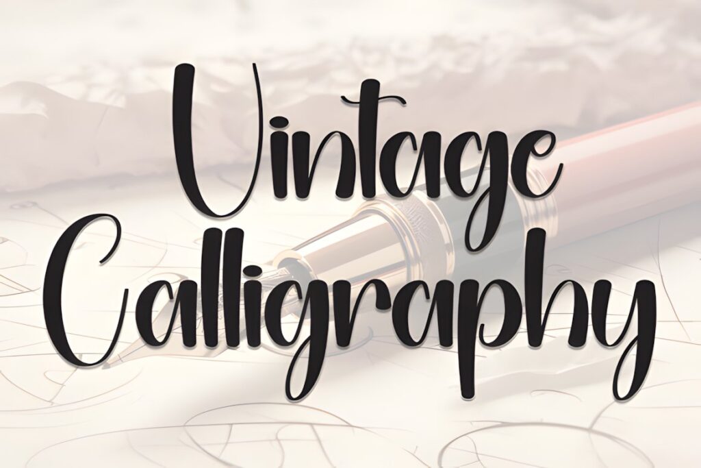
This Vintage Calligraphy font uses fluid brush strokes and expressive curves, giving it more visible movement than formal pen-style scripts. It makes sense for poster designs that need energetic handmade lettering, including lifestyle prints, event graphics, packaging-inspired artwork, promotional posters, and expressive quote layouts.
The dynamic rhythm gives short lines plenty of personality without requiring extra illustration. For highly structured historical posters, however, the contemporary brush feeling may be less convincing than a Victorian or copperplate-influenced option.
10. Vintage Calligraphy Elegant Script
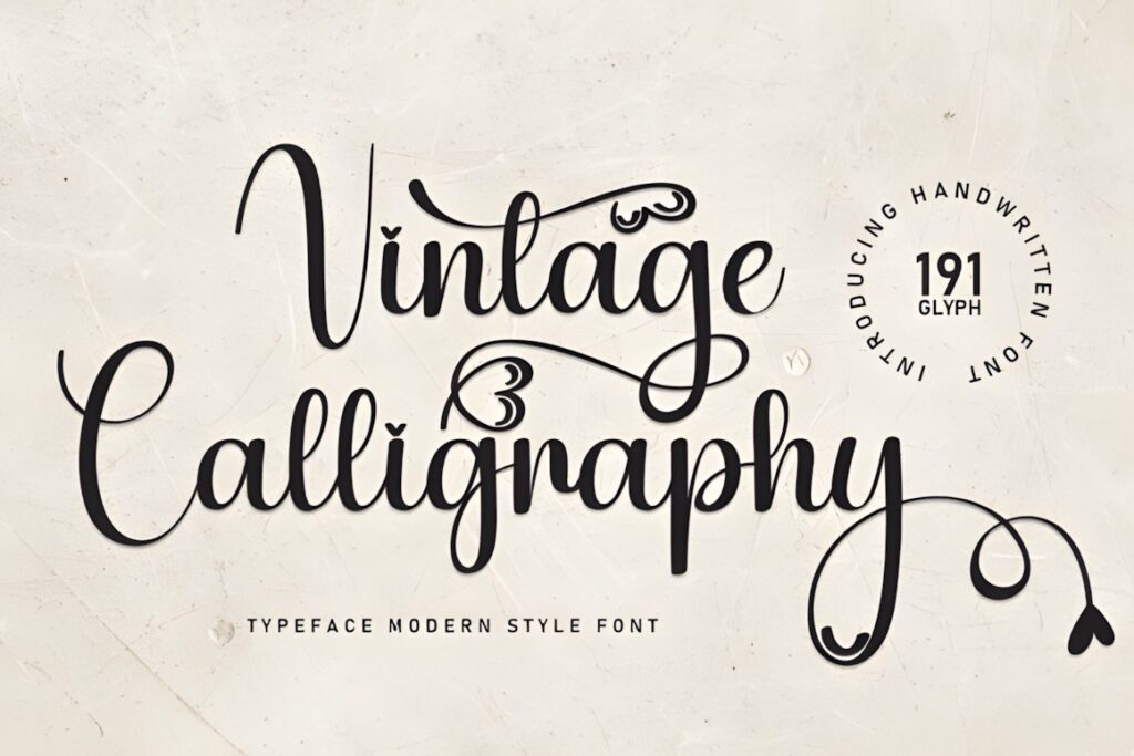
This elegant Vintage Calligraphy release from Inermedia STUDIO takes a calmer handwritten direction suited to quotation prints, thank-you artwork, romantic typography, formal wall decor, and understated title treatments. The overall personality is more graceful than rugged or retro-commercial.
Choose it for layouts where the lettering needs to complement generous white space or delicate illustration. If the poster relies on bold geometric shapes or heavy photography, a thicker script can compete with the background more effectively.
11. Vintage Calligraphy by William Jhordy
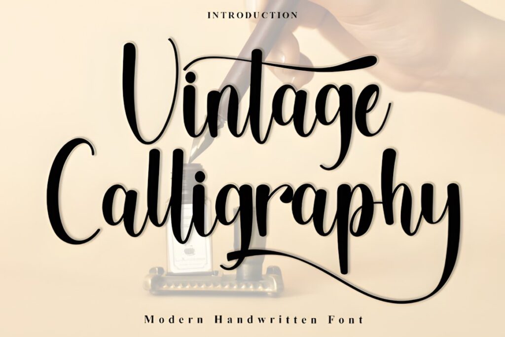
Vintage Calligraphy by William Jhordy uses flowing curves and a playful handwritten rhythm that sits between romantic script and casual display lettering. It can work nicely for lifestyle posters, personalized wall prints, event titles, celebration artwork, and modern compositions that still need a nostalgic handwritten reference.
This is a useful direction when formal copperplate feels too serious. Its more relaxed personality gives a print warmth, although that same informality may not suit museum-style, historical, or highly formal poster concepts.
12. Vintage Calligraphy by Preketek Texs
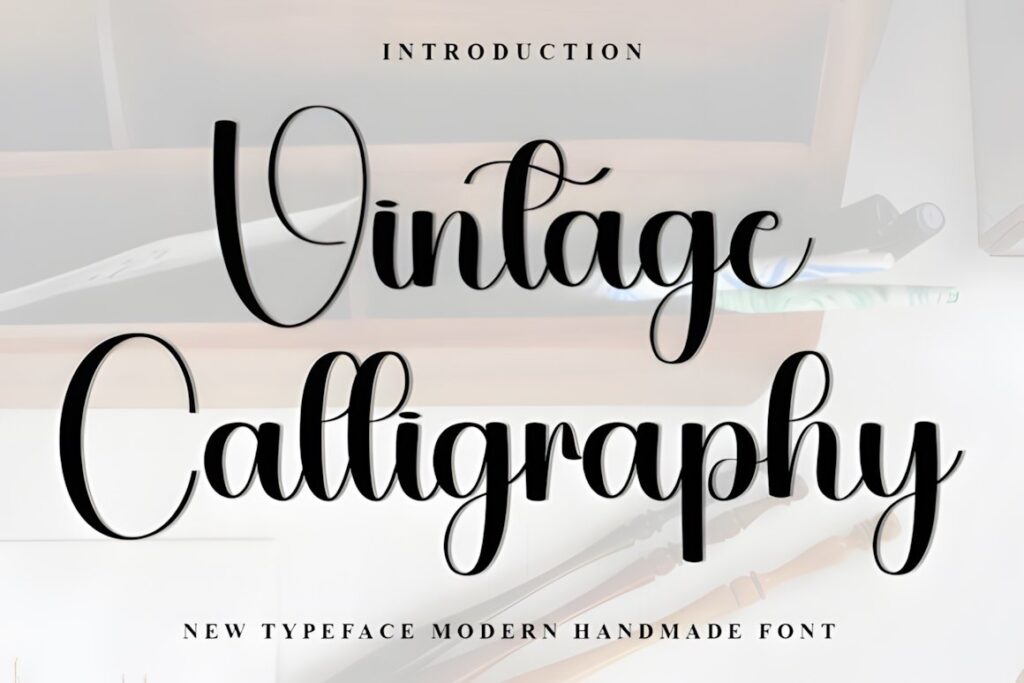
This Vintage Calligraphy design has a simpler, playful handwritten personality that can be easier to integrate into casual posters than highly flourished scripts. It fits craft prints, cheerful quotes, informal event artwork, personalized gifts, and designs where the vintage reference should feel friendly rather than luxurious.
The less formal character also makes it a practical contrast to rigid serif or block lettering. Choose another option if the project needs dramatic historical authenticity or an elaborate luxury-style headline, since this font’s strength is approachability rather than ceremony.
13. Vintage Calligraphy by Roronoa zoro.S.P.D
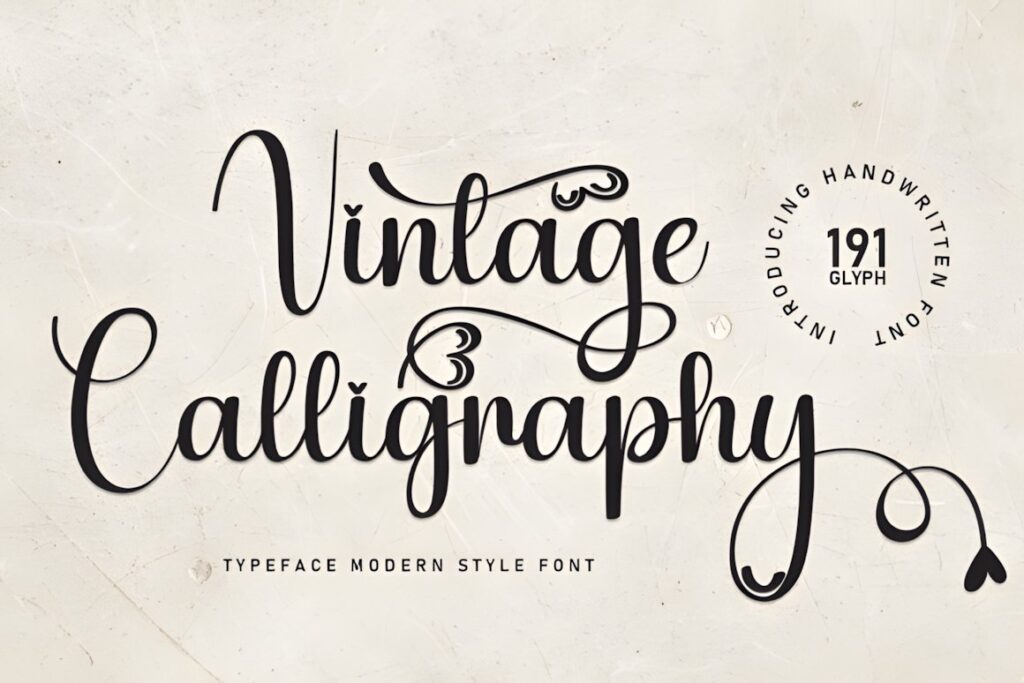
This delicate Vintage Calligraphy font leans toward romantic handwritten typography. Its lighter, sweeter character suits sentimental quote posters, wedding wall art, feminine editorial prints, bedroom decor, and giftable typography where the lettering should feel personal.
The fine decorative appearance works best when the finished print gives the text enough size and contrast. For signage-style posters viewed from farther away, consider Vintage by Aveni Letter Type or another heavier script with a stronger overall silhouette.
14. Vintage Calligraphy by Black Line
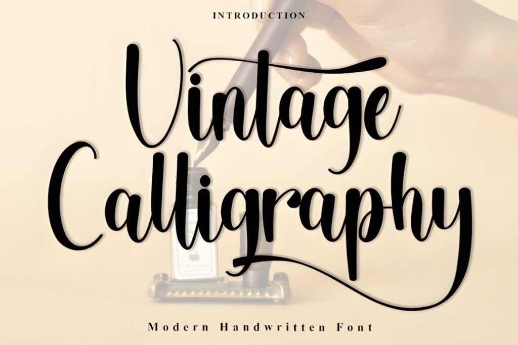
Vintage Calligraphy by Black Line uses lively brush-handwritten strokes with a celebratory, casual personality. It is a good match for birthday posters, party prints, cheerful quotes, event graphics, and colorful compositions where traditional formal calligraphy would feel too restrained.
The energetic stroke pattern pairs naturally with simple supporting type and uncomplicated backgrounds. For long paragraphs or highly compact layouts, use another font for the informational text and reserve this script for the main phrase.
15. Vintage Calligraphy by PiPi Creative
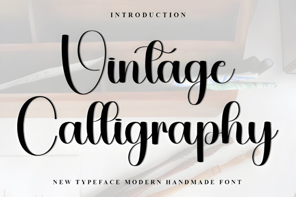
This Vintage Calligraphy font combines decorative script forms with a whimsical seasonal feeling. It works well for festive quote posters, holiday wall prints, decorative gift artwork, and other designs where a nostalgic headline needs more ornament than a straightforward handwritten script.
Glyph and ligature options allow selected letters to become decorative focal points. Keep those features selective when producing a multi-line poster; too many embellished connections can make the composition visually dense, especially around tightly stacked lines.
16. The Victorian
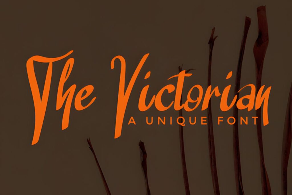
The Victorian is a timeless handwritten display font for old-world titles, antique-inspired quotations, heritage posters, historical-event artwork, and decorative print pieces. Its personality immediately pushes a composition toward traditional rather than modern retro styling.
This makes it useful when an ordinary brush font feels too contemporary. Because its character is strong, keep supporting type relatively quiet. A restrained serif can preserve the period mood while making dates, credits, or explanatory lines easier to scan.
17. Victorian by Letternity
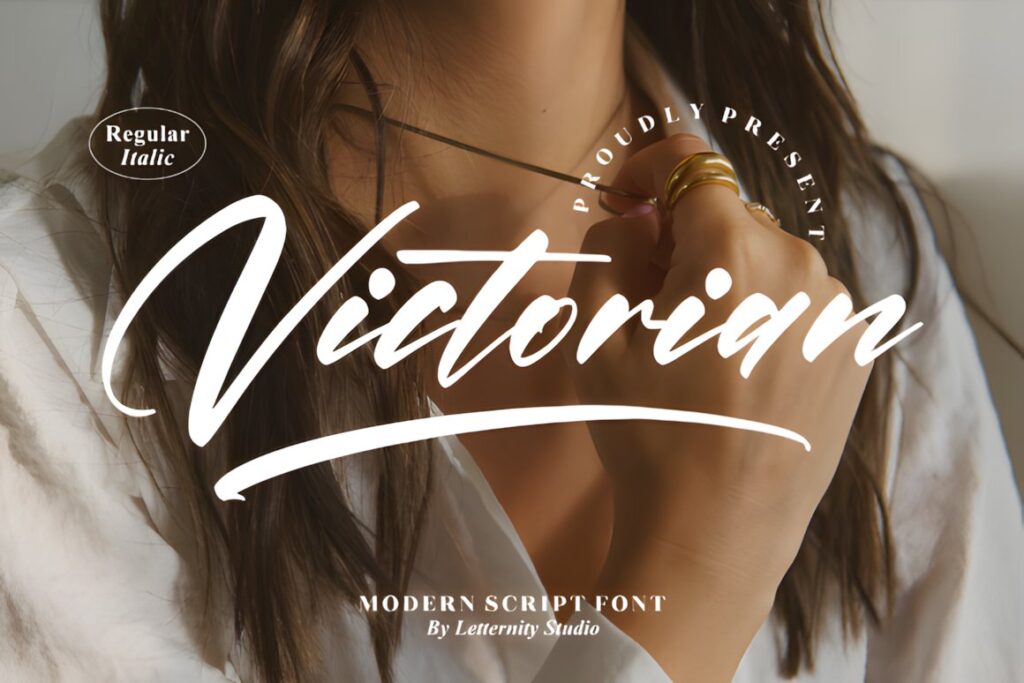
Victorian is a thin, graceful script with a distinctly formal personality. It suits luxury-style wall prints, historical-inspired posters, romantic quotations, formal event graphics, and decorative typography where the lettering needs elegance rather than heavy impact.
The font includes decorative glyph and ligature access, giving short titles more styling flexibility. Its thin construction is better suited to controlled print environments and larger text than to distant signage. For an outdoor-style poster or intentionally rugged artwork, a heavier vintage brush font will normally hold attention more effectively.
18. Classic Vintage
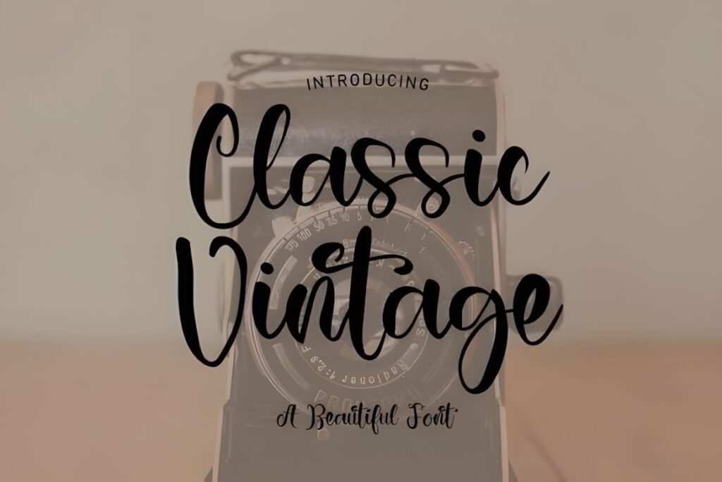
Classic Vintage is a handwritten font with a familiar old-fashioned personality that works for quote posters, retro branding prints, decorative wall art, title cards, and casual nostalgic compositions. Compared with highly ornate scripts, its appeal comes from recognizable handwritten character rather than elaborate flourishes.
Use it when you want vintage lettering to support the illustration instead of dominating the entire poster. It also makes a useful alternative when more formal calligraphy feels too polished for the subject. For maximum visual drama, one of the swash-heavy or bold brush options in the roundup offers a stronger focal point.
Quick Comparison for Different Poster Styles
| Font | Best for | Style | Key visual trait | Poster fit |
|---|---|---|---|---|
| Vintage Calligraphy | Decorative seasonal prints | Calligraphic script | Ornamental flourishes | Short focal phrases |
| Classical Calligraphy | Elegant quote posters | Copperplate-inspired | Smooth flowing rhythm | Formal display titles |
| Vintage Script | Retro commercial art | Rounded script | Friendly connected strokes | Café and lifestyle posters |
| Vintage by Aveni | Rustic posters | Brush script | Rough handmade edges | Large bold headlines |
| Vintage Signature | Editorial wall prints | Luxury calligraphy | Sweeping curves | Names and short quotes |
| Vintage Calligraphy by AA | Romantic artwork | Traditional script | Graceful alternates | Decorative prints |
| The Victorian | Old-world themes | Historical handwritten | Period character | Heritage posters |
| Victorian | Formal vintage prints | Thin ornamental script | Elegant delicate strokes | Close-view wall art |
Readability and Size
Calligraphy fonts behave differently at 72-point poster size than they do in small captions. Fine details that look elegant in a close-up preview may disappear when a print is reduced, framed behind glass, photographed for an online listing, or viewed from across a room.
For the main poster headline, test the composition at its approximate viewing size rather than judging only from a zoomed-in screen. Look at the negative spaces inside letters, the joins between connected characters, and the contrast between thin and thick strokes. If several letters merge into one dark shape, slightly increasing size or spacing can help more than adding effects.
Very fine Victorian-style scripts make more sense for decorative prints viewed nearby, while thicker brush lettering can carry farther. Neither approach is automatically better; the intended viewing distance should control the choice.
Swashes, Ligatures, and Decorative Capitals
Swashes are most effective when they establish hierarchy rather than decorate every available letter. On a poster, one extended capital or finishing stroke can frame a title, connect visually with an illustration, or fill an intentional area of negative space.
Using several long swashes on adjacent lines often creates collisions and makes the underlying words harder to recognize. Start with the regular characters, establish the line breaks, then introduce alternates only where they improve the silhouette. This also makes it easier to compare different fonts fairly instead of choosing whichever preview contains the most ornament.
For multi-line prints, reserve the most decorative forms for the first or most important word. Supporting lines can use the font’s simpler characters or a second typeface.
Font Pairing Tips for Vintage Posters
A decorative calligraphy font already supplies movement and personality, so the supporting type does not need to compete with it. Pair flowing scripts with a restrained serif when you want a traditional print feel, or with a clean sans serif when the poster needs a more contemporary vintage interpretation.
Assign each typeface a clear job. The script can carry a name, event title, quotation, or emotionally important phrase. The supporting font can handle dates, locations, descriptions, artist credits, and smaller factual information. This division creates hierarchy while preserving the legibility of the practical details.
Avoid combining two highly decorative scripts in the same composition unless there is a strong reason. Competing flourishes usually reduce contrast between hierarchy levels instead of making the poster feel richer.
Common Font Selection Mistakes
- Choosing only from a zoomed preview: reduce the design until it approximates real viewing conditions and check whether the words still read quickly.
- Using calligraphy for every line: keep functional information in simpler typography so the decorative script remains meaningful.
- Adding every available swash: alternate characters should improve composition, not demonstrate every feature in the font.
- Ignoring phrase length: narrow poster formats can make wide capitals and long flourishes difficult to fit without excessive reduction.
- Forgetting the final background: thin script needs sufficient contrast against photography, texture, or illustration.
- Assuming all vintage scripts communicate the same mood: rustic brush lettering, romantic calligraphy, and Victorian-inspired forms create very different visual associations.
Choosing the Right Style for Your Print
If you want a polished vintage quotation or formal poster title, Classical Calligraphy provides a controlled calligraphic look with room for decorative alternates. For a rougher handmade poster, Vintage by Aveni Letter Type creates a stronger brush-written texture.
For fashion, beauty, boutique, or editorial-inspired wall art, Vintage Signature gives short words a sweeping signature-style silhouette. Victorian makes more sense when the project needs a delicate old-world mood, while Vintage Script by Wow Magic suits friendlier retro poster work.
The strongest choice is the font whose detail level matches the viewing distance and whose personality supports the subject. Build the poster around readable letter shapes first, then use alternates, swashes, texture, and pairings to reinforce the vintage character.
Frequently Asked Questions
Are vintage calligraphy fonts suitable for poster headlines?
Vintage calligraphy fonts are well suited to poster headlines when the lettering remains readable at the intended viewing distance. Bold or moderately weighted scripts usually handle large promotional titles more easily, while thin ornamental calligraphy is better for decorative prints viewed nearby. Keep the main phrase short enough that the letter connections and flourishes have room to breathe.
How much text should I set in a calligraphy font?
Calligraphy fonts are usually most effective for short display text rather than every line of a poster. Use the script for the main title, name, or memorable quotation, then set dates, locations, descriptions, and other supporting information in a clearer serif or sans serif. This creates stronger hierarchy and prevents decorative letterforms from slowing down reading.
How should I use swashes on a vintage poster?
Use swashes selectively around the most important letters rather than decorating every word. A single extended capital or finishing stroke can frame a title or fill intentional negative space, while several overlapping flourishes may reduce readability. Establish the wording, line breaks, and spacing first, then test decorative alternates one at a time.
Can I use these fonts on posters or prints I sell?
The intended use should be checked against the current license for the specific font you plan to use. Licensing terms can affect client work, physical products, print-on-demand items, editable files, and other commercial applications differently. Review the current product license before publishing or selling the finished poster rather than assuming every font carries identical permissions.