ℹ️ Affiliate Disclosure: This article may contain affiliate links. If you book or purchase through these links, we may earn a commission at no additional cost to you.
Choosing the Right Vintage Calligraphy Fonts for Stitched Monograms
Vintage calligraphy alphabet fonts can give stitched monograms the formal curves, ornamental initials, and old-world character that plain lettering lacks. The challenge is choosing a script that still makes visual sense once delicate digital letterforms are translated into thread. Tight counters, hairline connectors, overlapping flourishes, and very long swashes can become difficult to reproduce when a monogram is small.
The 17 fonts below focus on vintage scripts, copperplate-inspired calligraphy, decorative initials, and monogram styles that provide noticeably different starting points for personalized linens, initials, patches, keepsakes, wedding pieces, and other stitched designs. Some favor bold ornamental capitals, while others provide restrained flowing scripts that leave more breathing room around each letter.
Many more vintage scripts and decorative alphabets are available, while this shortlist concentrates on styles with distinct monogram personalities, useful letter shapes, and different levels of ornament.

For stitched monograms, the most useful vintage calligraphy fonts tend to fall into four groups: decorative initial fonts for one- to three-letter marks, cleaner copperplate scripts for names, bolder calligraphy for smaller layouts, and ornate scripts reserved for larger statement pieces. These are installable design fonts rather than automatically digitized embroidery alphabets, so machine-embroidery projects may require appropriate conversion or digitizing before stitching. Wilcom, for example, documents conversion of suitable installed TrueType fonts into embroidery lettering and notes that the result depends heavily on the original letter shapes.
Quick Picks
- For ornate single initials: Ornamental Monogram — decorative vintage letterforms suit larger centerpiece initials.
- For classic monogram layouts: Monogram Script — multiple monogram-oriented styles make it useful when the initials themselves are the design.
- For traditional copperplate character: Classical Calligraphy — smooth calligraphy with alternate characters creates a formal heritage look.
- For a heavier script: Belastia Calligraphy — its bolder calligraphic treatment can make more visual sense when delicate hairlines are undesirable.
- For antique handwritten character: Vintage Manuscript — historical manuscript styling works well when the goal is less polished and more archival.
Vintage Calligraphy Fonts for Different Monogram Styles
1. Ornamental Monogram
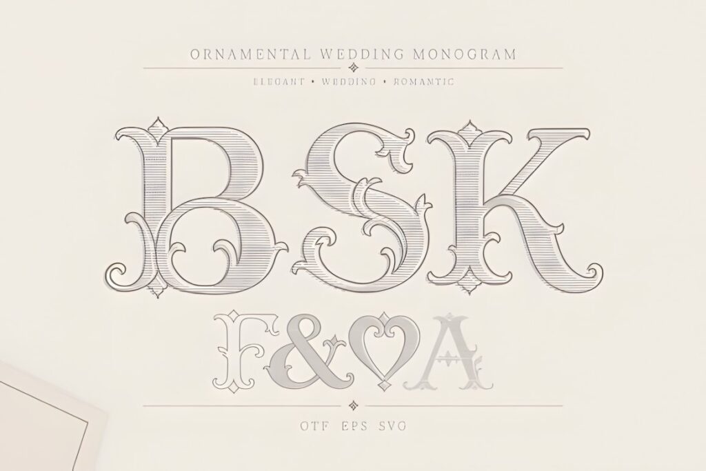
Ornamental Monogram is a decorative display family built around classic vintage and royal lettering, making it especially relevant when one large initial needs to carry the entire composition. The product includes regular and outline presentations and is explicitly positioned for monograms, crests, invitations, stationery, and personalized designs.
Its elaborate character makes the most sense for roomy initials on heirloom linens, framed pieces, jacket backs, or other projects where the letter can remain large. For tiny monograms, simplify the layout rather than trying to preserve every ornamental detail.
2. Monogram Script
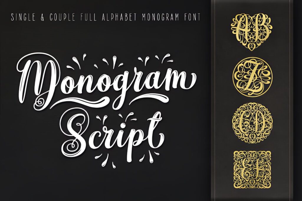
Monogram Script is a decorative font designed specifically around personalized lettering. Its product includes several monogram-oriented styles, including plain, single, and heart variations, giving it more layout flexibility than a conventional continuous calligraphy script.
Choose it when a compact group of initials is more important than spelling a long name. The dedicated monogram construction helps establish a centered emblem-like appearance; for a traditional handwritten name beneath the initials, one of the flowing calligraphy options later in the list will provide a softer contrast.
3. Utah Monogram
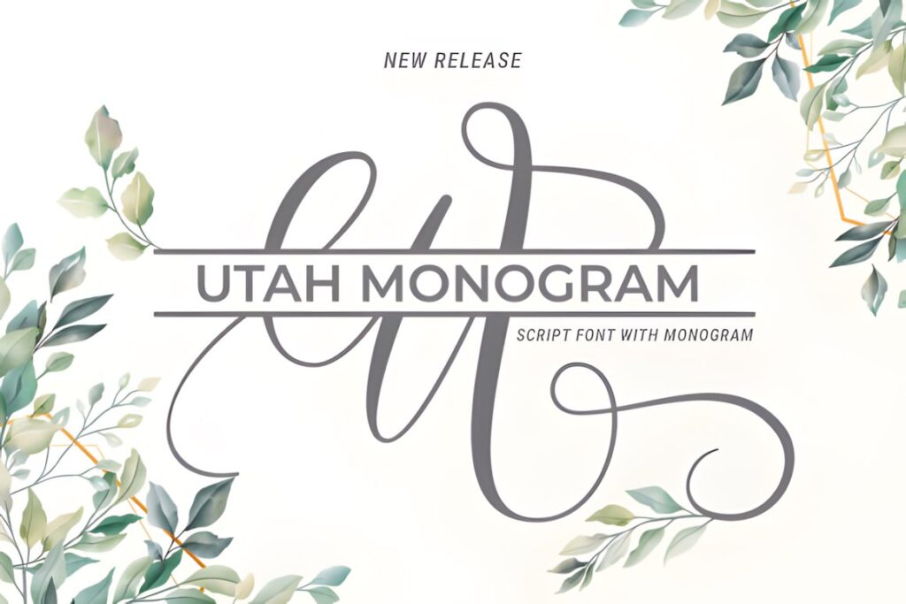
Utah Monogram combines classic calligraphic personality with dedicated uppercase, lowercase, and monogram presentations. Its long, graceful script shapes feel more handwritten than the heavier decorative initials above, so it works well for romantic personalization and traditional wedding-inspired projects.
This is a useful direction for towels, bridal keepsakes, or initials accompanied by a surname. Keep an eye on the finest curves when planning a compact stitch-out; Ornamental Monogram offers a more emblematic result when the individual initial should feel heavier and more self-contained.
4. Vintage Monogram
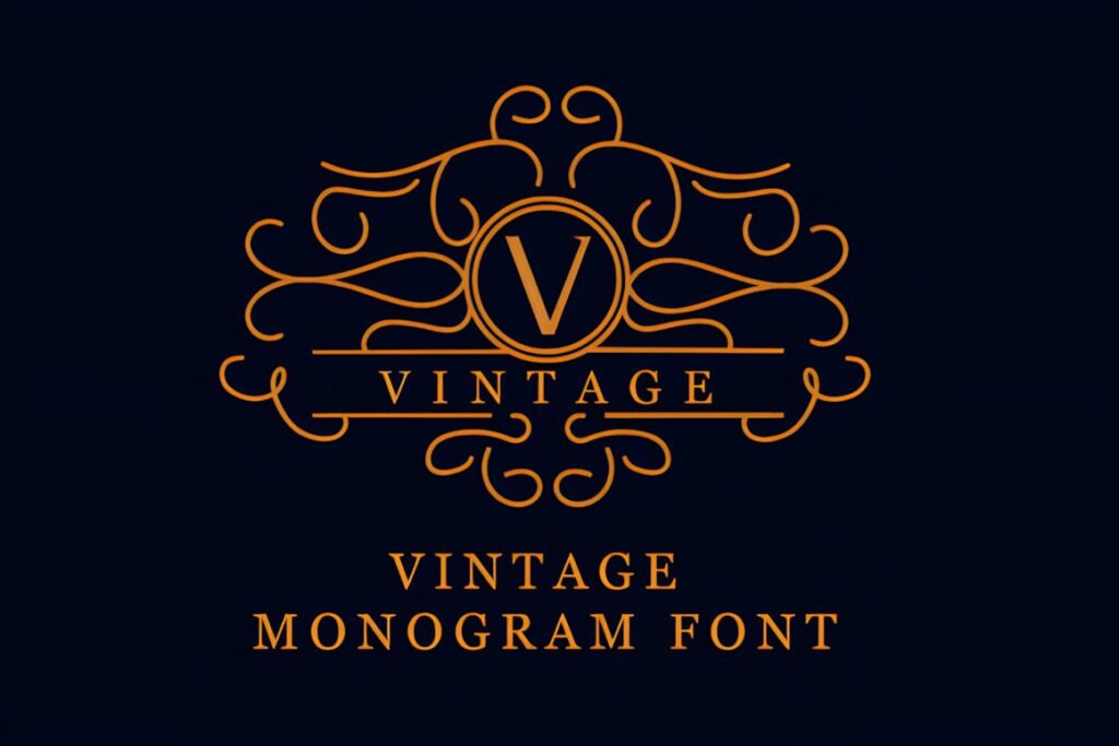
Vintage Monogram by handles creative is a simple, bold decorative font built around elegant vintage initials. Compared with fine copperplate scripts, its stronger shapes give a monogram more visual weight before additional ornament or surrounding decoration is introduced.
Consider it for initials that need to read as a compact badge on a bag, robe, towel, or personalized gift. Its decorative nature is better suited to short monograms than sentences, while Classical Calligraphy is the stronger direction when the design includes a complete name.
5. Classical Calligraphy
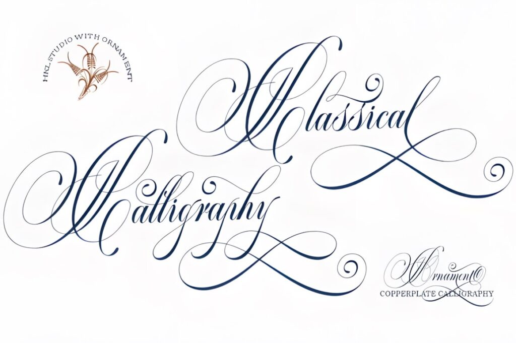
Classical Calligraphy mixes vintage copperplate influence with handwriting and includes alternate characters plus PUA-accessible glyphs and swashes. The smooth, formal construction gives it the traditional calligraphy character many people expect from heirloom initials and wedding personalization.
The strongest use is a medium or large monogram where the contrast between sweeping capitals and finer connecting strokes remains visible. Start with restrained letterforms before introducing swashes; a three-initial composition can become crowded quickly when every letter uses its most decorative alternate.
6. Vintage Signature
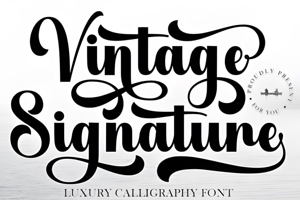
Vintage Signature is a luxury-oriented calligraphy font with broad sweeping curves, a refined handwritten rhythm, and PUA-accessible decorative characters. The overall impression is closer to an elegant signature than a rigid historical alphabet, making it useful when a stitched name should feel personal rather than heraldic.
Use it for a surname, first name, or two-letter mark with generous horizontal space. Because long sweeping terminals consume room quickly, a narrow pocket-size monogram may benefit from one of the shorter dedicated monogram fonts instead.
7. Elemental Calligraphy
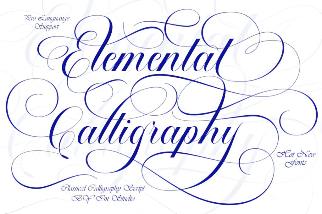
Elemental Calligraphy combines decorative copperplate influence with a cleaner contemporary finish. Its product description highlights smooth connected lettering and stylistic alternates, giving designers room to vary individual capitals without abandoning a consistent calligraphic rhythm.
This makes sense for polished initials on wedding accessories, personalized textiles, or a full name placed beneath a simpler monogram. Compared with Vintage Signature, its copperplate character reads a little more formal; avoid shrinking elaborate alternates until their loops begin competing with one another.
8. Syiterlla Outline
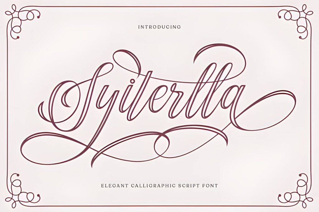
Syiterlla Outline is a vintage calligraphy script influenced by copperplate lettering and hand lettering. It includes alternate characters, glyphs, and ligatures, while its outlined presentation creates a noticeably different typographic texture from conventional solid scripts.
The outline treatment is most interesting for larger decorative initials where the interior and exterior shapes have room to remain distinct. It is a more specialized option for stitched interpretation, so test the final scale carefully rather than assuming the digital outline should be reproduced literally at a small size.
9. Vintage Manuscript
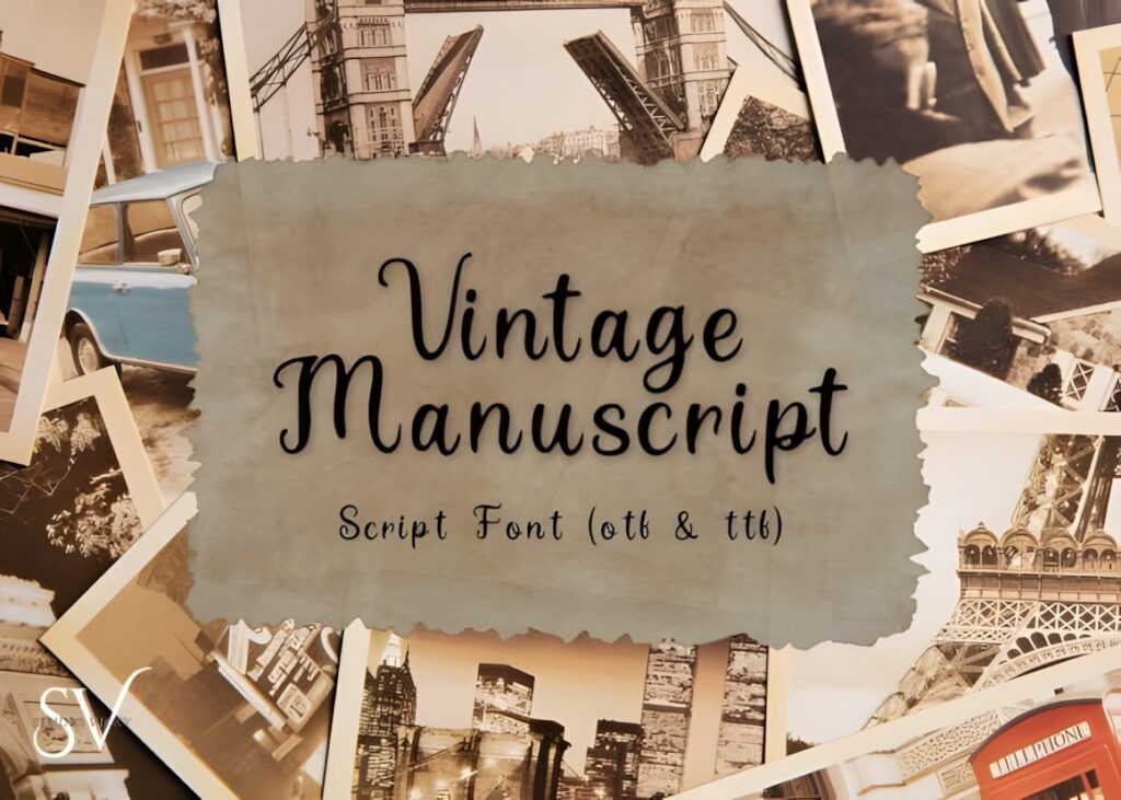
Vintage Manuscript takes its cues from historical handwriting, old letters, book pages, and traditional penmanship. Instead of looking like polished modern branding calligraphy, it leans into an antique manuscript personality that can make a personalized piece feel more archival and handmade.
Consider it for initials on linen, heritage-inspired gifts, fabric book covers, or commemorative pieces where slightly historical character matters more than perfect symmetry. For a formal three-letter wedding monogram, Utah Monogram or Classical Calligraphy offers a more ceremonious structure.
10. Victorian Signature
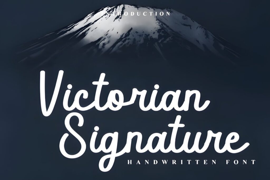
Victorian Signature combines looping vintage cursive with a cleaner modern script structure. Its dramatic sweeps and connected strokes recall formal correspondence and personalized seals, and the product provides PUA access to decorative glyphs, swashes, and alternates.
The font works particularly well when the stitched concept needs to feel like an actual handwritten signature. Give its capital loops plenty of breathing room. If the design must fit inside a tight circular frame, a compact decorative monogram alphabet may produce a cleaner silhouette.
11. Victorian
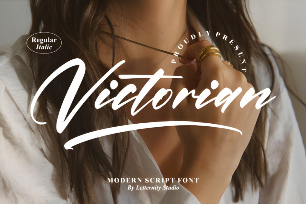
Victorian by Letternity is a thin, graceful script supplied in regular and italic presentations. PUA encoding provides access to additional glyphs and ligatures, while the overall letter style is noticeably lighter than the bolder monogram choices in this roundup.
Its delicate appearance suits an airy, understated monogram at a generous finished size. Thin strokes are the main consideration: on a small stitched piece, preserving the general Victorian silhouette may matter more than reproducing every fine digital line exactly.
12. Delsya Script
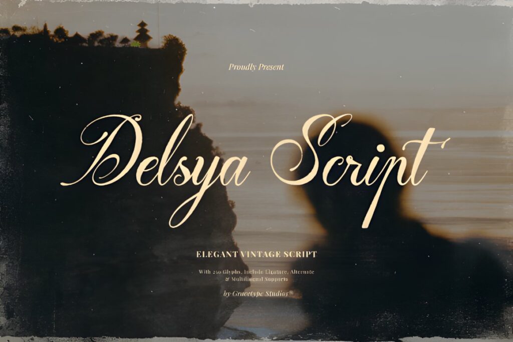
Delsya Script is an explicitly vintage script influenced by traditional copperplate calligraphy. Sweeping capital swashes, elongated terminals, and pronounced contrast between heavier downstrokes and thin connecting lines give it one of the more dramatic heritage looks in the selection.
This makes sense for a statement initial or surname where scale allows the long strokes to remain separated. The same drama can become excessive inside a very small three-letter arrangement, where Belastia Calligraphy or Vintage Monogram offers more visual weight with less reliance on fine hairlines.
13. De Lesa Paquetts
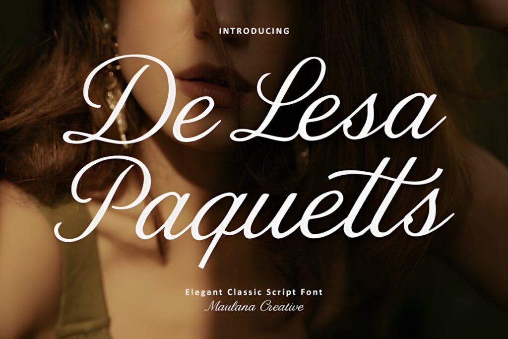
De Lesa Paquetts is a classic script based on traditional copperplate calligraphy with a clean contemporary treatment. The product lists uppercase and lowercase letters, ligatures, numerals, punctuation, multilingual support, and OTF and TTF files.
The balanced construction is useful when you need more than isolated initials—for example, a full family name paired with a larger capital. Its polished character is less rustic than Vintage Manuscript and less flamboyant than Delsya Script, which makes it easier to place beside other decorative elements.
14. Magnolia Calligraphy
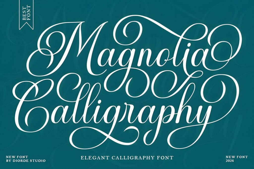
Magnolia Calligraphy combines decorative copperplate influence with a slightly bolder script structure. Its clean connected forms and stylistic alternatives retain the formal calligraphy mood without relying entirely on extremely light strokes.
That added visual weight makes Magnolia worth considering when a fine signature-style font feels too fragile for the intended composition. It can support an elegant surname or larger initials while still reading as formal calligraphy rather than a heavy display alphabet.
15. Belastia Calligraphy
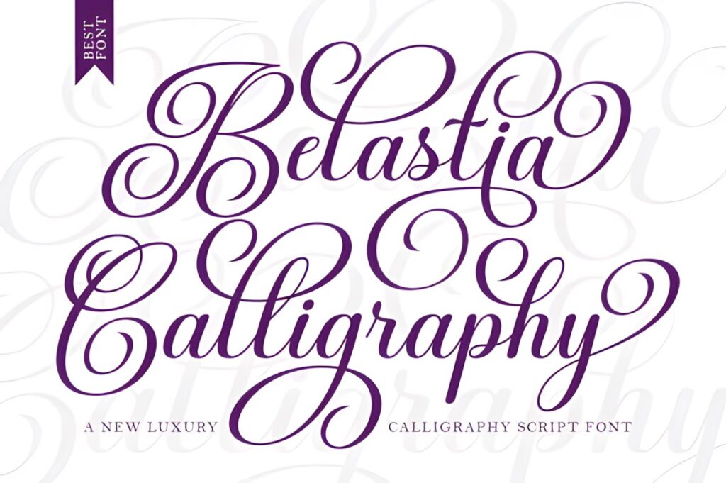
Belastia Calligraphy interprets classic decorative copperplate with a noticeably bold, clean treatment. The product also highlights alternative letterforms and connected script shapes, giving the font enough ornament for formal personalization without the same whisper-thin appearance as some traditional scripts.
Choose this direction when the monogram needs calligraphic curves but stronger visual presence. It is particularly useful to compare against Victorian or Delsya Script: those emphasize delicacy and contrast, while Belastia places more emphasis on substantial letter shapes.
16. Marontha
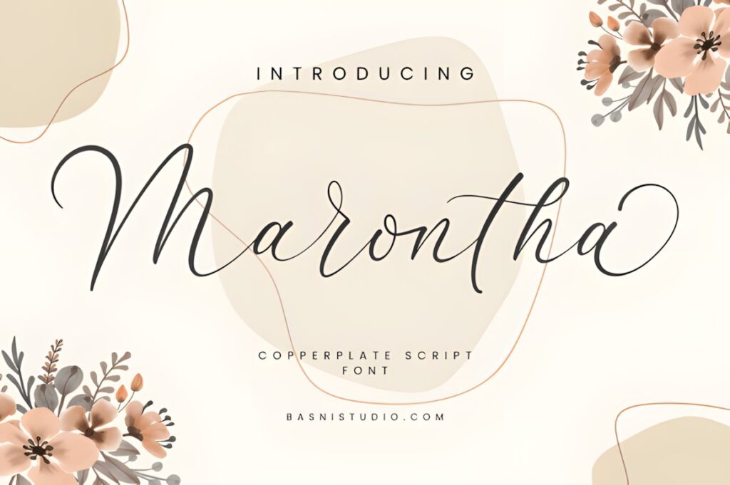
Marontha is a copperplate script with a more precise, controlled personality. Its product page lists a full letter set, punctuation, ligatures, and multilingual support, giving it practical flexibility when the composition extends beyond two or three initials.
Visually, this is a useful middle ground for projects that need historical calligraphy influence without an oversized decorative capital dominating the piece. Consider it for surnames, dates, or supplementary lettering placed near a simpler initial monogram.
17. Writing Monogram Font
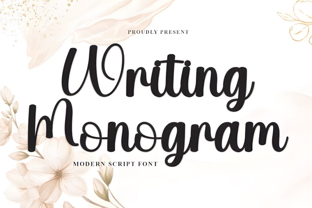
Writing Monogram Font is a modern script with rounded strokes, tall looping capitals, a lively baseline, and natural handwritten connections. It is explicitly presented for custom monogram logos and personalized projects, making it a softer and less formal alternative to the Victorian and copperplate styles above.
Use it when you want the monogram to feel personal and handmade rather than ceremonial. Its large loops still need space, but the overall mood fits casual gifts, floral themes, names, and personalized textile projects where strict historical styling would feel overly formal.
Quick Comparison for Stitched Monogram Projects
| Font | Best for | Style | Key visual trait | Project fit |
|---|---|---|---|---|
| Ornamental Monogram | Statement initials | Decorative vintage | Ornate royal forms | Large monograms |
| Monogram Script | Initial combinations | Monogram script | Dedicated layouts | Two- and three-letter marks |
| Utah Monogram | Romantic personalization | Classic script | Flowing calligraphy | Wedding and gift pieces |
| Classical Calligraphy | Formal initials | Copperplate-inspired | Swashes and alternates | Heritage-style projects |
| Vintage Manuscript | Antique character | Historical handwriting | Manuscript feel | Linens and keepsakes |
| Delsya Script | Dramatic display monograms | Vintage copperplate | Long sweeping capitals | Large statement pieces |
| Magnolia Calligraphy | Stronger script shapes | Decorative calligraphy | Slightly bolder strokes | Medium-size personalization |
| Belastia Calligraphy | Bold formal lettering | Copperplate-inspired | Substantial connected forms | Readable decorative initials |
| Writing Monogram Font | Casual personalization | Handwritten script | Looping rounded capitals | Gifts and informal monograms |
Thin Strokes, Loops, and Finished Size
Digital calligraphy can contain line differences that are much more extreme than a stitched result comfortably allows. Hairlines are part of what gives copperplate lettering its recognizable contrast, yet tiny connectors, enclosed counters, and narrow loops need enough finished space to remain distinct.
This matters most with Victorian, Delsya Script, Vintage Signature, and other delicate choices. Before committing to a complete project, preview the actual initials rather than judging only the alphabet specimen. A wide capital such as M or W can behave very differently from I or J, and overlapping swashes that look elegant around one pair of letters may clutter another.
Small-letter embroidery discussions consistently emphasize testing the real size and simplifying busy lettering where necessary. The exact practical limit depends on the digitizing, thread, fabric, machine, and design construction rather than the font name alone.
Using Installable Fonts for Machine Embroidery
An installable calligraphy font is not automatically the same product as a pre-digitized machine-embroidery alphabet. A normal font describes letter outlines; an embroidery design also requires stitch construction, sequencing, density, underlay decisions, and other embroidery-specific information.
Some embroidery software can convert installed fonts into embroidery lettering. Wilcom’s documentation, for example, describes converting suitable TrueType fonts and choosing embroidery treatments based partly on whether the original lettering is script, serif, or block. Wilcom also notes that automated conversion quality depends on the original shapes and may not equal a carefully digitized font. :chatgpt-content-reference{index=”21″}
That distinction is especially important for ornate vintage calligraphy. Treat the font as the visual source for your monogram and evaluate the resulting embroidery file separately before using it on the final fabric.
Swashes and Alternates Without Overcrowding the Initials
Swashes are most effective when they establish hierarchy rather than decorate every available letter. In a three-initial monogram, use the strongest alternate on the center or dominant initial and let the remaining characters provide support. This keeps the eye focused on the letter relationship instead of a tangle of overlapping terminals.
Long horizontal flourishes work more naturally on wide layouts such as towel hems and pillow fronts. Tall ascenders are easier to accommodate inside vertical arrangements or framed pieces. When space is limited, compare the default character with every available alternate and choose the version that leaves the most useful negative space.
Fonts such as Classical Calligraphy, Elemental Calligraphy, Victorian Signature, and Delsya Script provide the kind of decorative capital treatment that rewards this selective approach. Dedicated fonts such as Monogram Script and Ornamental Monogram already place more of the visual interest inside the letter itself.
Common Monogram Font Selection Mistakes
- Choosing from the word specimen instead of the actual initials. Preview the exact letter combination because capital width and swash direction can change the entire composition.
- Using the most decorative alternate for every letter. One ornamental capital often creates a clearer hierarchy than three competing flourishes.
- Designing at a large size and shrinking at the end. Fine spaces and thin connectors that work in a large preview may not translate cleanly to a compact stitched layout.
- Assuming an installable font is already an embroidery file. Machine stitching may require conversion, digitizing, and a test stitch before the design is ready.
- Ignoring the fabric. The same delicate lettering can read very differently on smooth linen and heavy, textured canvas; recent embroiderers discussing fine script on thick canvas specifically report difficulty retaining delicate lines.
Which Vintage Calligraphy Style Fits Your Monogram?
If the project revolves around one large decorative initial, Ornamental Monogram gives the letter enough visual structure to stand on its own. For a traditional two- or three-initial arrangement, Monogram Script offers dedicated monogram forms rather than asking a conventional script to do all the layout work.
If you want the recognizable rhythm of historical pen calligraphy, Classical Calligraphy provides a formal copperplate-inspired direction. Belastia Calligraphy makes more sense when you prefer stronger script shapes, while Vintage Manuscript shifts the result toward old handwritten letters and archival character.
The final choice should come from the actual initials, finished size, and amount of ornament the project can support. Preview the real monogram before digitizing or transferring it, and simplify delicate details whenever the stitched version becomes busier than the typography that inspired it.
Frequently Asked Questions
What type of vintage calligraphy font works best for monogram initials?
Decorative initial fonts and moderately bold calligraphy scripts are usually the easiest starting points for monogram initials because the letter shapes carry enough visual weight to work independently. Fine copperplate styles can create a more historically formal look, but their hairlines and long swashes deserve more space. Preview the exact two- or three-letter combination before choosing because different capitals can vary greatly in width and ornament.
Can a regular calligraphy font be used for machine embroidery?
A regular installable font can serve as the lettering source for machine embroidery, but it is not automatically a stitch-ready embroidery alphabet. Appropriate embroidery software may be able to convert or digitize installed lettering, depending on the font and software. The resulting stitches still need to be evaluated at the intended size and on the intended material before using the final fabric.
Are thin vintage scripts suitable for small stitched monograms?
Thin vintage scripts can work visually, but very small monograms leave less room for hairlines, tight counters, and elaborate loops. A slightly bolder script or simpler alternate may preserve the character more clearly at compact sizes. Always evaluate the finished dimensions rather than judging the font from a large digital preview, because thread and fabric change how delicate details are perceived.
Should I use swashes on every letter in a vintage monogram?
Swashes usually work better when they emphasize one important initial instead of decorating every letter equally. In a three-letter monogram, a prominent center capital paired with quieter side initials often produces clearer hierarchy and more negative space. Check several alternate combinations before finalizing the design, especially when the monogram must fit inside a small circular, rectangular, or corner placement.