ℹ️ Affiliate Disclosure: This article may contain affiliate links. If you book or purchase through these links, we may earn a commission at no additional cost to you.
Choosing the Best Vintage Calligraphy Fonts for Wedding Stationery
Vintage calligraphy alphabet fonts can give wedding stationery the character of handwritten letters, old invitations, and formal penmanship, but decorative scripts are not equally practical across an entire invitation suite. A font that looks striking on the couple’s names may become difficult to read on dates, venue details, RSVP cards, or small place cards. For wedding stationery, the most useful differences are letterform clarity, flourish density, stroke weight, spacing, and how naturally the script pairs with simpler supporting type.
The 11 fonts below range from antique manuscript-inspired lettering to romantic flowing scripts and restrained vintage calligraphy, giving you options for invitations, save-the-dates, menus, signage, envelopes, and personalized details.
Many more vintage and wedding scripts are available, while this selection concentrates on calligraphy styles with distinct personalities and practical roles across a coordinated stationery suite.

The strongest vintage calligraphy fonts for wedding stationery balance decorative character with readable letter shapes. Antique manuscript styles work well for old-world invitations, flowing scripts suit names and monograms, and cleaner calligraphy is easier to use across menus or smaller cards. Highly flourished lettering is usually most effective as a display accent rather than for every line of information.
Quick Picks
For antique letter styling: Vintage Manuscript — historical penmanship gives formal invitations a convincing old-world character.
For romantic name treatments: Vintage Signature — sweeping calligraphy works especially well for prominent couple names and elegant headings.
For ornamental invitations: Wedding Script — decorative letterforms provide stronger visual drama for formal invitation fronts and menus.
For a softer vintage look: Wedding Vintage — flowing handwritten forms feel romantic without relying on a rigid historical appearance.
For restrained elegance: Dellina Script — flowing calligraphy and swashes suit coordinated invitations, cards, and wedding headings.
Vintage Calligraphy Alphabet Fonts for Invitations and Wedding Paper
1. Vintage Signature
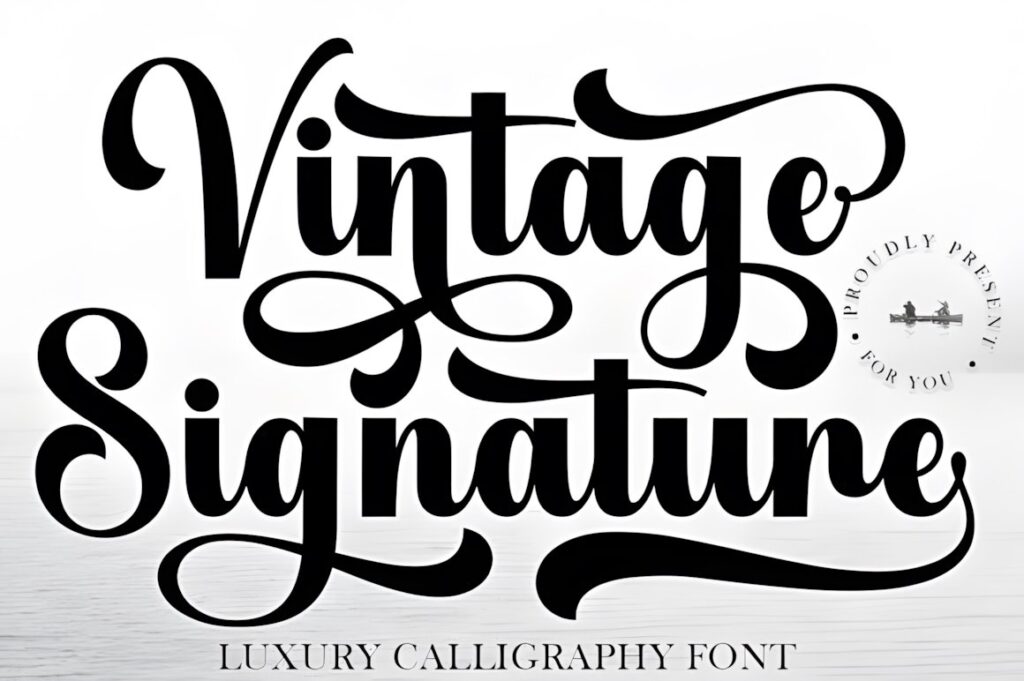
Vintage Signature is a sweeping calligraphy typeface suited to couple names, invitation headings, boutique-style monograms, and stationery that needs an expressive handwritten focal point. Its long curves and flowing rhythm create the impression of deliberate penmanship rather than casual handwriting.
Decorative characters are PUA encoded according to the product page, making its special characters accessible without requiring additional software. The elaborate character of the lettering is most convincing when given room to breathe. For venue information or compact RSVP copy, pair it with a quieter supporting typeface instead of shrinking the script into a dense text block.
2. Vintage Manuscript
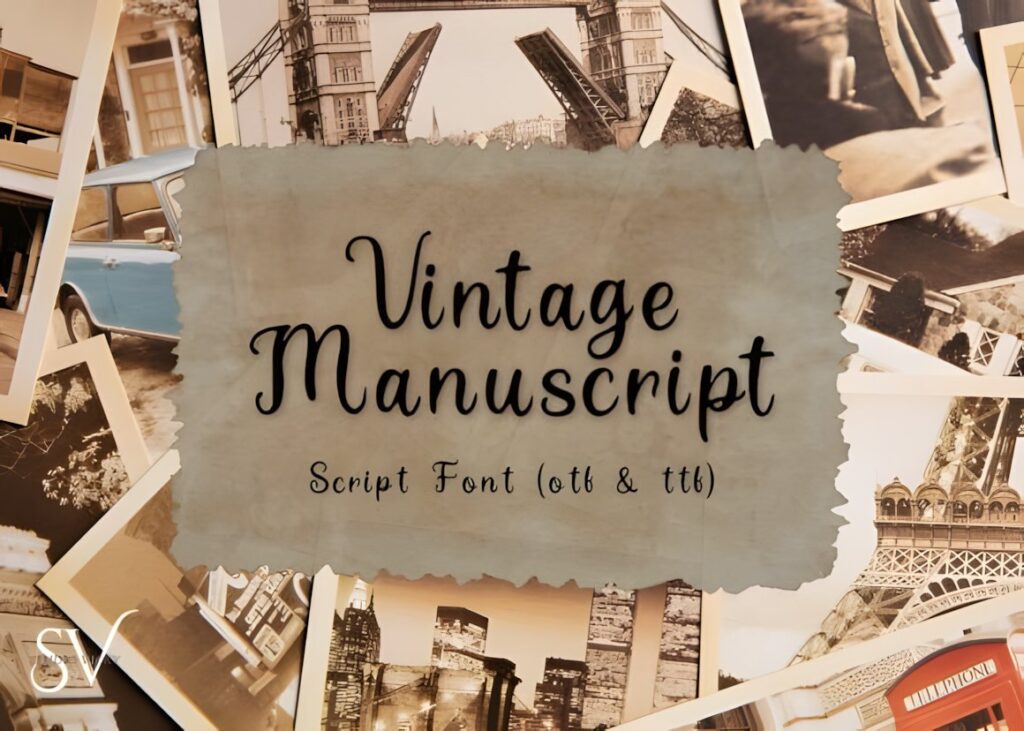
Vintage Manuscript takes the collection in a more historical direction, drawing on flowing penmanship associated with old letters, book pages, and antique calligraphy. It makes sense for manor-house weddings, period-inspired invitations, formal announcements, and stationery intended to feel deliberately aged rather than simply romantic.
The product includes TTF and OTF files. Its old-world personality is the main reason to choose it over a cleaner modern script. Consider a simpler option such as Dellina Script when the stationery needs contemporary polish, while Vintage Manuscript is better reserved for projects where historical atmosphere is part of the visual concept.
3. Wedding Vintage
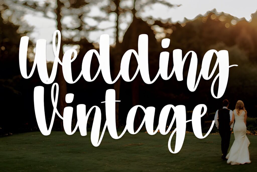
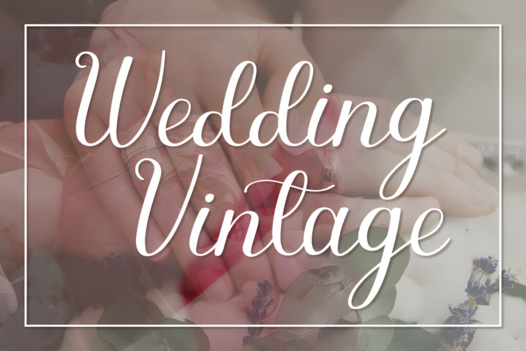
Wedding Vintage by Creativewhitee is a romantic flowing handwritten font aimed directly at invitations and other personal wedding projects. Compared with the more historical Vintage Manuscript, this option feels softer and more immediately decorative, making it useful for floral invitation suites, save-the-dates, welcome cards, and short personal messages.
Its graceful rhythm suits prominent names particularly well. Use it at a comfortable display size rather than forcing long practical information into the same script. If the design already includes ornate borders, wax-seal graphics, or detailed florals, a less decorative supporting font can keep the final layout from becoming visually crowded.
4. Tartaglia
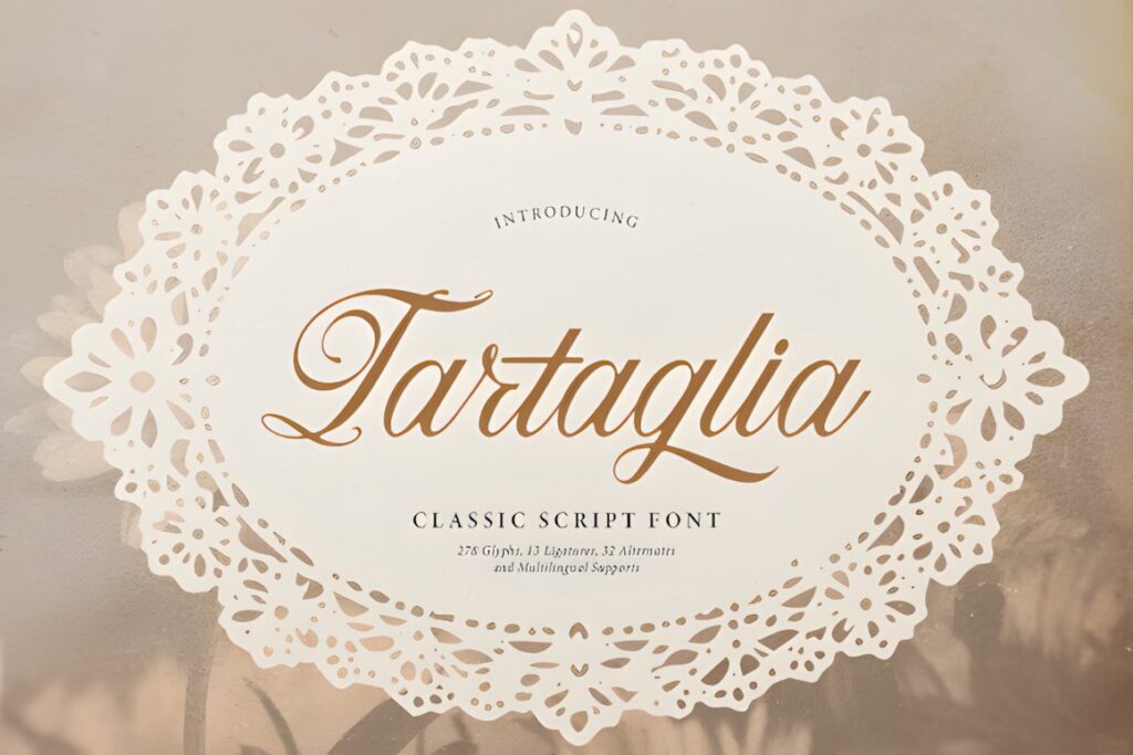
Tartaglia is a classic script with looped capitals, connected strokes, and delicate swash accents. Its styling fits formal wedding invitations, romantic stationery, reception signage, and layouts that reference traditional engraved or handwritten correspondence without looking like a literal historical manuscript.
The looping capitals make Tartaglia especially useful when the initials or first letters of the couple’s names are intended to become part of the visual composition. Those same flourishes require space, so test longer names before committing to a narrow invitation layout. For tight cards and small labels, a more restrained script can produce cleaner spacing.
5. Dellina Script
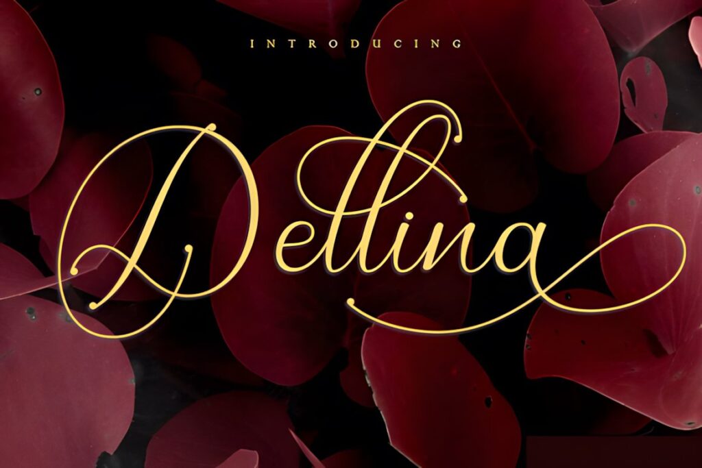
Dellina Script combines romantic calligraphy with decorative swashes, giving it a polished appearance for invitation headings, greeting cards, personalized wedding signs, and matching stationery pieces. It offers a useful middle ground between highly antique lettering and very casual modern handwriting.
The swashes are the feature to build around rather than use everywhere. A couple’s names can carry the decorative treatment while dates and venue information remain restrained. This makes Dellina especially practical when you want several stationery pieces to feel related without giving every card the same ornate composition. Vintage Manuscript will make more sense when a distinctly historical mood is the priority.
6. Vintage Script
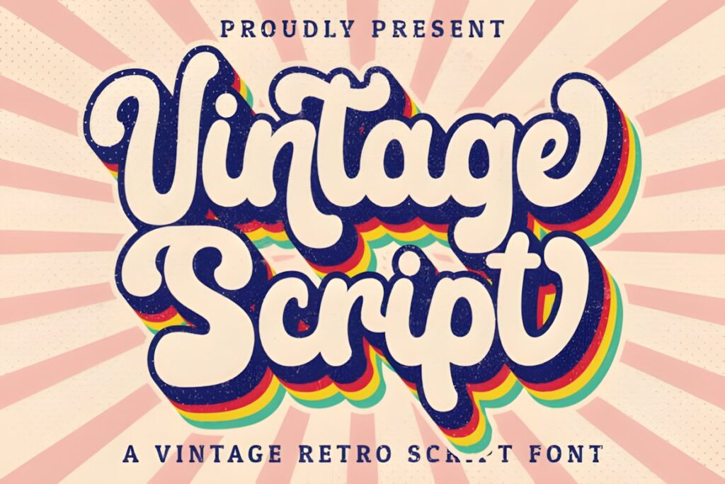
Vintage Script by Hoperative Design brings a more overt retro flavor to handwritten lettering. The font is presented for invitations, stationery, wedding designs, branding, and other display uses, so it works well when the wedding style is nostalgic without needing to feel strictly Victorian or traditionally formal.
The font is PUA encoded and includes accessible glyphs and swashes according to its product page. Use those decorative forms selectively for initials, names, or a short heading. Its retro personality is stronger than Dellina Script, so Vintage Script makes more sense for themed stationery, while a quieter calligraphy face may be easier to integrate into minimalist wedding paper.
7. Retro Script
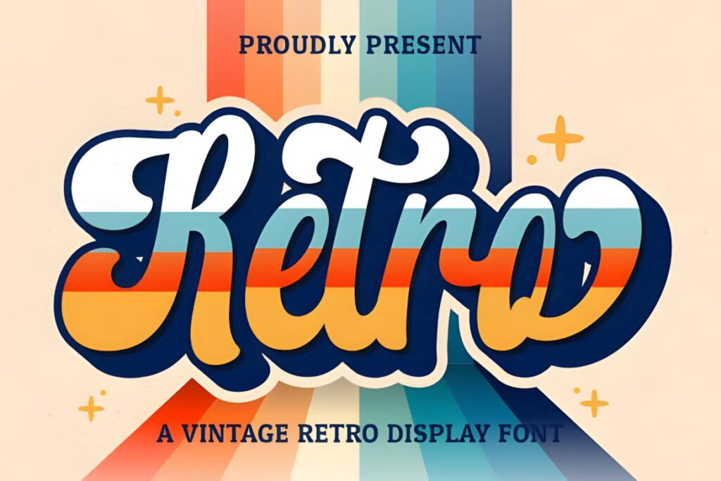
Retro Script is another Hoperative Design script, but its role is slightly different: choose it when the stationery should feel nostalgic, informal, and influenced by retro lettering rather than antique penmanship. It can work for wedding stationery, invitation accents, welcome signs, and celebration graphics where a strict black-tie aesthetic would feel too formal.
The product page states that the font is PUA encoded, with glyphs and swashes available for decorative customization. Because the retro character is noticeable, let the script establish the mood and keep secondary typography simple. For a stately or historic venue, Vintage Manuscript provides a more period-oriented result.
8. Wedding Script
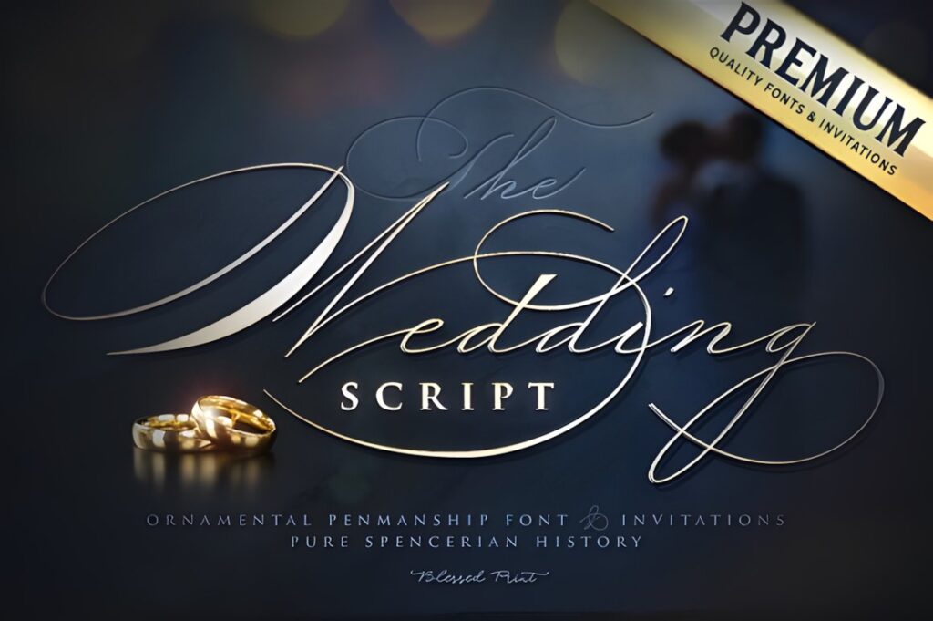
Wedding Script by Blessed Print is an ornamented calligraphy font designed for wedding invitations, menus, and logos. It suits stationery where the script needs to function as decoration in its own right, especially on invitation fronts, dinner menus, table numbers, or coordinated signage.
Its more ornate appearance creates stronger visual emphasis than the softer Wedding Vintage styles. That makes it useful when the overall design is relatively restrained and the typography needs to supply the decorative element. In a layout already filled with floral illustration, borders, or embellished monograms, the additional ornament can compete for attention, so a simpler script may create better hierarchy.
9. Wedding by Infontree
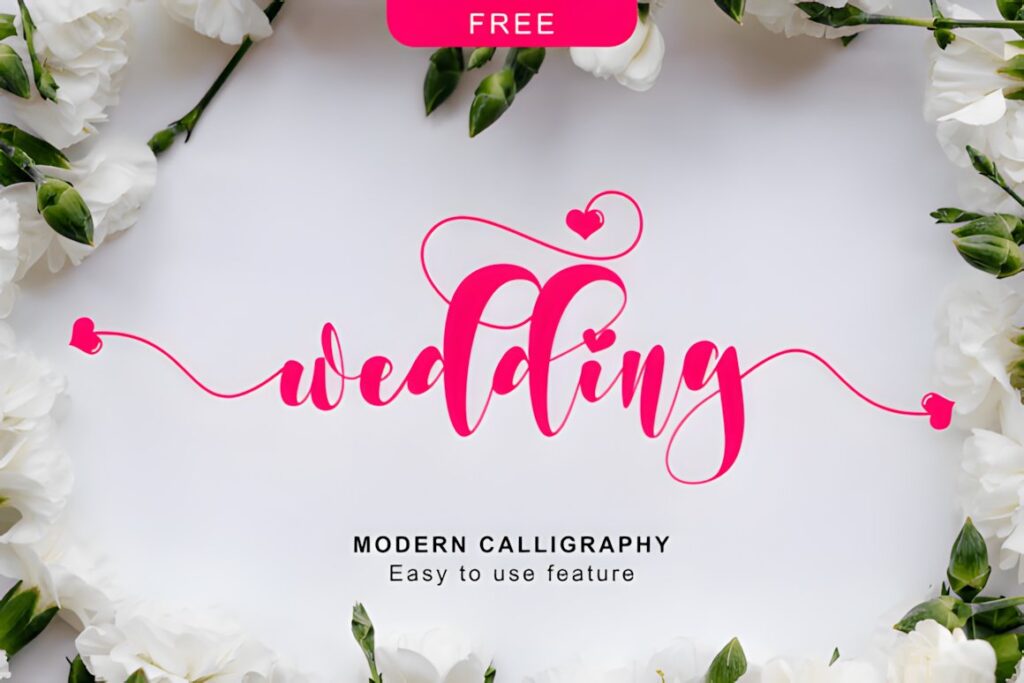
Wedding by Infontree is a romantic calligraphy typeface with letters that move along the baseline rather than sitting in a completely rigid rhythm. That gives short text a lively handwritten quality suited to names, save-the-date headlines, favor tags, envelope details, and other stationery accents.
The changing baseline provides personality, but it also makes this font better for expressive display text than highly structured informational sections. Use it where a handwritten touch matters more than strict alignment. For menus or invitation details with several lines that need a calmer rhythm, Dellina Script or another less animated option may integrate more easily.
10. Beautiful Vintage
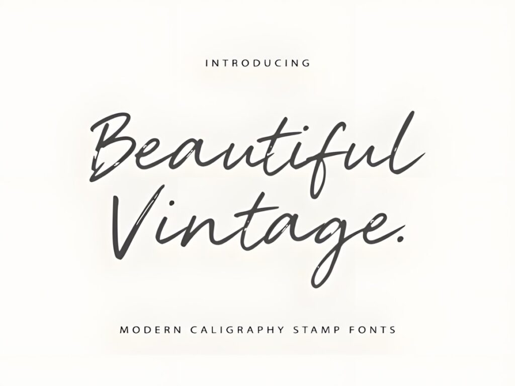
Beautiful Vintage is a timeless calligraphy font intended for uses ranging from formal wedding invitations to fashion-oriented layouts. For wedding paper, its strength is versatility: it can support an elegant vintage mood without pushing the design as strongly toward antique manuscript lettering or retro signage.
That flexibility makes it useful for a coordinated suite where the same decorative voice needs to appear on the invitation, menu, and smaller personalized pieces. Keep the calligraphy focused on short text and use a complementary supporting face for practical information. Choose Vintage Manuscript instead when historical authenticity is more important than broad styling flexibility.
11. Wedding Vintage by Erik Studio
Wedding Vintage by Erik Studio is a refined script with a formal calligraphic personality and decorative alternates and ligatures listed on its product page. It suits invitation names, monograms, stationery headings, menu titles, and other pieces where custom-looking letter combinations can become part of the design.
The alternates give you more freedom to adjust prominent words when standard letter combinations feel repetitive. Avoid using every decorative variation at once; selective customization usually creates a more polished result. This font makes sense when you want more control over expressive letterforms, while simpler scripts are easier when the project needs a consistent treatment across many small text elements.
Quick Comparison of the 11 Calligraphy Styles
| Font | Best for | Style | Key visual trait | Project fit |
|---|---|---|---|---|
| Vintage Signature | Couple names | Signature calligraphy | Sweeping curves | Invitations and headings |
| Vintage Manuscript | Old-world themes | Antique script | Historical penmanship | Formal invitations |
| Wedding Vintage | Romantic suites | Flowing handwritten | Soft graceful rhythm | Invites and save-the-dates |
| Tartaglia | Formal names | Classic script | Looped capitals | Invitations and signage |
| Dellina Script | Coordinated stationery | Romantic calligraphy | Decorative swashes | Invitations and cards |
| Vintage Script | Retro weddings | Vintage handwritten | Decorative glyphs | Invitations and accents |
| Retro Script | Nostalgic themes | Retro script | Informal vintage character | Signs and stationery |
| Wedding Script | Ornamental layouts | Decorative calligraphy | Strong ornamentation | Invitations and menus |
| Wedding by Infontree | Expressive accents | Romantic calligraphy | Dancing baseline | Names and tags |
| Beautiful Vintage | Versatile vintage suites | Timeless calligraphy | Balanced elegance | Invites, menus, cards |
| Wedding Vintage by Erik Studio | Customized names | Refined script | Alternates and ligatures | Names and monograms |
Using Calligraphy Across a Wedding Invitation Suite
A coordinated stationery suite does not require every piece to use the calligraphy font in the same way. On the primary invitation, the couple’s names can carry the strongest decorative treatment. A save-the-date may use the same script only for a short headline, while the menu might repeat it for section names such as Dinner, Dessert, and Drinks.
For smaller pieces—place cards, RSVP cards, envelope return addresses, and favor tags—reduce the amount of calligraphy before reducing the font to an uncomfortable size. One surname, one heading, or a short personalized phrase can be enough to connect the piece visually to the rest of the suite.
This approach also creates clearer hierarchy. Guests can recognize the decorative style immediately while practical details remain easy to scan.
Swashes, Ligatures, and Decorative Capitals
Decorative characters are most useful when they solve a composition problem rather than when they are added simply because they are available. A swash can fill open space beneath a short surname, an alternate capital can prevent two neighboring flourishes from colliding, and a ligature can make an important pair of letters feel more naturally connected.
Before building an entire invitation around alternates, type the actual names that will appear on the stationery. A capital that looks elegant in an alphabet preview may behave differently beside a particular lowercase letter. Long names also need more horizontal room, especially when the script contains wide entry strokes or exit flourishes.
If a font offers several decorative options, choose a small number of recurring treatments and repeat them consistently across the suite. Consistency usually looks more intentional than giving every word a different flourish.
How to Pair Vintage Calligraphy with Supporting Type
Let the calligraphy establish personality and give the supporting font a quieter job. For traditional wedding stationery, a restrained serif can handle dates, addresses, RSVP instructions, and menu descriptions while the script remains reserved for names and headings. A clean sans serif creates stronger contrast when the stationery combines vintage lettering with a more contemporary layout.
Avoid pairing two equally expressive fonts. A decorative script beside another ornate serif or handwritten face can leave every line competing for attention. Contrast in function works better: expressive calligraphy for emotion and identity, structured typography for information.
Also compare stroke weight. Very delicate calligraphy beside an extremely heavy supporting font can feel disconnected unless that contrast is deliberate. Test both styles together at the actual print sizes rather than judging them only as enlarged samples on screen.
Common Wedding Calligraphy Font Mistakes
- Using script for every line. Decorative calligraphy usually works better for names, headings, and short accents than for addresses or lengthy instructions.
- Choosing from an alphabet preview alone. Type the actual couple names, venue, and important words before deciding.
- Adding too many swashes. Flourishes need negative space around them to remain readable.
- Ignoring final print size. Thin strokes and tight counters can look very different after a design is reduced.
- Forgetting long names. Wide capitals and extended entry or exit strokes can quickly exceed a narrow invitation column.
- Using several competing decorative fonts. One characterful script plus restrained supporting type usually produces a clearer hierarchy.
Choosing the Right Vintage Style for Your Wedding
If the wedding concept is built around antique correspondence, old books, historic architecture, or period details, Vintage Manuscript has the clearest old-world direction. For a more romantic and polished presentation centered on large names, Vintage Signature brings stronger sweeping movement.
Choose Dellina Script when you need a decorative calligraphy style that can repeat comfortably across several coordinated pieces. Wedding Script makes more sense when the typography itself needs to supply much of the ornamentation. For a wedding with a nostalgic or less formal visual identity, Retro Script shifts the mood away from traditional formal calligraphy and toward retro lettering.
Whichever direction you choose, preview the real names and wording at final size before committing to the complete suite. Also check the current product license for the exact personal, client, printed-product, or other use you have planned.
Frequently Asked Questions
What makes a calligraphy font look vintage on wedding stationery?
Vintage calligraphy usually combines flowing handwritten construction with details associated with older penmanship, such as decorative capitals, long strokes, traditional curves, or restrained flourishes. The overall layout matters too. A vintage script paired with generous spacing, classic serif supporting text, and simple ornamental details will usually communicate the period influence more clearly than the script alone.
Should a calligraphy font be used for all the text on a wedding invitation?
Calligraphy is usually more effective as display typography than as the only font on an invitation. Use it for the couple’s names, short headings, or selected accents, then place dates, venue information, RSVP instructions, and other practical details in a more restrained serif or sans serif. This keeps the decorative character while improving readability and hierarchy.
How should swashes and alternate letters be used in wedding names?
Use swashes and alternates selectively where they improve the shape and spacing of the actual names. Long flourishes need enough empty space and can collide with nearby letters, borders, or other lines of text. Preview several combinations before finalizing the layout, then repeat a limited set of decorative treatments across the stationery suite for a more consistent result.
Do I need to check the font license before using it for wedding stationery?
Yes. Check the current license attached to the specific font product for the use you have planned. Personal invitations, paid client projects, printed products, editable templates, and items intended for resale can involve different licensing considerations. Avoid assuming that every font or every marketplace product grants identical rights simply because the designs appear in the same category.