ℹ️ Affiliate Disclosure: This article may contain affiliate links. If you book or purchase through these links, we may earn a commission at no additional cost to you.
Choosing the Best Vintage Calligraphy Fonts for Apothecary Designs
Vintage apothecary designs need lettering that feels old enough to belong on a botanical tonic, soap wrapper, herbal jar, or pharmacy label without making the text difficult to read. The challenge with vintage calligraphy alphabet fonts is balancing decorative character with the practical space available on labels. Long swashes can crowd borders, delicate strokes may disappear at small sizes, and very casual scripts can weaken the formal pharmacy-inspired look.
The fonts below approach that problem differently. Some use restrained handwritten forms for ingredient-style labels, while others provide dramatic Victorian curves, bold retro strokes, or ornate display lettering better suited to a product name. For apothecary packaging, the strongest layouts often use the calligraphy font only for the brand or featured product name and let a simpler supporting typeface handle dosage-style details, ingredients, dates, and other small information.
Many more vintage scripts are available, while this shortlist concentrates on fonts with distinctly different personalities and practical roles in apothecary-style labels, packaging, and branding.

The most useful vintage calligraphy fonts for apothecary designs fall into four groups: restrained handwritten scripts for small labels, flowing calligraphy for prominent product names, ornate Victorian lettering for historical character, and heavier retro scripts for packaging that needs stronger shelf presence. Choose according to label size and hierarchy rather than decoration alone.
Quick Picks
For a direct handwritten apothecary feel: Apothecary — a pen-like script that works naturally with handmade and botanical label concepts.
For elegant product names: Vintage Signature — flowing calligraphic forms suit prominent names on refined bottle and box packaging.
For Victorian-style packaging: Victorian — thin graceful script gives historical layouts a more formal character.
For bold vintage labels: Antique Vintage — thicker connected brush lettering is easier to use when the product name needs more visual weight.
For ornate heritage branding: Wonderful Vintages — polished retro lettering fits larger labels, packaging fronts, and vintage-style brand marks.
Vintage Calligraphy Fonts for Apothecary Packaging and Labels
1. Apothecary
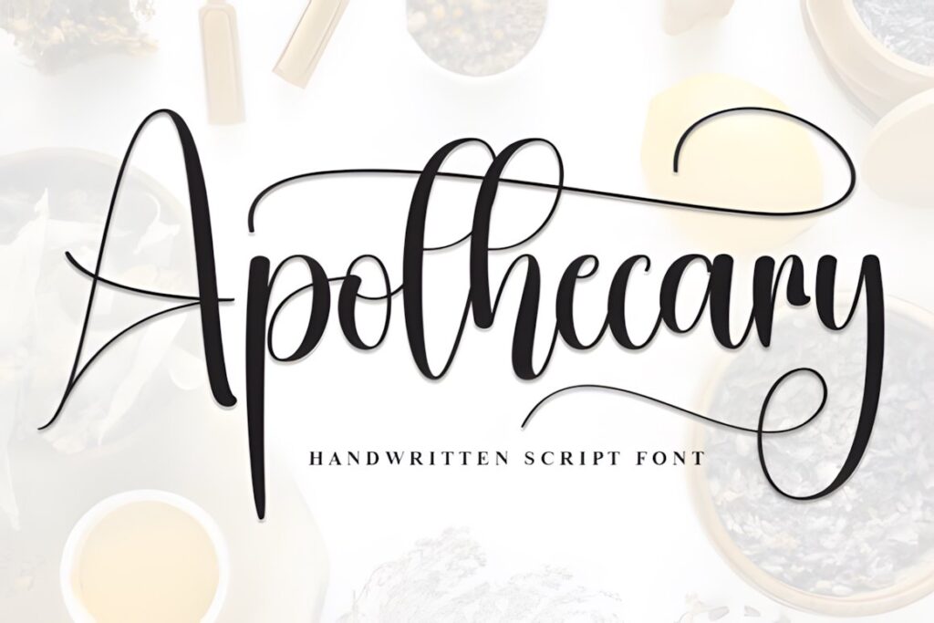
Apothecary is a handwritten font with a pen-written character, making it a natural starting point for botanical labels, handwritten-style ingredient names, small-batch packaging, and pharmacy-inspired stationery. Its personality is warmer and less ceremonial than highly flourished Victorian scripts, which helps when a design should feel handcrafted rather than luxurious.
Use it for a short product name or secondary handwritten line surrounded by structured borders and restrained supporting typography. For a label that needs dramatic historical ornament or a highly formal centerpiece, one of the more decorative scripts later in the list will create a stronger period effect.
2. Vintage Calligraphy
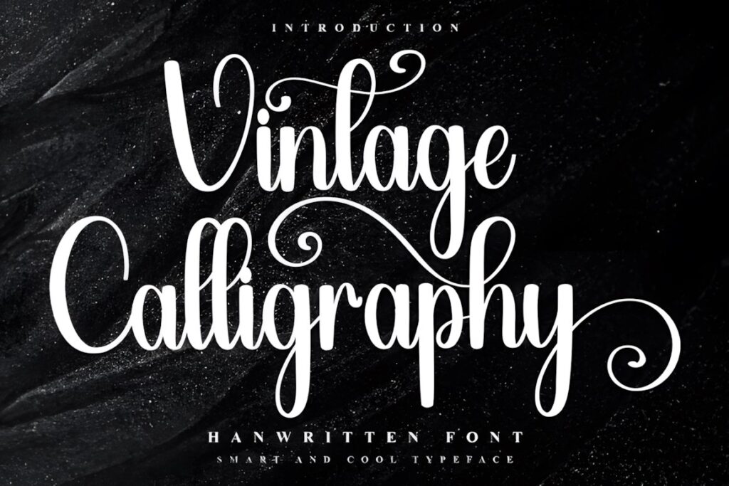
Vintage Calligraphy by Inermedia STUDIO is a decorative script with a nostalgic character and access to additional glyphs and ligatures through PUA encoding. Its flowing construction makes more sense for prominent wording than for compact ingredient text.
On an apothecary layout, consider reserving it for the featured remedy, fragrance, or collection name and giving it generous space between ornamental borders. If the label is very narrow or text-heavy, Apothecary or another restrained option will be easier to integrate without competing with surrounding information.
3. Vintage Signature
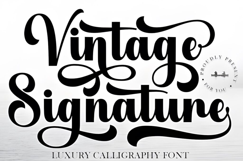
Vintage Signature is a calligraphy typeface built around sweeping curves and balanced handwritten forms. The product specifically positions it for applications including boutique branding and product labels, which makes its refined signature character especially useful for elegant tinctures, fragrances, soaps, and gift-box packaging.
This style works best when the calligraphy acts as a focal point. Give long capitals and flourishes room to breathe, then use a restrained supporting font for concentrations, ingredients, quantities, or descriptive text. For a rugged herbal-shop aesthetic, a rougher or heavier script may feel more appropriate.
4. Victorian Signature
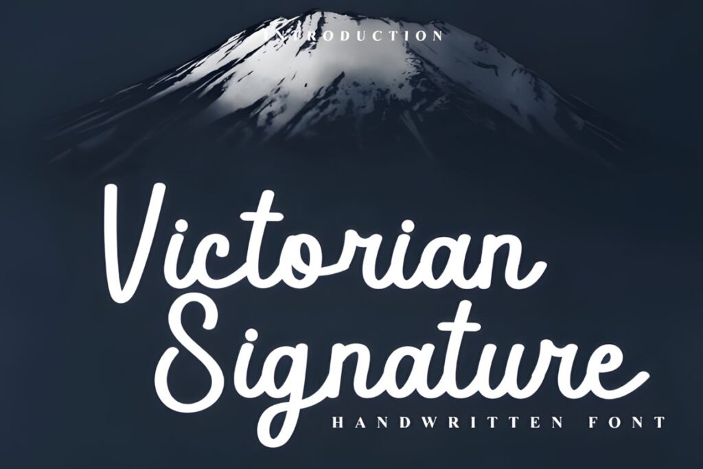
Victorian Signature combines connected cursive strokes with dramatic sweeps inspired by vintage handwriting. Its PUA-encoded swashes and alternate characters allow decorative customization where the label has enough open space for extended letterforms.
Imagine it across the center of a tall bottle label with a small uppercase descriptor above and structured details below. That hierarchy reinforces the historical mood without turning every text line into ornament. For tiny jars or narrow labels, use fewer decorative characters so the product name remains recognizable.
5. The Antique
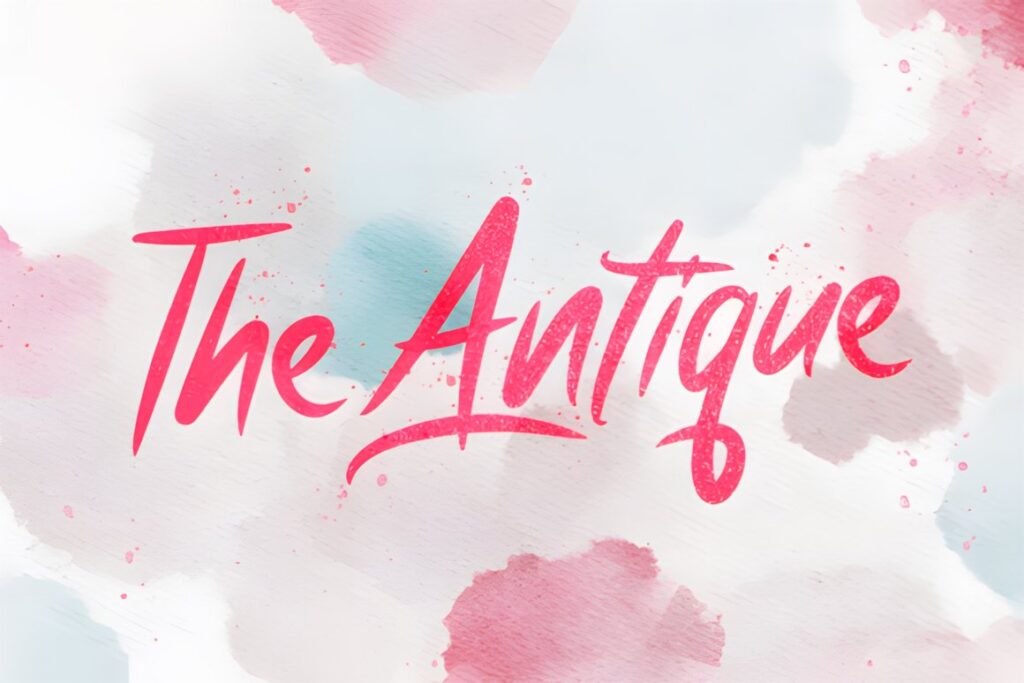
The Antique is a bold vintage script created for uses that include logos, headings, and labels. Compared with thin formal calligraphy, its heavier visual presence gives short wording more authority and makes it easier to use as the dominant text on a packaging front.
It suits apothecary concepts where the main name should compete successfully with frames, crests, herbs, and other vintage decoration. Consider a lighter script such as Victorian when you want a delicate correspondence-inspired look rather than a bold merchant-label appearance.
6. Victorian
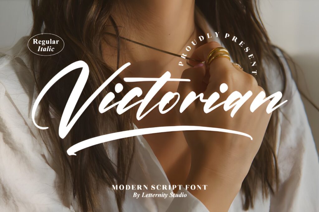
Victorian by Letternity is a thin, graceful script with PUA-encoded glyphs and ligatures. Its lighter construction is particularly useful for a refined historical direction where the lettering should resemble formal penmanship rather than bold advertising script.
Choose Victorian for larger printed labels, boxed goods, certificate-style packaging inserts, or prominent headings with enough physical space for delicate strokes. Very small labels may benefit from a thicker font because fine details can lose impact once the design is reduced.
7. Antique Vintage
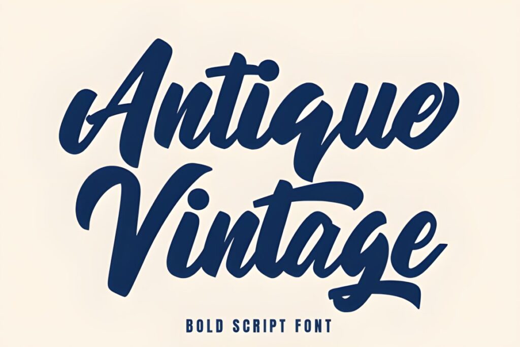
Antique Vintage uses thick brush-script strokes and connected handwritten forms. The heavier construction gives it a stronger presence than delicate calligraphy, making it useful for product names that must remain visually dominant alongside dense vintage ornament.
This makes sense for larger soap labels, candle packaging, botanical jars, and storefront-style apothecary branding. Its weight can become visually crowded in layouts already filled with borders and illustrations, so reduce competing decoration rather than shrinking the script excessively.
8. Vintage Script
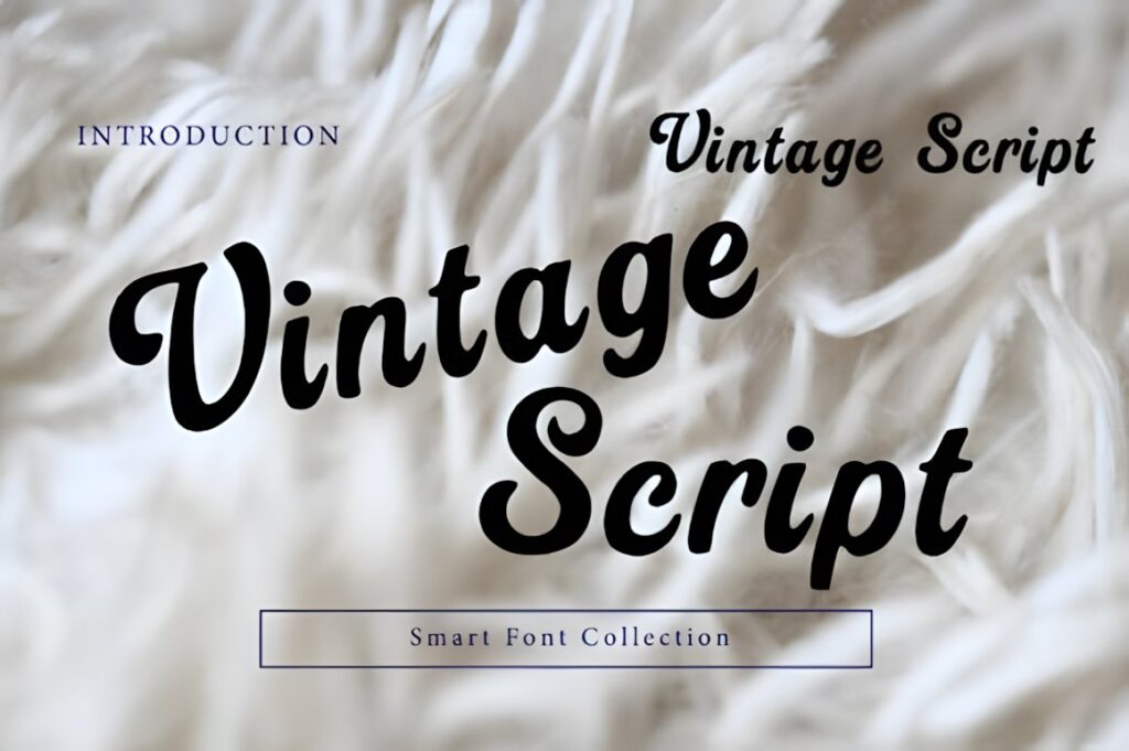
Vintage Script by Wow Magic is a smooth handwritten script with rounded strokes and connected lettering. Its product description specifically lists packaging and product labels among its intended uses, giving it a practical role in retro-inspired apothecary branding that does not need heavy Victorian ornament.
Use it when the label should feel approachable and nostalgic rather than museum-like. The rounded flow works well for handmade goods and shorter brand names, while formal medicinal or archival concepts may benefit from a sharper, more period-specific script such as Victorian Signature.
9. Vintessia
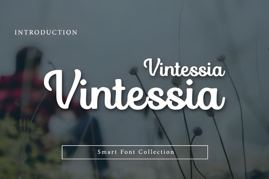
Vintessia is a vintage-inspired script with bold flowing strokes, soft curves, and a signature-like character. It is presented for branding, packaging, and label applications, which makes it a useful bridge between elegant calligraphy and stronger retro display lettering.
It can carry the main product name on bottles, boxes, candle labels, and personal-care packaging while a simpler typeface handles functional details. Choose a thinner script if your design relies on fine engraved-style borders or delicate botanical illustration and needs less typographic weight.
10. Wonderful Vintages
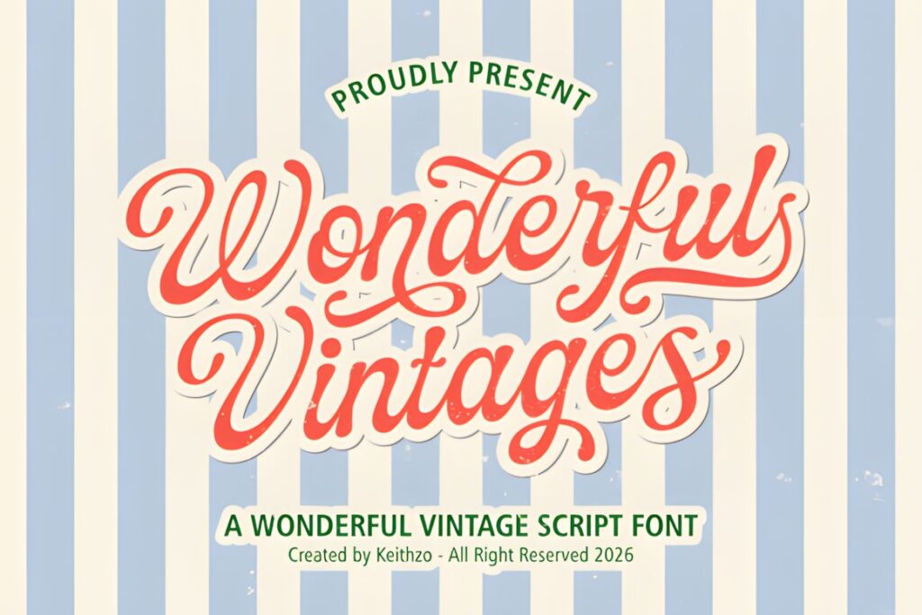
Wonderful Vintages draws on mid-century sign lettering and uses polished, rhythmic script forms suited to logos, packaging, posters, and labels. The product includes uppercase and lowercase characters, numerals, symbols, and multilingual support, providing more flexibility for complete packaging systems.
For an apothecary project, it works particularly well when you want historical flavor without restricting the visual language to strictly Victorian references. Its retro personality is stronger than a restrained handwritten font, so keep supporting information simple and let the script carry the main decorative role.
11. Mogetta Script
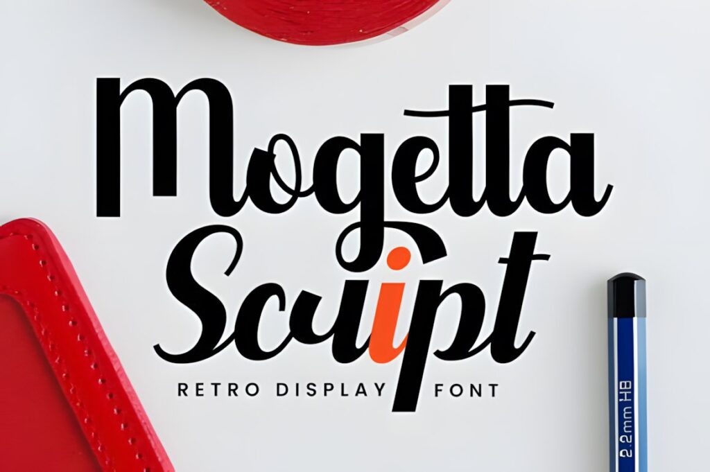
Mogetta Script uses sweeping flourishes and a tall script structure intended for applications including artisanal product labels and retro branding. That combination makes it useful for packaging where the lettering should feel crafted but still function as a clear display element.
Try it for the central product name on herbal balms, fragrances, candles, bitters-inspired packaging, or boxed gift sets. Because decorative flourishes occupy extra horizontal and vertical space, test the actual product name at finished label dimensions before building borders tightly around the typography.
12. Vintage Glory
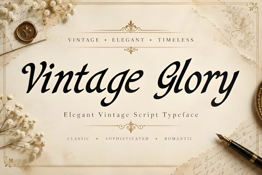
Vintage Glory is a decorative calligraphic script with expressive thick-and-thin strokes and flowing connections. Its listed applications include product labels and packaging, giving it a strong role in sophisticated apothecary concepts where the main wording should feel ornamental and deliberately styled.
This is better suited to a featured brand or product name than dense descriptive copy. Pair it with quiet typography for quantities, scent names, ingredients, and informational lines. If the label is extremely small, a simpler script such as Apothecary may preserve the handwritten mood with less visual complexity.
13. Shadow Beauty
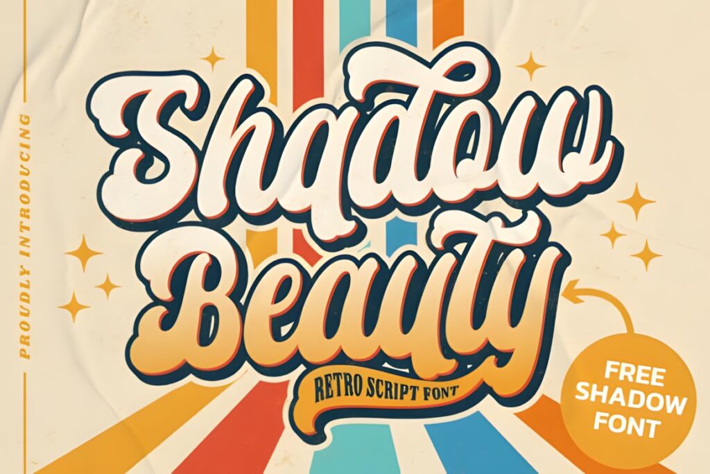
Shadow Beauty is a vintage-style script with decorative swashes and PUA-encoded characters. Its retro personality makes it suitable for short logos, brand names, and featured label text where a conventional modern script would feel too clean.
The swashes can help create a custom-looking wordmark, but the strongest result will usually come from using only a few decorative characters instead of ornamenting every letter. For labels with intricate frames, engraving-style illustrations, or multiple badges, limiting flourishes keeps the design from becoming visually congested.
14. Luckhig Rudhar
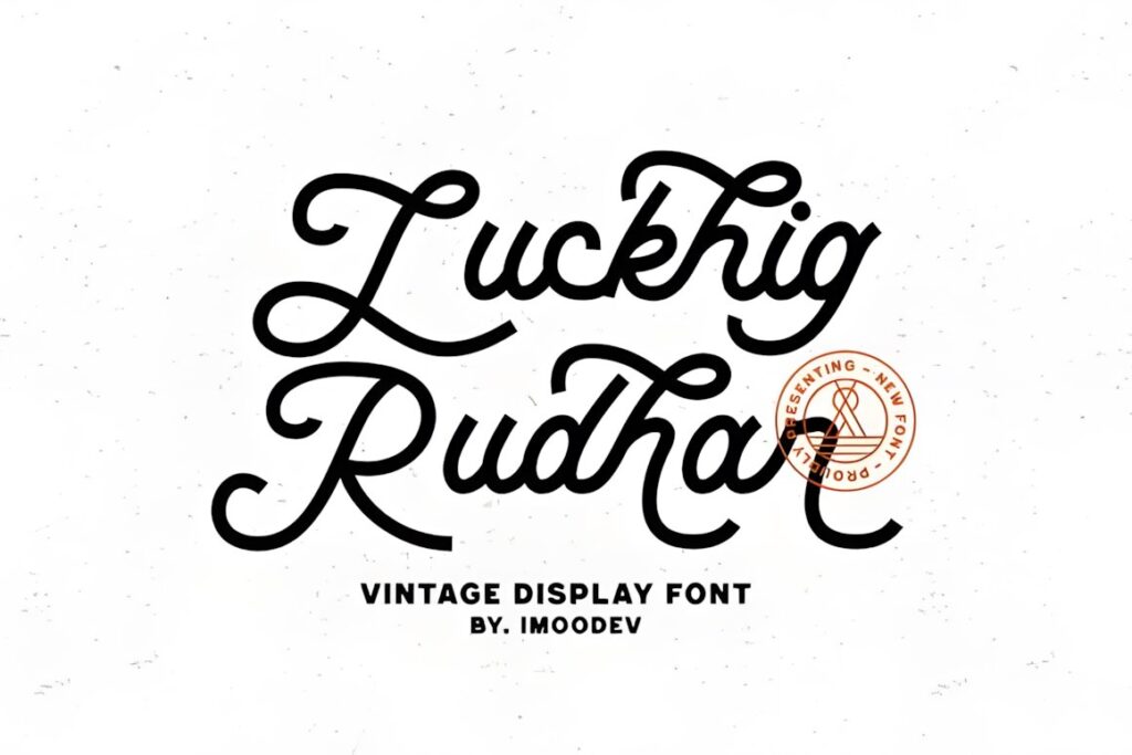
Luckhig Rudhar is a retro script designed around a 1960s-inspired appearance and includes an extruded version for stronger dimensional effects. Its listed uses include vintage designs, labels, headings, and packaging, so it can work well for apothecary concepts that lean toward retro retail rather than strict Victorian history.
Choose it for bold product names, gift packaging, or larger display labels where the lettering should feel energetic and immediately visible. For antique botanical packaging with delicate rules and engraving-style decoration, a thinner calligraphic option will create a more restrained relationship with the artwork.
15. Antonia Retro
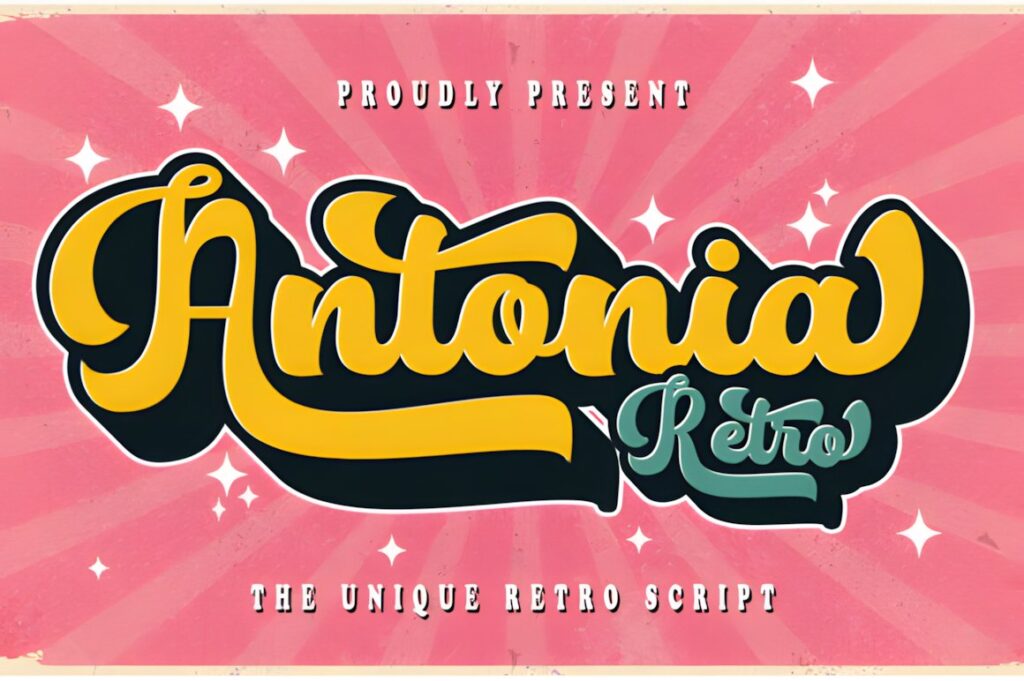
Antonia Retro is a bold script influenced by 1960s typography and includes an extruded version. The font is positioned for uses including labels, packaging, logos, stationery, and advertising, making it useful when an apothecary project needs a stronger retro-branding direction instead of delicate historical penmanship.
Its larger personality suits product fronts, outer boxes, store signage, and promotional graphics. It is less appropriate for small supporting copy or tightly packed vintage layouts, where a restrained script or serif companion can provide clearer hierarchy.
Quick Comparison
| Font | Best for | Style | Key visual trait | Apothecary project fit |
|---|---|---|---|---|
| Apothecary | Handmade labels | Handwritten | Pen-like character | Botanical jars and small-batch goods |
| Vintage Calligraphy | Featured product names | Decorative script | Flowing calligraphy | Ornamental bottle and box labels |
| Vintage Signature | Refined packaging | Calligraphy | Sweeping curves | Fragrance and boutique-style labels |
| Victorian Signature | Historical elegance | Connected script | Dramatic sweeps | Formal vintage bottle labels |
| The Antique | Bold headings | Vintage script | Heavier presence | Merchant-style packaging fronts |
| Victorian | Fine historical layouts | Thin script | Graceful strokes | Large labels and boxed products |
| Antique Vintage | Strong product names | Brush script | Thick connected strokes | Soaps, candles, and jars |
| Vintage Script | Friendly retro branding | Handwritten script | Rounded connections | Handmade-goods packaging |
| Vintessia | Brand-focused labels | Vintage script | Bold flowing strokes | Bottles, boxes, and candles |
| Wonderful Vintages | Heritage branding | Retro script | Polished rhythmic forms | Large labels and package fronts |
| Mogetta Script | Artisanal labels | Decorative script | Sweeping flourishes | Balms, candles, and boxed sets |
| Vintage Glory | Decorative focal text | Calligraphic script | Thick-thin contrast | Elegant product and fragrance labels |
| Shadow Beauty | Customized wordmarks | Vintage script | Decorative swashes | Brand names and focal text |
| Luckhig Rudhar | Retro retail packaging | Bold script | 1960s character | Large labels and display packaging |
| Antonia Retro | High-impact product fronts | Retro script | Bold dimensional style | Boxes, signage, and promotional labels |
How These Apothecary Font Styles Differ
The largest difference is not simply how vintage each font looks. It is how much space and visual attention the lettering demands. Apothecary and Vintage Script sit toward the restrained handwritten end of the spectrum, making them easier to combine with botanical drawings and informational text.
Vintage Signature, Victorian Signature, Victorian, and Vintage Glory introduce more calligraphic drama. These styles make sense when the product or company name needs to become the decorative centerpiece of the label.
Antique Vintage, Vintessia, The Antique, Luckhig Rudhar, and Antonia Retro use stronger strokes and a more obvious display personality. They are useful when the finished package must remain recognizable from farther away or when the design intentionally references vintage shop signs and commercial labels rather than handwritten correspondence.
Packaging and Label Considerations
Build the label hierarchy before choosing how many swashes or ornamental characters to use. The main name can carry the vintage calligraphy, but information such as quantity, scent, botanical variety, batch information, or descriptive copy usually benefits from simpler typography.
Short names provide more freedom. A word such as “Elixir” or a compact brand name can tolerate wide capitals and long finishing strokes. Multi-word product names consume horizontal space quickly, so a more restrained script often produces a cleaner result.
Always judge the font at actual output size rather than only on a large monitor preview. A flourish that looks balanced at poster scale may collide with borders when reduced to a two-inch label. Fine calligraphic strokes can also become less distinct on textured stock, kraft paper, or small-format packaging.
Font Pairing Tips for Apothecary Designs
Use the calligraphy font for personality and let the supporting font provide structure. A restrained serif can handle botanical names, product categories, dates, and formal information while preserving a historical tone. A quiet sans serif can work when the apothecary visual style is being interpreted in a cleaner contemporary way.
Avoid pairing two highly decorative scripts in the same small label. When both typefaces contain swashes, unusual capitals, and irregular rhythm, the hierarchy becomes difficult to read. Contrast is more useful: decorative script for the featured name, simpler typography for everything that explains the product.
For especially ornate scripts, repeat visual character through borders, dividers, or illustrations rather than introducing another decorative alphabet. This lets the typography feel integrated with the apothecary theme without making every element compete for attention.
Common Font Selection Mistakes
- Using script for every line. Keep important supporting information in a simpler typeface.
- Choosing by preview size alone. Test the actual bottle, jar, box, or card dimensions before finalizing the layout.
- Adding every available swash. One or two ornamental characters can create more impact than decorating the entire word.
- Ignoring long product names. Wide capitals and flourishes can make multi-word names difficult to fit inside vintage borders.
- Making the historical theme too literal. A modern product can still use apothecary references without forcing every element into ornate Victorian styling.
- Forgetting licensing details. Check the current product license for the exact client, packaging, resale, or merchandise use you have planned.
Choosing the Right Style for Your Apothecary Project
If you want the most direct handwritten apothecary reference, Apothecary gives the design a warm pen-written character without excessive ornament. For elegant bottles, fragrances, or boutique packaging, Vintage Signature provides more sweeping calligraphic movement.
For a stronger historical mood, Victorian brings lighter formal penmanship, while Victorian Signature creates a more expressive focal wordmark. If the package needs heavier lettering that remains visually dominant beside borders and illustration, Antique Vintage is the more assertive direction.
For apothecary branding with a broader retro-commercial influence, Wonderful Vintages, Vintessia, and Antonia Retro move away from delicate historical correspondence and toward packaging and sign-inspired display lettering. The right choice depends on whether the label should feel handwritten, Victorian, artisanal, or boldly retro.
Frequently Asked Questions
What type of calligraphy font works best for an apothecary label?
A vintage script with clear letterforms and controlled decoration usually works well for an apothecary label. Use flowing or Victorian calligraphy for a prominent brand or product name, while reserving simpler typography for ingredients, quantities, and other small information. The finished label size should determine how delicate or ornate the script can be.
Can vintage calligraphy fonts be used on small bottle labels?
Vintage calligraphy fonts can work on small bottle labels when the lettering remains simple enough at the final printed size. Short names and heavier strokes are usually easier to accommodate than long words with multiple swashes. Test the exact label dimensions before finalizing spacing, borders, or botanical illustrations around the script.
What should I pair with a vintage apothecary script font?
Pair a vintage apothecary script with a restrained serif or simple sans serif that can handle supporting information clearly. Let the script create personality in the brand or product name, then use the quieter typeface for categories, ingredients, quantities, dates, and descriptive text. Strong functional contrast usually creates a clearer hierarchy than pairing two decorative scripts.
Can I use these fonts for product packaging or client work?
Product packaging or client use depends on the current license attached to the specific font. Check the product page and license terms for the exact project you plan, particularly for client work, products for sale, print-on-demand applications, editable digital products, or other redistribution-related uses. Do not assume every font license covers every commercial scenario in the same way.