ℹ️ Affiliate Disclosure: This article may contain affiliate links. If you book or purchase through these links, we may earn a commission at no additional cost to you.
Choosing the Best Vintage Calligraphy Fonts for Wine Bottle Labels
Vintage calligraphy alphabet fonts can give a wine bottle label the sense of heritage and craftsmanship that plain display type often misses. The difficulty is choosing a script that still reads clearly when the winery name, varietal, vintage, and supporting details are compressed into a relatively small label. Very delicate hairlines can disappear, oversized swashes can crowd neighboring text, and highly decorative capitals may work beautifully for a short estate name but become difficult to manage in a longer wordmark.
For wine labels, I would compare letter width, stroke contrast, capital-letter personality, swash density, and how easily the calligraphy can be paired with a restrained serif or sans serif. The selection below ranges from formal copperplate-inspired scripts to rustic handwritten lettering and ornamental heritage styles, giving different types of wineries and bottle designs a more specific starting point.
Many more vintage scripts are available, while this shortlist concentrates on fonts with clearly different personalities and practical roles in wine-label and beverage-packaging layouts.

The most useful vintage calligraphy fonts for wine bottle labels usually fall into four groups: refined copperplate scripts for heritage wines, bold connected scripts for prominent estate names, rustic lettering for artisan labels, and ornamental display styles for short luxury names. The right choice depends less on decoration alone and more on how the lettering behaves at the final label size.
Vintage Calligraphy Fonts for Wine Bottle Labels
1. Classical Calligraphy
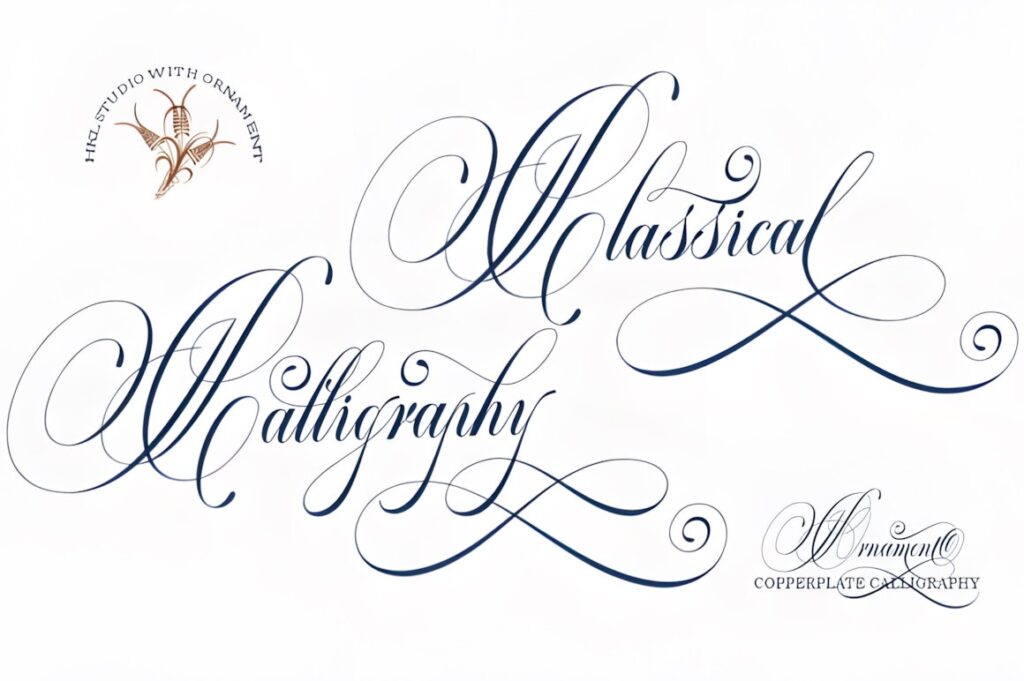
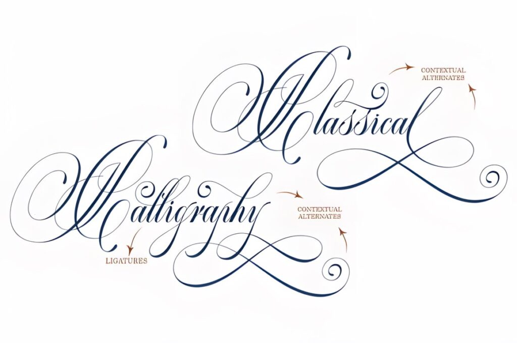
Classical Calligraphy is one of the most direct fits for a traditional wine-label brief. Creative Fabrica describes it as a vintage calligraphy script combining copperplate influences with handwriting and specifically lists alcohol labels among its intended uses. Its smooth connected forms and alternative characters can give an estate or reserve name a formal, old-world tone without relying on an especially heavy display style. :chatgpt-content-reference{index=”0″}
Choose it for elegant front-label names with enough surrounding space. For a dense or very small label, keep decorative alternates restrained and let a simpler companion face handle appellation and product details.
2. Delsya Script
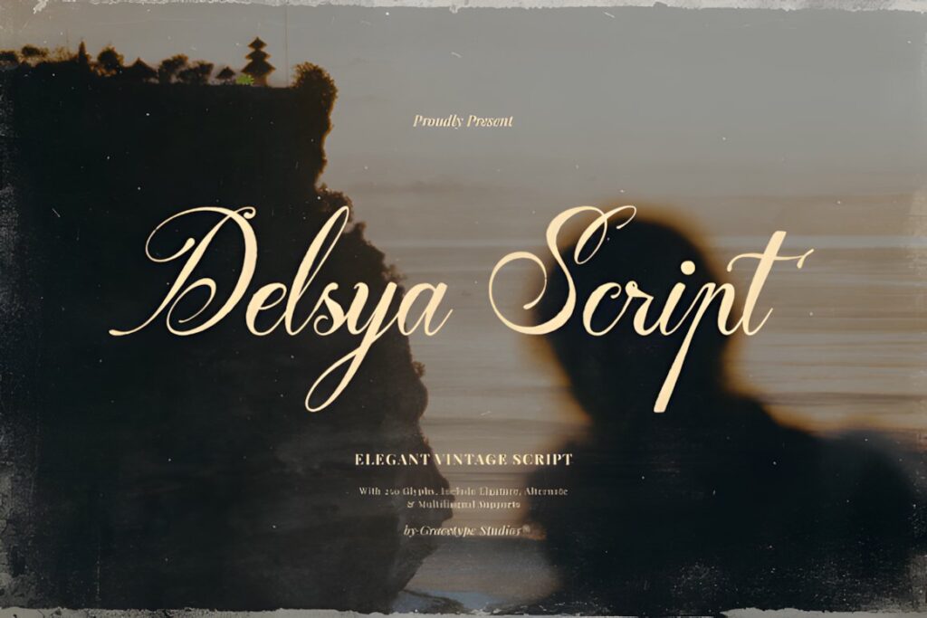
Delsya Script uses a more dramatic heritage approach, with copperplate-inspired rhythm, high stroke contrast, sweeping capitals, and elongated terminals. Its product page specifically mentions artisanal winery labels, making the font useful for a bottle design that needs a visibly luxurious calligraphic centerpiece rather than casual handwriting. :chatgpt-content-reference{index=”1″}
The expressive capitals suit short winery names especially well. Those same flourishes can become busy when the wordmark is long, so Delsya makes more sense when the script has generous negative space around it.
3. Ubel Amour
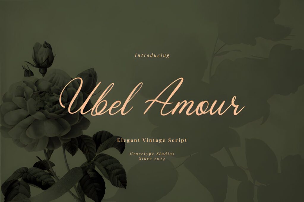
Ubel Amour is a flowing vintage script with a gentle slant and copperplate-inspired connections. Creative Fabrica specifically positions it for heritage wine labels, alongside other classic luxury applications. Its comparatively balanced proportions make it useful when you want an old-world impression without turning every letter into an oversized ornament. :chatgpt-content-reference{index=”2″}
This style makes sense for château-inspired, European, romantic, or small-batch branding. If the desired label is rugged, rustic, or heavily typographic, one of the stronger vintage scripts later in the list will provide more visual weight.
4. Yinderia
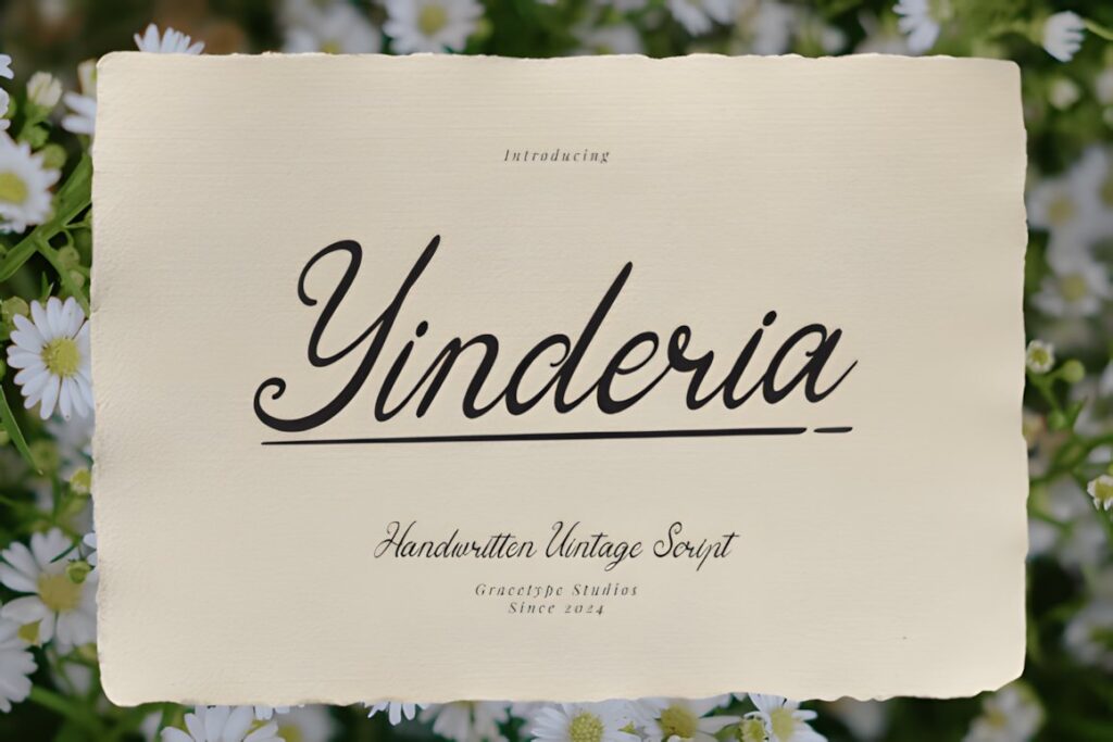
Yinderia leans toward classic fountain-pen handwriting, with flowing letterforms, graceful swashes, and a restrained vintage personality. The product description specifically lists boutique winery labels, making it suitable for wine brands that want handmade character rather than rigid formal calligraphy. :chatgpt-content-reference{index=”3″}
Its softer rhythm can work nicely for an estate signature, limited release, or family-name treatment. For a label that needs a sharper Victorian or engraved appearance, Delsya Script or Classical Calligraphy provides a more formal direction.
5. Vintage Signature
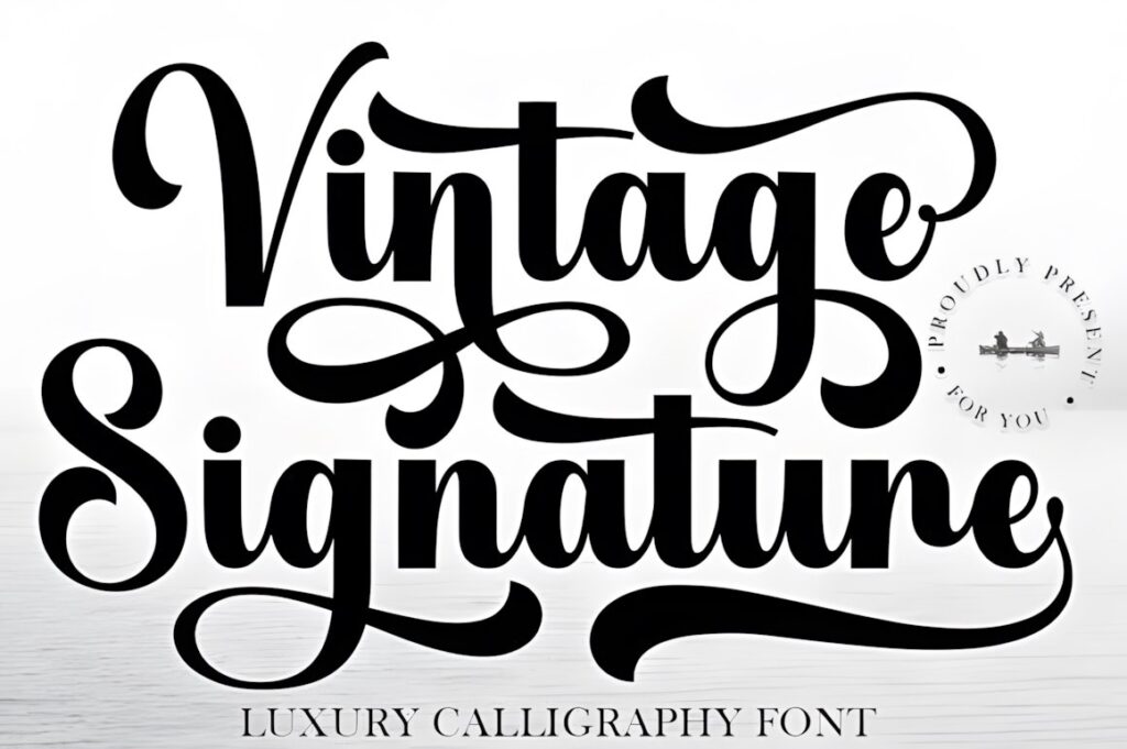
Vintage Signature combines luxury calligraphy with sweeping curves and a polished signature rhythm. Creative Fabrica highlights product labels among its potential uses and notes PUA encoding for access to special characters and decorative elements. :chatgpt-content-reference{index=”4″}
This is a useful direction when the wine brand should feel personal, boutique, or family-led. The signature character is strongest for the main name rather than long secondary information, so pair it with quieter typography below the wordmark.
6. Vintage Glory
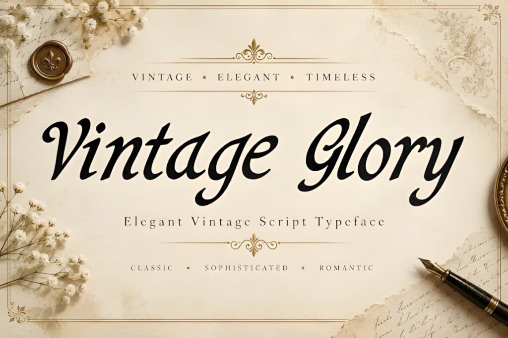
Vintage Glory uses pronounced thick-and-thin strokes, flowing connections, and a classic calligraphic character. Its product page positions the font for vintage and luxury projects including product labels and packaging, and lists an OTF font file. :chatgpt-content-reference{index=”5″}
Consider it when the bottle needs a decorative, romantic centerpiece rather than restrained handwriting. The expressive stroke contrast rewards larger sizing, so avoid squeezing a long name into a narrow label simply to preserve every flourish.
7. Wonderful Vintages
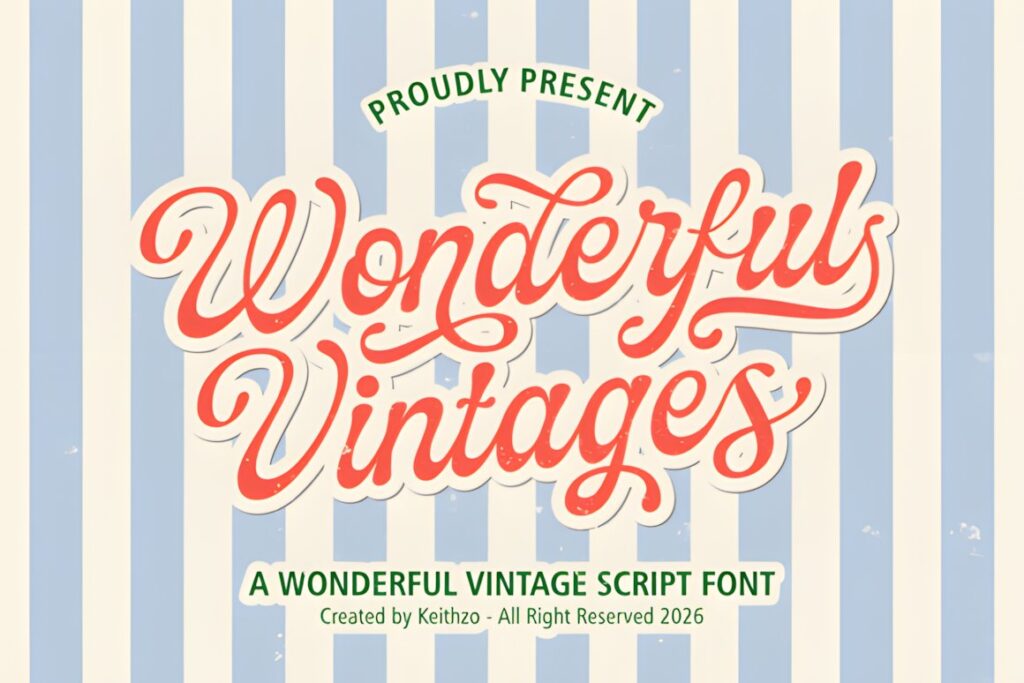
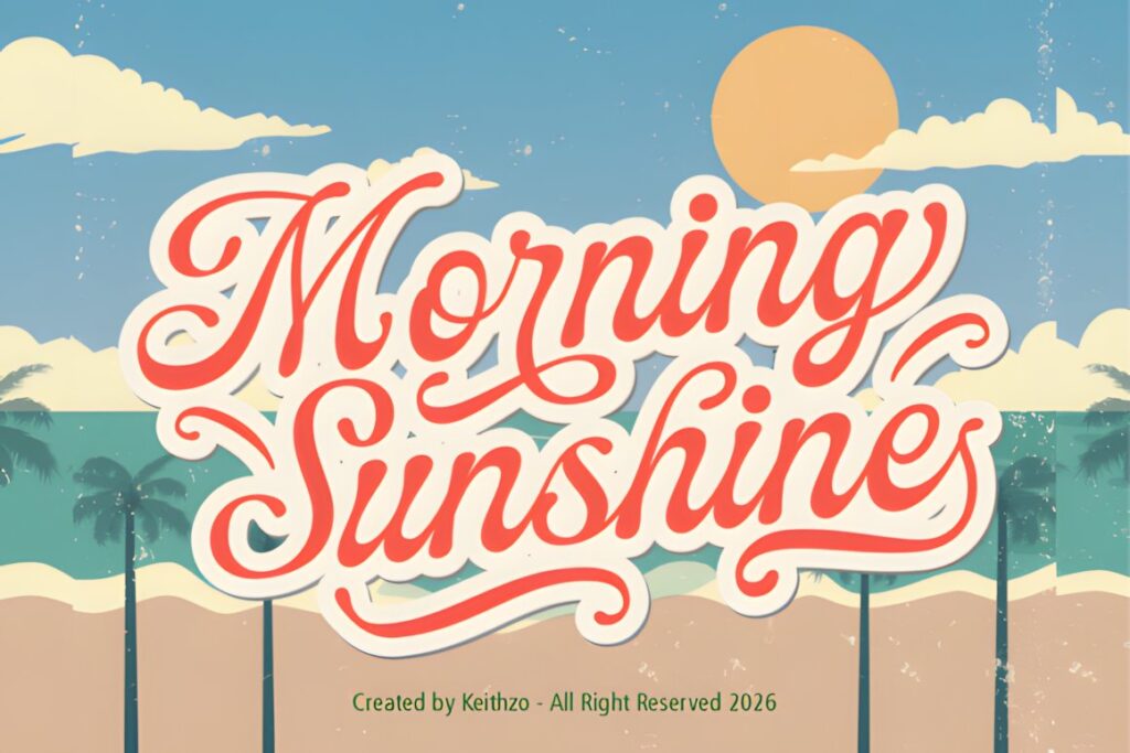
Wonderful Vintages takes the lettering toward nostalgic signage and traditional label design. Creative Fabrica describes it as a vintage script suited to vintage label artwork and nostalgic product packaging, making it a practical option for winery branding that should feel established, handcrafted, and less formal than copperplate calligraphy. :chatgpt-content-reference{index=”6″}
Its personality works particularly well for approachable artisan wines and retro-inspired releases. For an ultra-refined reserve bottle, a thinner and more restrained calligraphic style may communicate the desired mood more clearly.
8. Vintage Script by Wow Magic
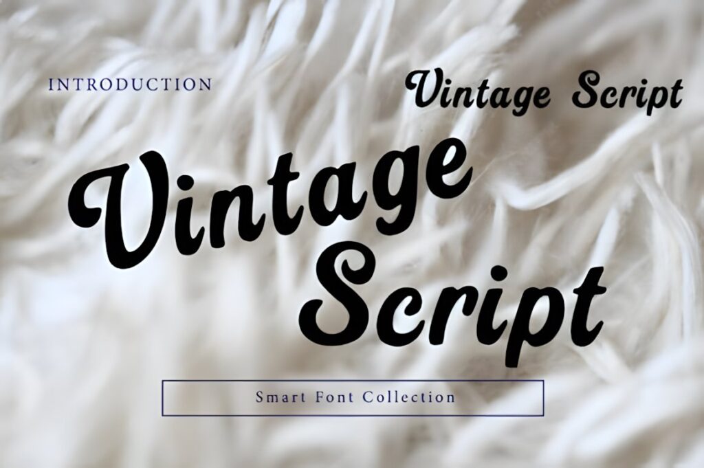
This Vintage Script uses rounded connected strokes and a bold retro flow designed for packaging and product labels. The heavier construction gives it more immediate presence than delicate copperplate styles, which can be useful when the winery name must remain visible from a little farther away. :chatgpt-content-reference{index=”7″}
Choose it for a warmer, old-school bottle identity or a casual artisan line. Its friendly character is less suited to labels aiming for severe classical formality, where Classical Calligraphy or Ubel Amour would create a more restrained tone.
9. Retro Script
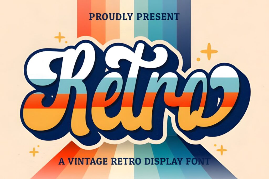
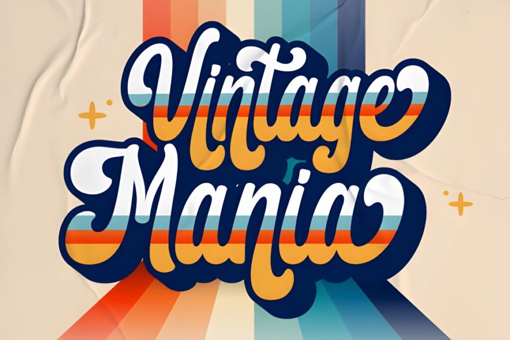
Retro Script is a vintage-style handwritten display font with flowing connected forms and accessible swashes. It carries a noticeably stronger retro-branding mood than classical wine calligraphy and can give a modern bottle a deliberately nostalgic identity. Creative Fabrica lists branding among its intended uses and notes PUA encoding for glyph and swash access. :chatgpt-content-reference{index=”8″}
This is better suited to an expressive winery logo, natural wine line, or throwback label than to dense informational text. Keep supporting details comparatively simple so the main script remains the visual focus.
10. Vintage by Aveni Letter Type
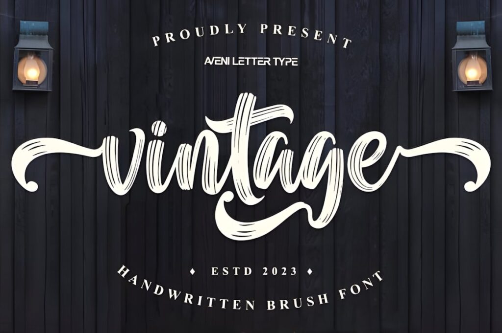
Vintage by Aveni Letter Type is a brush script with rough edges and visible handmade irregularity. Creative Fabrica specifically highlights a rustic vintage feel and packaging applications, making this a useful contrast to the cleaner calligraphy fonts in the roundup. :chatgpt-content-reference{index=”9″}
It can suit organic, small-batch, farmhouse, or experimental wine branding where polished copperplate would feel too formal. The rough texture carries much of the personality, so a simple label architecture usually gives it more room to work.
11. Batavia Retro
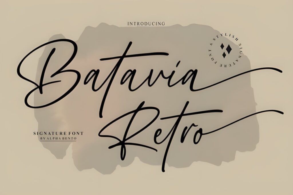
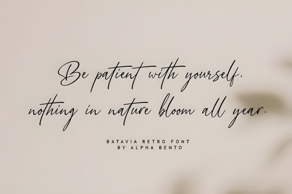
Batavia Retro combines handwritten movement with a cleaner, more minimal construction and includes handwritten ligatures. Creative Fabrica describes it as useful for logos and branding and notes PUA encoding for glyph and swash access. :chatgpt-content-reference{index=”10″}
This makes sense for a winery that wants vintage flavor without a heavily antique appearance. Its lighter visual footprint can also leave more space for an illustration, vineyard crest, foil element, or serif-based supporting hierarchy.
12. Weekend Plans
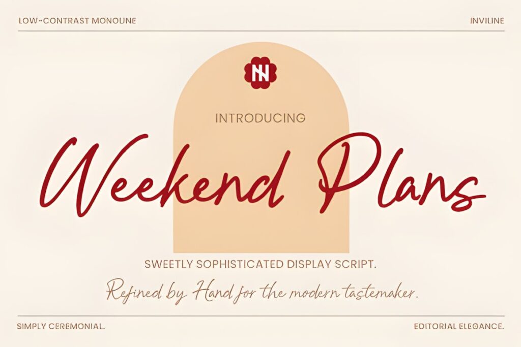
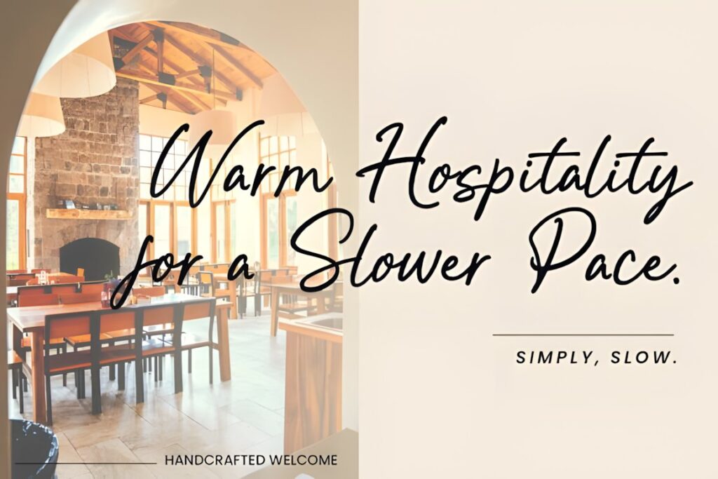
Weekend Plans is a low-contrast monoline script designed with classic packaging applications in mind. Its product page specifically references vintage Italian wine labels and notes ligatures and alternative characters for creating a more natural handwritten flow. :chatgpt-content-reference{index=”11″}
The more even stroke weight can be useful when very fine calligraphic hairlines feel risky at the intended print size. Choose it for a relaxed European or lifestyle-oriented label rather than a highly ornamental Victorian composition.
13. Scootline
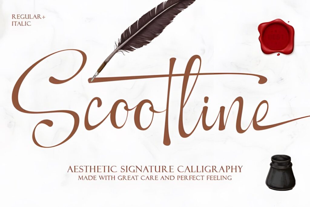
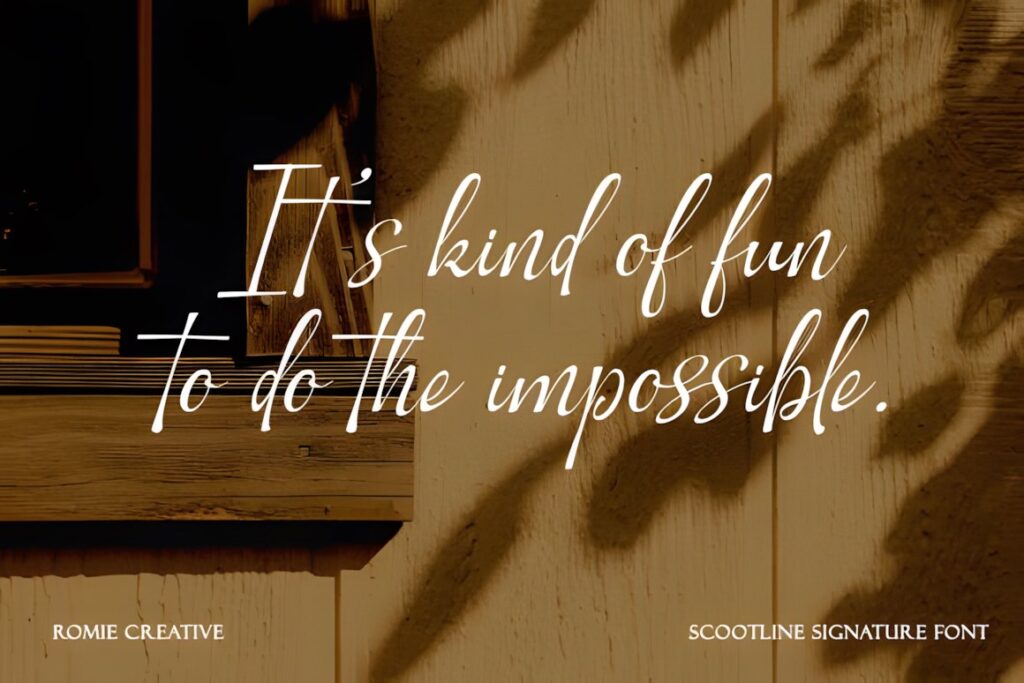
Scootline is a modern calligraphy font with signature-style movement that Creative Fabrica explicitly suggests for a red wine label. The listed character set includes uppercase and lowercase letters, numerals, punctuation, variation ligatures, and beginning and ending swashes on lowercase letters. :chatgpt-content-reference{index=”12″}
The customizable entry and exit strokes are useful for shaping a short winery wordmark. Because those swashes can extend far beyond the basic letters, test the final name inside the actual label width before committing to the most decorative alternates.
14. Wistallion
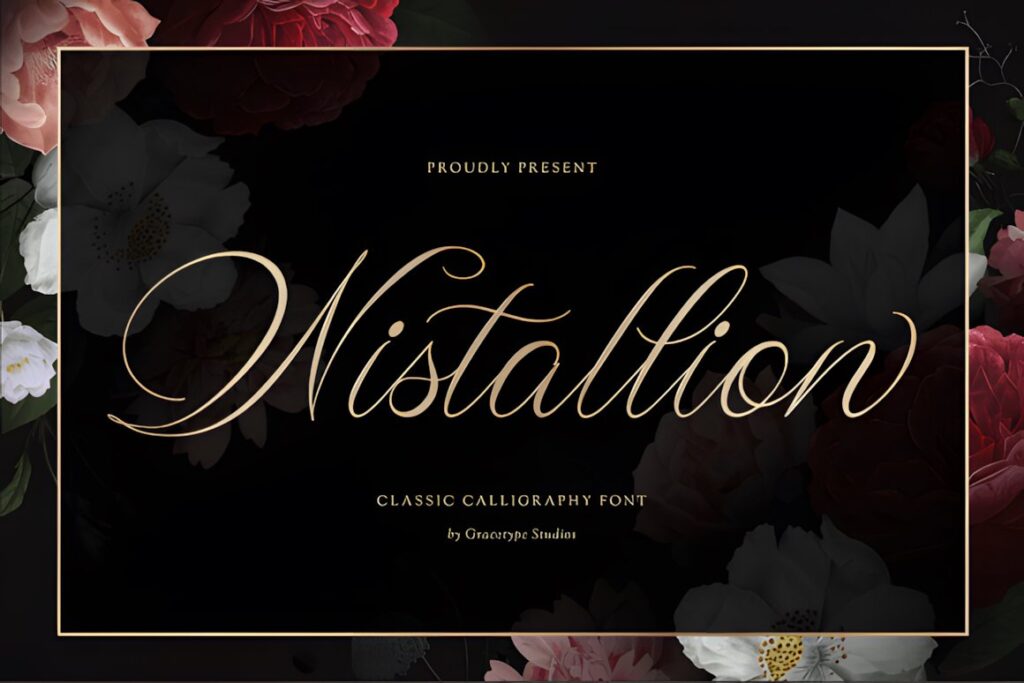
Wistallion uses ultra-fine flowing strokes, long ascenders, and restrained capital flourishes to create an old-world luxury mood. Creative Fabrica specifically identifies boutique winery labels as an intended use. :chatgpt-content-reference{index=”13″}
This font fits a spacious reserve or premium label where the winery name can remain relatively large. Its delicate construction is less forgiving when the script is reduced aggressively, so use a simpler or heavier option when the front label is compact or information-heavy.
15. Fresco Vintage Duo
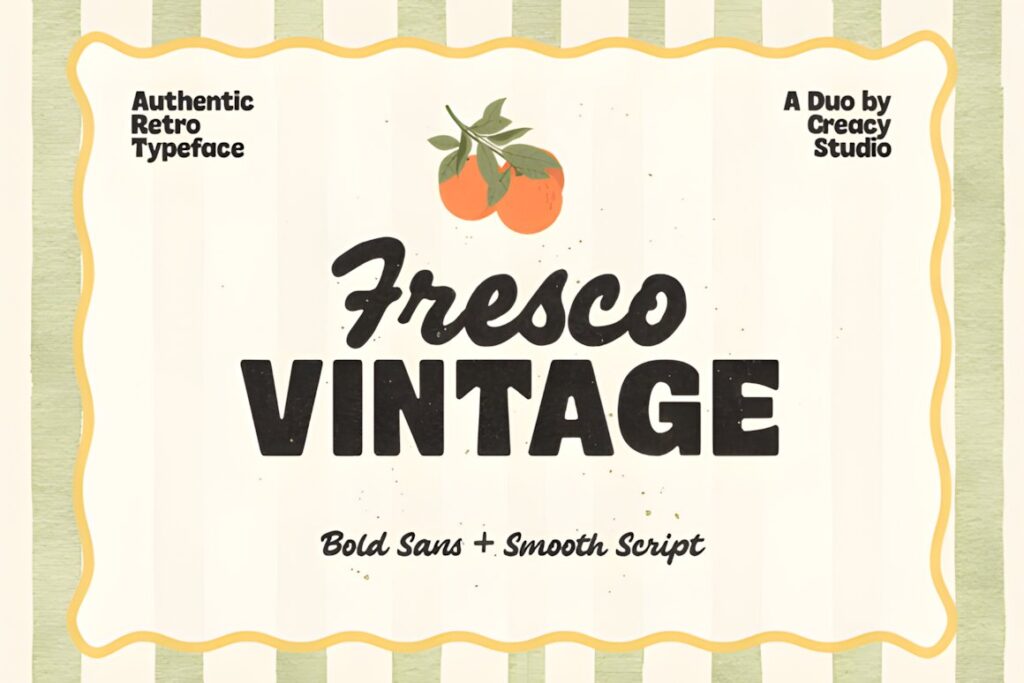
Fresco Vintage Duo combines an interconnected retro script with a bold geometric sans serif. That built-in contrast can be especially useful on a bottle because the script can carry the expressive brand name while the sans handles secondary hierarchy. Creative Fabrica lists uppercase, lowercase, numbers, punctuation, multilingual support, and OTF and TTF files. :chatgpt-content-reference{index=”14″}
Use it when you want the label system to feel intentionally coordinated rather than searching for a separate companion face. Its mid-century mood is more playful than formal copperplate lettering.
16. Hantera
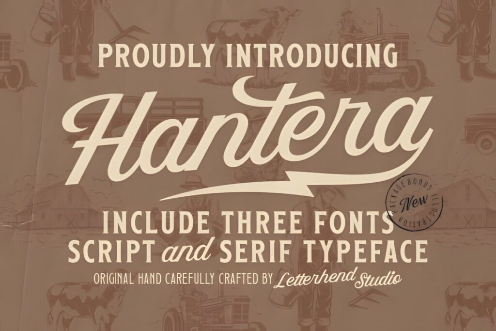
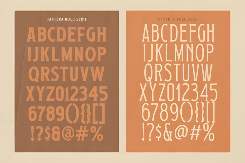
Hantera is a vintage typeface trio that combines flowing script with two sturdier serif styles. Creative Fabrica positions it for artisanal product labels and heritage branding and explains that the script can be layered with the serif styles for a classic secondary-text effect. :chatgpt-content-reference{index=”15″}
That makes Hantera useful for rustic vineyard, farm-estate, or workshop-inspired branding where one font family needs to support several hierarchy levels. It is visually tougher than romantic copperplate options, so it suits heritage craft more than delicate luxury.
17. Vintage Manuscript
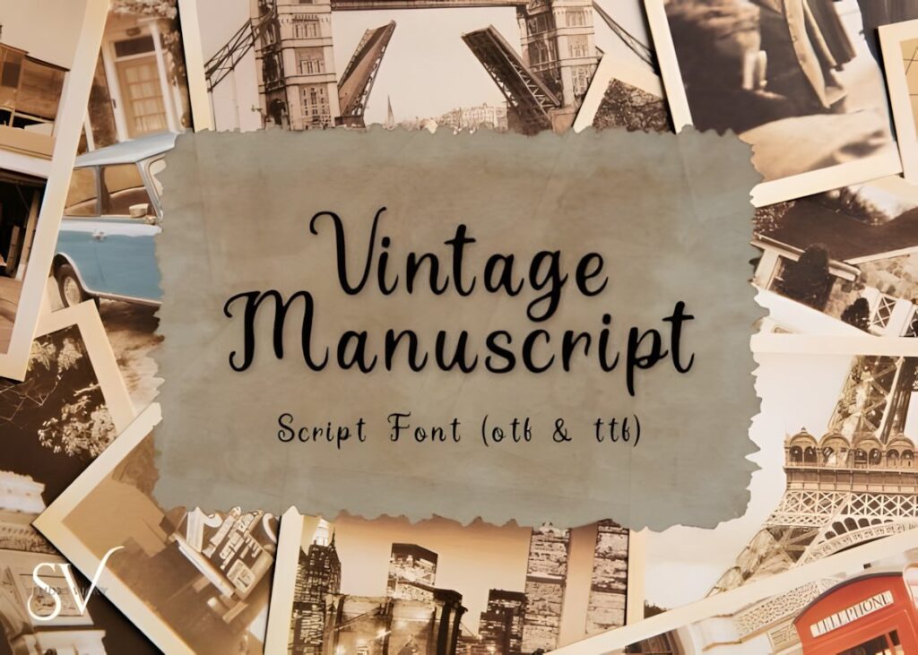
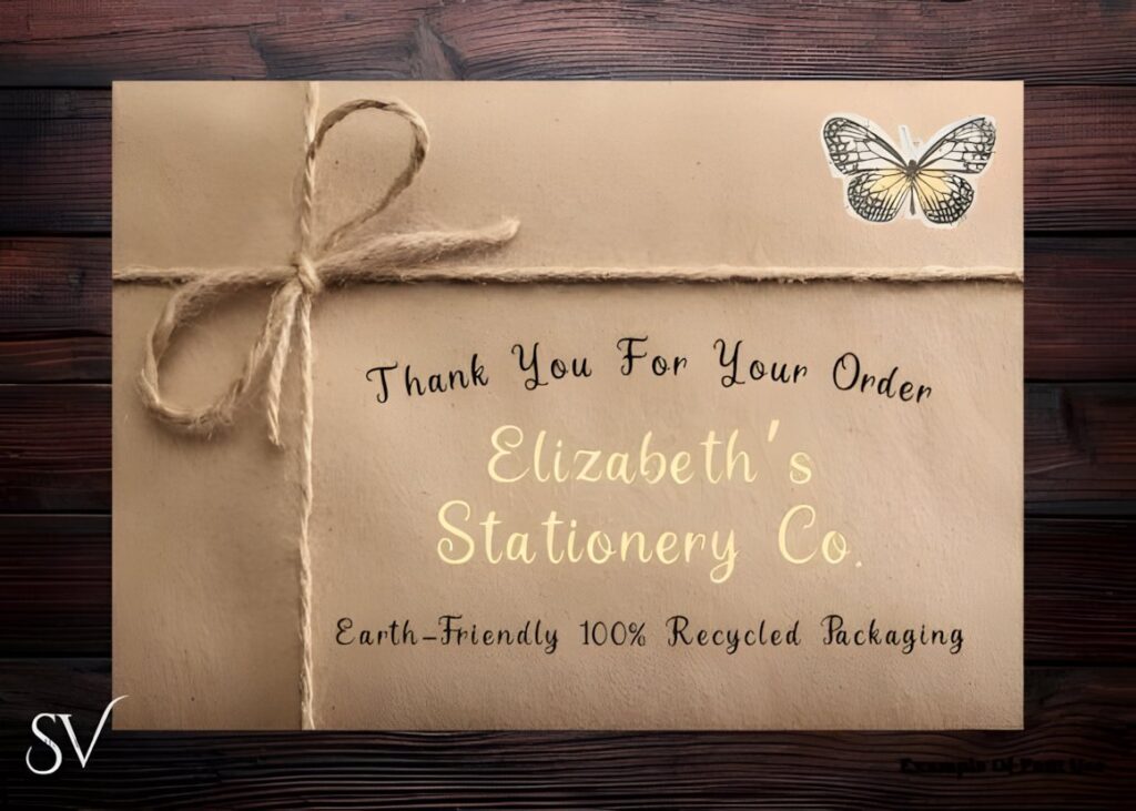
Vintage Manuscript draws on antique penmanship, historical letters, old book pages, and classic calligraphy. That source of inspiration gives it a more archival personality than many polished modern scripts. :chatgpt-content-reference{index=”16″}
It can work for a winery identity built around history, family records, an old vineyard, or a handwritten-estate story. The manuscript character is a stylistic feature, so avoid pairing it with too many other decorative elements that compete for the same antique effect.
18. Madeline
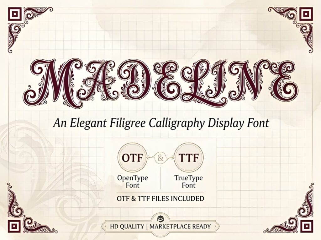
Madeline moves beyond ordinary script into decorative filigree calligraphy. Its letterforms incorporate ornate curls and scrollwork, and Creative Fabrica specifically includes boutique winery labels among its suggested applications. :chatgpt-content-reference{index=”17″}
This is a display-first choice for a short premium name, special bottling, or ornamental front label. Because each character carries substantial detail, Madeline needs more visual space than a conventional script and makes less sense for long wording or a crowded composition.
19. Black Forrest
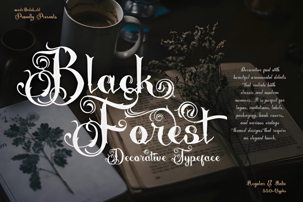
Black Forrest combines old-fashioned lettering, vintage script influences, bold strokes, curls, and extensive ornamentation. Creative Fabrica recommends it for classic product design including drink bottles and product labels and notes Regular and Italic styles. :chatgpt-content-reference{index=”18″}
Choose Black Forrest for a dramatic historic label, limited-edition bottle, or wine identity with gothic or turn-of-the-century references. It is substantially more ornate than Ubel Amour or Weekend Plans, so restraint elsewhere in the composition becomes especially important.
20. Cahaya Rembulan
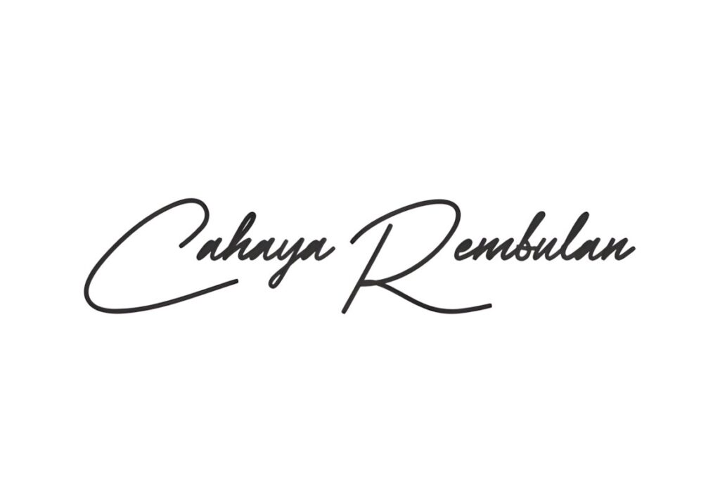
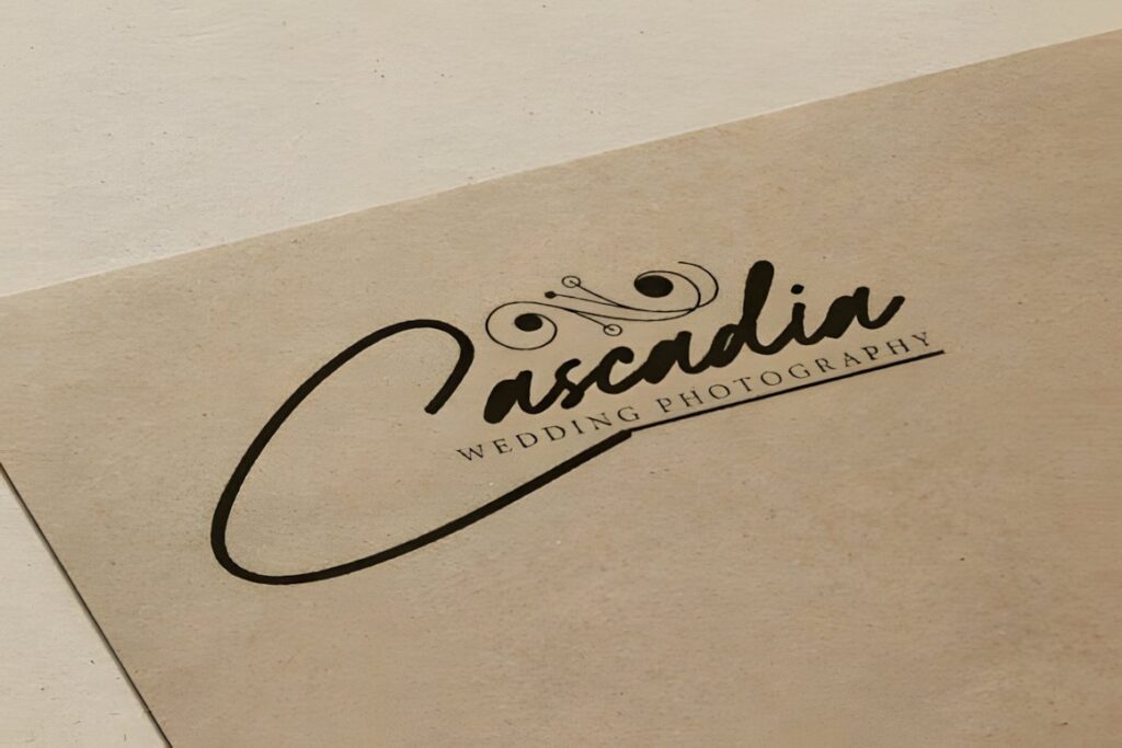
Cahaya Rembulan is an airy connected script with elongated swashes and a hand-guided-pen appearance. Creative Fabrica specifically mentions boutique wine labels and suggests pairing the font with a classic serif when a more timeless vintage result is needed. :chatgpt-content-reference{index=”19″}
Its lighter, more contemporary calligraphic rhythm suits a boutique winery that wants vintage cues without looking overtly retro. Use the script for a short focal phrase or name, then let the serif companion carry the structured product information.
21. Vintage Calligraphy
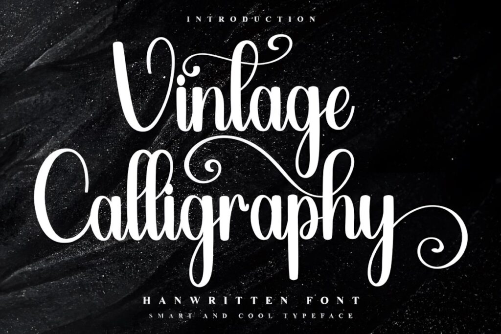

Vintage Calligraphy is a decorative script with nostalgic character, glyphs, and ligatures accessible through PUA encoding. Its listed uses lean more toward decorative and gift-label projects than wine specifically, but its calligraphic construction gives it a distinct option for seasonal releases, gift bottles, or labels that need a more celebratory vintage personality. :chatgpt-content-reference{index=”20″}
Because this design is more decorative and cheerful than several heritage-focused choices above, it makes more sense for a themed or approachable bottle than for a restrained reserve label.
Quick Comparison by Wine Label Style
| Font | Best for | Style | Key visual trait | Label fit |
|---|---|---|---|---|
| Classical Calligraphy | Traditional estate names | Copperplate calligraphy | Formal flowing strokes | Classic wine labels |
| Delsya Script | Luxury winery names | Vintage script | Dramatic capitals | Spacious premium labels |
| Ubel Amour | Heritage branding | Elegant script | Gentle slant | Old-world bottles |
| Vintage Script | Visible retro wordmarks | Bold connected script | Rounded strokes | Artisan labels |
| Weekend Plans | Italian-inspired labels | Monoline script | Even stroke weight | Compact contemporary labels |
| Fresco Vintage Duo | Complete label hierarchy | Script and sans duo | Built-in contrast | Retro packaging systems |
| Hantera | Rustic vineyard identity | Script and serif family | Heritage craft character | Farm-estate labels |
| Madeline | Special-edition bottles | Filigree calligraphy | Ornamental letterforms | Large decorative names |
| Black Forrest | Historic dramatic labels | Ornamental vintage display | Bold curls and swashes | Limited releases |
Readability and Size on Bottle Labels
The font preview at a large size can be misleading. A wine wordmark that looks refined on a desktop screen may become much more fragile after it is reduced to its printed width. Test the actual winery name rather than relying on alphabet specimens alone.
Pay particular attention to hairline connections between letters, small enclosed spaces, and narrow lowercase forms. If those details start disappearing at the intended size, either enlarge the script, simplify the chosen alternates, or move to a slightly heavier option such as Vintage Script or Retro Script.
Long names also change the decision. A sweeping calligraphy font may work beautifully for a four- or five-letter estate name but become too compressed with twelve or fifteen letters. In that situation, a more compact or monoline style can preserve the intended handwritten mood without sacrificing the composition.
Pairing Calligraphy With Supporting Wine Label Type
Calligraphy usually works better as the expressive layer of a wine label rather than the only typeface. Use it for the winery, collection, or cuvée name, then give functional information a calmer supporting face.
A restrained serif can reinforce an old-world, editorial, or château-inspired identity. A clean sans serif creates stronger contrast and works well when the script is already very decorative. Font duos such as Fresco Vintage Duo or Hantera can simplify that hierarchy because contrasting companion styles are already part of the same product.
Avoid pairing an ornate calligraphy font with another equally ornamental display type. Two competing personalities can make the label feel busier instead of richer. The supporting font should make the varietal, vintage, region, and other informational text easier to scan.
Swashes, Capitals, and Decorative Alternates
Vintage scripts often become distinctive through their capital letters, entry strokes, terminal swashes, and alternate characters. Those features are most effective when they solve a compositional problem rather than when every available flourish is used at once.
Try one expressive initial, one extended terminal, or a single alternate that helps balance the wordmark. If an uppercase flourish collides with a crest, border, vineyard illustration, or neck-label element, the simpler standard character may actually produce the more convincing premium result.
Before downloading specifically for alternate characters, verify the current product details and confirm that the features and file formats you need are included. The exact license should also be checked for the way the font will be used in client work, packaging, or products for sale.
Common Wine Label Font Mistakes
- Choosing from the alphabet alone: preview the real winery or wine name because letter combinations can change spacing and swash behavior dramatically.
- Using script for every line: keep technical and supporting information in a more restrained typeface.
- Reducing ornate lettering too far: filigree, thin joins, and hairlines need enough printed size to remain visible.
- Adding every alternate: one well-placed flourish usually creates a stronger hierarchy than several competing swashes.
- Ignoring the bottle architecture: test the wordmark inside the actual label proportions rather than on an unlimited artboard.
- Forgetting the print method: very fine typography should be evaluated at production size before the final artwork is approved.
Choosing the Right Vintage Style for Your Bottle
If your priority is traditional winery elegance, Classical Calligraphy and Ubel Amour give the label a more formal copperplate-influenced direction. For a luxurious name with stronger flourishes, Delsya Script provides a more dramatic centerpiece.
For a warmer artisan or retro bottle, Vintage Script, Retro Script, or Hantera create more weight and handmade personality. When the label needs its own coordinated supporting typography, Fresco Vintage Duo is particularly useful because the script and sans can divide expressive and informational roles.
For highly decorative special releases, Madeline or Black Forrest can turn a short name into the visual centerpiece, but both benefit from generous space and restrained secondary elements.
Frequently Asked Questions
What style of vintage calligraphy works well for wine bottle labels?
Copperplate-inspired scripts work well for formal heritage labels, while heavier retro scripts suit artisan or nostalgic branding. For a small bottle label, prioritize readable letterforms, controlled swashes, and enough stroke weight to keep the winery name clear after reduction. Highly ornamental lettering makes more sense for short names with generous surrounding space.
Should a wine label use calligraphy for all of its text?
Calligraphy is usually more effective for the winery, collection, or cuvée name than for every line on the label. Pair the decorative script with a restrained serif or sans serif for the varietal, vintage, region, and other informational copy. This creates a clearer hierarchy while allowing the calligraphic wordmark to remain distinctive.
How can I keep a decorative script readable on a small wine label?
Test the actual wine or winery name at its final printed size and watch the thinnest strokes, tight counters, close connections, and overlapping swashes. If important details disappear, simplify the alternates, increase the wordmark size, or choose a heavier script. A large desktop preview does not show how delicate lettering will behave after reduction.
Can I use these fonts on commercial wine packaging?
Check the current license attached to the specific font before using it on commercial wine packaging. Licensing terms can affect client work, products for sale, editable files, and other uses, so the product page should be treated as the current source for permitted usage. Do not assume that every font or license has identical conditions.
:chatgpt-content-reference{index=”21″}