ℹ️ Affiliate Disclosure: This article may contain affiliate links. If you book or purchase through these links, we may earn a commission at no additional cost to you.
Choosing Modern Sans Serif Fonts for Professional Resume Templates
A resume font has to do more than look modern. It needs to keep job titles, dates, skills, contact details, and longer experience descriptions easy to scan without making the page feel crowded. Modern sans serif fonts work especially well for professional resume templates because their clean letterforms can create clear hierarchy while keeping the overall layout restrained.
For resumes, the most useful differences are usually proportion, spacing, weight range, and how comfortably the typeface handles smaller text. A geometric font can make section headings feel structured, while a more neutral sans serif is often easier to use throughout the entire document.
Many more modern sans serif fonts are available, while this shortlist concentrates on styles with distinct resume uses, readable letterforms, and clearly different professional personalities.

The strongest modern sans serif fonts for professional resumes are generally neutral multi-weight families for complete layouts, highly readable styles for experience sections, and slightly more distinctive geometric fonts for names and headings. The right option depends on whether you want a conservative corporate resume, a minimal creative CV, or a compact layout with stronger typographic hierarchy.
Quick Picks
- For a flexible full resume: Modern Sans — nine weights provide plenty of hierarchy without changing families.
- For body text and headings: Coftein — specifically presented as readable for both longer text and headings.
- For a familiar corporate feel: Calyra — balanced proportions and multiple styles suit traditional professional layouts.
- For maximum typographic flexibility: Vernosa Variable — a large family supports both compact details and stronger headings.
- For a minimalist resume: Minimalist — restrained forms keep the page visually simple.
Modern Sans Serif Fonts for Resume Templates
1. Modern Sans
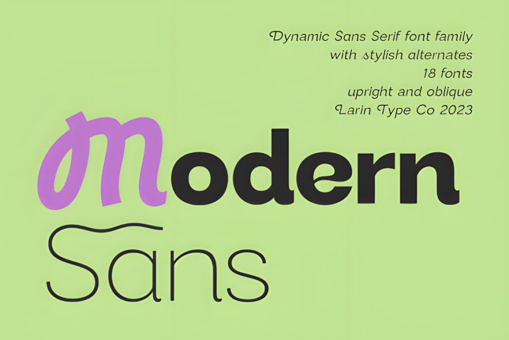
Modern Sans is a versatile grotesque-style family suited to resumes that need a clean professional structure without looking overly formal. The family includes nine weights from Thin through Black plus basic and oblique styles, giving you enough variation to build an entire resume hierarchy with one typeface.
I would use a restrained regular or medium weight for experience descriptions, then move to semibold or bold for section headings and the applicant’s name. Its broad family range makes more sense for a multi-section resume than a single display font. The available alternates can add personality, but a resume normally benefits from keeping those decorative variations to a minimum so dates, company names, and responsibilities remain quick to scan.
2. Coftein
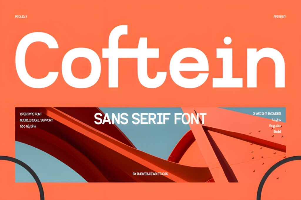
Coftein is a clean modern sans serif designed to work in both body text and headings, making it particularly practical for a one-font resume template. It comes in Light, Regular, and Bold weights, which is enough to establish a simple hierarchy without creating unnecessary typographic complexity.
The Regular weight makes sense for employment history and skills, while Bold can separate headings such as Experience, Education, and Certifications. Light can be useful for secondary details when the final text size remains comfortably readable. Compared with larger families such as Modern Sans or Vernosa, Coftein provides fewer weight choices, but that can actually simplify a straightforward one-page resume where only three clear hierarchy levels are needed.
3. Calyra
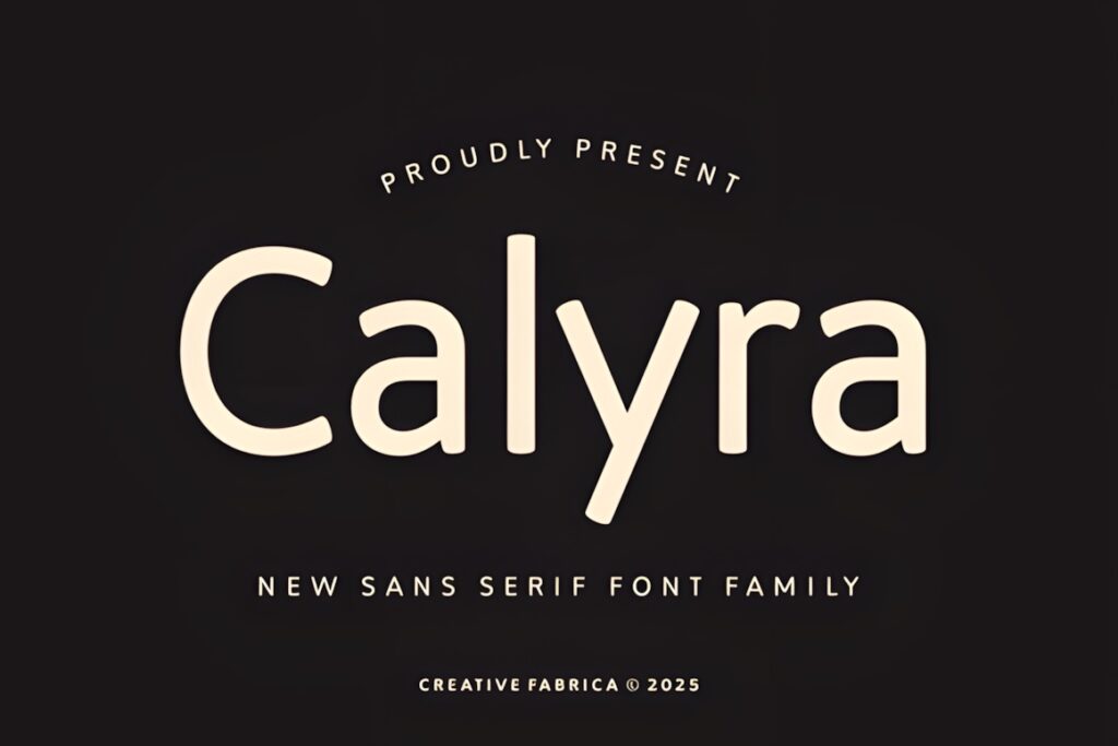
Calyra is a refined sans serif family built around balanced proportions, smooth curves, and a friendly professional appearance. Its familiar visual character is useful for corporate resumes, administrative roles, consulting CVs, and other documents where clarity should take priority over an experimental design style.
The family includes six styles ranging from Thin to Bold with matching italics. That gives a resume designer several practical ways to separate supporting information without introducing unrelated fonts. Regular text can carry descriptions, heavier weights can establish section headings, and italics can distinguish secondary information sparingly. Calyra is a stronger fit when you want an approachable professional tone; for a sharper geometric look, Gratav or Valtora may make more visual sense.
4. Valtora
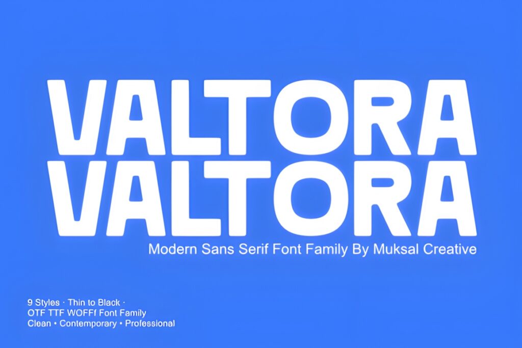
Valtora is a modern sans serif family with nine styles from Thin to Black and a neutral contemporary personality. It is designed for both text and display use, which makes it suitable for resume templates where the candidate’s name, section headings, and supporting copy need to feel related but clearly differentiated.
Its balanced proportions and clear letterforms make Valtora especially useful for structured two-column resumes or modern business CVs. Medium and semibold-style hierarchy can keep headings visible without relying on oversized text, while regular weights can handle the information-heavy areas. Because the family provides many weight choices, avoid using too many at once. Two or three carefully chosen weights will usually produce a cleaner professional document than showing the full range.
5. Dectone
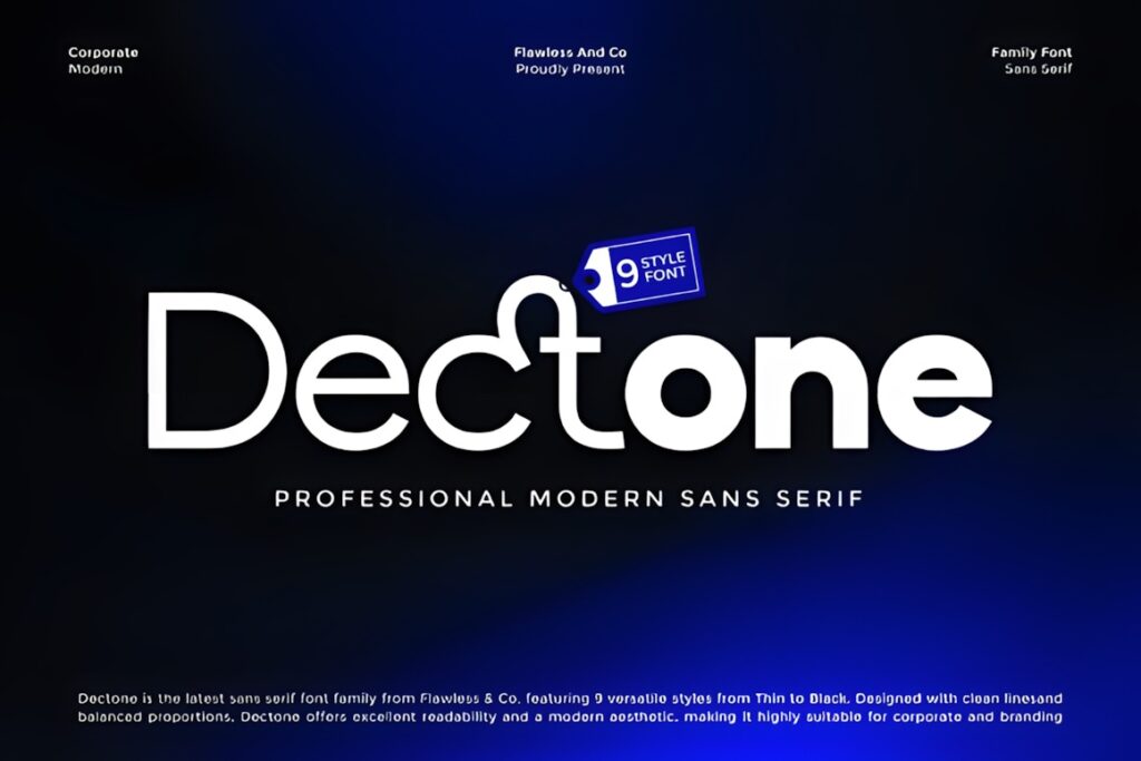
Dectone is a modern sans serif family with nine styles from Thin through Black. Its clean geometry and balanced proportions are a strong match for business resumes that use clear grids, aligned dates, compact skill sections, and distinct heading levels.
The range of weights gives you flexibility when building a reusable resume template: lighter or regular styles can support descriptive text while heavier weights can establish section divisions without extra graphic decoration. The sharper geometric character can make the page feel more structured than softer alternatives such as Calyra. That same character may be unnecessary for a very traditional resume, so choose Dectone when a contemporary corporate appearance is part of the intended presentation.
6. Vernosa Variable
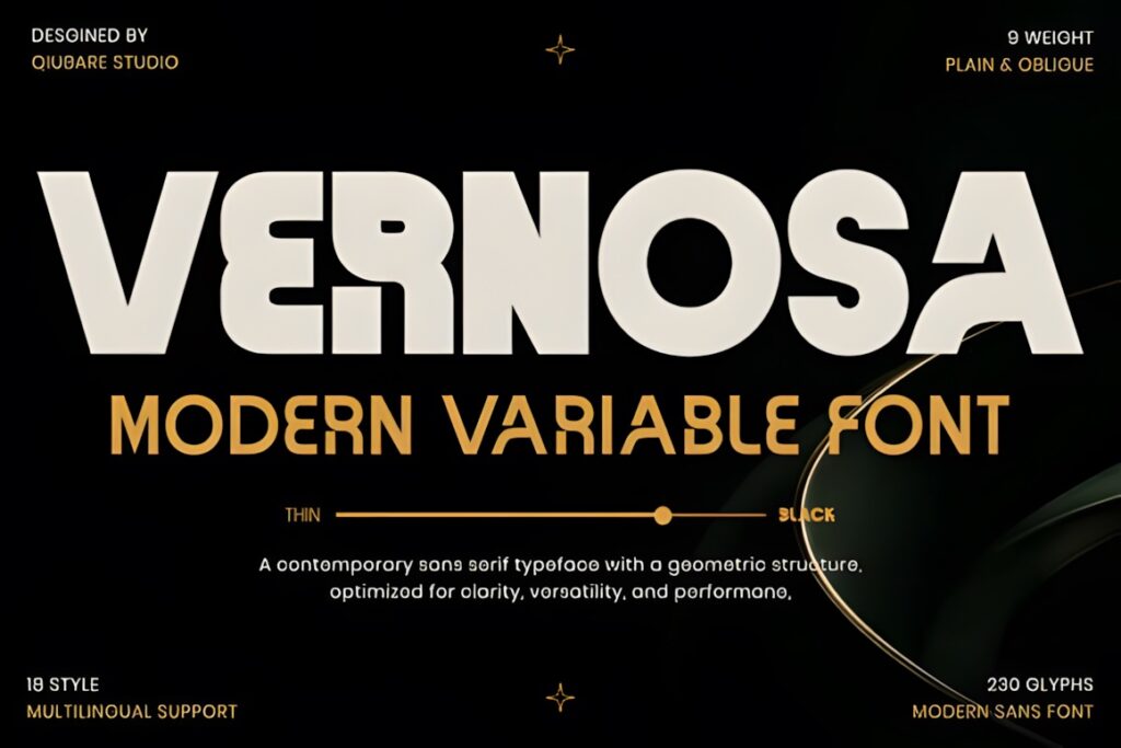
Vernosa is a contemporary variable sans serif family built around clean geometry, refined proportions, and readability at both larger and smaller sizes. The family offers 18 styles, including nine upright weights and nine oblique styles, making it one of the more flexible choices in this roundup.
That flexibility is useful for a sophisticated resume system where one type family needs to cover a large name heading, job titles, dates, section labels, and longer descriptions. You can create noticeable hierarchy through weight rather than through dramatic font-size changes. Vernosa makes the most sense for carefully designed professional or creative resumes that benefit from detailed typographic control. For a simpler template where three weights are sufficient, Coftein requires fewer decisions and can keep the styling process more restrained.
7. Gratav
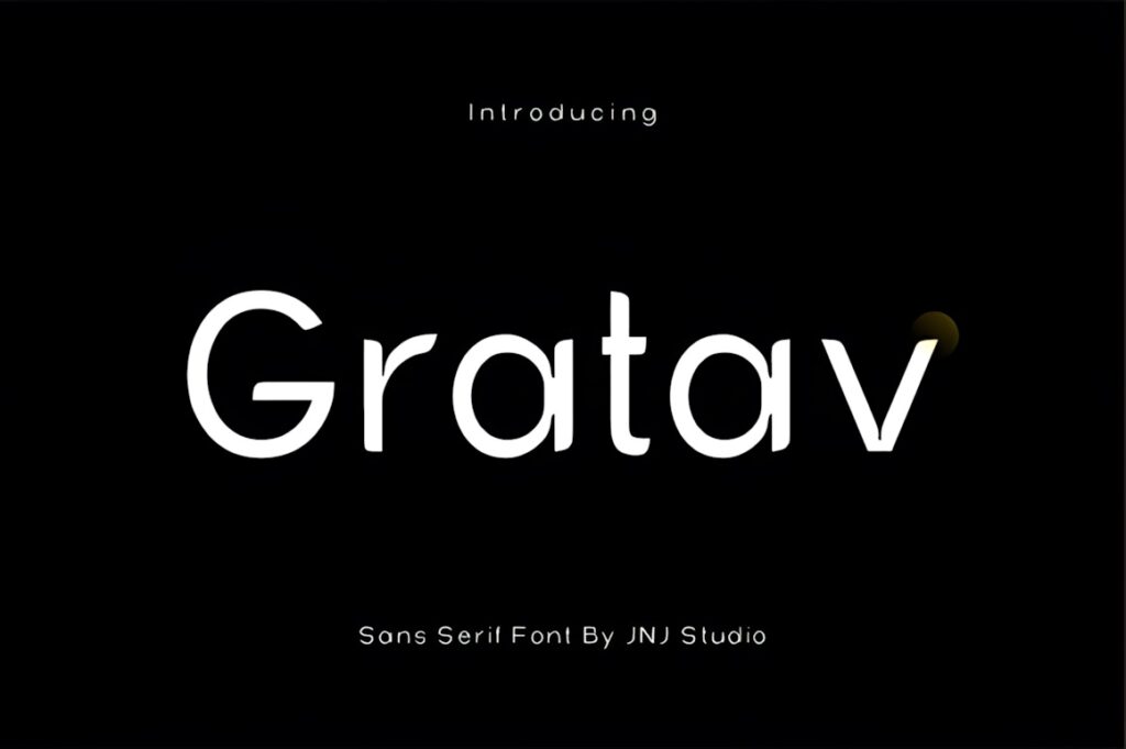
Gratav is a modern sans serif built around clean geometry with subtle humanist touches. Its neutral character and consistent proportions suit resumes that need to look current without allowing the typography to compete with the candidate’s experience and qualifications.
Visually, Gratav sits comfortably between strict geometric minimalism and a more approachable corporate style. That balance works well for product, technology, marketing, design, and business resumes where both professionalism and contemporary presentation matter. It can support headings and body copy, so it is practical for templates that avoid mixing multiple typefaces. If the resume needs a more familiar office-document character, Calyra may feel more conventional; Gratav is better suited to a slightly more design-conscious layout.
8. Sansdiego
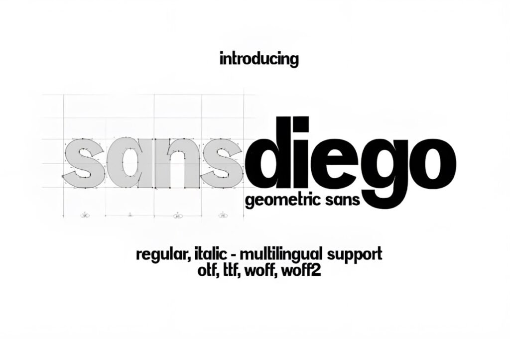
Sansdiego is a sleek minimalist sans serif intended for both body text and headings. It includes Regular and Italic styles, making it a straightforward option for clean one-page resumes where the design relies more on spacing and size than on a large collection of font weights.
This approach can work well for a minimal CV with generous white space, concise bullet points, and only a few hierarchy levels. Use the regular style for the majority of the document and reserve italics for selective secondary details rather than entire paragraphs. Sansdiego offers less weight-based flexibility than Modern Sans, Valtora, or Vernosa, so it makes more sense when the layout itself supplies most of the visual structure.
9. Worksy
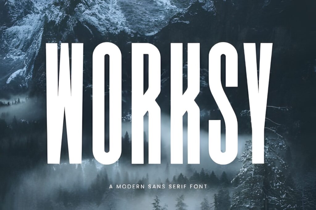
Worksy is a contemporary tall sans serif with a clean, minimal appearance designed for professional documents as well as headings and body text. Its taller proportions can give a resume a more streamlined visual rhythm, particularly in section headings, job titles, and the candidate’s name.
The style works well when you want a slightly more distinctive professional document without moving into decorative typography. Taller letterforms can also help headings feel prominent without requiring very heavy weight. For dense resumes with substantial experience descriptions, however, monitor line length and spacing carefully; a more neutral workhorse such as Coftein or Calyra may be easier to manage when body copy dominates the page.
10. Minimalist
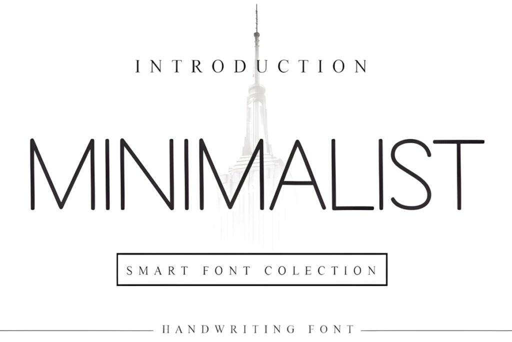
Minimalist is a neat sans serif with deliberately restrained forms. Its uncomplicated appearance suits resume templates that rely on white space, alignment, and concise information rather than decorative typography, making it useful for modern minimalist CV layouts.
This is the option I would consider when the typography needs to stay visually quiet and let portfolio links, job history, skills, and achievements carry the page. It can also work as a supporting font in a resume where the name uses a more distinctive typeface. Because Minimalist offers a simpler personality than large multi-weight families, consider Modern Sans or Valtora when you need a more elaborate hierarchy built entirely from one family.
Quick Comparison
| Font | Best for | Style | Key visual trait | Resume fit |
|---|---|---|---|---|
| Modern Sans | Complete resume systems | Grotesque sans serif | Nine-weight family | Flexible hierarchy |
| Coftein | Body text and headings | Clean modern sans | Three practical weights | Simple one-page resumes |
| Calyra | Corporate resumes | Refined sans serif | Smooth, balanced forms | Friendly professional layouts |
| Valtora | Modern business CVs | Neutral contemporary sans | Wide weight range | Structured hierarchy |
| Dectone | Grid-based resumes | Geometric sans serif | Clean geometry | Contemporary corporate style |
| Vernosa Variable | Advanced resume templates | Variable sans serif | 18-style family | Detailed typography systems |
| Gratav | Modern creative professionals | Geometric humanist sans | Neutral but contemporary | Balanced professional design |
| Sansdiego | Minimal one-page CVs | Minimal sans serif | Simple regular and italic styling | White-space-heavy layouts |
| Worksy | Distinctive headings | Tall modern sans | Elongated proportions | Modern visual hierarchy |
| Minimalist | Understated resumes | Minimal sans serif | Restrained letterforms | Clean distraction-free pages |
Readability and Size in Resume Typography
A font that looks polished at 36 points may behave very differently in a dense experience section. Test the typeface at the actual size you plan to use for responsibilities, achievements, education details, and contact information before finalizing the template.
Avoid choosing extremely light weights just because they create an elegant preview. Fine strokes can lose clarity when a resume is printed, viewed on a lower-quality display, or exported at a reduced scale. Regular and medium weights usually provide a more dependable foundation for information-heavy sections.
Line spacing deserves equal attention. Increasing font size is not the only way to improve readability; modestly increasing leading and keeping paragraphs short can often make a compact resume easier to scan without forcing the document onto another page.
Using One Font Family for the Entire Resume
A multi-weight sans serif can remove the need for font pairing entirely. Use one heavier weight for your name, a medium or semibold weight for headings and employers, and a regular weight for descriptions. This creates contrast through hierarchy while preserving consistent letter shapes throughout the document.
Modern Sans, Valtora, Dectone, and Vernosa are particularly useful when you want this approach because their families provide several hierarchy options. With simpler families such as Sansdiego, rely more heavily on size, spacing, capitalization, and layout rather than attempting to create too many weight levels.
Common Resume Font Mistakes
Using too many weights is one of the easiest ways to make a resume feel visually inconsistent. Even when a font family includes nine or more styles, most resumes need only two or three.
A second mistake is choosing typography primarily for the applicant’s name and ignoring how it performs in longer descriptions. The experience section normally contains much more text, so body-copy readability should influence the font decision first.
Also avoid compressing text simply to keep a resume to a predetermined page count. Extremely small type, tight line spacing, or highly condensed lettering can make otherwise strong information harder to scan. If the document feels crowded, edit the content and spacing before sacrificing readability.
Which Sans Serif Font Fits Your Resume?
If you want to build the entire resume around one flexible family, Modern Sans offers a broad weight range for headings and supporting text. For a simpler resume with an emphasis on straightforward readability, Coftein keeps the hierarchy manageable.
Choose Calyra when you want a familiar, approachable corporate presentation. Vernosa Variable makes more sense for a refined template that needs extensive control over weight and emphasis, while Minimalist suits a restrained layout where typography should remain largely in the background.
Frequently Asked Questions
Are sans serif fonts good for professional resumes?
Yes. Sans serif fonts can work very well for professional resumes because their clean shapes support clear headings, compact information, and readable body text. Neutral families are especially useful when a resume contains several sections and needs to remain easy to scan. Choose a font based on readability at the actual resume size rather than judging it only from a large preview.
Should I use the same font for resume headings and body text?
Using one font family for headings and body text can create a consistent professional resume. A multi-weight family lets you use bold or semibold styles for section headings and regular styles for experience descriptions. This approach is often cleaner than mixing unrelated fonts, although a carefully chosen second typeface can work when the design genuinely needs more contrast.
What font weight works best for resume body text?
Regular or medium weights are usually the most practical starting point for resume body text because they balance clarity with efficient use of space. Very thin weights may appear elegant at large sizes but can become harder to read in compact descriptions or printed copies. Test the font at its final size before committing to a lighter weight.
Can I use downloaded fonts in resume templates I sell?
The permitted use depends on the current license attached to the specific font product. Check the product’s current license before using a downloaded typeface in resume templates intended for resale, client work, editable products, or other commercial applications. Do not assume that every font marketplace product has identical redistribution or template-use terms.