ℹ️ Affiliate Disclosure: This article may contain affiliate links. If you book or purchase through these links, we may earn a commission at no additional cost to you.
Choosing the Right Modern Sans Serif Fonts for Effective Pitch Decks
A strong presentation font has to do more than look modern on a specimen sheet. In a pitch deck, the same typeface may need to handle a large opening statement, compact chart labels, short financial callouts, section dividers, and several lines of supporting text without making the slides feel busy. The most useful modern sans serif fonts for presentations balance clean shapes with enough weight, width, and character variation to create a clear hierarchy.
For this selection, I focused on sans serif families and typefaces that make practical sense for startup decks, client presentations, business proposals, strategy slides, and visually polished reports. Some are restrained enough for repeated use across an entire deck, while others work better as distinctive headline fonts.
Many more modern sans serif fonts are available, while this shortlist concentrates on styles that serve clearly different presentation roles, from understated body copy to high-impact title slides.

The most useful modern sans serif fonts for pitch decks usually fall into a few groups: neutral multi-weight families for complete presentation systems, geometric fonts for startup and technology decks, condensed faces for space-efficient headlines, and more distinctive sans serifs for cover or section slides. For most decks, prioritize readability and hierarchy before decorative personality.
Quick Picks
For a flexible full-deck system: Modern Sans — nine weights plus basic and oblique styles make it easier to build several levels of hierarchy.
For information-heavy business slides: Lts Raela Pro — its large weight range gives you more control over headings, numbers, labels, and supporting text.
For a clean corporate deck: Helvante — balanced geometric construction and a restrained personality suit professional presentations.
For minimalist slides: Minimalist — simple letterforms keep typography from competing with charts, photos, or diagrams.
For bold technology slides: Gonelo — stronger geometric forms give cover and section slides more presence.
Modern Sans Serif Fonts for Pitch Decks and Presentations
1. Modern Sans
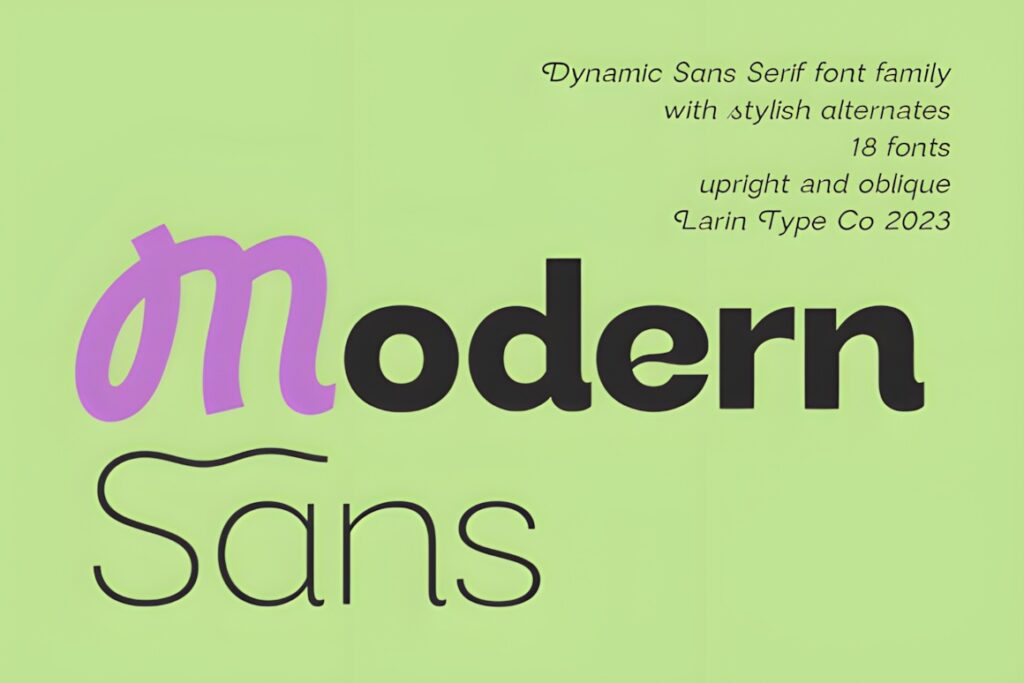

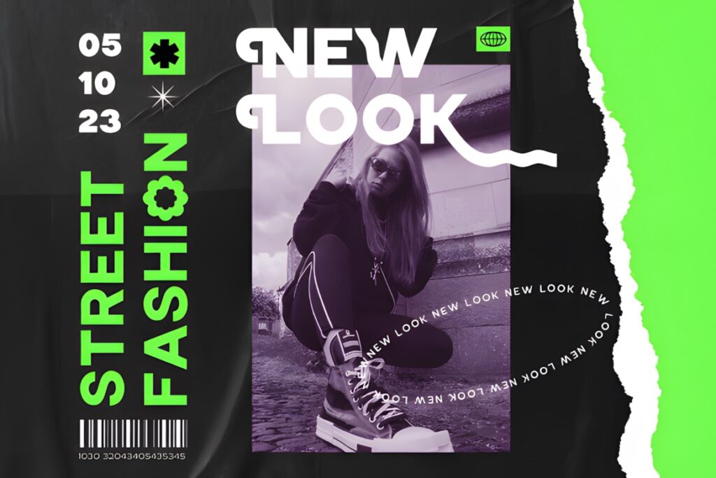
Modern Sans is a versatile grotesque family suited to presentations that need one consistent typography system across multiple slide types. The family includes nine weights from Thin through Black plus basic and oblique styles, giving you room to separate large titles, supporting statements, labels, and body copy without constantly switching font families.
I would favor it for longer startup decks, consulting-style presentations, and branded reports where consistency matters more than making every slide typographically distinctive. Its alternates can introduce more personality when needed, but keeping the standard forms for dense informational slides will usually produce a calmer result.
2. Lts Raela Pro
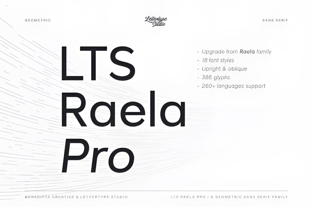
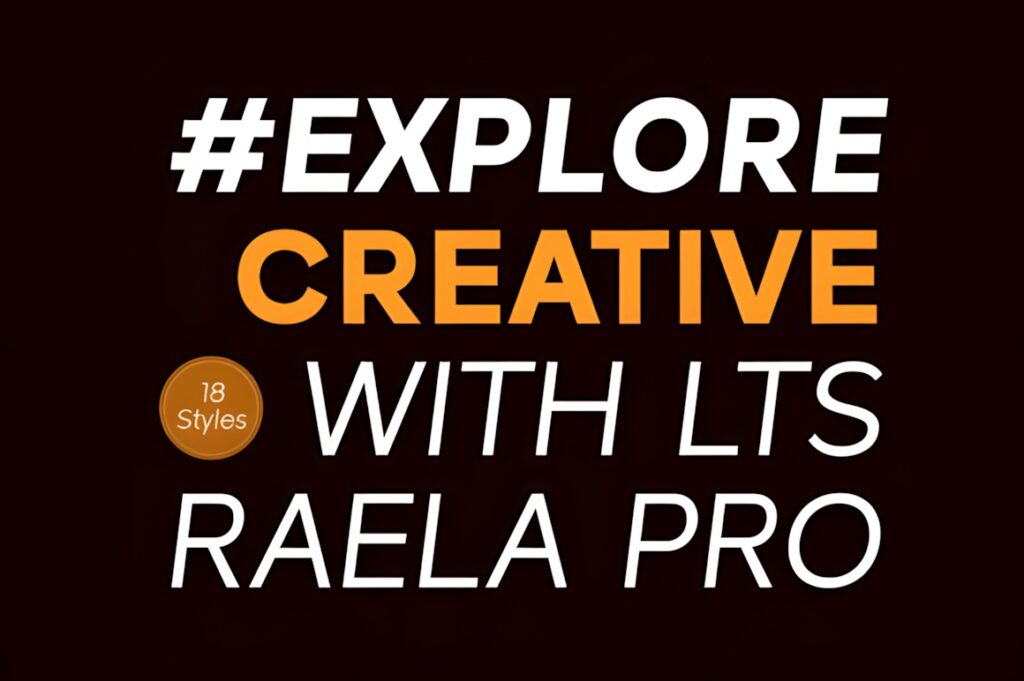
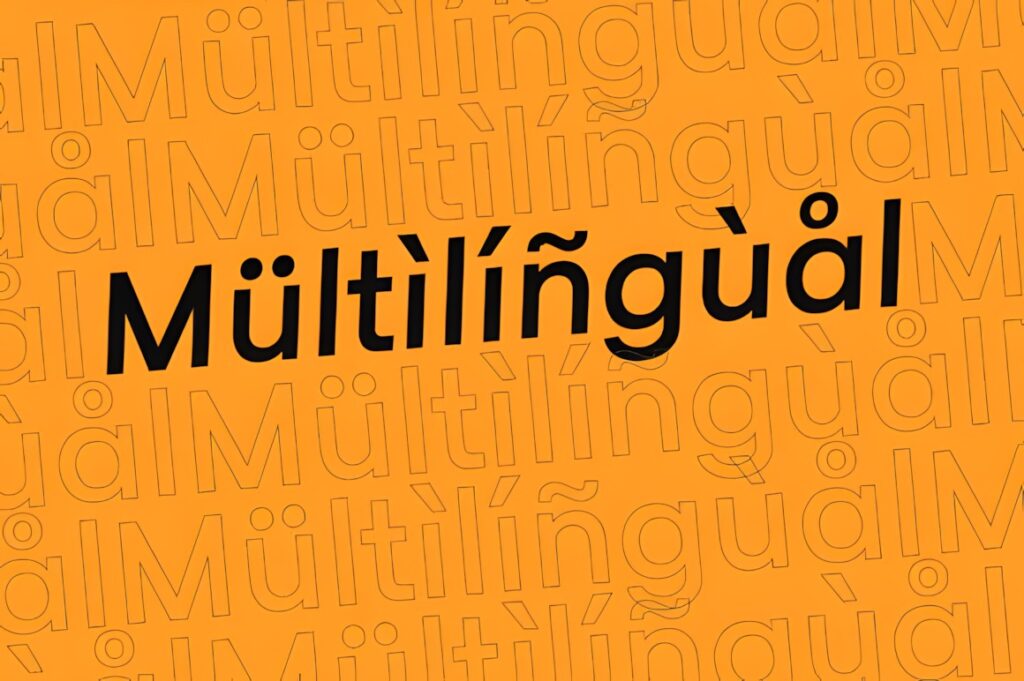
Lts Raela Pro is a geometric sans serif family designed around regular proportions and readability. Its 18 weights run from Thin to Heavy, and the documented OpenType features include stylistic alternates plus several figure variations. That range is particularly useful in decks containing financial metrics, tables, KPI slides, and multiple headline levels.
This makes more sense than a single-weight display face when your pitch deck needs a repeatable system instead of one striking title style. The broad family lets you create contrast through weight before introducing another font. For a very expressive cover, however, a more characterful option such as Gonelo or Protage may create a stronger opening impression.
3. Minimalist
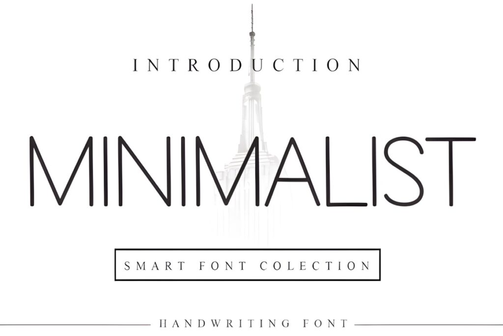

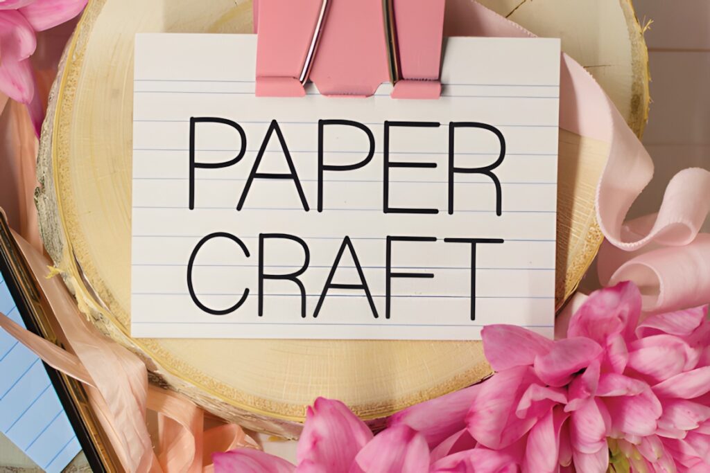
Minimalist is a clean, restrained sans serif that suits presentation layouts where typography should stay visually quiet. Its simple appearance can work particularly well around charts, product screenshots, diagrams, and photography because the lettering does not introduce much competing detail.
Choose this direction for minimal sales decks, portfolio presentations, creative proposals, and slide systems with plenty of whitespace. The tradeoff is personality: if the brand needs a strongly technological, editorial, or distinctive voice, a typeface with more recognizable geometry may provide a better title treatment. Minimalist is more useful when visual restraint is part of the presentation strategy.
4. Helvante
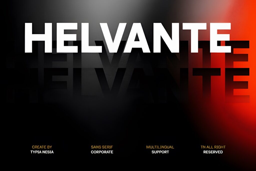
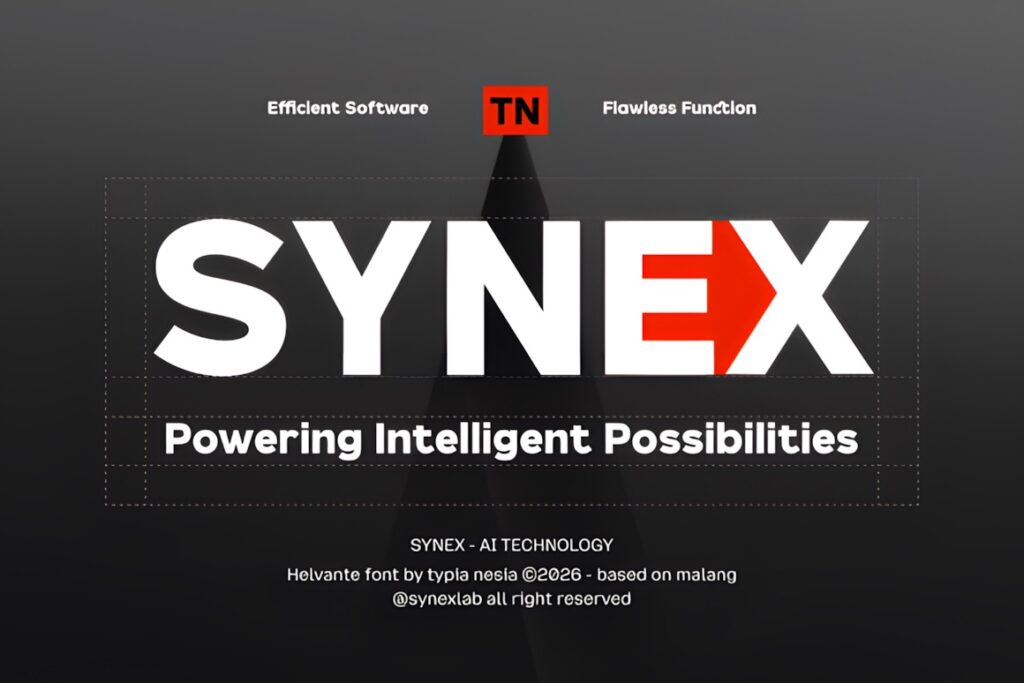
Helvante is positioned as a modern corporate sans serif with clean geometric letterforms and balanced proportions. Its stated uses specifically include presentations alongside corporate branding, editorial layouts, websites, interfaces, and marketing materials, making it a direct fit for polished business decks.
The relatively neutral construction makes Helvante useful when the presentation needs to feel contemporary without becoming visually experimental. Think investor updates, company profiles, strategy presentations, or client-facing proposals. If your slides rely on oversized expressive headlines rather than conventional corporate hierarchy, Protage or Gonelo can provide more visual force.
5. Geometrica Sans
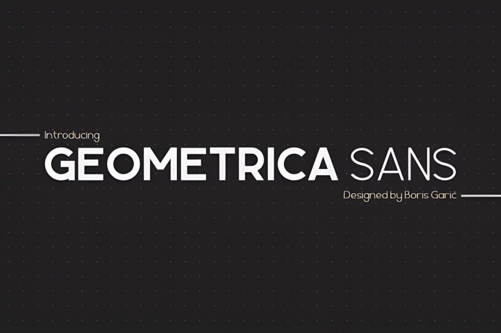
Geometrica Sans is built around basic geometric forms and comes in six documented weights: Thin, Light, Regular, Medium, Bold, and Black. That progression gives a presentation designer several practical hierarchy levels while keeping the overall visual language consistent.
Its structured personality makes sense for architecture, technology, product, engineering, and other decks where geometry complements the subject. Medium or Regular can carry secondary information while heavier styles can establish clear section titles. Compared with a quieter corporate face, Geometrica Sans has a more visibly constructed feel, so use it when geometric personality supports the brand rather than simply because the deck needs a sans serif.
6. Meigan
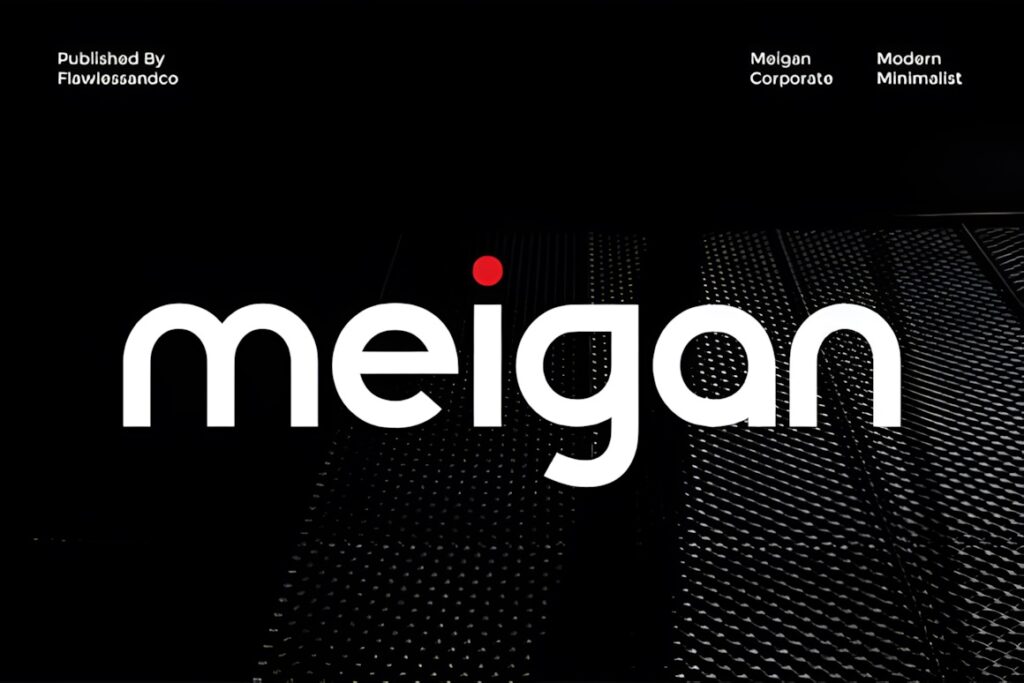
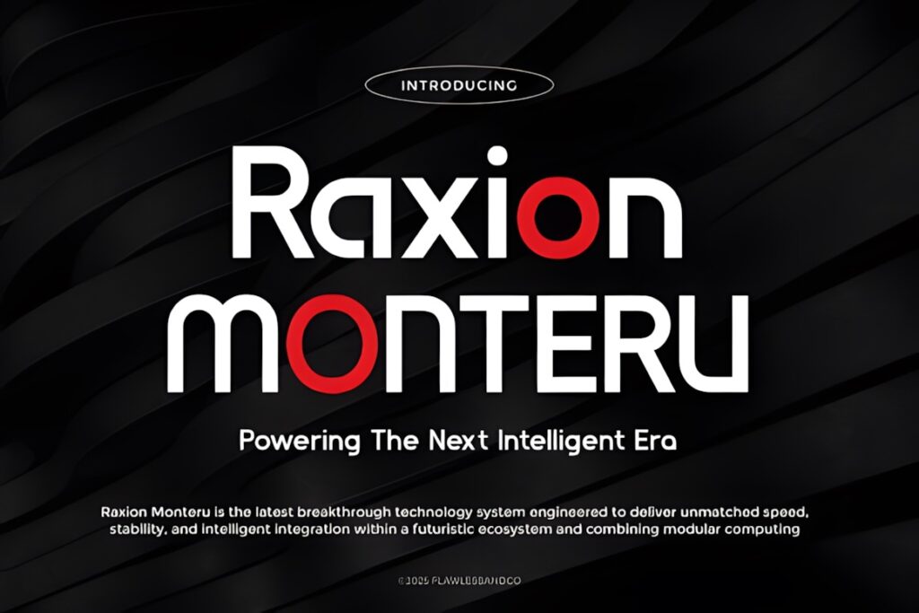
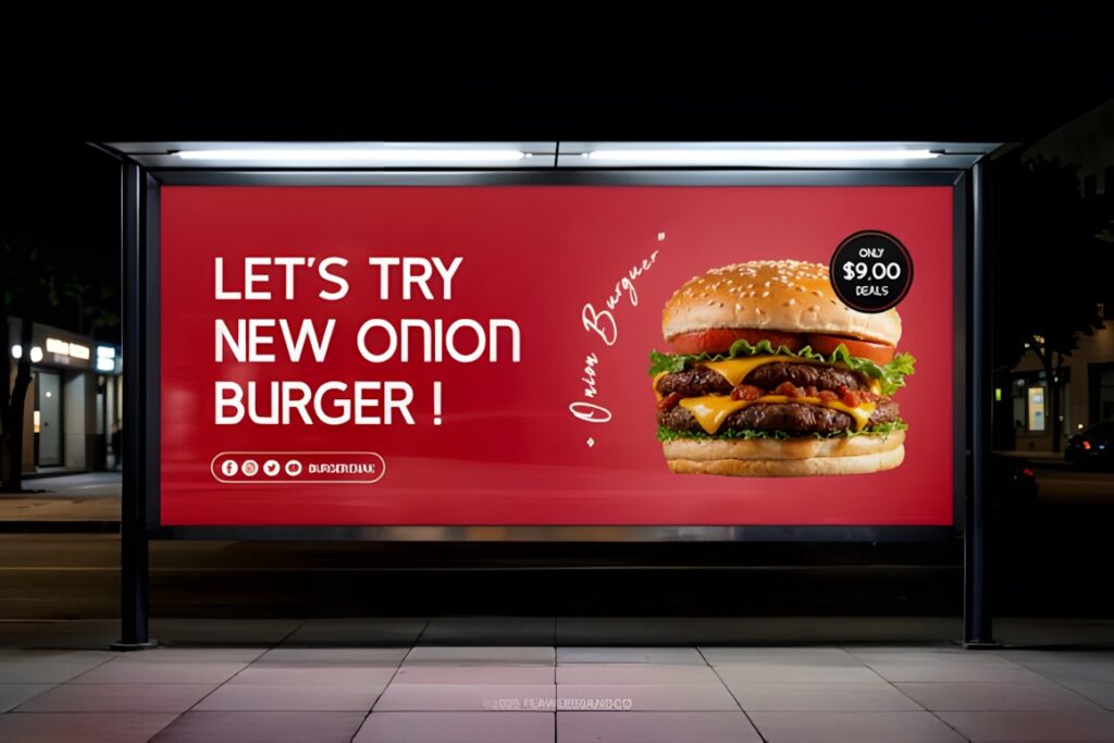
Meigan is a minimalist modern sans serif aimed at corporate, business, and contemporary branding work. Its product description emphasizes geometric shapes, balanced proportions, readability, and professional visual identity work, which makes it an appropriate direction for restrained business presentations.
I would consider Meigan for sales decks, internal strategy slides, business proposals, and presentations in which the typography needs to support the message rather than become the main visual element. It is less suited to situations where the title font needs an obviously unusual silhouette. In that case, keep a cleaner face for supporting information and use a more distinctive display option sparingly.
7. Glavia
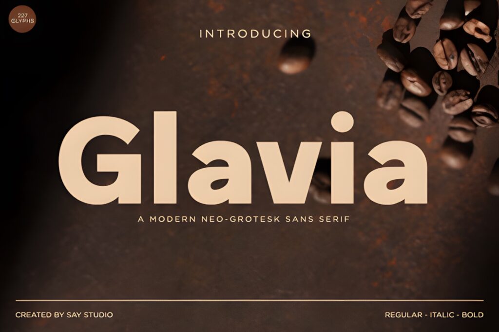
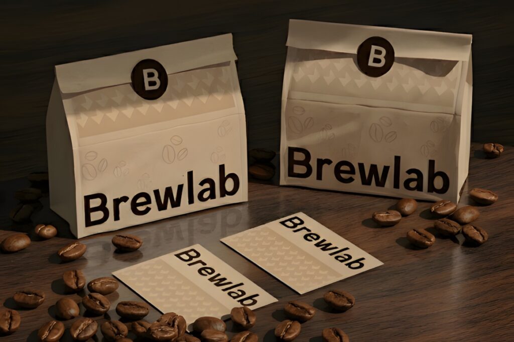
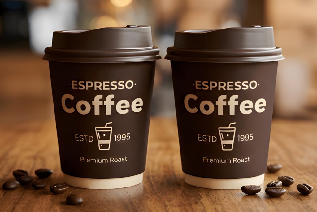
Glavia is a modern neo-grotesk sans serif designed for clarity and versatility. Corporate presentations are specifically listed among its intended applications, together with technology branding, startup identities, UI/UX layouts, packaging, advertising, and digital design.
That makes Glavia a logical fit for SaaS, product, technology, and startup decks where the visual system often combines screenshots, product interfaces, charts, and short statements. Its contemporary neo-grotesk direction can stay neutral enough for repeated slide use. For a deck built around unusually wide or narrow display typography, another option will provide stronger contrast, but Glavia works well when consistency is the priority.
8. Quano
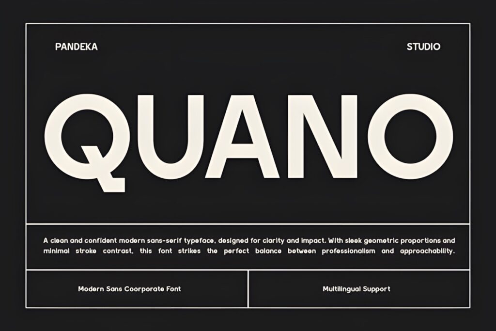

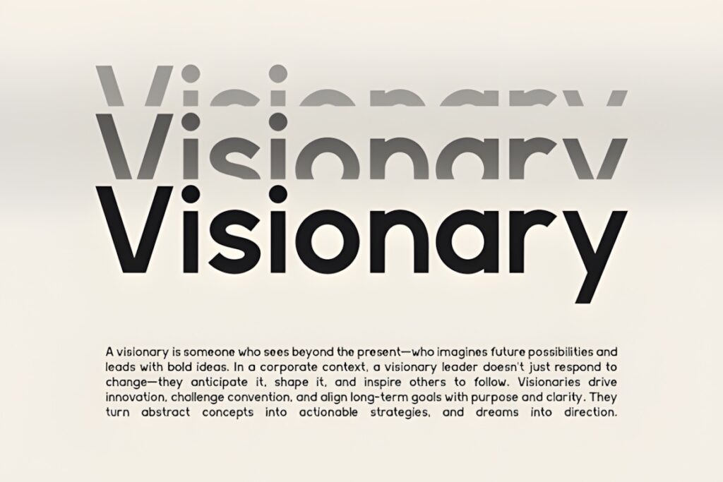
Quano is a contemporary corporate sans serif built around balanced proportions and geometric construction. The product page specifically identifies presentations, editorial layouts, branding, web design, and corporate identities as suitable applications.
Its role in a pitch deck is straightforward: use it when you want a clean business tone without making the slides feel tied to a conventional system font. Quano can suit corporate profiles, proposals, market analysis decks, and investor presentations. A restrained font like this also leaves more visual space for data and imagery. If a presentation consists mainly of dramatic one-line messages, a stronger display-oriented sans may make better use of those large text areas.
9. Chequers
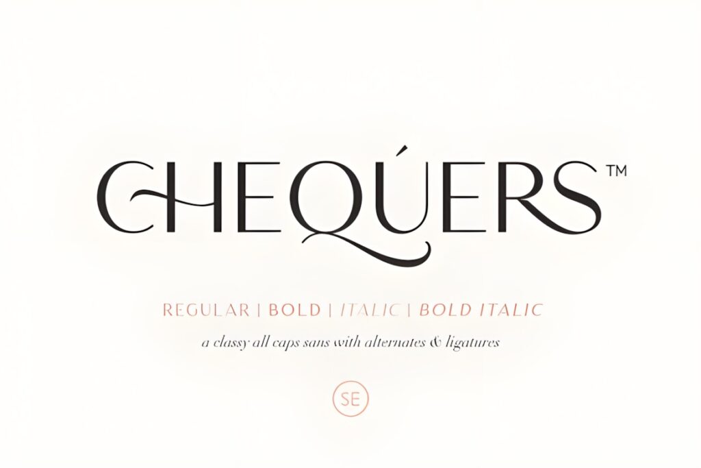
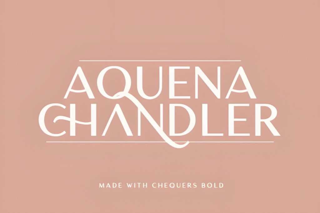

Chequers combines classic and modern sans serif characteristics and includes Regular, Bold, Italic, and Bold Italic styles. The product description also specifically mentions presentation use and includes ligatures for more distinctive typography.
The four-style structure can handle a simple presentation hierarchy without introducing too many variables: Regular for general text, Bold for emphasis, and italics when a secondary voice is useful. Ligatures can add polish to large titles or short brand statements, but they are less important in ordinary body copy. Choose Chequers when you want a little more typographic character than an ultra-neutral corporate sans without moving into an overtly decorative display font.
10. Montilla
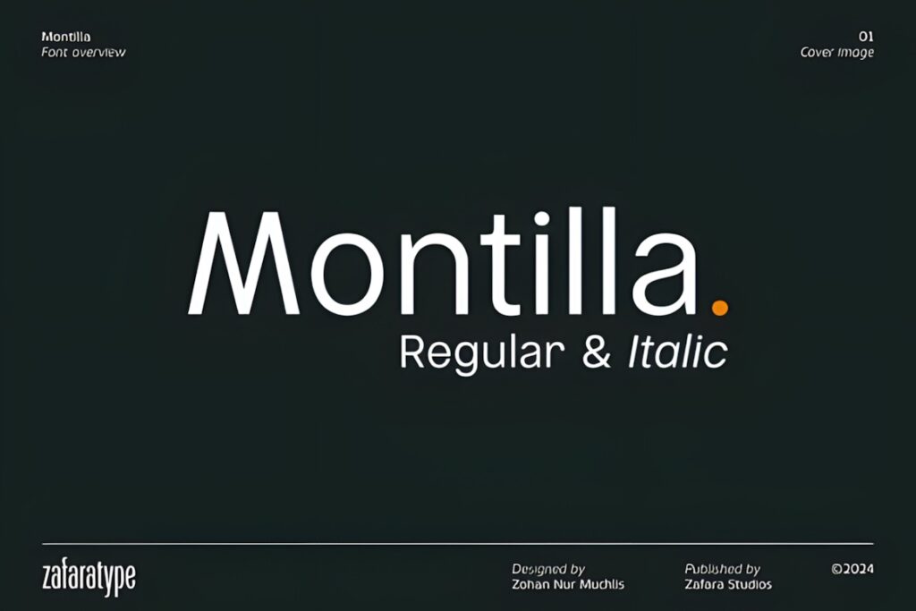

Montilla is a clean modern sans serif with Regular and Italic styles, sharp geometric angles, crisp ascenders, and balanced proportions. It is presented as a versatile workhorse for digital interfaces, corporate identities, and editorial publishing.
For presentations, that workhorse quality is useful when the slides already have a strong visual language built from photography, diagrams, or a branded color system. Montilla can stay relatively quiet while still feeling intentional. Because only Regular and Italic are explicitly documented in the retrieved product information, designers who need a much broader hierarchy of weights may find Modern Sans or Raela Pro easier to develop into a full presentation system.
11. Solvetica
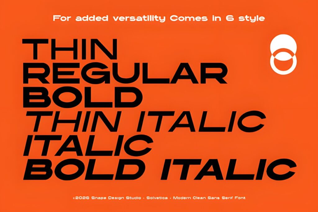
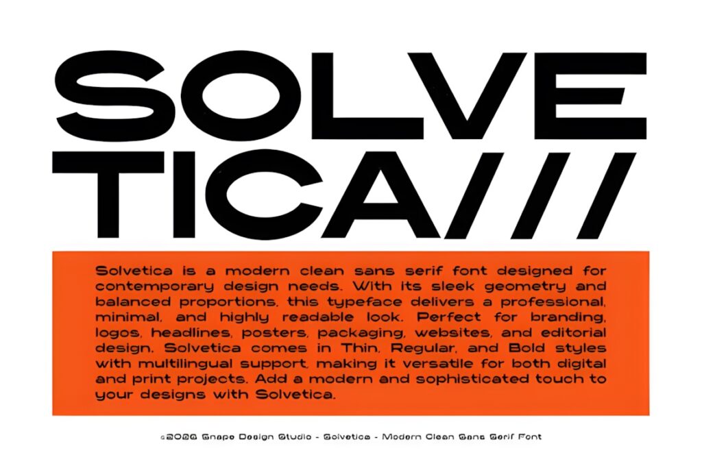
Solvetica is a modern clean sans serif family whose documented weights extend from thin through bold italic. Its balanced proportions and stated focus on legibility make it suitable for corporate branding, editorial layouts, and other systems where one family needs to cover different levels of emphasis.
That weight flexibility is particularly helpful in presentations containing repeated section headers, callout numbers, short explanatory text, and highlighted statements. Use stronger weights for key numbers and slide titles while keeping lighter or regular styles for supporting material. If your deck needs an overtly geometric technology personality rather than neutral versatility, Gonelo creates a more obvious stylistic signal.
12. Perfect Corporate
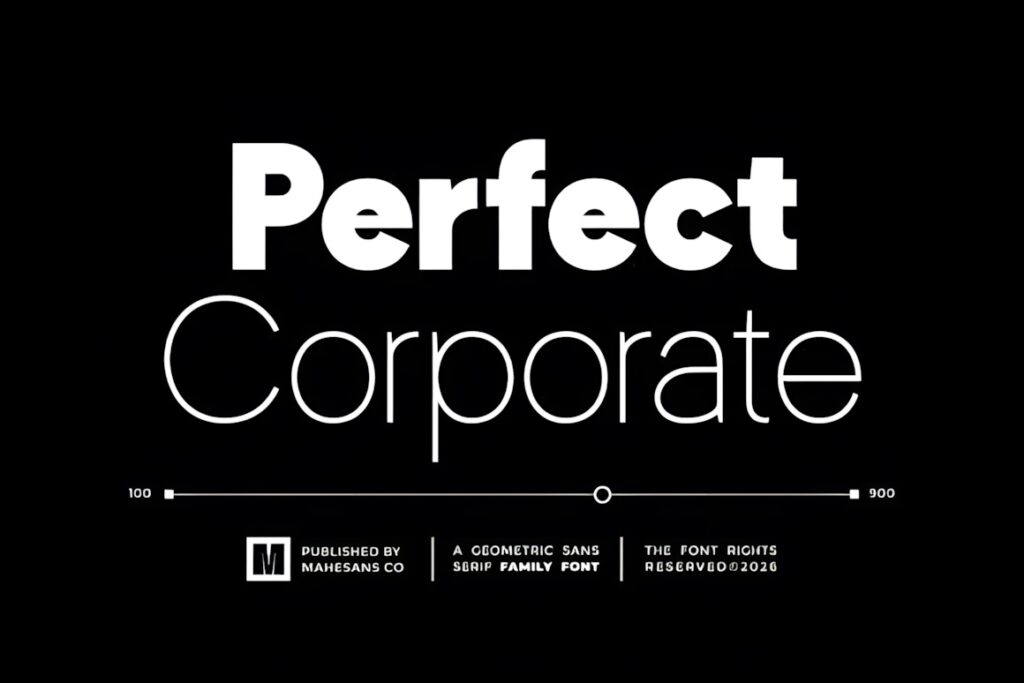
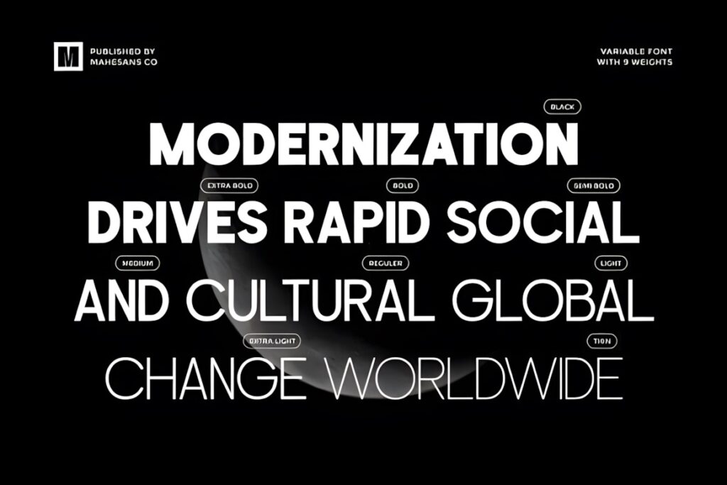
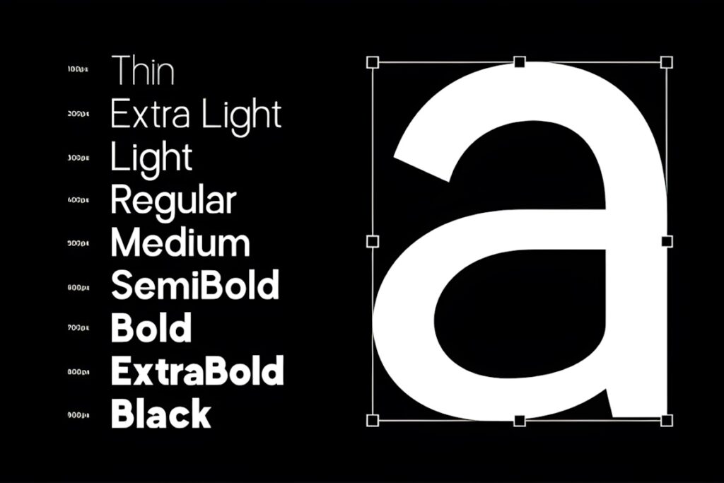
Perfect Corporate is a modern geometric sans serif designed around clarity, consistency, and professional visual impact. Its relatively restrained corporate direction makes it useful for decks that need a straightforward business tone rather than highly stylized typography.
Consider it for company overviews, consulting presentations, service proposals, and other situations where the viewer should concentrate on the argument, numbers, and visual evidence. The geometric structure can still make large headings feel contemporary. If you want the typography itself to become part of a more memorable creative identity, a face with more distinctive forms such as Protage may be the stronger direction.
13. Gonelo
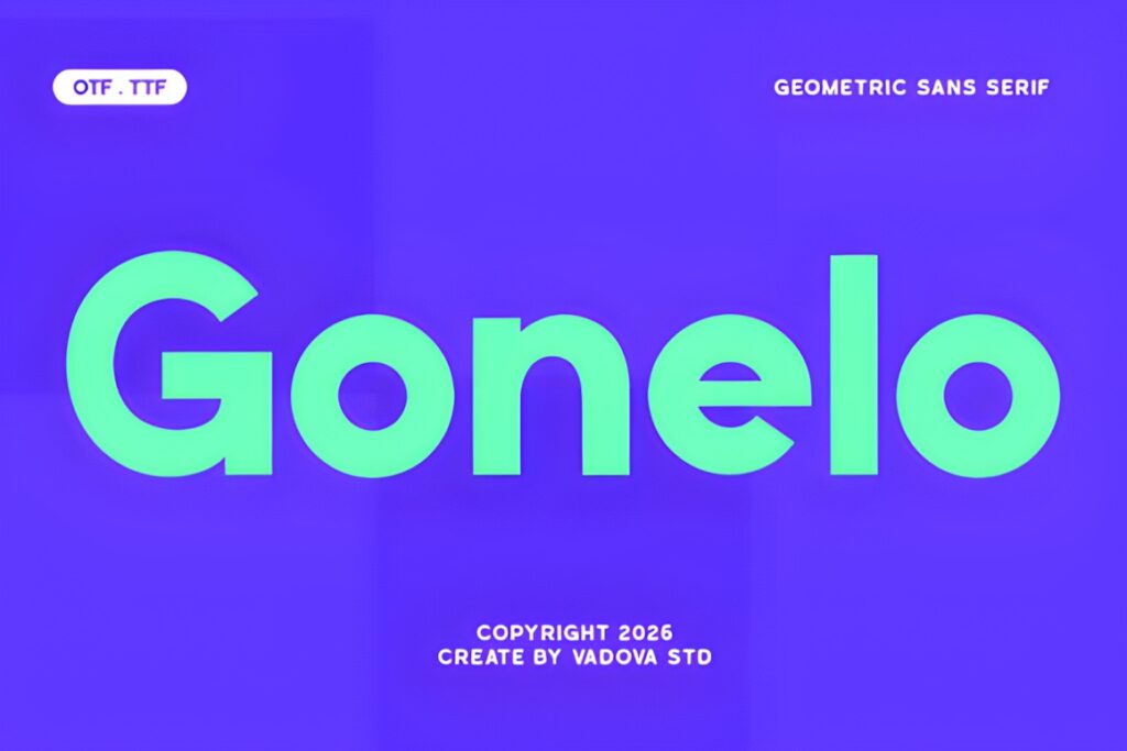
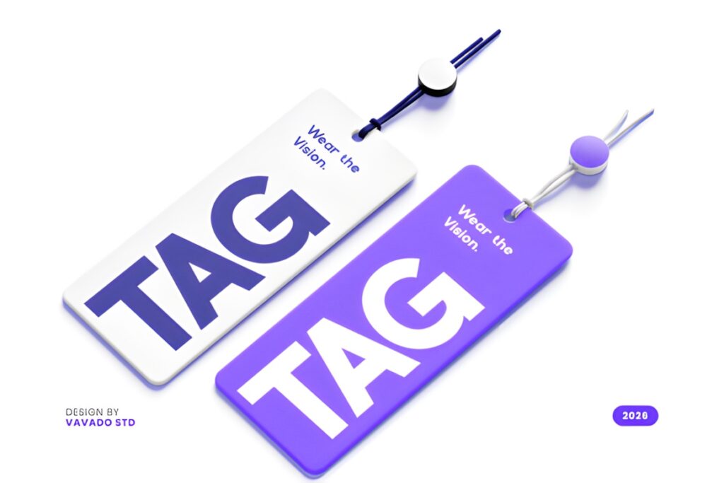
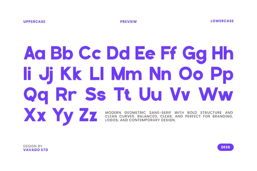
Gonelo is a bold modern geometric sans serif with circular forms, structured proportions, smooth curves, and a stronger visual presence than many neutral corporate faces. Presentation decks are explicitly included among its intended uses, alongside technology companies, SaaS products, digital interfaces, branding, and contemporary logos.
This makes Gonelo particularly useful for startup pitch covers, section dividers, major metrics, and concise statements that need to command attention. Its bold construction can become visually heavy when every slide contains several paragraphs, so I would treat it primarily as a headline-driven choice unless your actual slide tests confirm comfortable reading at smaller sizes.
14. Protage
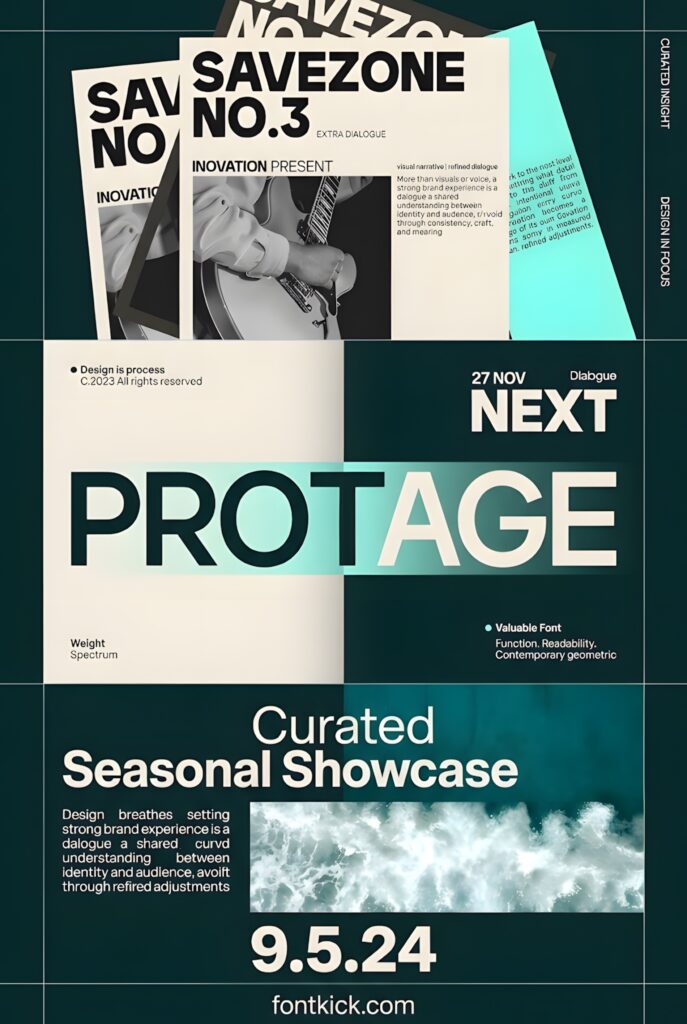
Protage is a contemporary sans serif built with clean geometry, balanced proportions, and confident strokes. Its stated uses span editorial layouts, technology projects, branding, interfaces, minimalist posters, and headline typography, giving it a useful position between a conventional workhorse and a more assertive display face.
I would use Protage when a pitch needs clearer visual personality without becoming decorative. It makes sense for section covers, product positioning slides, startup narratives, and shorter headline-led layouts. For data-heavy slides or long explanatory copy, a broader family such as Modern Sans or Raela Pro gives you more documented weight options for building subtle hierarchy.
Quick Comparison
| Font | Best for | Style | Key visual trait | Presentation fit |
|---|---|---|---|---|
| Modern Sans | Full deck systems | Grotesque sans | Broad weight range | Titles through supporting text |
| Lts Raela Pro | Data-heavy decks | Geometric sans | 18 weights | Complex hierarchy and figures |
| Minimalist | Visual-first slides | Minimal sans | Quiet, clean forms | Photography and charts |
| Helvante | Corporate presentations | Geometric corporate sans | Balanced proportions | Business and client decks |
| Geometrica Sans | Technical presentations | Geometric family | Six weight levels | Structured hierarchy |
| Glavia | SaaS and startup decks | Neo-grotesk sans | Contemporary neutrality | UI and product presentations |
| Chequers | Polished brand decks | Modern sans | Ligatures and four styles | Headlines plus supporting copy |
| Gonelo | Bold opening slides | Geometric sans | Strong circular geometry | Titles, sections, and metrics |
| Protage | Distinctive startup decks | Contemporary sans | Confident geometric forms | Headline-led layouts |
Building Clear Type Hierarchy in a Pitch Deck
A presentation rarely needs many fonts. In most cases, one flexible sans serif family is enough when you create contrast through size, weight, spacing, and placement. Use the heaviest or most distinctive style for slide titles, a moderate weight for important supporting statements, and a calmer regular weight for explanatory copy.
Avoid making every element compete for attention. If a large revenue figure is meant to be the first thing a viewer sees, the subtitle, chart labels, and explanatory text should step back. The same principle applies to a slide built around a short product claim or customer quote.
Multi-weight families such as Modern Sans and Raela Pro are especially useful here because hierarchy can come from related styles instead of unrelated typefaces. Presentation designers also frequently emphasize consistency, scale, and restrained font mixing over simply choosing serif versus sans serif.
Readability and Slide Density
A font that looks clear in a large headline is not automatically comfortable in a dense slide. Test the typeface with the longest title, smallest chart label, longest bullet, and most crowded data slide in the actual presentation template before committing to it.
Pay particular attention to width. Wide geometric lettering may force awkward line breaks, while extremely condensed letters can become tiring when used for several sentences. The goal is not to squeeze the maximum amount of text onto the slide; the font should support a presentation that can still be understood at viewing distance.
If a font feels distinctive but becomes difficult to scan in smaller text, reserve it for titles and use a more restrained style for supporting information. This division often works better than forcing one display-oriented face into every role.
Using Presentation Fonts Across Different Computers
Font availability becomes important as soon as a deck moves between collaborators, presentation software, or computers. A typeface installed on the designer’s machine may not automatically exist on the recipient’s system, and substitution can change line breaks, spacing, and even the overall composition of a slide.
Before building a large editable deck around a downloaded font, confirm how your presentation software handles font embedding and how the file will be shared. Public presentation discussions regularly describe layout changes when a font is unavailable or not preserved correctly between files and systems.
If collaborators need to edit the deck, test that workflow early rather than after dozens of slides have been formatted. If the final presentation will be distributed as a non-editable document, exporting to a suitable fixed format can reduce substitution problems. Always check the current license for the exact font and intended use before distributing font files or using them in client workflows.
Which Sans Serif Font Fits Your Presentation?
If you want one flexible family to structure almost an entire pitch deck, Modern Sans or Lts Raela Pro gives you the most useful documented range of weights in this selection.
For a clean corporate or client-facing presentation, Helvante, Quano, or Glavia keeps the visual language contemporary without making the typography dominate every slide.
If your deck relies on large, concise statements and strong section openers, Gonelo or Protage brings more personality. For quiet minimalist layouts built around photography, charts, or generous whitespace, Minimalist is the more restrained direction.
Whichever style you choose, test it in the most demanding slides first. A font that handles your longest title, smallest useful text, and busiest chart comfortably is more valuable than one that only looks impressive on the cover.
Frequently Asked Questions
What type of sans serif font works well for a pitch deck?
A clean sans serif with clear letterforms and enough hierarchy options works well for most pitch decks. Multi-weight families are particularly useful because titles, key figures, labels, and supporting text can remain visually related. More distinctive geometric fonts can work for opening or section slides, but readability should still guide smaller text choices.
Should I use the same font for an entire presentation?
One flexible font family can be enough for an entire presentation when it includes suitable weights or styles. Create hierarchy through size, weight, spacing, and placement before adding a second typeface. A second font is most useful when it has a clearly different role, such as a distinctive display face used only for major titles.
How do I know if a presentation font is readable enough?
Test the font inside real slides rather than judging it only from a specimen image. Check long headings, body text, chart labels, numbers, captions, and the smallest text you expect to use. View several slides at presentation scale and from a realistic distance, paying attention to width, spacing, contrast, and crowded letterforms.
Can a downloaded font cause problems when sharing a presentation?
A downloaded font can be substituted when another computer or application does not have access to it, which may change spacing and line breaks. Test the sharing workflow before finalizing a large deck and check whether your presentation software supports the required font handling or embedding method. Also review the current font license for your intended client, business, or distribution use.