ℹ️ Affiliate Disclosure: This article may contain affiliate links. If you book or purchase through these links, we may earn a commission at no additional cost to you.
Choosing Modern Sans Serif Fonts for Website Body Text and Readability
A modern sans serif font can look clean in a hero section yet become tiring once it is repeated across paragraphs, menus, cards, and mobile screens. For website typography, visual style is only part of the decision. Comfortable body text also depends on proportions, spacing, stroke weight, character clarity, and whether the family provides enough styles to build a useful hierarchy.
The fonts below focus on contemporary sans serif designs that can support readable website copy while still giving a brand a modern visual identity. Some are neutral workhorses for long-form content, while others bring more geometric, friendly, or distinctive character without becoming purely decorative.
Many more modern sans serif fonts are available, while this shortlist concentrates on styles with distinct web uses, readable letterforms, and clearly different personalities.

For website body text, start with a restrained sans serif with balanced proportions and a dependable regular or medium weight. Humanist options work well when reading comfort is the priority, geometric families can create a sharper contemporary identity, and multi-weight families are useful when one typeface needs to handle paragraphs, navigation, subheads, and headlines.
Quick Picks
For long-form website copy: TRT Monexa — a humanist sans serif designed around screen readability and digital content.
For small body text: Concur Family — its regular weight is specifically designed with small on-screen body text in mind.
For a versatile modern family: Modern Sans — nine weights plus basic and oblique styles give it plenty of hierarchy options.
For geometric clarity: Aftika — a seven-weight family with a prominent x-height suited to small digital text.
For a friendlier contemporary look: FT Neue Buddy — clean geometric construction softened by rounded terminals and subtle curves.
Modern Sans Serif Fonts for Web Design and Body Copy
1. Concur Family
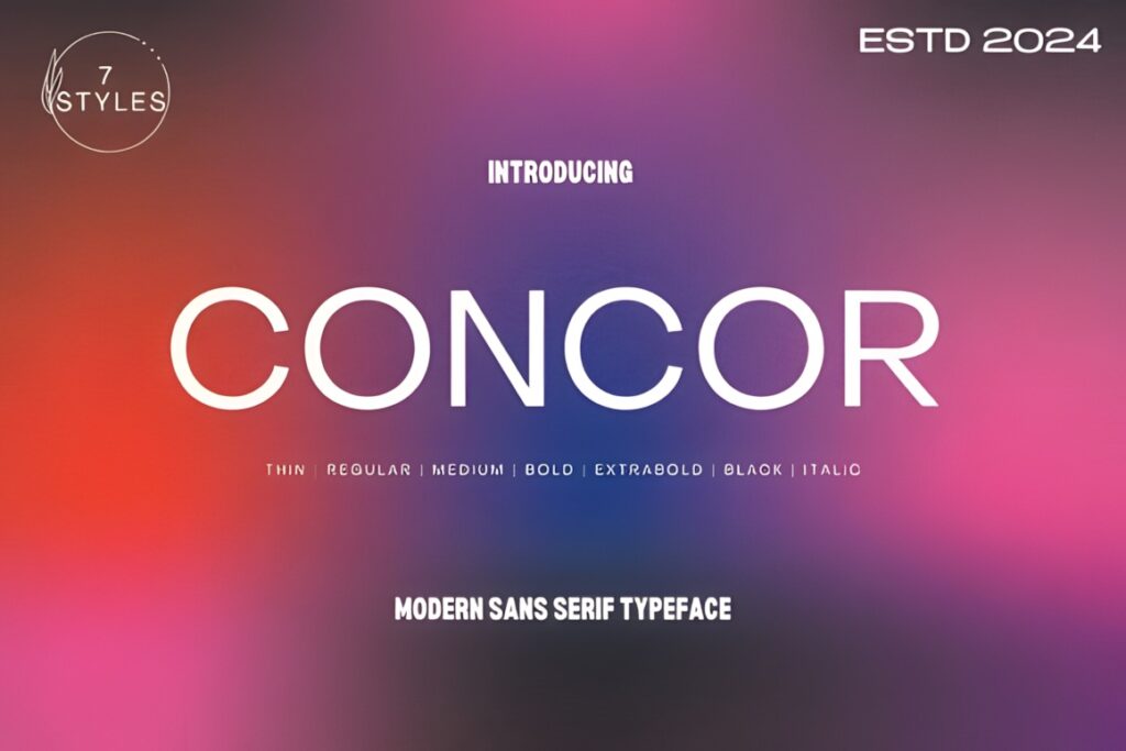
Concur Family is a contemporary sans serif that combines qualities associated with Swiss neo-grotesque and geometric typography. It is especially relevant for websites because the regular weight is designed for small body text as well as broader on-screen use.
The family includes five weights with upright and slanted versions, giving a web layout enough variation for paragraphs, navigation, subheads, and stronger display text. Choose Concur when you want a relatively neutral workhorse rather than a highly stylized brand font. If the website needs a softer or more noticeably friendly personality, FT Neue Buddy may provide more visible character.
2. TRT Monexa
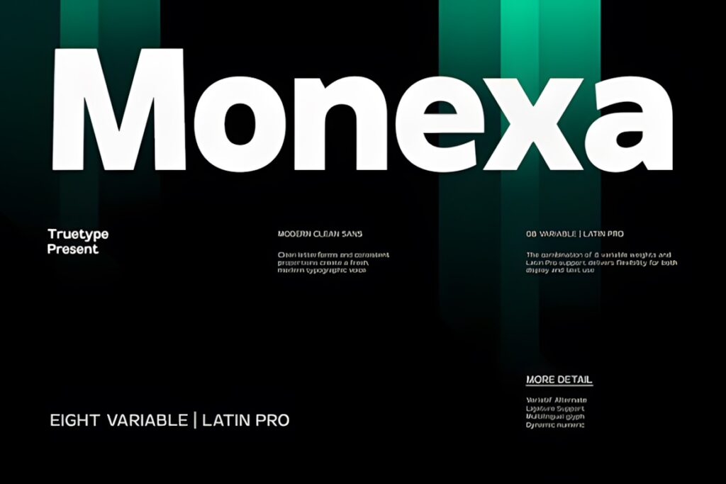
TRT Monexa is a modern humanist sans serif aimed directly at digital interfaces, websites, dashboards, mobile applications, and longer on-screen content. Open apertures, balanced proportions, and restrained styling make it one of the more body-text-focused options in this selection.
This makes sense when the typography should support the content quietly rather than compete with it. The humanist construction also gives it a less rigid feel than strongly geometric families. For a website that needs sharper geometric branding across both body text and headlines, Aftika or Avalance may create a more structured visual system.
3. Aftika
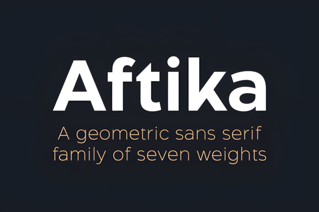
Aftika is a clean geometric sans serif family with seven weights and a prominent x-height. That combination makes it particularly useful when a contemporary appearance needs to survive at smaller text sizes on digital screens.
Its geometric structure gives websites a more designed, deliberate appearance than a neutral system-style sans serif, while the range of weights can support clear hierarchy. Consider Aftika for editorial websites, agencies, product pages, or modern business sites that need both body copy and stronger headings. A humanist option such as TRT Monexa may make more sense when the visual system should feel less geometric.
4. Coftein
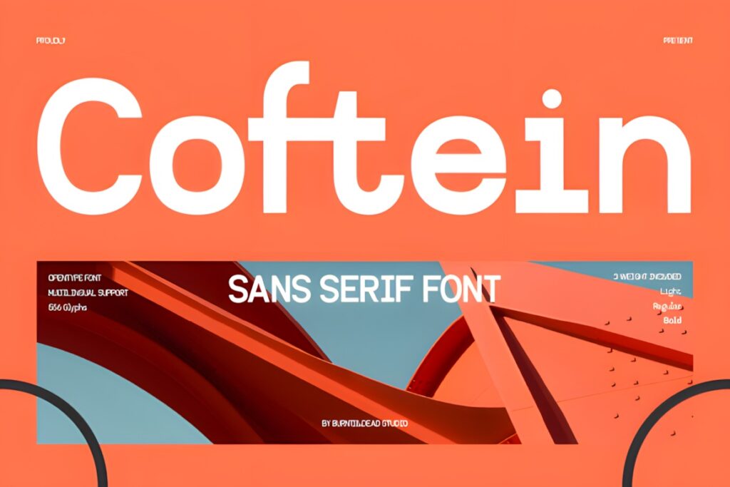
Coftein is a clean modern sans serif designed to work across body text and headings. Its three weights—Light, Regular, and Bold—create a simpler family than some of the larger systems in this roundup, but they cover the core hierarchy needed by many compact websites.
The restrained appearance suits landing pages, portfolio sites, digital content, magazines, and UI-oriented layouts. Use the regular weight as the safer starting point for paragraph copy, while bold can establish clear section headings. Choose a larger family such as Modern Sans or Dectone when the project needs more finely graduated weight changes across a complex design system.
5. Modern Sans
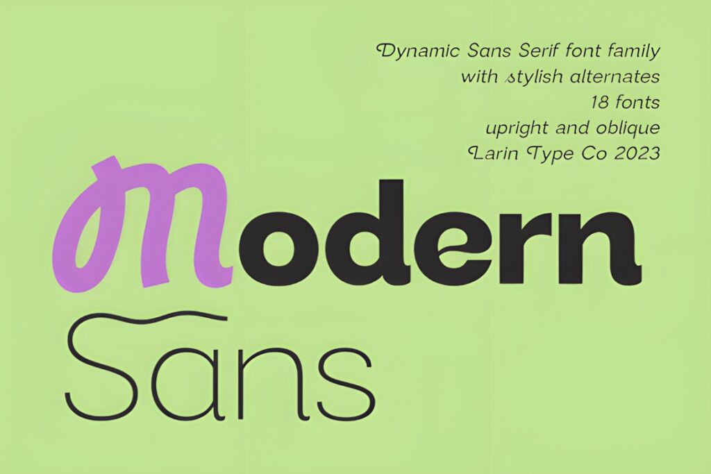
Modern Sans is a broad grotesque-style family with nine weights running from thin through black, plus basic and oblique styles. The product is positioned for websites as well as branding, descriptions, publishing, advertising, packaging, and other mixed typography needs.
The large weight range is the main reason to consider it for a full website system. You can keep typography visually consistent while assigning lighter or regular styles to body copy and stronger weights to navigation, titles, and calls to action. That flexibility may be unnecessary for a simple blog using only two or three text styles, where Coftein offers a more compact choice.
6. Avalance
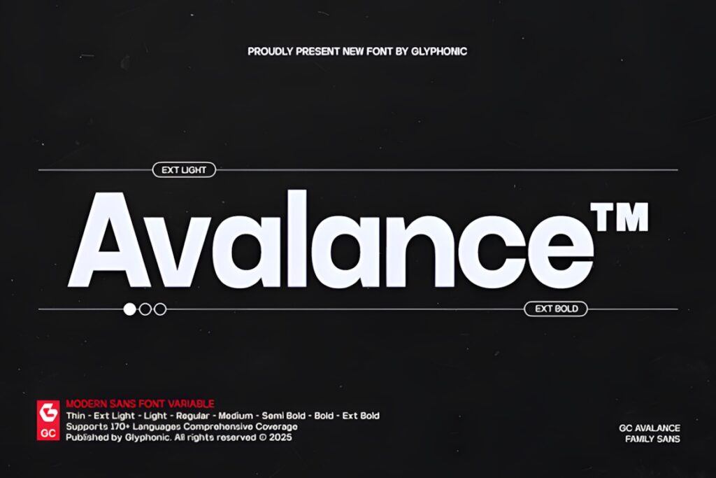
Avalance is a modern geometric sans serif variable font built around clean shapes, generous spacing, and multiple weights from Thin to Extra Bold. Its contemporary appearance fits websites that need a polished technology, corporate, editorial, or product-design tone.
The variable-family approach is useful when a design system needs finer control over typographic hierarchy without switching families. Avalance can move from body text into stronger interface and display roles while keeping the same underlying visual language. Its geometric personality is more noticeable than a quiet humanist sans, so content-heavy sites seeking maximum neutrality may prefer Concur Family or TRT Monexa.
7. FT Neue Buddy
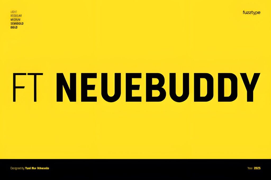
FT Neue Buddy is a geometric sans serif with rounded terminals, subtle curves, and a warmer personality than many strictly geometric families. Its Light, Regular, Medium, Semibold, and Bold weights allow it to handle both readable text and more assertive headings.
This font makes particular sense for websites that need to appear contemporary without feeling overly corporate or mechanical. The softer details can suit modern service brands, creative businesses, apps, and lifestyle projects. If the layout needs a harder, more precise geometric tone, Avalance or Aftika provides a more structured alternative.
8. Dectone
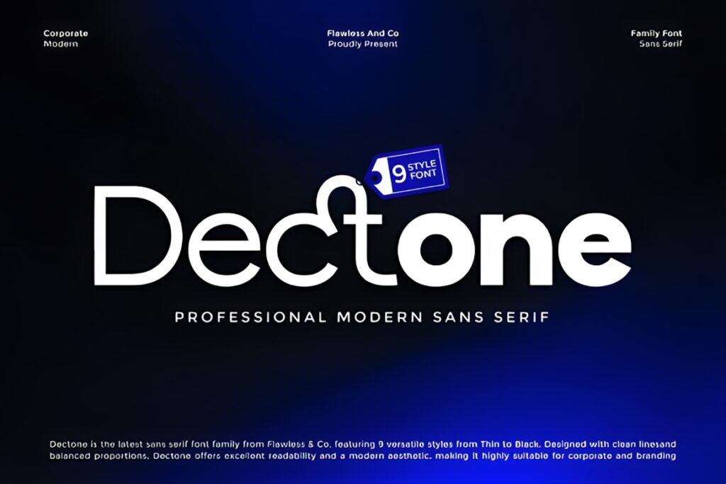
Dectone is a modern sans serif family with nine styles ranging from Thin to Black. Balanced proportions, clean geometry, and a broad weight range make it suitable for building hierarchy across websites, editorial layouts, digital interfaces, branding, and corporate materials.
Use Dectone when one family needs to cover several interface roles without making the site feel visually fragmented. Regular and middle weights are the logical place to begin for text-heavy sections, while heavier styles can handle prominent titles. Its clean professional tone is less playful than FT Neue Buddy, which may be preferable for brands wanting more warmth.
9. Flexing
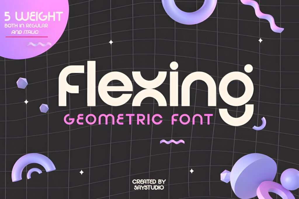
Flexing is a geometric sans serif family available in five weights with regular and italic styles. It combines a simple modern foundation with more distinctive character shapes, giving it more personality than the most neutral body-text families.
The family is intended for both text and display use, so it can work across website paragraphs, headlines, branding, and editorial layouts. Flexing is worth considering when the typography should contribute visible identity instead of disappearing completely into the interface. For dense articles or documentation where unobtrusive reading is the primary goal, Concur Family or TRT Monexa offers a quieter direction.
10. Palome
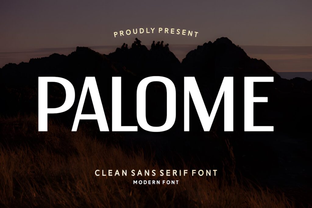
Palome is a sleek modern sans serif with clean lines and balanced proportions. Its restrained contemporary appearance is designed to maintain clarity across headlines and body text, making it a straightforward option for websites where simplicity is part of the visual identity.
Consider Palome for minimalist portfolios, brand sites, editorial pages, and digital interfaces where the type should feel polished without introducing strong geometric quirks. Its visual simplicity can also make pairing easier because the font does not compete heavily with photography or decorative headline typography. Choose a larger multi-weight family when you need a more complex typographic system.
11. Sansdiego
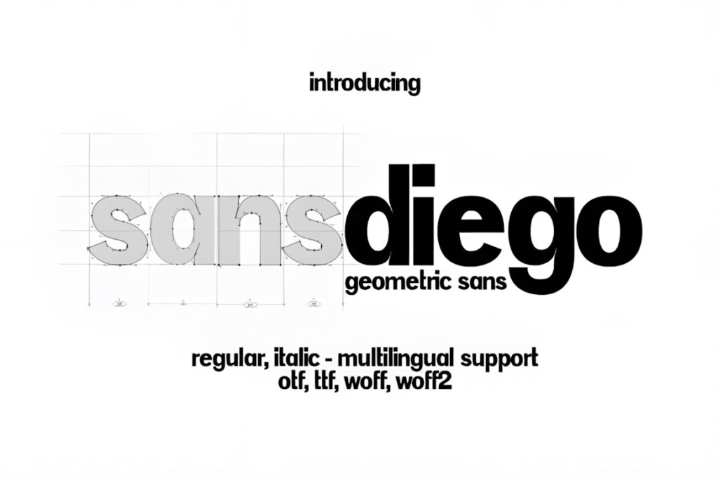
Sansdiego is a sleek minimalist sans serif offered in regular and italic styles. It is intended for body text and headings as well as websites, magazines, advertising, packaging, signage, and other clean contemporary layouts.
This is a practical choice for a relatively simple website that does not require a large number of weights. Regular can carry paragraphs while italic supplies basic emphasis without introducing another family. The limited style range is also its main constraint: larger content platforms and interface systems may benefit from Modern Sans, Dectone, or another family with more hierarchy options.
12. Gratav
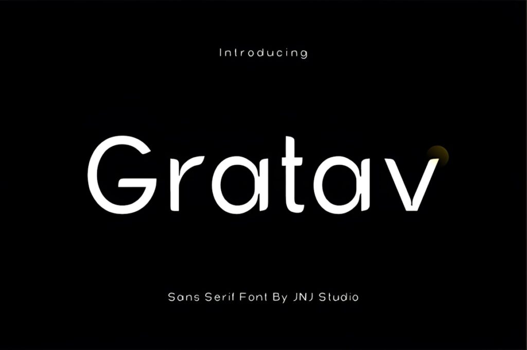
Gratav is a contemporary sans serif built around clean geometry with subtle humanist touches. Consistent proportions, smooth curves, and a relatively neutral character allow it to move between body text, UI/UX layouts, editorial design, branding, and corporate identity.
The mix of geometric order and softer details makes Gratav useful when you want a modern website to feel structured without becoming too mechanical. It can serve as the primary family across both informational copy and more prominent text. If a project needs a distinctly rounded, approachable tone, FT Neue Buddy offers a clearer stylistic shift; for a more purely neutral reading experience, consider TRT Monexa.
Quick Comparison
| Font | Best for | Style | Key visual trait | Project fit |
|---|---|---|---|---|
| Concur Family | Small body text | Neo-grotesque / geometric | Restrained structure | Content-heavy websites |
| TRT Monexa | Long-form digital reading | Humanist sans | Open, balanced forms | Web, apps, dashboards |
| Aftika | Modern editorial text | Geometric sans | Prominent x-height | Publishing and websites |
| Modern Sans | Complete typography systems | Grotesque sans | Wide weight range | Brand and business sites |
| Avalance | Tech-oriented layouts | Geometric variable sans | Clean, precise forms | Interfaces and editorial |
| FT Neue Buddy | Friendly modern brands | Rounded geometric sans | Soft terminals | Apps and service brands |
| Dectone | Corporate hierarchy | Modern geometric sans | Balanced proportions | Business and UI |
| Flexing | Text with more personality | Geometric sans | Distinctive characters | Brand-led websites |
| Palome | Minimal websites | Contemporary sans | Clean simplicity | Portfolios and editorial |
| Sansdiego | Simple web typography | Minimal sans | Sleek forms | Blogs and small sites |
| Gratav | Balanced modern interfaces | Geometric / humanist sans | Smooth, neutral rhythm | UI and brand systems |
| Coftein | Compact hierarchy | Modern sans | Clean restrained forms | Landing pages and UI |
Readability and Size on Real Websites
A readable font can still become uncomfortable if the surrounding typography is poorly configured. Test paragraphs at the actual desktop and mobile sizes you intend to publish. Look at complete sentences rather than isolated letters and check whether words remain easy to scan through several paragraphs.
Regular or medium weights are usually a more practical starting point for sustained reading than very thin styles. Thin weights can create attractive oversized hero text, but reducing the same weight for article copy, product descriptions, or interface instructions can weaken the visual texture of the paragraph.
Line spacing and text width matter as much as the font choice. If lines are packed tightly or stretched across an excessively wide content area, even a well-designed sans serif can become tiring. Evaluate the font inside the complete page layout before committing to it.
Font Pairing Tips for Website Typography
You do not need a second font simply because a website has headings and body copy. Families such as Modern Sans, Dectone, Avalance, and Concur provide enough internal variation to create hierarchy with weight, size, and spacing alone. This can make the interface feel more consistent and reduce unnecessary visual complexity.
When you do pair fonts, give each one a clear role. A restrained sans serif can carry paragraphs, navigation, captions, and product information while a more expressive serif or display face handles major headlines. The contrast should be obvious enough to look intentional rather than like two almost-identical sans serifs competing with each other.
For content-heavy websites, keep the body font relatively quiet. Personality can come from headings, imagery, color, and layout while the paragraph type remains focused on reading comfort.
Common Body Font Mistakes to Avoid
- Choosing from a large headline preview only. Always inspect several paragraphs at realistic website sizes.
- Using the thinnest weight for body copy. A regular or medium style often creates a stronger and more consistent reading texture.
- Ignoring letter spacing and line height. Typeface choice cannot compensate for cramped text.
- Using condensed styles for every paragraph. Narrow lettering can be useful, but longer passages often benefit from more comfortable proportions.
- Creating hierarchy with too many unrelated fonts. One flexible family can often handle paragraphs, captions, navigation, and headings.
- Assuming a font looks identical on every screen. Test important text across desktop and mobile layouts before settling on the final typography.
Choosing the Right Sans Serif for Your Website
If your main priority is comfortable long-form reading, TRT Monexa or Concur Family gives you a strong body-text starting point. Both are oriented toward practical on-screen typography rather than display impact alone.
For a more geometric contemporary identity, Aftika balances structure with small-text usefulness, while Avalance makes sense for modern interfaces and technology-oriented visual systems. If you need many weight options across an entire website, Modern Sans or Dectone gives you broader hierarchy flexibility.
For a friendlier tone, FT Neue Buddy adds softer curves without abandoning a clean sans serif foundation. Whatever you choose, test several real paragraphs, headings, links, and interface labels before making the font the permanent foundation of the site.
Frequently Asked Questions
What makes a sans serif font readable for website body text?
A readable website sans serif usually combines clear letter shapes, balanced spacing, practical proportions, and a body-text weight that remains visible without feeling heavy. Large x-height or open forms can also help in many designs, but the complete layout matters. Test the font in real paragraphs with your intended size, line height, column width, and screen backgrounds before making a final choice.
Should I use the same sans serif font for headings and body text?
Using one sans serif family for both headings and body text can create a clean and consistent website. Families with several weights make this especially practical because hierarchy can come from size and weight instead of changing typefaces. A second font is useful when you want stronger stylistic contrast, but it should have a clearly different role rather than duplicate the body font.
Is a geometric sans serif suitable for long paragraphs?
A geometric sans serif can work for long paragraphs when its spacing, proportions, weight, and character shapes remain comfortable at normal reading sizes. Some geometric fonts are more display-oriented than others, so the category alone does not determine readability. Compare complete paragraphs on desktop and mobile, and favor the less extreme weights and widths when sustained reading is important.
Can I use these fonts on a commercial website?
Check the current license attached to the specific font before using it on a commercial website, client project, downloadable product, or other commercial application. Licensing terms can define different permissions for desktop fonts, webfont use, editable products, resale, or other distribution. Confirm the license for the exact use you have planned rather than assuming every font carries identical rights.