ℹ️ Affiliate Disclosure: This article may contain affiliate links. If you book or purchase through these links, we may earn a commission at no additional cost to you.
Choosing Luxury Logo Fonts for Event Companies to Elevate Your Brand
A luxury event brand has to look polished in more places than a typical logo. The same identity may appear on a website, proposal deck, invitation, welcome sign, menu, seating chart, social post, and tiny vendor credit. That makes choosing luxury logo fonts for event companies less about finding the most decorative typeface and more about balancing personality with recognition. High-contrast serifs can give an event studio a formal editorial feel, while restrained scripts add the custom signature quality associated with weddings, galas, private dinners, and premium parties.
For an event company wordmark, pay particular attention to business-name length, thin strokes, decorative swashes, capitalization, and how easily the lettering can be reused at smaller sizes. The selections below include polished serifs, expressive scripts, and versatile font duos that solve different branding and event-stationery needs.
Many more luxury fonts are available, while this shortlist focuses on styles with distinct branding roles, readable letterforms, and clearly different personalities for premium event work.

The most useful luxury event logo fonts usually fall into a few groups: refined serifs for established planning studios, graceful scripts for signature-style brands, serif-and-script combinations for coordinated stationery, and decorative display faces for short high-impact names. The right choice depends on how formal the company should feel and how often the logo must work at compact sizes.
Quick Picks
For a tall editorial wordmark: Lavish — an elegant serif that gives short event-company names strong vertical presence without relying on elaborate ornament.
For coordinated logo and invitation typography: Seraphina — its serif-and-script pairing helps build contrast without sourcing two unrelated typefaces.
For formal luxury event stationery: Elvare — a refined wedding-oriented serif suited to invitations, bridal branding, and sophisticated event layouts.
For monograms and VIP party marks: Nouveau Monogram — decorative uppercase lettering gives initials and short marks an Art Deco-influenced identity.
Luxury Logo Fonts for Event Companies and Premium Parties
1. Lavish
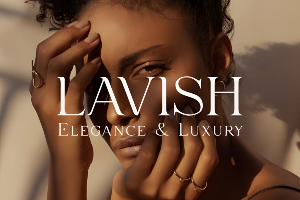
Lavish is a tall, elegant serif suited to event studios that want a clean luxury wordmark rather than a calligraphic logo. Its narrow vertical character can give short company names a sophisticated editorial presence and also works naturally for headings, labels, and formal printed pieces.
The restrained construction makes Lavish useful when the brand needs to span upscale private parties, weddings, and corporate events without leaning too heavily toward one theme. For a romantic signature effect, however, a script such as Luxury by Aimin Studio creates a more personal impression.
2. Luxury by Aimin Studio
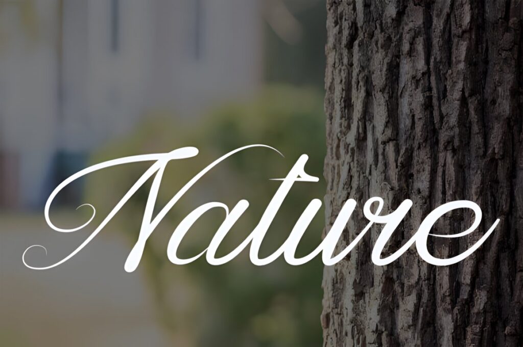
Luxury is a balanced handwritten font designed for logos, branding, and short display text. The flowing handwritten character makes it a strong fit for boutique event planners, wedding coordinators, and party brands that want their identity to resemble a polished personal signature.
This style works most naturally when the business name is short enough to let the letterforms breathe. A long company name, service descriptor, or detailed event information should usually be set in a restrained supporting font instead of extending the script across an entire layout.
3. Seraphina
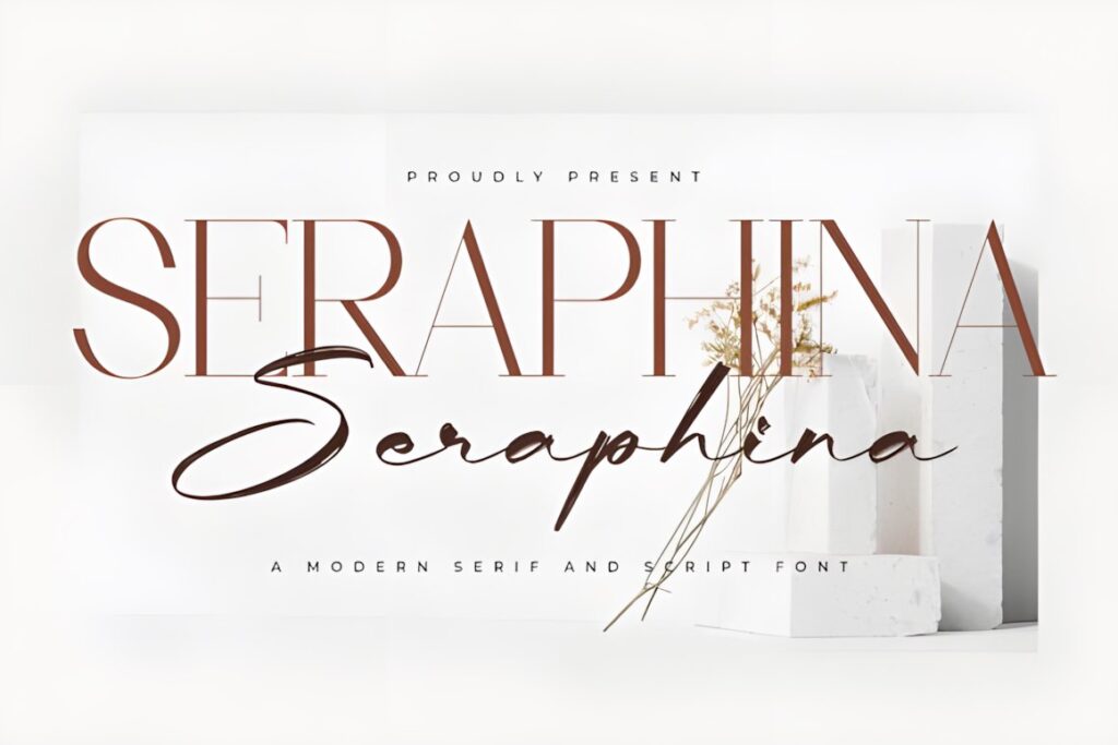
Seraphina is a font duo combining serif and script styles, giving an event company two coordinated typographic voices inside one product. That makes it particularly useful for branding systems where the main company name needs a structured face while a tagline, founder name, or decorative accent needs softer lettering.
The contrast also transfers naturally to invitations and social graphics. Use the serif to establish hierarchy and reserve the script for a small number of words. If the entire identity needs to feel more minimal and architectural, a single serif such as Lavish or Noble Elegant is easier to control.
4. Serifa
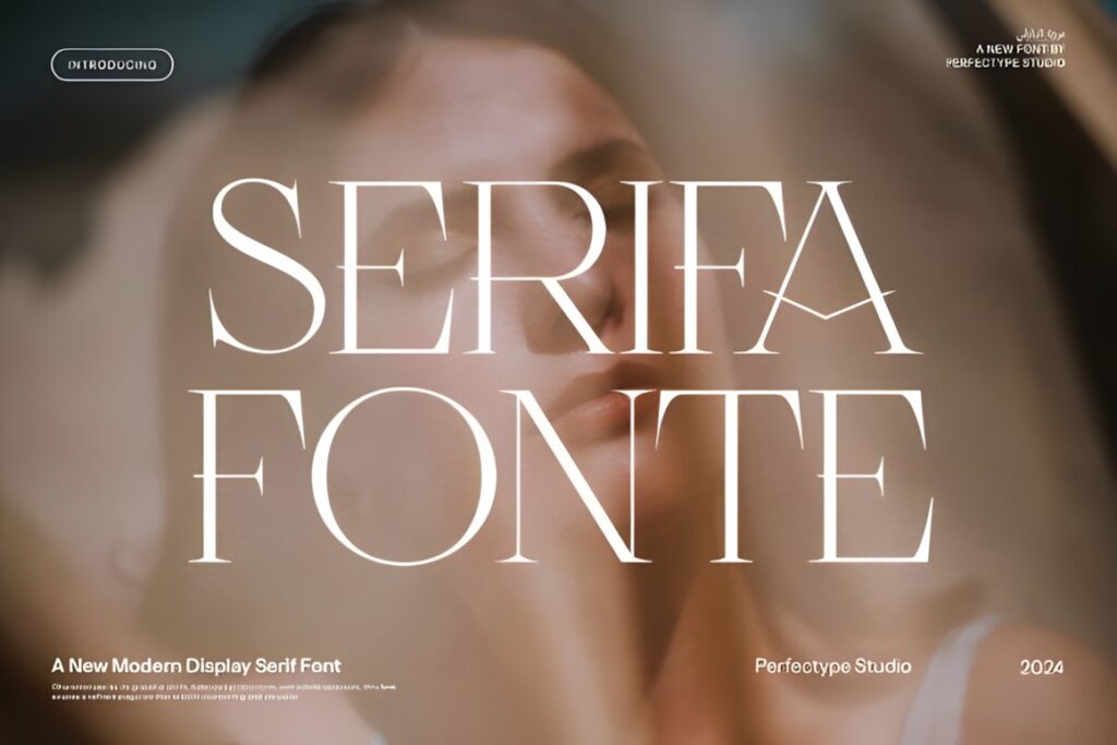
Serifa is an elegant serif created with branding and logo applications in mind. Its decorative ligature and alternate options give designers room to customize a short wordmark while retaining the underlying structure of a serif rather than moving into full calligraphy.
This makes sense for premium party companies that want recognizable typography with a little more personality than a conventional serif. Use the more decorative characters selectively; too many special forms in one company name can reduce clarity, particularly on small social icons and vendor marks.
5. Noble Elegant
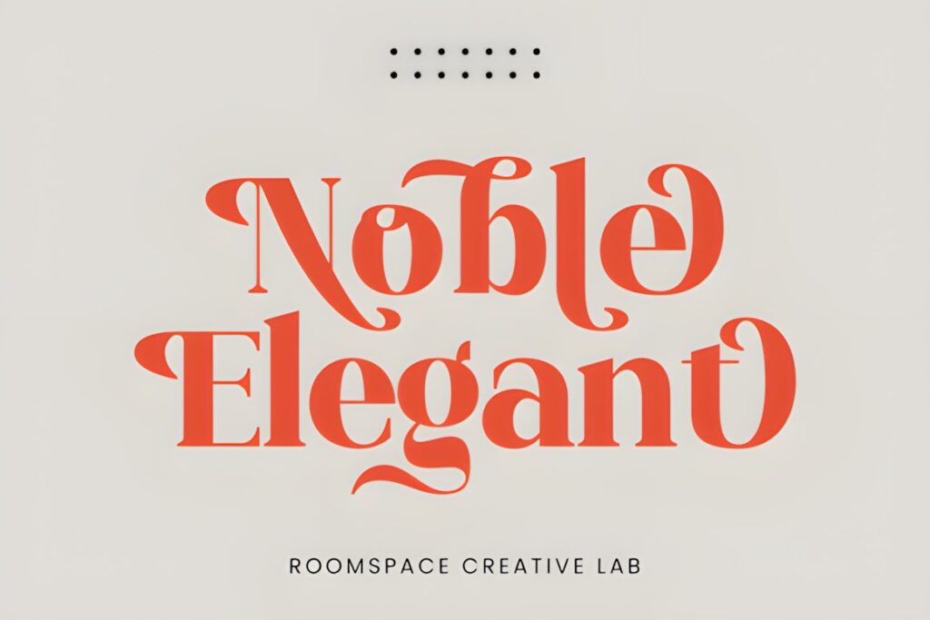
Noble Elegant combines traditional serif styling with modern decorative details and swashes. It suits refined event companies whose visual identity needs to feel formal enough for black-tie celebrations while still having a distinctive display personality.
The font can work across logos, wedding stationery, and editorial-style event materials, making it useful when consistency across touchpoints matters. For layouts containing a lot of logistical information, keep Noble Elegant for the primary name or major headings and use simpler typography for schedules and details.
6. Wedding
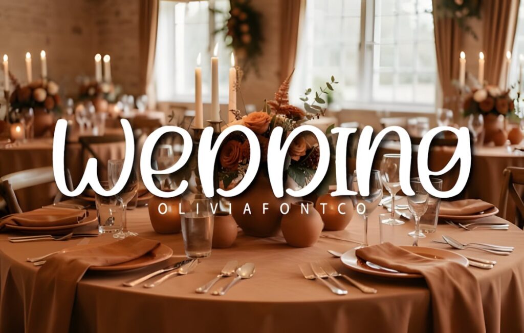
Wedding is a fluid script with elongated forms and a fine, monoline appearance intended for sophisticated event stationery and boutique branding. It is a natural candidate for planners specializing in weddings, engagement events, intimate dinners, and other occasions where a hand-penned identity reinforces the service style.
Tall ascenders and sweeping forms make the font most effective when it has generous space around it. Keep secondary wording compact and restrained. Event firms handling more corporate launches or conferences may find a structured serif easier to adapt across presentation decks and small digital applications.
7. Elvare
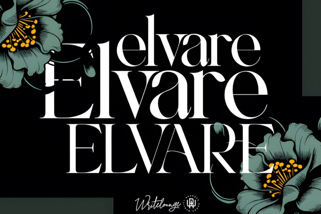
Elvare is a high-contrast serif built around wedding, bridal, and luxury event design. Its delicate curves and formal structure make it particularly relevant to companies that want the same visual language across a studio logo, invitation suite, save-the-date design, and premium client presentation.
Choose Elvare when romance needs to come through without making handwriting the core of the brand. Because fine details naturally receive less visual weight at small scale, test the finished wordmark at social-avatar and footer sizes before committing to very delicate logo treatments.
8. Romance Utille
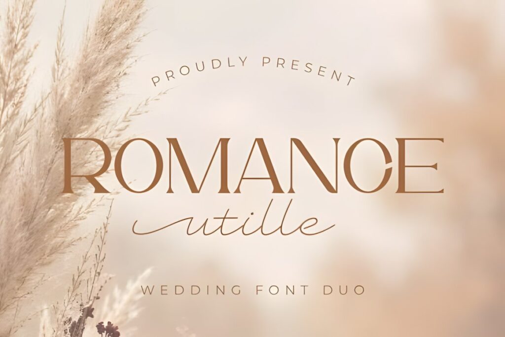
Romance Utille is a wedding-oriented font duo pairing an uppercase flare-serif style with a delicate monoline script. The two-part structure is useful for event brands that need a ready-made hierarchy between company names, event titles, client names, and short decorative accents.
For a premium party invitation, the serif can carry the principal headline while the script highlights names or a short phrase. The same hierarchy can be transferred into the event company identity. If you prefer a quieter brand with fewer stylistic variables, choose a standalone serif instead.
9. Nouveau Monogram
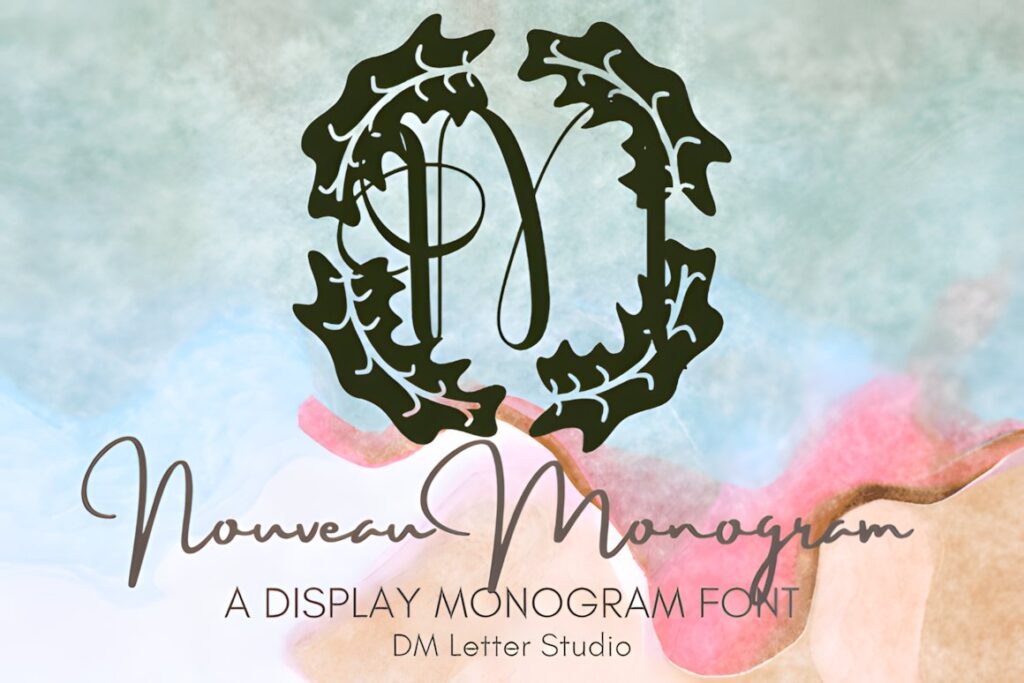
Nouveau Monogram uses uppercase lettering with Art Deco-influenced geometry and decorative detail. It fills a different role from the romantic scripts in this list: initials, abbreviated event-company marks, VIP party monograms, signage, and emblem-like brand applications.
Its strongest use is short display typography rather than lengthy service descriptions. An event company with recognizable initials could build a secondary monogram for profile images, menus, napkins, or signage while keeping a simpler primary wordmark for everyday business communication.
10. Victorian Luxury
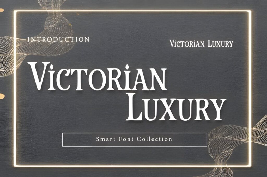
Victorian Luxury is a vintage display serif with tall proportions, sharp serifs, and decorative influence from nineteenth-century typography. It suits event brands built around heritage venues, formal dinners, masquerade themes, private clubs, historic properties, or theatrical premium parties.
The historic character is the reason to choose it, but it is also the main limitation. A minimalist contemporary event studio may find the aesthetic too specific. Use Victorian Luxury where an old-world identity is intentional rather than treating the vintage detail as generic luxury decoration.
11. Fairmont Fishtail
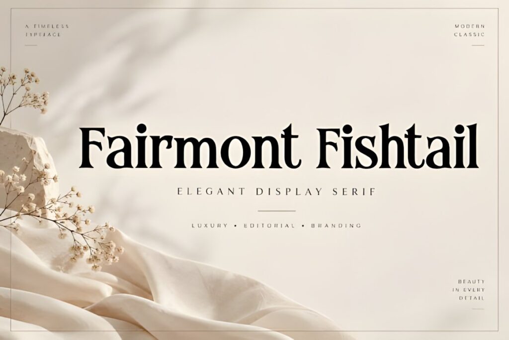
Fairmont Fishtail is a high-contrast display serif with an editorial personality. It fits premium event companies that want their identity to feel closer to a luxury magazine, fashion campaign, or polished hospitality brand than to traditional wedding calligraphy.
The strong contrast gives short headlines and wordmarks visual tension, which can work well for cocktail parties, product launches, and fashion-led events. For long names or small-print applications, simplify the surrounding typography and test the finest details at realistic output sizes.
12. Shanoy
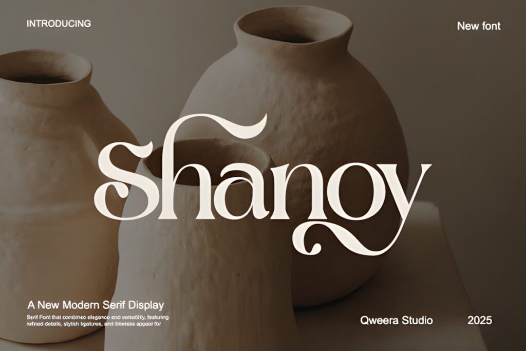
Shanoy is a modern serif display font distinguished by dramatic swashes and ligatures. That gives it more expressive movement than a restrained luxury serif, making it useful for creative event studios that want an editorial logo with a recognizable decorative detail.
Consider Shanoy for a short business name, major invitation heading, or branded party title where the special forms have room to become part of the composition. For compact signage or very small logo use, limit decorative substitutions so the company name remains immediately readable.
13. Malovi
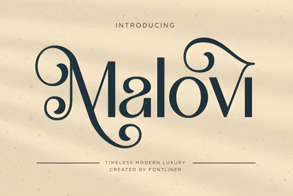
Malovi is a modern luxury serif with graceful curves, decorative swashes, and ligature details. Its balance between classic serif construction and visible ornament makes it suitable for planners wanting a logo that feels feminine and curated without switching completely to handwritten lettering.
The decorative character can carry a company name or premium party headline, while simpler typography handles schedules and supporting information. Compared with Shanoy, Malovi can serve a softer romantic direction; choose the one whose decorative rhythm better matches the brand personality.
14. Ravelyn
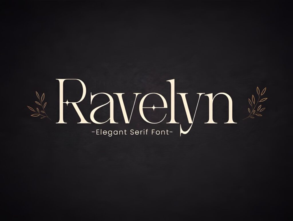
Ravelyn is a classic-meets-modern serif with ligatures and stylistic alternates that can give event branding a more individual wordmark treatment. It works well when the company needs a formal serif foundation that can also appear on invitations, editorial graphics, and premium marketing materials.
Alternates are most effective when they create one memorable detail rather than changing every possible character. Start with the standard letterforms, then introduce selective variations into the logo once readability is established. For an overtly calligraphic identity, a dedicated script offers a clearer stylistic direction.
15. Golden
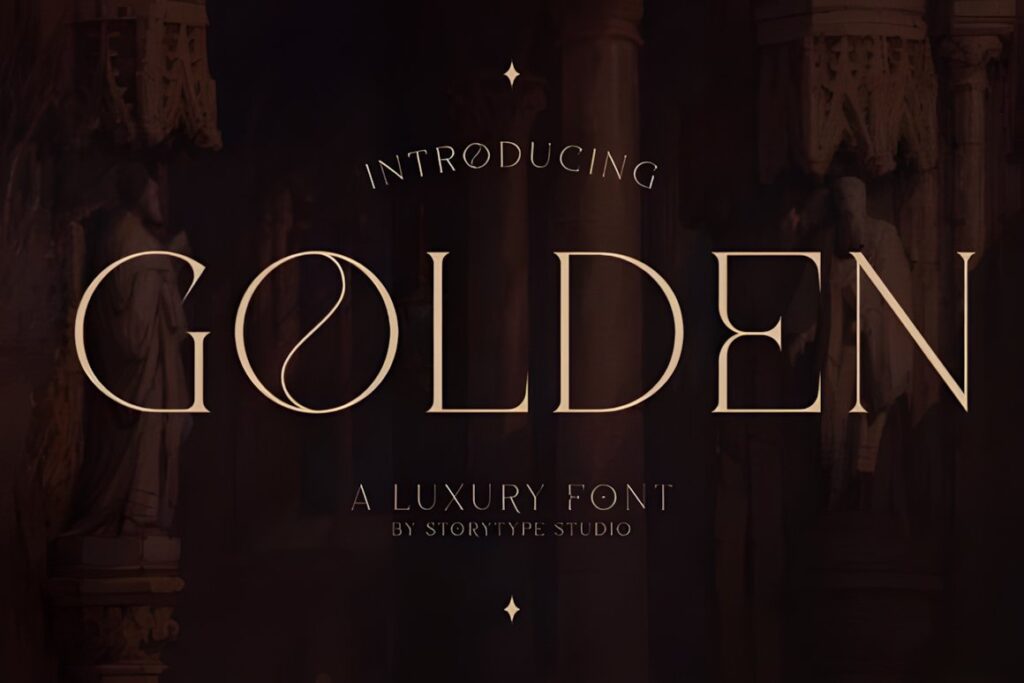
Golden is a serif typeface combining classic and modern influences, with glyph and ligature options available for more expressive display typography. Its versatility makes it relevant to event businesses that need a refined logo without locking the entire identity into an exclusively bridal or vintage look.
Use Golden for a wordmark that may need to coexist with fashion-led parties, corporate receptions, private dinners, and formal celebrations. The broader personality is useful for agencies covering several event categories, while more thematic faces such as Victorian Luxury make sense for narrower brand positioning.
16. Luxury by Shape Studio
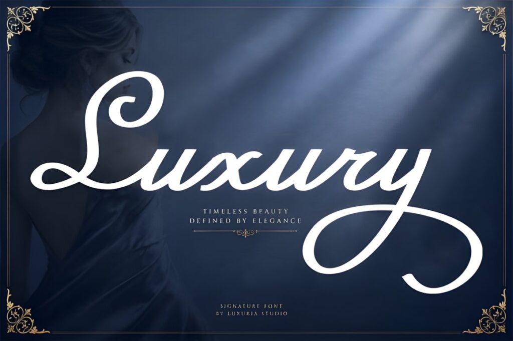
Luxury by Shape Studio is a flowing script with graceful swashes and a refined handwritten appearance. It works naturally for premium party invitations, romantic event branding, wedding stationery, and logo designs where the company identity should feel personal rather than corporate.
The expressive movement is strongest in short names and display phrases. If an event business has a long name or frequently works with corporate clients, consider using the script as a secondary signature element alongside a simpler serif or sans serif rather than making it responsible for every brand application.
Quick Comparison by Event Branding Style
- Clean luxury wordmarks: Lavish, Noble Elegant, and Golden suit event companies that need polished typography across several event categories.
- Editorial and fashion-led events: Fairmont Fishtail, Shanoy, and Ravelyn bring stronger display character to launches, cocktail events, and high-fashion layouts.
- Wedding and romantic branding: Elvare, Wedding, Malovi, and Luxury by Shape Studio lean toward graceful, formal, or romantic presentation.
- Built-in typography contrast: Seraphina and Romance Utille provide coordinated serif-and-script options for logos and stationery systems.
- Monograms and themed formal events: Nouveau Monogram works for initials and Art Deco-influenced marks, while Victorian Luxury brings a distinctly historic character.
Branding and Logo Considerations
A luxury-looking font is only one part of an effective event-company identity. Start by typing the complete business name rather than judging a typeface from individual specimen letters. A font that looks dramatic with a five-letter sample may become crowded when used for a multi-word planning-company name.
Test at least three practical sizes: the large website header, a medium proposal or social graphic, and a small avatar, footer, or vendor-credit application. If the logo loses recognition at the smallest size, create a simplified secondary mark instead of forcing every decorative feature into every placement.
Capitalization also changes personality. All caps often makes a serif feel more architectural and formal, while title case can soften the same typeface. Scripts usually need more breathing room because connected letters, loops, and extended strokes already add visual density.
Using Luxury Fonts on Invitations and Event Signage
Event branding rarely stops at the company logo. The type system may also appear on welcome signs, bar menus, table numbers, escort cards, invitations, social graphics, and event websites. A display font can create continuity across those pieces, but it should not replace clear informational typography.
Reserve the decorative font for the event name, hosts’ names, a short headline, or a single visual accent. Dates, addresses, schedules, seating information, and long service descriptions generally benefit from simpler letterforms with more predictable spacing.
Scale matters as well. Fine serifs or elaborate swashes that look polished on a large welcome board may lose definition on small place cards. Build the hierarchy around the finished output rather than applying identical typography at every size.
Font Pairing Tips for Premium Event Brands
Pair by function rather than simply combining two decorative styles. If the logo uses a high-contrast serif, a restrained sans serif can handle proposals, website navigation, dates, and service descriptions. If the primary mark uses a flowing script, a calm serif or sans serif gives the handwriting more room to stand out.
Font duos such as Seraphina and Romance Utille simplify this relationship because contrasting styles are already included within the same product. Even then, establish clear roles. One face should lead while the other supports it.
Avoid combining an ornate script, a swash-heavy serif, and another decorative display font in the same identity. Luxury branding usually benefits from controlled contrast: one distinctive voice plus typography that quietly handles information.
Choosing the Right Style for Your Event Brand
If your company covers many types of premium events, Lavish or Golden gives the identity a versatile serif foundation without tying it too closely to one occasion. For a wedding-led studio, Elvare offers a more romantic serif direction, while Luxury by Shape Studio creates a stronger handwritten signature effect.
Choose Seraphina when the branding system needs both structured and handwritten typography from a coordinated duo. For initials, invitation crests, or VIP party monograms, Nouveau Monogram fills a more specialized role.
The final choice should work with the real company name at both display and compact sizes. Before using any font for client work, merchandise, editable templates, or other commercial projects, check the current license details associated with that specific product and intended use.
Frequently Asked Questions
What type of font works well for a luxury event company logo?
A refined serif or controlled script usually works well for a luxury event company logo. Serifs can create a formal, editorial identity, while scripts add a personal signature quality. Choose according to the company name, event niche, and smallest size at which the logo must remain readable rather than selecting a font only for its decorative appearance.
Can the same luxury font be used for a logo and event invitations?
The same luxury font can connect a company logo with event invitations when it remains readable in both applications. Use the display face for the company name, event title, or client names, then introduce simpler supporting typography for addresses, schedules, venue information, and other detailed copy. This preserves visual consistency without forcing decorative lettering into every line.
Are script fonts practical for event company branding?
Script fonts can work well for event company branding when the main name is relatively short and the handwritten character matches the brand. Long names, dense swashes, and closely connected letters may become difficult to read at small sizes. A script logo often works more reliably when paired with a restrained supporting serif or sans serif for informational text.
What should I check before using a font for an event business?
Check the complete business name, small-size readability, available characters needed for the project, and the current license terms for your intended use. Also preview the font in realistic applications such as a website header, social avatar, invitation, proposal, and signage. Licensing terms can vary, so verify the current product license before client, resale, or other commercial use.