ℹ️ Affiliate Disclosure: This article may contain affiliate links. If you book or purchase through these links, we may earn a commission at no additional cost to you.
Choosing the Best Luxury Logo Fonts for Photography Studios and Brands
A photography logo has to do more than look elegant at full size. The same wordmark may appear in a website header, Instagram avatar, client gallery, business card, pricing guide, and small watermark over a photograph. That makes font choice especially important: delicate strokes can disappear, elaborate scripts can become difficult to read, and wide letterforms may overwhelm a long studio name.
For photography studios and personal brands, luxury logo fonts work best when their personality matches the type of work being photographed. Signature scripts can give wedding and portrait brands a personal feel, editorial serifs suit fashion and fine-art photography, while restrained sans serifs and monogram styles can create cleaner marks for commercial or architectural studios.
Many more branding fonts are available, while this selection concentrates on styles that solve different photography-logo needs, from signature watermarks to editorial wordmarks and compact monograms.

The strongest photography logo fonts usually fall into four useful groups: personal signature scripts, high-contrast editorial serifs, clean modern wordmark fonts, and compact monogram styles. Choose according to the length of your studio name, the mood of your photography, and how clearly the mark needs to reproduce at small sizes.
Quick Picks
- For a personal signature watermark: Authentic Signature — flowing handwriting gives portrait and wedding brands a personal feel.
- For fine-art photography: Grandeur — a refined serif works naturally with restrained editorial layouts and monochrome images.
- For fashion and editorial studios: Achroma Editorial — strong contrast creates a more directional magazine-inspired identity.
- For a clean commercial studio: Minimalist — a straightforward sans serif keeps the photography itself visually dominant.
- For initials and compact brand marks: Monogram — useful when a full studio name becomes too long for small placements.
Luxury Logo Fonts for Photography Studios and Brand Marks
1. Authentic Signature
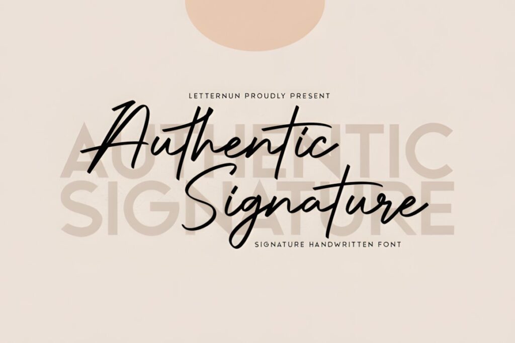
Authentic Signature is a flowing handwritten script suited to photographer names, personal wordmarks, portrait branding, and refined watermark treatments. Its inky movement gives a logo a more individual character than a conventional corporate typeface, making it especially relevant to wedding, lifestyle, family, and personal-brand photography.
The expressive curves are most useful when the photographer’s name is the visual focus. For a long business name or very small watermark, keep supporting text simpler so the composition does not become crowded. A restrained sans serif beneath the signature can separate personality from practical information.
2. Grandeur
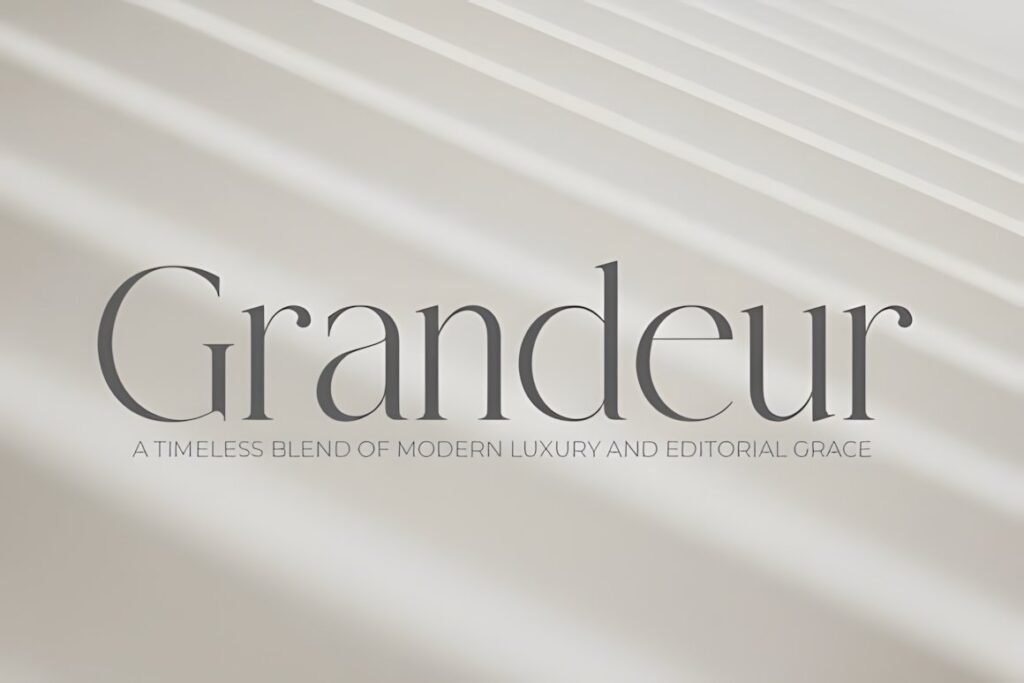
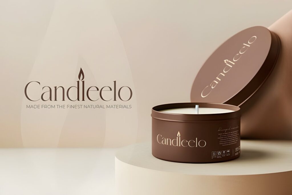
Grandeur is an elegant classic serif with clean lines and noticeable stroke contrast. It makes sense for fine-art photographers, fashion studios, architectural photography, and premium portrait brands that need an identity closer to a magazine masthead than a handwritten signature.
Its controlled structure also works well beside black-and-white photography because the typography can feel polished without adding another illustrative element. Choose a signature style such as Authentic Signature instead when the brand needs to feel highly personal or informal rather than editorial.
3. Luxodia Signature
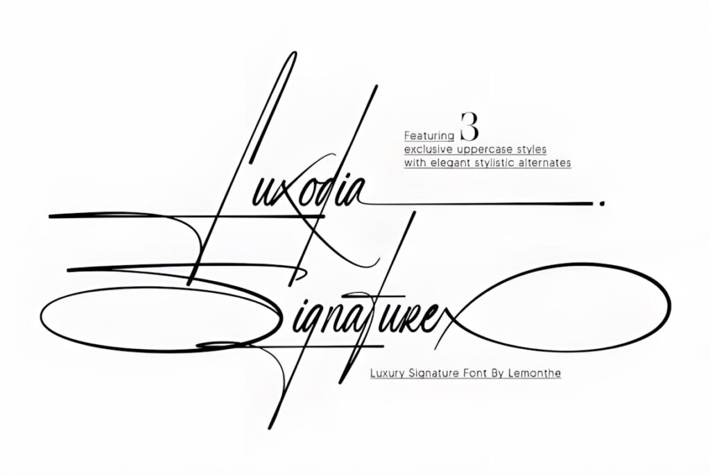
Luxodia Signature brings a more decorative signature look to photography branding. The handwritten character suits wedding photographers, glamorous portrait studios, beauty imagery, and creative businesses where the photographer’s name needs to feel like a recognizable personal mark.
Use it most confidently for short names and prominent display applications. Elaborate handwriting naturally creates more visual activity than a serif or sans serif, so secondary wording should remain quiet. For logos that must stay particularly crisp in compact social-media placements, Minimalist offers a cleaner alternative.
4. Quella
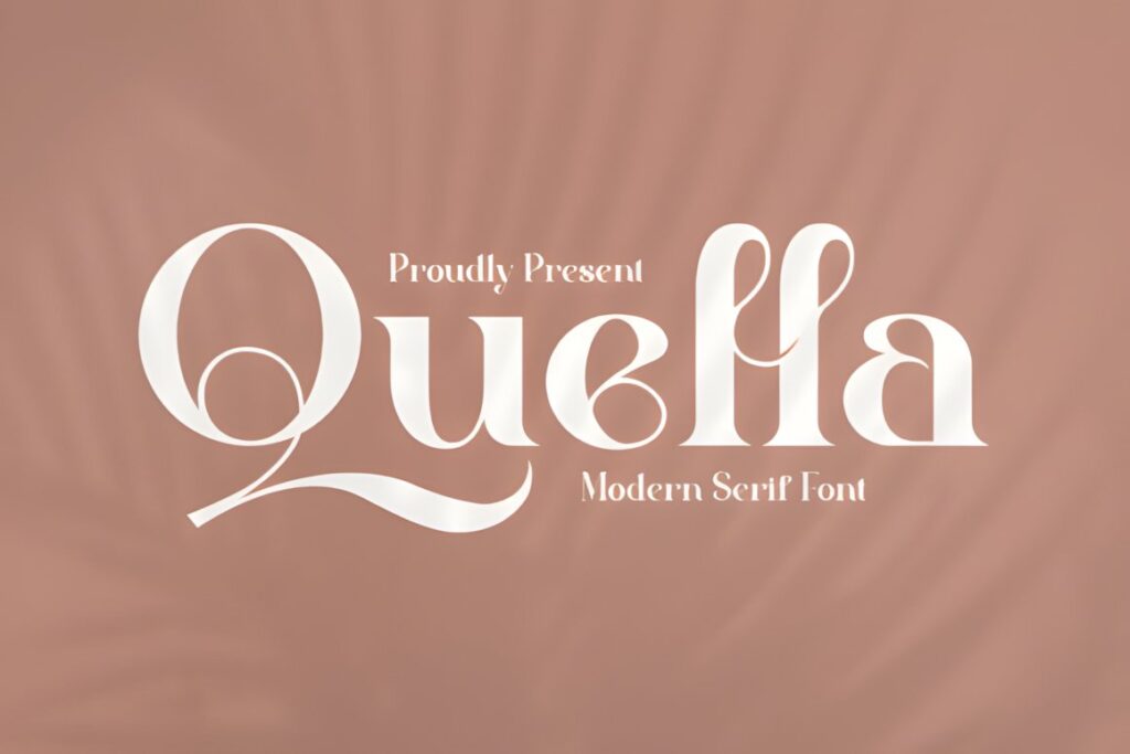
Quella is an elegant serif positioned for logos, branding, labels, photography, and watermark applications. Its serif structure gives photographers a more traditional luxury identity while still retaining enough personality for a recognizable studio wordmark.
This makes sense when a photographer wants elegance without relying entirely on cursive lettering. It can support portrait, wedding, editorial, or boutique studio identities and adapts more naturally to longer business names than many signature scripts. For a stronger fashion-magazine mood, Achroma Editorial is the more dramatic option.
5. Achroma Editorial
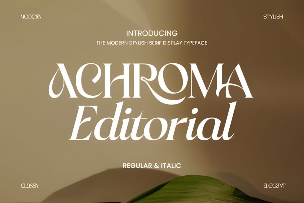
Achroma Editorial is a modern serif display typeface with regular and italic styles, designed around a polished editorial character. For photographers, that makes it particularly relevant to fashion, beauty, lifestyle, commercial portrait, and creative-direction studios.
The font has enough personality to become the main brand mark rather than merely supporting an icon. Its strongest role is in headlines and wordmarks where the letter shapes have room to show. A photographer who needs a discreet watermark on every image may prefer a simpler sans serif for that secondary application.
6. Berlin Signature
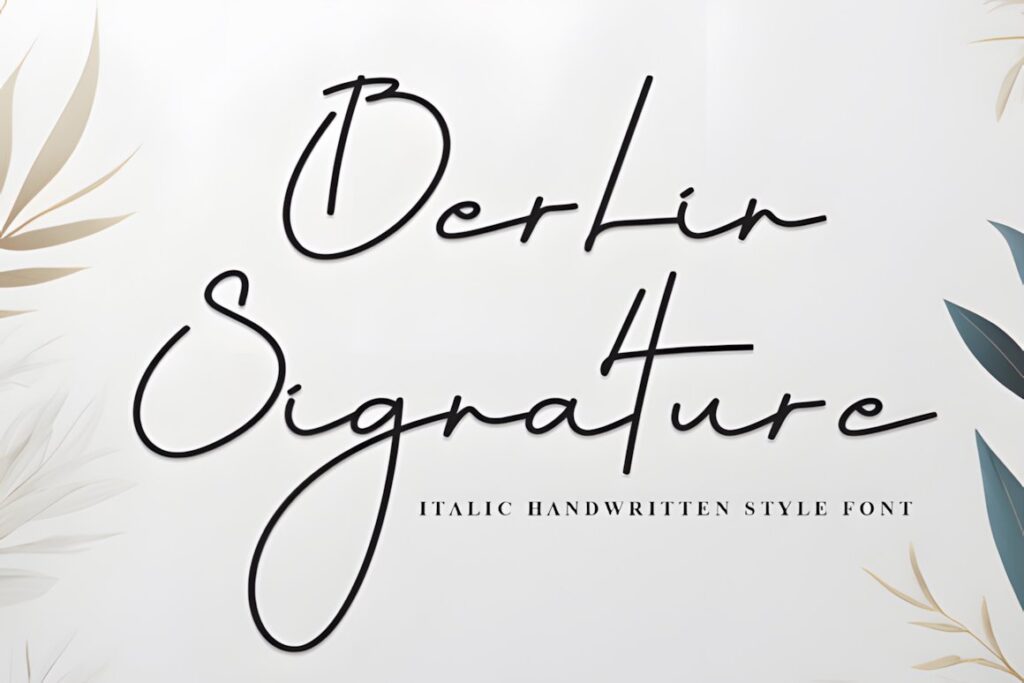
Berlin Signature uses an italic handwritten style with monoline strokes, expressive capitals, and a quick pen-like rhythm. It is directly suited to personal branding and photography watermarks, particularly for photographers who want the logo to resemble a signed name.
The monoline appearance feels cleaner than heavily contrasted calligraphy, which can help when combining a signature with minimalist website layouts. Keep large loops away from secondary wording and icons. When the identity needs to feel more formal and architectural, a serif such as Grandeur creates a more structured impression.
7. The Letter Editorial
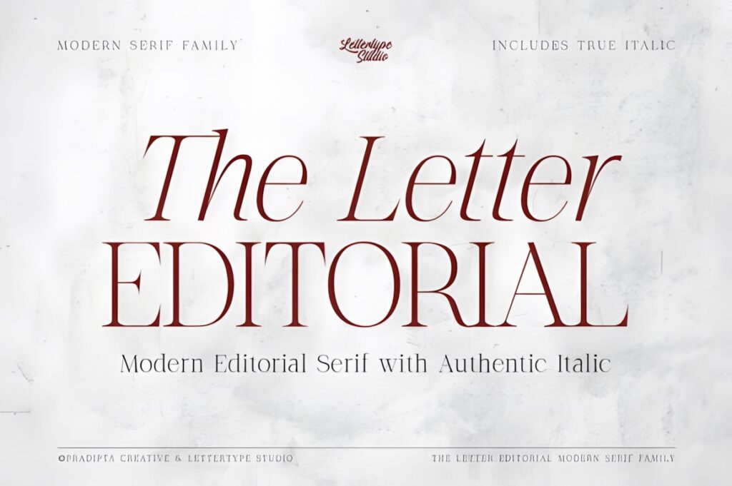
The Letter Editorial combines a sophisticated serif structure with a separately drawn italic companion. It works well for photography studios that need a complete editorial identity rather than one highly decorative logo treatment.
The regular style can carry a studio name while the italic introduces contrast in subheads, printed collateral, or website typography. That makes it useful for fashion, fine-art, destination, and luxury portrait photographers building a broader visual system. For a casual handwritten identity, the font may feel too formal; Berlin Signature creates a more personal impression.
8. Photography
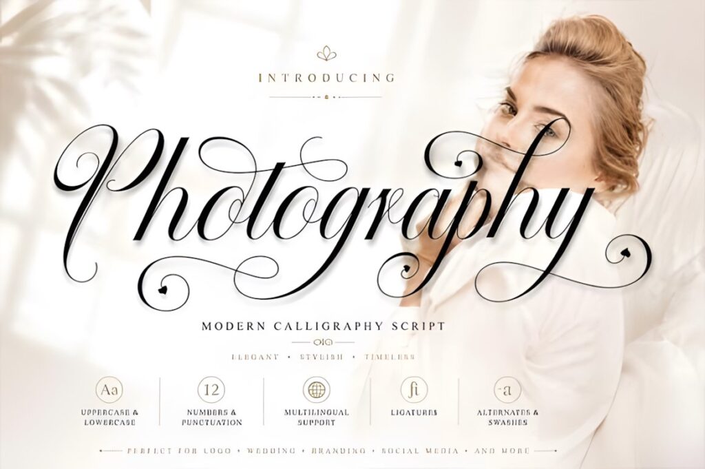
Photography is a modern script font with an irregular baseline and a distinctly feminine handwritten character. The product includes initial and terminal letters and alternates, giving designers more ways to adjust the beginning and end of a photographer name.
Its personality is particularly suited to wedding, newborn, family, boudoir, and lifestyle photography identities. The irregular rhythm helps avoid a rigid typed appearance, but it also makes the style less appropriate for studios seeking a neutral corporate image. Keep decorative alternatives controlled when the finished logo will frequently appear at watermark size.
9. Serifa
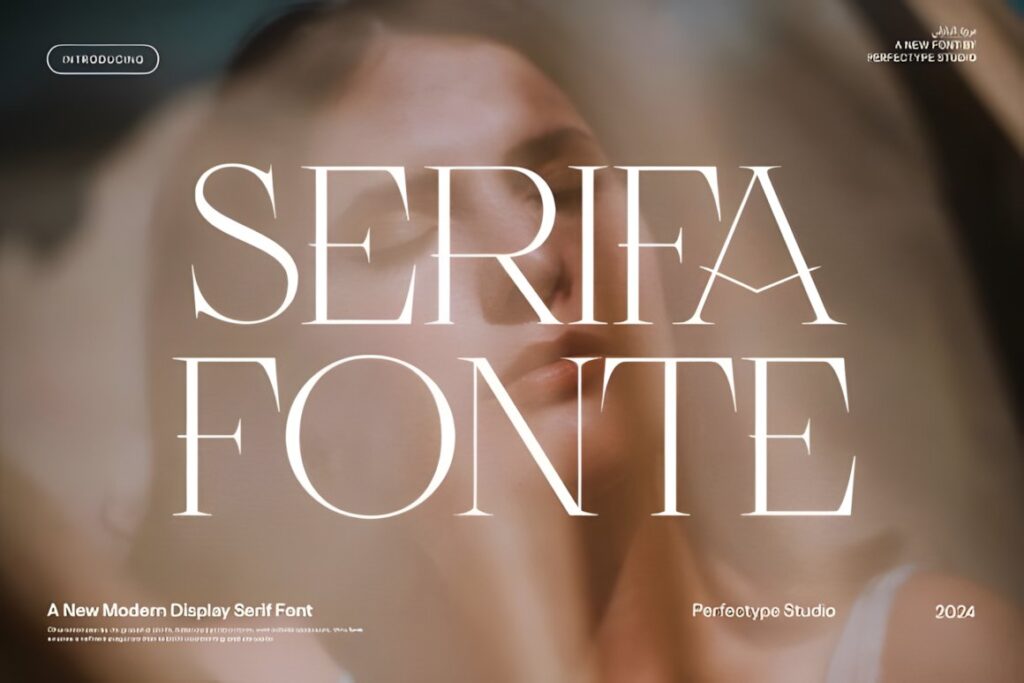
Serifa is an elegant serif created for branding and logo work, with ligature and alternate options available for customizing selected letter combinations. That gives a photography studio room to create a more distinctive wordmark without moving into a full handwritten script.
Consider it for high-end portraits, fashion, personal branding, interiors, or product photography where a polished serif supports the visual language. Alternates are most effective when used selectively; filling every available character with decorative forms can weaken recognition, particularly when the logo is reduced.
10. Minimalist
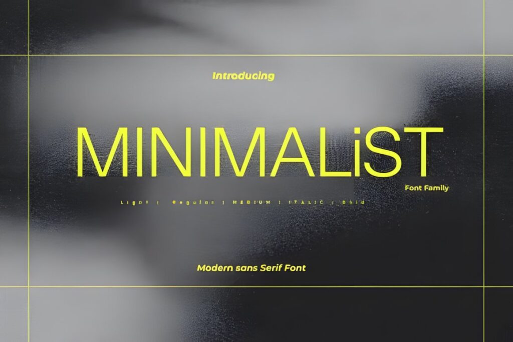
Minimalist is a modern sans serif branding font with relatively economical character widths and a clean contemporary appearance. It is a practical direction for commercial photographers, real-estate studios, corporate headshot businesses, architectural photographers, and multidisciplinary production companies.
A restrained sans serif allows complex photography to remain the visual focus and usually accommodates longer business names more comfortably than sweeping scripts. The tradeoff is personality: if the photographer wants the brand to feel unmistakably handmade or romantic, a signature font such as Authentic Signature creates a stronger personal cue.
11. Stockist
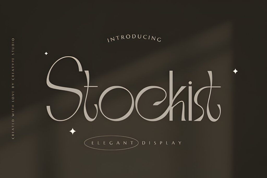
Stockist is an elegant serif suited to branding, logos, photography, watermarks, packaging, and other polished identity work. Its role in this list is as a versatile middle ground between highly expressive editorial fonts and minimal sans-serif wordmarks.
Use it when a photography brand needs sophistication without appearing strongly calligraphic. It can support wedding, portrait, fashion, food, interior, or product photographers and remains easier to combine with straightforward supporting typography. For a more dramatic editorial identity, The Letter Editorial offers greater contrast between regular and italic typography.
12. Monogram
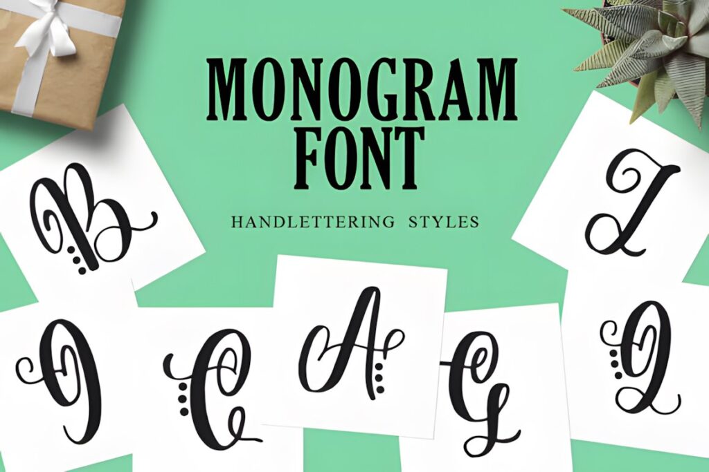
Monogram is an elegant display font supplied in two styles, including a version with decorative dots. It offers a useful route for photographers whose initials are more practical than a long full-name wordmark.
A compact initial-based mark can work on social avatars, corner watermarks, packaging, print pieces, and small brand applications where a full studio name becomes difficult to fit. Keep the monogram visually simple enough to recognize without the accompanying name. If the complete business name needs to remain the primary logo, Quella or Stockist provides a more conventional wordmark structure.
13. Ophelia
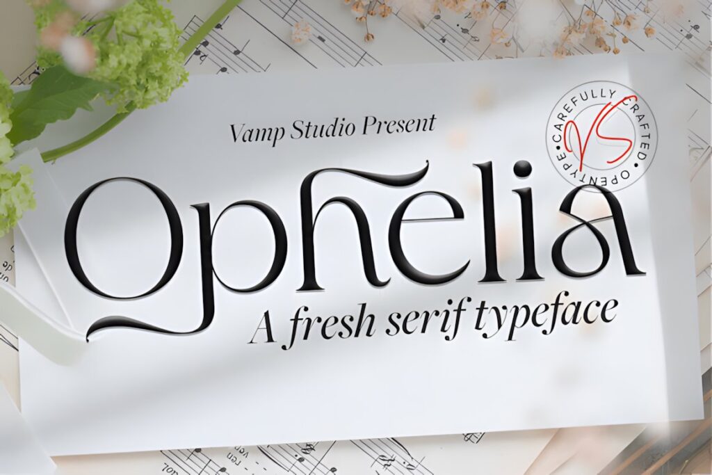
Ophelia is a modern elegant serif described for branding, logos, photography, watermarking, packaging, and stationery. The letterforms offer a clean luxury direction that can suit photographers who want a polished identity without the stronger visual movement of handwriting.
This style is particularly useful when the same typography needs to appear across website headers, printed client materials, social graphics, and the logo itself. For a studio centered on a personal signature, Ophelia may feel too composed; choose one of the script options when a handwritten identity is central to the brand.
14. The Signature
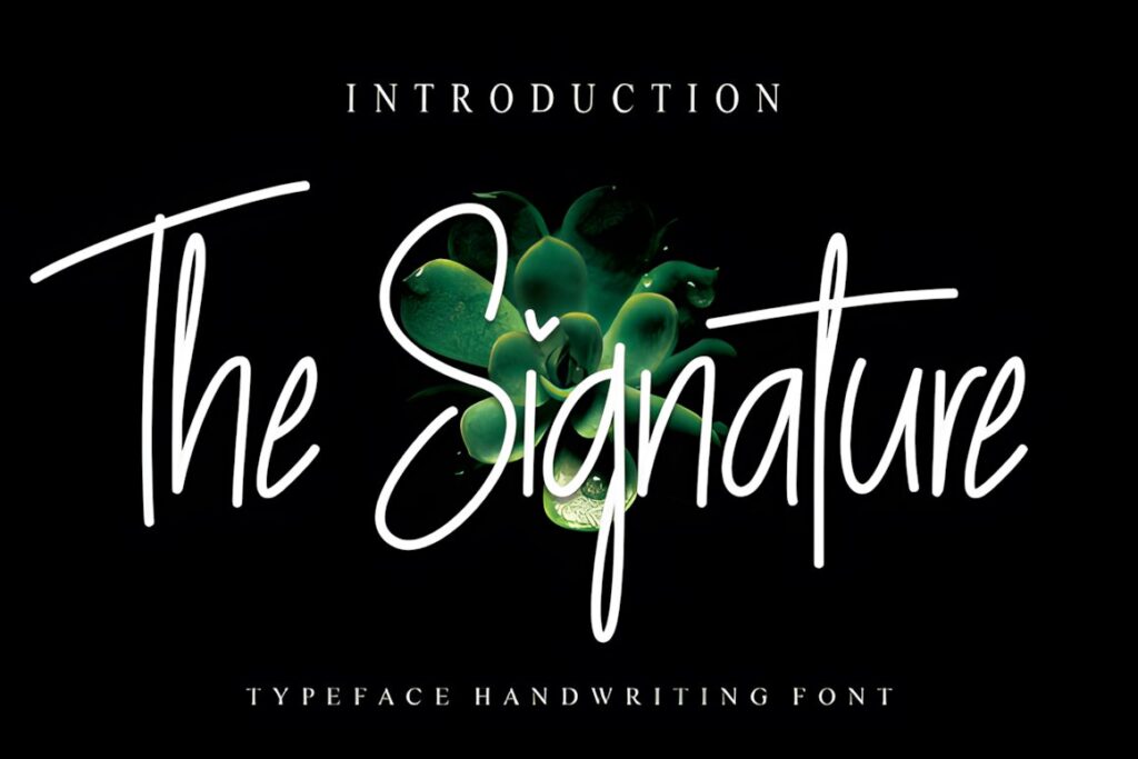
The Signature is a timeless handwritten font designed for eye-catching logos, branding, and short display text. For photographers, its clearest role is a name-led brand mark that feels less institutional than a serif or modern sans serif.
It suits photographers who want the visual identity to feel closely connected to an individual rather than a larger production company. Keep secondary descriptors restrained and test the finished composition at small sizes. A clean sans serif for “Photography” or “Studio” can create clearer hierarchy than using two expressive typefaces together.
15. Editorial Style
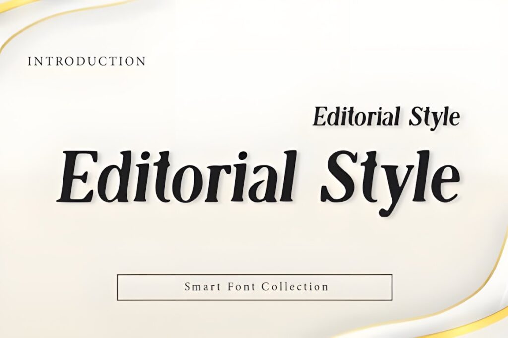
Editorial Style is a high-contrast serif display font created around modern luxury and magazine typography. It fits photography studios that want their branding to communicate fashion, art direction, beauty, publishing, or a carefully curated portfolio aesthetic.
The design is strongest when used as a prominent wordmark or title rather than dense informational copy. Give the letters room to breathe and use simpler typography for navigation, contact details, and captions. For documentary or corporate photography where neutrality matters more than fashion character, Minimalist is the quieter alternative.
Photography Logo Font Comparison
| Font | Best for | Style | Key visual trait | Project fit |
|---|---|---|---|---|
| Authentic Signature | Personal photographer names | Script | Flowing ink-like curves | Portrait and wedding branding |
| Grandeur | Fine-art studios | Serif | Refined high contrast | Editorial wordmarks |
| Luxodia Signature | Luxury personal brands | Script | Decorative signature feel | Watermarks and logos |
| Quella | Versatile studio identities | Serif | Elegant letterforms | Logos and watermarks |
| Achroma Editorial | Fashion photography | Serif | Editorial contrast | Magazine-style identities |
| Berlin Signature | Personal watermarks | Script | Monoline handwriting | Names and signatures |
| The Letter Editorial | Full brand systems | Serif | Regular and italic contrast | Fine-art and fashion studios |
| Photography | Romantic photography brands | Script | Irregular handwritten rhythm | Wedding and lifestyle work |
| Serifa | Customized wordmarks | Serif | Ligatures and alternates | Premium studio branding |
| Minimalist | Commercial studios | Sans serif | Clean compact structure | Corporate and architectural work |
| Stockist | Classic luxury branding | Serif | Balanced elegance | Portrait and product studios |
| Monogram | Initial-based brand marks | Display | Compact decorative letters | Avatars and small marks |
| Ophelia | Clean premium identities | Serif | Modern restrained shape | Cross-platform branding |
| The Signature | Name-led photography brands | Script | Handwritten personality | Wordmarks and watermarks |
| Editorial Style | Creative-direction studios | Serif | Magazine-inspired contrast | Fashion and beauty photography |
Branding and Logo Considerations
A photography logo should still work when the photograph behind it changes. Test a prospective wordmark over dark, light, detailed, and low-contrast images rather than judging it only on a clean presentation board. A typeface that looks impressive at large scale may lose the details that made it appealing when reduced to a corner watermark.
Long photographer names usually benefit from controlled width and restrained decoration. Short names have more room for unusual ligatures, tall capitals, or signature flourishes. If the business name includes words such as “Photography,” “Photo,” or “Studio,” those supporting words do not need to compete with the primary name.
A simple secondary sans serif can therefore be useful even when the main logo uses a script or decorative serif. The contrast makes hierarchy clearer: the distinctive font identifies the brand, while the supporting typography communicates practical information.
Readability at Watermark and Social Media Size
Watermarks and social avatars expose weaknesses that may be invisible in a large logo. Very fine hairlines, closely spaced letters, tiny enclosed counters, and oversized swashes can lose definition when reduced. Before settling on a logo font, create several realistic small versions rather than relying only on the full-size wordmark.
For a signature font, pay particular attention to the first capital, joins between letters, and long finishing strokes. A flourish that looks graceful on a website header can interfere with the edge of an image or collide with a subtitle in a compact watermark.
Serif and sans-serif wordmarks should also be tested in both dark and light versions. Photography changes constantly, so a logo system often benefits from simple one-color variations that can sit over different images without relying on one fixed background.
Font Pairing Tips for Photography Brands
The safest pairing strategy is to give each font a different job. If the photographer’s name uses an expressive signature script, use a restrained sans serif for “Photography,” locations, dates, services, and navigation. This keeps the handwriting special rather than repeating it everywhere.
With an editorial serif logo, supporting copy can move in the opposite direction. A neutral sans serif can handle websites and price guides while the serif remains the recognizable display face. Avoid pairing two fonts simply because both look luxurious; two strong personalities can create competition rather than hierarchy.
For monogram identities, the initials can function as the compact symbol while a simpler full-name wordmark provides clarity elsewhere. That approach is useful when one logo needs to work across tiny social avatars, large website headers, print pieces, and photograph watermarks.
Common Photography Logo Font Mistakes
- Choosing only at large size: always reduce the design to realistic watermark and profile-image dimensions.
- Using two decorative fonts together: let one typeface carry the personality and make supporting typography quieter.
- Forcing a long name into a signature: a serif, sans serif, or initials-based mark may provide better recognition.
- Adding too many flourishes: alternates and swashes work best when they improve the silhouette rather than decorate every letter.
- Ignoring different photographs: test the mark over light, dark, busy, and minimal images.
- Making the word “Photography” compete with the name: secondary wording can usually be smaller and simpler.
Choosing the Right Style for Your Photography Brand
If the photographer’s personality is central to the business, Authentic Signature or Berlin Signature creates a name-led handwritten identity. For wedding and lifestyle photography with a softer direction, Photography provides a more romantic script character.
For fine-art, fashion, beauty, or editorial work, Grandeur, Achroma Editorial, and The Letter Editorial place more emphasis on structured luxury typography. A commercial or architectural studio that wants the images rather than the logo to carry most of the personality can use Minimalist.
If a full studio name becomes difficult to reproduce at small size, Monogram offers a different solution: build a compact initial mark for avatars and watermarks, then keep the full name for larger brand applications.
Frequently Asked Questions
What font style works well for a photography studio logo?
A photography studio logo can work well with a signature script, elegant serif, restrained sans serif, or monogram font depending on the brand. Signature styles suit personal and wedding photography, editorial serifs fit fashion and fine-art studios, while clean sans serifs make sense for commercial and architectural photography. The right choice should remain recognizable at both website-header and watermark sizes.
Are signature fonts good for photography watermarks?
Signature fonts can work well for photography watermarks when the lettering remains clear after reduction. Short photographer names usually give scripts more room to breathe, while long names can become crowded when capitals, loops, and finishing strokes overlap. Test the exact wordmark at realistic image sizes and keep secondary wording simple rather than combining multiple decorative typefaces.
Should a photography logo use one font or two?
A photography logo can use two fonts when each one has a clearly different role. An expressive script or serif can identify the photographer’s name, while a restrained sans serif handles words such as Photography, Studio, or a location. Pairing two equally decorative fonts usually weakens hierarchy, so keep the supporting typeface quieter than the main brand font.
Can I use these fonts for a photography business logo?
A font may be visually suitable for a photography business logo, but usage rights should be checked against the current license for the specific product. Review the license before using a font for client work, commercial branding, merchandise, editable products, or other business applications. Licensing terms can matter separately from whether the typeface itself fits the visual identity.