ℹ️ Affiliate Disclosure: This article may contain affiliate links. If you book or purchase through these links, we may earn a commission at no additional cost to you.
Choosing the Best Luxury Logo Fonts for Interior Design Studios
A luxury interior or decor studio logo needs to feel refined without becoming fragile, overly fashionable, or difficult to read. The challenge is balancing architectural structure with enough personality to distinguish a studio name on portfolios, signage, presentation covers, websites, and social profiles. For this type of branding, proportions, contrast, spacing, and the shape of key capitals usually matter more than decorative detail alone.
This selection of luxury logo fonts includes architectural serifs, restrained high-contrast typefaces, minimalist sans serifs, geometric display styles, and a few expressive options for studios that want a more boutique identity.
Many more luxury fonts are available, while this shortlist concentrates on styles with distinct branding roles, readable silhouettes, and personalities suited to premium interiors and decor businesses.

The strongest choices for premium interior branding usually fall into four groups: structured serifs for architectural authority, high-contrast serifs for editorial elegance, clean sans serifs for contemporary studios, and distinctive display faces for shorter names. The right direction depends on whether the brand should feel restrained, artistic, architectural, residential, or boutique.
Quick Picks
- For architectural studio branding: Mirow Serif — strong geometric construction gives short wordmarks an architectural presence.
- For refined interior boutiques: Rolive — high contrast and sweeping details create a softer editorial identity.
- For minimalist contemporary studios: Kovela — restrained forms and alternate details balance simplicity with distinction.
- For modern furniture and decor brands: Bagisk — wide geometry makes a more expressive statement.
- For understated luxury: Grandeur — classic serif proportions fit restrained, editorial brand systems.
Luxury Logo Fonts for Interior Design and Decor Studios
1. Mirow Serif
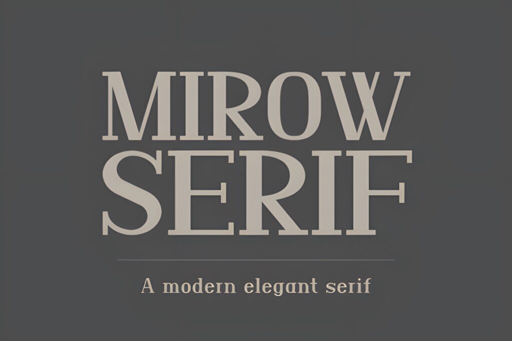
Mirow Serif is a structural display serif particularly suited to interior design studios, luxury hospitality identities, and brands that want an architectural feel. Its all-cap appearance combines high contrast with substantial geometric stems and sharp serif details.
The firm construction makes sense for short studio names that need to look established rather than delicate. It can become visually dominant in longer wordmarks, so a restrained supporting typeface and generous surrounding space will usually keep the identity balanced.
2. Rolive
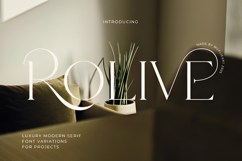
Rolive is a luxury modern serif with slender high-contrast strokes, flowing curves, and dramatic decorative details. It is particularly relevant to boutique interior studios that want their logo to feel editorial and fashion-aware rather than strictly architectural.
Choose Rolive when a short studio name can give its more expressive letterforms enough room. For identities that need maximum restraint at small sizes, a cleaner option such as Kovela or Caveline can make more sense.
3. Konxer
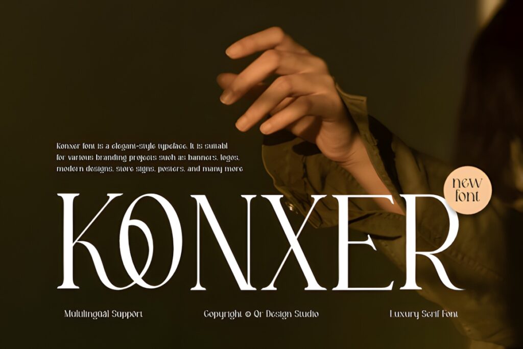
Konxer is a high-contrast display serif built around sharp terminals, thin horizontal details, and dramatic uppercase forms. Its visual character works especially well for independent interior boutiques and studios seeking a more couture-influenced identity.
The distinctive construction gives a short wordmark immediate personality, but it is less neutral than a classic serif. Consider Grandeur instead when the brand needs to work across conservative client proposals, architectural documentation, and understated corporate materials.
4. Kovela
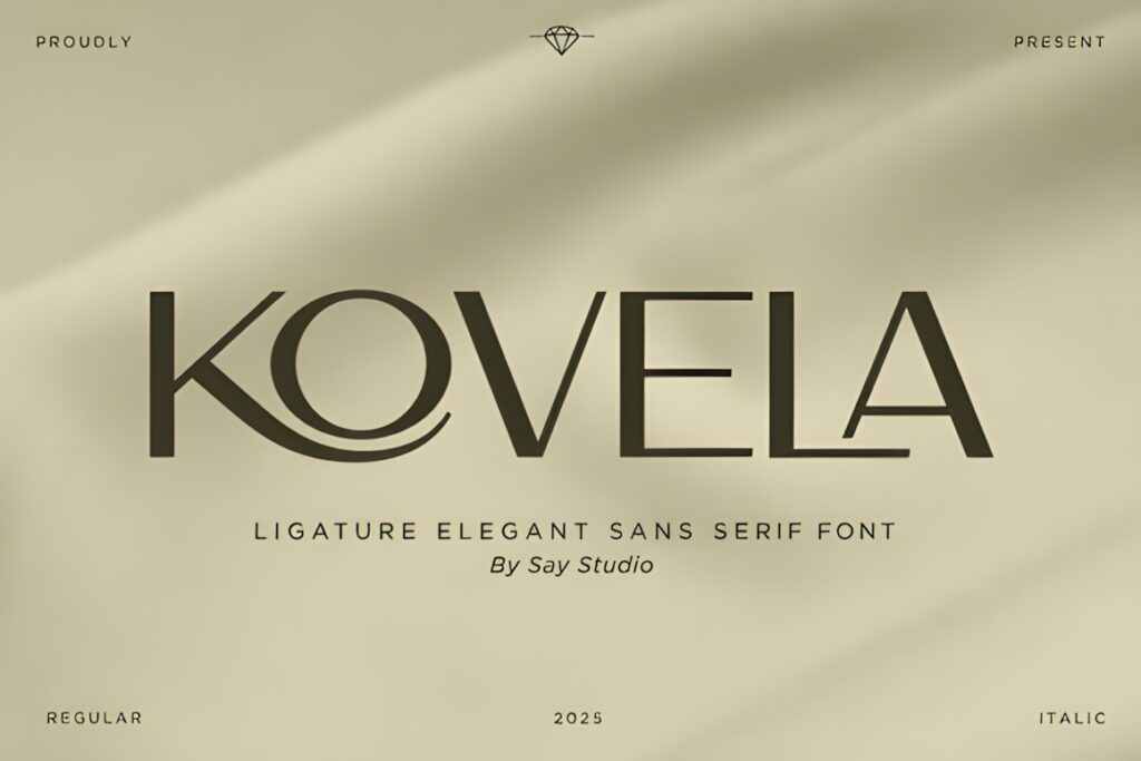
Kovela brings minimalist structure together with ligatures and stylistic alternates, making it useful for architecture, interior design, lifestyle branding, and polished studio identities. The family includes Regular and Italic styles along with uppercase, lowercase, numerals, punctuation, multilingual support, and OTF, TTF, and WOFF files.
Its strength is flexibility: the basic letterforms can stay restrained while selective alternates add identity to a studio name. Avoid using too many special characters together; one recognizable typographic gesture is usually stronger than turning every letter into a feature.
5. Grandeur – Elegant Classic Serif
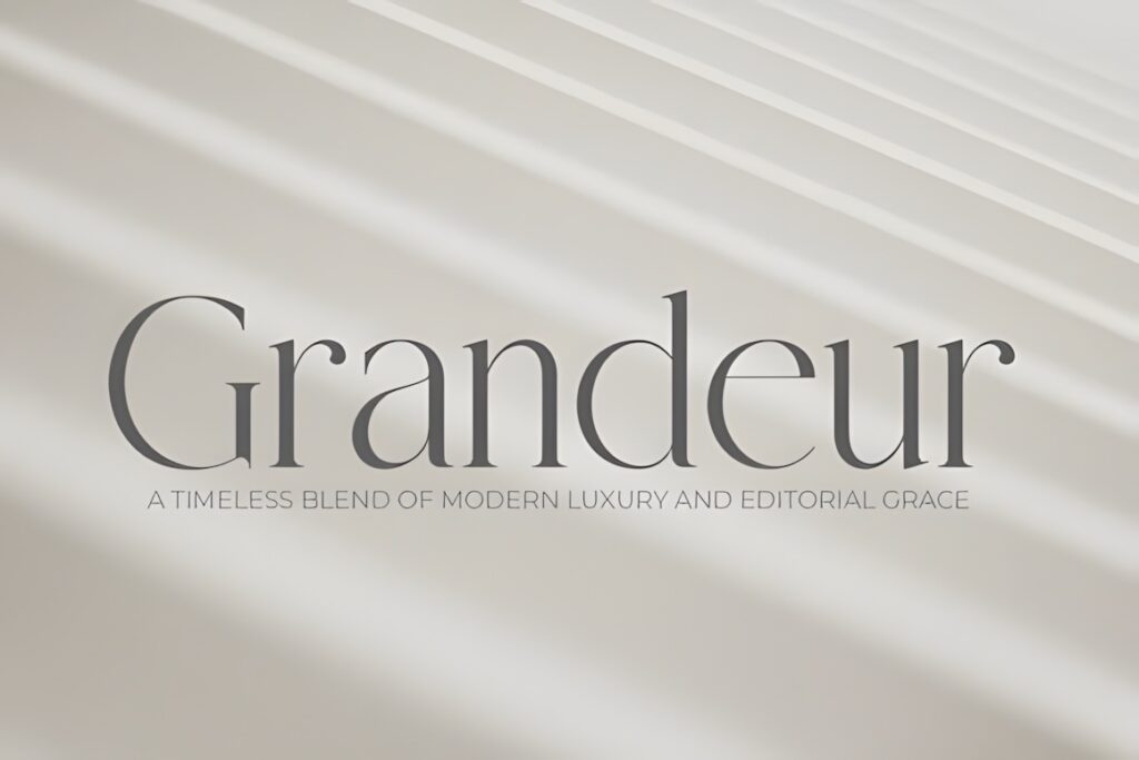
Grandeur is a classic high-contrast serif with a restrained editorial character. Its clean proportions suit interior designers, luxury real estate brands, hotels, professional portfolios, and decor studios that want refinement without heavily decorative lettering.
This makes sense when the brand language includes neutral palettes, architectural photography, natural materials, and spacious layouts. Studios wanting a more unconventional or contemporary signature may find Bagisk or Raisha more distinctive.
6. Defalco
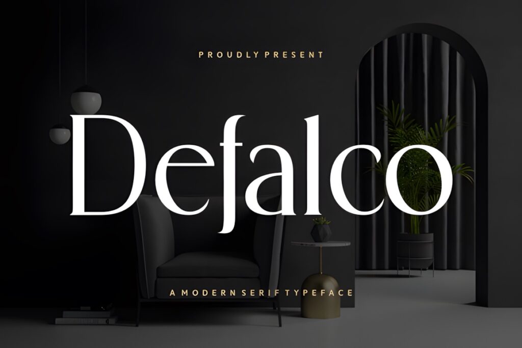
Defalco is a modern serif with a crisp, sophisticated presence that suits premium interior identities and contemporary design portfolios. Its character sits between traditional luxury typography and cleaner modern branding.
Use Defalco when the studio needs elegance without the larger swashes found in more decorative choices. Its quieter personality can also leave more visual room for photography, material samples, and furniture imagery to become the dominant part of the brand presentation.
7. Rafina
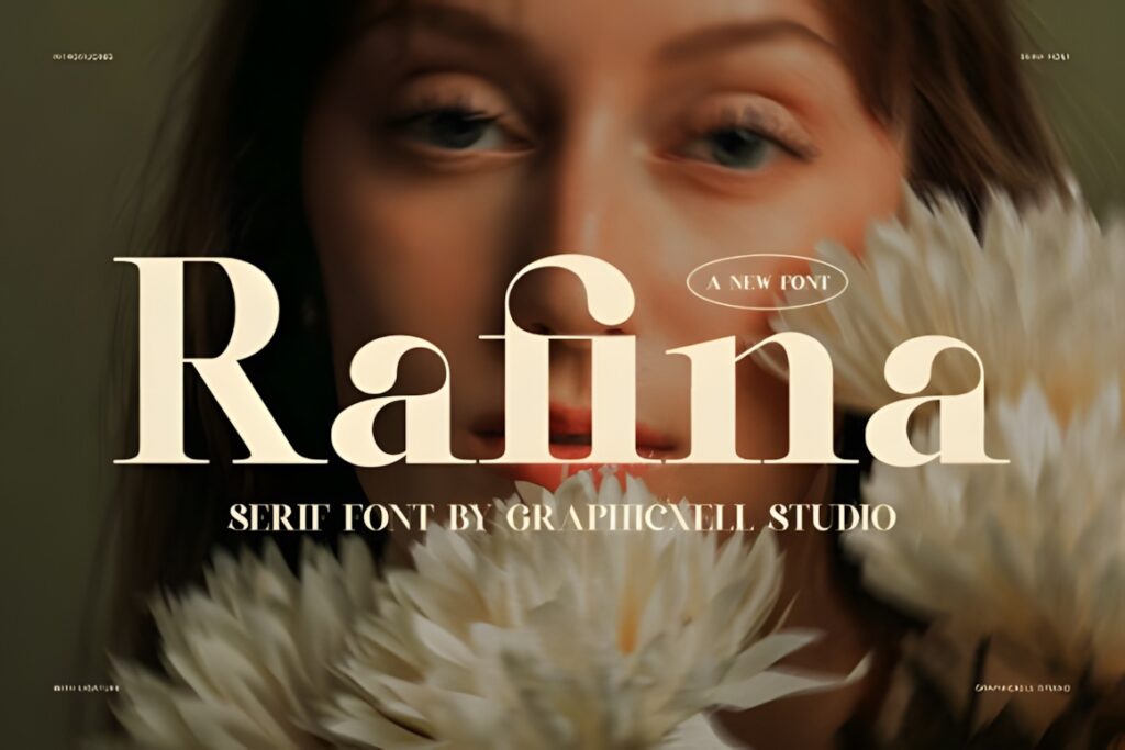
Rafina is a modern high-contrast serif combining smooth curves with built-in ligatures. It fits interior, hotel, boutique, lifestyle, and editorial branding where a studio wants a polished identity with more fashion influence than a conventional corporate serif.
The font is most persuasive in prominent logo text and headings. If the finished identity needs to remain extremely quiet and functional across technical-looking materials, a minimalist sans such as Nerova can create less visual competition.
8. Raisha
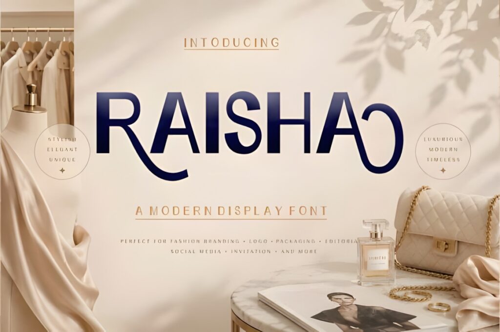
Raisha takes the collection in a different direction with thin, elongated sans-serif forms and open geometric counters. Its minimalist fashion character suits contemporary interior portfolios, design presentations, and studios built around modern spaces.
The lightweight construction works particularly well when the logo has room to breathe. At very small display sizes, however, thin strokes can lose presence, so the identity should be tested on social avatars and compact stationery before committing to the final scale.
9. Quandra
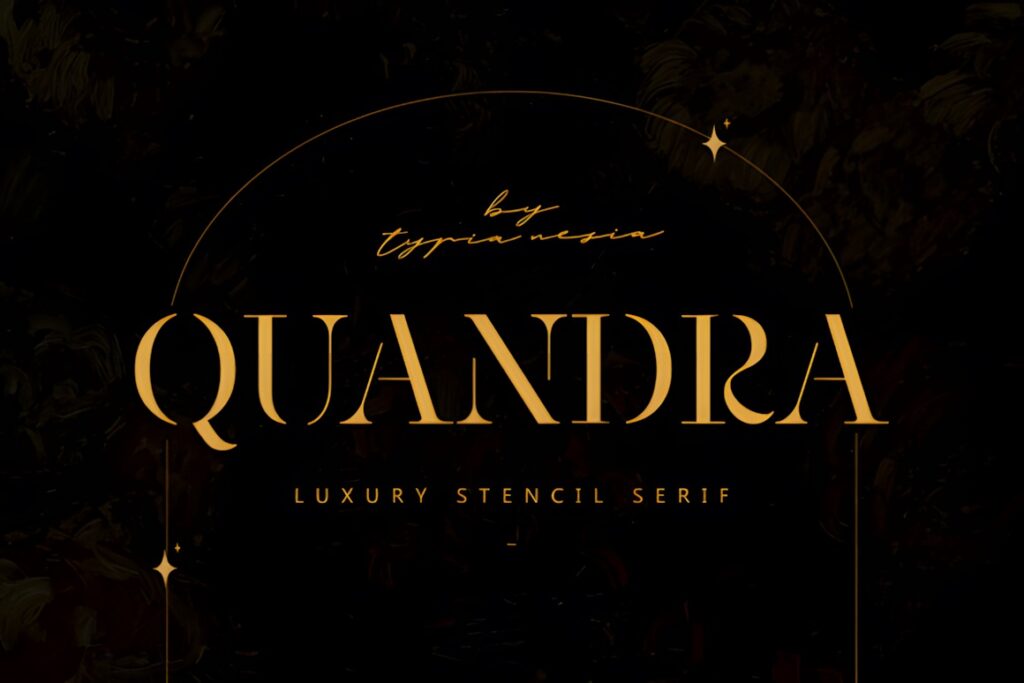
Quandra is a luxury stencil serif that brings a more graphic, architectural tone to logos and high-end branding. The stencil construction separates it clearly from traditional fashion serifs and makes it relevant to interior design, premium hospitality, and concept-driven studios.
Consider Quandra when the identity needs a memorable structural device rather than understated typography. The distinctive cuts become part of the brand personality, so studios seeking a timeless neutral wordmark may prefer Grandeur or Defalco.
10. Signature Beautiful
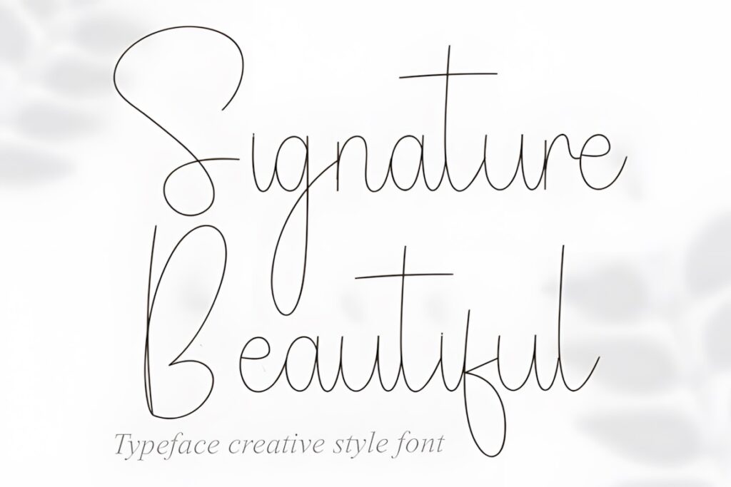
Signature Beautiful is an ultra-slim script with elongated strokes and a flowing handwritten rhythm. It offers a softer logo direction for boutique interior designers, stylists, decorators, and personal studio brands where the designer’s name is central to the identity.
This style works better for short names than dense informational layouts. Use the script as the main signature element and pair it with a restrained serif or sans serif for descriptors such as “Interior Design,” location names, or service categories.
11. Drazelle
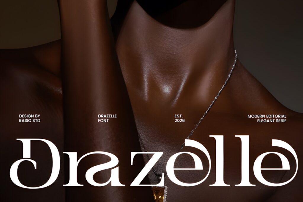
Drazelle is a high-contrast serif built around fine hairlines, confident vertical stems, sculpted curves, and generous spacing. Its polished editorial appearance is well suited to architectural presentations, interior design portfolios, hospitality visuals, and boutique identities.
Drazelle makes sense when photography and typography need to feel equally refined. Because of its contrast, give the logo enough finished size to preserve the finer details; more substantial serif construction can be preferable for very small brand applications.
12. Bagisk
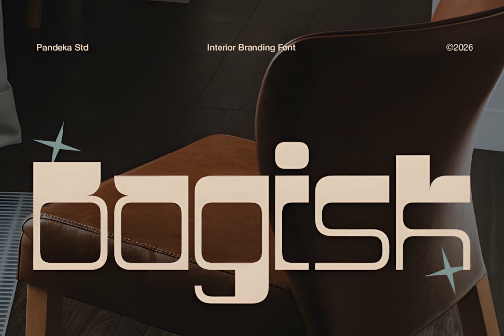
Bagisk is a wide geometric display font created around contemporary interior and architectural branding. Its retro-futuristic construction, angular forms, and distinctive decorative accents give furniture brands and design studios a much more graphic personality than classic luxury serifs.
The font comes in Regular and Slant styles with uppercase, lowercase, numerals, punctuation, and symbols. It is especially useful for short names, showroom signage, and statement branding. For a quieter residential studio identity, its geometry may feel too assertive.
13. Desevon
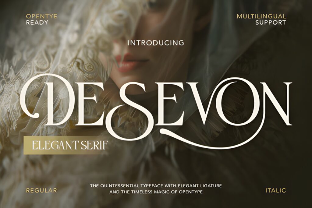
Desevon is an elegant high-contrast serif with graceful curves, ligatures, stylistic alternates, and delicate swashes. It brings more decorative flexibility to premium studio branding while retaining a recognizable serif foundation.
Choose Desevon when the logo needs one or two customized letter interactions rather than an entirely unconventional silhouette. Keep alternate characters selective in longer studio names; too many flourishes can weaken clarity and make small versions of the wordmark harder to scan.
14. Serifa
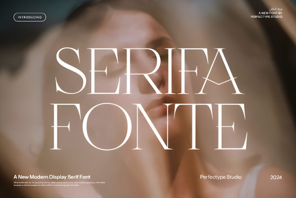
Serifa is a refined serif aimed at logo and branding work, with alternate characters and ligature options for creating a more customized wordmark. Its personality fits decor studios that want a recognizable luxury aesthetic without moving into handwritten typography.
The additional letter variations are useful when one specific pair of characters needs more distinction. Start with the standard forms first, then introduce alternates only where they improve the studio name rather than decorating it indiscriminately.
15. Affigue
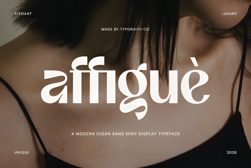
Affigue is a modern clean sans serif display face with a bold but softened appearance. It offers a useful alternative to delicate luxury serifs for contemporary decor studios, furniture brands, and designers who want stronger typography in presentations or large-format applications.
Its cleaner silhouette can pair particularly well with image-heavy portfolios and neutral interiors. Choose a serif such as Rafina when the identity needs stronger editorial contrast or a more traditional luxury signal.
16. Caveline
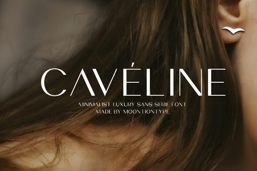
Caveline is a minimalist luxury sans serif with clean lines and refined proportions. It includes uppercase and lowercase characters, numbers, punctuation, plus OTF and TTF files, making it a straightforward option for modern branding systems.
Its restraint suits contemporary studios where architecture, furniture, and photography should remain the visual focus. For a wordmark that needs a recognizable decorative signature on its own, Kovela or Desevon provides more typographic detail.
17. Nerova
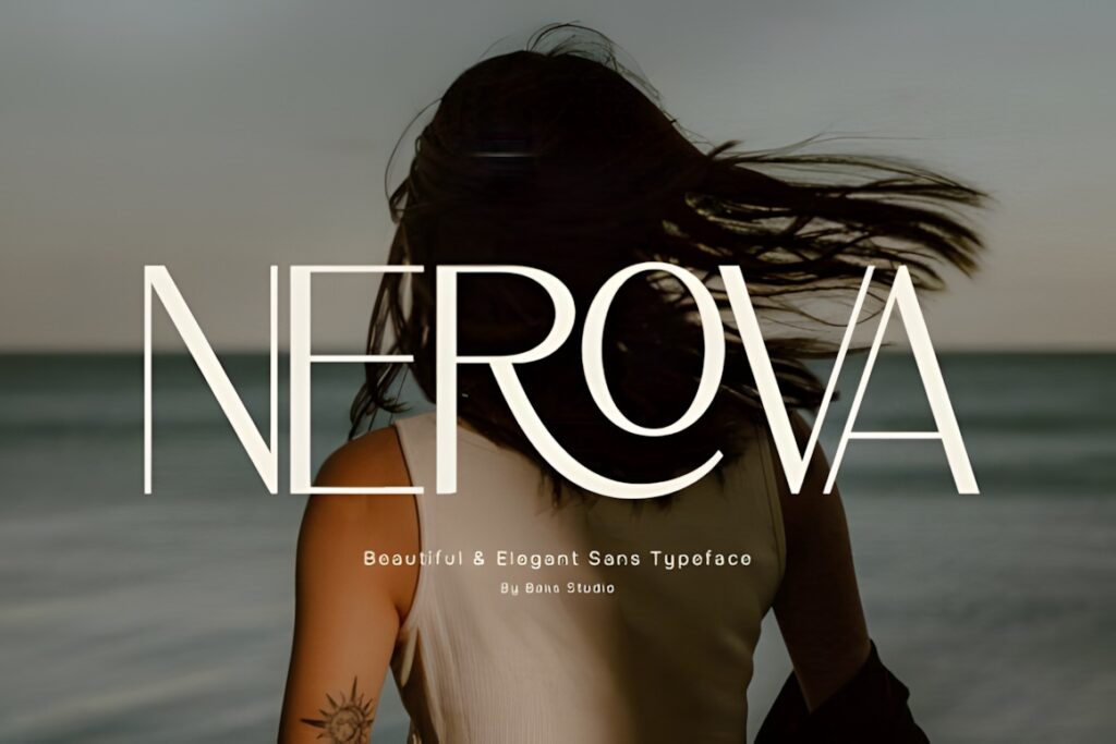
Nerova is an elegant sans serif built around balanced proportions, smooth curves, and restrained spacing. The result is more polished than purely geometric, which makes it useful for interior, lifestyle, packaging, and design-led brand identities.
This is a practical direction when a decor studio wants a modern identity that does not immediately read as fashion typography. Its controlled personality also leaves room for texture, material photography, and distinctive art direction elsewhere in the brand system.
18. Golden
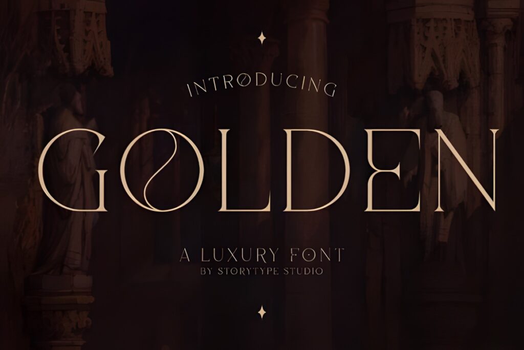
Golden combines modern and classic serif influences, giving logos a polished editorial personality without relying entirely on extreme hairlines. It also includes accessible extra glyphs and ligatures, providing room to refine a studio wordmark.
The style is useful for premium residential design, curated decor brands, and studios that want traditional elegance with a slightly contemporary edge. Keep decorative glyph choices restrained when the business name itself is long.
19. Qorvella
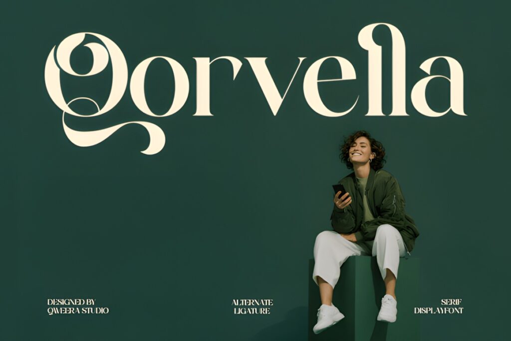
Qorvella is a modern elegant serif designed around graceful curves, refined proportions, and ligatures. Its balanced appearance gives premium branding a softer personality than a sharply architectural serif while still retaining a clean logo silhouette.
It makes sense for interior boutiques, decor shops, styling studios, and residential designers that want refinement without an austere corporate mood. For stronger architectural structure, Mirow Serif or Bagisk provides a more pronounced geometric character.
Quick Comparison by Studio Style
| Font | Best for | Style | Key visual trait | Project fit |
|---|---|---|---|---|
| Mirow Serif | Architectural studios | Display serif | Structural capitals | Logos and signage |
| Rolive | Boutique interiors | Modern serif | Sweeping details | Wordmarks and presentations |
| Kovela | Contemporary studios | Elegant modern | Ligatures and alternates | Flexible brand systems |
| Grandeur | Quiet luxury | Classic serif | Editorial proportions | Portfolios and identities |
| Raisha | Minimal interiors | Thin sans serif | Elongated geometry | Portfolio headers |
| Quandra | Concept-driven studios | Stencil serif | Architectural cuts | Statement logos |
| Bagisk | Furniture and decor brands | Geometric display | Wide angular forms | Signage and short names |
| Caveline | Minimalist branding | Sans serif | Clean proportions | Modern identities |
| Qorvella | Residential decor studios | Elegant serif | Soft refined curves | Logos and brand marks |
Branding and Logo Considerations for Interior Studios
An interior studio logo often has to work beside strong imagery: finished rooms, furniture, material samples, architectural drawings, and mood boards. That means the typeface does not need to create every ounce of personality by itself. A restrained wordmark can actually strengthen a visual identity when photography and project imagery already carry substantial detail.
Short studio names can handle wider proportions, unconventional terminals, or larger ligatures more easily. Longer names usually benefit from simpler construction and careful spacing. Test the complete business name rather than judging a font only by its marketplace specimen.
Also compare uppercase, lowercase, and mixed-case versions before deciding. All caps can create architectural authority, while lowercase or title case often feels more residential, approachable, or boutique.
Font Pairing Tips for Premium Decor Brands
Give each typeface one clear job. If the logo uses an expressive high-contrast serif, pair it with a quieter sans serif for addresses, service descriptions, web navigation, project captions, and proposal details. If the main identity is already a minimalist sans serif, a restrained editorial serif can add contrast to presentations and printed materials without changing the logo itself.
Avoid pairing two highly decorative typefaces simply because both look luxurious separately. Competing ligatures, swashes, or unusual proportions weaken hierarchy. One recognizable display voice plus one supporting workhorse is usually easier to apply consistently across a studio’s website, portfolio, stationery, and social graphics.
Readability and Logo Scale
High-contrast serifs can look particularly refined on portfolio covers and large website headers, but their thin details deserve a small-size test. Reduce the finished logo to the approximate size of an Instagram avatar, proposal header, or business card mark and check whether the essential silhouette still reads clearly.
Display fonts with geometric cuts or swashes need similar testing. A detail that looks distinctive at 150 pixels high may become visual noise at 25 pixels. Consider creating a simplified secondary mark if the main wordmark depends on elaborate forms.
Spacing matters just as much as the font itself. Luxury branding often benefits from controlled breathing room, but excessive tracking can make long studio names feel fragmented. Adjust spacing according to the actual letter combinations rather than applying one extreme value across the whole name.
Common Font Selection Mistakes
- Choosing from a specimen word alone: test the complete studio name, including awkward letter pairs.
- Using every alternate: one distinctive ligature can create identity; several may make the wordmark harder to read.
- Ignoring small applications: check social icons, stationery, proposal headers, and website navigation.
- Matching luxury with thinness alone: strong proportions, spacing, and hierarchy can feel refined without extremely fine strokes.
- Letting the logo compete with interiors: image-led brands often benefit from quieter typography.
- Skipping license details: confirm the current product license for the exact client, business, merchandise, or digital use you plan.
Choosing the Right Style for Your Studio
If your interior studio needs a strong architectural impression, Mirow Serif provides one of the most structural silhouettes in the selection. For softer editorial luxury, Rolive or Rafina gives the wordmark more movement and contrast.
For a restrained contemporary identity, Kovela, Caveline, or Nerova leaves more room for architectural photography and material-led art direction. A furniture or decor business that wants typography to become a larger visual feature can consider Bagisk, while Grandeur fits brands built around quieter, classic luxury.
Frequently Asked Questions
What type of font works well for a luxury interior design logo?
A luxury interior design logo often works well with a restrained high-contrast serif, architectural display serif, or clean premium sans serif. Choose according to the studio’s positioning rather than luxury styling alone. Architectural firms may benefit from structured geometry, while residential and boutique studios can use softer curves or selective ligatures. Always test the complete studio name at both large and small sizes.
Are serif or sans serif fonts better for premium decor branding?
Both serif and sans serif fonts can support premium decor branding, but they communicate different personalities. Serifs often create a more editorial, established, or classic appearance, while clean sans serifs can feel contemporary, architectural, and minimal. The better choice depends on the studio’s work, client base, photography style, and the visual character already present throughout the brand.
How can I keep a luxury logo readable at small sizes?
Keep the main silhouette clear and test the logo at the smallest size it will realistically appear. Fine hairlines, large swashes, extreme spacing, and complicated ligatures can lose clarity in social avatars or small stationery. If the primary wordmark is highly detailed, a simplified secondary mark can help maintain recognition across compact applications.
Can these fonts be used for client branding and commercial projects?
Usage rights depend on the current license attached to the individual font product and the way the finished design will be distributed. Check the current license before using a font for client work, merchandise, print-on-demand products, editable digital files, or other commercial applications. Licensing terms can change, so verify the relevant product page for the exact use you plan.