ℹ️ Affiliate Disclosure: This article may contain affiliate links. If you book or purchase through these links, we may earn a commission at no additional cost to you.
Choosing luxury logo fonts for fine dining and restaurant branding
A fine-dining logo needs to feel refined before a guest reads a menu or steps through the door. Luxury logo fonts for fine dining and restaurant branding therefore have a difficult job: they need enough personality to make a restaurant name memorable without becoming ornate, fragile, or difficult to recognize on menus, reservations, signage, packaging, and digital profiles.
For upscale restaurant identities, the most useful differences are usually contrast, letter width, capitalization, decorative detail, and how confidently a typeface handles a short wordmark. High-contrast serifs can create a fashion-led dining identity, restrained serifs suit contemporary restaurants, while more expressive alternates work when the logo itself needs to become the visual signature.
Many more luxury fonts are available, while this selection concentrates on styles with distinct branding roles, readable letterforms, and noticeably different personalities.

The strongest luxury restaurant fonts usually fall into a few useful groups: restrained modern serifs for minimalist dining rooms, high-contrast editorial serifs for dramatic wordmarks, classic elegant serifs for established restaurants, and decorative serif designs for boutique concepts that need a more distinctive signature.
Quick Picks
- For minimalist luxury branding: Silkydusk — refined proportions and a clean modern serif structure work well for restrained restaurant identities.
- For dramatic editorial wordmarks: High Fashion — pronounced thick-and-thin contrast creates a stronger visual statement.
- For elegant versatility: Elegant — its medium-weight serif construction can translate more comfortably across large and smaller brand applications.
- For a distinctive signature: Desevon — alternates, ligatures, and swashes provide more opportunities for custom-looking lettering.
- For classic upscale branding: Richmond Grovelyn — a regular serif and italic companion offer useful hierarchy within one identity.
Luxury Restaurant Logo Fonts for Different Brand Styles
1. Silkydusk
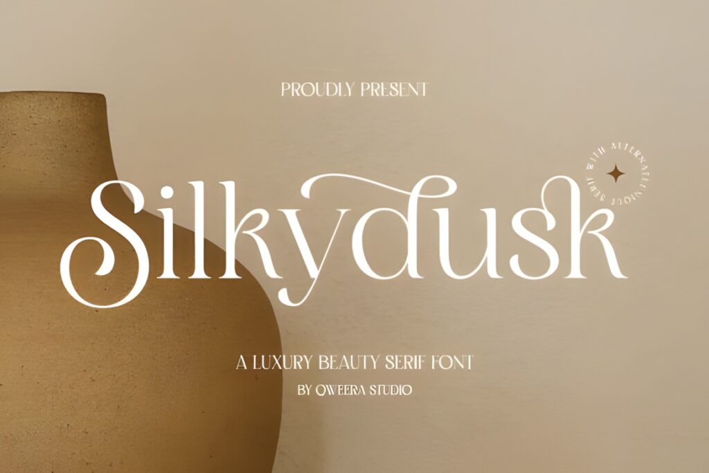
Silkydusk is a luxury minimal modern serif suited to restaurants that want an understated, polished wordmark rather than a heavily decorative logo. Smooth curves, balanced proportions, alternates, and ligatures give the letterforms enough identity for a chef-led restaurant, wine bar, or modern tasting-room concept without making the typography excessively ornate.
The font is supplied in OTF, TTF, and WOFF formats and includes multilingual support. Its restrained structure makes sense when the restaurant name needs to work across a storefront, menu cover, website header, and packaging. For a brand that intentionally wants an old-world or highly ornamental appearance, a more expressive option such as Desevon may communicate that direction more clearly.
2. Desevon
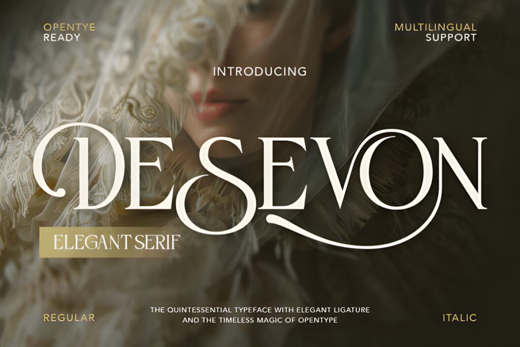
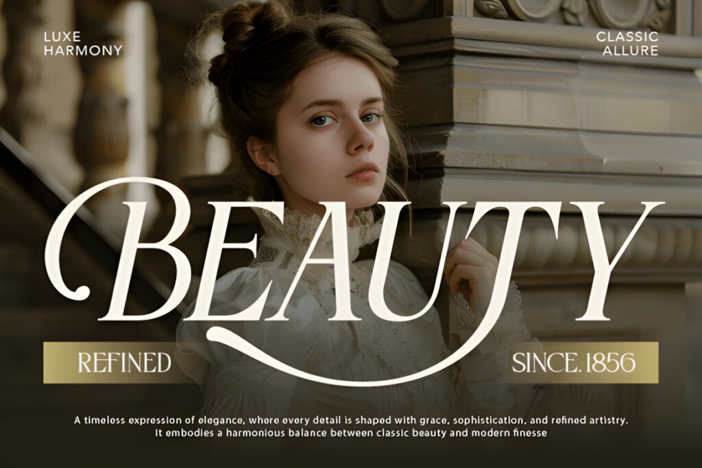
Desevon is a high-contrast serif with graceful curves, ligatures, stylistic alternates, and decorative swashes. That combination gives it a stronger signature quality than a straightforward serif, making it useful for boutique restaurants where the name itself is intended to become a recognizable visual element.
Its expressive details can work especially well for menu covers, private dining stationery, wine-oriented branding, and short restaurant names. The main consideration is restraint: elaborate alternates are most effective when applied selectively. A long name rendered with multiple swashes can quickly become busy, so cleaner choices such as Elegant or Silkydusk make more sense when compact readability is the main priority.
3. Elegant
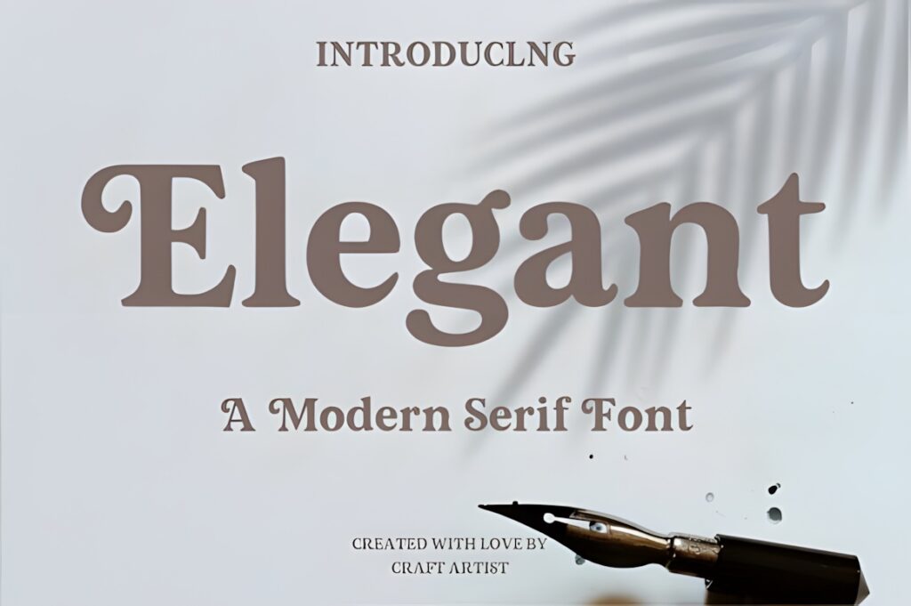
Elegant uses a medium-weight, relatively low-contrast serif structure with softened terminals, giving it a more grounded appearance than extremely delicate editorial typefaces. For restaurant branding, that balance can be valuable when a logo needs sophistication but also needs enough visual weight for practical applications.
This is a useful direction for contemporary restaurants, premium cafés, bakeries, hotel dining concepts, or culinary brands that want refinement without appearing overly formal. Because the shapes are less dependent on razor-thin details, the style can also feel more stable at modest sizes. Choose a sharper high-contrast font such as High Fashion when the desired identity is intentionally more dramatic and editorial.
4. Luxury
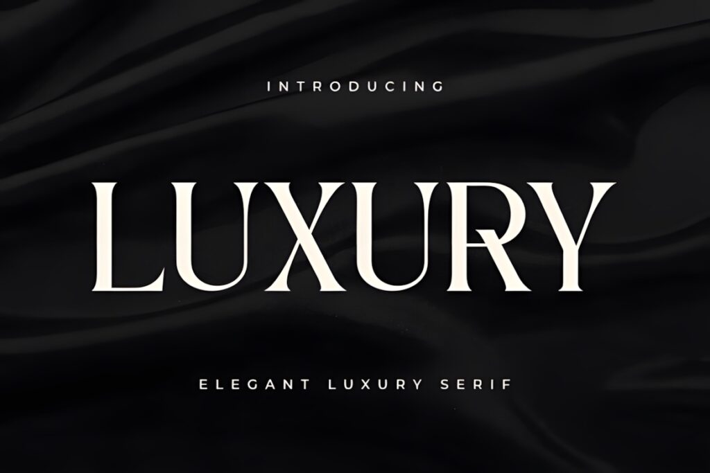
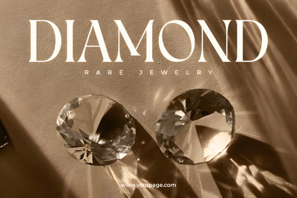
Luxury by Sensatype is an elegant serif with a balanced weight and restrained overall appearance. Rather than relying on extreme contrast or elaborate ornament, it offers a straightforward upscale personality that can suit restaurant names requiring a more timeless visual direction.
Consider this style for a classic dining room, wine-focused concept, boutique hotel restaurant, or premium food brand where typography should communicate refinement without dominating the rest of the identity. It also leaves more room for a monogram, emblem, illustration, or location line to carry secondary personality. Restaurants seeking a fashion-editorial aesthetic may find Kelvia or Marquina visually more assertive.
5. The Letter Editorial
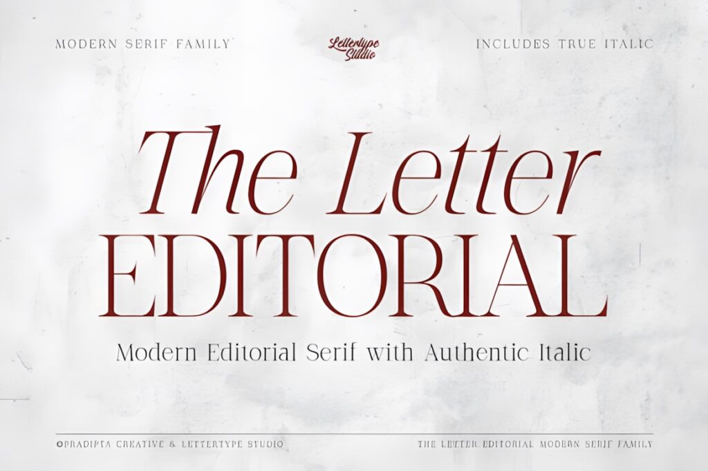
The Letter Editorial combines a refined serif regular style with a separately drawn italic companion. Its high contrast and sculpted letterforms give restaurant branding a polished editorial character, while the italic introduces a softer secondary voice for supporting brand elements.
That makes the family particularly interesting for identities that need more than a single static wordmark. The upright style can carry the restaurant name while the italic can support a chef name, short descriptor, seasonal menu heading, or other secondary detail. If the brand needs one simpler style that requires fewer typographic decisions, Luxury or Stockist may provide a more direct foundation.
6. Editorial Style
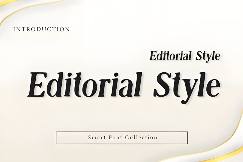
Editorial Style is a high-contrast serif display font built around clean structure, refined proportions, and magazine-inspired typography. In a restaurant identity, that visual language can create the impression of a modern destination with carefully controlled interiors, presentation, and branding.
It makes sense for concise restaurant names, tasting-menu concepts, premium hospitality branding, or logos intended to sit beside minimal photography and generous negative space. Because its character comes partly from strong stroke contrast, test the finished logo at menu and mobile-avatar sizes rather than judging it only as a large headline. Elegant is a useful alternative when a more substantial stroke structure is preferred.
7. Opulent Editorial
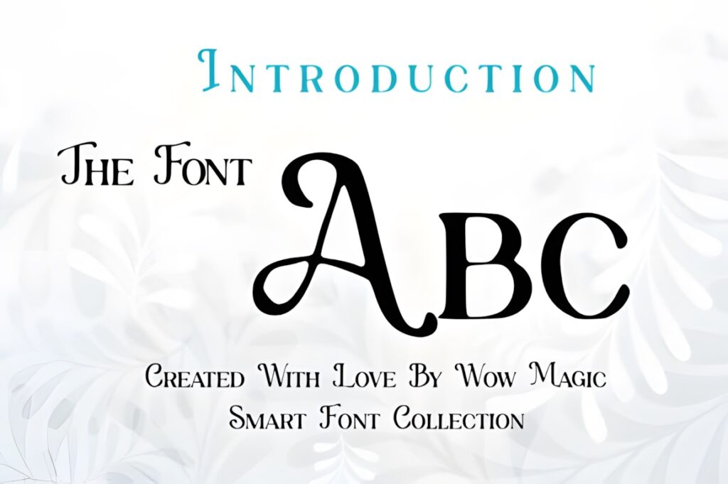
Opulent Editorial is a luxury serif display typeface influenced by classic editorial and high-fashion typography. Its polished structure suits restaurants that want their logo to feel deliberately upscale and contemporary rather than rustic or handcrafted.
Use it where the restaurant name is the dominant brand asset: centered on a menu cover, set across a restrained storefront, or paired with architectural photography. Its editorial personality is strongest in short display text, so supporting information such as opening hours, tasting-menu descriptions, and addresses should normally use a quieter companion font. For a brand requiring more decorative customization within the wordmark itself, Desevon provides more expressive possibilities.
8. High Fashion
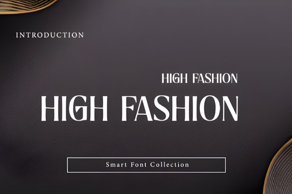
High Fashion is a bold display serif with pronounced thick-and-thin contrast and relatively narrow proportions. Those characteristics make it useful when a fine-dining identity needs greater drama without relying on script lettering or decorative illustrations.
The narrower structure can help with vertically arranged menus and restaurant names that would feel too wide in a broad display face. Generous tracking can make the wordmark feel calmer and more spacious, while tighter spacing produces a denser contemporary look. Its delicate hairlines deserve particular attention at reduced sizes, so restaurants expecting heavy use on small labels or compact digital icons may prefer Elegant or Stockist.
9. Serifa
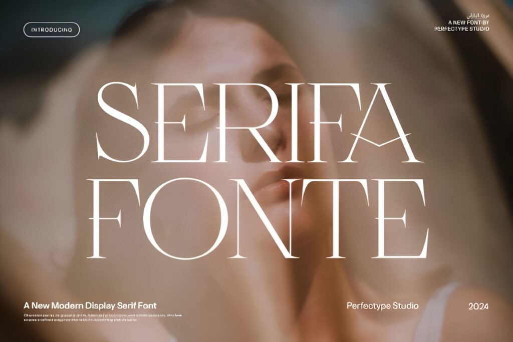
Serifa is an elegant serif created for branding and logo work, with alternate and ligature options that can make an otherwise traditional restaurant name feel more individual. It occupies a useful middle ground between restrained luxury typography and highly ornamental display lettering.
That flexibility suits restaurants that want a recognizable wordmark but do not want decorative flourishes to define the entire identity. A carefully chosen alternate can become a repeatable brand detail across menus, gift cards, packaging, and signage. Avoid combining too many alternate characters in one word; preserving a few conventional forms usually keeps the name easier to recognize. Silkydusk is the cleaner choice for a more minimalist identity.
10. Stockist
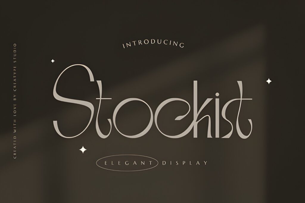
Stockist is an elegant serif intended for logos, branding, packaging, labels, and other identity work. Its relatively conventional serif personality makes it useful for dining brands that need sophistication without making the restaurant look strongly fashion-oriented or overtly decorative.
Consider Stockist for established-looking restaurants, premium cafés, specialty food concepts, or hospitality brands where the logo needs to coexist with photography, menus, packaging, and multiple sub-brand elements. Because its role is more restrained, it can also leave room for a distinctive icon or monogram. If typography itself needs to provide the central visual statement, Marquina or High Fashion will create a noticeably stronger display presence.
11. Richmond Grovelyn
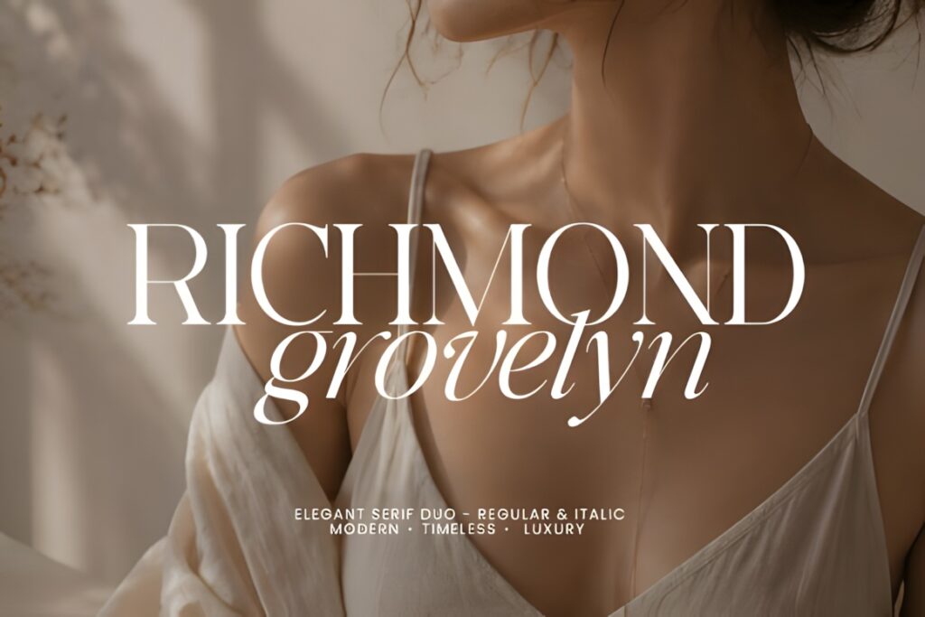
Richmond Grovelyn pairs a refined high-contrast regular serif with an italic style, plus ligatures and multilingual support. The two-style approach can be useful for a restaurant brand system because it allows the primary wordmark and secondary messaging to feel related without being typographically identical.
A fine-dining restaurant could use the upright style for its main name and introduce the italic selectively for a chef signature, location, private-dining line, or menu title. The supplied OTF and TTF formats also provide standard options for design workflows. Restaurants that need a very minimal identity may not require this much variation; Silkydusk keeps the overall visual language more restrained.
12. Strage
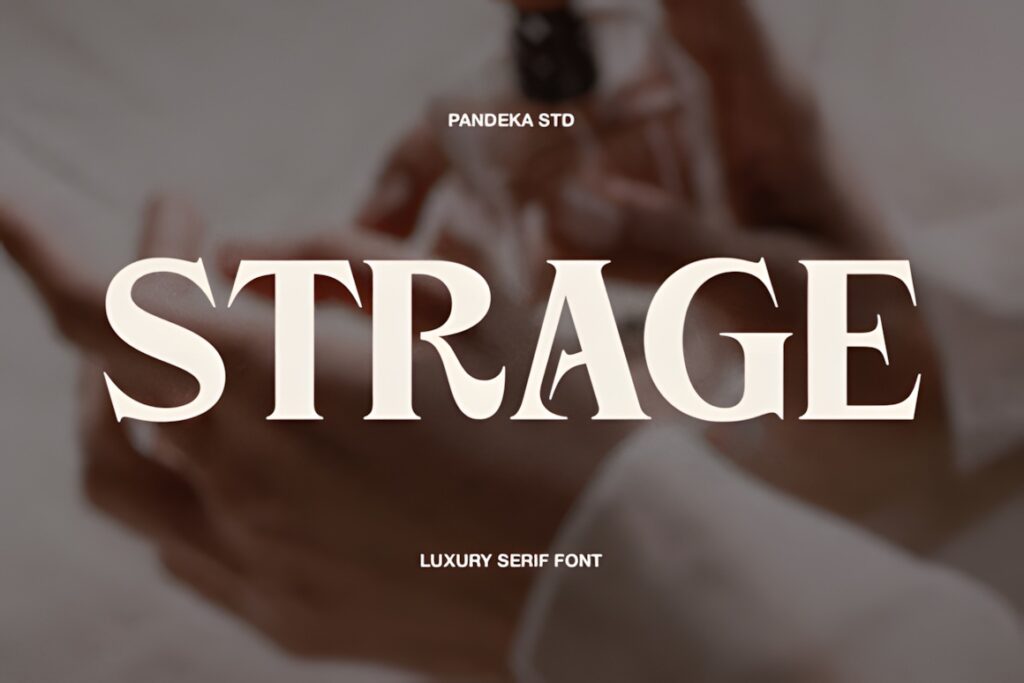
Strage is a modern luxury serif supplied in regular and outline styles. Graceful curves and polished contrast give the regular version a contemporary premium character, while the outline treatment introduces a second visual texture for larger display applications.
This makes Strage worth considering for a restaurant identity that needs flexible typography for events, menus, social graphics, and seasonal campaigns without leaving the same overall type family. The outline style should be treated as a display accent rather than the default solution for every application, especially at small sizes where fine details can become less clear. For a simpler one-style identity, Stockist requires fewer visual decisions.
13. Kelvia
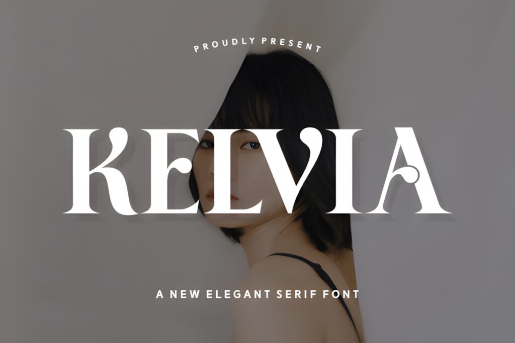
Kelvia is a modern serif with sharp contrast, sculpted curves, and a stronger high-fashion personality. For restaurant branding, it can give a short name immediate presence without requiring a separate emblem or elaborate decorative composition.
It suits contemporary fine dining, chef-driven concepts, cocktail bars, premium hospitality projects, and restaurants whose interiors already lean toward minimal materials and editorial styling. Because its personality is relatively assertive, supporting menu typography should stay restrained rather than competing with it. Restaurants seeking something warmer and more traditional may prefer Luxury or Stockist, while Kelvia makes more sense when contrast and visual tension are part of the brand direction.
14. Roliace
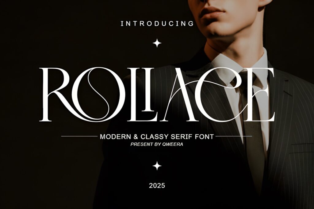
Roliace is a modern classy serif built around refined contrast and an orderly, professional structure. It offers an upscale appearance without depending on large swashes or highly unusual character forms, which can make it easier to incorporate into a complete restaurant identity.
This is a practical direction for restaurant groups, premium hospitality businesses, modern brasseries, and concepts where the logo needs elegance but also needs to sit comfortably beside locations, descriptors, and other structured information. Roliace is less theatrical than High Fashion and less decorative than Desevon, so it works particularly well when typography should reinforce the experience rather than become the entire concept.
15. Marquina
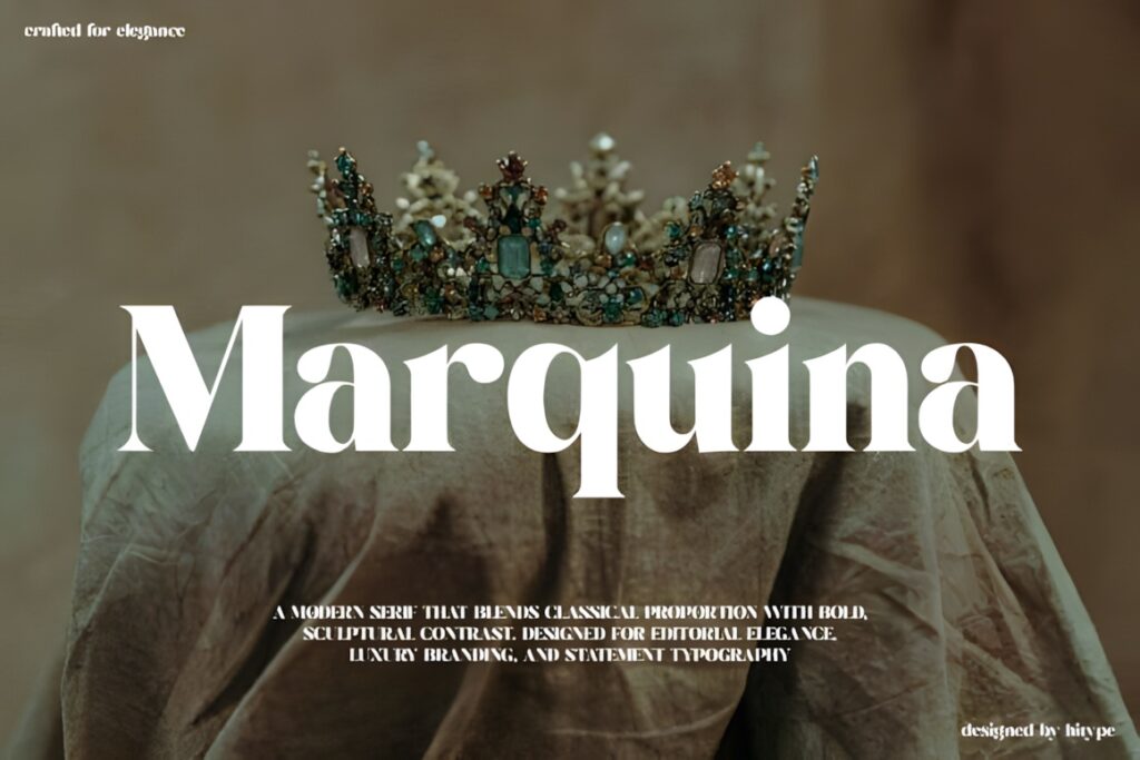
Marquina is a bold high-contrast serif with sculpted strokes and a pronounced editorial quality. Complete uppercase and lowercase character sets, numerals, punctuation, and multilingual support make it a substantial option for identities that need more than a single display word.
The font fits restaurant concepts aiming for cinematic, fashion-led, or highly curated luxury rather than casual warmth. Its stronger contrast can look particularly effective in short names, large menu titles, and signage with plenty of surrounding space. Because the design already carries considerable personality, logos generally need fewer additional decorative elements. For a quieter and more neutral upscale impression, Roliace or Stockist offers a less dramatic alternative.
Quick Comparison
| Font | Best for | Style | Key visual trait | Project fit |
|---|---|---|---|---|
| Silkydusk | Minimal fine dining | Modern serif | Smooth, refined curves | Logos, menus, packaging |
| Desevon | Signature wordmarks | High-contrast serif | Swashes and alternates | Logos, stationery, menus |
| Elegant | Versatile restaurant identity | Modern serif | Medium weight, softer terminals | Branding across multiple sizes |
| The Letter Editorial | Layered brand systems | Editorial serif | Regular and true italic character | Wordmarks and secondary details |
| High Fashion | Dramatic restaurant names | Display serif | Strong thick-and-thin contrast | Signage and display typography |
| Serifa | Customized logos | Elegant serif | Ligatures and alternates | Wordmarks and branding |
| Richmond Grovelyn | Classic luxury systems | Serif duo | Regular and italic styles | Menus, identity, packaging |
| Kelvia | Contemporary fine dining | Modern serif | Sharp contrast and sculpted curves | Logos and large headlines |
| Marquina | Editorial luxury | High-contrast serif | Bold sculpted strokes | Wordmarks and menu covers |
Branding and Logo Considerations
A restaurant logo has to survive more environments than a large storefront sign. Before committing to a typeface, set the actual restaurant name rather than judging the font from its specimen. Letter combinations that look elegant in an alphabet preview can behave very differently once a long name, repeated capitals, or unusual letter pairings are introduced.
Test at least three practical versions: the full primary wordmark, a compact horizontal version, and a small application such as a social avatar or reservation-card header. If distinctive serifs or hairlines disappear immediately, consider simplifying the logo rather than forcing every detail into every size.
Also decide whether the font itself provides enough personality. Desevon, Serifa, Kelvia, and Marquina can carry more visual character on their own. Stockist, Luxury, and Roliace leave greater room for a symbol, monogram, illustration, or architectural element to become equally important.
Readability on Menus, Signage, and Small Brand Details
High contrast is one of the clearest ways to create a luxury look, but the thinnest strokes are also the first details to become visually weak at reduced sizes. A restaurant can use a dramatic display serif for its main logo while reserving a sturdier supporting face for prices, ingredients, addresses, opening hours, and reservation information.
Scale also changes the impression of spacing. A widely tracked restaurant name may feel sophisticated on exterior signage but unusually fragmented on a small label. Build separate lockups when necessary instead of scaling one composition mechanically.
Decorative alternates deserve the same treatment. A custom initial or one distinctive ligature can create brand recognition; several swashes competing inside a short wordmark can make it harder to scan. Fine dining typography usually feels more controlled when decorative features are treated as accents rather than defaults.
Font Pairing Tips for Fine Dining Brands
Use the luxury serif to establish personality, then give the supporting font a different job. The logo may be elegant and high contrast, while menu descriptions need a quieter serif or sans serif with comfortable spacing and less decorative detail.
Avoid pairing two fonts simply because both look expensive. Two decorative typefaces often compete for attention. Contrast in function is more useful: expressive display lettering for the restaurant name, restrained typography for navigation and menu information, and perhaps the italic companion from the same family for short secondary statements.
Keep the number of type roles limited. A strong restaurant identity can often be built from one display face, one supporting text face, and variations in size, capitalization, spacing, and weight rather than adding several unrelated fonts.
Common Luxury Restaurant Font Mistakes
- Choosing from the alphabet preview alone: always test the complete restaurant name, location line, and key menu headings.
- Making every element luxurious: decorative typography loses impact when logos, headings, descriptions, and prices all compete for attention.
- Ignoring small applications: evaluate the identity on social avatars, reservation materials, labels, and mobile layouts.
- Overusing alternates: one memorable ligature may strengthen a wordmark; several unusual characters can reduce recognition.
- Using the logo face for long menu copy: many display serifs are better reserved for short text while a more restrained font handles reading.
- Skipping license checks: confirm the current product license for the specific client, restaurant, packaging, merchandise, or other use you plan.
Choosing the Right Style for Your Restaurant
If the restaurant concept is minimal and contemporary, Silkydusk keeps the luxury signal controlled and clean. For a more dramatic fashion-editorial identity, High Fashion or Marquina creates much stronger contrast and display presence.
If customized lettering is important, Desevon provides decorative alternates and swashes, while Serifa offers another route to creating a more individualized wordmark. For a restaurant identity that needs to remain polished across many practical applications, Elegant provides a more restrained balance between personality and readability.
The final choice should be made with the real restaurant name and smallest expected brand application on screen. A typeface that still feels distinctive when the decoration is reduced is usually easier to turn into a coherent long-term identity.
Frequently Asked Questions
What font styles work well for a fine-dining restaurant logo?
Elegant serif and high-contrast display serif fonts are particularly useful for fine-dining logos because they can create a refined identity without requiring excessive decoration. Modern restrained serifs suit minimalist restaurants, while sharper editorial styles create a more dramatic luxury impression. The restaurant name, intended logo size, and overall concept should guide the final choice rather than the style label alone.
Can the same luxury font be used for the logo and restaurant menu?
A luxury display font can be used for the logo and selected menu headings, but it does not need to handle all menu text. Decorative or high-contrast serifs may become tiring or fragile in longer descriptions and small prices. Keep the distinctive font for short brand elements, then use a restrained supporting typeface for ingredients, descriptions, addresses, and other information that needs effortless reading.
How can a restaurant logo font look luxurious without becoming hard to read?
Use distinctive details selectively and test the complete restaurant name at several sizes. High contrast, generous spacing, elegant proportions, or one memorable alternate can communicate luxury without covering every letter in decoration. For long names or small applications, reduce swashes and complicated alternates first. A simpler version of the same wordmark can also be created for labels, social profiles, and other compact placements.
Can luxury logo fonts be used for commercial restaurant branding?
The permitted use depends on the current license attached to the specific font product. Before using a font for a restaurant client, packaging, merchandise, signage, editable files, or other commercial work, check the current license terms on the product page. Do not assume that every font marketplace listing grants identical rights for every type of commercial project.