ℹ️ Affiliate Disclosure: This article may contain affiliate links. If you book or purchase through these links, we may earn a commission at no additional cost to you.
Choosing Modern Serif Fonts for Book Design and Readability
A modern serif font can give a book contemporary character without sacrificing the familiar rhythm that makes serif type comfortable to read. The harder part is separating fonts designed mainly for dramatic covers from typefaces that can also handle chapter introductions, quotations, captions, short passages, or longer body copy.
For book design, the most useful differences are usually proportion, stroke contrast, spacing, italic availability, visual density, and how decorative the letterforms become at smaller sizes. This selection concentrates on modern serif fonts with documented editorial, publishing, readability, or body-text potential rather than display-only styles.
Many more modern serif fonts are available, while this shortlist focuses on styles with distinct book-design roles, readable letterforms, and clearly different personalities.

The strongest modern serif fonts for book design combine controlled contrast with balanced proportions and enough clarity for sustained reading. Multi-style families such as Editorium Serif and Qelvora offer more typographic flexibility, while cleaner single-style options such as Field, Galeriya, and Morgan make sense when you want a simpler contemporary page.
Quick Picks
For a complete editorial family: Editorium Serif — 18 styles give you substantially more room for hierarchy, emphasis, and long-form publishing layouts.
For elegant book typography: The Letter Editorial — combines a structured regular style with a separately drawn italic and explicit book-design use.
For lighter body text: Qelvora — its lighter weights are specifically positioned for body copy and editorial layouts.
For clean contemporary pages: Field — a straightforward modern serif described as suitable for both headings and body text.
For cover-to-interior flexibility: The Bilstein Editorial — regular and italic styles can bridge expressive headings with more restrained text.
Modern Serif Fonts for Books and Editorial Layouts
1. Editorium Serif
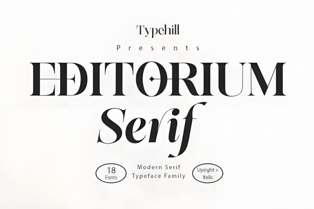
Editorium Serif is a modern variable serif built specifically around editorial typography. Its 18 styles—nine upright and nine italic—make it especially useful when a book needs a consistent family across body copy, subheads, quotations, introductions, and stronger display text. Creative Fabrica describes it as suitable for publishing, magazines, books, and both print and digital editorial environments.
Balanced letterforms, controlled contrast, and an unusually broad style range give Editorium a practical advantage over single-style fonts. Choose it when hierarchy matters across an entire publication. If your book uses only one text style and minimal typographic variation, a simpler family such as Field or Morgan may be easier to manage.
2. The Letter Editorial
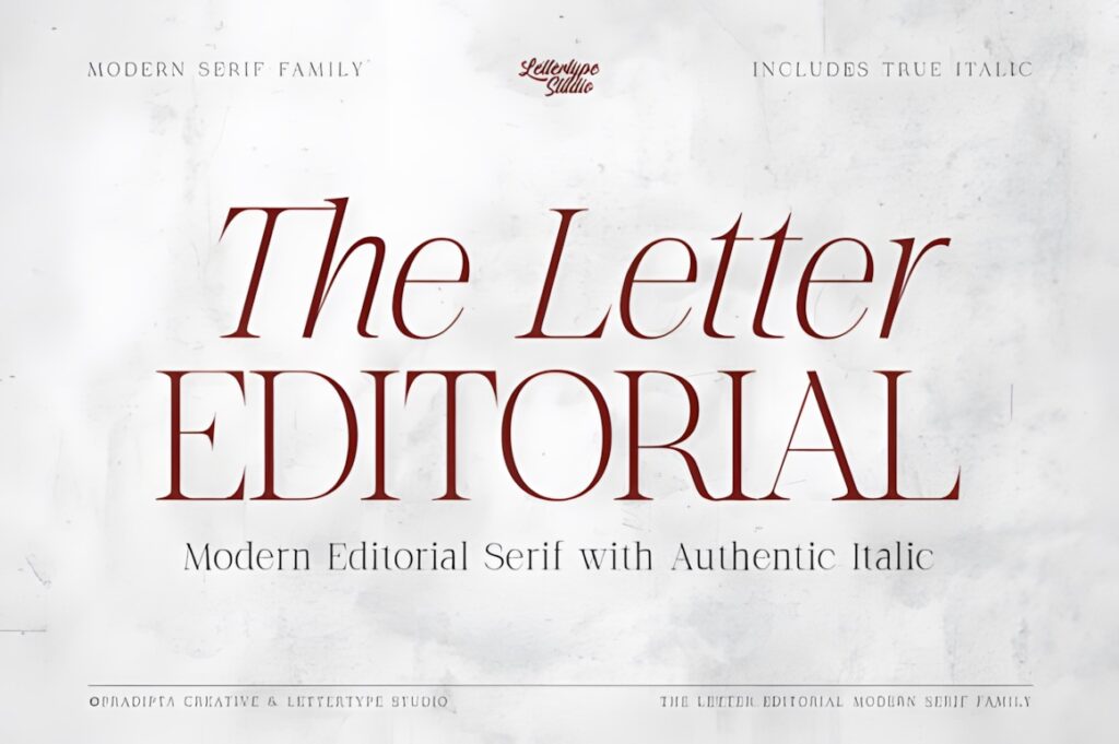
The Letter Editorial is a sophisticated modern serif created for editorial work, book design, branding, and refined layouts. Its regular style uses structured, high-contrast forms, while the companion italic was drawn separately rather than simply slanted. The product description specifically positions the family for elegant body text as well as stronger editorial typography.
This makes sense for literary projects where italics appear frequently in quotations, emphasis, captions, or introductory matter. The contrast gives the page more personality than a neutral text serif. For very compact pages or extremely long continuous chapters, test the lighter details carefully at the final print size.
3. Qelvora
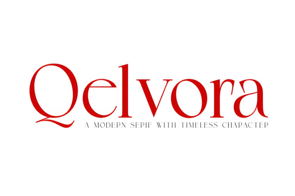
Qelvora combines contemporary styling with a broader weight range, and its lighter weights are specifically described as suitable for body text and editorial layouts. Heavier weights can take over headlines and stronger hierarchy, while italics add another level for quotations and emphasis.
This range makes Qelvora useful when you want one serif family to handle several book functions instead of pairing unrelated typefaces. Use lighter styles for quieter pages and reserve heavier cuts for chapter titles or section openings. If you prefer very traditional book typography, its more polished contemporary personality may be more noticeable than necessary.
4. Galore
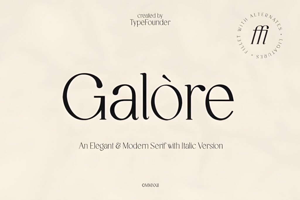
Galore is a clean modern serif with an elegant editorial tone and an accompanying italic style. Its product description explicitly positions the font for both bold headlines and subtler body text, making it more flexible than a serif intended only for covers or logos.
The softer luxury character works well for fashion books, creative nonfiction, lookbooks, catalogs, or visually led publications where typography should contribute to the atmosphere. For technical books or very dense academic pages, a more restrained option such as Editorium Serif or Field may produce a quieter reading texture.
5. Aver Magera
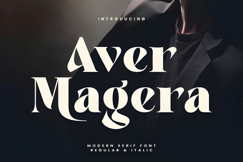
Aver Magera is a contemporary serif supplied in regular and italic styles. Its smooth thick-to-thin contrast gives it a refined editorial character, and the product page notes that the family can be used for both headlines and body text.
It makes sense for books that need a fashionable rather than purely traditional tone—think portfolios, lifestyle publishing, photography books, creative guides, and premium printed material. The italic gives you a natural way to create emphasis without introducing another family. For lengthy novels with very small type, compare its contrast against less decorative alternatives before committing.
6. Galeriya
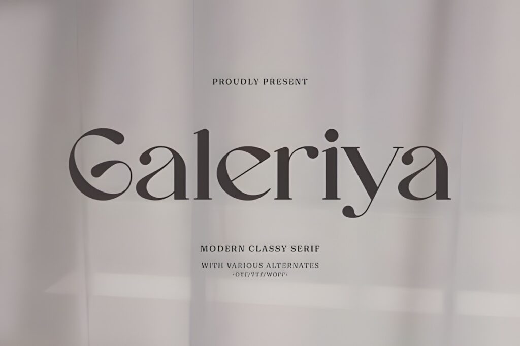
Galeriya is a modern serif with clean lines, smooth curves, and a contemporary interpretation of classic serif construction. Creative Fabrica specifically describes it as suitable for both headings and body text, which makes it relevant when the interior needs one consistent visual language.
Its relatively straightforward structure suits books where you want modernity without making every paragraph feel highly stylized. Consider Galeriya for short books, workbooks, editorial projects, or branded publications that mix text with photography and graphics. For projects needing many weights or a dedicated italic system, a larger family such as Editorium Serif offers more hierarchy options.
7. Fagon
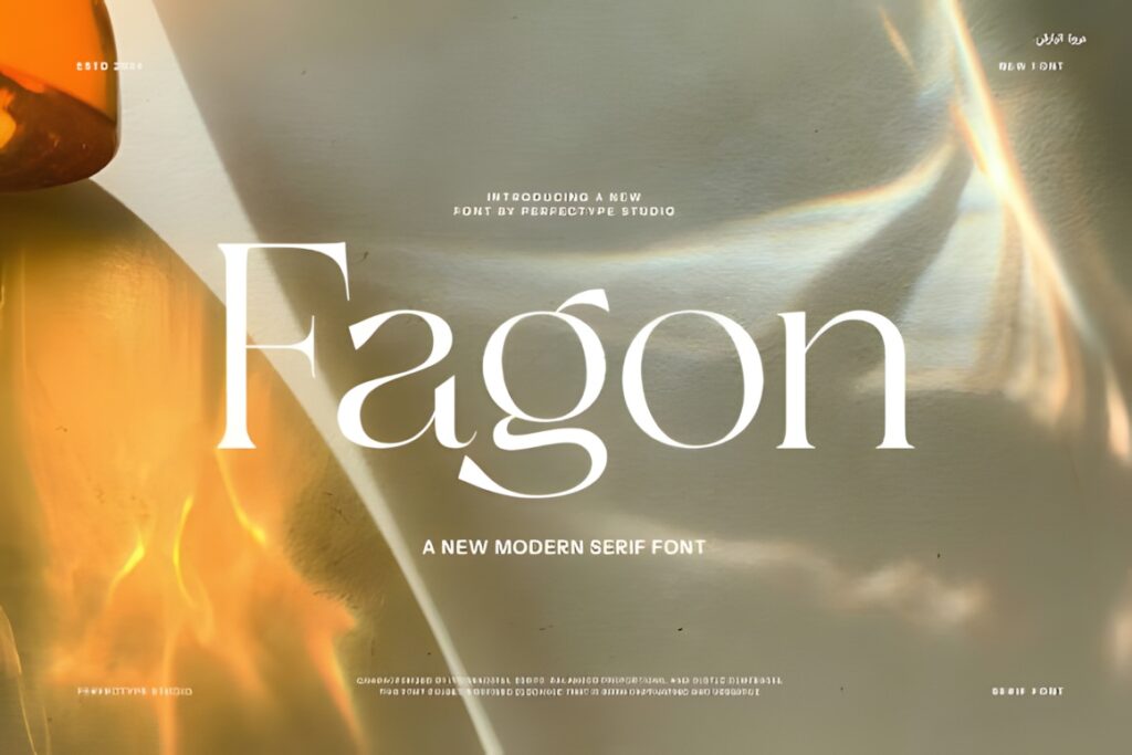
Fagon uses sharp serif details alongside smoother curves, giving the typeface a contemporary but recognizable reading structure. The font is described as suitable for headings and body text, with a mix of traditional serif construction and cleaner modern styling.
This is useful when a book should feel current without moving too far into fashion-editorial territory. Fagon can create a consistent relationship between page titles and shorter reading passages. Its sharper details may contribute more visible personality than Field or Morgan, so compare complete paragraphs if the project depends on a particularly neutral reading experience.
8. Field
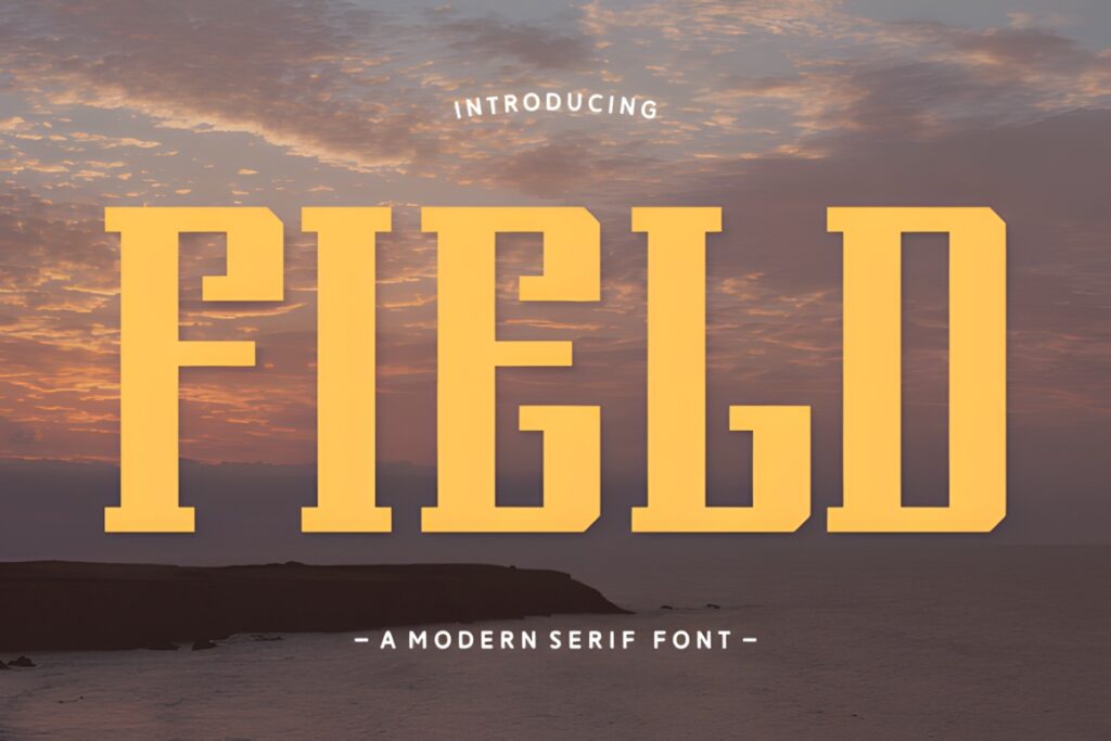
Field is a clean modern serif designed around readability and contemporary curves. Its product description identifies both headlines and body text as appropriate uses, giving it a straightforward role for book interiors that need restrained modern styling rather than dramatic display typography.
Choose Field when the text itself should remain central and the typeface should provide polish without dominating the page. It can work particularly well for guides, compact nonfiction, magazines, and text paired with illustrations. If a project requires strong typographic contrast between several levels of headings and text, a larger multi-weight family offers more flexibility.
9. Mengka
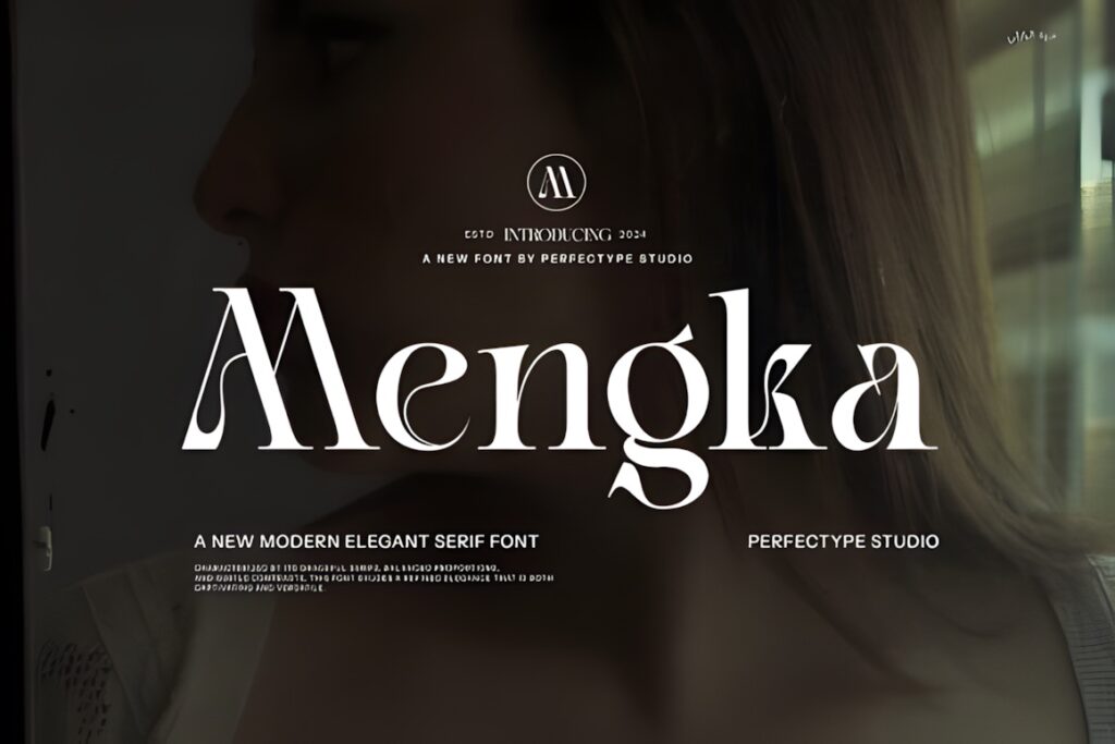
Mengka is a modern serif built around clean lines, stylish curves, and straightforward readability. The font is presented for both headline and body-text use, so it can move between chapter openings and smaller supporting text without requiring an immediate switch to another family.
Its balanced contemporary appearance is useful for books that need elegance but not an overtly vintage mood. Mengka makes more sense for design-conscious publications than for projects that deliberately imitate traditional typesetting. As with any modern serif, test several pages with real paragraph lengths to make sure the spacing and contrast suit your selected size.
10. Morgan
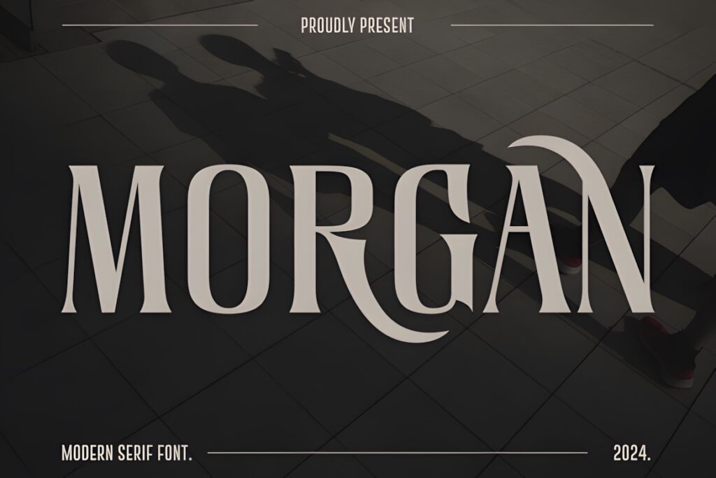
Morgan is a modern serif with smooth curves and visible thick-to-thin stroke contrast. Creative Fabrica describes it as easy to read while retaining enough personality for headlines as well as body text.
That balance makes Morgan useful when you want paragraphs to feel more distinctive without moving to a highly decorative editorial serif. Consider it for essays, visual books, brand publications, or short nonfiction where the typography can have a noticeable voice. For very dense reference material, Field or Editorium Serif may provide a more restrained foundation.
11. Journey Slovanika
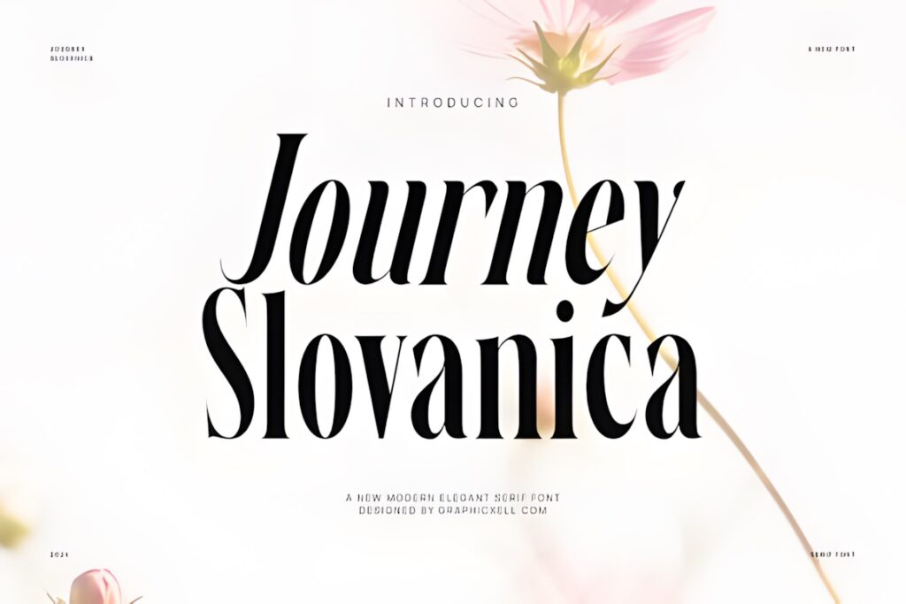
Journey Slovanika is a modern serif with pronounced thick-and-thin contrast and regular and italic forms. The product page explicitly presents it for headline and body text, including longer passages, and also positions it for magazine and editorial work.
Its elegant contrast gives a book more fashion or lifestyle character than a restrained text serif. This makes it worth considering for memoirs, wedding publications, visual journals, boutique catalogs, or other books where typography is part of the visual identity. For highly utilitarian manuals or compact technical books, the decorative tone may be more noticeable than needed.
12. Story Type
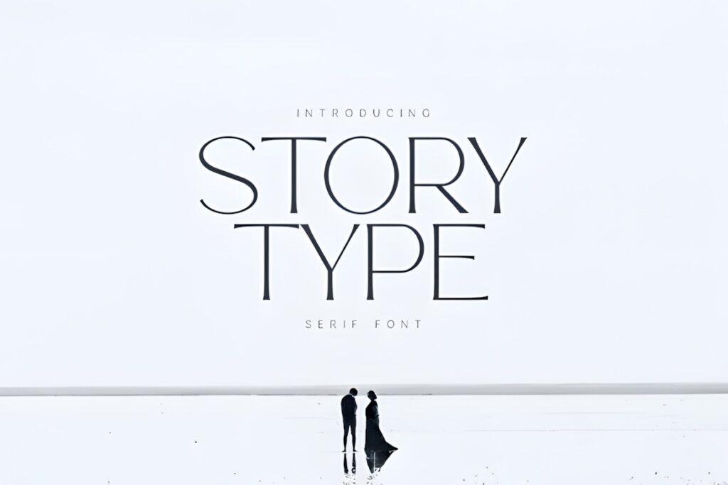
Story Type is an elegant modern serif with slender strokes, balanced proportions, and a calm editorial personality. Creative Fabrica identifies editorial design and books among its uses and states that the font can bring clarity to both headlines and body text.
The airy appearance can work well where generous margins and lighter page composition are part of the design. Choose Story Type for refined creative books, essays, introductions, quotations, or publications that mix text with spacious imagery. Because the strokes are relatively slender, test smaller sizes carefully before using it for long, tightly set chapters.
13. Veliora
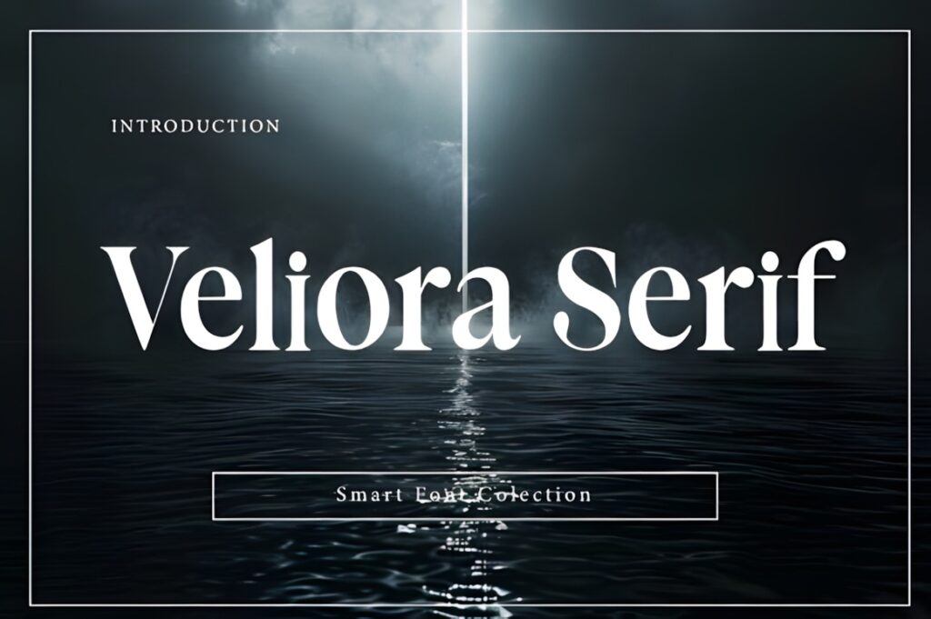
Veliora is a modern elegant serif designed around smooth curves, refined serifs, and clean letterforms. Its product description specifically notes a balance between sophistication and readability and identifies both display and body text among its possible uses.
Veliora suits book projects that need contemporary elegance without extremely unusual letterforms. It can bridge cover typography, chapter headings, introductions, and shorter reading passages while maintaining one personality. For very long-form interiors, compare it beside more publishing-focused families such as Editorium Serif before deciding which creates the calmer paragraph texture.
14. Bomegar
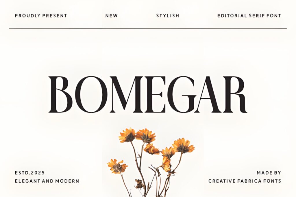
Bomegar is an editorial serif with refined strokes and balanced proportions. Creative Fabrica describes the typeface as useful for both bold headlines and graceful body text, placing it between a display-oriented luxury serif and a practical editorial option.
This balance can work well in coffee-table books, fashion publishing, creative portfolios, or branded editorial material where the same typography needs to appear at several scales. Its polished appearance is more expressive than a neutral book serif, so use it when that visual presence supports the subject rather than distracts from it.
15. Modist
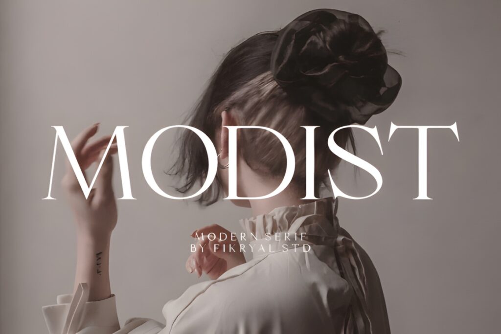
Modist is a modern serif that combines classic serif structure with smoother contemporary proportions. The product description emphasizes balanced construction, clarity, and readability, giving it a practical role for layouts where the serif should look modern without becoming heavily ornamental.
Consider Modist for clean book interiors, editorial layouts, workbooks, or mixed-content publications where typography must coexist with charts, photography, or illustrations. Its visual personality is quieter than Story Type or Journey Slovanika. If your design depends on numerous weights or dedicated italics, confirm the included styles before building the complete hierarchy around it.
16. Modern Serif
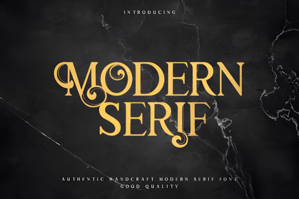
Modern Serif blends traditional serif influence with a contemporary aesthetic and pronounced but balanced contrast. Its product page emphasizes versatility and a more subtle elegant appearance rather than extremely decorative styling.
For book design, I would consider Modern Serif where chapter titles, pull quotes, short introductions, and editorial supporting text need a clear modern voice. Its page does not specifically position the font as a dedicated long-form text family, so test extended paragraphs before using it for an entire novel or dense nonfiction interior. Editorium Serif or Qelvora are stronger candidates when broad text hierarchy is the main requirement.
17. The Bilstein Editorial
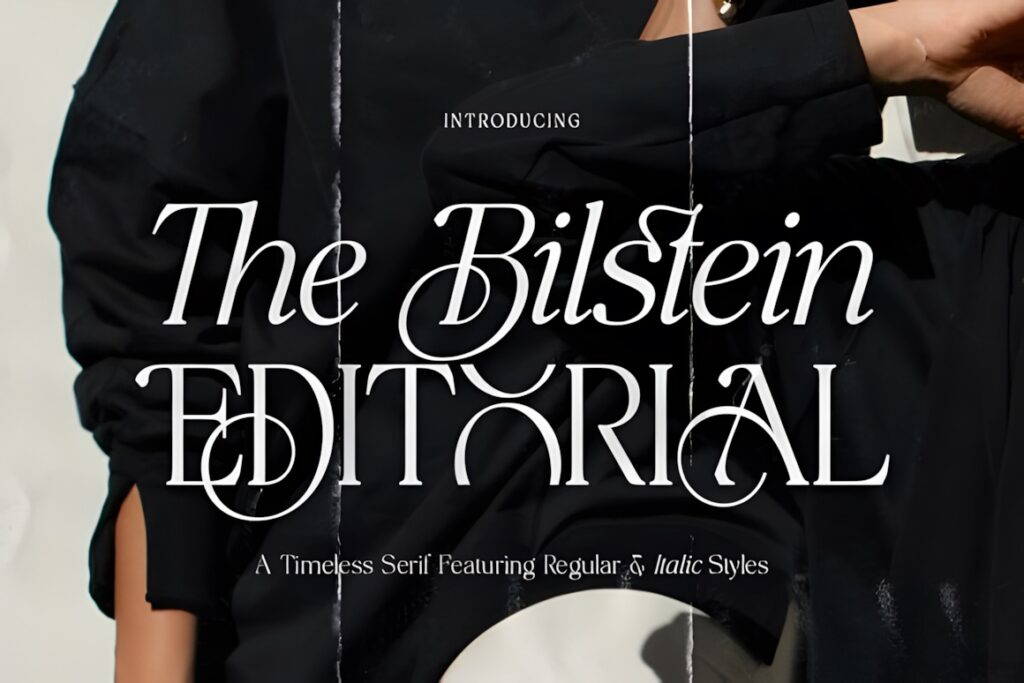
The Bilstein Editorial is a modern editorial serif with high-contrast strokes, distinctive curves, and regular and italic styles. The product description states that it can work for elegant body text as well as stronger headlines while maintaining readability.
This combination works well when the interior should carry the same sophisticated tone as the cover. Use the italic for quotations or emphasis and the regular style for restrained editorial passages. The high-contrast look will be more visible than a neutral text serif, so books with very long uninterrupted chapters should be proofed at the actual intended point size and line length.
Quick Comparison for Book Design
| Font | Best for | Style | Key visual trait | Project fit |
|---|---|---|---|---|
| Editorium Serif | Full book hierarchy | Editorial serif family | 18 upright and italic styles | Publishing and long-form layouts |
| The Letter Editorial | Elegant books | High-contrast editorial serif | True italic companion | Body text, quotations, editorial pages |
| Qelvora | Flexible text hierarchy | Contemporary serif family | Light-to-heavy range | Body copy through headings |
| Galore | Lifestyle publishing | Modern luxury serif | Clean regular and italic character | Headlines and shorter body text |
| Field | Clean interiors | Modern serif | Restrained curves | Headings and body copy |
| Journey Slovanika | Expressive editorial books | High-contrast modern serif | Strong thick-thin rhythm | Long text and visual publishing |
| Story Type | Spacious layouts | Elegant modern serif | Slender, airy forms | Editorial passages and display text |
| The Bilstein Editorial | Cover-to-interior styling | Editorial serif | Regular and italic contrast | Headlines and elegant body text |
Readability and Size
Book typography should be judged as paragraphs, not as individual letters. Set at least two or three pages using the real trim size, margins, line length, leading, and paper or screen conditions you plan to use. A serif that looks balanced in a large online preview can become delicate or visually busy once it is reduced to normal reading size.
Pay particular attention to contrast. Fonts such as Story Type, Journey Slovanika, The Letter Editorial, and The Bilstein Editorial use a more visible thick-to-thin relationship, which can create a refined editorial page. Cleaner choices such as Field or Galeriya may be easier to keep visually quiet across repeated paragraphs.
Line spacing matters as much as the font itself. If a modern serif has tall or energetic letterforms, slightly more leading can keep successive lines from feeling crowded. Avoid squeezing the tracking simply to fit more words onto a page; consistent reading rhythm is usually more important than saving a few lines.
Font Pairing Tips
A modern serif can often handle the primary reading role by itself, especially when the family contains multiple weights or italics. When you do introduce a second typeface, give it a clearly different job instead of choosing another font with nearly the same personality.
For example, use the serif for body text and chapter titles, then introduce a restrained sans serif for running heads, page numbers, captions, diagrams, or navigation. The contrast should come from function and structure rather than decoration. A quiet sans serif can make an expressive serif feel more deliberate while keeping supporting information easy to scan.
If the serif already has a strong italic, use that for quotations or emphasis before adding a script font. Book interiors usually benefit from fewer coordinated type styles rather than several decorative voices competing on the same spread.
Display Text vs Longer Text
Not every attractive modern serif should carry a complete manuscript. Display typography can tolerate more extreme contrast, unusual proportions, and decorative details because the reader sees only a few words at a time. Body copy repeats the same forms thousands of times, so small design decisions become much more noticeable.
Editorium Serif and Qelvora provide especially useful family structures when you need several levels of text. Field, Galeriya, Fagon, Mengka, and Morgan are straightforward choices for cleaner page systems. Story Type, Bomegar, The Bilstein Editorial, and Journey Slovanika bring stronger editorial personality and may work especially well when the book has generous space and shorter blocks of text.
Modern Serif illustrates the opposite case: it has a versatile contemporary look, but its product description does not specifically establish it as a dedicated long-form book face. That makes it more sensible to begin with chapter openings, titles, pull quotes, or shorter editorial passages and expand its role only after testing.
Common Font Selection Mistakes
- Choosing from the cover alone: a font that works beautifully for a title may still feel tiring across twenty pages of paragraphs.
- Testing only one sentence: use actual chapter-length text with punctuation, italics, numbers, and paragraph breaks.
- Using contrast that is too delicate: very thin details can lose clarity when printed small or reproduced on lower-quality paper.
- Ignoring italic needs: books with quotations, references, titles, or frequent emphasis benefit from a properly coordinated italic style.
- Adding too many typefaces: one versatile serif plus a restrained supporting sans serif is often enough for a complete book hierarchy.
- Skipping license verification: check the current product license for your exact publishing, client, resale, print-on-demand, or digital-book use before production.
Choosing the Right Serif for Your Book
If you need the broadest editorial system, Editorium Serif is worth starting with because its upright and italic range can cover several levels of a book without changing families.
If elegant body copy and a distinctive italic matter most, The Letter Editorial offers a stronger literary-editorial personality. For more weight flexibility, Qelvora makes sense because lighter styles can handle quieter text while heavier ones build hierarchy.
For a simpler contemporary interior, Field or Galeriya can keep the typography cleaner. If the book is more visually driven and you want the serif to contribute noticeable style, Journey Slovanika, Story Type, or The Bilstein Editorial provide more expressive alternatives.
Frequently Asked Questions
Are modern serif fonts good for book body text?
Modern serif fonts can work well for book body text when their proportions, spacing, contrast, and details remain comfortable at normal reading sizes. Fonts specifically described for body text, publishing, or longer passages are stronger starting points than display-only serifs. Always proof several full pages at the actual trim size before choosing a font for an entire manuscript.
What should I look for in a serif font for a book interior?
A book-interior serif should provide clear letterforms, comfortable spacing, controlled stroke contrast, and a consistent reading rhythm. Regular and italic styles are especially useful for emphasis, quotations, and titles. If the book needs several heading levels, a family with multiple weights can simplify hierarchy and keep the complete interior visually consistent.
Can I use the same serif font for book titles and body text?
The same serif font can handle titles and body text when the family remains readable at small sizes and offers enough stylistic range for hierarchy. Multi-weight families make this easier. A more decorative modern serif may work beautifully for chapter titles but feel too noticeable across long paragraphs, so test both display and reading sizes before using one font everywhere.
Do I need to check the font license before publishing a book?
You should check the current license for the exact font before publishing or selling a book. Licensing terms can affect printed products, client projects, ebooks, editable digital files, print-on-demand products, and redistribution differently. Review the license associated with the product you download rather than assuming that every font permits the same publishing uses.