ℹ️ Affiliate Disclosure: This article may contain affiliate links. If you book or purchase through these links, we may earn a commission at no additional cost to you.
Choosing Modern Serif Fonts for Effective Editorial Headlines
Modern serif fonts for editorial headlines need to do more than look elegant in a specimen. Magazine covers, feature openers, fashion spreads, pull quotes, and section titles all ask for different balances of contrast, width, personality, and readability. A dramatic high-contrast serif can make a short cover line feel intentional, while the same level of detail may become distracting in a long deck or narrow column.
This selection focuses on contemporary serif typefaces that make sense for editorial display work, with options ranging from restrained magazine styles to expressive fashion-forward letterforms. The main differences to watch are headline width, stroke contrast, decorative details, italics, and how strongly each typeface competes with photography or supporting typography.
Many more modern serif fonts are available, while this shortlist concentrates on styles with distinct editorial uses, readable display forms, and clearly different personalities.

The strongest modern serif fonts for magazine use usually fall into a few practical groups: clean high-contrast serifs for cover headlines, taller fashion serifs for dramatic titles, expressive styles with ligatures for feature openers, and more restrained families that can support several levels of editorial hierarchy. The right choice depends on how much personality the headline needs and how much visual space the layout gives it.
Quick Picks
- For polished fashion-editorial headlines: Gathero — tall forms and strong contrast give large titles a confident magazine feel.
- For flexible editorial hierarchy: The Letter Editorial — its regular and true italic styles offer useful contrast within the same visual voice.
- For clean magazine covers: Editorial Style — a comparatively controlled high-contrast serif suited to clear display typography.
- For expressive feature openers: Shanoy — dramatic swashes and ligatures make short titles more decorative.
- For modern editorial systems: Mello Serif — multiple weights and italics make it easier to build several levels of typographic hierarchy.
Modern Serif Fonts for Editorial Headlines and Magazine Layouts
1. Modern Serif
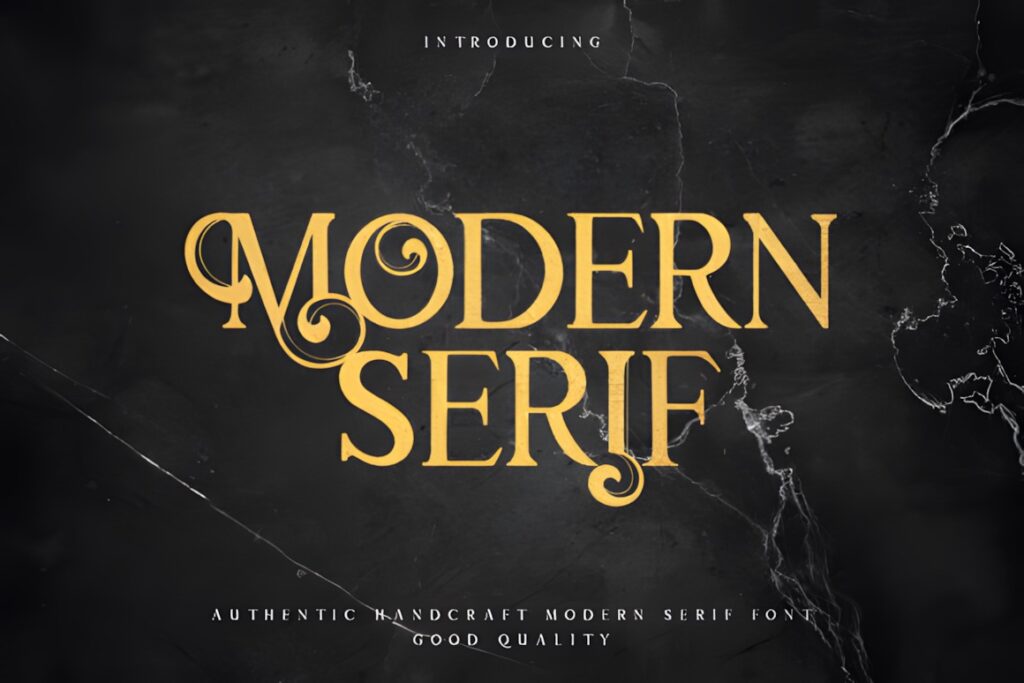
Modern Serif is an elegant contemporary serif with noticeable contrast and relatively balanced proportions, making it a useful starting point for magazine titles that need sophistication without excessive decoration. The product is presented specifically as a serif that combines traditional influence with a contemporary aesthetic.
Choose it when the headline should feel refined but still leave space for photography and supporting copy. Its restrained character makes more sense for versatile editorial layouts than a serif built around large swashes or unusual alternate forms.
2. Editorial Style
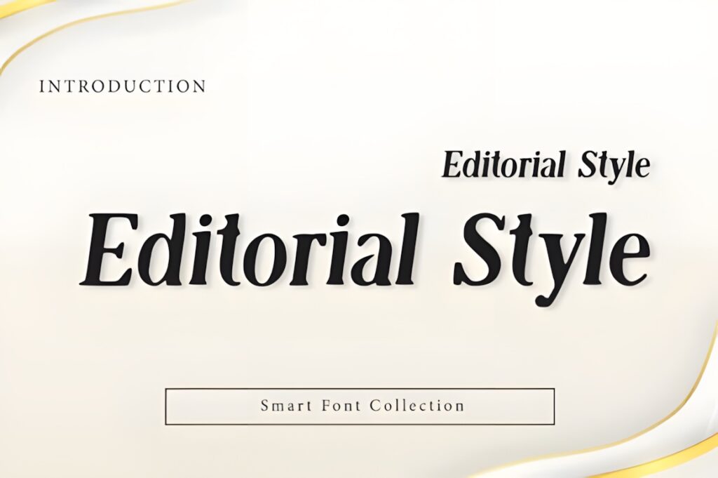
Editorial Style is a high-contrast serif display font created around modern luxury and magazine-inspired typography. Its clean structure and smooth serif shapes suit fashion covers, feature headlines, book titles, and other layouts where the type needs presence without becoming highly ornamental.
This makes sense when you want a polished editorial voice that remains relatively straightforward to compose. For a feature title that depends on exaggerated ligatures or sweeping decorative forms, Shanoy or Pagome would create a more expressive result.
3. Savera Editorial
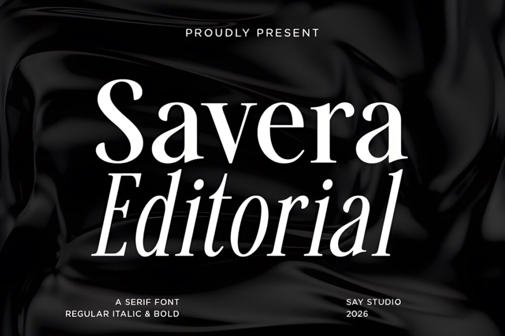
Savera Editorial is a refined serif typeface positioned specifically for magazines, fashion branding, packaging, and editorial layouts. Its overall character is polished rather than experimental, so it can work well where the typography needs to support a sophisticated layout instead of becoming the only visual focus.
Consider Savera for magazine departments, feature pages, and title treatments that need an elegant but controlled voice. A more dramatic high-fashion cover may benefit from the taller proportions of Gathero or Fleeting Moment.
4. Editorial
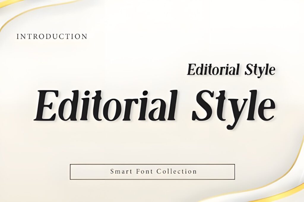
Editorial is a modern display serif family intended for magazine and book covers, website headers, branding, and related display applications. Compared with delicate fashion serifs, its more substantial serif character can give headlines a firmer visual anchor.
Use it when the layout needs a serif title that feels established and structured rather than exceptionally thin or airy. Its stronger presence can work particularly well against simple backgrounds or photography with enough negative space around the type.
5. The Letter Editorial
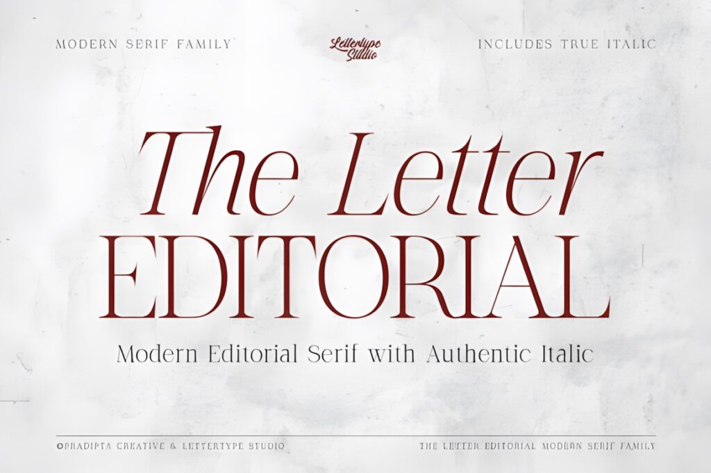
The Letter Editorial combines high contrast and refined serif proportions with a separately drawn true italic companion. That combination is particularly useful in editorial design because the regular and italic can create hierarchy without forcing the layout to switch to an unrelated typeface.
This font makes sense for feature packages that need a headline, emphasized words, pull quotes, or secondary display text with a connected visual language. If you only need a single restrained headline treatment, Modern Serif may be simpler to manage.
6. Rolive
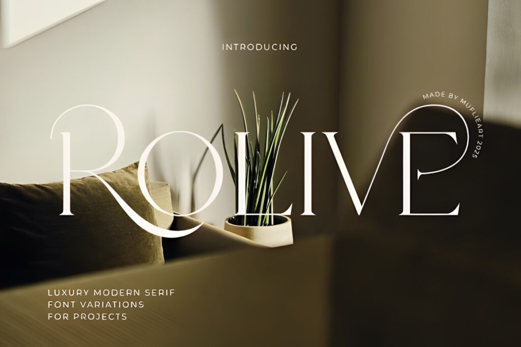
Rolive takes the modern serif direction into a more decorative fashion space. Its slender high-contrast construction is combined with sweeping forms and expressive details, giving magazine covers and luxury editorial titles a stronger couture-style personality.
Choose Rolive for short display phrases where individual letterforms have room to breathe. The same flourishes that make a large title distinctive can become crowded in compact multi-line headings, so a cleaner option such as Editorial Style is easier when space is limited.
7. The Bilstein Editorial
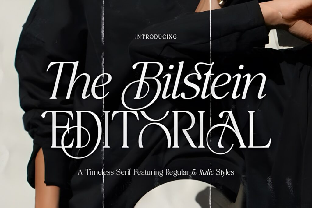
The Bilstein Editorial is a high-contrast editorial serif with distinctive curves and both Regular and Italic styles. It is designed around magazine headlines, editorial layouts, branding, packaging, and other display-focused applications.
The two-style setup is useful when an editorial spread needs contrast without losing typographic continuity. The italic can introduce movement in a kicker or highlighted phrase, while the regular style carries the primary headline. For a larger range of weights, Mello Serif offers more hierarchy options.
8. Minors
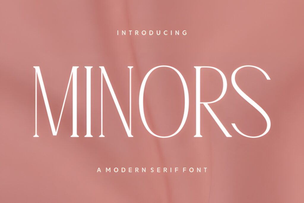
Minors uses tall, slender forms and strong thick-to-thin contrast to create a clean fashion-editorial appearance. The typeface is presented for magazine headlines, packaging, branding, and stylish social graphics, making its intended role clearly display-oriented.
Its narrow visual rhythm is useful when a cover needs height and elegance without taking up as much horizontal space as a broader serif. That same slenderness means very long or small secondary text may call for a quieter companion rather than repeated use of Minors throughout the page.
9. Gathero
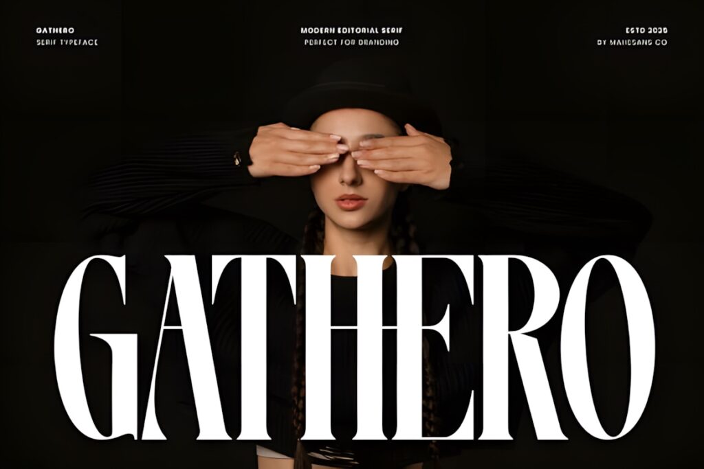
Gathero is a modern editorial serif built around tall letterforms, pronounced contrast, and a confident fashion-magazine character. The product includes uppercase characters, ligatures, and multilingual support, while its intended uses include headlines, editorial layouts, posters, and luxury branding.
This is a strong fit for a cover line or feature opener that should visibly lead the page hierarchy. Because its personality is assertive, pair it with more neutral supporting typography instead of trying to carry every text role with the same font.
10. Kelvia
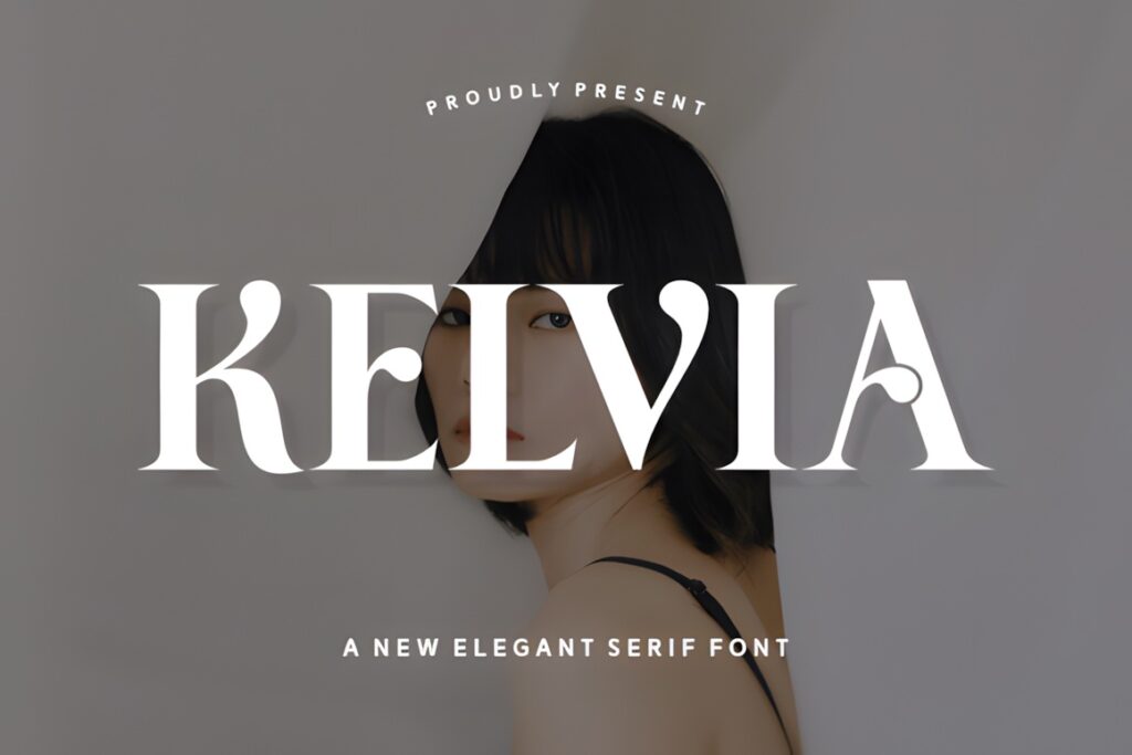
Kelvia is a sharply contrasted modern serif with sculpted curves and a bold display presence. It is intended for magazine headlines, editorial layouts, branding, and upscale packaging, so it fits naturally into layouts where the serif headline is supposed to carry visual authority.
Use Kelvia when a clean page needs a strong typographic focal point. Compared with more flowing fonts such as Rolive, Kelvia feels more architectural and controlled, which can be easier to combine with structured grids and minimal art direction.
11. Footle
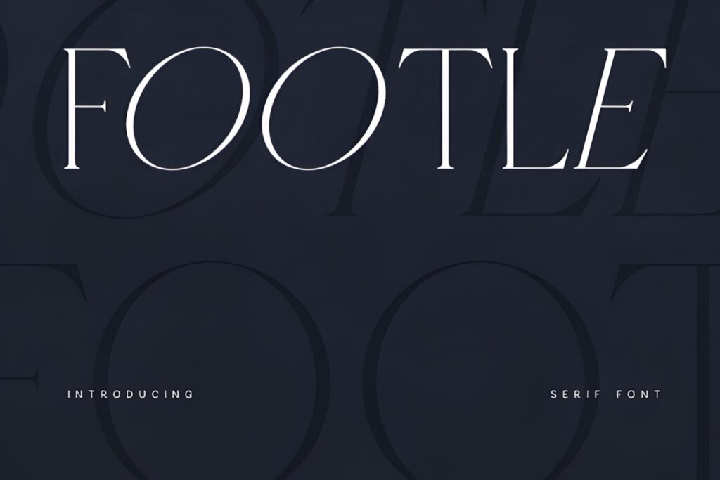
Footle is a modern serif with graceful curves and sharper serif details, developed for editorial layouts, magazine titles, luxury branding, and related display typography. Its personality is refined without relying on oversized flourishes.
That balance makes Footle useful for a lifestyle or fashion feature where the headline should feel elevated but still coexist comfortably with images and supporting content. If the title itself needs to become a decorative graphic element, Shanoy or Pagome gives you more overt personality.
12. Guegie
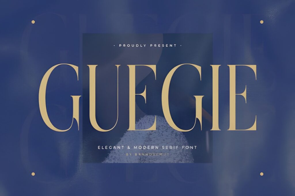
Guegie combines tall serif letterforms with balanced proportions and crisp typographic details. Its product description highlights editorial design, premium packaging, and large headline use while also emphasizing legibility across different sizes.
Consider Guegie when you want a sophisticated headline without the extreme thinness or decorative ligature work seen in more fashion-driven fonts. It can provide an elegant middle ground between restrained editorial typography and highly stylized luxury display lettering.
13. Rafina
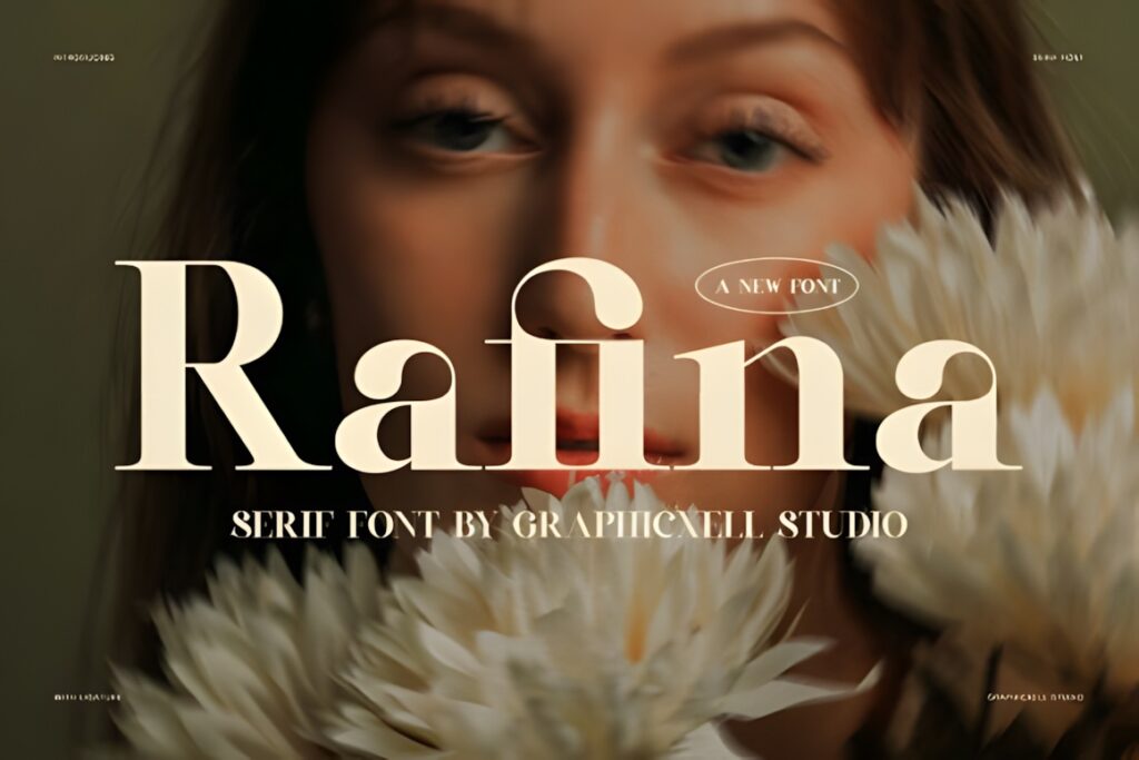
Rafina is a modern high-contrast serif with smooth curves and built-in ligatures, created for headlines, branding, packaging, and editorial-style design. The ligatures introduce extra personality without changing the fundamental clean serif structure.
Rafina works well for short feature titles where a few distinctive letter combinations can make the typography feel custom. For long headlines with several lines, use the decorative combinations selectively so the type does not compete with the overall page hierarchy.
14. Nothing Changed
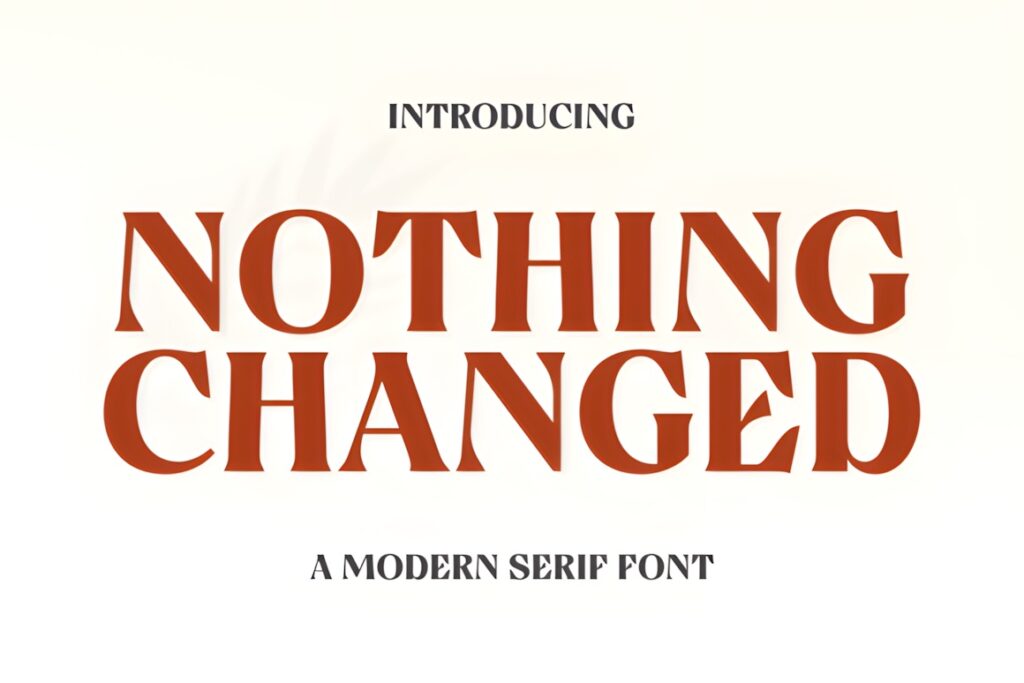
Nothing Changed is a modern serif display face with substantial vertical contrast, subtle serifs, and distinctive capital details. Its design is aimed directly at titles and headlines where a contemporary editorial tone is more important than neutral text setting.
Use this font when a large headline can take advantage of unusual capital shapes and visible stroke contrast. For smaller magazine departments or layouts where the same typeface must cover several text levels, a broader family such as Mello Serif is more adaptable.
15. The Avenue Editorial
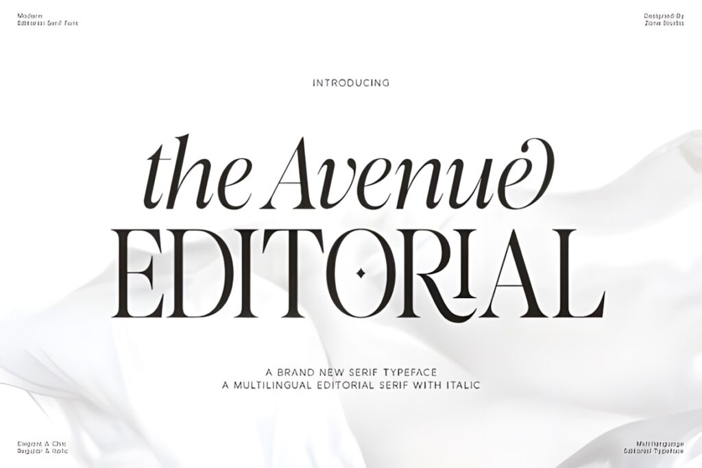
The Avenue Editorial is a contemporary serif designed specifically around editorial projects, magazine covers, luxury branding, and premium visual identities. It combines contrasting details, subtle curves, italics, and multilingual support within an editorial-focused type system.
This is useful when one publication needs both composed upright headlines and more expressive italic accents. Its polished tone makes sense for fashion, beauty, culture, or lifestyle pages where the typography should feel sophisticated without becoming overtly experimental.
16. Clarton
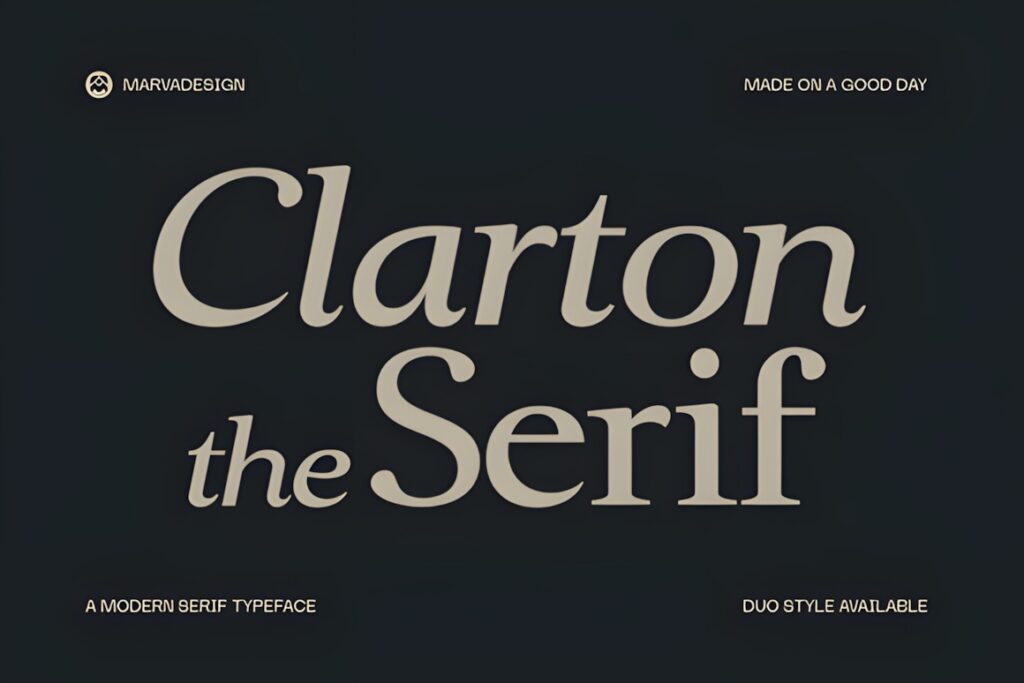
Clarton is a high-contrast modern serif with refined serifs, balanced uppercase and lowercase forms, and a natural italic companion. It is positioned for editorial layouts and magazine headlines as well as branding and other display projects.
The regular-and-italic combination gives Clarton more flexibility than a single decorative display face. It works particularly well when an article opener needs a bold main title plus an italic phrase or secondary line that still feels related to the primary headline.
17. Grand Nineties
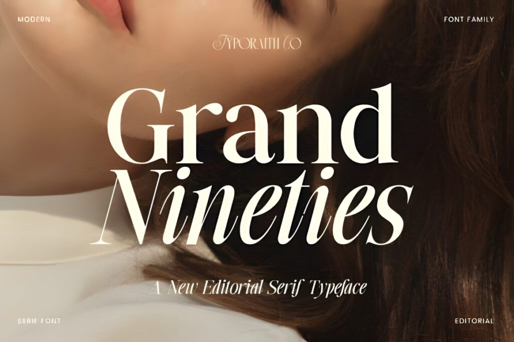
Grand Nineties draws on classic fashion-magazine typography while keeping its overall treatment contemporary. Refined serif shapes, balanced proportions, and graceful italic curves make it suitable for magazine covers, fashion editorials, beauty layouts, and brand-led publishing.
This font is worth considering when the project calls for a recognizable fashion-editorial mood without the more experimental swashes found in Shanoy. Its character is still visible, but the overall rhythm is controlled enough for a broad range of display compositions.
18. Montegar
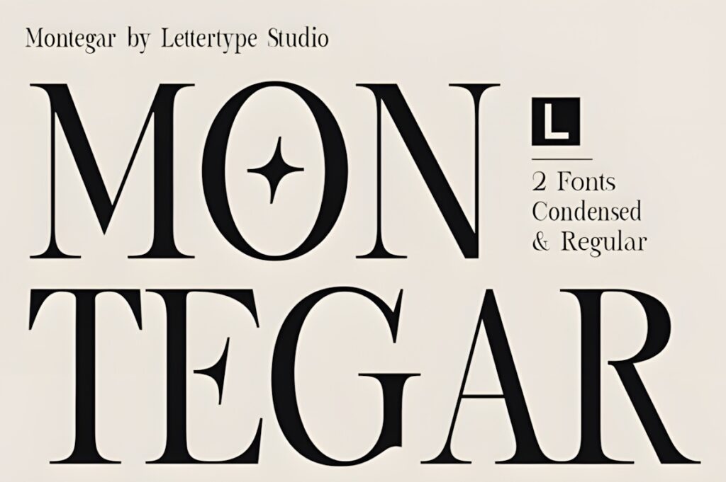
Montegar is a modern serif created for editorial headlines and other premium display work, with dramatic contrast, refined serifs, Regular and Condensed styles, alternates, and ligatures. Those style choices give the typeface unusual flexibility for headline composition.
The condensed option is particularly useful when a magazine title has to fit a narrow measure without shrinking the type excessively. Its decorative accents make the font better suited to prominent display roles than ordinary article copy, so reserve it for hierarchy points that deserve attention.
19. Mello Serif
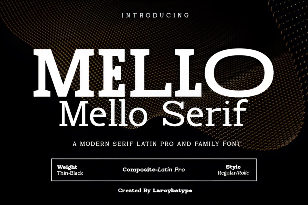
Mello Serif is a modern serif family with multiple weights and italic styles, intended for headlines, magazines, branding, fashion layouts, and other polished visual work. The broader family structure distinguishes it from many single-style display fonts in this roundup.
Choose Mello Serif when the project needs a consistent serif voice across more than one level of hierarchy. Different weights can separate cover lines, section titles, decks, and pull quotes while keeping the publication visually coherent. For a single dramatic headline, a more specialized font may create more immediate impact.
20. Shanoy
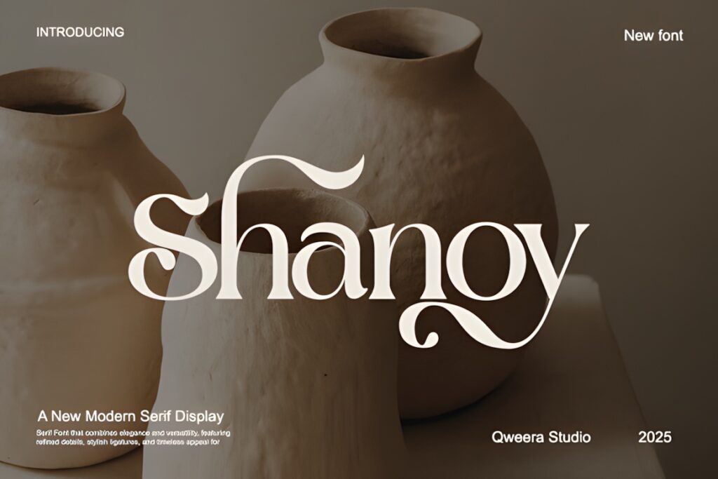
Shanoy is a modern serif display font defined by dramatic swashes and ligatures that turn selected letter combinations into a stronger visual element. Its intended uses include editorial titles, magazines, packaging, branding, and lifestyle visuals.
It makes the most sense for short fashion features, beauty stories, culture openers, or special-edition covers where the headline can function almost like artwork. Elaborate details need breathing room, so a straightforward serif such as Savera Editorial is easier for longer headlines or crowded cover compositions.
21. Raffined
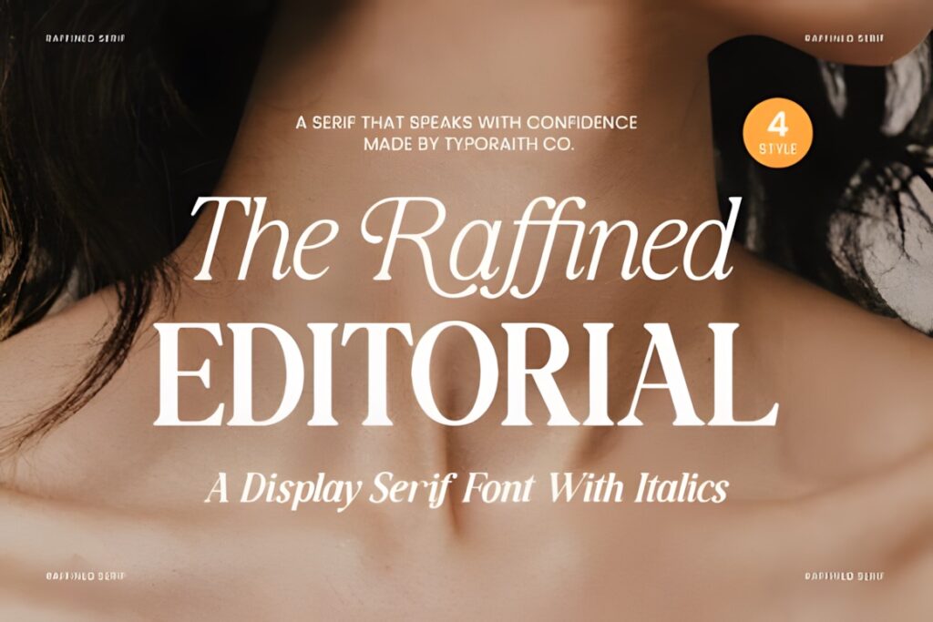
Raffined is a display serif with pronounced contrast, sharp serif details, flowing curves, and italic styles. It is aimed at editorial design, magazine headlines, fashion campaigns, packaging, and other layouts where typography needs a polished visual role.
Its combination of sharpness and softer curves gives Raffined enough personality for major feature headlines without moving fully into ornamental lettering. Use it when the page needs a recognizable luxury-editorial direction but still requires reasonably conventional serif structure.
22. Fleeting Moment
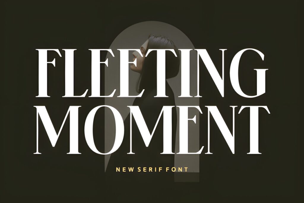
Fleeting Moment combines tall proportions, sharp serifs, and high-contrast strokes in a fashion-forward display serif. It is specifically suited to magazine covers, poster headlines, photography portfolios, and upscale branding, making its editorial role especially clear.
The tall construction works particularly well when the art direction calls for a narrow column of oversized type or a vertical sense of elegance. For smaller sections of editorial text, its dramatic display character should be supported by a simpler companion rather than reduced into every typographic role.
23. Qorine
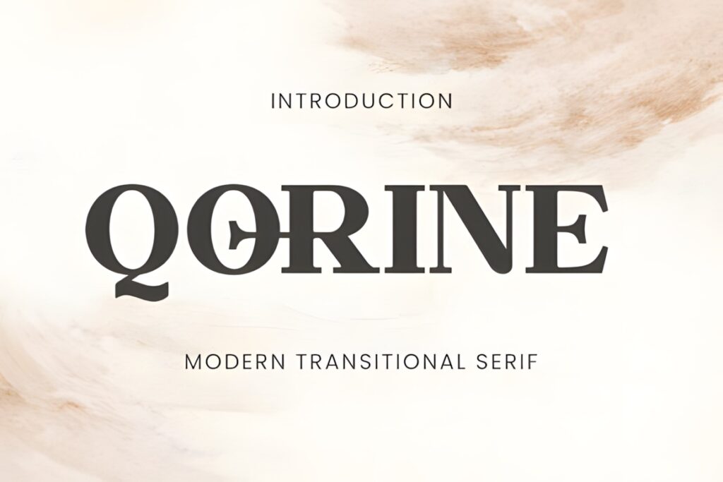
Qorine is a modern transitional serif with balanced contrast, sculpted serifs, elegant curves, alternates, and ligatures. It is designed for fashion editorials, magazine headlines, packaging, and premium branding while maintaining a more restrained overall structure than highly decorative display faces.
This makes Qorine a useful closing option for layouts that need contemporary personality without relying on exaggerated proportions. Use the alternates or ligatures selectively for a feature title, then keep secondary typography simpler so the editorial hierarchy remains clear.
Quick Comparison for Different Editorial Roles
| Font | Best for | Style | Key visual trait | Project fit |
|---|---|---|---|---|
| Editorial Style | Clean cover headlines | High-contrast serif | Controlled structure | Fashion and lifestyle magazines |
| The Letter Editorial | Multi-level features | Editorial serif | True italic companion | Feature openers and pull quotes |
| Gathero | Bold fashion titles | Tall editorial serif | Strong vertical presence | Magazine covers and posters |
| Minors | Narrow elegant headlines | Slender modern serif | Tall narrow rhythm | Fashion and beauty layouts |
| Montegar | Tight headline measures | Modern display serif | Regular and Condensed styles | Feature titles and covers |
| Mello Serif | Editorial systems | Serif family | Multiple weights and italics | Multi-page magazine hierarchy |
| Shanoy | Decorative openers | Expressive display serif | Swashes and ligatures | Short feature titles |
| Fleeting Moment | High-impact covers | Fashion display serif | Tall high-contrast forms | Cover lines and large headlines |
Display Headlines vs Longer Editorial Text
A modern serif that looks convincing at 60 or 90 points is not automatically the right choice for a paragraph, deck, or caption. High-contrast strokes, elaborate ligatures, unusual terminals, and narrow proportions become easier to appreciate as the type gets larger. At smaller sizes, the same details can compete with the content.
Fonts such as Gathero, Fleeting Moment, Shanoy, Rolive, and Nothing Changed make the most visual sense when the headline has enough space to show their character. For a publication that needs multiple serif hierarchy levels, families or paired styles such as Mello Serif, The Letter Editorial, Clarton, or The Bilstein Editorial give you more room to differentiate title treatments without changing typographic direction completely.
Font Pairing Tips for Magazine Layouts
Give each typeface a clear job. If the modern serif is expressive, use it for the publication name, major feature title, pull quote, or department opener and let a quieter sans serif or restrained text face handle navigation and supporting information. Contrast in function is usually more useful than choosing two fonts that are equally decorative.
High-fashion serifs with thin details often benefit from a supporting font with simpler shapes and steadier stroke weight. This keeps decks, dates, authors, captions, and page furniture readable while preserving the visual impact of the primary serif. Avoid introducing several display fonts on the same spread unless the publication already has a deliberately eclectic typographic system.
Readability and Headline Size
Test the actual words you plan to use, not only the alphabet shown in a font preview. Headline length changes the way a serif behaves: narrow letters may help a five-word cover line fit comfortably, while expansive ligatures can make even a short phrase difficult to balance.
Also check the thinnest strokes at the final print or screen size. Strong thick-and-thin contrast gives many of these fonts their editorial character, but very fine details need sufficient scale and contrast against the background. When a title sits over photography, judge the whole composition rather than the font in isolation.
Common Editorial Font Selection Mistakes
- Choosing from the font name alone. “Editorial,” “luxury,” and “modern” can describe very different letterforms, so compare actual proportions and contrast.
- Using decorative ligatures everywhere. A special combination can make a short title memorable, but repeating it across every text level weakens hierarchy.
- Ignoring headline length. A wide serif that looks balanced in a two-word sample may become awkward in a seven-word headline.
- Shrinking a display serif into body copy. Display-oriented detail often needs scale; use a text-oriented companion when longer reading is required.
- Forgetting the background. Fine hairlines that look clear on white can lose definition over detailed photography or low-contrast colors.
Choosing the Right Serif for Your Magazine Style
If you want a clean fashion-magazine direction, Editorial Style or Savera Editorial keeps the typography polished without dominating the page. For stronger high-fashion impact, Gathero or Fleeting Moment provides taller, more assertive letterforms.
For a publication that needs more than one coordinated display treatment, Mello Serif offers multiple weights and italics, while The Letter Editorial gives you a regular serif plus a distinctly drawn italic. When the title itself should become part of the visual artwork, Shanoy is the more expressive direction because of its prominent swashes and ligatures.
Before using a font in client work, products, publishing, or another commercial context, check the current license attached to that specific product and confirm that it covers the use you have planned.
Frequently Asked Questions
What makes a serif font suitable for magazine headlines?
A serif font works well for magazine headlines when its letterforms stay clear at the intended size while giving the page a distinct visual voice. Display serifs often use stronger contrast, taller proportions, sharper terminals, or unusual details to create hierarchy. Check the actual headline length, background, and available space rather than judging the typeface only from a specimen.
Can modern serif fonts be used for magazine body text?
Some modern serif families can support longer text, but many editorial fonts are designed primarily for display sizes. Very high contrast, narrow forms, dramatic ligatures, or decorative details may become tiring or fragile in small paragraphs. Use a dedicated text face or a more restrained family style when readability across several paragraphs is the priority.
How should I pair a modern serif with another font?
Pair an expressive modern serif with a supporting typeface that performs a different job. The serif can handle the cover line or feature headline, while a restrained sans serif or text-oriented serif carries decks, captions, credits, and body copy. Contrast in function and visual complexity usually creates a clearer editorial hierarchy than combining two equally decorative display fonts.
Can I use these fonts for commercial magazine or client projects?
Commercial use depends on the current license attached to each individual font product. Do not assume that every font has identical permissions for publishing, client work, merchandise, editable templates, or other commercial uses. Review the current product license before downloading or delivering finished work, especially when the design will be sold, redistributed, or used for a client.