ℹ️ Affiliate Disclosure: This article may contain affiliate links. If you book or purchase through these links, we may earn a commission at no additional cost to you.
Choosing the Right Modern Serif Fonts for Canva Logo Design
Modern serif fonts on Canva can give a logo a refined editorial mood, but the most dramatic specimen is not always the most usable wordmark. A fashion label may benefit from thin, high-contrast strokes, while a skincare brand needs lettering that stays clear on small packaging and social avatars. Name length, capitalization, spacing, and the shape of key letters can change the result as much as the typeface itself.
The choices below cover restrained luxury serifs, condensed display faces, ligature-rich styles, and stronger options for bolder identities. These are downloadable font products rather than a promise that each face is already included in Canva’s built-in library. After downloading a font, confirm that your Canva plan supports font uploads and that the supplied file format meets Canva’s current requirements.
Many more modern serif fonts are available, while this shortlist focuses on distinct logo uses, recognizable letterforms, and clearly different brand personalities.

The strongest modern serif fonts for elegant Canva logos balance personality with readable letterforms. Choose a clean luxury serif for flexible branding, a condensed high-contrast face for short fashion names, a ligature-rich font for a custom-looking wordmark, or a sturdier serif when the logo must remain clear at small sizes.
Quick Picks
- Best all-around luxury wordmark: Modesca — polished letterforms plus ligatures and alternates give a logo room to feel customized.
- Best for condensed fashion branding: Nedogta — tall proportions create impact without requiring a wide logo lockup.
- Best for a solid-and-outline system: Strage — Regular and Outline styles support coordinated logo variations.
- Best for expressive beauty branding: Filoptus — bold strokes, swashes, and ligatures suit a more decorative identity.
- Best for an unusual editorial signature: Faiten — vertical forms and script-like flourishes make selected letters memorable.
Modern Serif Fonts for Elegant Canva Logo Designs
1. Modesca
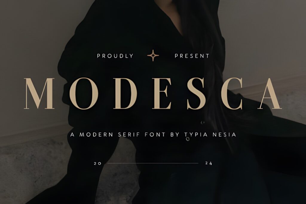
Modesca is a modern luxury serif suited to fashion, beauty, hospitality, and premium product logos. Its sleek lines feel polished without pushing the wordmark into an overly vintage direction. The product includes uppercase and lowercase letters, numerals, punctuation, ligatures, alternates, and multilingual support, giving designers useful ways to refine a name.
Choose Modesca when the identity needs a composed, versatile centerpiece that can extend into packaging and editorial graphics. Use alternates selectively; changing too many letters can reduce recognition. For a narrower, more dramatic logo, Nedogta makes more sense.
2. Calteo
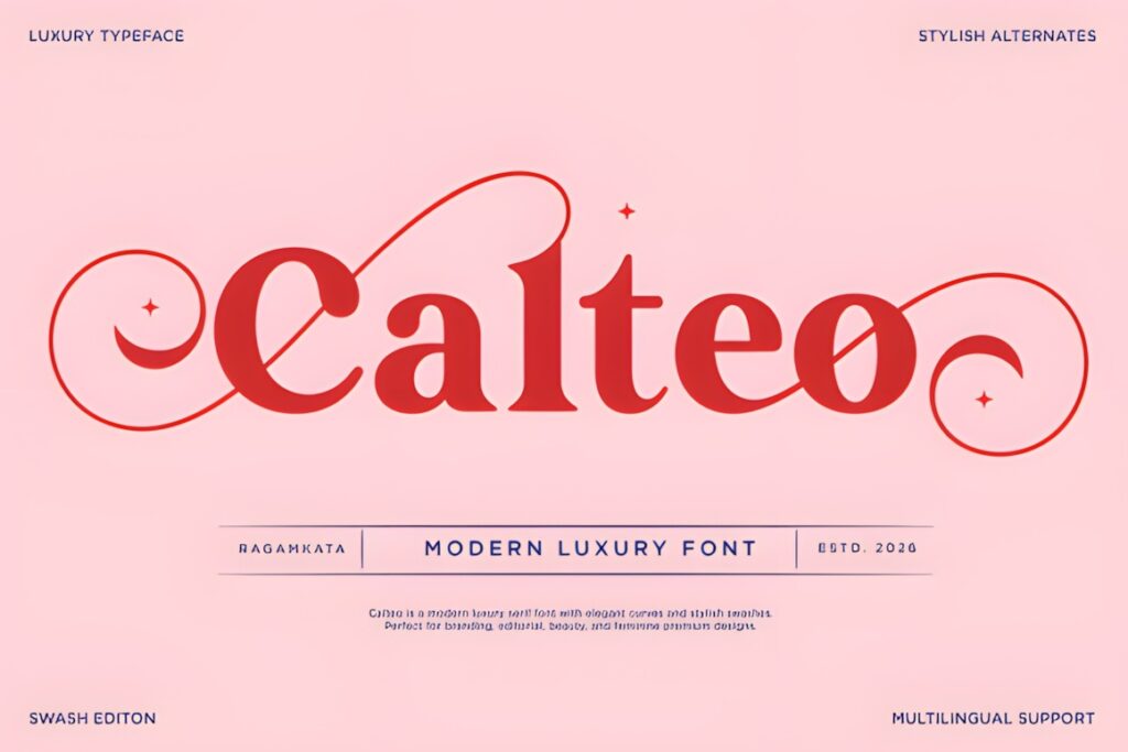
Calteo is a high-contrast modern serif for feminine luxury logos, cosmetics, wedding businesses, and boutique identities. Graceful curves and decorative swashes bring more ornament than Modesca, so it can turn a short brand name into the main visual element.
This font fits a logo that needs softness and fashion-editorial energy rather than strict minimalism. Preview the thinnest strokes at avatar and label size before settling on the design. If the name is long or must work very small, a calmer choice such as Story Type may be easier to control.
3. Strage
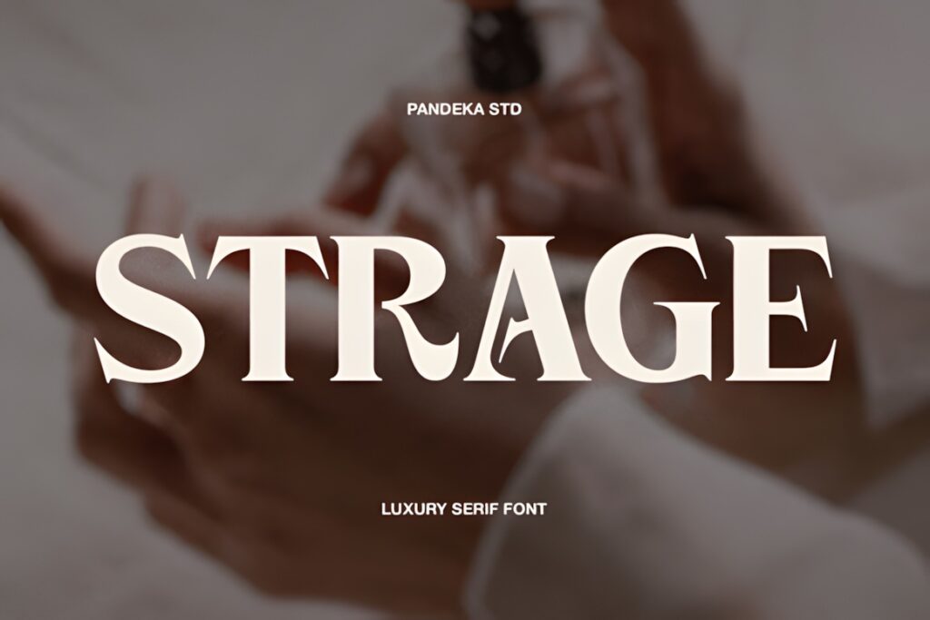
Strage is a contemporary luxury serif with Regular and Outline styles, making it useful for a logo system that needs coordinated solid and airy treatments. Its elegant contrast and smooth proportions suit beauty, perfume, fashion, and upscale lifestyle branding.
Best for: brands that want one letterform structure across a primary logo, social graphic, and decorative monogram. The outline style works better as an accent than as tiny supporting text. Choose a single-style font when simplicity and fast brand consistency matter more than variation.
4. Nedogta
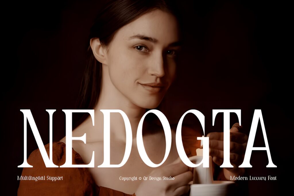
Nedogta is a tall, condensed display serif made for short luxury names, fashion mastheads, jewelry identities, and premium packaging. Extreme thick-and-thin contrast, crisp Roman construction, and sharp triangular serifs create a formal, high-impact silhouette.
The narrow proportions help when horizontal space is limited, but the delicate crossbars and tight structure deserve careful size testing. Nedogta is strongest for a short wordmark with breathing room. A longer business name will usually feel calmer in Bilgafe or Modesca.
5. Bilgafe
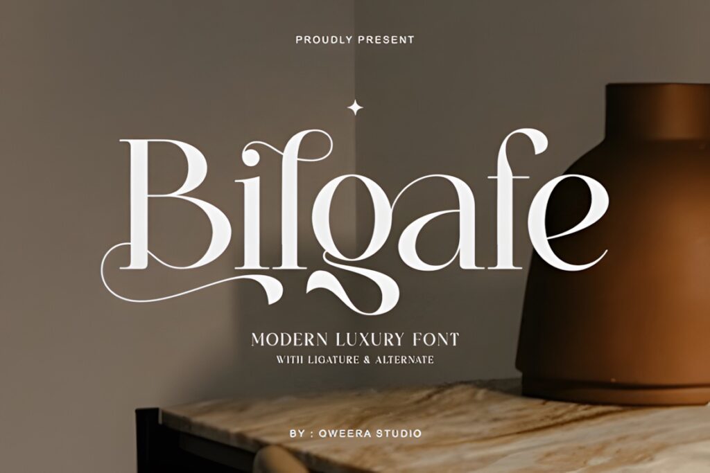
Bilgafe is a clean modern luxury serif for cosmetics, lifestyle, editorial, and boutique logos. Smooth transitions keep the core wordmark composed, while ligatures and alternates can add a more custom-lettered detail to selected character pairs.
This is a practical option when the brand should feel elevated but not theatrical. Start with the default letterforms, then test one ligature or alternate at a time. If the identity calls for overt swashes and a more expressive shape, Filoptus provides a stronger decorative direction.
6. Filoptus
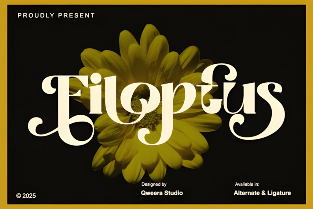
Filoptus is an expressive modern serif with bold strokes, artistic ligatures, and pronounced swashes. It suits beauty studios, wedding brands, creative boutiques, and product identities that need the name to feel decorative even in a simple Canva layout.
Its strongest asset is visual presence, especially in short names and initials. Give swashes clear space so they do not collide with a tagline, icon, or frame. For an identity that must remain quiet and flexible across many applications, Qorvella or Story Type is the safer direction.
7. Marquis
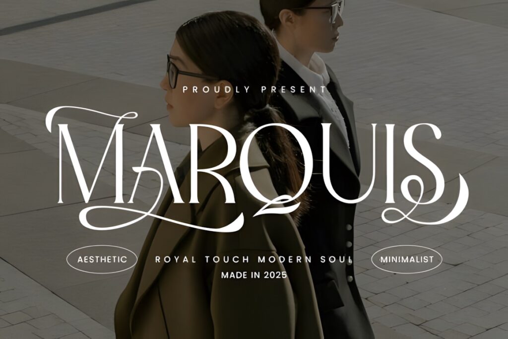
Marquis is an elegant modern serif that blends classic curves with a cleaner minimalist tone. Fine details and stylish ligatures make it suitable for feminine businesses, editorial brands, photographers, and premium social-media identities.
Consider this when: the logo needs refinement without the extreme narrowness of a fashion display face. Marquis can bridge modern-classic and feminine styles, but its delicate details still need room. Black Frost offers a sharper, more assertive alternative.
8. Malovi
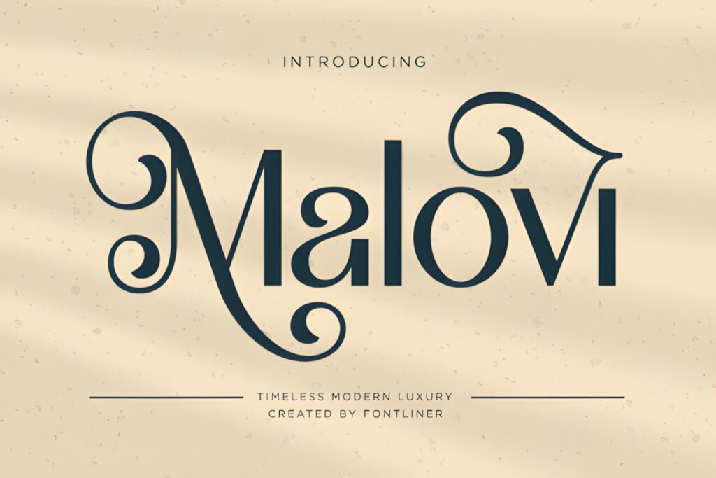
Malovi is a modern luxury serif for logos that need a timeless, polished character rather than a playful or rustic mood. It makes visual sense for upscale service businesses, product branding, fashion, and refined editorial graphics.
Use Malovi as the focal typeface and keep the surrounding Canva layout restrained so the letterforms carry the identity. Its luxury tone may feel too formal for a casual family brand or energetic children’s product. Fioren brings more artistic warmth when the identity needs to feel less reserved.
9. Absolute Glows
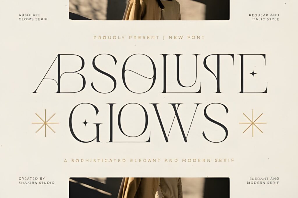
Absolute Glows is a modern elegant serif designed for luxury branding and premium visual identities. Its refined direction suits skincare, jewelry, interiors, hospitality, and other businesses that want a contemporary logo with a formal serif foundation.
This choice works well when the logo should feel sophisticated without relying on a retro theme. Build the first version in black and white, then check how the letter shapes survive on colored backgrounds. Choose Strage instead when an outline companion style is central to the brand system.
10. Berfal
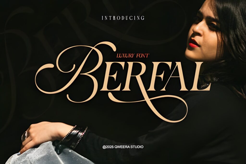
Berfal is a modern luxury serif with stylistic alternates and elegant ligatures for custom-looking logos and display typography. It is a good fit for fashion, beauty, lifestyle, and premium product names that need a recognizable typographic detail.
The alternates offer flexibility, but a logo becomes harder to recognize when every possible flourish is used at once. Select one signature letter and keep the rest of the name readable. Bilgafe is the more restrained comparison; Filoptus is the more ornamental one.
11. Caluxe
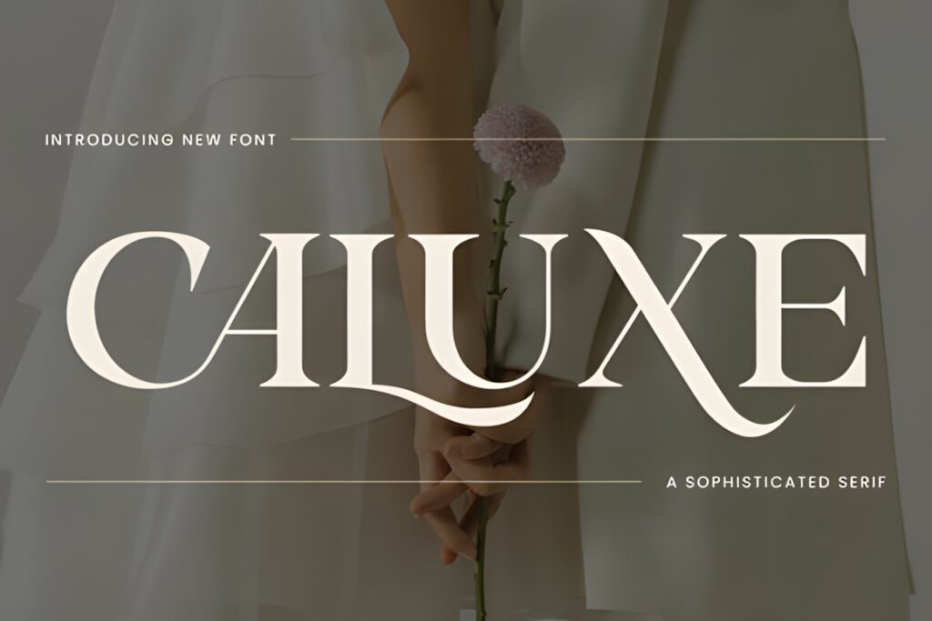
Caluxe is a modern serif with refined letterforms and graceful curves, suited to luxury logos, wedding stationery, fashion graphics, and product packaging. Its polished appearance can connect a Canva wordmark with a broader set of elegant campaign visuals.
Choose Caluxe when the brand needs classic prestige with a contemporary finish. It is less suited to an identity built around bold industrial forms or informal friendliness. For a logo with a sharper editorial edge, Black Frost creates a more angular impression.
12. Faiten
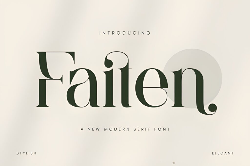
Faiten is an elegant modern serif with strong vertical axes and unexpected script-like flourishes in selected bowls and terminals. It suits editorial brands, literary businesses, event identities, and premium packaging that need a wordmark with an identifiable twist.
The unusual details can make a short name memorable, especially when a distinctive letter falls in a prominent position. Test the exact spelling carefully, because a brand name without those expressive characters may show less of Faiten’s personality. Story Type is a quieter option for longer names.
13. Qorvella
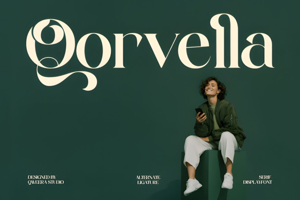
Qorvella is a clean modern serif created for luxury visual identity work. It fits professional beauty, fashion, interiors, wellness, and boutique branding where the logo should feel elegant without becoming heavily ornamental.
Best for: a restrained Canva logo that can sit comfortably beside photography, neutral colors, and simple packaging layouts. Qorvella may be too quiet when the wordmark must deliver all the visual drama by itself. In that case, Calteo or Faiten offers more expressive detail.
14. Story Type
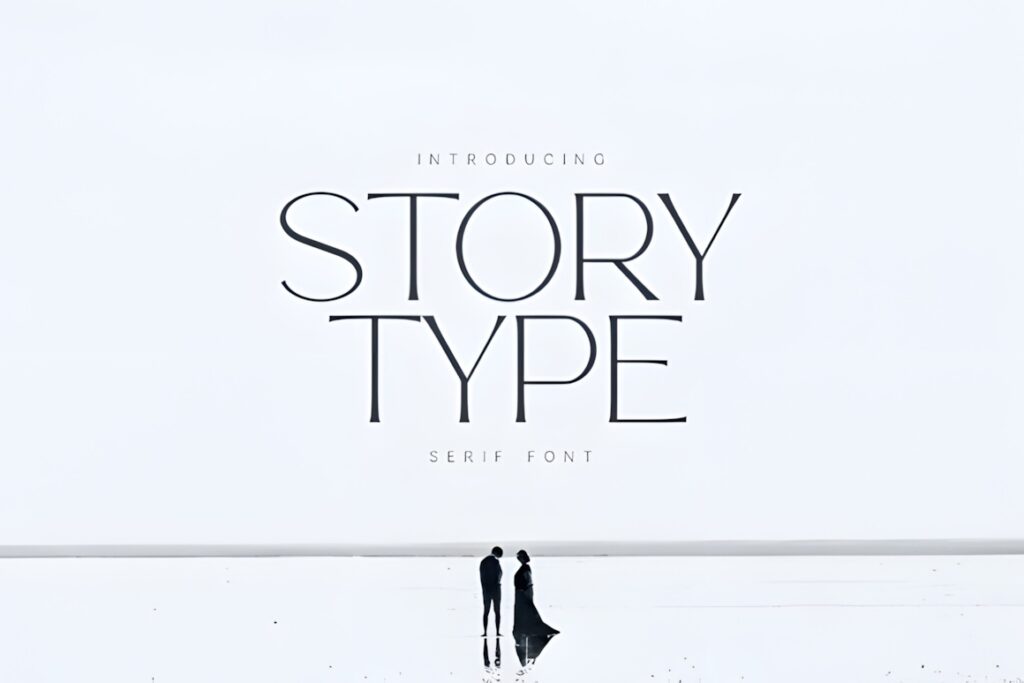
Story Type is an elegant modern serif with slender strokes, balanced proportions, and graceful letterforms. It is suited to editorial, bookish, fashion, invitation, and creative-service identities that want a quiet, narrative quality rather than a bold retail look.
Its balanced structure makes sense for medium-length names and refined logo layouts with generous white space. Slender strokes still require testing on small exports and low-contrast backgrounds. Choose Strage for a more graphic system or Nedogta for stronger vertical drama.
15. Replice
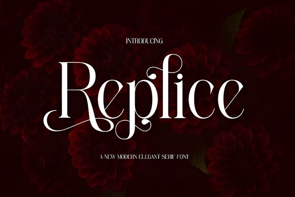
Replice is a refined modern serif that uses ligatures to bring a tailored feel to logos and display names. It works for boutiques, personal brands, creative studios, and product identities that want a classical base with a small amount of customization.
Replice makes the most sense when the actual brand name contains letter pairs that benefit from its ligatures. Compare both the default and alternate forms before deciding; clarity should win over novelty. Berfal provides a broader decorative direction when more variation is desired.
16. Dree
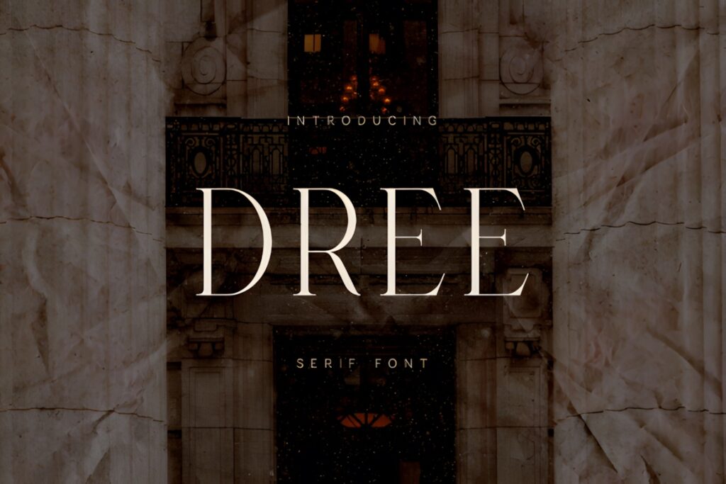
Dree is an elegant modern serif that blends traditional structure with a contemporary display sensibility. It suits branding, book covers, premium packaging, posters, and cinematic visual identities. The product lists multilingual support along with numerals, punctuation, and symbols.
Choose Dree when the identity may need more than a simple English wordmark and the serif should extend into a broader editorial system. Its expressive display character is better for names and headings than dense informational copy. Qorvella is a calmer option for a minimal brand system.
17. Black Frost
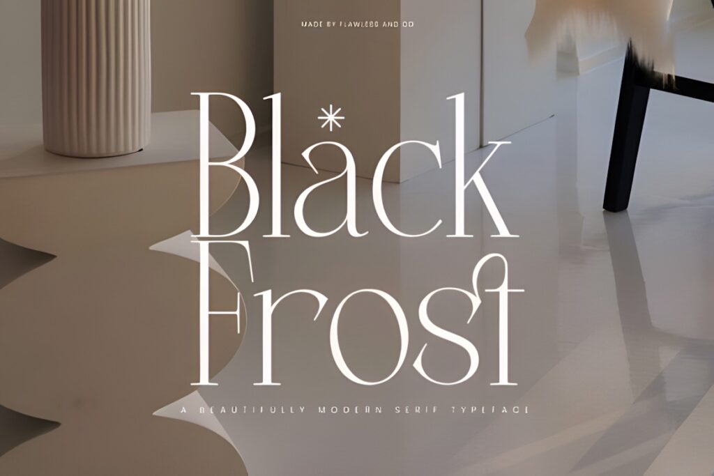
Black Frost is a modern elegant serif with refined letterforms and sharper details. It is suited to high-end fashion, product packaging, wedding brands, and editorial logos that need more edge than a soft, romantic serif provides.
The sharper character can bring confidence to a monochrome wordmark or a restrained Canva composition. It may feel too severe for a warm, handmade, or child-focused identity. Marquis offers a softer modern-classic alternative, while Caluxe leans more formal and graceful.
18. Fioren
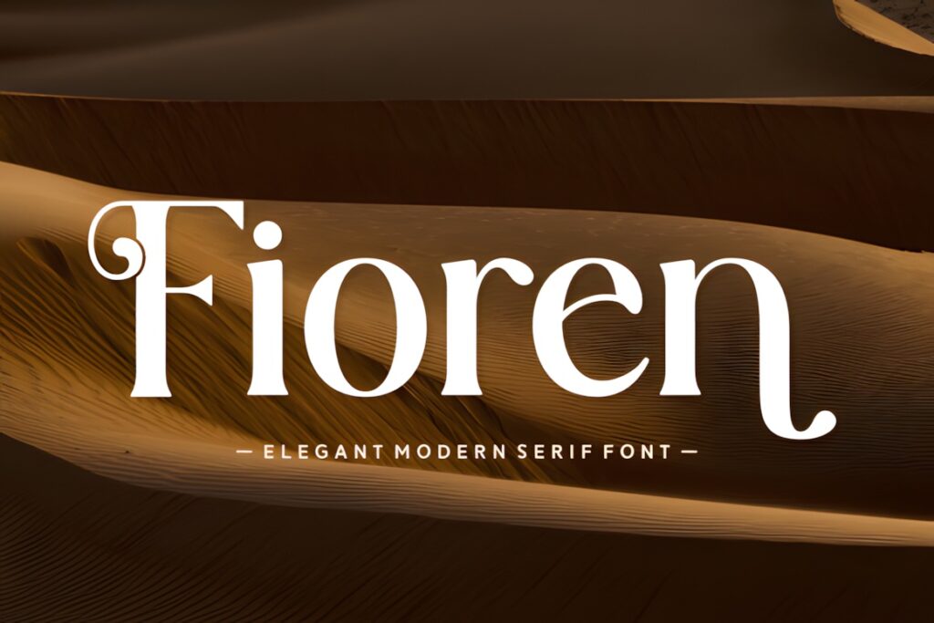
Fioren is an elegant modern serif with an artistic flair, making it useful for creative studios, florists, photographers, beauty brands, and event businesses. It brings more personality than a strictly minimal serif while keeping a sophisticated overall direction.
Use Fioren when the wordmark should feel curated and expressive but not dominated by large swashes. Let the typeface breathe rather than surrounding it with multiple decorative Canva elements. For a more neutral luxury identity, Modesca or Qorvella will be easier to apply broadly.
19. Solynne
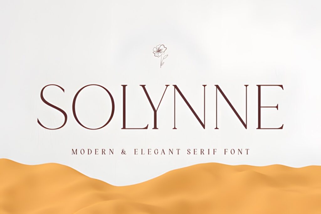
Solynne is a refined modern serif with a timeless, composed personality. It suits wellness, interiors, boutique retail, beauty, and professional creative brands that want elegance without an obvious period theme.
Solynne is a sensible finishing option for a clean logo layout, especially when typography needs to work with photography and understated color palettes. It is less suited to brands that rely on novelty or a highly decorative signature. Filoptus or Faiten supplies more immediate character.
Quick Comparison by Logo Style
| Font | Best for | Style | Key visual trait | Logo fit |
|---|---|---|---|---|
| Modesca | Flexible luxury branding | Modern serif | Sleek with alternates | Short to medium names |
| Calteo | Beauty and bridal brands | High-contrast serif | Curves and swashes | Decorative short names |
| Strage | Multi-version logo systems | Luxury display serif | Regular and Outline | Primary marks and accents |
| Nedogta | Fashion and jewelry | Condensed display serif | Tall, sharp proportions | Short narrow wordmarks |
| Bilgafe | Quiet-luxury identities | Clean modern serif | Ligatures and alternates | Controlled customization |
| Filoptus | Expressive beauty logos | Decorative modern serif | Bold strokes and swashes | Statement wordmarks |
| Faiten | Editorial signatures | Expressive serif | Script-like flourishes | Distinctive letterforms |
| Story Type | Editorial and literary brands | Slender modern serif | Balanced proportions | Medium-length names |
| Black Frost | Sharper premium branding | Modern elegant serif | Crisp details | Confident monochrome marks |
| Solynne | Understated businesses | Refined modern serif | Composed character | Versatile clean layouts |
Branding and Logo Considerations
A logo font has to do more than look elegant in a large preview. Test each candidate with the exact business name, then place it in three realistic situations: a wide website header, a square social avatar, and a small package or business-card application. A face that succeeds in all three gives the brand more flexibility.
Short names can support condensed structures, strong contrast, and memorable alternates. Longer names usually benefit from less ornament, moderate width, and open spacing. If the wordmark includes a descriptor such as “studio,” “collective,” or “skin care,” keep that supporting line simpler and smaller so it does not compete with the name.
Do not judge a font only by its most dramatic capital letter. Inspect every character in the brand name, repeated letters, punctuation, and numerals if a founding year is part of the mark. A distinctive R may sell the specimen, but awkward spacing around an actual letter pair can matter more in the finished logo.
Font Pairing Tips for Canva Brand Kits
Give the modern serif one clear role: brand name, campaign headline, or product-line title. Pair it with a restrained sans serif for taglines, contact details, ingredient lists, and other information that must stay readable. Contrast in function is more useful than pairing two fonts that both demand attention.
For a tall high-contrast font such as Nedogta, use a supporting face with simple shapes and enough weight to survive small sizes. A ligature-rich option such as Berfal or Filoptus needs an especially quiet partner. With calmer choices such as Qorvella or Solynne, the supporting font can carry slightly more personality as long as the two do not share nearly identical proportions.
Build a small type hierarchy in Canva rather than selecting fonts page by page: one logo face, one heading style, and one highly readable supporting style. Repeating those roles across social posts, packaging mockups, and presentations will make the brand feel more consistent than adding another decorative font.
Before Downloading and Uploading a Font
- Check the current product page for the included font files and features instead of assuming every preview style is supplied.
- Confirm that your Canva account and Brand Kit access allow custom font uploads.
- Canva currently supports OTF, TTF, and WOFF uploads, but the downloaded product must actually include a supported file.
- Review the current license for logo, client, product, print-on-demand, or editable-template use as applicable to your project.
- Upload only font files you are authorized to use and keep the original product and license information with the project records.
- Type the full brand name before choosing a font; alternates and ligatures may not suit every letter combination.
Which Modern Serif Fits Your Logo Best?
If you need one adaptable luxury serif for a polished wordmark, Modesca is the most balanced starting point. For a short fashion or jewelry name that should feel tall and editorial, Nedogta makes more visual sense. Choose Strage when matching solid and outline logo treatments would strengthen the identity.
Filoptus is better for a beauty or event brand that needs swashes and expressive detail, while Faiten suits a short name whose letters can take advantage of its unusual flourishes. If restraint and broad usability matter more than decoration, start with Qorvella, Story Type, or Solynne.
Frequently Asked Questions
Can I upload these modern serif fonts to Canva?
You can upload a downloaded font to Canva when your account includes the required Brand Kit font-upload access and the product supplies a supported file. Canva currently accepts OTF, TTF, and WOFF files. Because the products in this roundup are not necessarily built into Canva, check the downloaded files and Canva’s current upload requirements before planning the final logo.
What type of modern serif works best for an elegant logo?
A clean modern serif with readable letterforms and controlled contrast is the most flexible choice for an elegant logo. Condensed, high-contrast fonts suit short fashion or beauty names, while calmer proportions work better for longer business names and small applications. Test the actual wordmark in uppercase, title case, and lowercase before choosing.
How do I keep a thin serif logo readable at small sizes?
Keep a thin serif logo readable by using strong color contrast, avoiding crowded spacing, and testing the mark at its real output size. Delicate hairlines may disappear in social avatars or compact labels even when they look sharp in a large Canva canvas. A simplified compact logo or a sturdier serif may be necessary for small placements.
Can I use a downloaded serif font in a commercial logo?
Commercial logo use depends on the current license attached to the specific font product. Review the license for your intended business, client, merchandise, print-on-demand, and editable-template uses rather than assuming every download grants identical rights. Keep a record of the product and license terms that applied when you obtained the font.